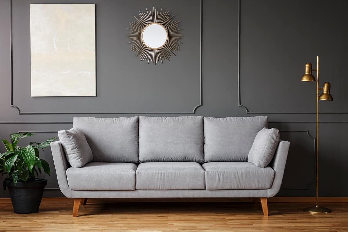
Gray is one of the most popular neutral shades of paint in interior design right now, but frustratingly it is also among the hardest paint colors to get right.
Here we explore exactly why finding the perfect gray paint for your room is so hard, as well as tips for choosing gray paint and some of the best gray paint colors for living rooms.
Table of Contents
Why is Gray So Tricky?
If you have experimented with gray paint colors before, then you will know firsthand how hard gray can be to get right. There are several factors that come into play that will determine how a gray paint color looks in a room, and this means that it rarely looks the same as you expect.
A gray paint that you see in a friend’s house is going to look completely different when applied to the walls in your home, and even if you love the gray paint you used in your bedroom, it can look like a totally different color when used in your living room. Besides gray as a neutral color, there are also other neutral paint colors that work well for the living room.
Undertone
Understanding the undertone of paint color is essential to getting the look and atmosphere you want. The vast majority of paint colors all have a mass tone and an undertone, and identifying them will allow you to choose paint colors more effectively.
The mass tone of a color is the color your eyes instantly perceive when you look at it, while the undertone is the other color that is used to create the final color, but it will be much more subtle than the mass tone.
It can be difficult to identify an undertone at first, especially when you are looking at a standalone paint swatch; however, with practice, this is a skill that can be learned. Knowing the undertone is going to help you ascertain how the paint is going to appear in different types of lighting.
If the undertones are orange, yellow, or red, then the paint has warm undertones, and if they are blue, green, or purple, then the paint has cool undertones.
Natural Light
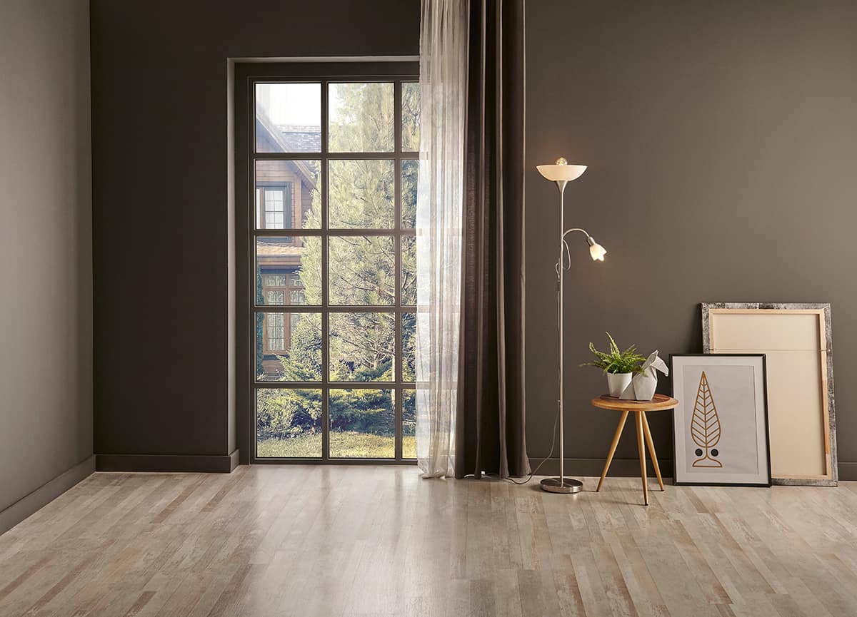
The type of natural light you get in a room will alter how a color is perceived. If the aspect of your windows is south facing, then you will have a good level of bright sunlight in your room throughout the day, so this is the easiest type of room to decorate with gray paint because it will make the paint appear as its truest color, whether that be with cool or warm undertones.
North-facing windows will mean that your living room receives a low level of light, which can make it look dull and cool.
The best shades of gray in a north-facing room will have warm undertones to balance out the cool effect of the northerly light.
East and west-facing rooms are more difficult because they will have bright yellow light at some points in the day and cool gray light at others. You should decorate rooms with this type of light according to what time of day the room is predominantly used.
Artificial Light
Artificial light will also affect how a color is perceived in a room, but thanks to light bulbs now being appropriately labeled with the type of light they produce, this is easier to manage.
If you have light bulbs which produce warm white light, then this is going to have the effect of making your gray paint color appear tinted with yellow or orange. This means that a cool gray paint might appear more neutral, while a warm gray paint might appear closer to beige or pale yellow than gray.
White bulbs give off a white light that helps to make gray paint colors appear truer, while cool white light bulbs give off a light that is tinged with blue.
If you have a gray paint on your walls that has cool undertones, then a cool white artificial light can actually make the gray appear more like a shade of baby blue. However, if you have a warm gray shade on your walls, then a cool white light bulb is going to balance out the warm tones and make it feel more neutral.
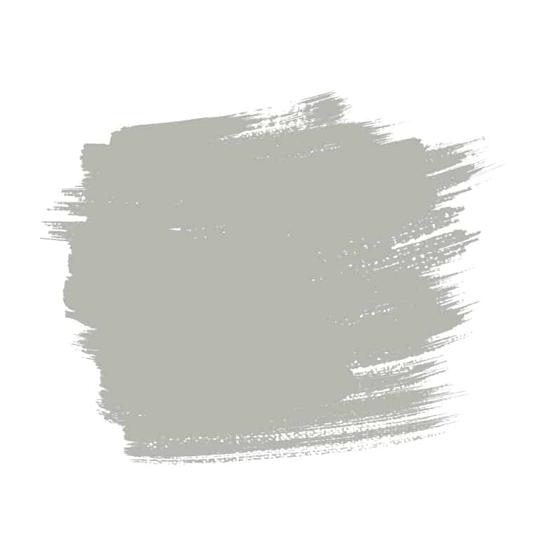
Sherwin-Williams Repose Gray
This is a cool-toned gray with subtle green undertones. It will work beautifully in a living room that benefits from plenty of natural light, ideally a south-facing aspect.
Pair it with accessories in green to help pick out the green tones in this shade for a crisp and modern look. Consider painting the walls gray and opting for an olive green velvet sofa for a nature-inspired luxury.
Benjamin Moore Dior Gray

This is a medium to dark shade of gray that has distinct blue undertones, giving it a cool feel. Use it in a living room where you want to create a sense of intimacy and comfort while maintaining a modern vibe.
In cool lighting, this color can appear blue rather than gray, so use it in a south-facing room or invest in some warm light bulbs.
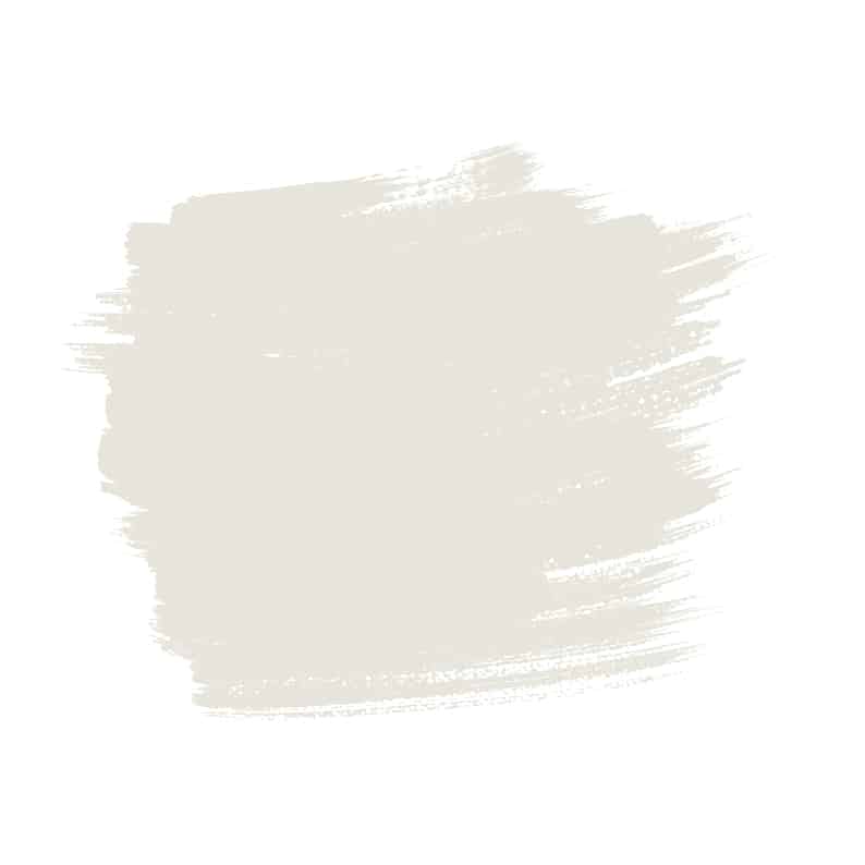
Valspar Gray-Green Linen
 Green Linen is even more chameleon-like than most shades of gray because it can look gray, green, or beige, depending on the lighting. Its true color is a greige with green undertones, which is great for achieving a fresh and modern look that still retains a certain amount of warmth and comfort.
For a more beige hue, pair this color with warm tones like terracotta, or use it in a room with plenty of bright natural light. For a cooler look, use this shade on living room walls with north-facing windows and cool accessories.
Behr Irish Mist
Irish Mist is a stunning pale gray color for achieving a dreamy look in a living room. It is a gray shade of off-white with a hint of beige, which means it makes a room feel airy and bright, even if the space lacks natural light.
Use pure white sofas and curtains for a crisp style, or pair them with beige accessories to highlight the warmth in the gray.
Sherwin-Williams Amazing Gray
 Amazing Gray is a mid to light tone of gray, which has warm beige undertones. It is a nice choice if you need a warm gray to brighten up a space with dull lighting but want to avoid overly yellow paint tones for the living room.
This color is able to make a space feel modern and elegant while also offering the comfort and safety of warming beige. It is versatile in terms of using it alongside other colors, working well in a range of color schemes. Use it with aged tan leather sofas and dark wood furniture for a heritage style, or pair it with white paneling and blue accessories for a cozy-coastal look.
Behr White Metal
 White Metal is a pale shade of gray with blue undertones, which make it a cool gray. It provides a nice crisp and fresh backdrop in a living room and helps to make smaller spaces feel airier since it reflects light.
It will appear almost baby blue in cool or dull lighting, so use it in a room that receives plenty of natural light to enjoy its true tranquil color. The blue undertones in this paint give it a soothing appeal which will work well for a relaxing living room.
Farrow & Ball Cornforth White
Cornforth White is a popular shade of gray for interior use because it reads as a neutral gray but actually has very soft brown undertones, which make a room feel warm and comfortable.
It is a pale paint color that works well as the backdrop in a living room for a classic look. Pair it with crisp white for an elegant monochromatic look, or use rich brown accessories to highlight the warmth in the paint color.
Benjamin Moore Balboa Mist
This is a light shade of gray that borders on the taupe because it has some beige to light brown undertones. The resulting effect is a soft gray shade that has the contemporary feel of gray with the warming comfort of beige.
It works well in a relaxing living room because it feels laidback, casual, and inviting when used with other pale colors. Alternatively, pair it with charcoal trim for a contrast that is sharp and sophisticated.
Sherwin-Williams Agreeable Gray
If you have been investigating gray paint shades, then you have probably already heard of ‘agreeable gray’ from Sherwin-Williams. It is one of the paint brand’s most popular and bestselling colors, which is no accident. This light shade of gray paint has subtle beige undertones to help it create a warm atmosphere in a living room.
The color is still predominantly gray, so it doesn’t fall into the ‘greige’ category, but it offers just enough warmth that makes it appealing to homeowners moving away from cold and crisp interior styles. This gray also has the benefit of working well in a variety of different lighting types, appearing soft even in low-lit living rooms.