Determining a color scheme in a farmhouse should factor in how natural light falls in each room and the type of atmosphere you want to achieve.
Farmhouse style is associated with muted, unfussy color palettes, but that doesn’t mean your home has to be bland or lifeless. Here we look at some of the best paint colors for use in the contemporary or cozy-themed farmhouse.
We focus on shades of off-white, green, beige, and gray for paint colors that encompass modern trends without dismissing the history of the farmhouse.
Table of Contents
Color Palettes for Farmhouse Interiors
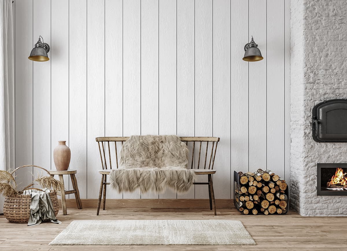
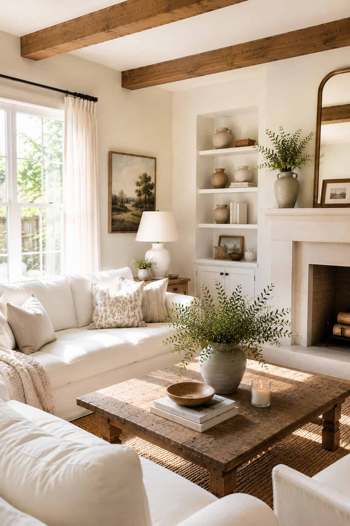
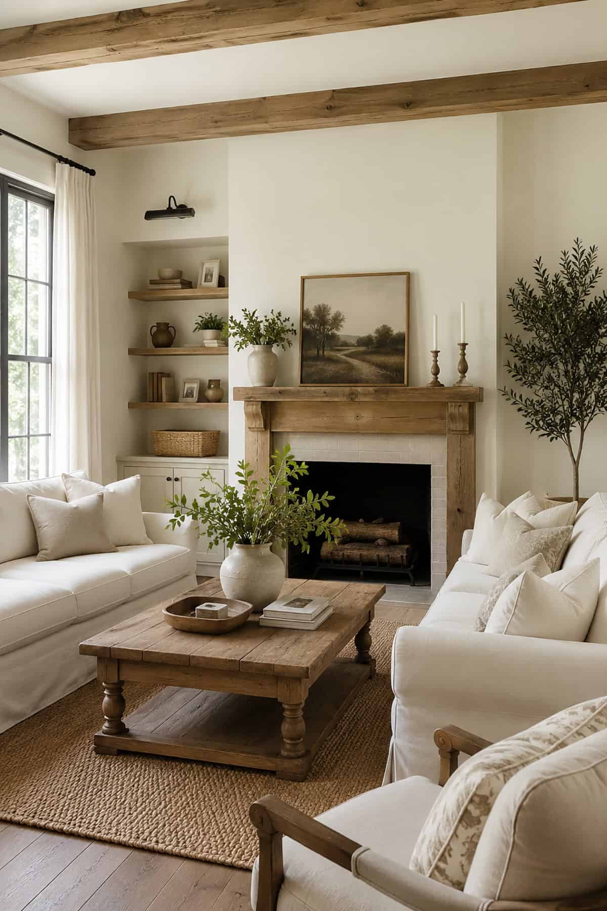
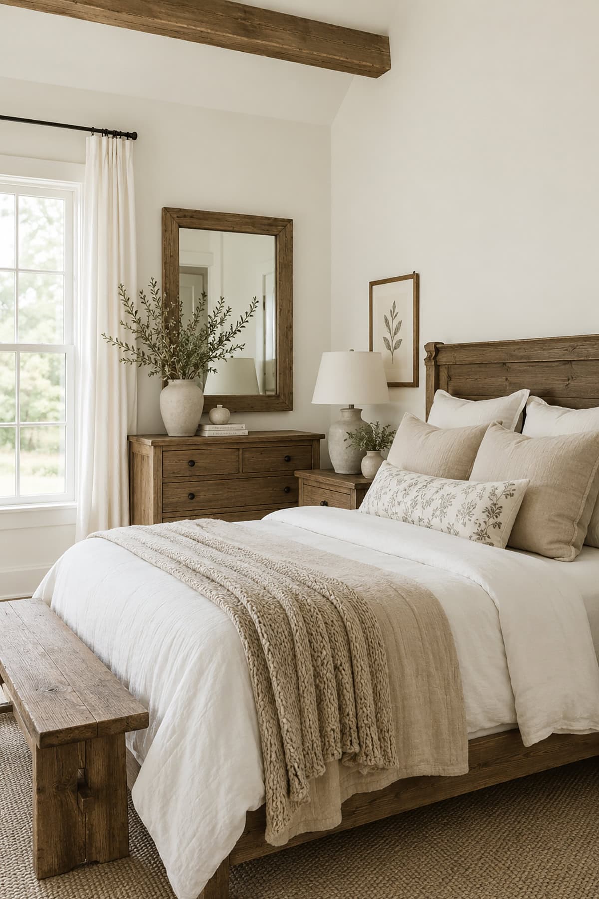
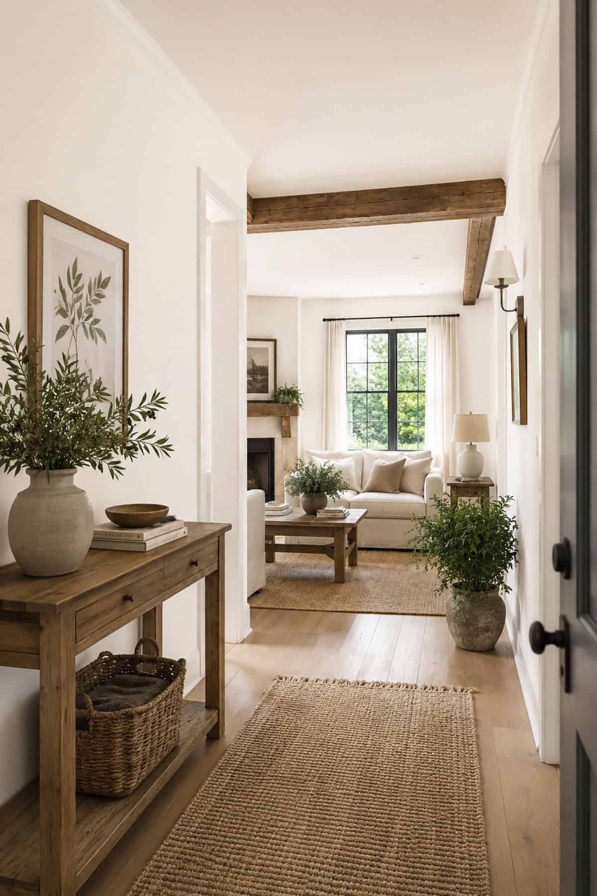
Off-White Simplicity
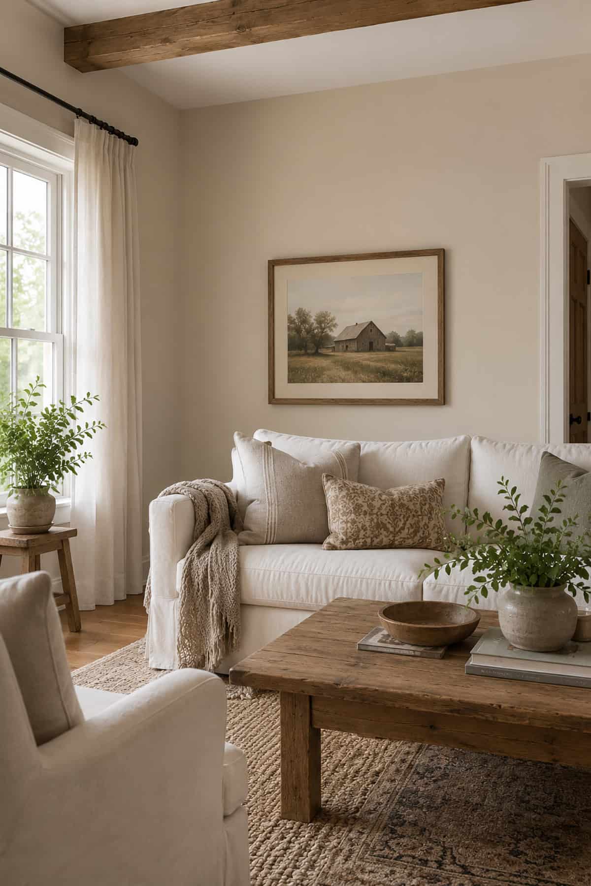
White is always a good color choice for walls in a farmhouse because it provides the perfect base upon which you can build any style. In kitchens, white-painted walls can create a fresh vibe with marble countertops for a modern space that doesn’t conflict too heavily with the more traditional elements of the farmhouse’s architecture.
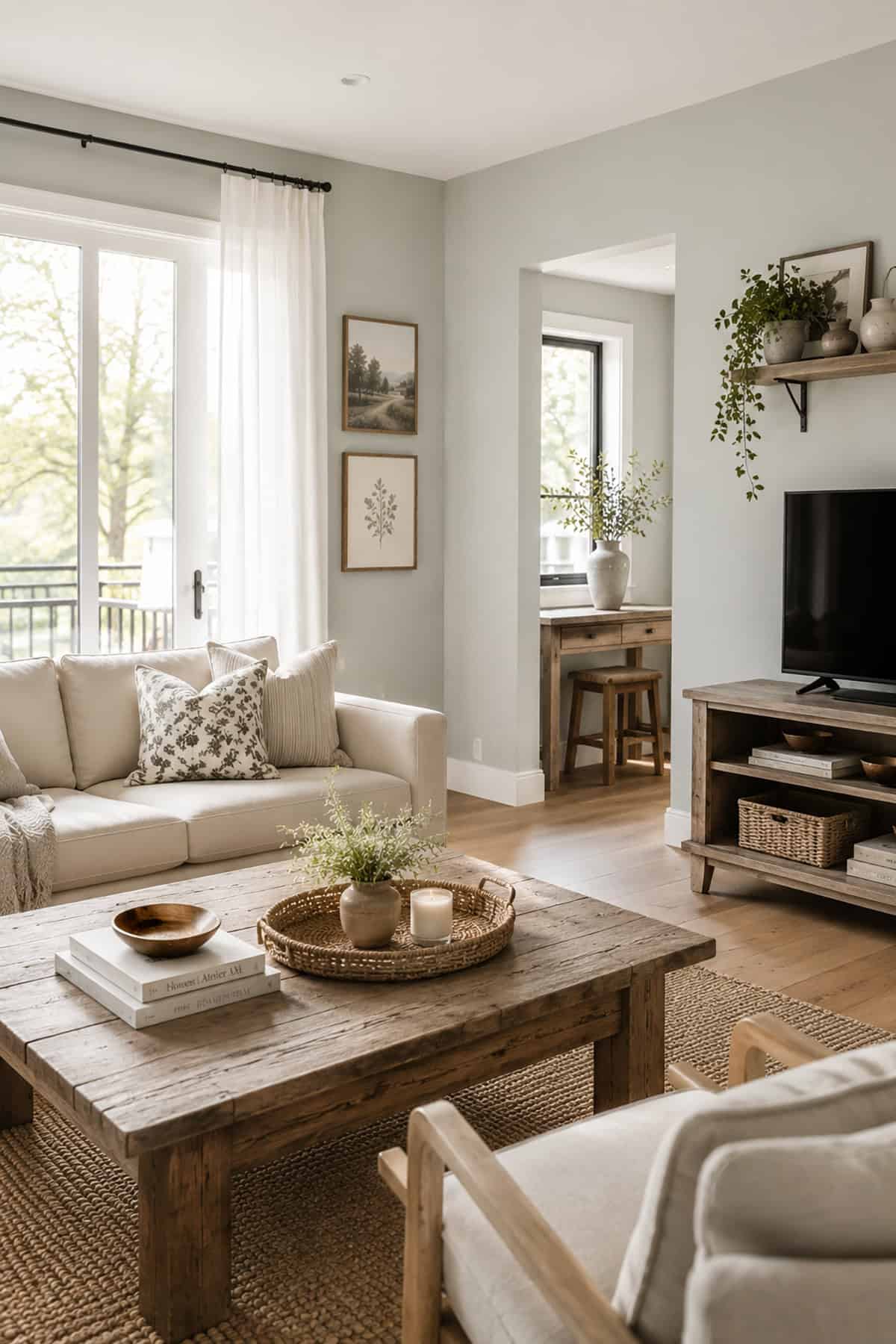
In a living room, use off-white walls to contrast against a dark hardwood floor or to allow a deep-colored sofa to stand out. Although white paint can look simultaneously effortless and chic on farmhouse walls, it can actually be one of the most tricky colors to choose because there are so many variations of white available, with seemingly endless hues and undertones. Here we explore the best white paint colors for a farmhouse interior.
Sherwin Williams- Alabaster

This off-white color from Sherwin Williams reads as pale beige or pale greige, depending on the type of light in the room. It has very slight yellow undertones with a hint of gray, which provides it with the perfect balance between warm and cool. It is ideal for use in a farmhouse where you want a modern look that embraces the classic and historical feel of the property.
This off-white shade comes across as cozy due to the warmer undertones, but the hint of gray ensures that it doesn’t read as dated. Use it on walls with pure white trim for a subtle contrast, or pair it with gray kitchen cabinets to subtly warm up a cool space.
Behr- Polar Bear

This off-white paint color from Behr is inspired by Arctic summers, designed to combine the classic elegance of true white with the playful energy of a polar bear cub.
It has imperceptible pink undertones and a hint of yellow that result in an overall warm feel, ideal for rooms without natural light or north-facing rooms that don’t get a lot of daytime sun.
Benjamin Moore- White Dove

This is a warm white paint color that has a hint of gray to prevent it from reading as yellow when painted on the walls. It is a tremendously popular paint color that many designers consider the perfect shade of warm white because it looks great in any space, in any type of light.
If you struggle to find the right white paint for your farmhouse, ‘White Dove’ could be a contender for bright or muted spaces.
Farrow & Ball- Wimborne White

This paint color from Farrow & Ball is about as close as you can get to white without being true white. It is just one shade away from pure white, with the slightest yellow undertones to result in a warming feel that doesn’t read at all as yellow or creamy.
Use ‘Wimborne White’ for a fresh look against exposed stone walls in a farmhouse or in a sunny bathroom for a spa-like feel.
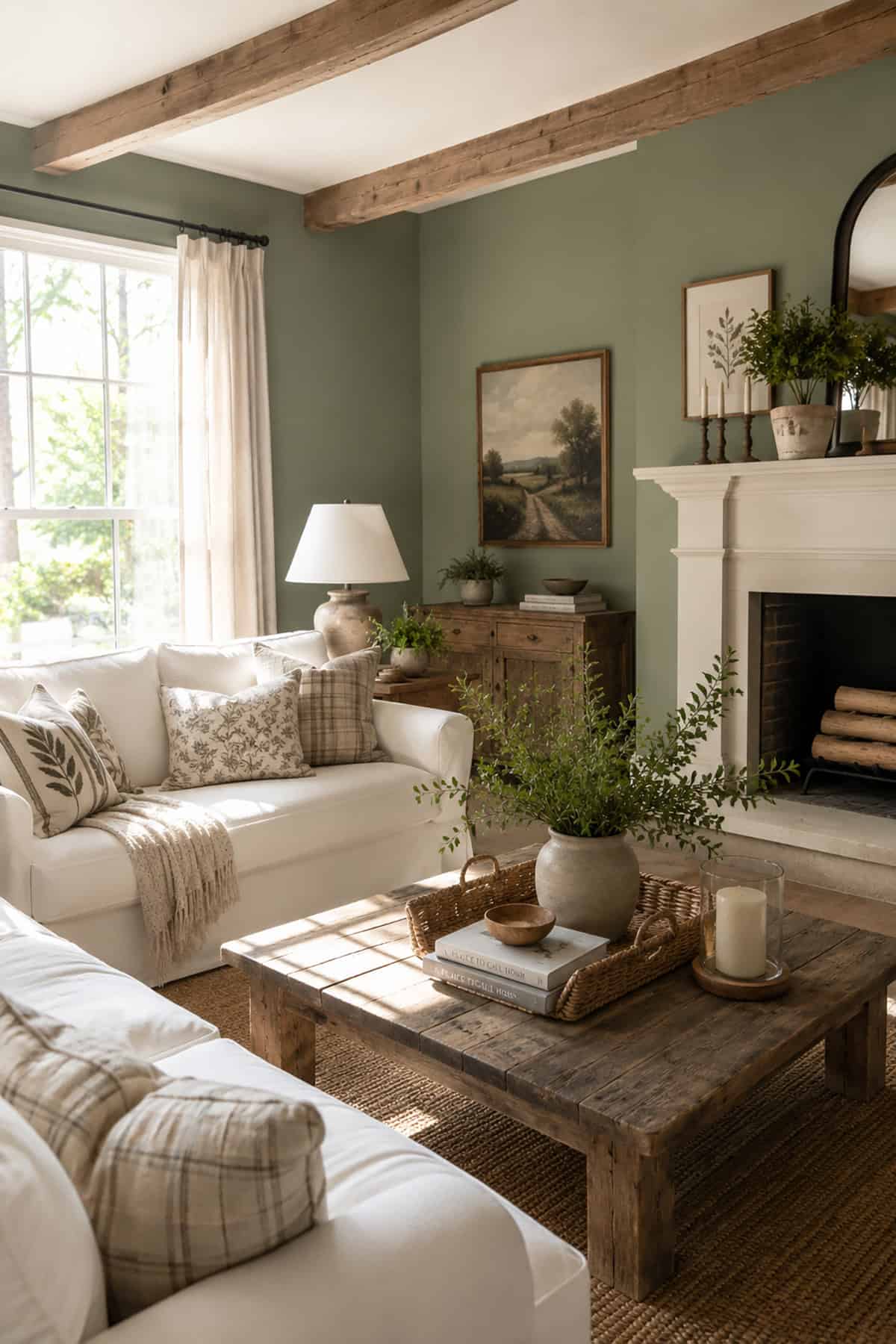
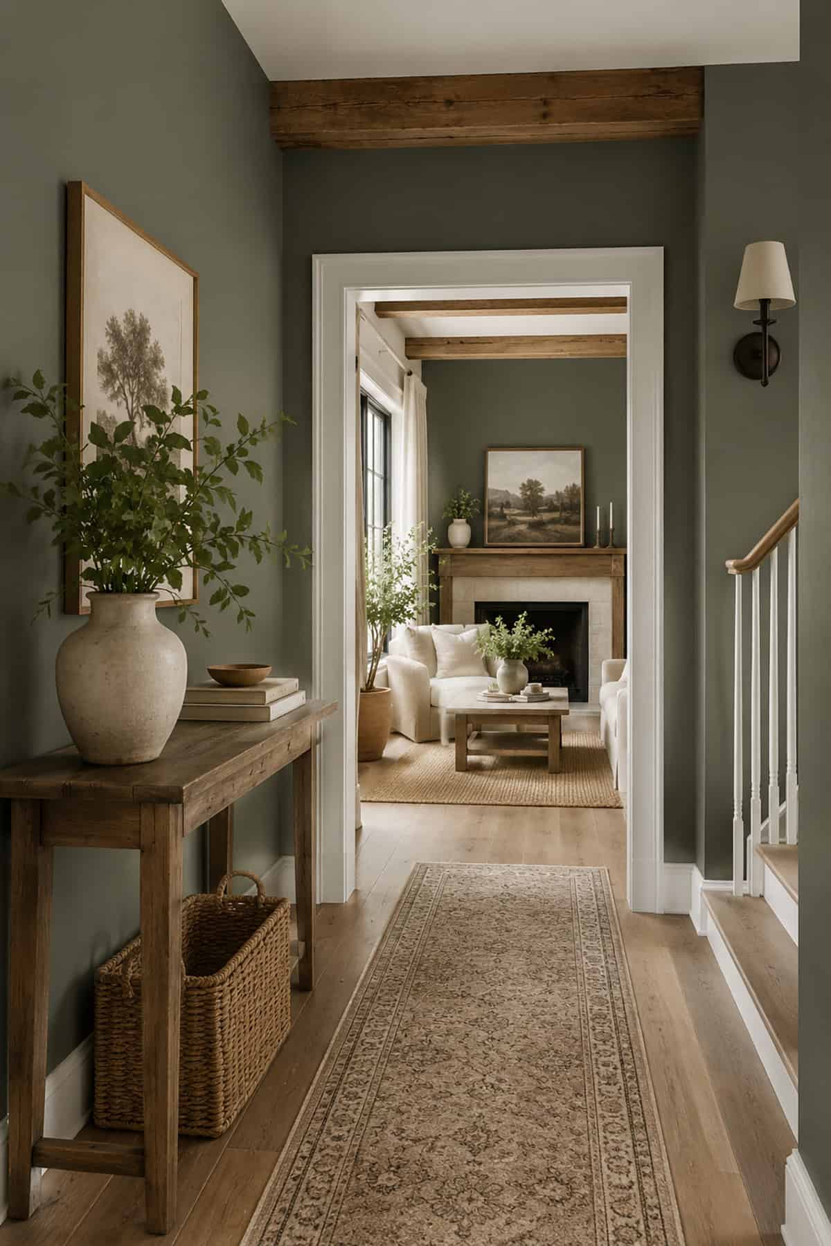
Botanical Greens
Although farmhouse decor is renowned for being neutral and somewhat subdued, green is actually the perfect color to use if you want to veer away from the more predictable paint shades. Since green is one of the predominant background colors to the natural world, it makes a good choice for the backdrop in a home without coming across as loud or overwhelming.
Green is an especially suitable option for farmhouses that have extensive grounds or impressive gardens since it helps to invite the outside into the home. Of course, there is a lot of variation between green shades of paint, and it’s imperative to opt for the right color to avoid an incongruous look in your farmhouse. Muted mossy greens will work well for farmhouse decor, along with olive tones and sage-inspired shades.
Farrow & Ball- Green Smoke
This is a medium to dark shade that is predominantly green but also features elements of blue and gray for a cool and smokey result. It pairs well with blush for a floral theme, or use it alongside beige or greige for a warm and familiar vibe.
As a muted shade of dark green, this color lends itself to calm and cozy areas of the home, such as bathrooms, reading nooks, or guest bedrooms.
Behr- Laurel Tree
Laurel Tree by Behr is a color inspired by nature, and it has definitive herbal vibes. It is a gorgeous shade of green to add new life to a dated farmhouse room, with a simultaneously hopeful and tranquil energy that lends itself perfectly to a variety of spaces in the home.
Use this color in the kitchen with white cabinets for a fresh and welcoming atmosphere, or team it with dark wooden furniture in the home office for a majestic feel.
Valspar- Garden Flower
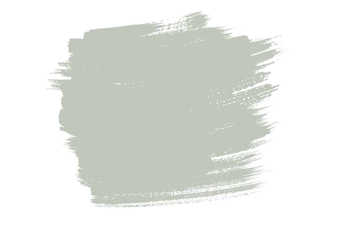
The name of this paint alone rouses visions of spring gardens and new life. It is a muted shade of gray-green, which will read as neutral in farmhouse decor.
‘Garden Flower’has a cool and fresh feel, yet pairs well with warmer shades such as tan or beige for a cozy and inviting vibe.
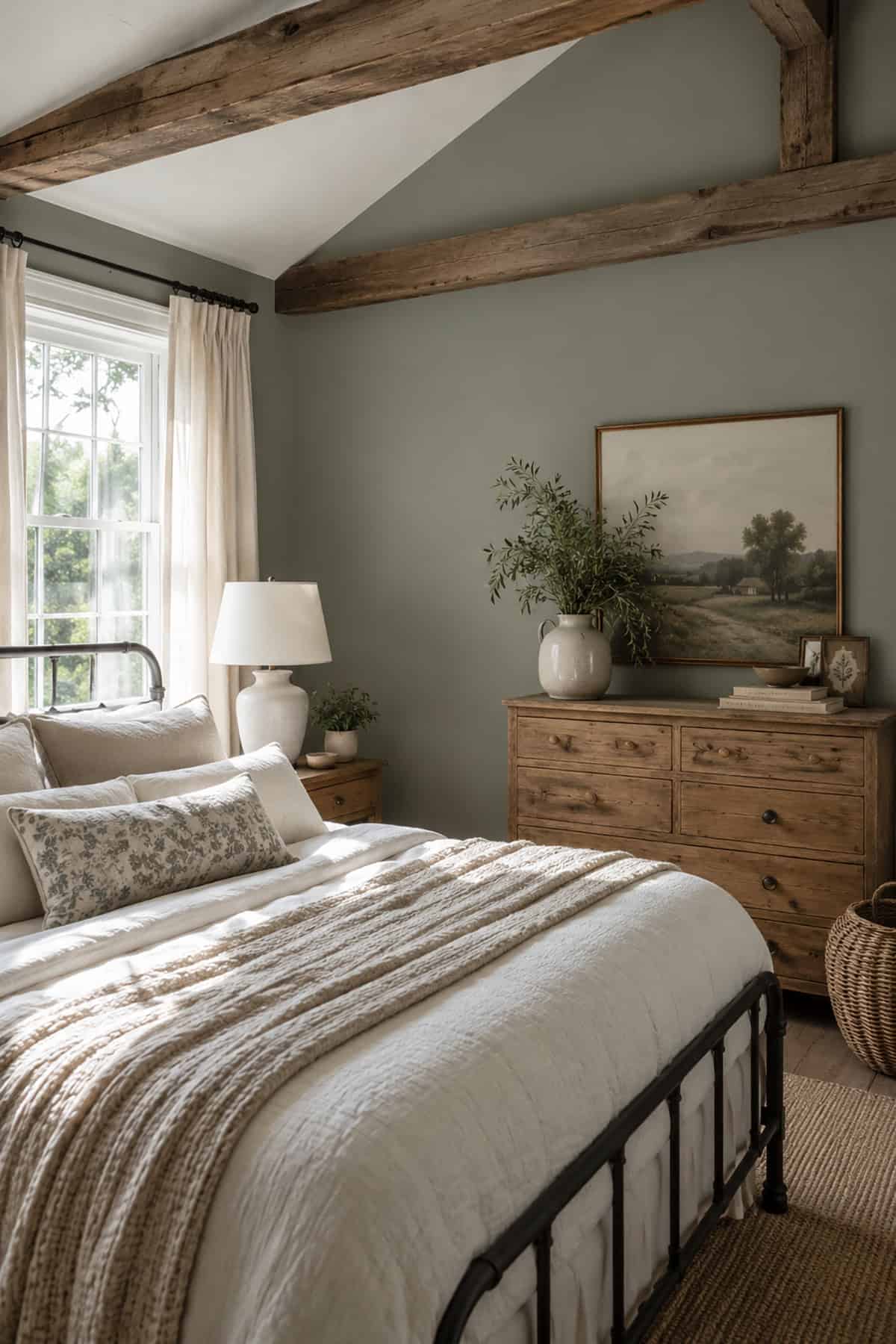
Benjamin Moore- Vintage Vogue
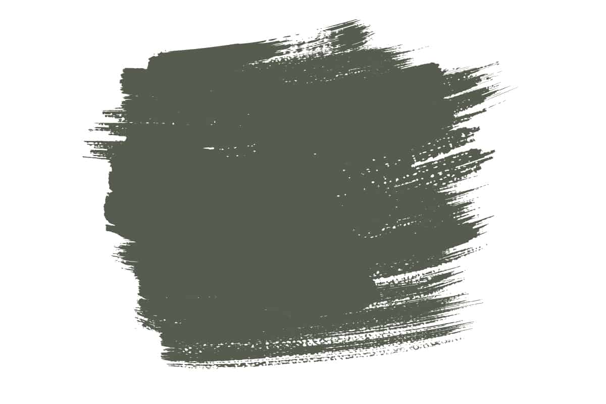
This is a dark and smokey shade of green that can be used on walls or trim for a look that is not expected or predictable yet still feels comfortable and familiar. It has cool undertones that make it read as modern and edgy, while the depth and intensity of the color help to link it to the heritage elements of a farmhouse for a style that does not feel conflicting.
Use ‘Vintage Vogue’ to paint closet doors in an off-white bedroom or as a wall color in a dining room that looks out onto a meadow garden.
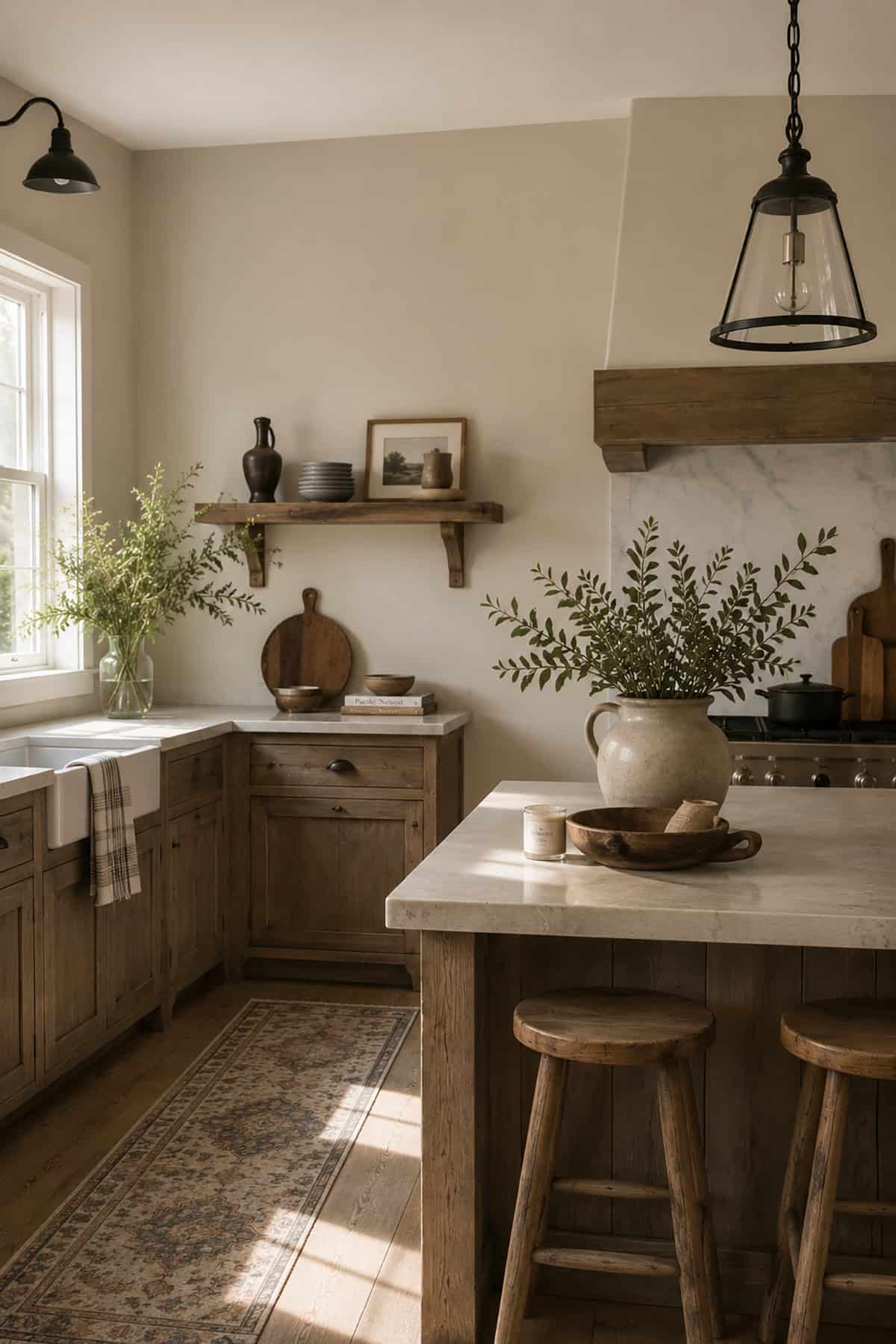
Soothing Beige
Up until recently, beige had a reputation for being somewhat dated and boring, but new blends of beige have reinvigorated this forgotten color to give it a new lease of life in the world of interior design. Beige works beautifully in farmhouse decor because it doesn’t contend with the neutral aspects of the home, such as wooden or stone original features, and it maintains a neutral and warming presence.
When choosing a beige paint color, be sure to steer clear of shades that feel too yellow as these will read as old-fashioned, and they can be hard to coordinate other colors with without appearing sickly. Instead, look for shades of beige that lean towards gray or soft taupe for a style that is both contemporary and classic.
Farrow & Ball- Bone

This is a soft shade of beige that has slightly green undertones for a look that feels natural and fresh while maintaining the cozy and welcoming aspects you expect to find in a beige paint.
‘Bone’ is a chic alternative to traditional beige colors and pairs well with off-whites, dark greens and blues, and muted pink tones.
Sherwin Williams- Cargo Pants
This sandy paint color has green undertones that mean it will read as a muted sage in rooms with cool natural lighting.
In sunny rooms, it will take on a more stoney shade of beige that appears both cozy and classic. Pair it with white trim for an elegant vibe, or use it in a farmhouse bathroom with navy accessories for a timeless appeal.
Benjamin Moore- Cream Fleece
This color is inspired by the natural shade of undyed sheep’s wool. It is a soft yet crisp color, with subtle undertones of gray that prevent it from coming across as old-fashioned or too yellow. In rooms with low light, it will read as a pale taupe, while in brighter rooms, it will feel more fresh and elegant.
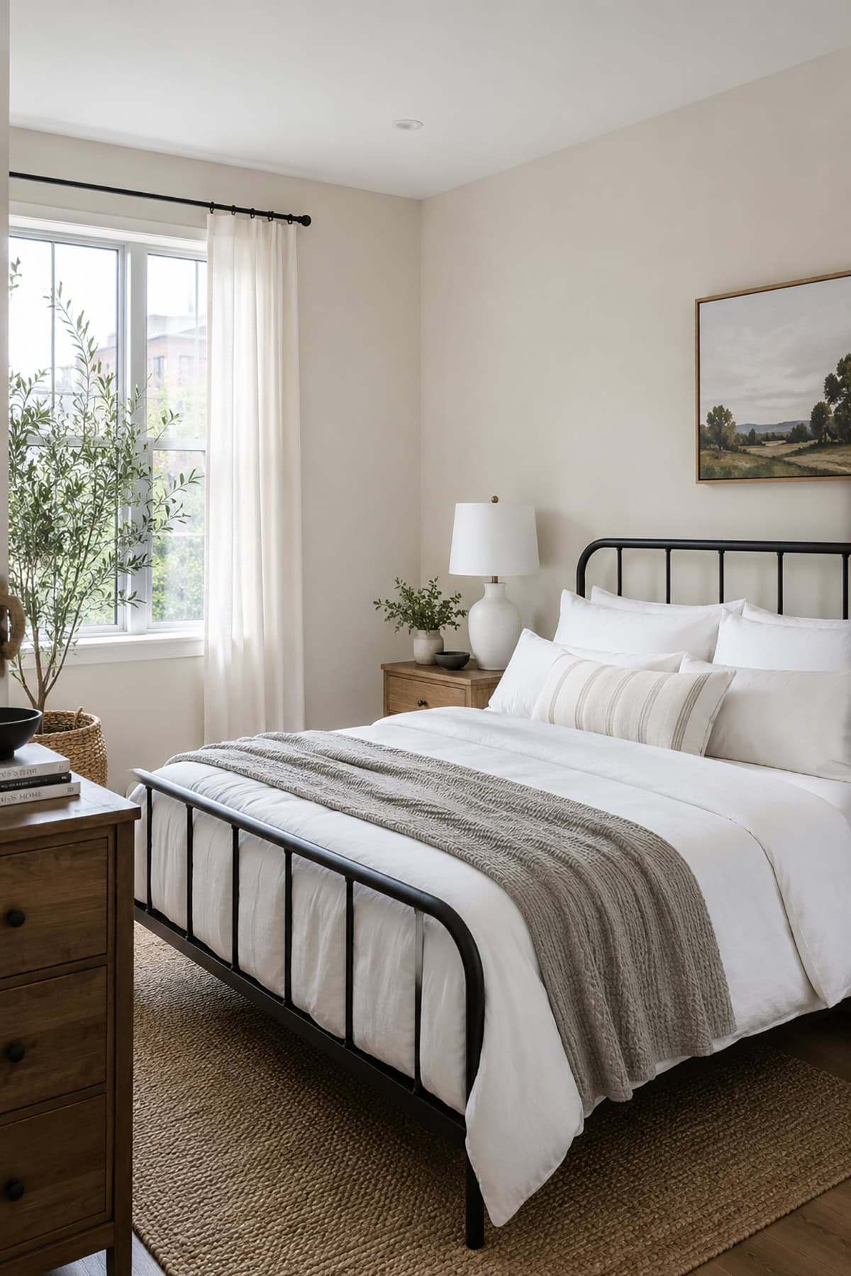
Use it in a farmhouse kitchen with white cabinetry for a classic look or in a bedroom for an atmosphere that feels clean and inviting at the same time.
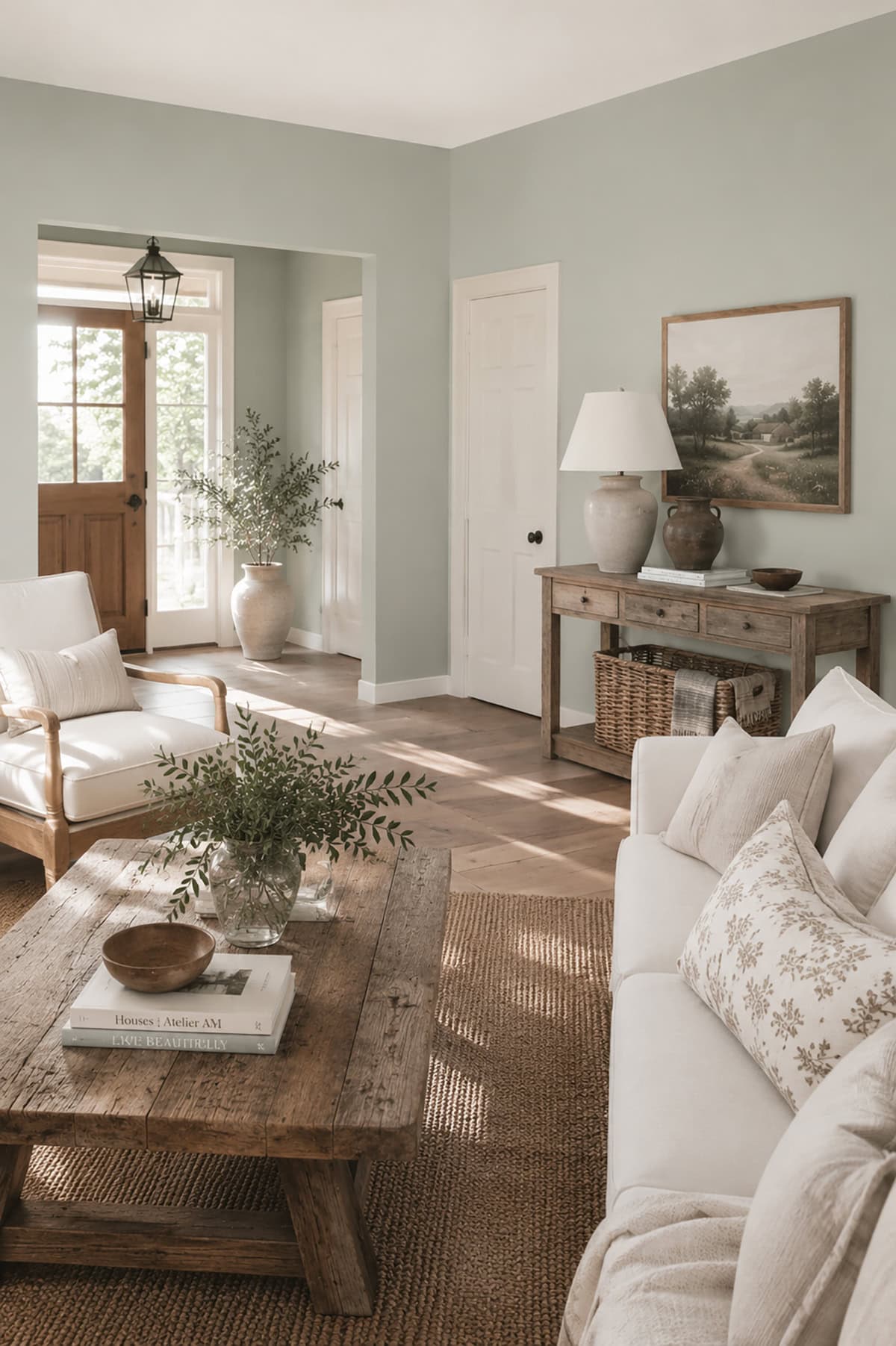
Minimalist Gray
Gray has been the color that dominated the interior design world for most of the 2010’s. Although we are starting to see warmer colors come back into vogue, gray certainly isn’t a color you can expect to see completely retreating from home decor color palettes any time soon.
This is because while some gray colors can read as cold or hostile, there are just as many shades of gray that do a great job of helping a room to feel fresh and modern while maintaining a neutral atmosphere. Like shades of off-white, you have to be careful when picking gray paint colors because the undertones can really stand out in certain lights, entirely transforming the color to something you hadn’t imagined in some cases.
The colors you pair with gray can also affect the shade of gray your eyes see, so this should be considered when sampling paints. In farmhouse decor, if you’re trying to move away from traditional color palettes while maintaining a neutral vibe, gray can be a good choice.
Gray can work well with a range of other colors and can even help to balance out the dated effect of other decor items. For example, in an old mahogany farmhouse kitchen, painting the walls gray can balance out the intensity of dark wood and make it feel more contemporary. Here we look at some of the best gray paint colors suitable for farmhouse decor.
Benjamin Moore- Stonington Gray

‘Stonington Gray’ by Benjamin Moore is a light shade of gray with blue undertones. It creates a fresh and crisp look when used as a wall color, or it can add some dimension to white walls when used as a trim color.
In low-lit rooms, the blue undertones will reveal themselves for a gray-blue result, while in brightly-lit rooms, the blue undertones won’t be perceptive, and you’ll be left with a classic gray shade. To bring out the blue tones in this color, use orange or yellow accents, or to quieten the bluer aspects, add accessories in green, black, or dark gray.
Behr- Silver Drop
This pale shade of gray from Behr has green undertones that will be more evident in darker or low-lit rooms. The green tones give the paint a fresh and tranquil appeal and ensure that the color pairs perfectly with more pronounced green features. Use this color as wall paint in a kitchen with green cabinets or in a bedroom with dark green paneling.
In brightly lit rooms, this paint will read as having more of a silvery look, with a crisp and clean feel. It is ideal for use in living areas where you want a calm and soothing energy that is both classic and contemporary.
Benjamin Moore- Stormy Sky

It’s easy to see where this dark gray paint color got its name, as it rouses images of thick gray clouds and intense storms looming on the horizon. It is a deep shade of gray with blue undertones for a cool and invigorating feel. Despite being quite a consuming and emotional color, this paint works well in farmhouse interior design because it has a richness that elicits a sense of history and foreboding.
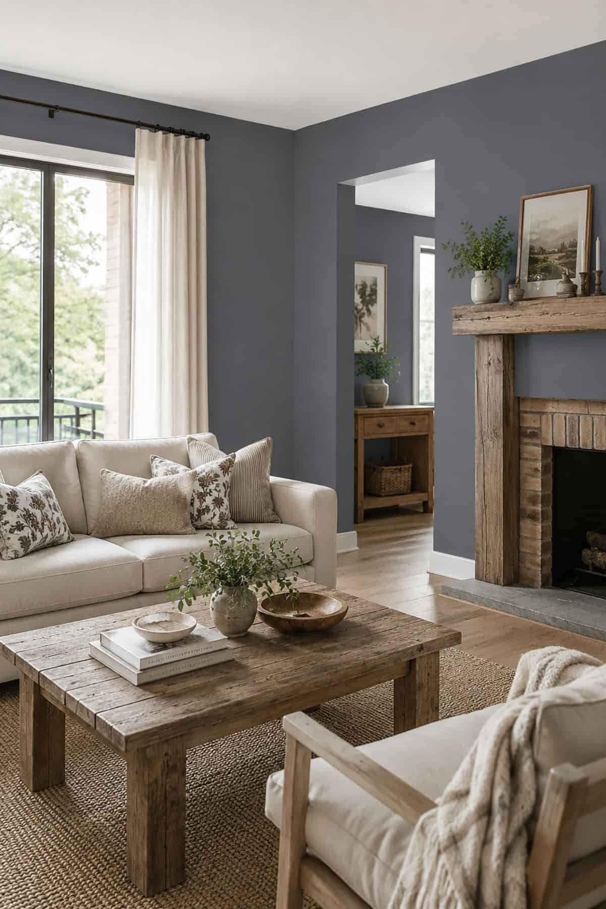
It will make a strong impact when used as a trim color in rooms with light gray, off-white, or muted green walls, but it is also neutral enough to be used as a wall color. Pair it with beige cabinets in a kitchen for a style that reads as elegant and moody, or use it in a bathroom with brass fittings for a flash of old-world glamor.