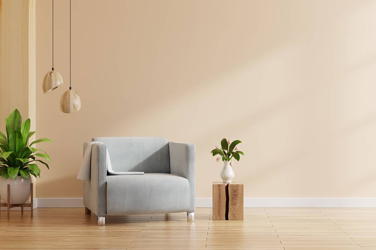
Neutral paint colors are the go-to options for living rooms because this is a space in the home which is going to be used by numerous people, so you don’t typically want it to feel overly personalized.
In a family home, the living room is where all of the family members are going to congregate for movie nights, to relax, or play games, and in any home, the living room is where people usually entertain guests.
As a result, most people want their living room to feel welcoming, relaxing, and airy, and this is often best achieved with neutral paint colors on the walls.
Neutral colors are also the most inoffensive colors, so you are unlikely to make anyone feel uncomfortable in your living room with a neutral color scheme.
Neutral colors work as an ideal background color in a living room because they work well with most other colors, giving you the freedom to try out more daring shades on your soft furnishings or accessories if you feel inclined to do so.
Here we take a closer look at what constitutes a neutral and the best neutral paint colors available for the living room.
What are Neutral Paint Colors?
The definition of a neutral is one that lacks color. In this sense, the only true neutrals are pure black and pure white because they have no other colors mixed with them to make them feel cool or warm.
However, in interior design, there is a selection of paint colors that are considered neutrals. A neutral paint color, in the broader sense, is one that doesn’t have a bright or intense color and comes across as quite plain or unremarkable.
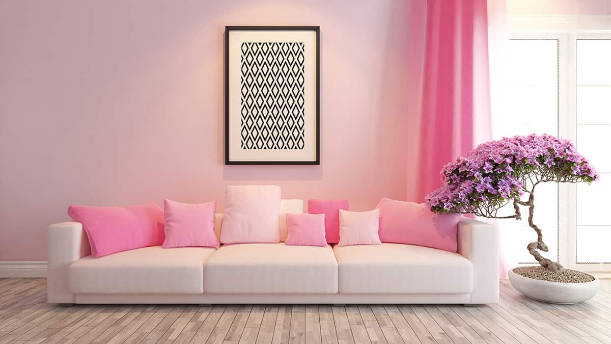
Traditionally people will think of beige or gray when they think of neutral colors, but interior designers have expanded the range of neutral shades to include soft greens, blues, and even pinks.
These colors can come across as neutral when they are very subtle and muted, especially when the color is one that can be found in nature.
For example, muted blue and green shades can read as neutral because they are the background colors of the outdoor world.
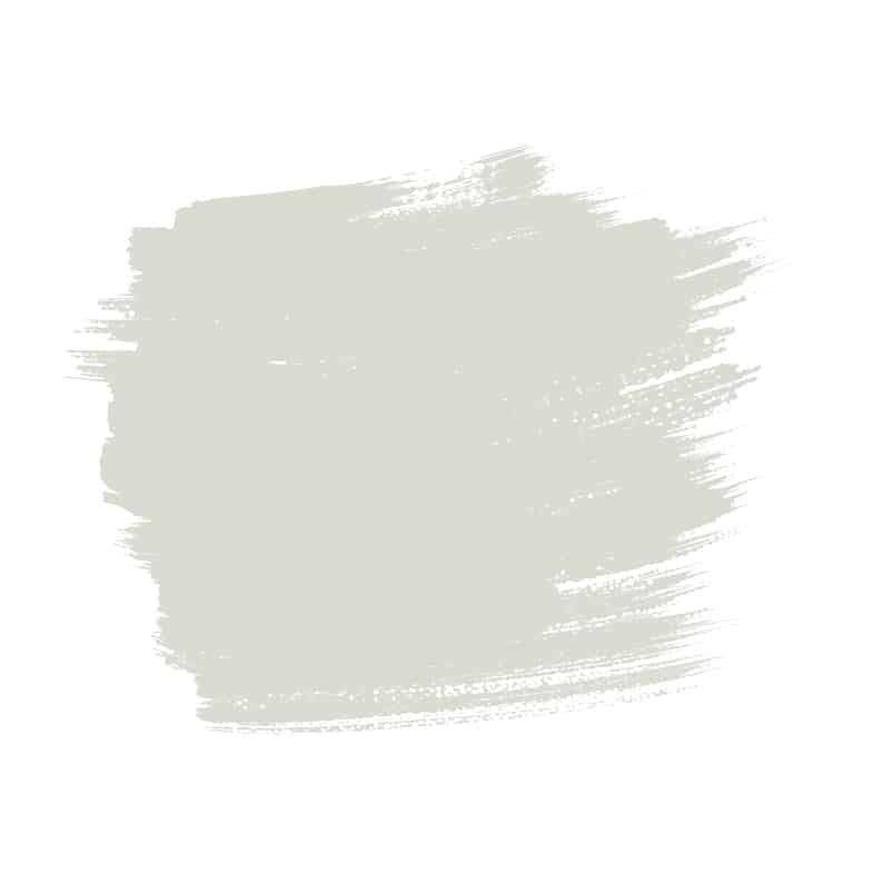
Whites
Benjamin Moore- Sea Pearl
<
If you’re looking for an off-white that reads as neutral, then Sea Pearl is a great choice. It is not pure white, but the undertones are so subtle that they won’t make the space feel cool or warm.t is a living room that feels crisp, airy, and modern.
In bright natural light, this color will make for a clean and fresh environment, while in the duller light of the evening, it will retain neutrality that prevents it from feeling clinical.
Valspar- Country Whitewash
 This off-white paint color will create a crisp and fresh look in a living room with bright or low light since it has subtle warm undertones that prevent it from coming across as stark or sterile.
If your living room is small, use this color on the walls to create the illusion of a more airy, spacious room. As a shade of white, you can pair it with any other colors you like with confidence.
Grays
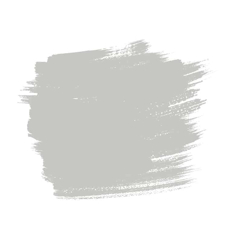
Sherwin-Williams- Roycroft Mist Gray
 Roycroft Mist Gray is a gray paint with very subtle warm undertones, which prevent it from coming across as cool and uninviting; however, it isn’t warm enough to cross over into greige territory.
It is a medium shade of gray, which has a confident elegance, making it a nice choice for formal living rooms.
Benjamin Moore- Harbor Gray
 Gray paint colors can be really difficult to get right because they contain either cool or warm undertones, which will change the perception of the color depending on your lighting.
Harbor Gray from Benjamin Moore is one of the safer grays because it doesn’t have any obvious cool or warm tones and has more of a pure gray color that is achieved by combining white with a drop of black. Visit our page on gray paint colors for the living room to learn more about using gray paint color schemes in the living room.
Beiges
Benjamin Moore- Lennox Tan

Lennox Tan is a rich beige color with a golden base. It feels luscious and inviting, making for a living room that feels cozy and safe.
This color can be paired with gold metallic accessories and pink velvet furniture for a modern luxury look, or use linen and cotton blends in off-white for a living room that is more breezy and natural.
Behr- Off The Grid

Off The Grid is a dark beige color that comes across as soft and warm. It will make for a relaxing feel in a living room, paired with white trim and pale beige sofas. It has a slight hint of gray in it, which helps to give it a modern look.
It also offers a richness that many beige paints lack, which contributes to the cozy atmosphere it creates.
Greiges
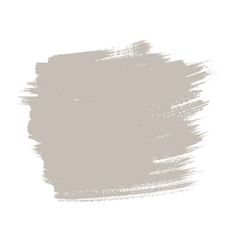
Benjamin Moore- Edgecomb Gray
This is a shade of gray with yellow undertones, which give it a greige look. It will transform according to the light in a space, appearing warmer and closer to beige in low light or cooler and closer to gray in bright natural light.
This is a gorgeous background color in a living room if you want the space to feel modern without sacrificing warmth.
Farrow & Ball- Purbeck Stone
 Purbeck Stone is a mid to light shade of greige that works in brightly lit and moodier living rooms. It contains enough gray to come off as contemporary and classic, while the warmth of the beige tones makes a space feel effortlessly cozy.
Unlike some shades of greige, this paint color doesn’t have any obvious yellow tones, which helps it avoid appearing dated.
Blacks
Farrow & Ball- Paean Black
 This black paint reads as an off-black close to charcoal, but it has a red base which means that it helps to create a sense of warmth and coziness in a space.
It works well in a large living room if you want to make the space feel more intimate, and it can also be striking as a feature wall in a living room.
Browns
Farrow & Ball- Tanner’s Brown

This deep and rich brown makes for a luxurious and cozy feel in a living room. Use it in a small space to create a den vibe with an intimate atmosphere.
This color will help the walls to feel as though they are receding, which can actually make a small room feel bigger, contrary to popular belief. Choose brass fixtures and fittings for a contemporary style that nods to the 1920s and 30s.
Greens
Sherwin-Williams- Shagreen
This is a pale olive shade of green that feels fresh and warm, thanks to the yellow undertones. It will work well with cool or warm color families, making it a versatile shade for living room walls.
Pair it with dark brown hardwood floors for an earthy and natural style, or opt for charcoal trim and gray furnishings to create a contemporary look.
Benjamin Moore- Glazed Green
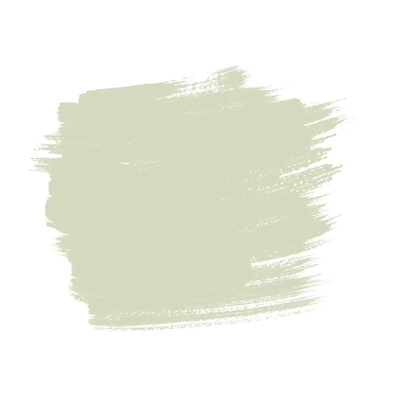 Glazed Green uses nature’s neutral as its inspiration. It is a soft pistachio shade in a milky tone that makes it feel lustrous and delicate, like traditional glazed pottery.
Use this color to link the interior of your living room to the world outside, creating a sense of calm and quiet.
Blues
Farrow & Ball- Downpipe
 Downpipe is a dark shade of blue which can read as dark gray depending on the light. While initially, you might not think of this paint color as a neutral, it will fade into the background easily when used on all of the walls in a living room, resulting in a space that feels intimate and relaxing.
In spite of its cool tones, the darkness and depth of this blue paint mean that it won’t make a room feel unwelcoming, and actually, it has a soothing appeal to it due to the level of blue.
Farrow & Ball- Pale Powder
 Pale Powder is a barely-there shade of blue that will read differently depending on the light in your living room. In bright light from south-facing windows, this color can appear as a cool shade of off-white, while in north-facing rooms or those with small windows, the color will come across as a soft aqua-mint shade.
It has a crisp and refreshing appeal which will make a living room feel clean and airy. The dusky green undertones in this paint prevent it from feeling cold or uninviting, making it ideal for a welcoming living room in a family home.
Pinks
Farrow & Ball- Peignoir
If you want a shade of pink which comes across as neutral, then Peignoir is as close as you are likely to get. It is created by mixing pink with gray, which results in a color that has subtle femininity yet still retains a gentle warmth.
Pair it with dusky blush accessories to highlight the pink hues, or use it with brown furniture for a farmhouse chic look in your living room.