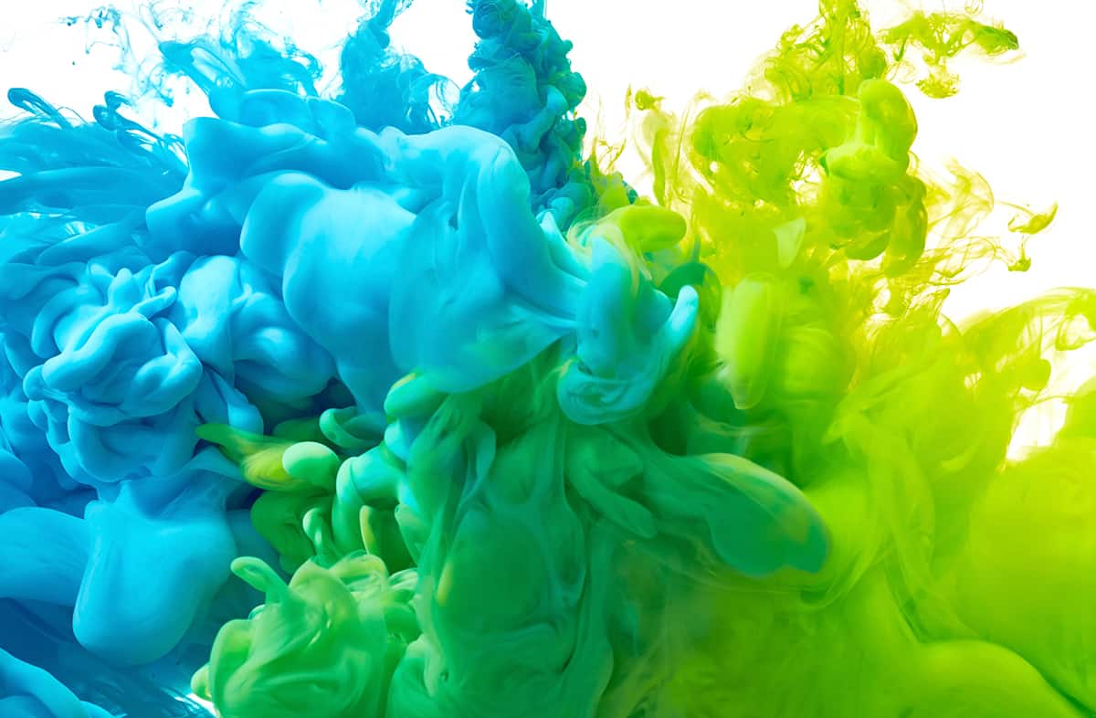
When mixed together in balanced proportions, green and blue make green-blue, which is a color similar to turquoise or teal. The color you get when mixing green and blue more closely resembles a shade of blue than a shade of green, because green itself is made up of 50% blue.
This means when you mix green and blue together, the resulting color will be made up of 75% blue pigments and 25% yellow pigments. Here we look at some of the best colors which are made using a combination of green and blue, and how to use them in home decor.
Table of Contents
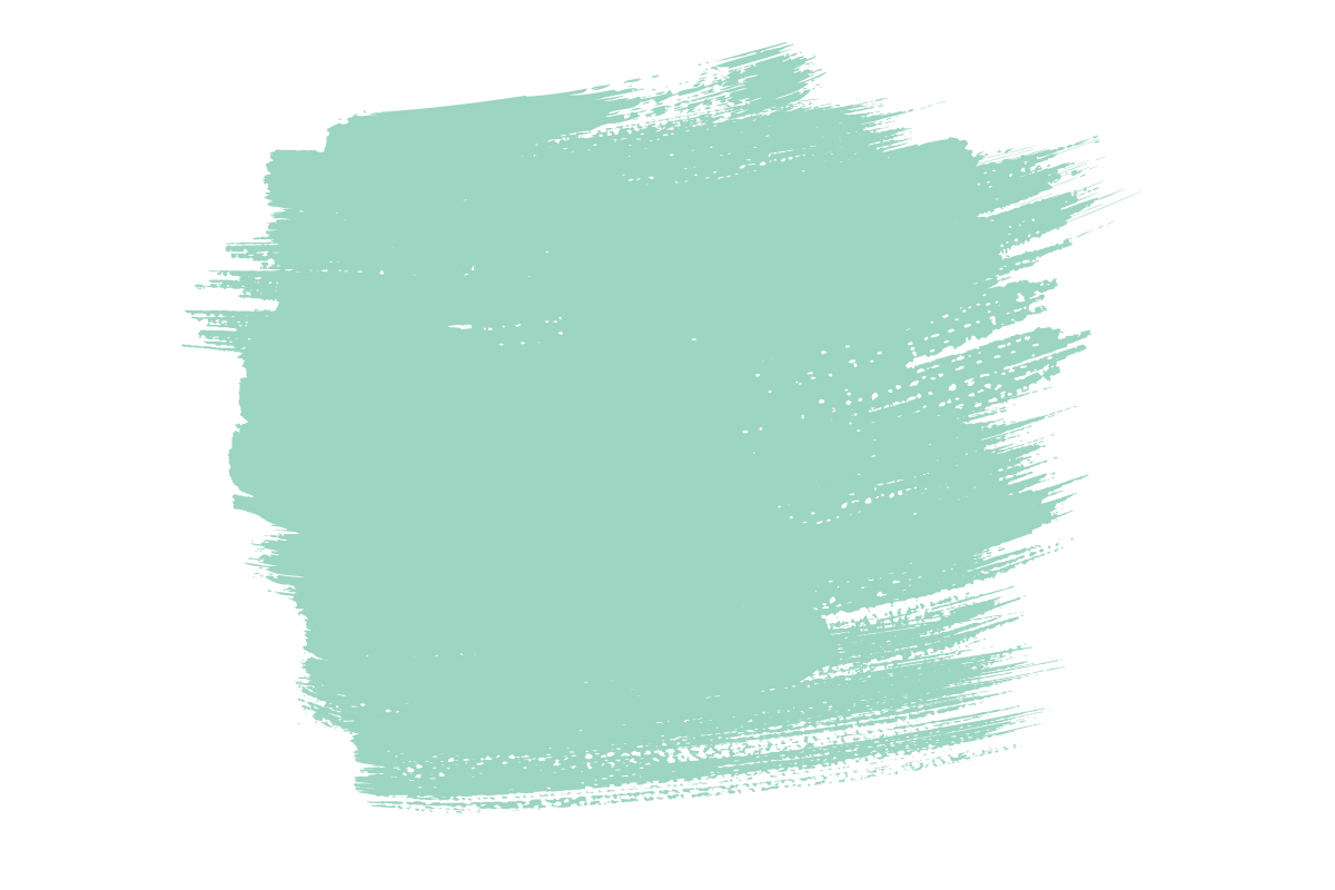
How to Make Teal or Turquoise
Teal and turquoise are both shades of blue that lean slightly toward the green on the color wheel. They can be described as green-blue colors, or blue with green undertones. While teal is a slightly darker version of green-blue, turquoise is more of a medium color with a brighter intensity.
To make teal or turquoise, you would need to mix blue paint and green paint together in equal portions. The shade of blue you use, and the shade of green you use, is of course going to affect the resulting color you get. A dark blue with a dark green will give you a green-tinged shade of navy, while pastel blue and green mixed together will result in a minty sky-blue shade.
For the perfect shade of turquoise, mix 50% primary color yellow with 50% primary color blue to first achieve a balanced shade of green. Next, mix 50% green with 50% primary color blue, and the end result should be the tertiary shade of green-blue.
Are Teal and Turquoise the Same?
Teal and turquoise are both shades of blue-green, but they are quite distinctive from one another. Teal is a slightly darker shade of blue-green, which has less vibrant energy compared with turquoise.
Turquoise contains more green than blue, which gives it a bold and invigorating vibe, and it is also more heavily saturated – keep these in mind when trying to pair with turquoise. Both of these colors can be made by mixing blue and green.
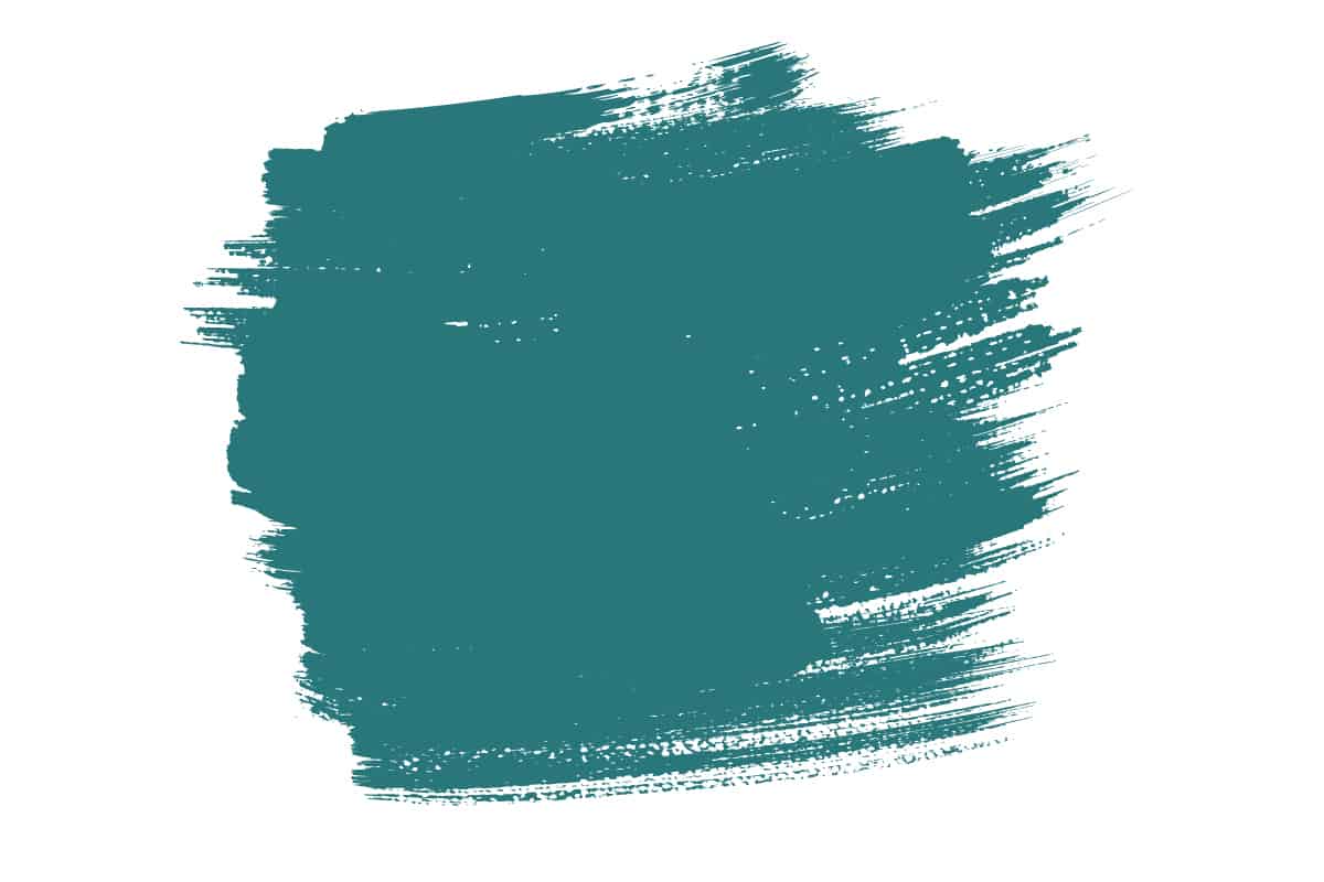
7 Recommended Teal Paint Colors
Largo Teal by Benjamin Moore

This color is based on the deep blue-green oceans surrounding the Florida Keys. It is an enigmatic, heavily saturated shade of teal which will breathe life into any space.
Pair it with pure white trim for a vibrant, aquatic look, or opt for terracotta accents to create a more Moroccan theme. Largo Teal could be stunning on an accent wall surrounded by soft gray, or be used on every wall in a bathroom for a room which envelops you and takes you on an exotic adventure.
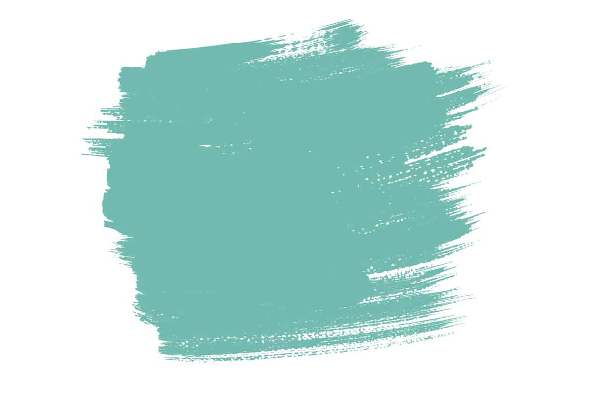
Teal Ocean by Benjamin Moore
Another shade of paint that mimics the blue-green tones of the deep sea, Teal Ocean is a calming and cooling color that feels clean and inspiring. This shade works in various lighting, appearing deeper in low-lit rooms, and more vibrant in brightly lit spaces.
This color will look elegant with jewel tones, such as emerald and amethyst, but it can also be used as an accent in an earthy design scheme, alongside shades of beige and burnt orange.
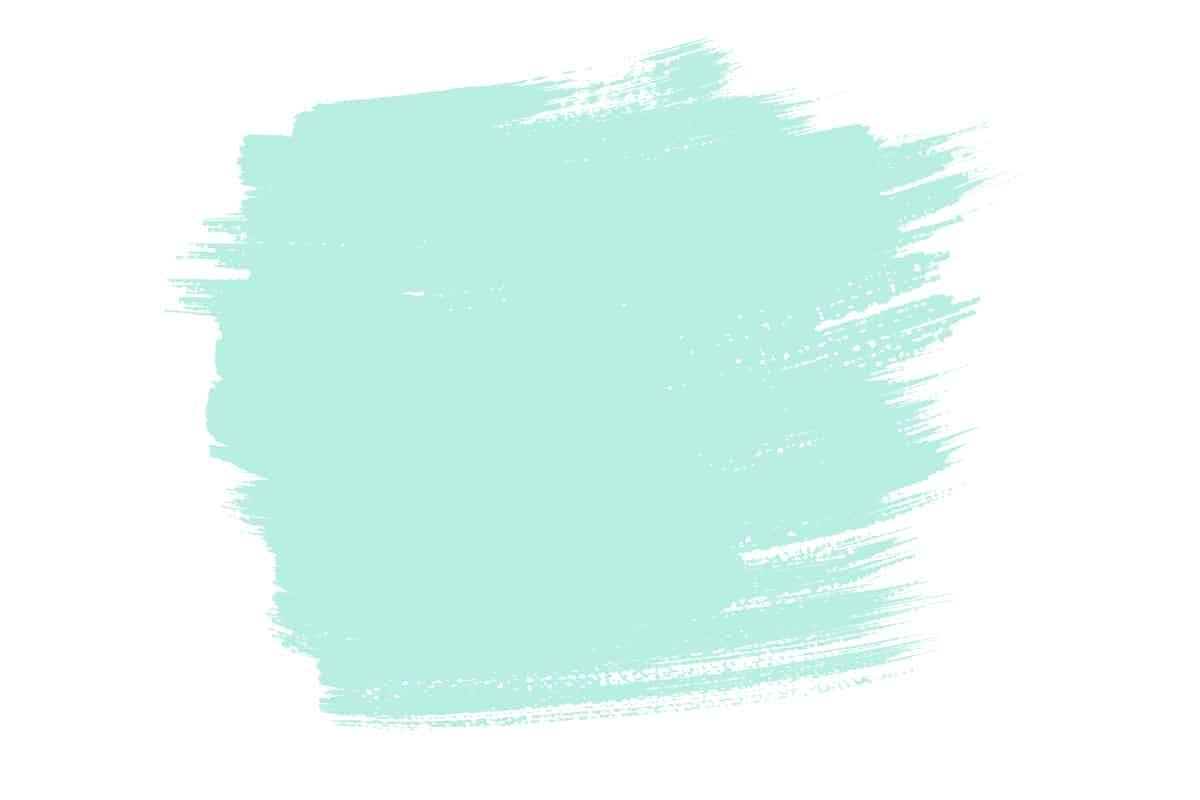
Capri Teal by Glidden Paint
This shade of teal is made of a mixture of softer blue and green, resulting in a more digestible green blue. It pairs well with other pastel inspired shades, such as apricot or pale coral, blush, and mint green. Capri Teal has simultaneously soothing and refreshing energy, making it a safe choice in bathrooms, or bedrooms where you want to wake up feeling well-rested. This is a popular color choice for coastal-themed spaces. Use sand accents and white trim to highlight the coastal-inspired look.
Best Turquoise Paint Colors
Tropics by Behr

If you’re looking for a true shade of turquoise with a bold and lively energy, then Tropics by Behr is definitely worth considering. This is probably the shade that comes to mind when most people envision turquoise, with its quirky, cool coloring, and intense depth of saturation.
The intensity of this color can make it hard to place within a color scheme, but sticking in the blue family is always a safe bet, for example, use Tropics on the walls, with dark blue furniture, and sky blue accessories.
Light peach also pairs well with this shade of turquoise because it provides contrast without causing a battle for dominance between the two shades. Peach will complement this color rather than try to steal its limelight.
Florida Aqua by Benjamin Moore
Benjamin Moore describes this shade of turquoise as a “light shade of blue-green that glows like the sun reflecting on crystal-clear waters”.
It has an upbeat energy that can create a soothing or refreshing atmosphere. Pair it with white trim and natural beige furnishings for a casual take on beach chic, adding tropical houseplants to the space to emphasize the exotic vibe.
Green Turquoise by Valspar
Green Turquoise by Valspar has a sky blue base with mint green undertones. It is a playful and refreshing shade of green that will be brought to life with accenting shades such as flamingo pink or bright coral. Use this color in a child’s bedroom for a fun and tropical vibe, or pair it with navy and white for a casual nautical look.
Green Turquoise can also be used in more mature spaces, such as master bedrooms or guest bedrooms and dining rooms when paired with dusky pink accessories and brass accents.
Turquoise Blue by Behr

Turquoise Blue by Behr has a lively energy and creates a positive, upbeat atmosphere. It will look crisp and clean alongside pure white trim, or use warm off-white shades as accents to create a more relaxed feel with this paint color.
This blue-green shade belongs to the blue family but has green undertones which tone down the coolness of the color. Use this shade with mint green and peach for a fun and playful style, or opt for bolder shades such as cherry red and navy for a color palette that has an Americana theme.
Using Green-Blue in Home Decor
Green has a refreshing, revitalizing effect, while blue is more soothing and calming. Combining green and blue together to achieve a green-blue color such as teal or turquoise will result in a shade that feels both refreshing and calming. These colors can be used in various ways in home decor depending on the intensity of the shade.
Softer green-blue colors, such as those mixed with white, are ideal for laidback living, or they can be paired with bold red or yellow accents for a nautical-inspired style. More saturated shades of green-blue can be used to their full effect on all of the walls in a room, or choose these bolder colors for accent or feature walls.
Green-blue paint does not have to be reserved for walls, and in fact it is a stunning color for trim, and also for exterior home projects. Paint your front door and window frames in turquoise with white siding, for a fresh and clean look that elicits ocean vibes. Green-blue paint can be utilized on upcycled furniture, adding a bold exclamation point in a neutral-themed space.