Humans are creatures of color. Because vision is our primary sense, our brains rely on colors to interpret signals from the outer world. It was like that from the dawn of humanity. Red often means danger – poisonous snakes, insects, blood, bushfires. Orange, also the color of fire, but a controlled one, and it excites us. Black brings the mystery and dangers of the night.
But when everything was just fine, our ancestors were surrounded by clear blue skies and waters, sandy beaches, lush green forests and grasslands, and some sunshine.
This ancestral experience left a deep mark in our psychology and added an emotional tone to our interpretation of colors.
This is where the story of calming colors begin.
Table of Contents
What Are Calming Colors?
All colors can have some effects on mood. And some specific colors evoke feelings of calm and relaxation. Usually, these colors are light, but not overly intense, and they are easy on the eyes. Besides the soothing effect on our vision, these colors have a particular effect on our minds.
We can divide calming colors into three main categories:
Cool colors
Cool colors are blue, green, and purple. They are calming, tranquilizing, soothing, and introspective. When used in the right way, cool colors stand for health, security, beauty, and anything connected to the natural world. However, deep dark shades of these colors often symbolize and evoke sadness. They also evoke health, beauty, power of nature, and freshness.
Pastel colors
Pastel colors are light shades of common hues. -they can be the soft variants of both warm and cool colors and include peach, lilac, light violet, light pink, and really light, soft shades of green and blue. These colors are very gentle, easy on the eyes, and soothing. Depending on the hue, they can be either calmingly energizing or passivizing, but generally, they have an uplifting effect on the mood.
Neutral colors
Neutral colors – gray, white, beige, cream, and light brown – also feel calming and clean. They are good to use with other calming colors – cool or pastel – to add a bit of variety and contrast to a room.
Best Calming Colors For Your Home or Office
Now, we are going to explore some popular hues and shades for home. I will give you ideas about the situations and spaces where you can use them best.
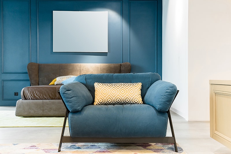
Navy blue envokes stability, certainty, and deep calm. It can really help you de-stress, and it increases mental and spiritual contemplation.
The downsides of using navy blue as a dominant color in a room are that it is a color connected to sadness and melancholy. If you are overly prone to these moods, avoid using it, or combine just the navy blue details with suitable neutrals such as white.
A navy blue room like this one is ideal for a person who is stable and generally happy but works in an overly stimulating environment, or feels a lot of intellectual strain. If you are that kind of a person, a room like this one for rest could really help you unwind and relax after a hard working day.
Minty Blue
Minty blue is calming, but it manages to steal a bit of zest from the green. As it’s namesake – mint plant, it is a very refreshing shade.
Minty blue is ideal both in homes and in office spaces, and waiting rooms where people may feel tense. A doctor’s or a dentist’s office could really benefit from using mint green because it will relax a patient. Plus it will make the space feel more professional, clean, and fresh. Here we see minty blue combined with some botanical motives – mint is a perfect color to do that.
Yellow
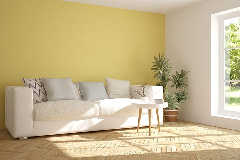
Yellow is an energizing and the most uplifting color – even to the point of irritation. However, in its pastel version, yellow soothes while still discretely energizes, without attacking your visual apparatus.
For overworked adults, painting the bedroom walls in pastel yellow is probably not a good idea. It could feel too light and lively for proper relaxation and nighttime rest. However, it could be a perfect choice for kids’ rooms. Children are naturally happy and always on the go. A sunny yellow room could help keep those spirits up when difficulties – such as too much homework – come about.
Beige
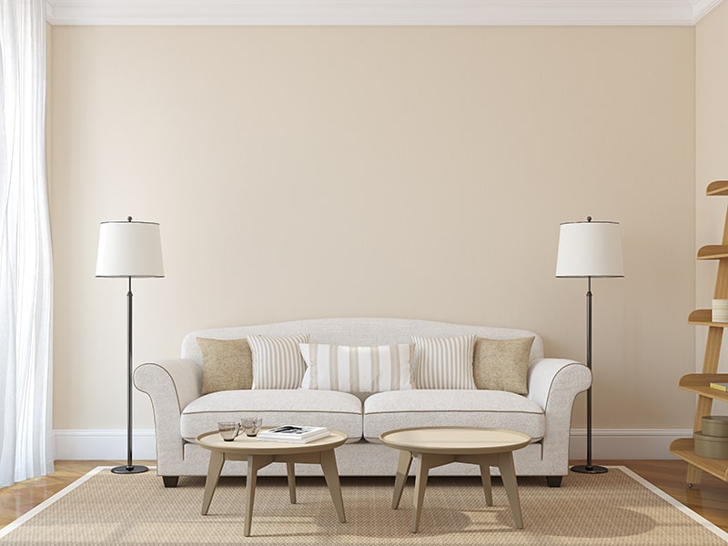
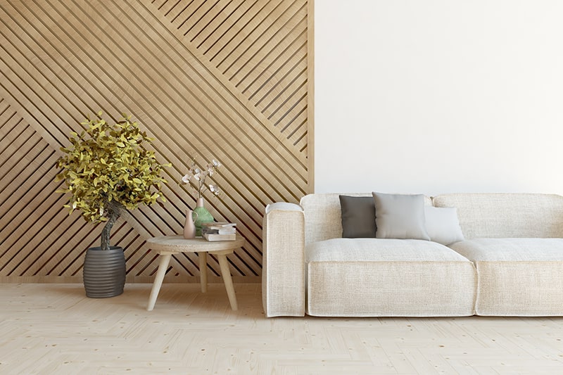
Beige is a color that is as light and neutral as white, but it’s less heavy on the eyes. That is because the beige reflects less light, but nevertheless, it feels very clean and open.
Beige is great to use in smaller rooms – it will ensure they look a bit bigger and spacier than they are. It could be ideal on the walls of a minimalistic living room with a few pieces of modern wooden furniture. Also, it makes a good choice for bedrooms. In the case you don’t like your walls to be particularly colorful, beige will make them completely neutral, but not as bright as if they were painted white.
Colors such as cream and ivory have a similar look and effect.
Pink
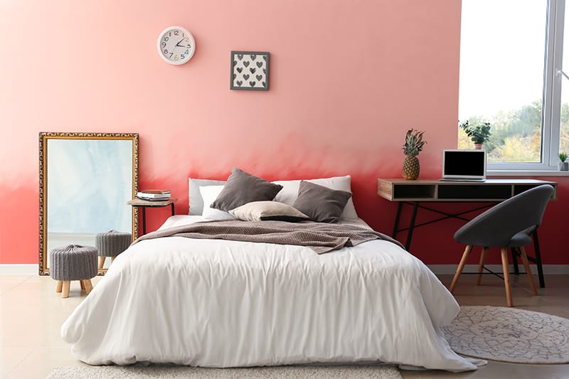
Here is one of the most soothing colors on our list. Contrary to the stereotype, pink is not just a color for girls and princesses – it has a calming effect on both sexes. It is a very nurturing and supportive hue. Some studies have shown that people report feeling cleared of negative feelings such as rage and hostility after spending time in pink rooms.
Pink is great to use in bedrooms, and going for a duller shade that doesn’t contain yellow will make sure you’ll be able to relax fully. On the other hand, livelier hues such as Coral can be used in study rooms. And last but not least, girl’s rooms painted in pretty pink shade are a classic that never goes out of style.
Pink goes great with neutrals such as white and grey.
Lilac
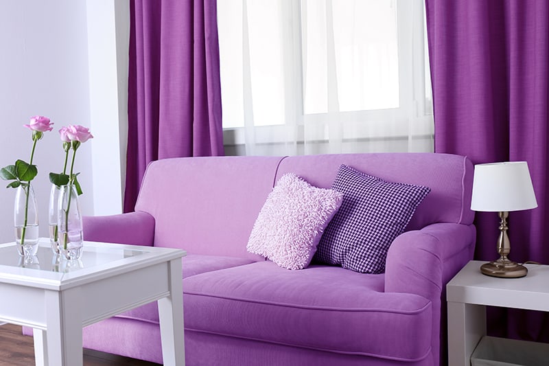
Lilac is one of the more energizing hues among the calming colors. Also, it is one of the most romantic.
Since lilac is a shade of purple, it is associated with royalty, mystery, and wisdom. Lighter shades like lilac can also be very sensual.
Shades of purple have become very popular in interior design, and they are pretty versatile, so limiting lilac to only a few possible uses is not a good idea. It can work well in living rooms, children’s rooms, bathrooms . just anywhere.
Lilac can work in both modern and old-fashioned, vintage setups. To get the very contemporary look when using lilac in your living space, combine it with gray, white and silver. Combining it in white, beige, and floral patterns can result in some great rustic chic setups. To get a bit more luxurious vintage look, use it along golden.
Eggnog
Eggnog hue can vary from really light brown to a skin tone. It is a neutral color and, in terms of its effects on mood, it has similar properties as beige. That means it is a very versatile color, ideal if you would like a room to feel open and welcoming, and to nurture a discrete, natural charm.
Like beige and cream, eggnog is a stabilizer color that won’t irritate you.
Eggnog could be perfect to use in modern apartments, especially when combined with natural wood furniture. It is a good choice for people who are sophisticated, mindful, modest and down-to-Earth.
White & Grey
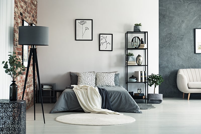
The combination of the neutrals – white and grey – is very relaxing. While black and white combinations tend to be very intense and contrasting, the mature steadiness of grey doesn’t contrast the white with such intensity. These two colors work in symbiosis. The openness of white won’t let grey get gloomy and difficult, while gray will keep white from overpowering your vision.
White and gray combos are excellent to use in contemporary bedrooms, with minimalist furniture and decoration with a lot of straight lines and smooth surfaces. It goes perfectly with some grey marble elements. I especially like seeing grey bedsheets and bed covers, which are both aesthetically pleasing and practical.
Just one word of caution: because of the impersonal impression that we associate with grey, make sure to add some interesting details. An unusual pattern on the pillows, plus a few plants that we can see in our example do a great job in making this room feel to feel cozy, interesting, and personal.
Turquoise
Turquoise is one of all-time classics, although it doesn’t dominate modern interiors as much as some other hues. The namesake for the color is the beautiful turquoise gemstone, a rare opaque, blue-green mineral which has been prized for thousands for its unique color.
Turquoise comes in several different shades: “original” turquoise, pale turquoise, medium turquoise, dark turquoise and turquoise blue (which surprisingly has more green than blue in it). Depending on the intensity of the shade, its effect on the mood changes. Teal, Aquamarine, and Cyan with their own variations can also be considered a part of the Turquoise spectrum.
Pale and turquoise give off a youthful, enthusiastic vibe. Still, the inherent cool features of blue and green make it calming – it’s all brightness and positivity, just without euphoria. It can be a good choice for a child’s room.
Darker turquoise shades evoke the power of the gemstone – they are mature, grounding and of course, relaxing. They inspire healthy and creative thoughts. Although turquoise can get dark, it will not plunge you into darkness. The natural brightness of turquoise keeps it from becoming a “sad” color. The blessings of the green-blue mixes come into the spotlight again – as vivid and uplifting color, green adds a bit of life to the blue.
Tips on using Calming Colors In Your Apartment
Here are several tips to keep in mind if you want to pick one of the calming colors for your living space.
- Always consider what type of personality you are. Although you can use certain colors just because they are in style, never use colors that are out of tune with your general mood patterns.
- If you are overly sensitive or have sensory issues, avoid adding too many colors. Neutrals are your friends.
- Sometimes we can feel drawn to certain colors because of our current issues, and not only our natural preferences. For example, studies have shown that people who are often depressed have a preference for blue and its darker tones. However, if a depressed person surrounds herself with those “sad” colors, it could amplify the negative emotions.
- On the other hand, you won’t be able to change your emotions suddenly just by forcing a certain color. The trick is to find harmony between you, your needs, and your taste.
Conclusion
I hope you’ve gained a new perspective on calming and relaxing hues. Colors can help you unwind and regenerate from tiredness and stress. Never underestimate the power of colors.
What’s your favorite calming color? Let us know in the comments!