Vision is the most dominant sense in humans. Thirty to forty percent of our cerebral cortex is dedicated to our sight. That means that our brains dominantly rely on visual data to interpret reality.
Colors are a significant part of that. For our ancestors, the difference between colors could mean the difference between life and death – a way to tell between a harmless and poisonous snake for example, or between an edible or poisonous berry or mushroom. Colors helped them tell day from night, dusk from dawn. They indicated changing seasons, weather, water quality, and in general – signaled a good or a bad habitat.
That is why we developed such a deep psychological relationship with colors, and especially the colors we are surrounded within our living spaces.
Besides our biology and psychology, the way we react to colors is also rooted in our cultural conditioning. That means our relationship to colors is spontaneous but somewhat complicated.
In this article, we’ll explore the complete psychological influences of different colors in our home, especially when being used on our interiors and paint colors. Let’s get started.
Coral
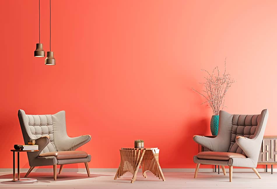
Coral has been declared the Pantone color of the year 2019. It is a hue that falls between orange and pink. To be more precise, its a pinkish shade of orange. Therefore, when it comes to influencing mood, it brings the best of both worlds – the calming, soothing effect of pink, and the excitement and liveliness of orange, but without exaggeration. The pink component of coral won’t let orange get vivid to the point of irritation, while the orange component prevents the potentially passive effect of pink.
White
White is a symbol of purity, cleanliness, innocence, and those are the feeling it evokes. In western culture, it is generally associated with goodness. Surrounded by many bright, clean surfaces can help you feel uplifted and positive.
As for the visual properties, white is associated with minimalism. Also, it makes spaces and objects look larger than they are, helping you create a feeling of a vast space when you are actually limited by its size.
If you plan to coat your home all-white, be careful – white reflects a lot of light. Because of that, it can be tiring for your eyes in the long run.
Blue
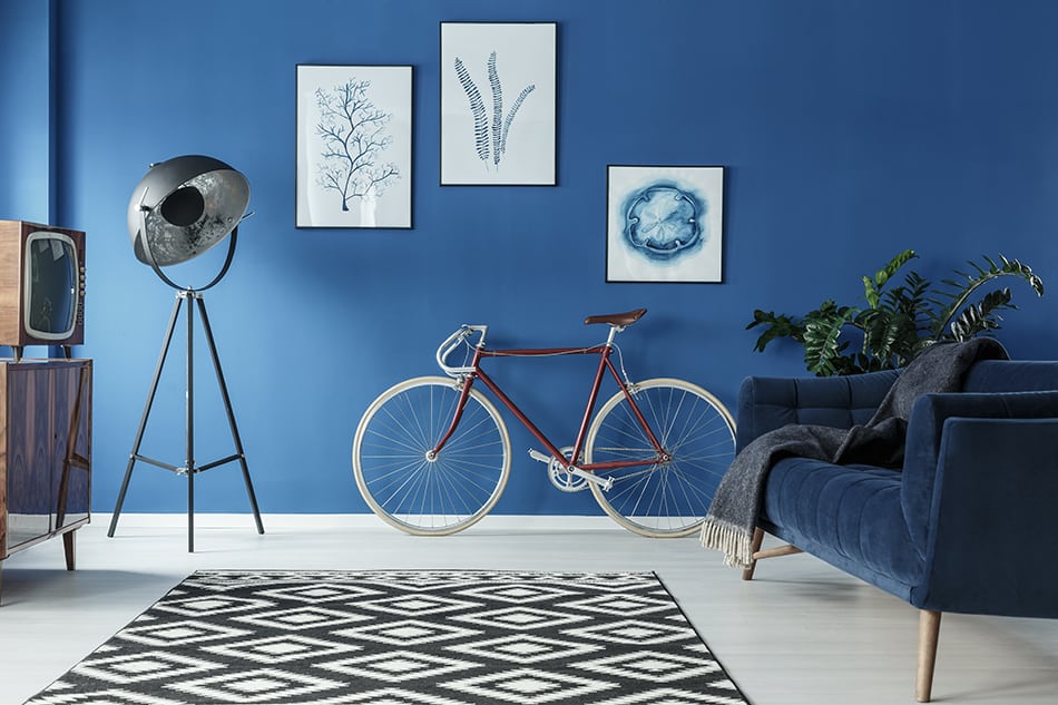
Color of the sky and the ocean, blue is associated with peace, mental clarity, spirituality, and wisdom. It can help you relax, unwind, contemplate, and meditate. Blue is a cool color, and it might actually help you feel refreshed when it’s hot outside.
Be careful with blue – especially the dark blue shades – if you are prone to sad moods and apathy. These states are called the blues for a reason!
This interior shows that blue and neutral colors are an excellent match. The contrasting black and white carpet adds an element of surprise, making the space dominated by the deep blue background more exciting and dynamic. And so does the decoration.
Yellow
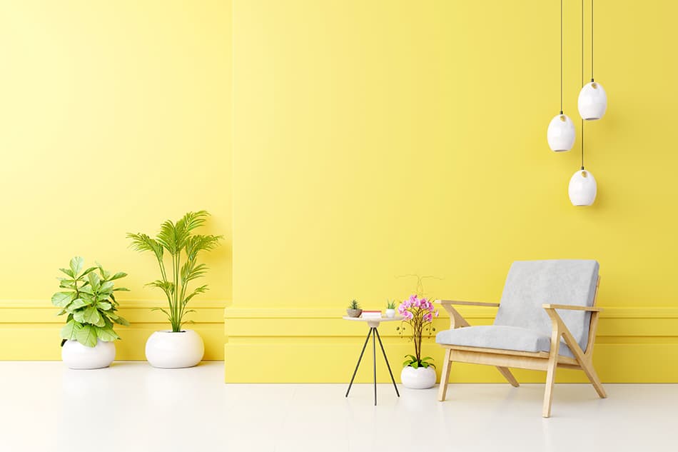
Yellow is a color associated with the Sun, beaches, and many spring flowers such as dandelions, tulips, and daffodils. No wonder it sparks liveliness, excitement, and positivity. If we have to pick a color that symbolizes happiness and lust for life, it would be yellow.
If you feel like you need additional stimulation and energy, you could easily enhance it by generously using a light yellow hue on an accent wall or even on all walls. If you are a joyous person, but easily get overexcited, adding just a splash of yellow in the form if decor or other elements might be a better option to avoid taking your enthusiasm too far. Like all strong and/or primary colors, yellow goes perfectly with both dark and light neutrals.
Due to it’s energizing properties, yellow is not an ideal choice for bedroom walls, except if you use a really light shade. Some people find yellow too intense and irritating to the eyes or describe it as anxiety-inducing.
Black
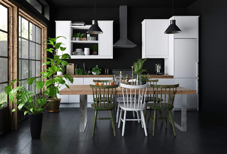
Black is the color the night, earth, and shadows. Because of this, it is associated with darkness, doom, and mourning, often evoking negative emotions, at least in the traditional Western culture.
However, that is not all there is to black. When generously used in an interior, black can have a grounding effect, and increase your intellectual capacities. It makes a space feel smaller, so it can be utilized to make large rooms seem cozier. Also, it is one of the most elegant colors and can, therefore, be very aesthetically pleasing.
The cultural perception of black is a lot different in the East and the West. While in the West it is connected to mourning, sadness, and evil, in many Eastern cultures it is completely different. In China, black is associated with youth and young boys, prosperity and good health; in Japan, with mistery and the feminine. In short – our relationship to black is quite complicated.
Even though black is not all about darkness, if you are prone to bad moods and depression, use it only in moderation. Also, never use it as a dominant wall color in small rooms, because it can make you feel claustrophobic.
One more word of caution – if you have an overly bright and sunny room, painting it black might seem like a good idea. However, it will attract and keep in a lot of warmth, so it might not be a good solution in warm climates.
This spacious dark kitchen concept, with a lot of natural light, wooden floor, wooden table and chairs, and lush house plants gives off an earthy atmosphere, rooted in the mystery of the natural world.
Red
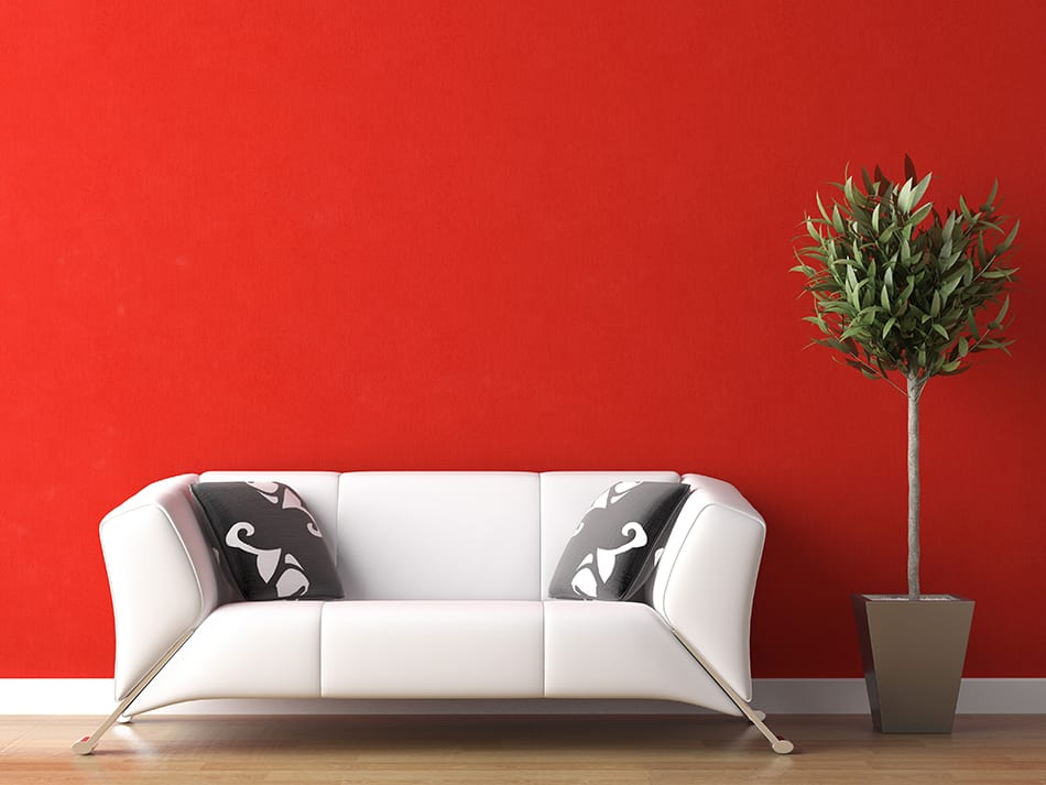
Love, passion, romance, but also blood, anger, and danger – the symbolism of red has a deep duality to it. But undoubtedly, it is the warmest, the most intense and the most energizing color on the list.
Red is known even to have a direct physical effect on humans – it increases heart rate and breathing rate. Because it’s such a powerful color, you should use it intelligently and in moderation. Too much of it can feel overwhelming, draining, and bring about the aforementioned negative aspects.
You can “tame” red by combining it with a lot of neutral colors.
Olive
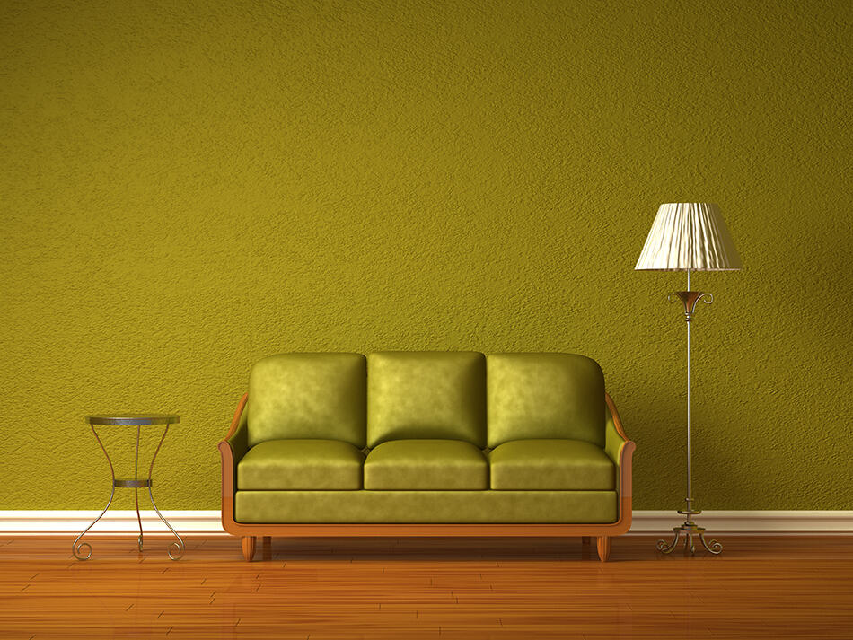
Olive is quite a special shade of green. Although it’s yellowish-green – and both green and yellow are considered lively colors – the brownish tint makes olive significantly duller than many other shades of green. Because if that, its psychological effect is more that of a neutral color. It is serious and formal, but not as impersonal and strict as gray.
Olive is also associated with the military, and therefore it can evoke the feeling of discipline.
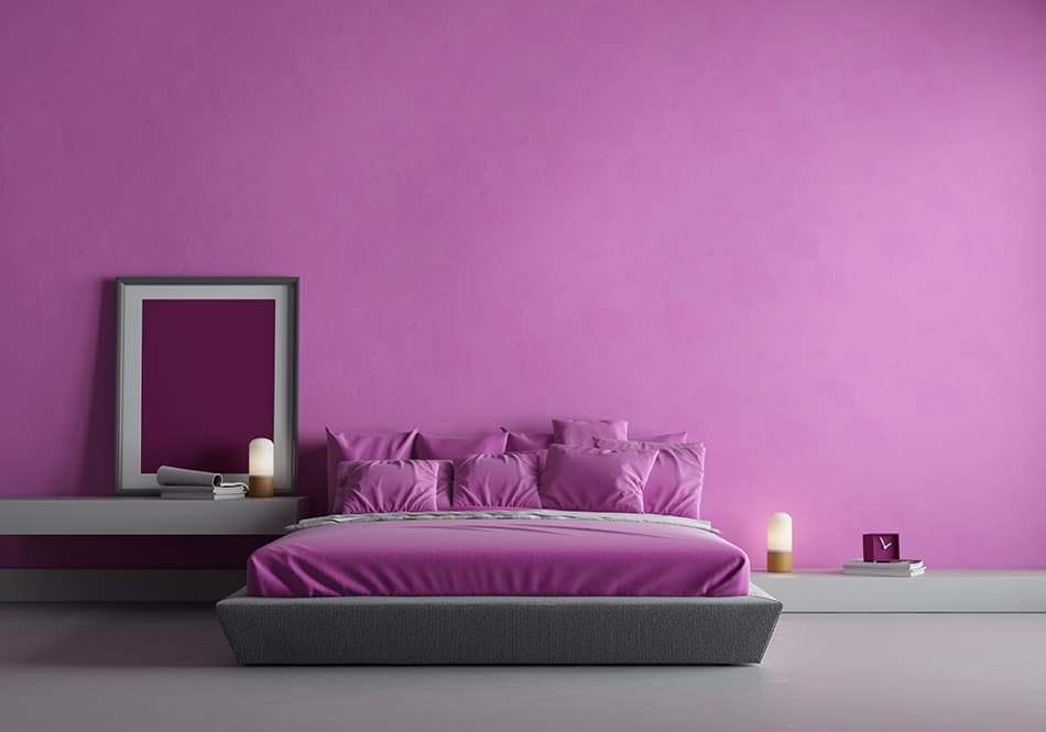
Pink
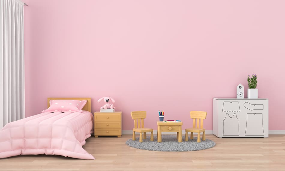
By its pastel nature, pink is a calming color. However, there’s even more to it. Studies show that pink is a pro-social color that enhances peace and harmony in human relationships. The participators of a study reported they were rid of feelings of anger and hostility after spending time in pink rooms.
The only drawback to using pink is that lighter and duller shades can make you feel passive. There’s an anecdote that spots teams used to paint their rival’s lockers pink to make them weaker and passive before the big game. If you like pink, but you are chronically low on energy, choosing warmer pinkish hues such as coral might be a better idea.
Violet
Violet is a hue that represents tenderness, romance, and innocence. It is the color of some of the most delicate and fragrant flowers – violets, hyacinths, lilacs.
That is why violet is soothing and calming for the mind. Unlike its “cousin” – purple, people consider violet an energizing color. However, a pinkish shade of violet could make you feel passive.
Purple
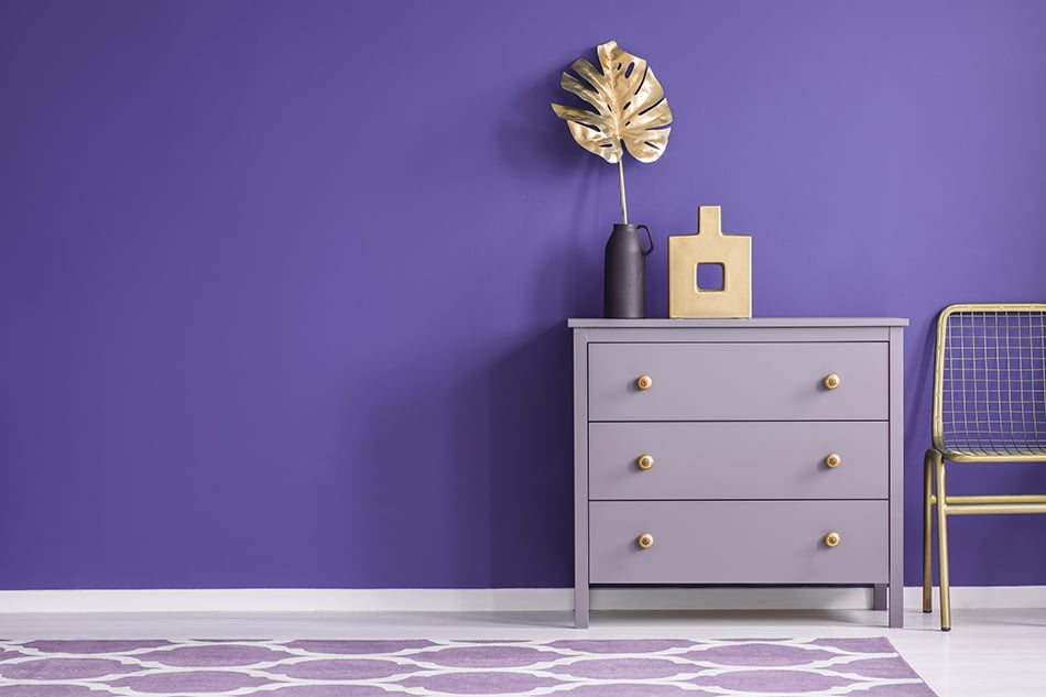
Purple represents luxury, royalty, and wealth. That’s why we see it so nicely paired up with golden in our example – the match seems so natural. Deep purple is also the color of mystery and spirituality. Looking at it feels soothing and nurturing. It can also help with inspiration in your creative endeavors.
The only possible issue with purple is that it can push your behavior in a passive direction. Avoid using passive colors in rooms connected with a lot of activity or decision-making.
Grey
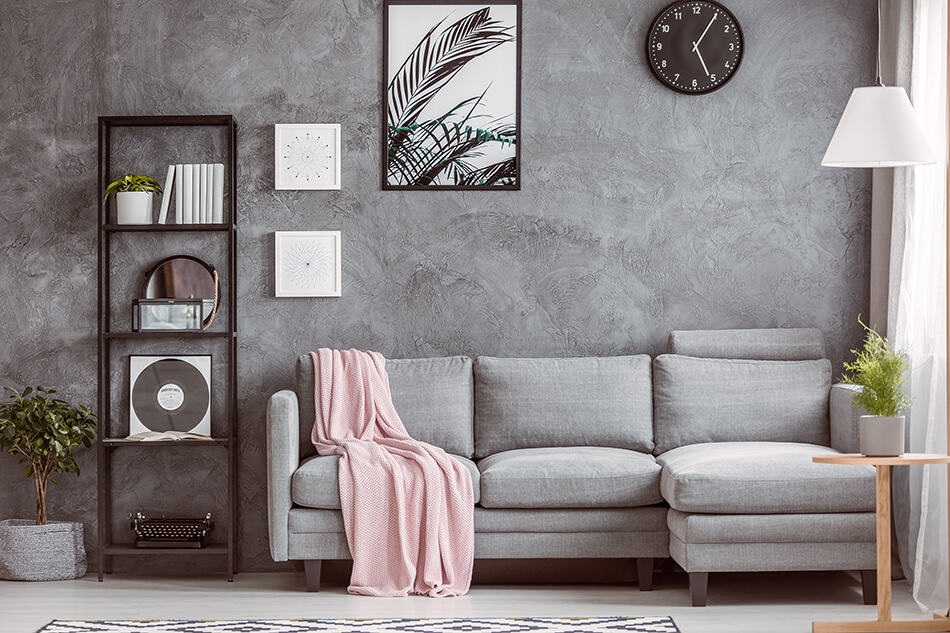
Grey is the color of maturity and seriousness. The “no-nonsense” color evokes feelings of responsibility, formality, and stability in all its shades.
However, grey can also feel impersonal, unemotional, and conservative. While it is undoubtedly a grounding color that won’t agitate you, surrounding yourself with too much of it can make you feel lifeless and dull. Luckily, it makes a great background color to make furniture, decoration, and other interior design elements of your favorite color really stand out.
Green
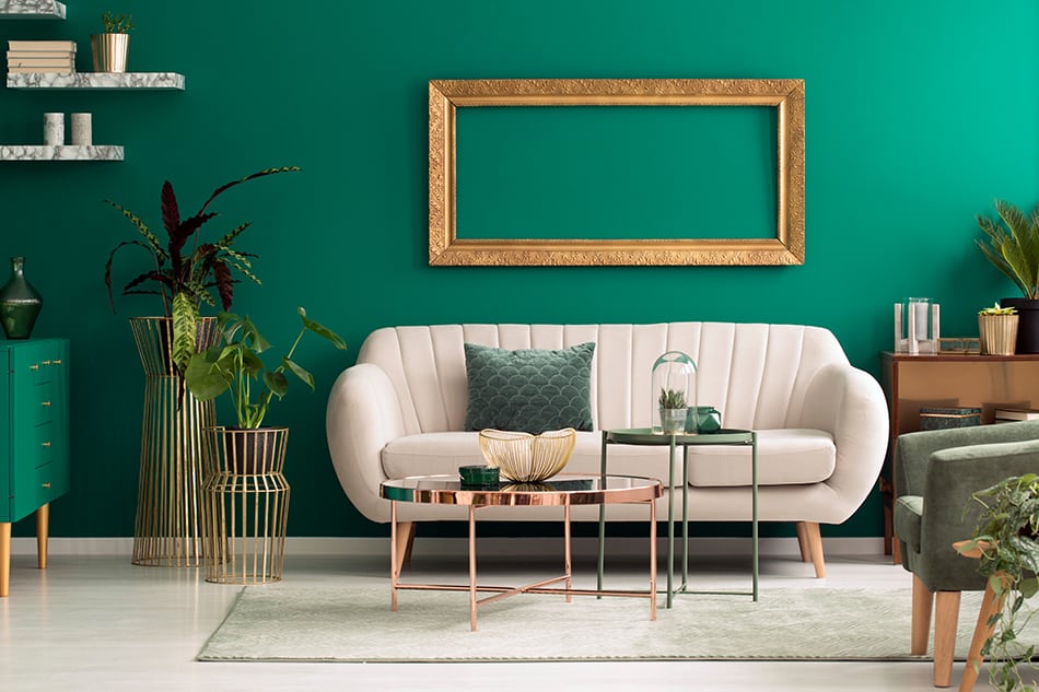
Our species evolved surrounded by green landscapes – which are associated with a healthy, fruitful environment. That is why green is the color that is the most pleasing to the eye. Another interesting feature of green is that it is both calming and energizing at the same time – and isn’t that how everyone wants to feel?
It is considered a healing color – some research has shown that workers in green office interiors suffer from fewer stomach aches.
The effect of green on mood and behavior will depend on a particular shade. Since green is made from blue and yellow, we can divide it into two categories. Yellowish greens, like lime green, are very energizing and vibrant. Bluish greens close to turquoise have a more calming effect. Typical “lawn” green stands in between and brings the best of both worlds.
Culturologically, green is associated with luck and fertility, but additionally with jealousy and envy. It is also the color connected to Ireland (and Celts in general) and also to Islam.
Orange
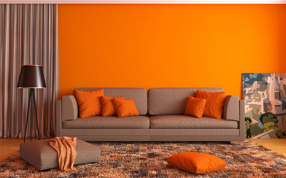
If we consider liveliness, orange comes right after yellow. It’s the color of sunsets, citrus fruit, many beautiful flowers – all in all, a very life-affirming hue.
Orange radiates with enthusiasm. It energizes like red, but without aggression and agitation. Also, it is a hue that has a warming effect.
Orange is also known to boost attention, and grabs attention, making it a popular color in marketing.
Conclusion
Once, I read an interesting statement that sounds almost like an old saying: “Colors create the same impressions for different people.” It’s true – many studies found that thousands of people exposed to a certain color will have the same or similar associations connected with it.
So, when it comes to colors, you can trust your own perception. I’m sure that just by immersing yourself in these images you’ll be able to feel how each color affects you. Words are here just to reassure you, broaden your views a bit, but most importantly – to help you use and manipulate colors to suit your needs and enhance your well-being. Let your true colors shine through.
Which color do you like and how do you think it reflects your personality? Tell us in the comments!
Here is an infographic that sums up the main point of this article. Love this? Share and Pin it now!
Share this Image On Your Site
Please include attribution to https://www.homenish.com/ with this graphic.
Leave a Reply
You must be logged in to post a comment.