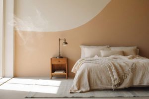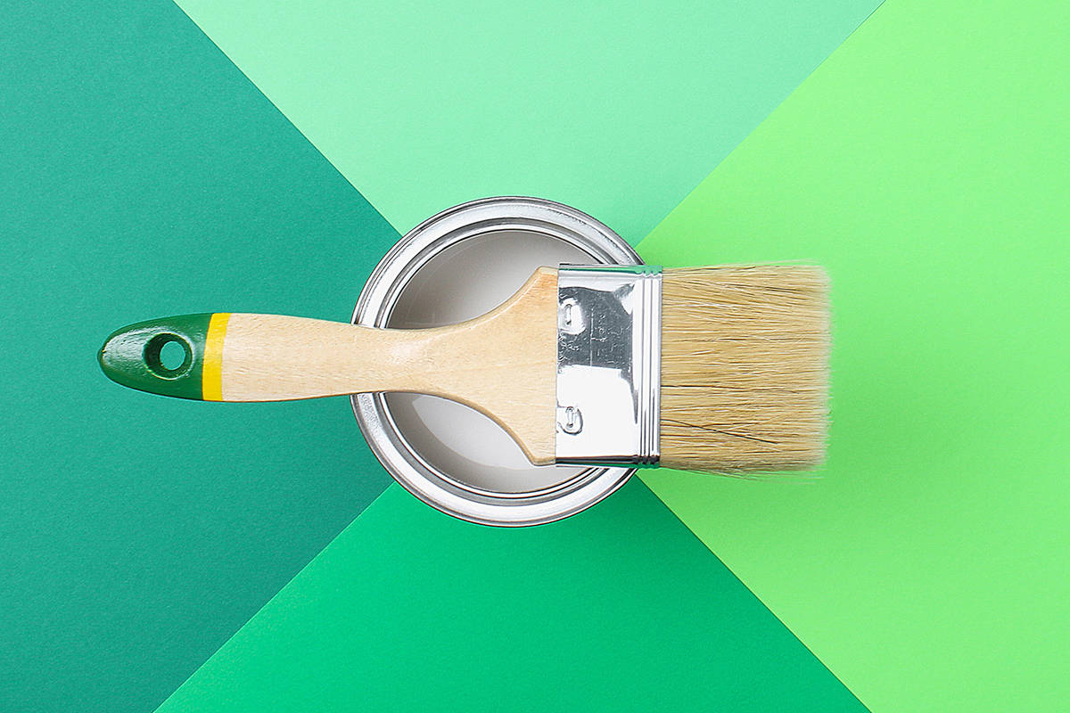
Green is a very hot color in interior design right now, being used in everything from upholstered sofas to kitchen cabinets. One of the easiest ways to freshen up your interior style with this trendy color is to simply paint the walls in a room or update the trim in a neutral room with dark green paint.
Green is an incredibly versatile color that can be used to create anything from soothing and relaxing to moody and atmospheric rooms. It also works well with a range of different accent colors. To figure out which green wall paint is best for you, check out our recommendations below.
Green as a Natural Neutral
Green is a color that can be so easily linked to the natural world because it is so commonly seen in a variety of outdoor landscapes. Green can be found on mossy mountainsides, lush green fields, the foliage of rainforests, and even in blue-green ocean coastal scenes.
This way, in which green forms part of the fabric of our natural landscape, leads green to become almost a neutral color in some ways because it is the backdrop to our everyday lives.
As green as a color is so heavily associated with nature, it is the ideal color to use when you want to bring a feeling of the outdoors into your home.
For natural and neutral shades of green, opt for earthy paint tones that have muted and subtle hues, such as pale sage green or olive green. The colors should have undertones of gray, brown, or beige to make them work as a backdrop for your space.
The best green paints to create natural or neutral interior decor are:
Avocado by Benjamin Moore

Avocado by Benjamin Moore is a saturated green color with strong olive vibes. It is quite muted, so even though it is a darker shade, it will work well as a wall color for the whole room.
Softened Green by Sherwin Williams
This is a subtle shade of green with plenty of gray tones running through it. It would work nicely in a living room or dining room with dark gray or dark olive green accents and plenty of houseplants.
Shades of Spring by Benjamin Moore

Shades of Spring is a soft minty shade of green that sits somewhere between soothing and refreshing. It is an earthy green that you would find in nature, which is what makes it the perfect choice for natural-themed interior decor.
Green as a Refreshing Tonic
Green can be a very vivid and fresh color that can work as a great palate cleanser in a home to invoke a feeling of revitalization. Refreshing shades of green are those that have undertones of yellow, such as lime green, or bright green tones like jade green.
These types of refreshing green shades can be used on all walls in a room for an intensely vibrant look, or for a more subtle hit of fresh green, you could just paint a feature wall or the wood trim in a room.
Another idea is to paint kitchen cabinets with a refreshing shade of green to get the full hit of vibrancy without completely surrounding yourself with the color. Use black metal work with fresh shades of green for handles and light fittings or a muted gold shade such as brass.
Silver accents can make lime green look dated, and bright gold can be too brash with this color. Copper represents a nice contrasting shade if you really want to set off your vivid green.
The best green paints to create refreshing and vibrant interior decor are:
Kelly Green by Benjamin Moore

Kelly Green is a darker shade of bright green that would work really well as a statement color painted on every wall in a room.
Keep it simple with monochrome accents such as white bed linen and black framed art prints, or introduce bold jewel tones to contrast and create a fun look, such as fuchsia pink, violet, and sapphire.
Chic Lime by Benjamin Moore

This is a fruity shade of green that is reminiscent of apples, limes, and kiwis. Chic Lime has obvious yellow tones and would look vibrant and refreshing alongside white wood trim or wainscotting.
It could be complemented with natural tones such as beige and tan for a high-end southern parlor look, or contrast the green with hot pink and tangerine orange.
Avocado Whip by Behr

This paint color looks just like the inner flesh of a perfectly ripe avocado. It has yellow undertones that aren’t too obvious but give the green a warm and uplifting feel.
This color would look great on bathroom walls, or give your kitchen a makeover by painting the cabinets in this modern and playful shade.
Green as a Soothing Shade
Green colors that have blue undertones tend to be very relaxing, as blue is a color with naturally soothing energy.
For a relaxed space to unwind and destress in, paler shades of green work best as they aren’t overstimulating for the eyes; however, if you want a darker shade of green, there are a few deep colors that would work well to achieve a tranquil setting.
When working towards a soothing atmosphere in interior decor, you will want to pay attention to accent colors just as much as your main color.
Contrasting shades can create a vibrancy that works well for some spaces, but in a relaxing room, a tonal vibe will work better to avoid too much stimulation. Consider dusky shades alongside soothing greens, or stick with neutral tones like beige and gray.
The best green paint colors for soothing interior decor include:
Sea Salt by Sherwin Williams
This is a very pale shade of green with a hint of baby blue. It is a relaxing color that works well as wall paint in bedrooms or casual living rooms.
To make the most of this shade, paint trim in pure white color. Trim in shades of off-white or beige can tend to alter the way the eye sees this color, making it appear bluer.
Teresa’s Green by Farrow and Ball

This shade of green looks like a cross between pale mint green and light blue. It is calming and tranquil and suggestive of links with the coast. It could work well in a casual beach-themed interior or a relaxation haven with pure white accessories to contrast.
Narragansett Green by Benjamin Moore

Narragansett Green is a dark shade of green that you might not associate with a soothing atmosphere; however, it can have a really restful effect when used as wall paint. It is a color that sits somewhere between forest green and teal, with obvious blue tones.
Despite being a dark color, it is a muted shade that makes it easier on the eyes and more relaxing to be around. Use this color on the walls in a small room, such as a guest bedroom, to create a safe oasis.
Green as a Mysterious Mood
Green can be a very alluring color that creates mystery, depth, and atmosphere. Dark and deep shades of green with gray, blue, or brown undertones can all work really well for an intimate or moody space. For the most impact, surround yourself with your color of choice by using it floor to ceiling on all of the walls in a room.
Dark greens can also be put to good use on wood trim in white or off-white rooms for a stark contrast. For a high-end look, avoid contrasting dark greens with white as this can be too stark, and instead opt for muted pastels or dusky shades.
For a glam effect, pair dark green paint colors with vivid jewel shades in the form of luxury soft furnishings, such as a cerise pink velvet armchair.
The best green paint colors for a dark and moody look include:
Essex Green by Benjamin Moore

Essex Green is a dark shade of pine green that is reminiscent of dense forests and mossy mountains. It is a deep shade that still has natural associations due to the purity of the color. It would work well in a living room teamed with copper highlights for a sophisticated vibe.
Green Smoke by Farrow and Ball
This is a woody green color with gray undertones that give it a smoky feel. It could be described as dark, dusty green and would work well in a bedroom for a moody feel, with accents of blush pink to add some contrast and romance.
Secret Garden by Sherwin Williams
This is a dusky paint color that feels earthy, like lush moss growing on fertile soil. It is a color that feels deep and soulful and, therefore, can work as a classic shade in a room.
Despite being a very dark color, this paint feels almost like a neutral shade because it has a grounding quality to it. Use various shades of gray with this paint color to achieve an elegant glamour, or contrast it with off-whites.
For more blue-green paint tones, we recommend you follow our guide on aqua paint colors for your home.