Aqua isn’t considered to be a particularly trendy paint color among interior designers or home decor enthusiasts right now, but if you are looking for a long-term paint color that will stand the test of time and remain a pleasant and palatable shade, then aqua should be among your considerations.
Aqua is a blue-green color that can sometimes have undertones of gray. Depending on the shade and saturation of the paint color, aqua can be soft and muted or lively and vibrant.
It is often thought of as a color best suited to coastal decor styles, and while it can work very well in an easy-breezy beach look, there are also shades of aqua that have a distinctly vintage or quirky feel to them.
You could use aqua to create a tropical and fun decor style alongside flamingo pink, or pair it with glossy cherry red for a retro vibe.
Aqua also makes a nice paint color choice for children’s bedrooms or playrooms because it can be a bright and cheerful shade that also promotes relaxation. Whatever kind of style or atmosphere you are hoping to achieve, there will be an aqua shade to suit.
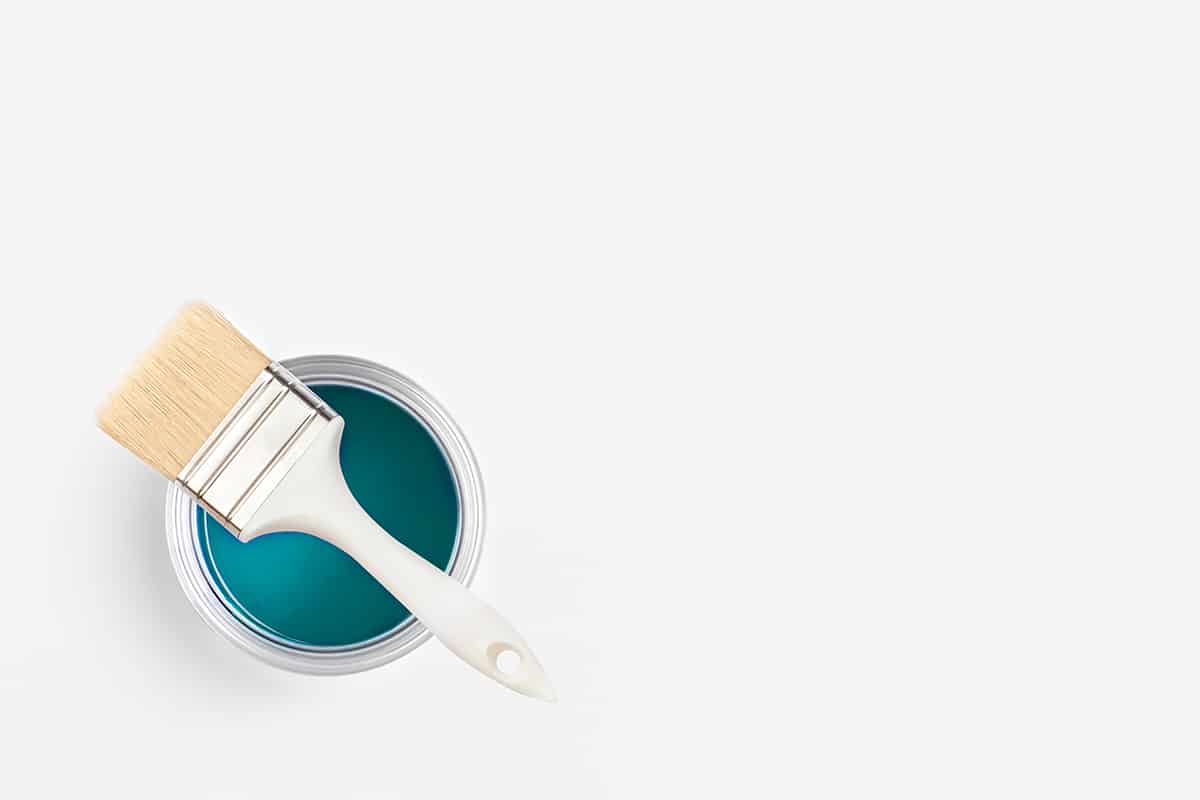
Here we look at the best aqua paint colors for use around the home.
Table of Contents
- Rainwashed by Sherwin Williams
- Jamaican Aqua by Benjamin Moore
- Sea Salt by Sherwin Williams
- Clear Pond by Behr
- Palladian Blue by Benjamin Moore
- Marquee Aquifer by Behr
- Beach Blanket by Valspar
- Interesting Aqua by Sherwin Williams
- Marina Isle by Behr
- Quiet Moments by Benjamin Moore
- Waterscape by Sherwin Williams
- Frozen Pond by Behr
- Comfort Gray by Sherwin Williams
Rainwashed by Sherwin Williams

This is a shade of aqua that is distinctly more blue than green. It is a cheerful and fresh color that works really well in coastal interior styles and pairs really nicely with shades of off-white such as ivory and cream.
Natural shades of beige will also work well with this color, representing golden sands alongside the aqua blue of a summer sky. For a more clean and sharp look, use pure white trim with this shade of aqua and white furnishings.
This is a color that can be used in any room in the home where you want to achieve a low-key bright, and breezy style.
Jamaican Aqua by Benjamin Moore

This is a strong shade of aqua that offers the perfect balance between blue and green. It is a heavily saturated color that has a bright and refreshing energy from the green but also a calming and soothing feel from the blue elements.
It would work well in a traditional bathroom or as a fresh color in a living room. The color has a strong beach vibe, so it would also be effective in coastal-style spaces.
Sea Salt by Sherwin Williams

This is a very pale shade of aqua that features gray, blue, and green tones. As the colors in this paint are so subtle, the other colors you use alongside it will be pivotal in bringing out the elements you want to see. Pair this color with a pure white trim in a room with lots of natural light to experience the full array of tones this color has to offer.
If you put this paint with beige accents, it will highlight the blue tones and appear almost like a baby blue pastel color. In low light, the paint can look completely gray.
The color works really nicely as a very subtle shade of aqua if you want a wall color that is not a neutral but also doesn’t want to choose a bold color.
Get a tester pot and view it in various lights throughout the day to see how it will look in your chosen room before committing to painting the whole space.
Clear Pond by Behr

This paint shade is more blue than green, and it works really well as a vibrant yet tranquil color. It has gray undertones that give it a dusty feel, preventing it from being too bright.
This can work well on walls, but it’s also a really nice choice of color to use on painted furniture, especially in vintage or coastal settings. It will have a quirky vibe when used with small accents of canary yellow, or pair it with butter yellow and floral fabrics for a country cottage feel.
Palladian Blue by Benjamin Moore

This shade of aqua is blue-gray. It can look bluer in natural light or will look grayer in darker spaces or with artificial light. This color is a good choice if you want to add a little pigment to a room without making it a very obvious, bold color. The mix of blue and gray gives this paint a very calming and soothing feel, which can work well in any room.
Marquee Aquifer by Behr

This is a bold aqua shade that sits right between blue and green. It has distinctly mermaid vibes that would make it a nice choice in a child’s bedroom with pink and golden scalloping, or use it for trim in a neutral-colored room. This shade could work well as the primary color in a space, accented with bubblegum pink and white for a fun, tropical feel.
Beach Blanket by Valspar

If you want a coastal-themed space without choosing the usual shade of blue, then this is a great option. It leans more towards the green side of aqua that gives it a more sunny appeal compared to calming blue.
There are some warm tones in this color that will result in a space that is more inviting compared to blue-grays that can feel cold. Pair this shade with warm neutrals such as beige and tan or pretty pastels like vanilla yellow or strawberry milkshake pink.
See more green paint inspirations in our article ‘12 Green Paint Colors For Every Room.’
Interesting Aqua by Sherwin Williams

This is a muted shade of aqua that is predominantly blue, with green and gray undertones. It has a dusty quality that makes it feel modern and could be used to create a casual and airy interior with white accents or a sophisticated formal feel with darker accents like charcoal or navy.
For a contemporary take on a coastal style, choose this color to update kitchen cabinets or pair it with dark wood furniture in a bedroom.
Marina Isle by Behr

This color has less saturation compared to some of the more intense aqua shades, but it still offers a bright and cheerful feel thanks to the presence of green undertones. It can appear more muted in artificial light but will have a vibrant appeal in bright natural light.
Pair this color with natural neutrals such as olive green and camel for a contemporary outdoorsy feel, or use it alongside rusty brown to create a warm contrast.
Quiet Moments by Benjamin Moore

This is a light aqua shade that looks like a cross between green and gray. Living up to its name, it is both calming and rejuvenating, making it a nice choice for rooms where you want to relax, such as bedrooms or living rooms.
This color would work nicely in a nursery or child’s room as a gender-neutral shade that promotes sleep and tranquility. In some lights, this color can look like a soft mint shade, which will be brought out if you use white trim alongside it. Accent this pale aqua paint with dusky pink accessories or warm beige shades such as gingerbread.
Waterscape by Sherwin Williams

This shade of aqua resembles mint ice cream in that it is a sweet, pastel shade of green-blue, though it certainly leans more towards green with blue undertones. It can look childish if paired with the wrong colors, so avoid other ice-cream pastel shades and instead use this color with dark tans to bring out a more sophisticated side.
You could also use this color with a dark gray paint on trim and doors to give it an instant modern lift or frame large art prints in matte black frames to hang on the wall.
Frozen Pond by Behr

Despite looking a little icy, this color actually has a somewhat warming feel as it leans more towards green than blue. It is a darker shade of aqua that can look very modern and quirky when paired with hot pink and navy blue for a contemporary take on coastal chic.
Use this color in bedrooms with floral prints for a more traditional look, or use it in a bathroom with white accents for a hit of invigorating freshness.
Comfort Gray by Sherwin Williams

As you might expect from the name, this is a shade of aqua with gray undertones. The predominant color you get coming through this paint is green, in a refreshing minty shade. The combination of colors in this aqua paint results in a final shade that is both soothing and fresh, making it perfect for bedrooms, kitchens, and living rooms.
Use this color with golden or brown-toned wood to make it feel warmer and inviting, or pair it with ivory accents with a modern New England vibe.
This is a paint color that brings a distinct energy to a room, so if you prefer a more subtle atmosphere, then use it in smaller doses, such as to paint wooden furniture, to paint trim, or to paint closet doors.