The bedroom is probably the most critical room in your house. It is the place of your night’s rest – and we all know that a good night’s rest is very important. Every vital aspect of your life – health, emotional wellbeing, cognitive functioning – it all depends on how you sleep.
And what’s another thing that affects the quality of your mood and life in general? Colors!
Colors that surround you daily can have a profound impact on your well-being. Cool colors can make you more peaceful and more focused. Bright, warm colors can make you feel more lively and creative.
Put these two aspects together, and it becomes clear that colors in the bedroom are fundamental for setting the tone of every new day.
Let’s explore some attractive, vivid bedroom color schemes and designs together.
Table of Contents
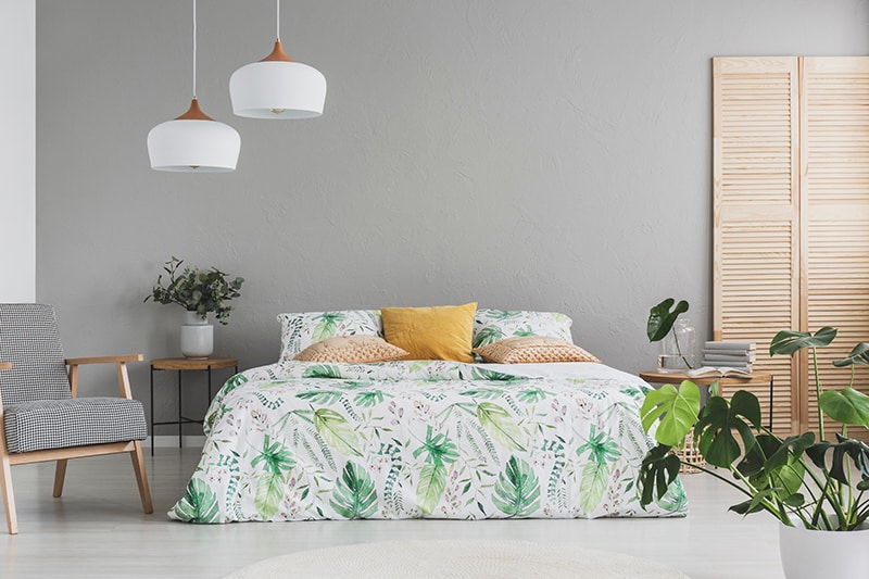
Green
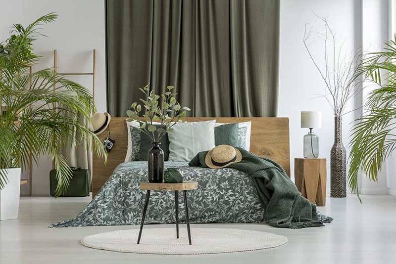
Green is the color of nature and life. Because – believe it or not – humans evolved in harmony with nature and are surrounded by vegetation, green has a relaxing color effect and is the color that is the easiest on our eyes. It feels like home.
Since green is actually a product of the cooling blue and the bright yellow, it is considered both calming and energizing.
Although green can be presented in various ways, this particular room pronounces the green’s naturalistic aspect – with houseplants, simple and beautifully patterned wooden furniture, and plant-themed sheets.
Another reason why green is special for bedrooms? It is said to increase fertility, making it a perfect choice for couples looking to expand their family.
Dark Green
All dark greens – including the already mentioned pine green – have a calming, “forest-like” effect on our minds. It can also look mysterious and quite elegant. However, it should be noted that it shares the already mentioned issues with other dark colors and shades.
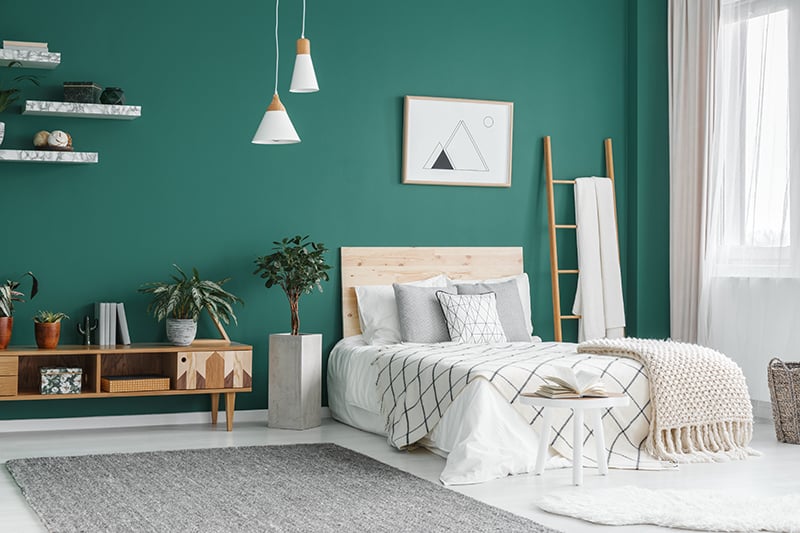
Here, a sage green, rough back wall creates an ideal neutral background for these sleek, modern furniture and decoration pieces. Although it is not so obvious when you first think about it, black, white, and yellow go exquisitely well with this shade of green.
Mustard Yellow
Mustard yellow is an earthly, duller cousin of our typical, bright yellow. It is not as intense, and it can help create a warm, cozy, and elegant look in bedrooms.
It works best as an accent color – for the main wall, or for details in which case it should be used consistently throughout the room. However, too much it can get hard on the eyes, which makes it a great choice to be used in combination with other, lighter shades.
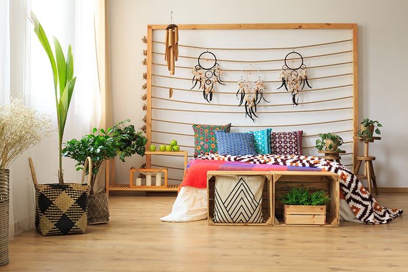
Since mustard yellow is associated with warmth and has an earthy touch to it, it brings to mind the desert-dwelling ancient cultures, such as Mexican, African, or Native American. And accordingly, this room is decorated with various ethnic patterns and items.
Pine Green
Remember when I said that greens can successfully be used in setups other than naturalistic designs? Here we see a wonderful deep pine green bedroom incorporating geometry.
Since this shade is quite dark, having just one accent wall looks good. Bedroom details such as bed covers, houseplants, lamps, and decorations really stand out against a dark background.
As with other dark shades, I do not recommend using it generously in a small room since it can make you feel claustrophobic. If your bedroom is on the sunny side, it can soak in and trap too much heat.
Cobalt Blue
Blue is the color of calmness and spirituality. It cools down the space. If you desperately need to relax before falling asleep, or you are waking up tense, having a blue-themed bedroom is an excellent way to help you unwind.
Cobalt blue shares the luxurious feel with its famous “cousin,” the Prussian blue, but is lighter and less intense. That makes it an ideal addition to the bedroom.
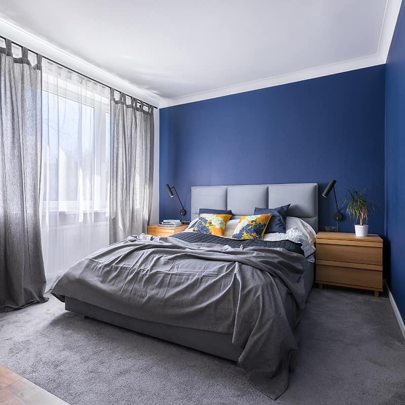
Cobalt blue will combine beautifully with various shades of gray. For the best effect, make sure to include a few details of lively complementary color. Here we see the pillows with a floral pattern featuring hues of blue and our old friend mustard yellow.
Pink
You might be unaware of it, but pink is the color of peace. Some studies have shown that people feel calm and rendered of aggression when looking at soft pink. It induces playfulness and kindness, so it is a no-brainer why these traits make it ideal in for the bedroom.
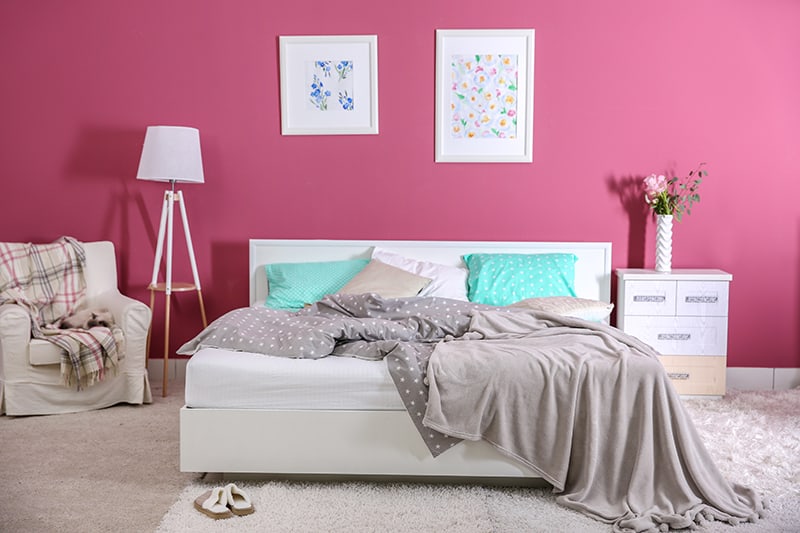
Vivid pink back wall combined with neutrals – white and gray, plus turquoise pillows to shake things up a little. The starry pattern on the bedsheets also gives the whole space an additional young, dreamy feel.
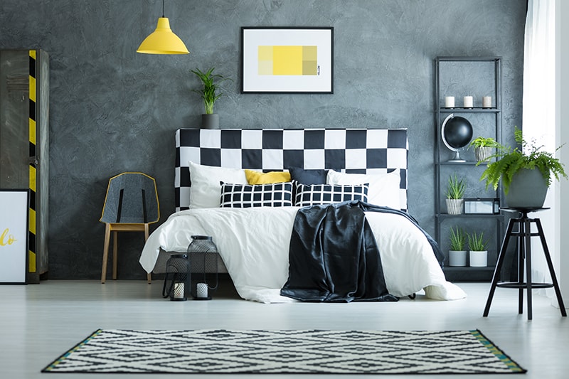
Gray
Probably the most neutral of all colors, gray is not very stimulating, which can be a good thing in the bedroom. Dark grays can look very sophisticated. Pale grays will help you achieve a calming and light atmosphere ideal for unwinding. It can be combined with other neutrals but also with very vivid colors, so it is very versatile.
Gray walls make a great backdrop for playing with other colors in the room. The back wall helps bring out the best of the greens in this room – both on living houseplants and the botanical drawings on the sheets. The earthy colors – both the color of the wood and the mustard yellow (for the pillow) add more life and make a statement.
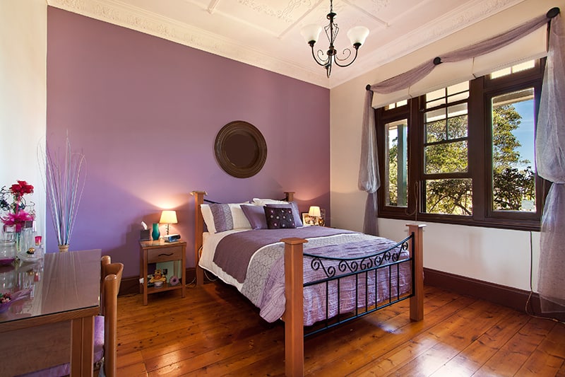
Ultra Violet
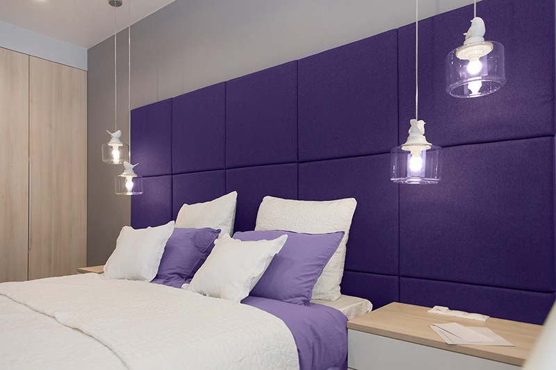
Darker shades of purple are associated with luxury and creativity. Ultraviolet is a unique shade because it is not either to lively nor too dull; not too light and not too dark. It is complex, mysterious, contemplative, and spiritual.
It is a good choice to incorporate it in your bedroom if you like to relax, practice mindfulness or calmly contemplate the world before you go to sleep.
Ultra Violet has been declared Pantone color of the year 2018, which instantly made it even cooler.
This simple bedroom setup, with the violet back wall and pillows, combined by the neutral white, really makes ultra violet dominate the space.
Be careful, though, because darker shades of purple can make you feel a bit too dreamy and passive.
Lime
Lime is probably the most festive of all the shades of green; hence there are not many colors that match well with lime green.
It points out the life-celebrating, vital aspect of green, stimulating alertness, excitement, and the pure joy of life.
Because of its lively properties, lime is the right choice for a young person’s sleep and study room. It can have a good influence on mood and provide proper motivation. Also, it could help a teen who struggles to wake up in the morning.
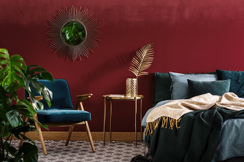
Maroon
Maroon – a dark red hue with a pinch of brown – is not a typical, conservative bedroom color. Accordingly, it has some advantages and some disadvantages.
Maroon boosts adrenalin and raises blood pressure and heart rate. It represents passion and intensity. Love, risk, courage, excitement, risk-taking, and creativity – all those aspects of life could wear a maroon coat, to put it metaphorically. Maroon is also the color of autumn and harvest time – its name comes from the French word for Chesnutt.
These traits make maroon the right choice if you want to increase the elegance and passion factor in your bedroom. However, it has its downsides.
Maroon, crimson, and other deeper shades of red can evoke the feeling of uneasiness, moodiness, and aggression in some people. In short, all the intensity can make relaxation hard. By limiting the amount, and by combining maroon with the right decoration, you can avoid the sinister feel and use its positive aspects to create an outstanding interior.
Gold table between green armchair and bed in a sophisticated red bedroom interior with mirror.
Here, we can see how maroon teams up with gold, and also dark hues of blue and green.
Lilac
Of all the shades of purple, lilac, lavender, and wisteria make us can help rest both our eyes and our minds. They are soothing but inspiring and have revitalizing properties – which makes them ideal for people who have trouble sleeping or waking up.
Lilac goes well with other natural colors and hues. In this example, it is noticeable how the lilac wall and the matching sheets make the wonderful wooden bed and the wooden floor stand out. The entire room gives out new agey, nature-loving vibe even without the use of green.
Coral
Coral is the new Pantone color of the year. The company chose it as a warm and pro-social color to contrast our increasingly cold, digitalized, and technology-driven world. By combining the comforting and peaceful aspects of pink with the energetic elements of orange, you get a hue that is genuinely life-affirming, facilitates conversation, and increases good mood in general.
Utilizing coral is ideal if you are looking to increase intimacy and connection in your bedroom. Although it’s a lively hue, it is not intense. Painting an accent wall (or an entire room with some paler shade) will not overburden your eyes or your mood. It goes well with discrete neutral colors such as gray and white.
White
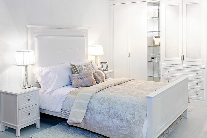
White is the color of purity and elegance. White reflects ambient light the best, so it can be a good choice for inherently dark rooms.
Straight white linen reminds us of restricted environments such as hospitals or military barracks. Still, by using thick, puffy white blankets and pillows, you will make your bed look elegant and lush.
White is also beloved by neat-freaks because you can quickly see if a white thing is dirty – even without smelling it.
But there lies the dark side of white. White-themed bedrooms might not be practical if you have a lot of pets or small children in your home. Also, too much white can be tiring for some people – and you don’t need to get your brain overworked in your own bedroom.
This example of a white bedroom is exquisitely lavish, with the upholstered hardwood white double bed, satin pillows, and a fuzzy carpet to add a bit of playfulness. You can see how well sleek materials like metal and glass go with white.
Orange
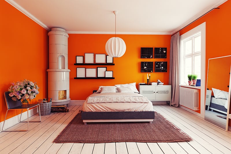
There are not many colors as exciting, stimulating, and energizing as orange. From juicy orange fruits to fabulous sunsets, orange is all about celebrating life.
You should use orange in the bedroom carefully because, although it is a color that makes us feel better, it doesn’t really help us to relax. You should stay away from it if you have trouble falling or staying asleep. On the other hand, it might help you if you are hard to wake up. If you love orange, but think it could be overstimulating, you can always use orange ornaments.
Here, we see orange walls skillfully combined with a lot of neutral elements, especially white ones, dominated by the rustic charm of a white Swedish stove.
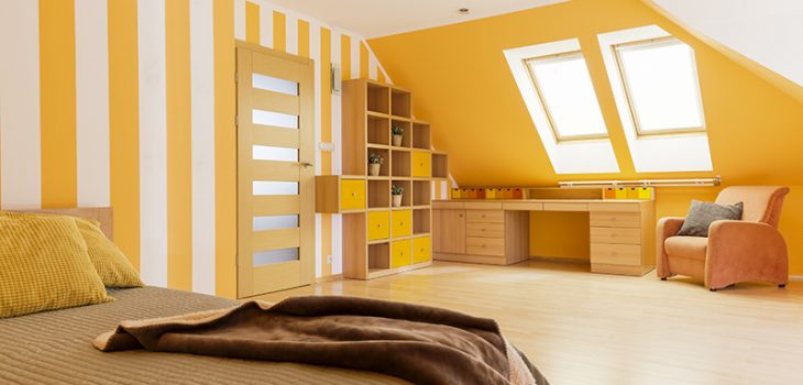
Sunny Yellow
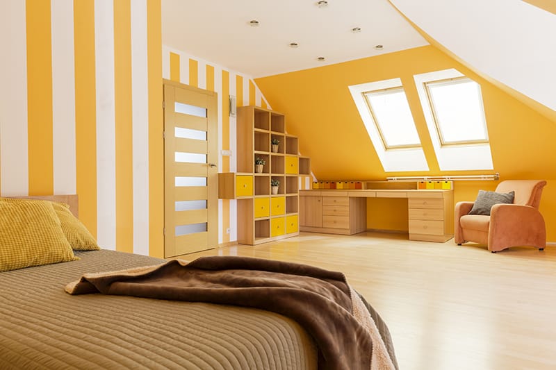
Yellow is perhaps the brightest color on the list.
It is the right choice for bedrooms if you are a morning person, and start every day enthusiastically (even without coffee). Like lime, it’s the right choice for a young person’s bedroom.
This is a cozy yellow attic bedroom. The liveliness of the sunny yellow helps disperse the dark stereotypes around attics. You can see that it goes wonderfully with white and the light wood color. The different hues of yellow on the drawers on the table are an especially thoughtful detail.
However, yellow can induce nervousness and a sense of unease in some people, or cause discomfort in individuals oversensitive to light.
Monochrome
Although the term “monochrome” can be used for rooms painted in different hues of one color, here we are talking about the beautiful simplicity of black and white.
Black and white monochrome balances the two extremes. The contrast can be stimulating. Setting your bedroom in black & white monochrome can help you unwind if you are sensitive to colors or are surrounded by too much color during the day.
If you are in need of constant change, having a B&W base in your bedroom is ideal. Just by swapping the bed covers or pillows, you can create an entirely new mood for your space.
Black
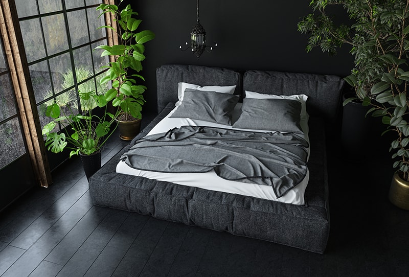
Black is the synonym for “darkness.” That is why it is often related to nighttime, death, depression, and other things most of us do not want in our lives or our bedrooms.
However, for interiors, black exhibits different properties. It is a grounding, introspective color that helps us feel more in control. When used on walls, it makes other decorations stand out exquisitely. Houseplants shine against black backgrounds, as seen in the picture. Also, as an unusual bedroom color, it adds extravagance to your space.
Be careful because dark colors can make rooms look smaller, so black is not suitable for small spaces with low ceilings. Also, if your bedroom is hit by sunlight for most of the day, you should know that dark walls will soak in and trap heat.
Black can be paired and balanced out by using white and other light neutrals, like in the previous example.
Sky Blue
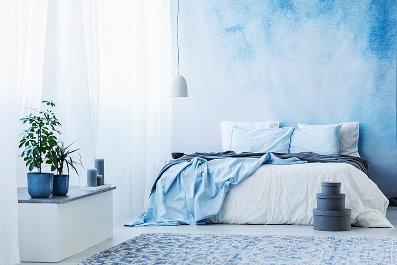
Sky blue is an archetypal color. It induces a sense of peace, spirituality, joy, and limitless potential. “Touching the sky” feeling can be achieved in your bedroom with the simple help of some paint. In this picture, the accent wall even has cloud shapes on it.
Because of this “sky-clouds connection,” light neutrals are colors that go wonderfully with sky blue, and using them is a good formula for achieving the airy, flying feeling in your space. “Sky is the limit!”
Conclusion
I hope you like our choice of colors and that you have found exciting ideas for refreshing your bedroom.
Do you have a personal experience with any of our suggestions? What is your favorite color to use in bedrooms, and how do you think it affects you? Let us know in the comments!