If you’ve made the decision to paint a room white, your search for color doesn’t end there. In fact, there are so many shades of white and off-white to choose from that you’ll probably feel like your search is only just beginning.
One of the more popular shades of off-white is antique white. But what exactly is this color, and how does it differ to true white? Here we explore the various degrees of white and off-white and see how they compare in multiple types of lighting and color schemes.
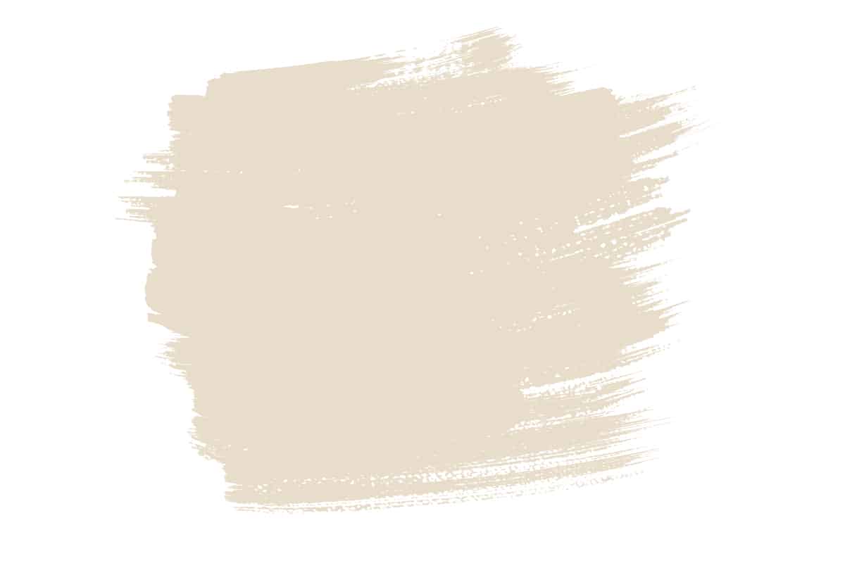
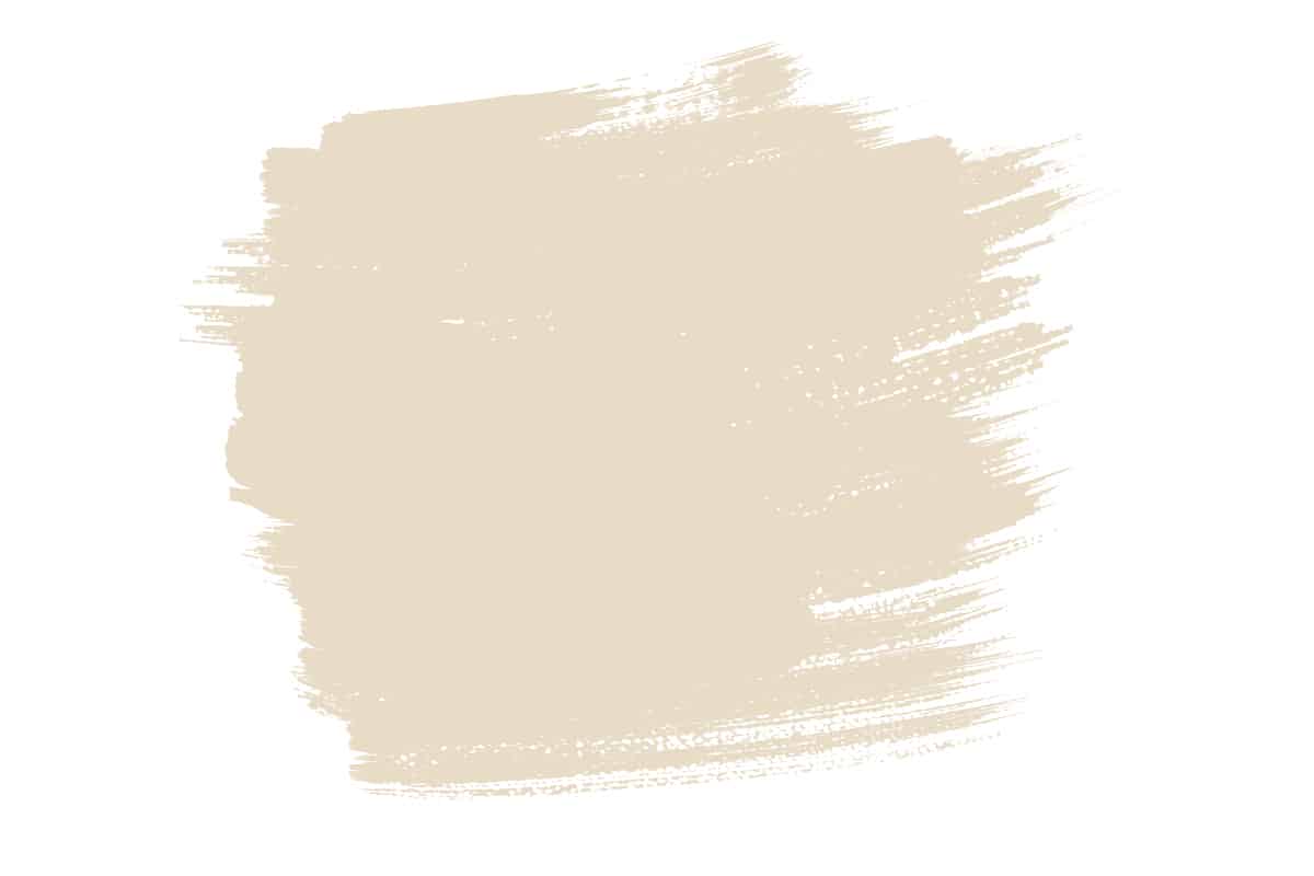
Antique white is a shade of off-white which has a warm tone. It is made by adding the smallest amount of yellow to white to create a very pale, creamy color. By comparison, white is neither warm nor cool, and is perfectly neutral because it lacks color of any kind.
Table of Contents
Is Antique White a Shade of Cream?
Antique white sits halfway between white and cream, so it could be described as a warm shade of off-white or a pale shade of cream. While antique white certainly shares the same tone and temperature as cream, it contains a much heavier proportion of white and therefore reads as more subtle and neutral than cream.
Does Antique White Look Yellow?
Antique white is made by mixing white paint with a very tiny amount of yellow paint. The resulting color should look like a warm shade of off-white, but depending on the lighting and the other colors you have in the room, it could look like a pale shade of yellow. For some people, even in cool light antique white appears to have too much of a yellow hue, but there are ways you can tone it down.
Putting antique white near to yellow, orange, or gold objects will actually make it to appear more white, whereas you should avoid putting antique white next to shades of purple, cool gray, or cool blue because these will bring out the yellow tones in antique white.
Best Lighting for Antique White
The best lighting for antique white paint depends on the type of atmosphere you want to achieve. It will also depend on the amount of natural light a room receives, the aspect of the windows, and the types of lightbulbs you’re using in the room. For a warm and sunny atmosphere, antique white works well on the walls of a bright, well-lit room.
For example, use it on the walls of a kitchen diner that is flooded with natural daylight in the morning, and you will have an uplifting yet cozy space to enjoy your breakfast. If you have a north-facing window or small windows which prevent a room from getting a lot of natural light, then antique white will take on a more neutral appearance.
It will be less creamy and more of a subtle off-white, potentially even slightly gray in low light. Antique white works well on the walls of a poorly lit room if you want to brighten it up, because it will help to reflect any available light and will ensure the space doesn’t feel cold. By comparison, a cool white in a poorly lit room can appear sterile and unwelcoming.
Color Schemes with Antique White
Antique white can be a really tricky color to work with because it reads differently depending on the light and depending on the other colors you pair it with. Many designers avoid antique white for this reason because it can be a struggle to get right. If you have your heart set on using antique white in your color scheme, consider using these other colors alongside it.
Antique white and tan
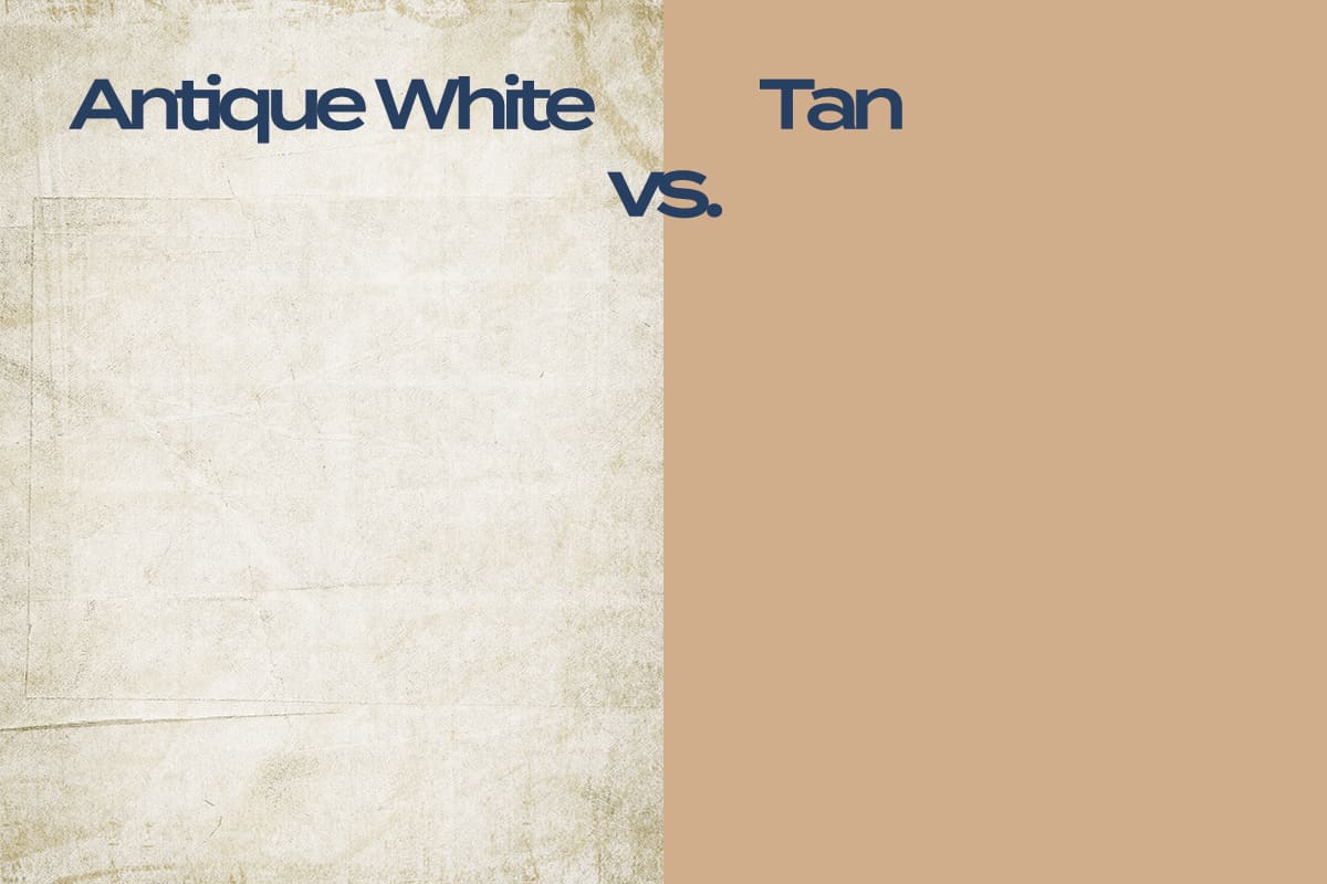
Tan is a warm neutral that hovers somewhere between beige and brown. It could be described as a dark beige or a light brown. Tan works well with antique white in neutral, natural color schemes because the more obvious warmth in tan helps to neutralize the warmth in antique white by comparison.
Antique white will appear less yellow when used next to tan, so this color scheme will make a space feel casual, comforting, and contemporary.
Antique white and lilac
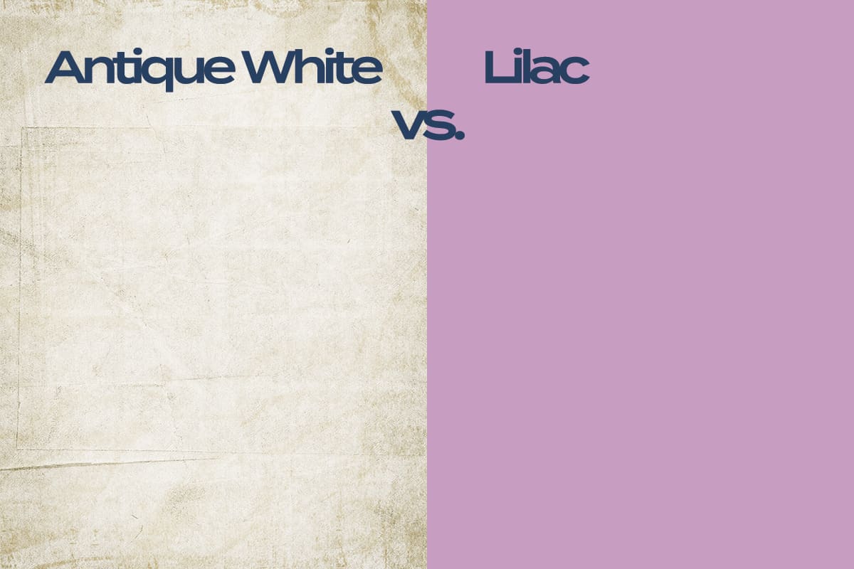
Purple and yellow are complementary colors, and complementary colors work to make each other appear more vivid and vibrant. If you position lilac next to antique white, the purple and yellow tones will make each other even stronger. This means the antique white will appear more heavily creamy, bordering on pale yellow.
This can work really well in floral-themed spaces or cottage-themed rooms, as the colors inspire thoughts of spring and flowering meadows.
Antique white and burgundy
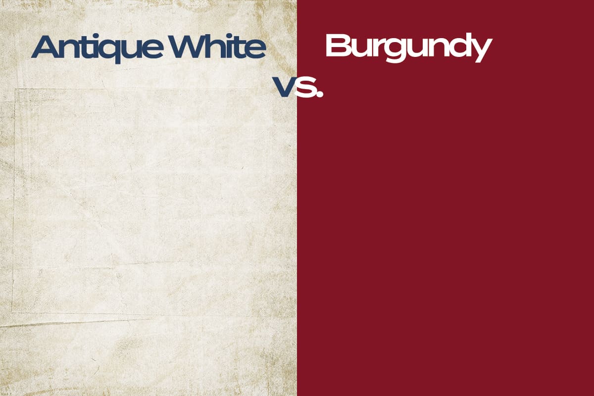
In a room that has the burgundy color, antique white is a nice option for trim. It will read as neutral next to burgundy, and as two warm colors, the intensity of both shades will be slightly toned down.
If you were to use pure white trim next to burgundy walls, the contrast could look quite stark. By comparison, antique white offers a more gentle transition and maintains a feeling of warmth.
Antique white and white
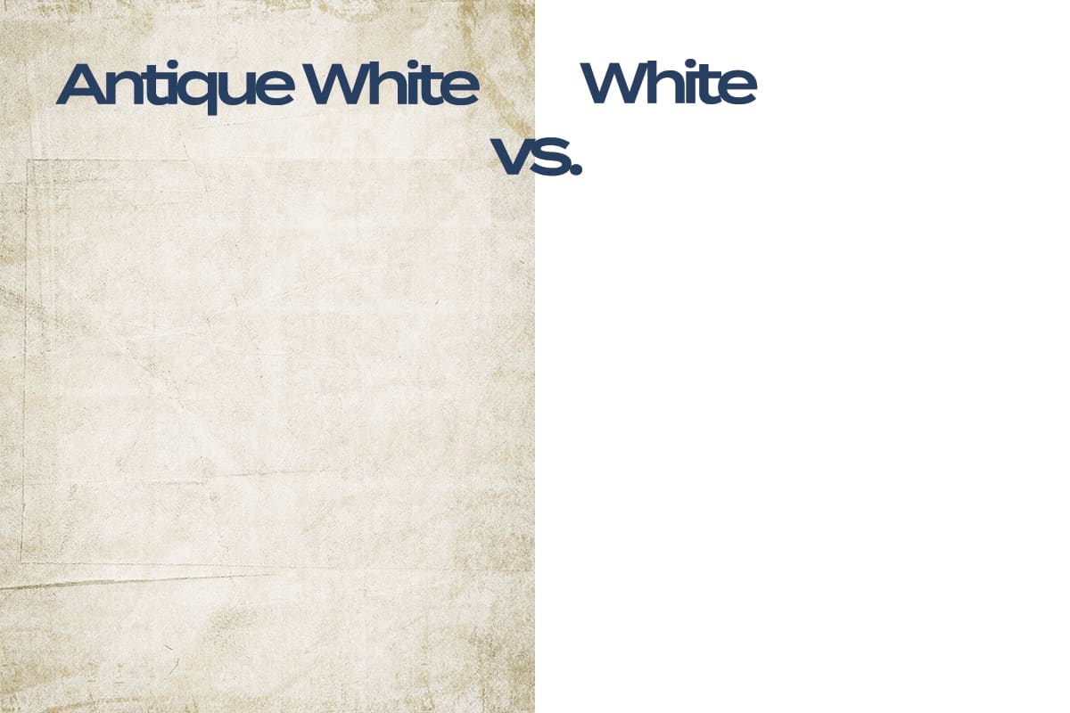
Antique white can be used to highlight the brightness of true white in a color scheme. For example, in a kitchen with antique white walls, white marble countertops, and white cabinets will appear to be even more pristine by comparison. This can help to make the kitchen feel fresh and clean, while the antique white on the walls adds warmth and a sense of happiness.
Best Antique White Paints
Antique White by Behr
The natural shade of off-white has a pale sandy tone. It will look more beige in low lighting, and more creamy in bright light.
Antique White by Sherwin Williams
This is a darker antique white that borders on milky beige. It works well on walls in both bright and low lighting, and has an especially classic feel when complimented with alabaster trim.
Antique White by Glidden

This is a muted shade of antique white with very subtle gray undertones. It is predominantly warm, but the hint of coolness means it looks great next to both beige and gray.