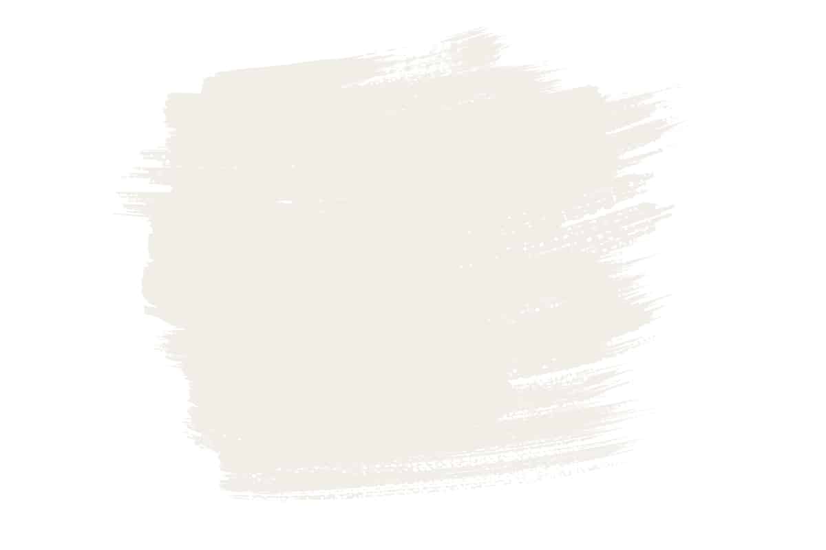
Almond is a natural neutral based on the pale color of these edible nuts. Here we explore everything about the color of almonds, looking at the best colors to use alongside it and the meaning of this color.
Table of Contents
What Color is Almond?
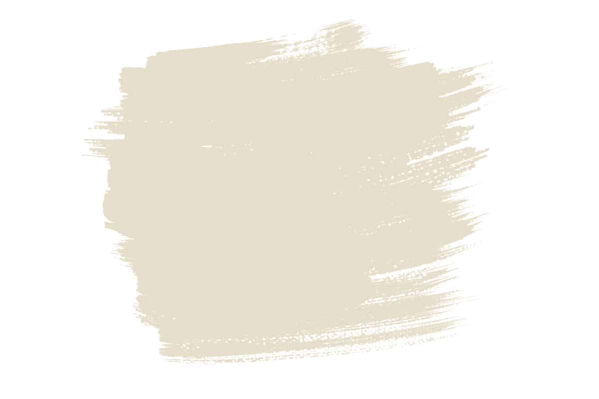
The color almond is a classic neutral that is a very pale shade of tan. It often gets confused with beige, but beige is considerably warmer than almond. Almond has a very subtle pink tone which ensures that it reads as marginally cooler and slightly more modern than beige.
It can also be compared to ivory, though ivory is significantly lighter and arguably a little bland compared with almonds. Almond is enormously popular in interior design as a fresh alternative to beige or magnolia. It can look crisp yet welcoming, balancing the need in modern homes for a color that is comforting to spend time around without creating a dated or drab energy.
Almond also comes in many varieties since it is based on the almond nut, which itself comes in many varieties with slight variations in color between each type of nut. The color of almonds can range from off-white to light tan.
The Meaning of Almond Color
The color of almond is associated with neutrality, tranquility, peace, sophistication, and class. It has a gently warming tone that creates a sense of comfort and ease when used in a room, and yet it is subtle enough that the warmth is not obvious, and it could easily be mistaken for white. The ability of almond to fade into the background while instilling a sense of peace in a room is a special quality that can be put to good use in a variety of ways.
As a distinctly neutral color, almond doesn’t bring about any strong feelings, and as such it is a great color to use in common areas of a home, in workspaces, or in renovations to appeal to a broad scope of people. The color of almond is inoffensive and easy to be around, so it’s a good choice if you’re struggling to choose a paint for a room or you don’t want to put a lot of thought into a color scheme.
Despite being a shade of beige, almond is not a color that would be associated with outdated styles in the same way that beige is. It has a soothing yet contemporary vibe, and it can look relaxing or formal depending on the type of colors you pair it with and the style of accessories you use. It is a color that oozes sophistication without being loud or drawing attention to itself.
Similar Colors to Almond
Bone
Bone is a natural neutral and warm off-white. It has very subtle yellow tones and is based on the color of animal skeletons. This is a really relaxing and soothing color that has similar properties to almonds, though is slightly paler. Bone and almond are actually two shades that go really well together in a neutral palette for a casual and comfortable home decor style. Opt for walls in bone paint and furnishings in almond tones, with rattan accessories and woven hangings on the walls.
Tan
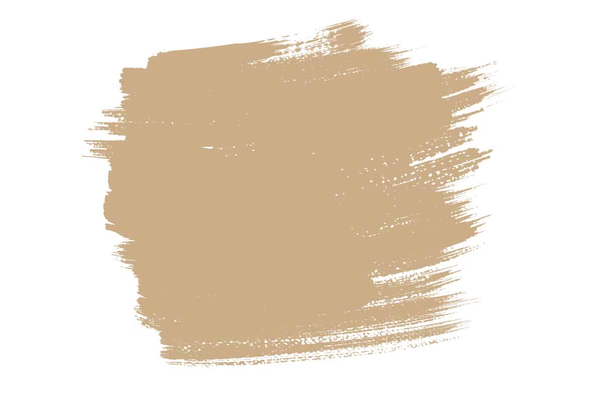
Tan is a deeper and darker shade than almond, but it runs in the same tone family. Almond can be considered as a light version of tan, with a heavier amount of white added to the mix. Tan is a warm color that can make a space feel cozy and comfortable without making it too dark, and it can be highlighted with almond accents.
Once again, these two colors work really well together in a neutral color palette, especially when layered for a sense of depth. Choose a tan leather sofa and layer this up with almond throw blankets and a selection of throw cushions in various neutral tones, such as almond, bone, ivory, and white.
Cappuccino

Cappuccino is very similar to almond in terms of shade and tone, but it is marginally richer. It is more distinctly warming than almond, featuring slightly more brown in the mix. Cappuccino paint used across a whole room can create a neutral, welcoming vibe, without making it feel dated or dark.
It is also a color that can be put to good use on soft furnishings since it is neutral enough that it will work with a wide range of color schemes and won’t look out of date and need replacing any time soon.
What Color Goes with Almond?
Almond is a beautiful neutral color that can be successfully paired with almost any color you can imagine. If you struggle to conceptualize color palettes for home decor, then using almonds is always a safe bet.
It will look classic in any setting and is easy to live with, creating a comfortable and inviting atmosphere. Almond will be a great addition to any color palette, but there are some colors in particular that can really help to set it off. These colors include black, white, brown, and green.
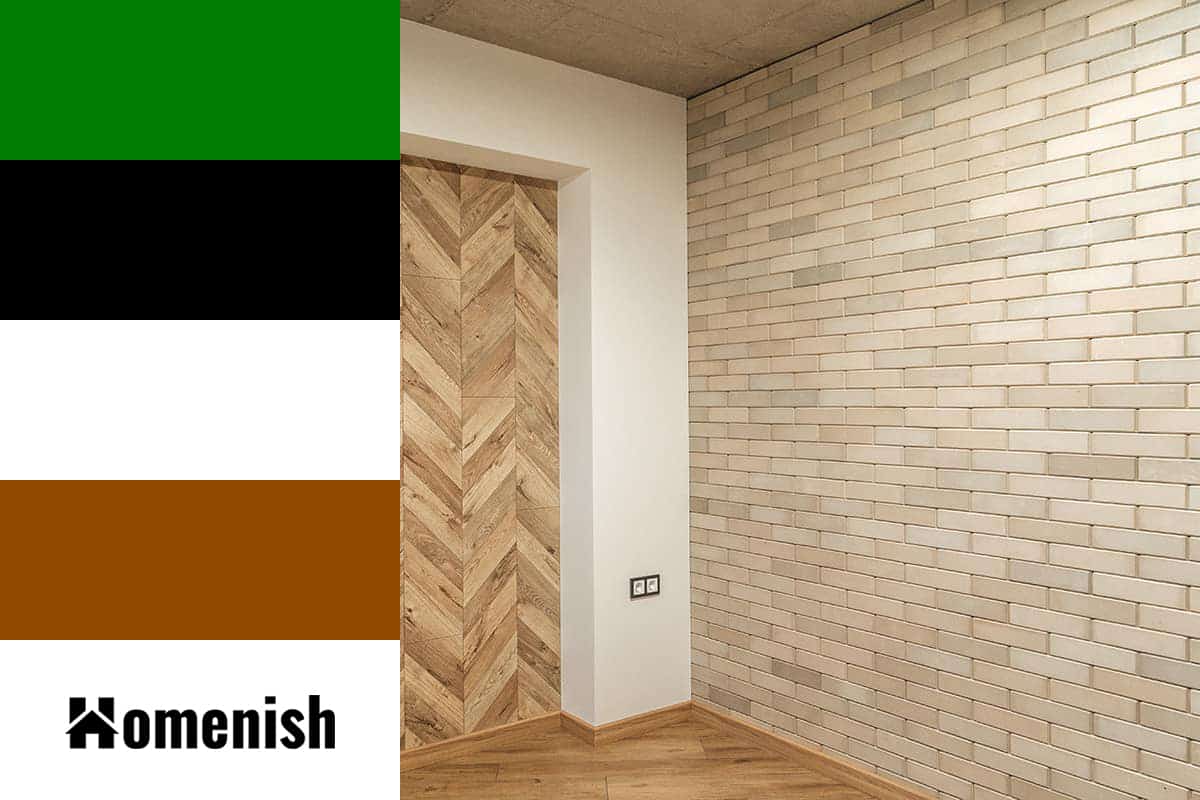
Black
| Shade | Hex Code | CMYK Color Code (%) | RGB Color Code | Color |
| Almond | #e7d2be | cmyk(0%, 9%, 18%, 9%) | rgb(231, 210, 190) | |
| Black | #000000 | cmyk(0%, 0%, 0%, 100%) | rgb(0, 0, 0) |
If you want a room with a classy, sophisticated vibe, then almond and black will achieve exactly that. Use almond as your main shade, as a paint on the walls, and also for key furnishings such as a sofa and rug. Use black as a dark accent against the softness of the almond, and to draw attention to features in the room.
For example, paint the window frames in black to make the view a focal point, or paint the fireplace in black if this is a key feature in the space. Other ways to bring black to the room include using soft furnishings such as cushions and curtains, or smaller accessories such as photo frames and candle holders. Aim to use black in around ten percent of the room for a high-end, exclusive style, or bump this up to around 30 percent for a more swanky edge.
White
| Shade | Hex Code | CMYK Color Code (%) | RGB Color Code | Color |
| Almond | #e7d2be | cmyk(0%, 9%, 18%, 9%) | rgb(231, 210, 190) | |
| White | #ffffff | cmyk(0%, 0%, 0%, 0%) | rgb(255, 255, 255) |
Neutral color palettes are very on trend right now, and you can achieve this look quite easily with limited knowledge in interior design. Start with an almond base on the walls, and add in a selection of white and off-white elements to create depth and a layered tonal effect.
Avoid using any bright or bold colors to keep the look fairly simplistic, and this will also allow for greater definition between the shades of white and beige. You can also use white with almond to make almond appear more interesting, since almond will take on a darker look comparatively next to the starkness of white.
Brown
| Shade | Hex Code | CMYK Color Code (%) | RGB Color Code | Color |
| Almond | #e7d2be | cmyk(0%, 9%, 18%, 9%) | rgb(231, 210, 190) | |
| Brown | #914900 | cmyk(0%, 50%, 100%, 43%) | rgb(145, 73, 0) |
Brown comes in many variations, and any tone of brown will work with almond because these are both warming, neutral colors that belong to the same color family. However, a light to medium chestnut brown is particularly striking with almond, in sophisticated interior decor styles, or those based on a mid-century modern look.
Opt for almond colored walls and wooden furniture stained in chestnut brown. Darker browns can also look great alongside almond, creating a contrast of light and dark that is vivid and interesting without being too stark.
Green
| Shade | Hex Code | CMYK Color Code (%) | RGB Color Code | Color |
| Almond | #e7d2be | cmyk(0%, 9%, 18%, 9%) | rgb(231, 210, 190) | |
| Green | #007c00 | cmyk(100%, 0%, 100%, 51%) | rgb(0, 124, 0) |
Almond has a subtle warming effect, which can be balanced out with a cool, fresh green. Green is a cool color, but there are variations of green that contain a higher proportion of yellow, and this gives them a more vibrant, lively look, with a hint of warmth. Apple green, pear green, lime green, and chartreuse are all bright and fresh shades of green that will create an energetic atmosphere in a space when used alongside almonds.
Using a fresh green will lift the almond and bring a sense of spring, or new beginnings to a color palette. Use almond paint on the walls, with fresh green accents such as lamp shades, curtains, and houseplants. You could also add gold or brass touches to the space to bring about an exotic, luxurious vibe.
Best Almond Paint Colors
Natural Wicker by Benjamin Moore
This paint color is described by Danielle Rollins of Danielle Rollins Interiors as ‘the color of a Marcona almond’. She goes on to say, “It’s not too white, too yellow, or too blah, and it looks great with anything, but my favorite way to use it is paired with leafy green or the glossiest chocolate brown.” This is a really soft almond shade that brings the slightest warmth to a space while still maintaining a very neutral look.
Almond Milk by Valspar
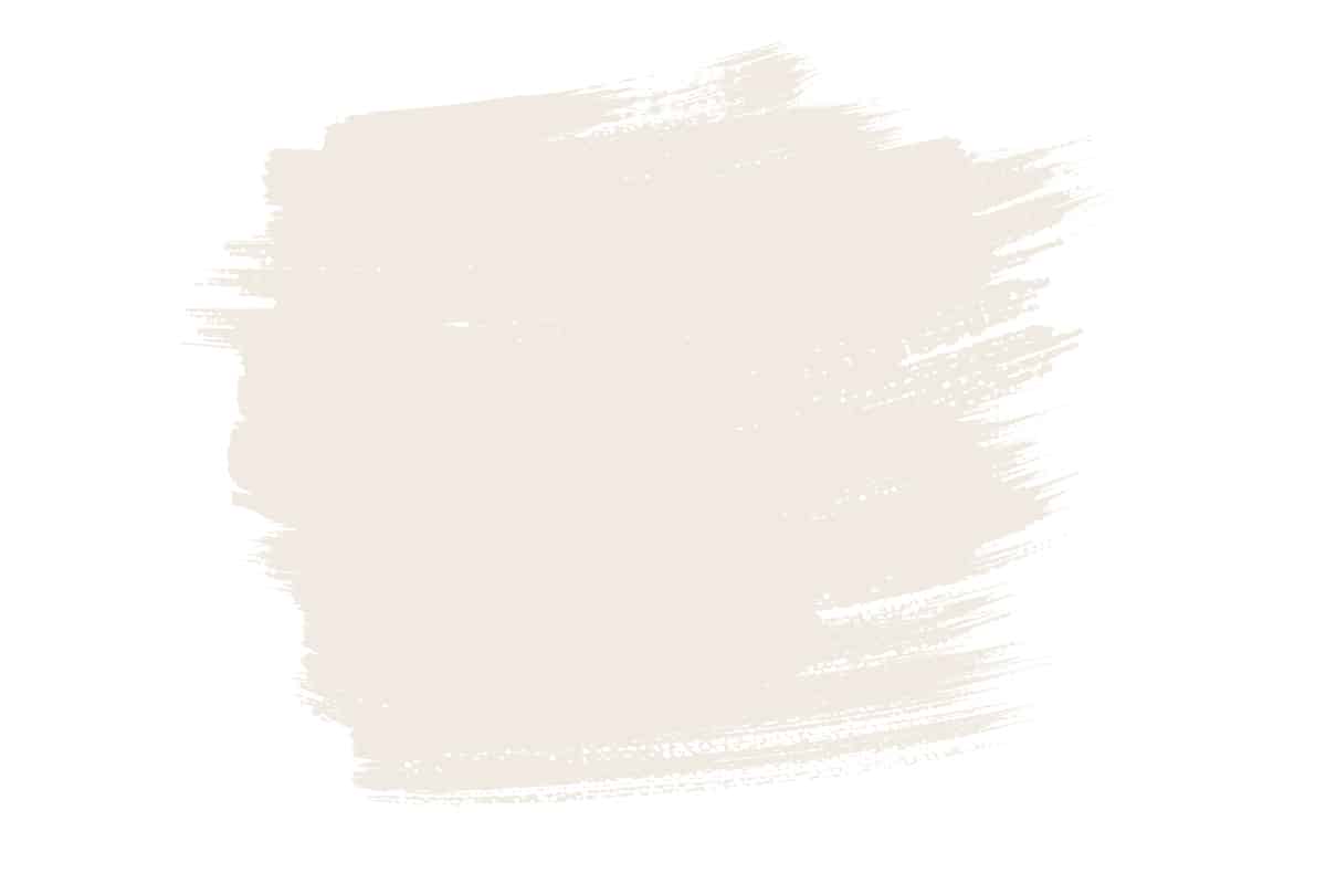
This paint color is based on the color of almond milk , and has a very light and soft milky hue. It is among the palest of all almond shades, and will read quite differently depending on the light source. Use it in warm, well lit rooms for a bright and fresh feel.
Dimity by Farrow & Ball
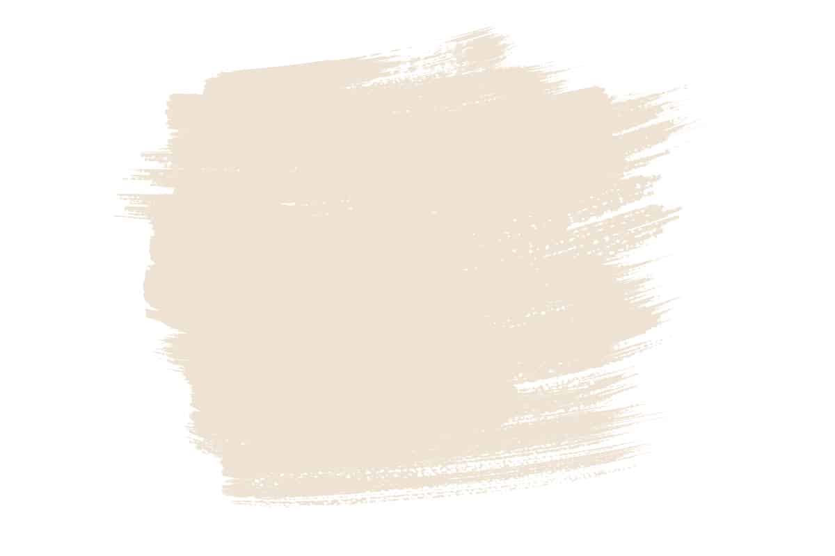
Dimity is described by Farrow & Ball as ‘elegant and understated’, which is a perfect explanation for the style that this painting conveys. It is a true almond shade with a subtle warmth that feels comforting yet contemporary.