Your bed is your sanctuary, which means it needs to be superbly comfortable and unapologetically you. It is not hard to imbue your personality into your bed, although if you are a décor addict, you can very easily spend countless hours comparing color and fabric combinations.
True to our style of dealing with one aspect at a time, we are about to delve deep into bedding colors. While the quality of materials will provide comfort and warmth, bedding colors will still be responsible for tying the whole room together.
Your final choice of bedding colors will be one of the last details to choose from, but it will make your room appear well-thought-out, rather than a dorm room hastily furnished with whatever is on sale. And you can achieve this without leaving the discount section!
Table of Contents
6 Best Bedding Colors
Thanks to online retailers and their endless, remote catalogs, bedding colors now come in a wider variety than ever before. Just a few years ago, there was a good chance that the kind of cotton or thread count you were after simply did not exist in your favorite color. Nowadays, most sheet sets and comforters are available in at least a dozen varieties.
The best way to avoid drowning amidst all this variety is to have a clear idea from the get-go about what you are looking for.
Light Colors
Light bedding colors are often the preferred option for people living in hot climates. Cream-like or white sheets tend to look very well in light fabrics such as linen. Light colors tend to feel more delicate and often evoke the kind of minimalistic luxury of a hotel room.
This palette includes anything from completely white to light browns, greens, blues, and pinks. Patterns and patchwork designs that use light colors will usually be more discreet and will try to blend in rather than clash.
Dark Colors
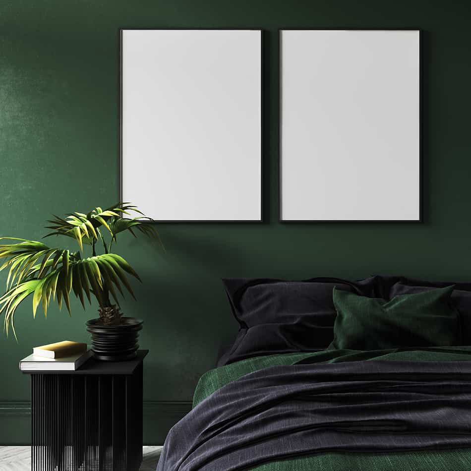
Many years ago, moms used to joke about how dark bedding looks cleaner for longer. This is not strictly true: quite to the contrary, very dark colors are often quicker to betray an accidental spill than a neutral cream or beige.
Conversely, there are many advantages to dark-colored sheets. Whether you are going for a solid deep blue, a vivid red, or even satin black, dark sheets tend to look powerful. Depending on how your room is decorated, dark sheets can be a statement choice (such as in a gothic-inspired or very masculine room). Dark bedding accents tend to look great alongside geometric shapes and straight lines.
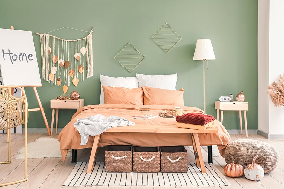
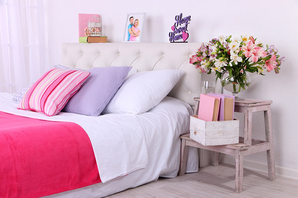
Pastels
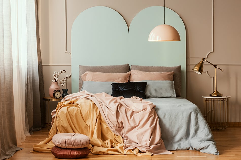
This is a favorite choice for boho-inspired bedrooms or those decorated with green palettes or flower motifs. There is a unique childlike innocence to pastels that usually translates to feminine styles. However, some ethnic-inspired styles can also be balanced by softer pastel sheets or accents.
One of the advantages of pastel colors is that they immediately feel cozy. These are the colors that come to mind when entering a hidden bed and breakfast during a stormy winter night.
Neons
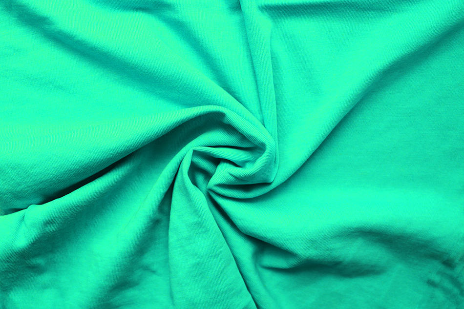
Completely neon beddings remain relatively rare, as very bright colors are usually considered stimulating rather than relaxing. Because of this, you are more likely to find them as accents rather than full sheet sets.
Neons can provide a dash of flavor to an otherwise somber dark set. For example, you can throw bright oranges, and lime green throw pillows on black sheets. The result will be a very charged, youthful look on an ensemble that would otherwise look too serious.
Animal Prints

Animal prints are not as popular nowadays as they were during the 1970s. However, alongside faux-camo, they remain a great choice for those who are eager to show that they don’t take themselves too seriously.
In this category, we need to distinguish “true” animal prints, in which leopard or tabby-like stripes follow the color combinations that they would in nature from their fantastic counterparts. For example, purple and black leopard fabric is often showcased in boudoir photography, as they are simultaneously naughty and decadent.
Patterned Sheets
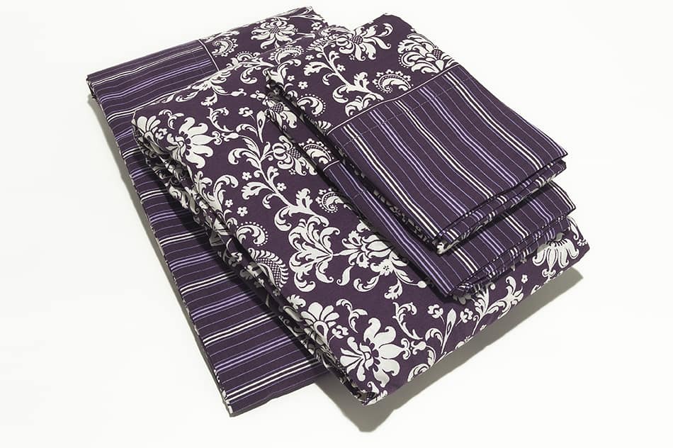
This is a surprisingly wide category, as it encompasses many unique designs alongside ubiquitous tartan-inspired sets. To choose the appropriate set of patterned bedding, you will want to take into account the fabric’s texture and the color combination used. Ideally, if your bedding has two or three different colors, at least one of them should be part of the room’s overall décor.
Popular pairings include:
- Leaf green and creams
- Victorian cream and gold
- Sea blue and grey
- Black and crimson red
- Orange and mustard yellow
- Teal and light blue
Once you have already chosen a general theme or direction to follow, it is time to experiment. This will allow you to find the perfect colors for your bedding.
How to Choose the Best Color for Bedding
Returns and refunds are not a pleasant procedure, and return shipping fees can add up very easily. Skip the trouble and the “trial and error” when choosing your sheets and blankets: follow this logical method to ensure you get the right color the first time around.
Create a Mood Board or Palette
Whenever you first start decorating a new room, you should start with a mood and a basic palette. This is as true for kitchens as it is for bedrooms, although they may not be as obvious in the latter case.
Your starting point should always be the kind of mood or sensation that you wish to experience every time you walk into the room. This will be the basis for the colors and styles for any furniture, art, or accents within that room. Anything you add should then be chosen, thinking about enhancing this mood or balancing another detail that is leading the room’s mood astray.
Choose Three Main Colors
To bring the room’s mood to fruition, you should choose no more than three or four complementary colors. Think of these as the predetermined palettes that Office themes showcase: they don’t need to be similar, but they should go well together.
A good rule for a three-color palette is to choose two complementary colors and add a supplementary one. What does this mean? Essentially, it means that in a standard color wheel, you want two colors that are adjacent to each other, plus one that is directly opposite.
On the other hand, if you want a four-color palette, you can get started with the same principle. Then, choose a fourth color that is very similar to one of the other colors – for example, a lighter shade of Victorian green or blue.
Explore Items and Furnishings
Once you have a mood and a palette, you will have something to get you started on your search for items. Nowadays, one of the best places to look for décor ideas is Pinterest. Simply enter the overall décor style (such as “English Rose Garden,” “Japanese-inspired,” or “Country”) into the search bar, followed by one or two colors in your chosen palette.
You are bound to find dozens of beautiful options that follow your favorite guidelines.
Fill Up the Room
As we said before, beddings are usually one of the last things chosen in a bedroom. Most people tend to choose heavier, more expensive elements such as curtains or furniture first. This makes sense, as they will also be harder to replace.
Choose Materials First
Once you are ready to come back to the bed and its details, it is best to ensure your bedding is functional. Most models come in a variety of colors, so focus on finding the perfect material and warmth rating first.
Depending on your lifestyle, you may need to privilege something easy to wash or that wicks moisture away. Alternatively, you may be chasing the luxurious feel of sinking in a down comforter instead.
Start Shopping!
If your favorite décor style favors patterned bedding, ensure that this pattern uses at least two of the colors in your palette. More complex tartans or flower motifs can have dozens of different colors, so focus on two of the predominant ones.
Then, use the third (or fourth) color in your palette to add accents around the bed. This can be something as minimal as the trimming around the comforter or the fringes on some eye-catching pillows.
If you are leaning towards solid-colored sheets, you may need to leave one of your main palette colors out. However, depending on your local weather conditions, you may still get a chance to include it later on by adding a contrasting throw blanket.
If you absolutely must leave one of these colors out of your bed, just add it in any of the accents that are immediately around the bed, such as your bedtime lamp or night table. In this way, this part of the room won’t feel like it was tacked onto the room at the last minute. Alternatively, you can use this color to paint one of the walls opposite the bed.
Beddings may be easy to replace or switch around, but they should still look harmonious with the rest of the room. Follow the steps we provided above, and take some time to think about what each color represents.
In this way, you will have a beautiful themed bedroom that looks like the work of a professional decorator. Most importantly, the bedroom will be truly the work of your mind and, therefore, the place where your mind feels at rest!