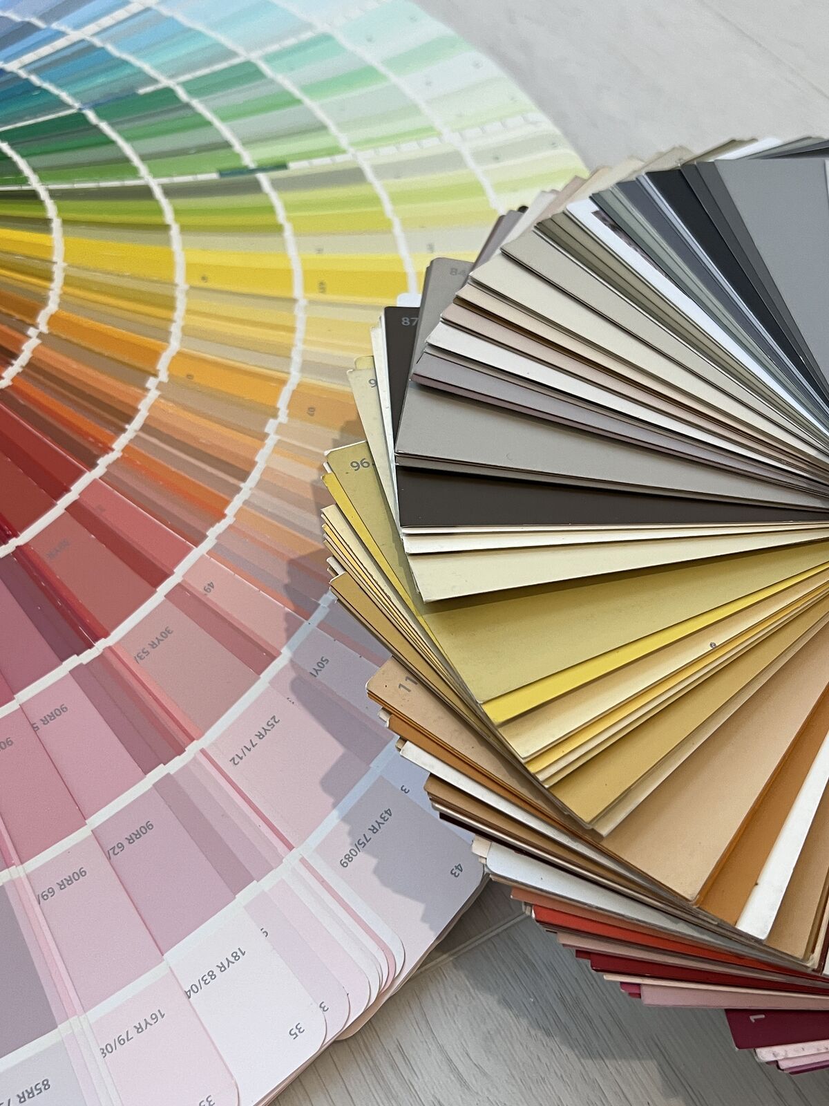
Benjamin Moore Webster Green, Sherwin-Williams Celery and Behr Grounded lead the 2027 color conversation with distinctly different greens. Each paint brand and color forecaster names its own Color of the Year, while Pantone reveals its selection in December.
Nature-inspired greens, muted blues and warm earth tones connect many of the announcements. Their undertones separate them: yellow-green reads differently beside oak than mossy olive, and a smoky blue changes against cream trim. Below, you’ll find every major pick with its code, the shades it pairs with and the rooms where it shines.
Table of Contents
What Is the Color of the Year for 2027?
There is no single Color of the Year for 2027. Each paint brand and forecaster names its own, and the picks so far lean toward herbal greens, smoky blues and earthy neutrals. Pantone has not revealed its choice yet.
| Brand | 2027 Color of the Year | Code | Color Family |
|---|---|---|---|
| Benjamin Moore | Webster Green | HC-130 | Mid-tone classic green |
| Sherwin-Williams | Celery | SW 6421 | Light yellow-green |
| Behr | Grounded | T27-01 | Mossy olive |
| Valspar | Cottage Door | 8004-38E | Grayed mid-tone blue |
| Dulux (UK) | Soulful Sage | — | Pale gray-green |
| Glidden | Artifact | PPG10-16 | Warm smoky blue |
| Dutch Boy | Deep Rooted | 311-7DB | Earthy terracotta orange |
| Dunn-Edwards | French Press Coffee | DEBN07 | Deep plum-brown |
| Graham & Brown | Rose Earth | — | Earthy clay pink |
| PPG (industrial coatings) | Country Soil | — | Beige-taupe-brown neutral |
| WGSN and Coloro | Luminous Blue | 125-28-38 | Vivid forecast blue |
| Minwax | Pickled Oak | — | Light warm wood stain |
Has Pantone Announced Its 2027 Color of the Year?
As of November 6, 2026, Pantone has yet to announce its 2027 Color of the Year; its website lists a reveal event in Miami on December 3. Until then, Pantone’s 2026 selection remains Cloud Dancer, PANTONE 11-4201.
Pantone is a color-standards company, and its annual selection expresses a direction in design and culture. Homeowners following the Pantone Color of the Year 2027 announcement should distinguish that forthcoming designation from the paint-brand selections already listed above.
The Biggest Paint Colors of the Year 2027
Green dominates the major paint announcements, though smoky blue, terracotta, deep brown and earthy pink broaden the palette. Differences in undertone determine which selections sit comfortably beside existing finishes.
Benjamin Moore – Webster Green (HC-130)
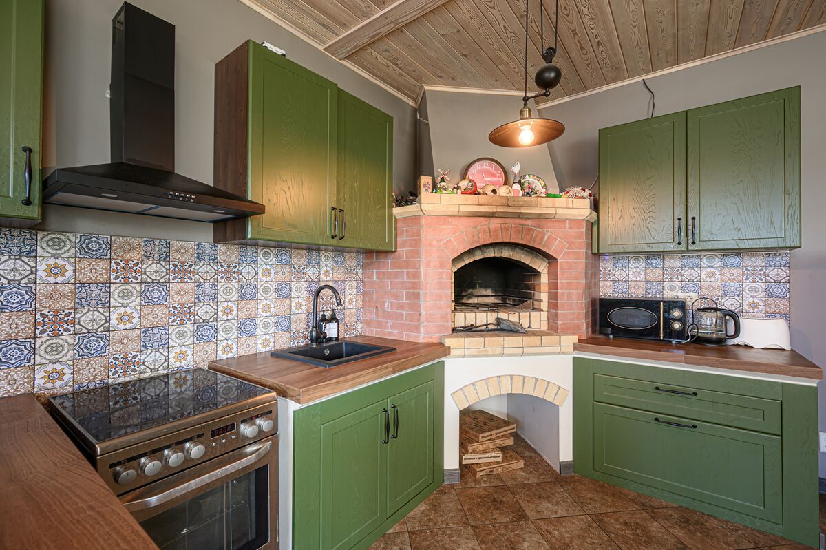
Webster Green HC-130 is a mid-tone classic green from Benjamin Moore’s Historical Collection, balancing blue’s stability with yellow’s warmth. Its depth suits kitchen cabinets and living-room walls, especially where off-white trim defines the edges.
Brass hardware emphasizes the yellow side of the color, while terra cotta introduces a warmer companion without repeating the green. A front door painted Webster Green stands out against a pale facade.
For cabinet projects, a sample placed vertically beside the countertop reveals the relationship more clearly than a small chip resting flat. Existing backsplash colors deserve the same comparison, particularly where their undertones lean cool.
Sherwin-Williams – Celery (SW 6421)
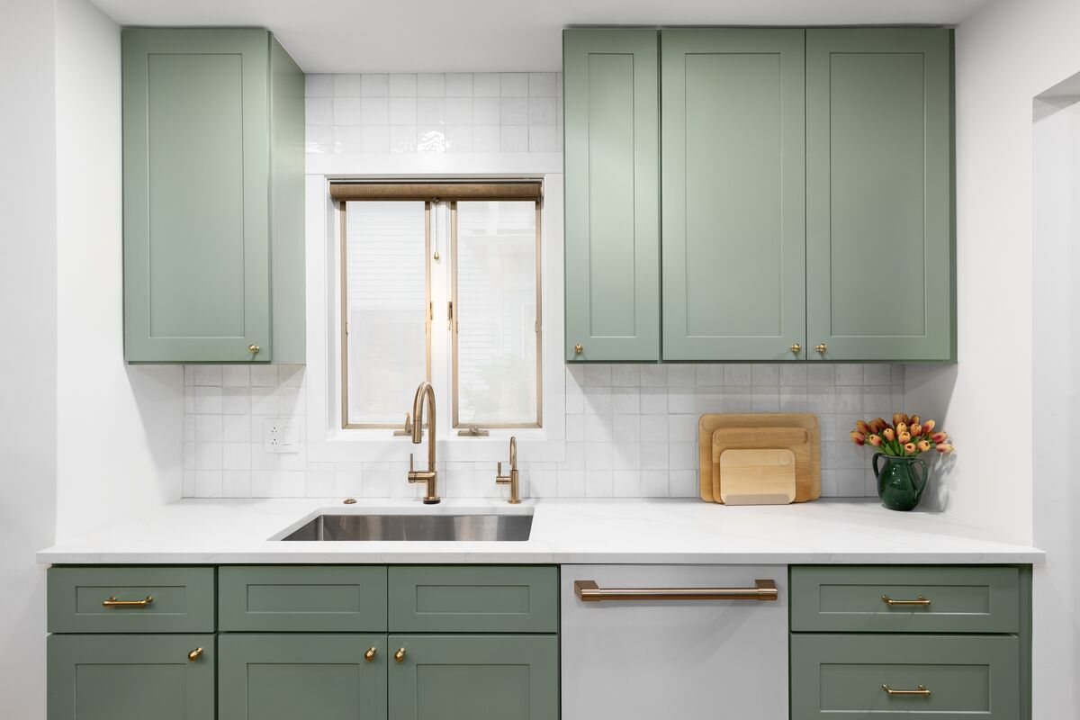
Soft yellow undertones distinguish Sherwin-Williams Celery SW 6421, the light herbal green also selected by HGTV Home by Sherwin-Williams. Its airy color suits kitchens and dining rooms where a deeper green would occupy a larger share of the visual field.
Cream cabinetry supports its yellow undertone; pale oak and muted blue accents keep the palette restrained. In a laundry room, Celery extends the color across broad walls while appliances remain visually separate.
Warm artificial light emphasizes its yellow character. A sample beside white cabinets is especially useful because a cool white and a creamy white establish different relationships with this yellow-green.
Behr – Grounded (T27-01)
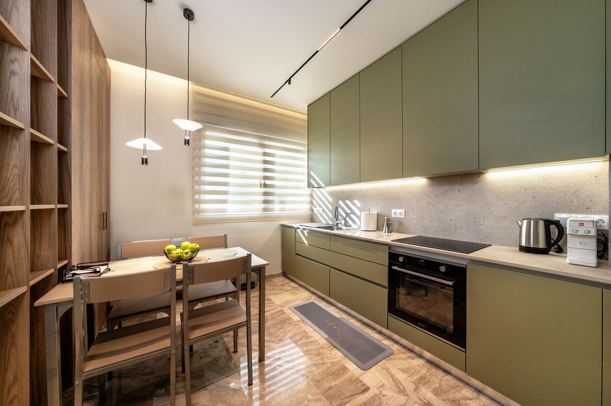
Brown undertones anchor Behr Grounded T27-01, a mossy olive suited to substantial painted surfaces. Kitchen cabinets are a strong application, particularly beside greige walls and clay-colored accessories.
In a dining room, russet upholstery picks up its earthy character without matching the green. Bedrooms also suit Grounded, with lighter bedding separating the wall color from darker furniture.
Its olive direction deserves close attention beside wood flooring. Yellow-toned oak and red-toned wood establish different palettes, so samples belong beside the existing floor as well as at eye level. In dim corners, the brown component becomes an important part of the room’s color balance.
Valspar – Cottage Door (8004-38E)
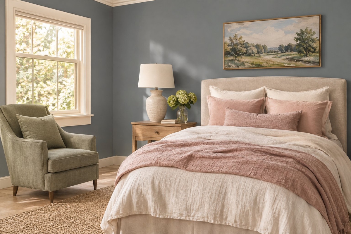
Valspar Cottage Door 8004-38E is a grayed mid-tone blue with warm undertones, described by the brand as trans-seasonal. It suits bedrooms and nurseries where blue needs a softened edge.
Ivory trim preserves that warmth, while creamy pink bedding introduces a gentle contrast. Medium sage is another compatible companion, particularly on an upholstered chair or adjacent painted furniture.
Cottage Door also belongs on the exterior shortlist. Outdoor samples need assessment against roofing and masonry because those large fixed surfaces influence the blue’s appearance. A shaded porch and a sunlit wall should receive separate checks before the color extends across an entire facade.
Dulux – Soulful Sage
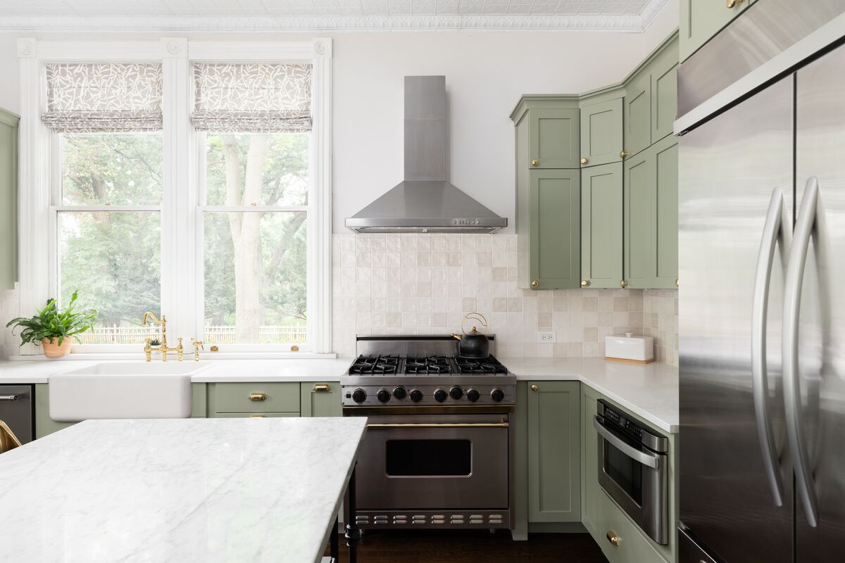
Dulux’s UK selection, Soulful Sage, is a soft, radiant pale gray-green suited to bedrooms and living rooms. The gray component distinguishes it from the more yellow-forward Celery and the deeper Webster Green.
Warm neutrals maintain a restrained palette, while clay-colored accents give it an earthy counterpoint. Cool gray upholstery emphasizes the cooler side of the green.
In a Japandi-style room, pale wood furniture and limited color contrast suit this shade’s lightness. US homeowners should treat the UK designation as market-specific and check the locally supplied product and color identification before specifying it. A similarly named shade from another range should receive its own sample assessment.
Glidden – Artifact (PPG10-16)
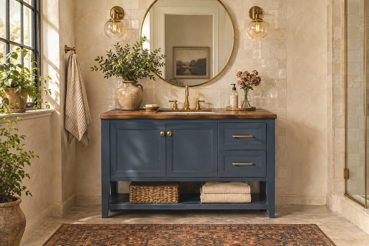
Glidden Artifact PPG10-16 is a warm smoky blue that the brand likens to a favorite pair of blue jeans. Cabinets and built-ins suit its softened color, especially beside warm wood and cream walls.
Brass pulls look especially good against the blue. In a bathroom, the same pairing connects painted cabinetry with metal fixtures without requiring every surface to share one color.
Artifact sits close to Valspar Cottage Door, making side-by-side swatches useful. Their differences deserve assessment under the same light and against the same trim. A screen image is insufficient for deciding how either shade relates to existing tile or cabinetry.
Dutch Boy – Deep Rooted (311-7DB)
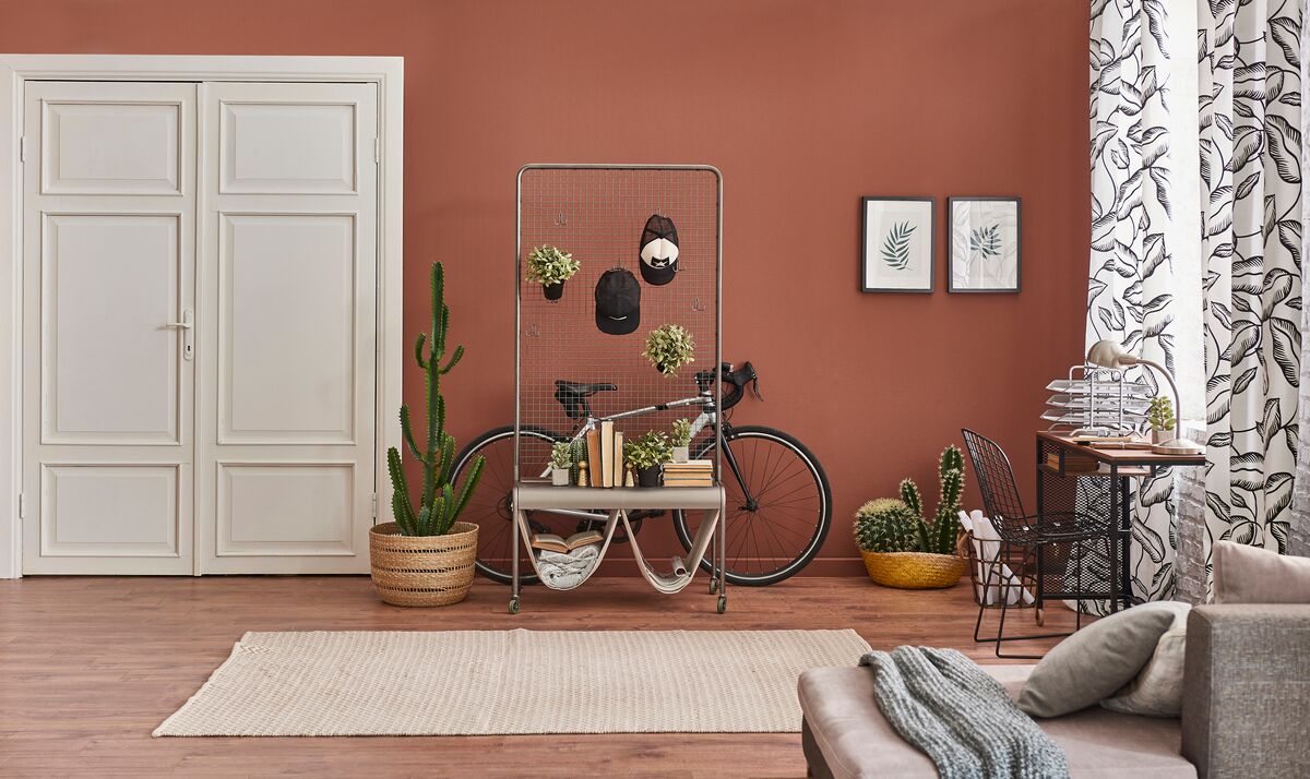
Terracotta orange separates Dutch Boy Deep Rooted 311-7DB from the many greens in the 2027 lineup. Its mid-tone, earthy color suits dining rooms where cream trim and dark furniture provide clear boundaries.
Blue upholstery sets up a complementary contrast, while gold accents reinforce its warm direction. In an entryway, Deep Rooted pairs naturally with a blackish-brown console and a pale floor.
Painted furniture is a smaller-scale application for this comparatively assertive hue. A chest or sideboard introduces terracotta without committing every wall to orange. Adjacent wall colors deserve a sample check because beige with pink undertones behaves differently beside it than a cooler neutral.
Dunn-Edwards – French Press Coffee (DEBN07)
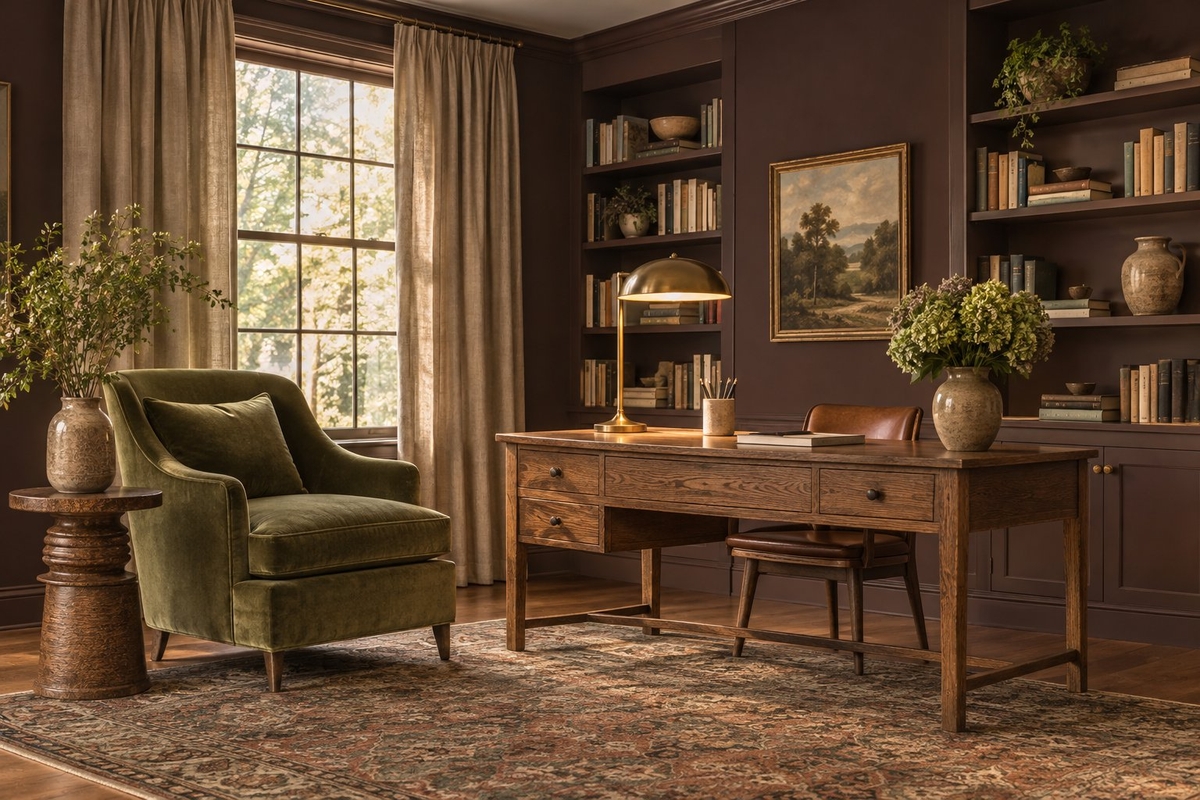
A subtle plum undertone distinguishes Dunn-Edwards French Press Coffee DEBN07 from a straightforward dark brown. Its depth suits studies and dining rooms with enough lighting to reveal the color beyond its darkest areas.
Sage green upholstery gives a muted contrast, while greige trim softens the transition to lighter surfaces. Metallic fixtures stand out clearly against the brown.
A powder room is another suitable application when the lighting reaches the walls evenly. Large samples help expose the plum undertone beside existing stone or tile. Warm wood also pairs with French Press Coffee, though a clear difference in depth helps furniture remain distinct from painted walls.
Graham & Brown – Rose Earth
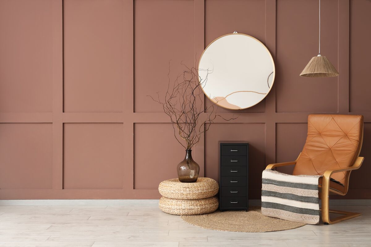
Inspired by Italian clay pigments, Graham & Brown Rose Earth combines warm earthy pink with soft clay and muted brown undertones. Bedrooms and nurseries suit its subdued pink direction, particularly beside cream fabrics.
Walnut furniture anchors the room, while soft muted greens extend the palette beyond pink. These pairings keep the clay influence visible across a room’s larger surfaces.
Bathrooms are another useful setting, with the shade assessed directly against tile and countertop materials. Warm bulbs emphasize its earthy side, so a daylight check remains important. On a feature wall, the adjoining neutral should share enough warmth to avoid an abrupt undertone shift.
Other Notable Colors of the Year 2027
PPG, WGSN and Coloro, and Minwax extend the conversation into industrial finishes, cross-industry forecasting and wood stain. Their selections require different specifications from retail wall paint.
PPG – Country Soil
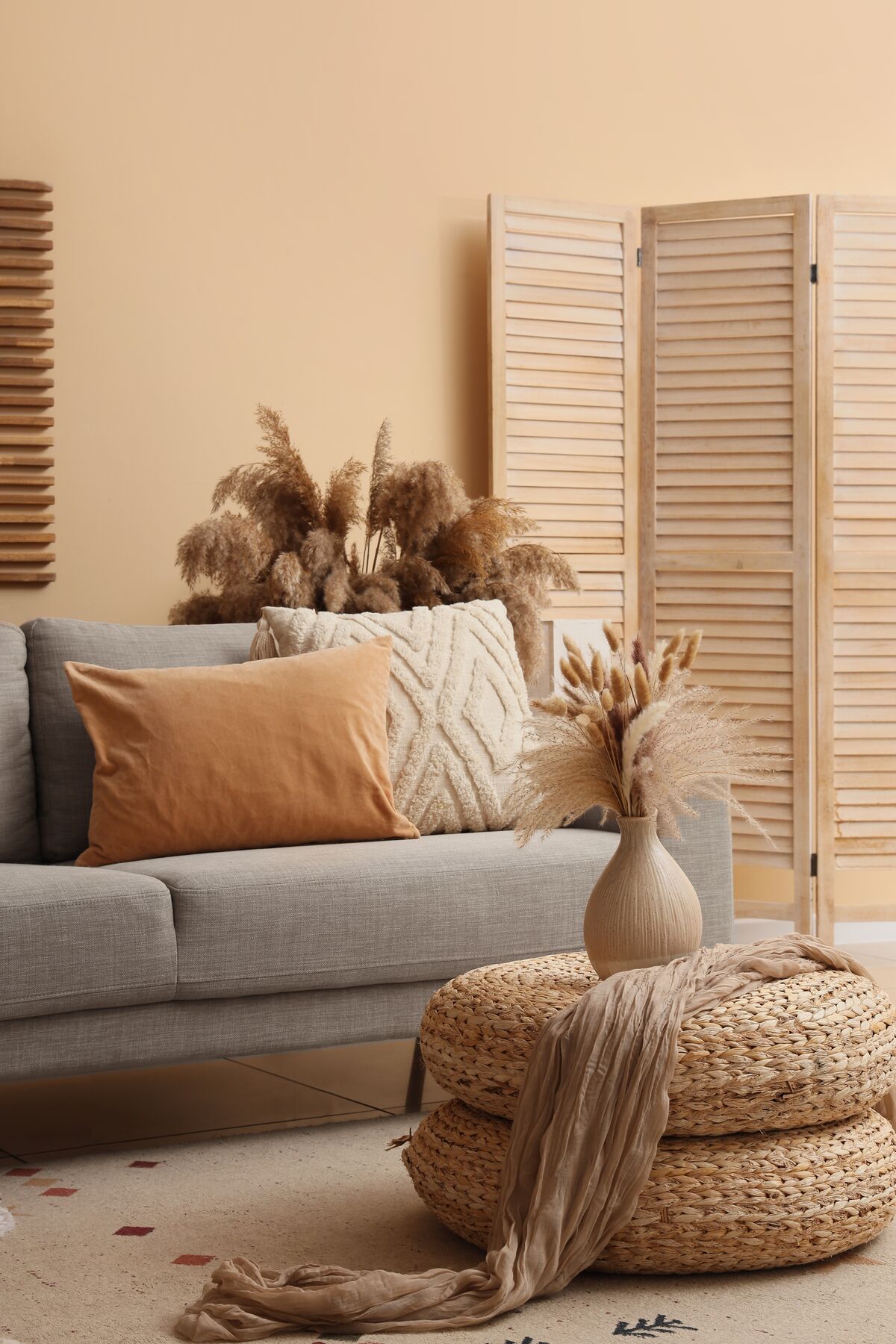
PPG Country Soil, also called Roasted Chestnut, is a medium-depth neutral between beige, taupe and soft brown. PPG’s industrial coatings business announced it on September 30, 2026.
This is a design forecast for product finishes, with no retail wall-paint code. Its relevance to interiors lies in the shift toward richer brown neutrals, including finishes on furnishings and manufactured products. It also gives designers a deeper alternative to pale greige.
WGSN and Coloro – Luminous Blue
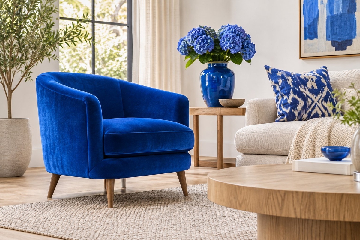
Luminous Blue is WGSN and Coloro’s forecasting color for 2027, announced in April 2025 with Coloro code 125-28-38. They describe it as dynamic, mysterious and eccentric.
The designation covers fashion, beauty and products; it is separate from paint selections and Pantone’s program. For interiors, its vivid direction is most useful as a reference for upholstery or decorative objects, with any wall-paint equivalent assessed through physical samples.
Minwax – Pickled Oak
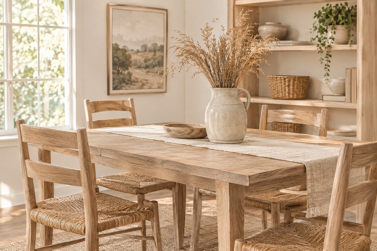
Minwax Pickled Oak is a light, airy neutral wood stain with gentle warm undertones, inspired by white oak and vintage pine. Furniture and cabinetry are relevant applications, along with DIY projects like refinishing a side table or a set of shelves.
The underlying wood remains part of the finished color. Species, sanding and application affect the result, so a sample on matching scrap is more informative than a printed color chip. Flooring applications require a product specifically approved for that use.
What Do the 2027 Colors of the Year Have in Common?
Across the paint color trends for 2027, softened undertones connect the greens, blues and earthy shades. Luminous Blue marks a more vivid direction within the broader forecasting landscape.
Nature-Inspired Greens Take Center Stage
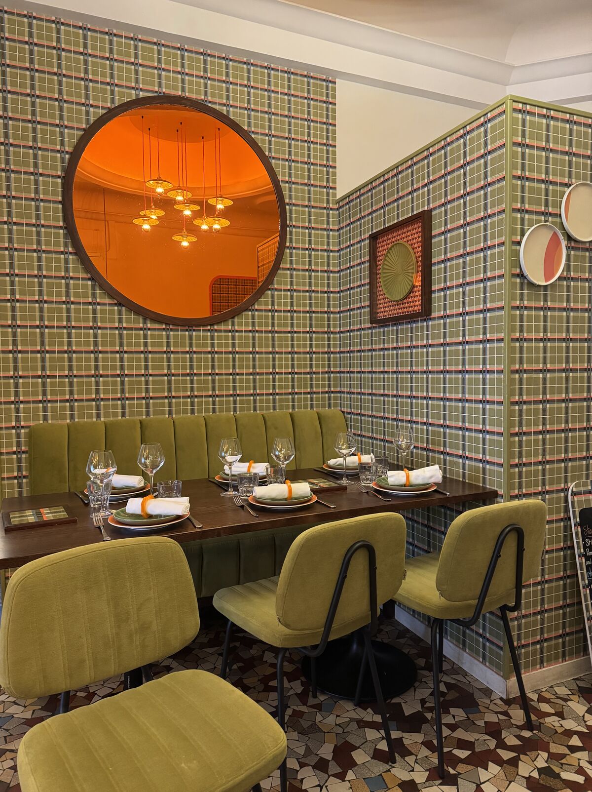
The green selections range from pale gray-green to brown-based olive, with substantial differences in depth. Soulful Sage occupies the light, gray-influenced end, while Celery introduces a clearer yellow undertone.
Webster Green has a mid-tone balance of blue and yellow. Grounded shifts toward mossy olive through its earthy brown base.
These distinctions guide placement. Celery pairs readily with pale cabinetry, while Grounded suits a kitchen planned around clay accents and greige walls. Webster Green’s established depth supports brass hardware and off-white trim.
Warm Earth Tones Keep Gaining Ground
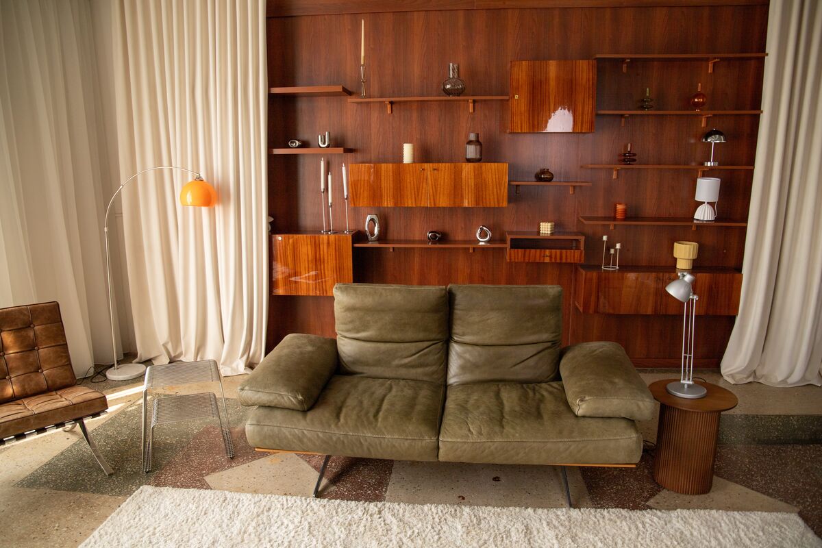
Earthy pink, terracotta and plum-brown broaden the warm side of the 2027 palette. Rose Earth carries muted brown and clay undertones, while Deep Rooted commits more clearly to orange.
French Press Coffee moves into deep brown with a subtle plum cast. PPG Country Soil occupies a quieter middle ground between beige, taupe and soft brown, within its industrial-finish context.
Their applications differ in scale: Rose Earth suits broad bedroom walls, Deep Rooted is effective on an entry chest, and French Press Coffee supports a dark study with layered lighting.
Muted Blues Offer an Alternative
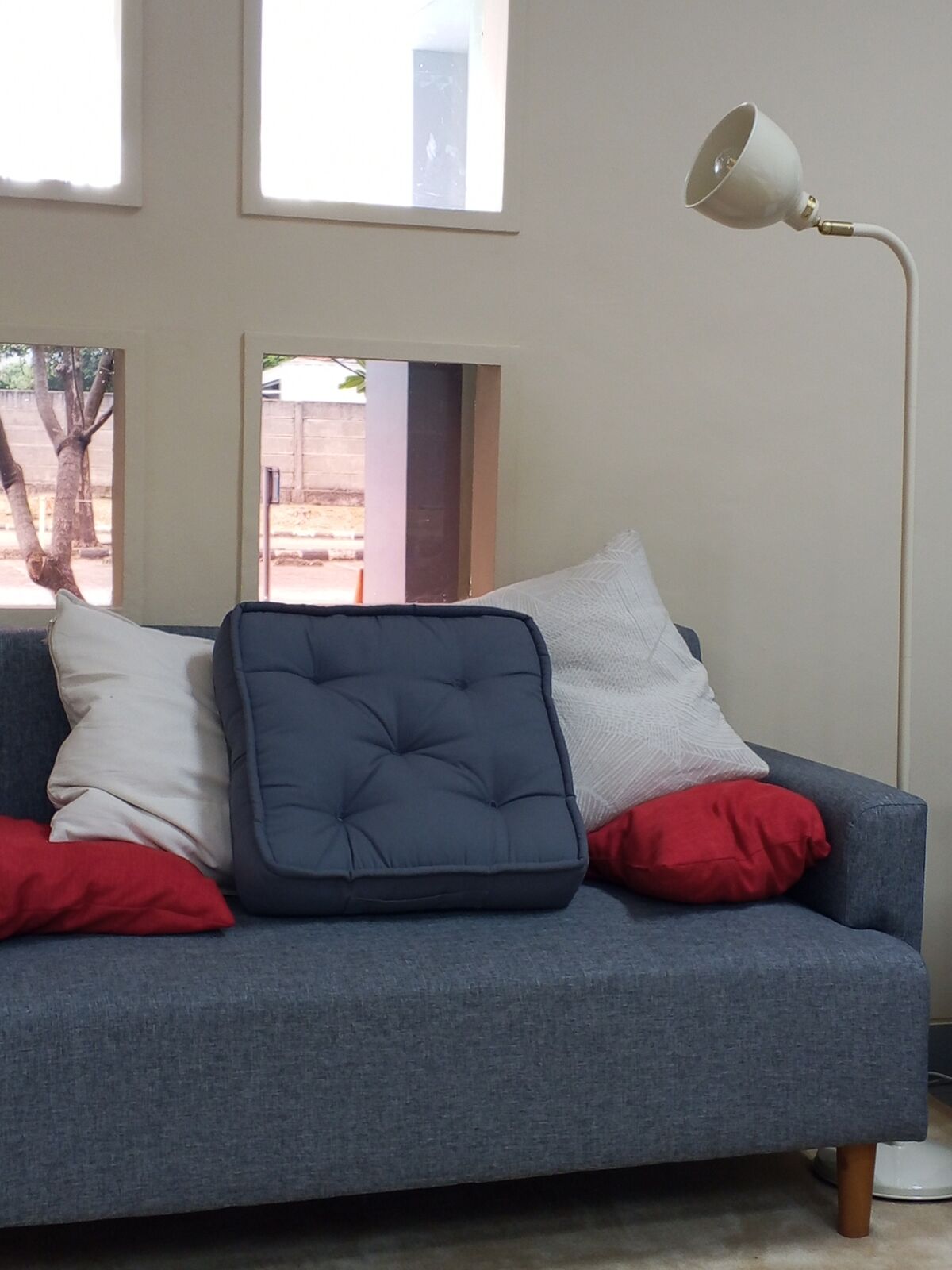
Cottage Door and Artifact share a softened blue direction with warm undertones. Valspar’s choice is a grayed mid-tone blue; Glidden’s selection has the smoky character associated with worn denim.
Both pair with cream and warm wood, making them relevant to homes whose existing finishes already lean warm. Neither deserves an automatic darker-or-lighter ranking without adjacent samples.
Luminous Blue occupies a separate forecasting direction. Its vivid character points toward a stronger accent, while the two paint selections suit larger areas such as cabinetry or bedroom walls.
How to Use the 2027 Colors of the Year in Your Home
Placement starts with the room’s fixed finishes and the amount of surface receiving color. A cabinet door, a full wall and an exterior elevation each expose different relationships between paint, light and surrounding materials.
Living Rooms
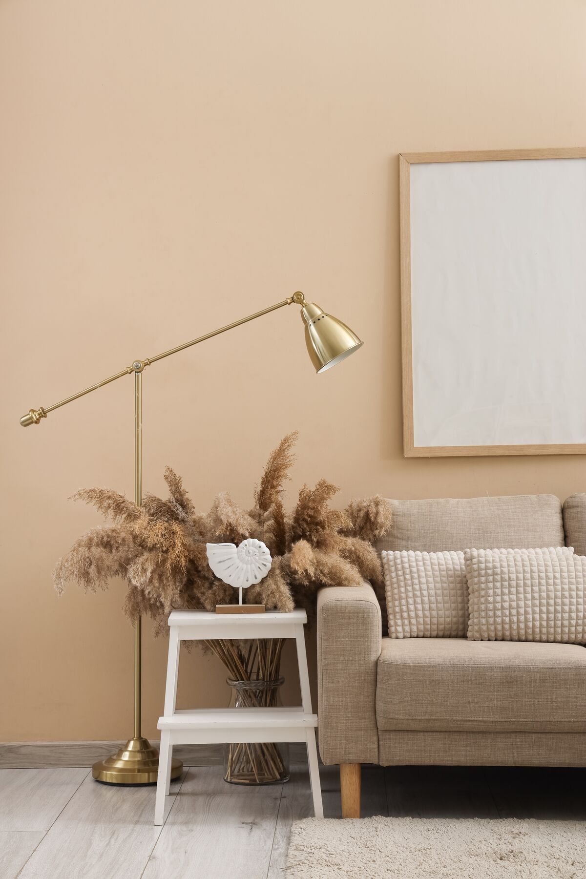
Webster Green suits living rooms with off-white trim and brass accents, while Grounded pairs with clay-colored upholstery and greige adjoining walls. Both are substantial enough to define the main seating area.
For a lighter palette, Soulful Sage sits comfortably beside pale wood and warm neutral fabrics. Daylight from a cool-facing window changes the balance between the green and gray, so check samples in that light.
Place samples near the sofa and flooring. In the evening, assess them under the lamps used daily, including in any shaded corners.
Bedrooms
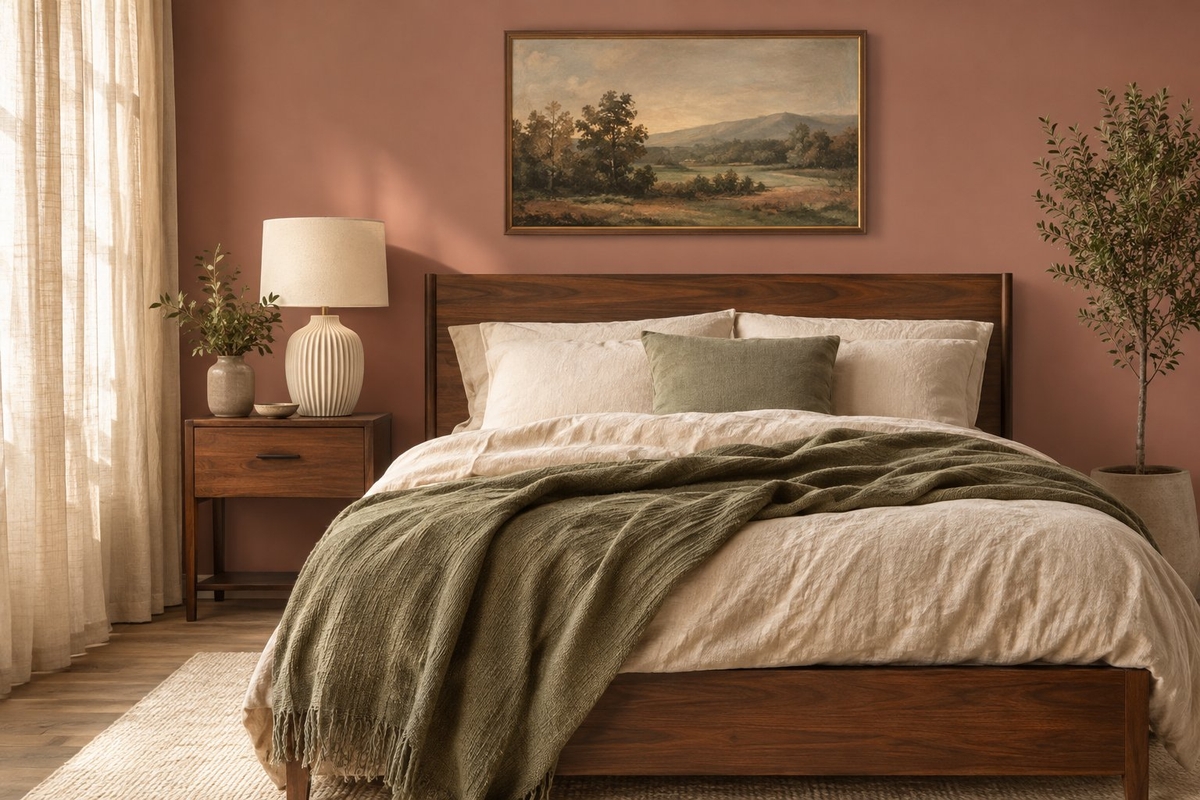
Cottage Door and Rose Earth are strong bedroom candidates, with distinct relationships to bedding and furniture. Ivory linens support Cottage Door’s warm blue undertones; walnut furniture anchors Rose Earth’s clay-pink palette.
Soulful Sage suits bedrooms planned around pale wood and warm neutrals. French Press Coffee supports a much deeper scheme, especially when lighter bedding remains prominent.
Include bedside lamps in sample checks because their light falls close to the wall. Assessing a color solely under a ceiling fixture misses the lighting conditions used before sleep.
Kitchens and Cabinets
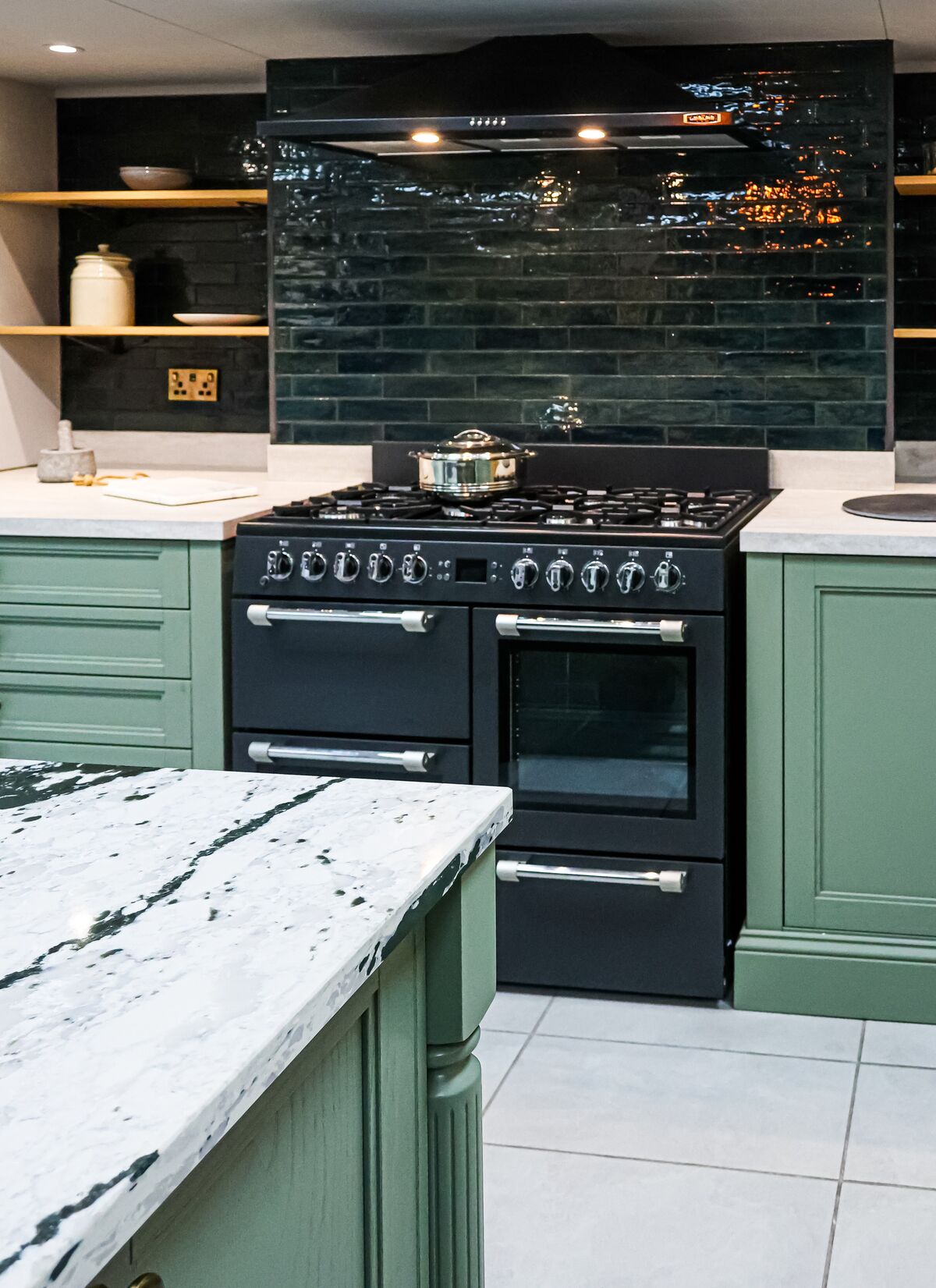
Webster Green, Grounded and Artifact are practical color candidates for kitchen cabinetry because each pairs with established kitchen materials. Webster Green suits brass and off-white, Grounded relates to clay and greige, and Artifact pairs with cream and warm wood.
Place cabinet samples upright beside the backsplash, with the countertop visible in the same view. Check under-cabinet lighting separately because it illuminates nearby surfaces differently from ceiling fixtures.
Celery is a lighter option for kitchen walls. Pay particular attention to its yellow undertones beside creamy cabinets and yellow-toned flooring.
Bathrooms and Small Spaces
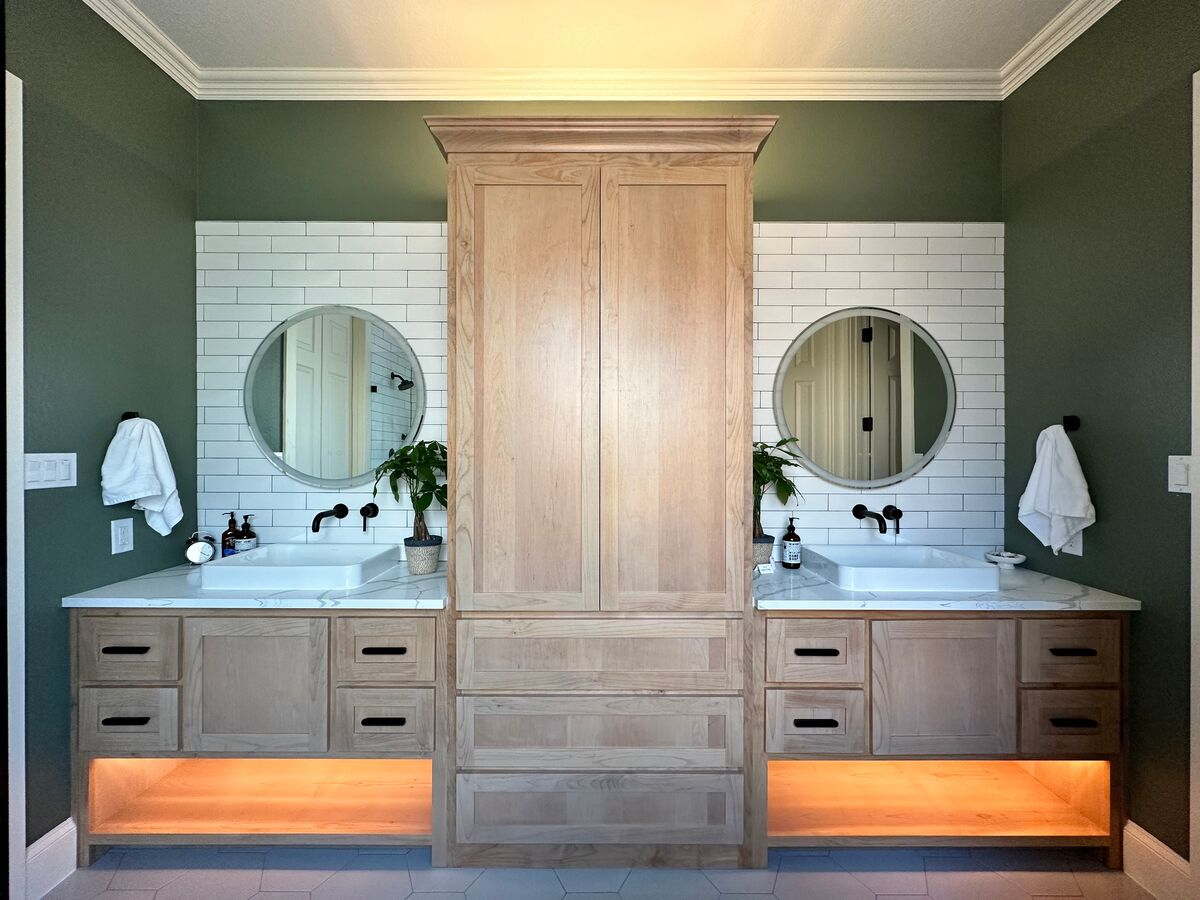
Rose Earth suits bathrooms with cream finishes, while Artifact is a useful candidate for painted vanities beside warm wood or brass. In a powder room, French Press Coffee supports a deliberately deep wall color with well-distributed lighting.
Existing tile sets a strong constraint in these rooms. Pink-beige stone and blue-gray porcelain set very different starting palettes.
Soulful Sage is suitable where a pale gray-green is preferred. Place samples beside both the vanity surface and shower tile, then switch on the vanity lights for an evening assessment.
Front Doors and Exteriors
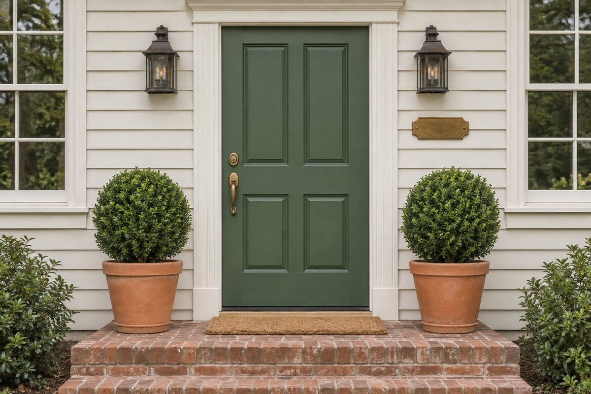
Webster Green is a strong front-door choice, while Cottage Door and Artifact suit broader exterior applications. The green pairs with off-white surroundings; compare the blues against warm masonry and cream trim.
Outdoor daylight changes through the day, and a covered entry receives different illumination from exposed siding. Large sample boards placed in both conditions provide a more useful comparison than a chip viewed indoors.
Confirm that the paint product is approved for the surface and exposure. Door material, existing coating and local weather influence preparation and finish selection.
How to Choose the Right 2027 Color Trend for Your Home
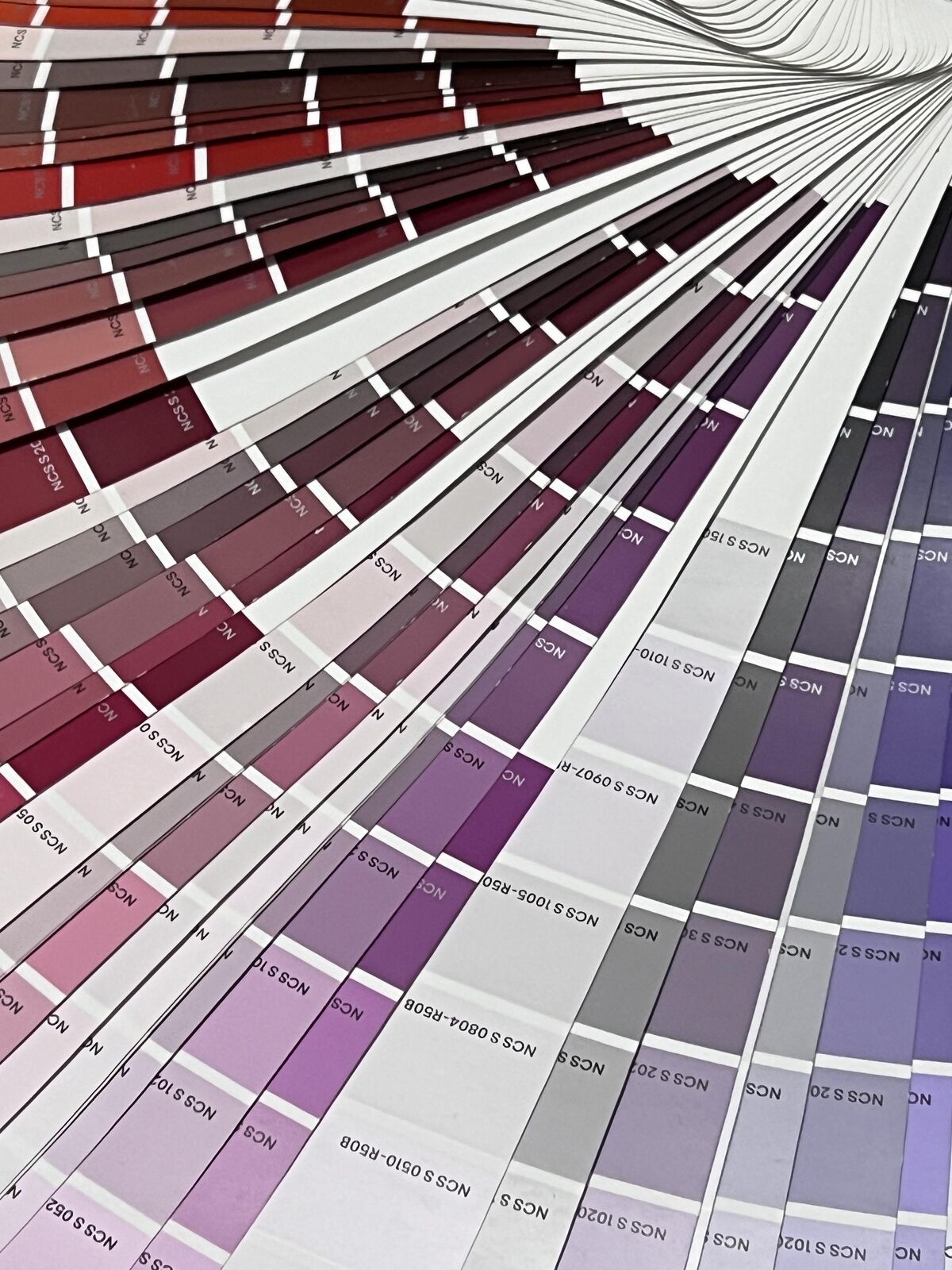
Connect the proposed color with existing materials and everyday lighting.
– Natural and artificial light: Represent both window orientation and bulb color during assessment.
– Existing undertones: Flooring, furniture, countertops and tile are the fixed points to match.
– Paint samples: Large samples viewed in the morning, afternoon and evening reveal shifts that small chips conceal.
– Limited first applications: Furniture or a door provides a smaller commitment before a whole-room repaint.
– Long-term preference: A color that suits the household’s established furnishings has relevance beyond the 2027 trend cycle.
Frequently Asked Questions
The annual announcements raise separate questions about selection authority, color direction and room suitability. Paint names, forecasting codes and stain finishes serve different specification needs.
Is There One Official Color of the Year for 2027?
No. Each organization chooses its own 2027 Color of the Year within its particular program. A paint manufacturer’s designation applies to its branded selection, while Pantone and forecasting organizations operate separate systems.
For decorating specifications, keep the brand name and exact color identifier together so similarly described shades remain distinguishable.
Is Green the Biggest Color Trend for 2027?
Green is the strongest recurring family among the major paint picks listed here, spanning Celery’s yellow-green through Grounded’s mossy olive. This range gives homeowners drawn to green options at several depths.
Blue, terracotta and earthy pink remain substantial alternatives for rooms with different existing finishes.
What Is the Difference Between Pantone and Paint Brands’ Colors of the Year?
Pantone’s selection is a color-standard and cultural design statement, while paint brands select colors associated with their coating ranges. A Pantone designation alone does not specify a wall-paint product or finish.
A decorating specification also needs the chosen manufacturer’s color identification, suitable coating type and sheen for the intended surface.
Which 2027 Color of the Year Is Best for a Small Room?
Celery is a strong starting point for a small room planned around a light palette, particularly with cream and pale oak. Soulful Sage suits a cooler gray-green direction.
For a deliberately dark powder room, French Press Coffee is another option. Assess samples beside the mirror under the room’s installed lighting.