The concept of ugly colors is highly subjective and varies from person to person since beauty is in the eye of the beholder. What one person finds ugly, another may find beautiful.
Color preferences are influenced by culture, personal experiences, and individual tastes, so there is no universally agreed-upon list of ugly colors. However, some colors are often associated with negative emotions or have been deemed less aesthetically pleasing in certain contexts.
For example, colors like vomit green may be considered unattractive or unappealing to some. It’s important to remember though, that whether or not a color is deemed ugly is entirely dependent on an individuals perception.
That being said, if you are decorating a home for resale, or you want to paint a room that will appeal to a rental market, then it’s wise to avoid so-called ‘ugly colors’, and instead opt for something more universally appealing. Here we explore some of the colors that have a reputation as being ugly.
Table of Contents
Ugly Colors in Home Decor
In interior design, the perception of ‘ugly’ colors can vary widely. However, there are colors that are less commonly used in interior design due to their potential to be overwhelming, offensive, or difficult to work with. Some of these colors include:
Neons and Fluorescents
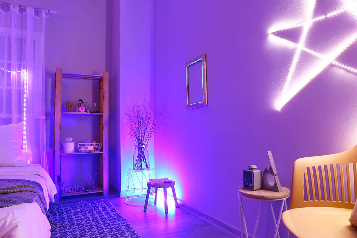
Extremely bright and intense neon colors, like neon green, neon pink, or neon orange, can be challenging to incorporate effectively in interior design and are often considered visually jarring. If you walk into any home decor or home furnishings store, you’ll be hard-pressed to find a selection of accessories to buy in neon or fluorescent colors, and the reason for this is that they simply aren’t popular. Home stores know their markets and what people want to buy, and stock their shelves according to supply and demand. The lack of availability of neon home decor items is a reflection of the belief that these types of colors have no place in the home. While neon and fluorescent colors can go through phases of popularity in other areas, for example in fashion or make-up, typically they are considered ugly colors for the home.
Avocado Green

This particular shade of green is often associated with a dated and unattractive color scheme. Avocado green was a popular color for bathroom fixtures such as toilets and bathtubs in the 1970’s, and as a result this color has an old-fashioned, almost musty association.
Interestingly, there is now a generation of people who weren’t around to witness the avocado green trend in the 1970’s, and as such they have no prior misconceptions about this color. This means that avocado green is coming back into fashion in some circles, and may not be considered to be an ugly shade for much longer.
Drab Dark Brown
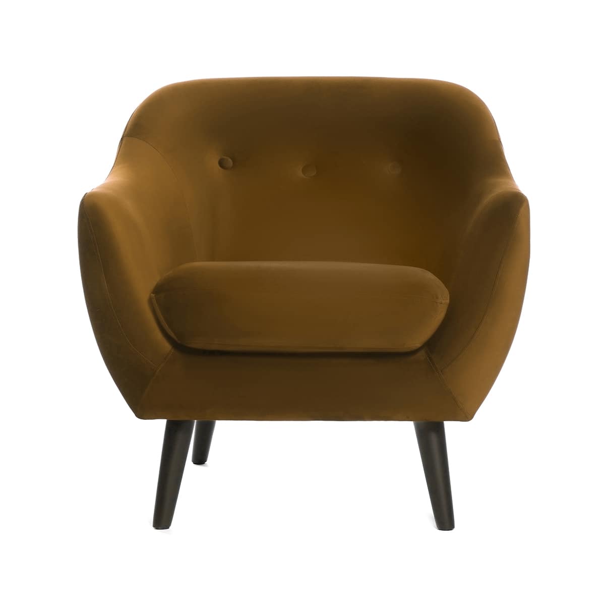
Drab dark brown is a shade of brown that contains a hint of green undertone. It is also known as Pantone 448 C. This color has actually been deemed to be the ugliest color in the world according to researchers in Australia. Researchers wanted to find a color that was universally unappealing, that they could use to package cigarettes in order to put customers off and effectively reduce the number of people who smoke.
The research conducted concluded that drab dark brown was the ugliest color, and since it has been used on the packaging of cigarettes, the number of tobacco products being sold is actually on the decline, showing just how much a color can affect how a person feels about something.
Mustard yellow
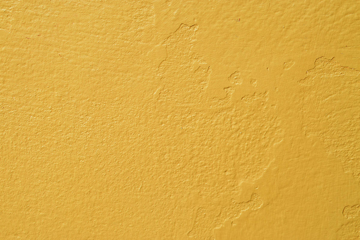
While some people may appreciate the warmth of mustard yellow, it can be perceived as dull or unattractive by others. It is closely linked to the color of mustard, so if you aren’t a fan of this condiment then you’re more likely to find that mustard yellow evokes unpleasant feelings for you. Mustard yellow is also a similar color to bile, which is another reason it may be considered to be an ugly color.
There are many ways to use mustard yellow effectively in home decor for an appealing result, however, even if you like this color it is best to use it as an accent color as opposed to your main color. Some research has indicated that mustard yellow can make people feel tired and become quick to temper, especially in rooms where mustard is the dominant shade.
Muddy Colors
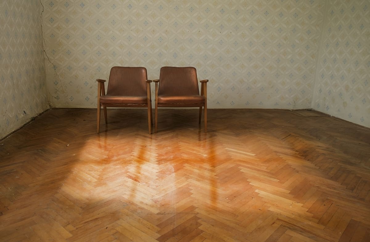
Colors that are excessively muddy, dull, or grayed out can create a sense of drabness in space and may be considered unattractive in interior design. The colors used in the famous Mona Lisa painting are often considered to be muddy colors, and you might imagine a room to feel quite depressing if it was entirely painted in these shades.
If you want to create a sense of relaxation, joy, or creativity, then dull and muddy colors are certainly colors to avoid. These types of shades can also be associated with excrement, which is another reason they are widely perceived as ugly.
Intense Colors
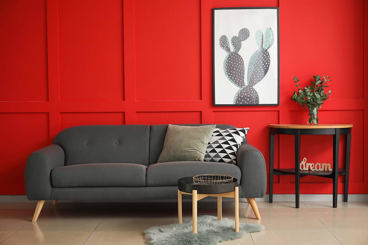
Colors that are overly saturated or intense, such as electric blue or fire engine red, can be challenging to use in large quantities without overwhelming a space.
This is why they are a rare choice in interior design and home decor, although that doesn’t necessarily make them ugly colors, instead, they are seen as colors that aren’t easy to live with. Colors that provoke an intense response such as heavily saturated, bright colors, can put you in a state of high alert, which isn’t typically how most people want to feel in their homes.
Gloomy colors
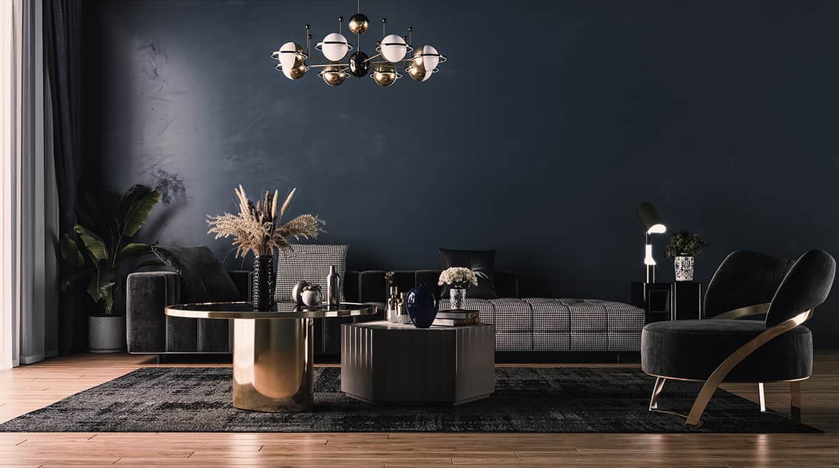
Very dark colors, like charcoal black or deep maroon, can make a room feel smaller and less inviting, and they are often considered unattractive when used excessively. However, when used in small amounts, or when used in the right way, dark colors such as these can actually work really well.
They are especially useful if you’re trying to create an intimate space, or they can add contrast when set against lighter colors. To avoid making a room feel gloomy, consider the emotional impact of a dark color before your use it to paint your walls. Dark colors with cool tones tend to work well since they appear simultaneously dark and fresh.
Should I Avoid Using Ugly Colors?
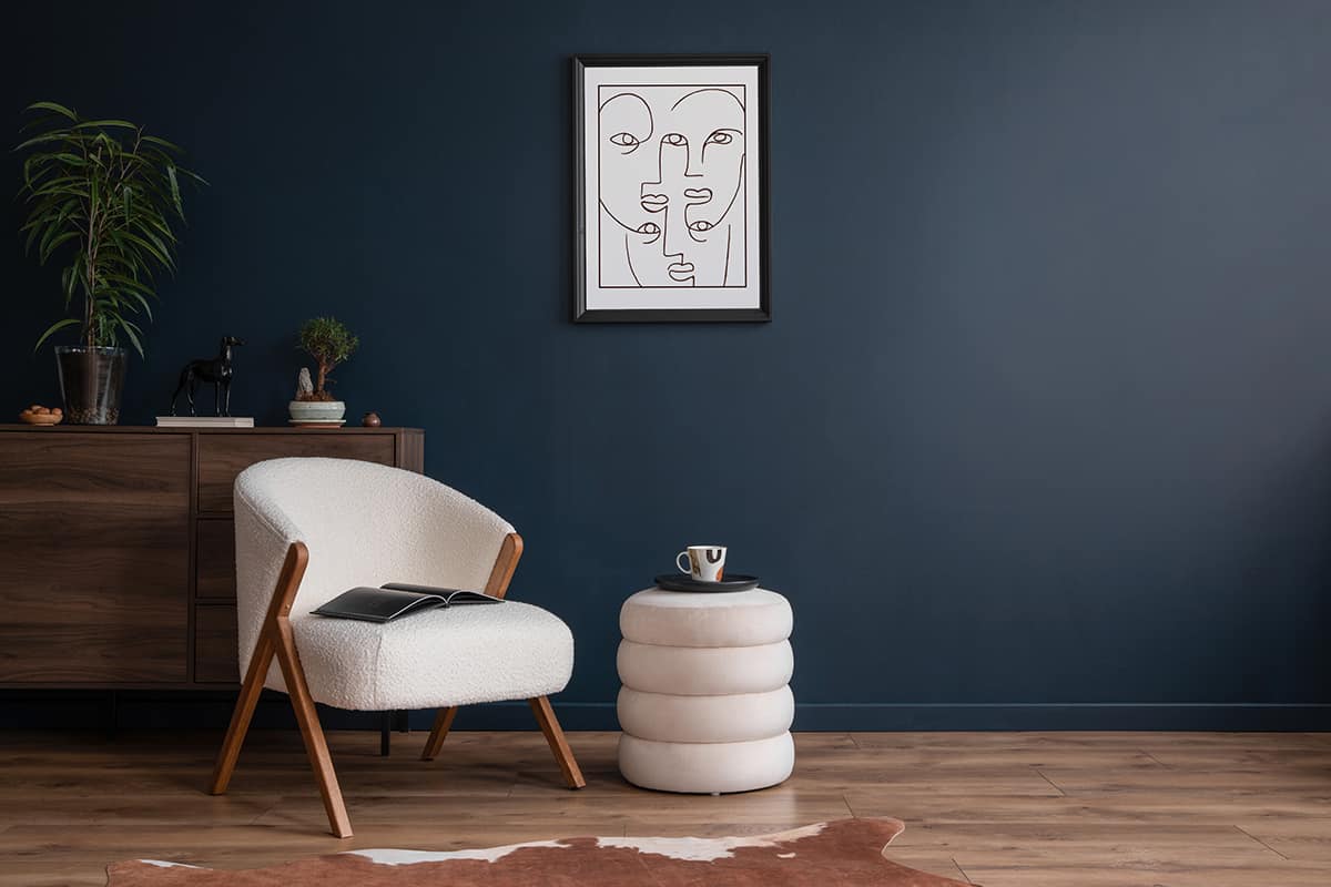
Whether or not you should avoid using what some might consider “ugly” colors in your home decor depends on your personal taste, the overall aesthetic you want to achieve, and the emotional impact you desire in your living space.
Personal Taste
Your home is your personal sanctuary, so it should reflect your style and preferences. If you genuinely like a color that some consider unattractive, don’t be afraid to use it in your decor. Your comfort and happiness in your space are essential, and you shouldn’t worry about pleasing other people.
Coordination and Balance
The key to using any color effectively in home decor is coordination and balance. Even unconventional or bold colors can work when paired with complementary hues and when integrated into a cohesive design scheme.
Consider your color scheme as a whole rather than focusing too much on each individual color. If the colors work well together and create the type of atmosphere you are trying to achieve, then you shouldn’t be too concerned about how trendy or liked each color is.
Emotional Impact
Colors can have a significant impact on mood and atmosphere. Consider how a color makes you feel. Some “ugly” colors might evoke unique emotions or create a specific ambiance that suits your needs or design concept. Some people may hold a color close to their heart due to its significance within their lives, or if its linked to a memory they hold dear. If you feel comforted by a color, even if some people consider it to be ugly, you shouldn’t be put off from using it in your design scheme.
Trend vs. Timelessness
Trends in home decor come and go. What is considered fashionable today may be outdated tomorrow, and this can impact which colors are thought of as ugly or attractive. If you’re concerned about the longevity of your design choices, you may want to use trendier colors sparingly or in easily changeable elements, for example, accessories and decor items.
Classic colors such as neutrals are always a good choice for the main colors in your color scheme if youre concerned about colors losing their appeal over time, since neutral colors always look timeless and classy. If the color of your accessories becomes unappealing or ugly in your eyes, you can easily swap them out for some different colored items.
Ultimately there are no strict rules in home decor when it comes to color. What some people may consider “ugly” colors might be the perfect choice for you. The most important thing is to create a space that makes you feel comfortable and happy. If a color resonates with you and enhances the atmosphere you desire, then it can be a beautiful addition to your home decor, even if it may be seen as ugly by others.