Let’s be honest — kitchen cabinets take a beating. Between fingerprints, splatters, and everyday messes, it feels like they’re always dirty. The good news? Some colors do a much better job at hiding the grime, and we’ve rounded up 14 of the best.
Table of Contents
Kitchen Cabinet Colors That Hide Dirt
Dirt, smudges, and everyday marks build up on cabinet surfaces in any busy kitchen. Certain colors are better at disguising these common messes, so cleaning can be less frequent and cabinets look tidier longer.
Charcoal Gray
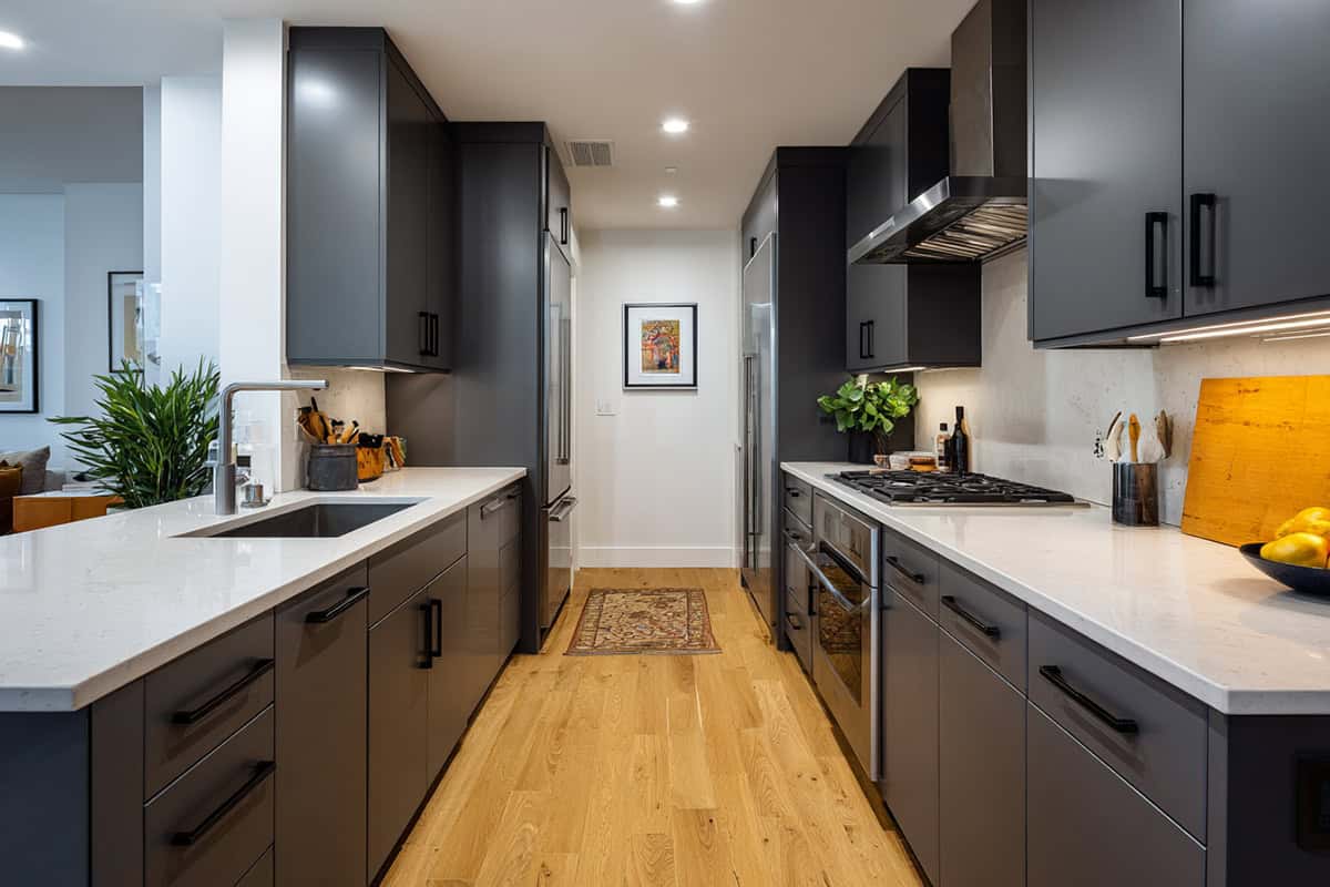
This shade stands up well to the daily mess of kitchens. Charcoal gray is dark but not harsh, so it hides fingerprints, dust, and crumbs effectively.
The cool undertone downplays stains that lighter colors show, especially from greasy splatters or dark sauces. You won’t see smudges easily. If you have a busy household or pets, charcoal gray camouflages both dirt and scratches.
Cabinet hardware in brushed nickel or matte black highlights the richness of gray. Matte or satin finishes help further diffuse light and mask imperfections.
Deep Olive Green
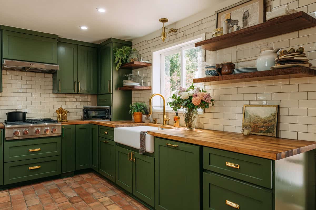
If you want something subtle yet distinct, deep olive green fits the bill. Its earthy and muted tone blends well in kitchens and keeps specks, splashes, and leftover food prints from standing out.
The color works with both modern and rustic decor. The green undertone helps distract from stains caused by vegetables and everyday kitchen use. It also does not highlight streaks from frequent cleaning.
You can use matte finishes to tone down reflections that catch dirt. Pair it with brass or wood hardware for a balanced look.
Mocha Brown
There’s something reliable about a warm brown that doesn’t make messes stand out. Mocha brown offers a middle ground between dark and light shades. It absorbs minor spills and doesn’t show dust as much. Grease marks and crumbs blend in rather than pop out.
This color gives warmth to your space without overpowering. Use a semi-matte finish for cabinets, so shine doesn’t highlight fingerprints. This shade looks inviting in both natural and artificial light.
It matches well with beige, cream, or white walls and works for classic, traditional, or modern kitchens.
Greige (Gray + Beige)
If true gray seems too cold and tan too warm, greige is a practical option. The blend of gray and beige hides crumbs, dust, and water spots from spills.
This neutral shade complements nearly any countertop or backsplash, so your kitchen keeps a tidy appearance regardless of its color scheme. Stains and food marks are less visible, especially on a satin or eggshell finish.
A greige surface resists fading and doesn’t amplify wear over time. Brass and black hardware fit right in.
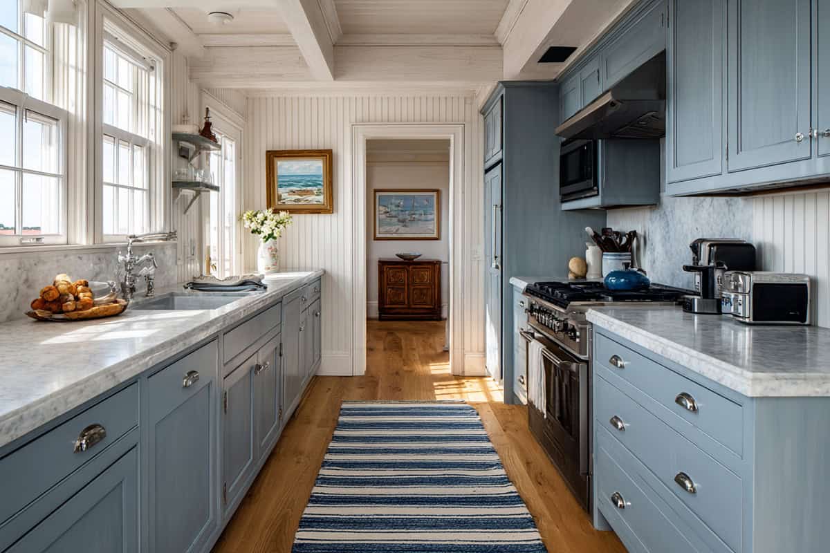
Unlike vibrant blues, a dusty navy softens boldness with a hint of gray. You get the hiding power of a dark shade, but the muted finish helps stop streaks from grabbing your attention.
Food spills and smudges blend into the blue-gray surface. Dust is less visible than on lighter cabinets. Scratches and minor marks do not show readily.
This color works well with chrome or brushed nickel hardware and feels coordinated with both traditional and modern kitchens.
Weathered Sage Green
A faded, muted sage creates a calming effect and keeps smudges from dominating your cabinet surfaces. This shade offers enough depth to conceal dirt without making the room feel dark.
Vegetable stains, water spots, and fingerprints blend with the green undertone. You’ll notice fewer cleaning streaks, especially on a matte finish.
Weathered sage matches natural wood accents and stone countertops, making it a flexible choice for many styles.
Taupe
Nothing too bright, too dark, or too trendy—taupe strikes the right balance. This soft, slightly brownish-gray neutral is effective at disguising light dust and everyday kitchen messes.
Unlike brighter cabinets, taupe does not emphasize greasy marks. It works in kitchens that receive lots of sunlight because it does not yellow or fade easily. Use a satin finish for low maintenance.
White, black, or brushed brass handles provide a nice contrast to taupe without making small messes stand out.
Rustic Terracotta
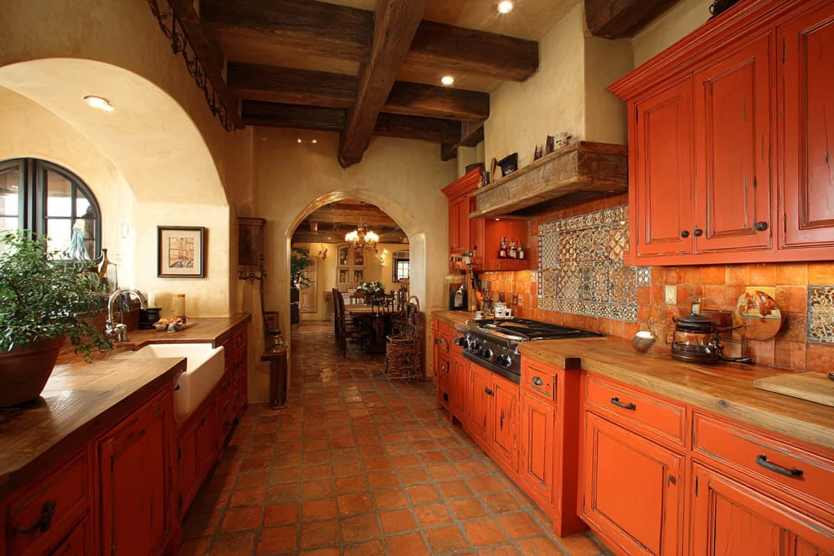
A muted terracotta with earthy red tones gives warmth while disguising crumbs and sauce splatters. The color hides stains associated with tomato or spice-heavy recipes that might otherwise show on pale cabinets.
Matte terracotta finishes diffuse light, making cleaning streaks less visible. The hue is especially forgiving in high-use environments. Minor dings or chips blend into the natural, imperfect look.
It’s a solid match for wood countertops, brass hardware, and textured backsplashes—ideal for farmhouse or Mediterranean-inspired kitchens.
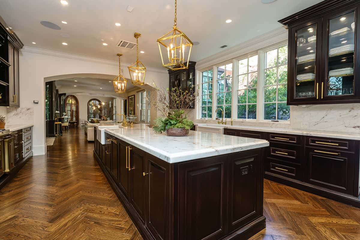
Matte Black
Matte black absorbs light rather than reflecting it, so it conceals fingerprints, greasy marks, and water spots well. This finish prevents streaks from showing, compared to glossy black surfaces.
Dust can sometimes stand out, but minor daily messes remain unseen. Pairing matte black with soft-close hardware ensures the surface remains clean for longer periods.
When used for lower cabinets or islands, it pairs well with lighter upper cabinets to break up the depth and make cleaning easier.
Mushroom
A gentle gray-brown, mushroom is light but not stark. It effectively camouflages dust, crumbs, and the small stains that accumulate in food prep areas.
This shade feels modern but versatile, blending with a range of wall and floor colors. Streaks from cleaning tend to fade into the subtle variations of the finish. Hardware in aged nickel or light bronze adds to the muted, easy-clean effect.
Dusty Teal
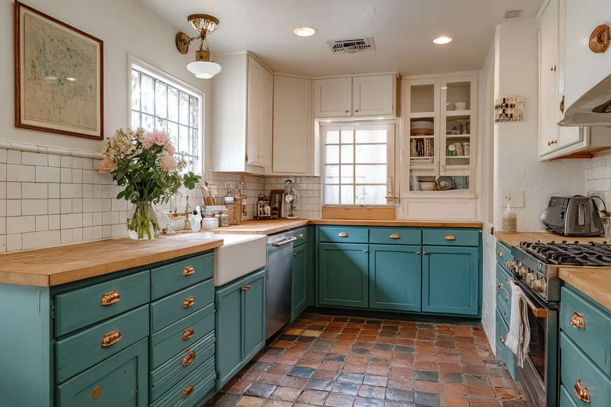
Dusty teal adds color without being too attention-getting. The blend of gray and blue-green helps conceal both oil splashes and light dust.
Its muted finish makes watermarks less obvious, especially near sinks and stoves. The tone pairs with white or wood accents for a fresh, clean look. Streaks from wipes and scratches lose their impact against the soft teal.
Matte or eggshell finishes keep the surface forgiving between deep cleans.
Espresso Brown
If you like the richness of black but want something slightly softer, this near-black shade works beautifully. Espresso brown conceals grease, fingerprints, and cooking stains without making the room feel flat.
Compared to black, espresso reveals less dust and fewer cleaning marks. The finish works best in spaces with good natural or bright task lighting to prevent the room from feeling too dim. Hardware in gold or brushed silver highlights its richness.
Smoky Plum
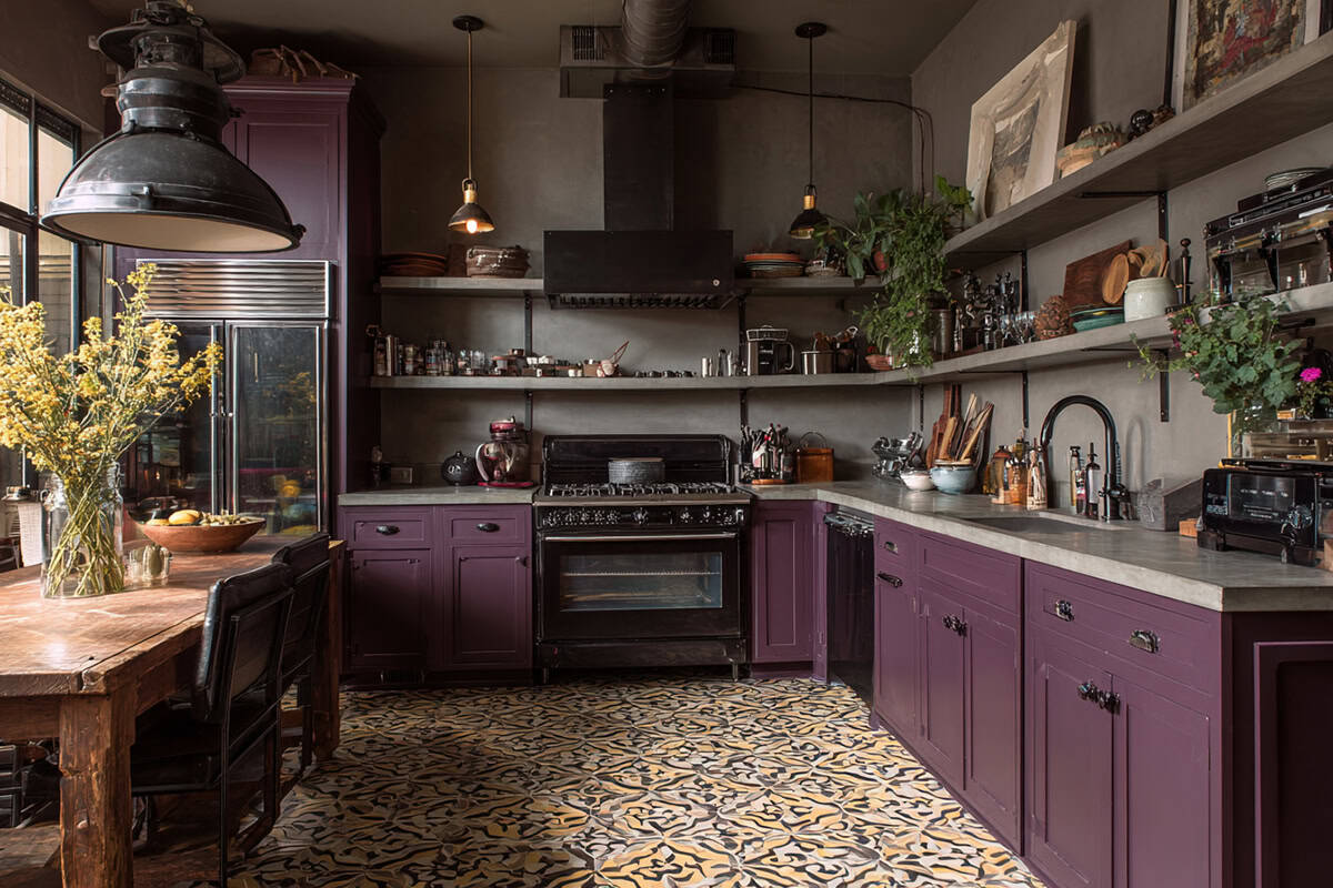
This unexpected tone brings a bit of depth while still offering practicality. The muted plum-gray softens the appearance of dirt and blends well with a variety of countertop finishes.
The soft focus of this shade dulls both food smudges and fingerprints. Cabinets do not look busy or cluttered even after several days of use. Pairing it with dark hardware and light countertops balances the color’s effect.
It suits eclectic, vintage, or transitional kitchens wanting a subtle hue that hides dirt.
Slate Blue
A cool slate blue brings together dusty blue and gray, striking a balance between color and practicality. This shade’s great at hiding water marks, flour dust, and those inevitable fingerprints.
Pair it with stainless steel or chrome handles for a finish that feels modern but not cold. Honestly, you’ll probably find yourself cleaning less and just enjoying the kitchen’s mellow vibe. It really shines in spaces with a mix of natural and artificial light.