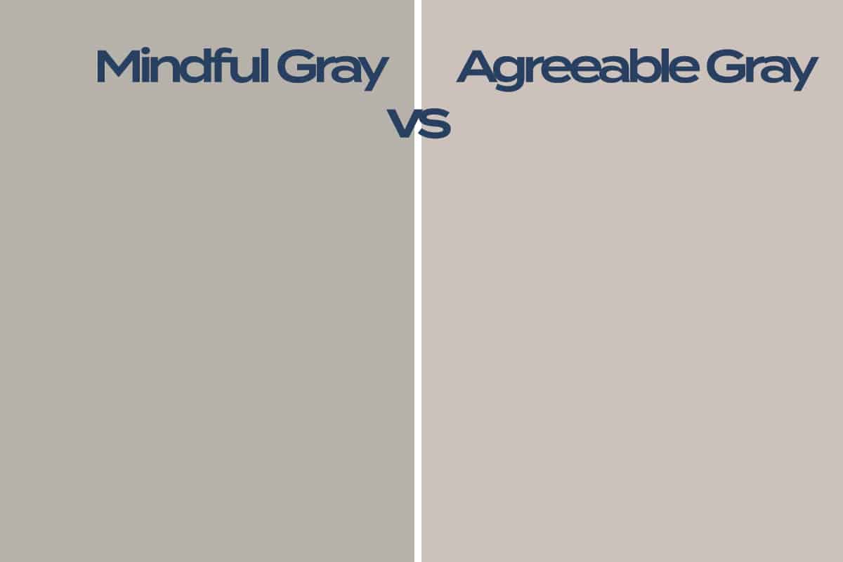
Mindful Gray and Agreeable Gray are both popular paint colors from Sherwin-Williams. They are both classed as warm grays, but they have some differences in terms of their undertones and overall appearance.
Here we explore the similarities and differences between both Mindful Gray and Agreeable Gray to help you understand which paint color will be a better choice for your home.
Table of Contents
Mindful Gray Qualities
Mindful Gray, as you would expect from the name, is a peaceful shade of gray. It has brown undertones, which gives it a warm feel. However, the overriding sense of the color is still cool. It is a light to medium shade, which will read differently in various types of lighting. In a low-lit room, mindful gray will come across as quite dark since it has a light reflection value of 48.
This means it doesn’t do a great job of reflecting light and therefore creates a dim, cozy feel. In a well-lit room, the color will read as lighter, and the warm tones will be more apparent. There are also very subtle green undertones in Mindful Gray, which help it to feel fresh. The green undertones also ensure the paint doesn’t come across as blue or purple in a certain light, which can be a problem with many other types of gray paint.
Agreeable Gray Qualities
Agreeable Gray is another shade of gray from Sherwin-Williams, which is enormously popular. This gray has more obvious brown undertones, giving it a taupe or greige look. It is lighter in shade than Mindful Gray and therefore gives a more muted, subtle look when used on walls in the home.
Agreeable Gray has a light reflection value of 60, which means it is reasonably good at reflecting light. The result of this is that Agreeable Gray will reflect light sources in a room, making a well-lit space feel even more open and airy. Even in a poorly lit room, Agreeable Gray will reflect any light sources it can find to result in a brighter and more uplifting atmosphere in the space.
Best Lighting for Mindful Gray
Mindful Gray from Sherwin-Williams is predominantly gray with a slight hint of brown, which gives it a touch of warmth. If you want to bring out the warmer tones in this color, use it in a room that gets plenty of natural daylight. Bright daylight will highlight the brown tones in Mindful Gray so that it reads as a slightly greige color. If you want a cozy space, Mindful Gray should be used in a room that does not receive much daylight.
This will prevent the brown tones from showing through, allowing the color to read as cooler in temperature. Using this color on all of the walls in a low-lit room can make the space feel deep and intimate, lending itself well to a dark bedroom or dining room.
If you don’t want to make the low-lit room feel dark but have your heart set on Mindful Gray, consider using it on one wall as an accent color, or use it on trim while opting for a more light reflective color on the walls. The relatively low light reflective value of Mindful Gray means that it absorbs light more than reflects it, which means any room painted in this color will read as slightly darker than you probably expect.
Best Lighting for Agreeable Gray
Agreeable Gray is one of Sherwin-Williams’ most popular shades of gray because of how easy it is to use. As a shade of gray that leans towards greige, this color is cool enough to look modern, and warm enough to feel welcoming and cozy. It works well in any type of lighting, which is another reason why people love this color so much.
It’s hard to go wrong with Agreeable Gray, so it’s no surprise that it is the go-to shade of gray for many interior designers. Agreeable Gray has a light reflective value of 60, which means it reflects a good amount of light to help a space feel warm and bright without being so reflective that it comes across as too intense. In a well-lit room, this paint color will appear more greige than gray, giving a space a warm and comforting atmosphere.
In a low-lit room, the color will read as more gray, with a slight hint of beige to prevent the space from feeling cool. Agreeable Gray is an interesting color because it can appear to transform itself depending on the time of day and the light in the room.
In an east-facing room, walls painted in Agreeable Gray might look beige and bright in the morning when the light is bright and grayer in the afternoon and evening when there is no direct source of natural light penetrating the space.
Is Mindful Gray Better than Agreeable Gray?
Both Mindful Gray and Agreeable Gray possess qualities that make them attractive choices of paint color. The color which is going to work best for you will depend on the style and atmosphere you want to achieve, and the type of lighting your room gets. Mindful Gray is darker and has a lower light reflective quality than Agreeable Gray while also having more subtle brown undertones.
This means it will be a better choice if you want a deeper or cooler effect in a room. If you want to bring out the warm undertones of Mindful Gray, use brown wooden furniture and accessorize with beige or brown rugs and cushions.
Agreeable Gray has a more greige tone, which is ideal for natural color schemes where you want a warm atmosphere that isn’t so warm it comes across as dated. Agreeable Gray works in a wide range of lighting types but will appear warmer in bright natural light, and slightly less warm in low light. Both of these colors are stunning options when used as wall paint, but they also make an interesting choice for interior trim for white walls or dark gray walls.