Home design & decorating tips about architecture, color schemes, paint colors, interior styles, and so on.
Decorating
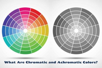
Having an understanding of chromatic and achromatic colors can help if you’re an artist or a designer. Here we uncover the definition of both of these terms and explain how they can be used in home decor.
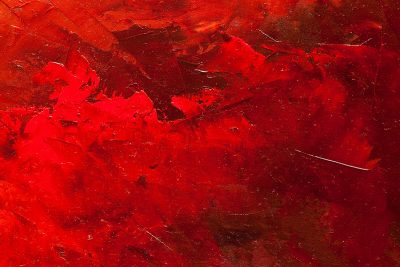
Red is one of the most prominent colors on the color wheel because of how bold and vivid it is. It is heavily used in art to make people or objects stand out, though it is lesser used in home decor because of its intensity. Here we explore the psychology of red and look at what colors make red.
On the standard color wheel, there are three types of colors; primary colors, secondary colors, and tertiary colors. The primary colors are red, yellow, and blue, and all of the secondary and tertiary colors are created by using these primary colors in varying combinations. There are six tertiary colors, which are blue-green, green-yellow, yellow-orange, orange-red, red-purple, and purple-blue. Here we explore how to make tertiary colors and how they can be used in home decor.
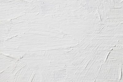
There is a lot of debate around whether white is actually a color since the very definition of white is that it lacks color, and white is not featured on the color wheel or on the color spectrum. If we believe that white isn’t a color, then how do we go about making white? Here we explore different suggestions and debunk some myths when it comes to creating white.
A monochrome color palette will contain various shades, tints, and tones of the same color, creating a look that offers depth and interest without any stark contrasts that might be overstimulating.
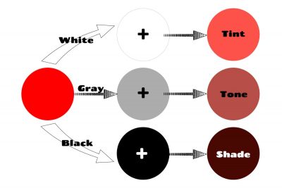
Tints, tones, and shades are terms you’ll hear often if you’re involved in anything that uses color theory. Artists, fashion designers, and interior designers will all be familiar with the impact of tints, tones, and shades on color schemes and on the energy they create.
Green is a secondary color, which means it can be made by mixing two primary colors together. The colors you will need to make green are blue and yellow, but the type of blue and yellow you use are going to dictate the type of green you end up with.Here we investigate how to make a range of different types of green.
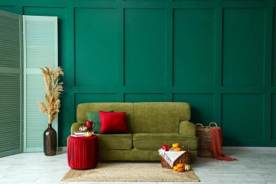
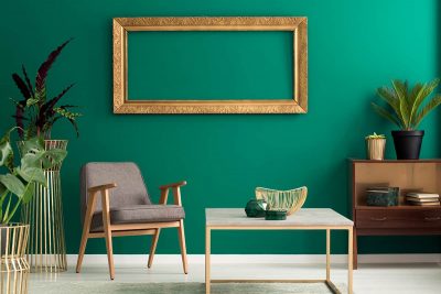
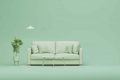
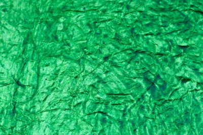
Green is absolutely thriving in the world of interior design right now, as it continues to grow in popularity as a paint color, fabric color, and furniture color in home decor. Here we explore some of the best shades of green that are trending at the moment, along with green hex codes and how to use these colors in home decor.
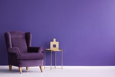
Purple is one of the lesser-used colors when it comes to interior design, but it can be used to great effect if you want to invoke a sense of elegance and glamor, or if you are creating a space based on a spring-time floral theme.
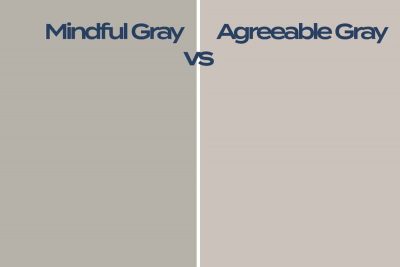
Mindful Gray and Agreeable Gray are both popular paint colors from Sherwin-Williams. They are both classed as warm grays, but they have some differences in terms of their undertones and overall appearance.
For a true brown, mix an even combination of all three primary colors; red, blue, and yellow. You can alter the shade of brown you get by varying the amount of the primary colors in the mixture. By using the principles of color theory, you can also create brown by mixing a secondary color with its complementary primary color.
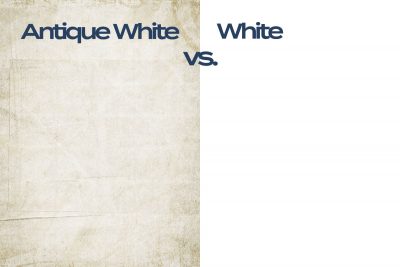
Antique white is a shade of off-white which has a warm tone. It is made by adding the smallest amount of yellow to white, to create a very pale, creamy color. By comparison, white is neither warm nor cool, and is perfectly neutral because it lacks color of any kind.