Your home gym should be a place that motivates you to move, and believe it or not, paint color plays a big role. The right shade can boost your energy, calm your mind, or simply make the space feel more inviting. Let’s dive into 12 paint colors that are perfect for a workout room.
Table of Contents
Best Paint Colors For Home Gym
Picking a paint color for your home gym really does matter—it shapes motivation, mood, and even how big or bright the room feels. Some shades kick up the energy, others chill things out, and a few can make a cramped space feel much less claustrophobic.
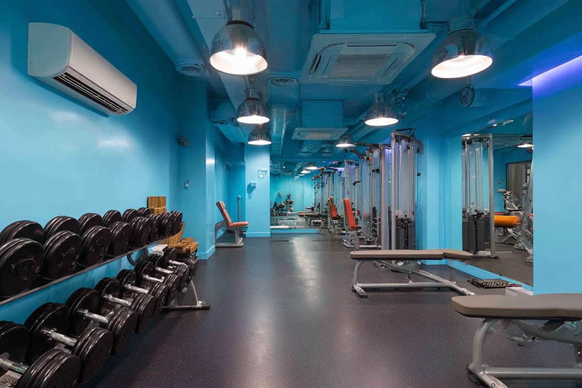
Electric Blue
Vibrant electric blue delivers a jolt of energy and alertness. This punchy color is right at home in spaces where you’re all about HIIT, cycling, or anything that gets your heart pounding. Suddenly, a workout feels a bit more lively with that kind of blue on the wall.
It also does this fun trick where it visually stretches smaller rooms, making them seem bigger and more open. The color bounces light around, so even late-night sessions don’t feel too dim. If you want it to look extra sharp, try pairing it with gray or white equipment.
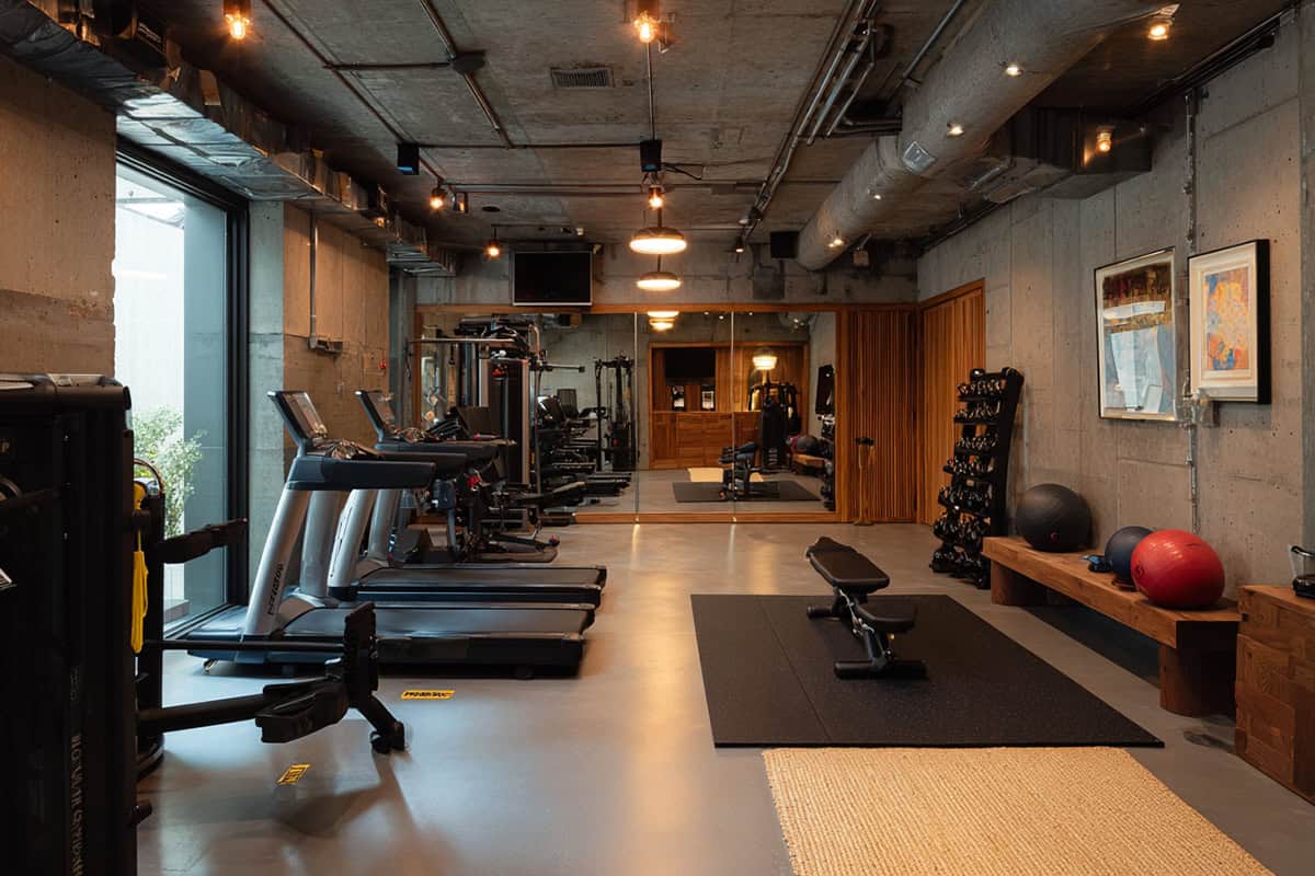
Charcoal Gray
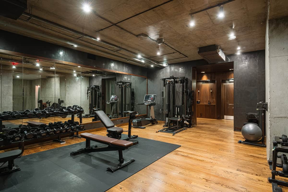
Charcoal gray brings in a modern, grounded vibe. There’s something about this deep neutral that helps you tune out distractions—perfect for lifting or yoga. It soaks up extra light, softening any harsh glare from bulbs or sunlight sneaking in.
Accent colors in your gym gear or wall art really pop against this background, and scuffs or marks are way less obvious. It just works with black, metal, or wood equipment, so you don’t have to overthink the matching.
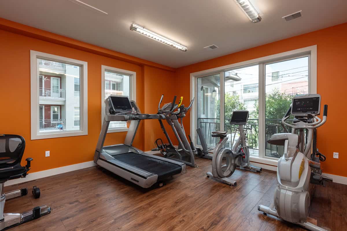
Citrus Orange
Need a mood boost? Citrus orange is up for the job. It’s lively and bold, and there’s actual research tying orange to higher energy and better moods—great for cardio or dance workouts.
One accent wall is usually enough, especially in a small gym, or you can tone it down with a muted shade. White or gray keeps it looking crisp, while teal or navy accessories can cool things off a bit. Too much orange, though, and it can get a little wild.
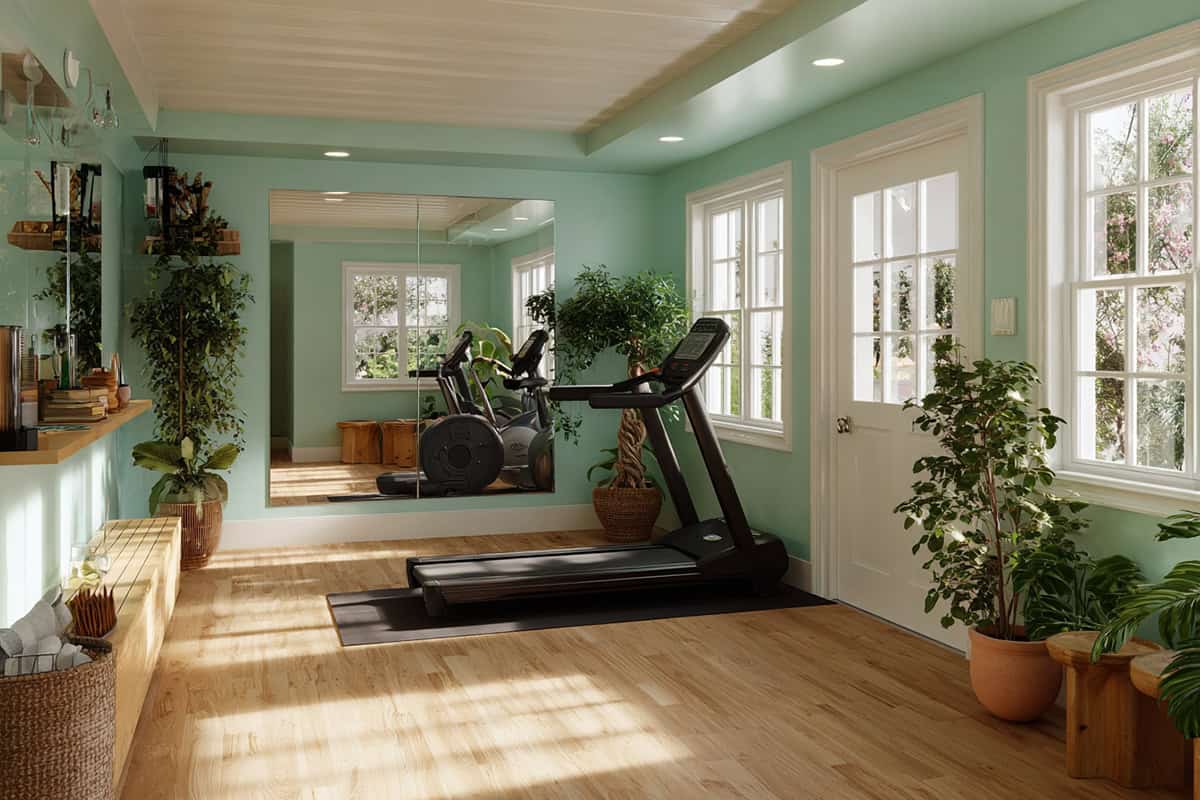
Mint Green
Mint green sets a calm but still upbeat tone. It’s gentle, making it ideal for stretching, meditation, or low-impact movement. There’s a clean, fresh feeling to it—something most people want in a gym.
Natural light keeps it soft, not stark. It’s easy on the eyes, which helps for recovery or cool-down stretches. Wood shelves or a few plants really round out the look, making the space feel balanced and inviting.
Slate Blue
Slate blue is steady and soothing. It’s the sort of color that helps you focus—nice for pilates, barre, or when you’re in a disciplined training groove. Unlike super dark colors, it stays bright enough, especially with white trim.
You can mix in metallic equipment or softer touches and it all works. If your gym doubles as a workspace or somewhere to relax, slate blue feels both professional and approachable. It doesn’t really go out of style, either.
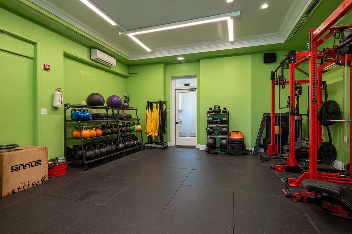
Neon Green
Want a room that screams energy? Neon green’s hard to ignore. It ramps up adrenaline and drive, especially for intervals or boxing. But honestly, too much can be a bit much—try it as a feature wall or even just stripes.
Lighting makes a difference; softer light will mellow it out. Neon green looks sharp with black or charcoal mats and gear. If you want to dial it back, add in muted greens or some white accents.
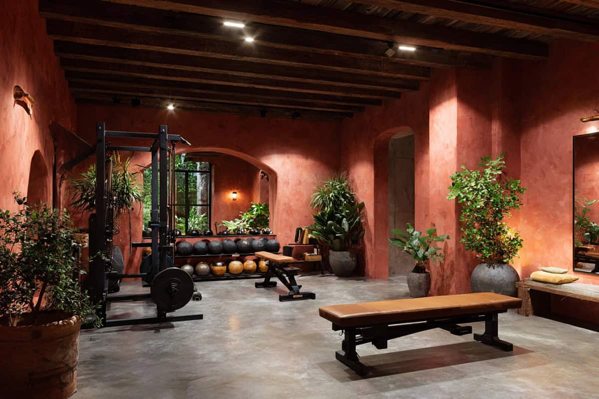
Terracotta
Earthy and warm, terracotta brings comfort into the gym. It’s a reminder to stay balanced—mind and body both. Those deep orange-red tones soak up harsh light, giving even big, echoey rooms a cozy feel.
Dark wood or bamboo shelves make it look natural, and lighter, creamy accents help keep things from feeling too heavy. Woven baskets or a couple of plants add texture without cluttering up the space.
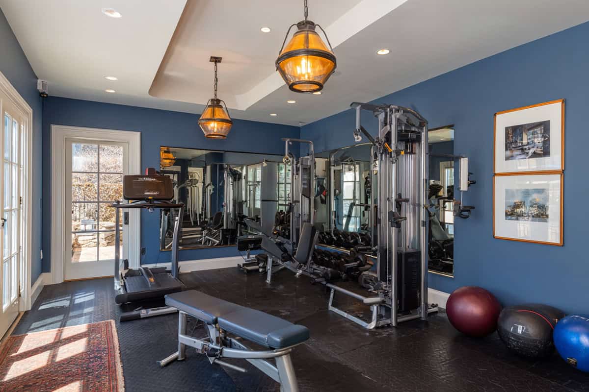
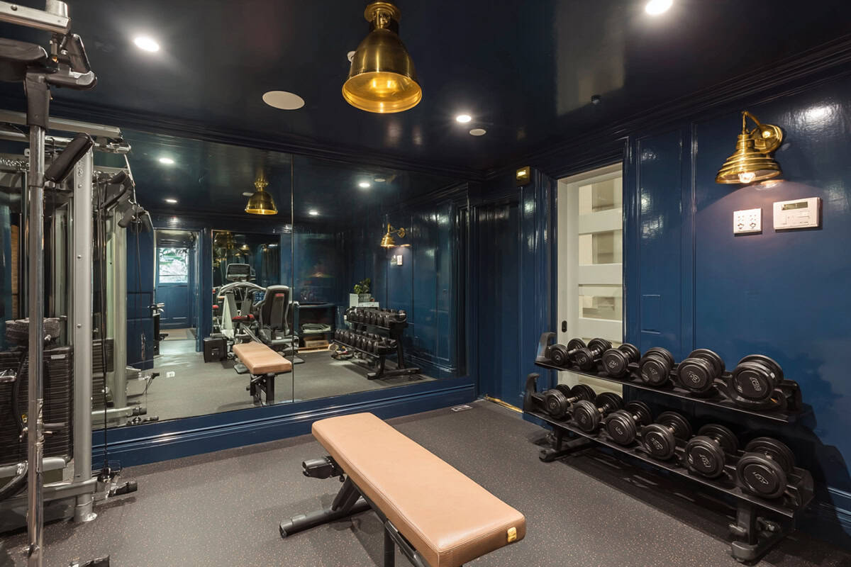
Navy blue just feels strong and a little bit serious. It grounds the room, dialing in mental clarity and discipline for strength training. Equipment and mirrors really stand out against it.
If your room’s big, navy makes it feel more defined and less empty. Just be sure the lighting’s bright enough so it doesn’t get gloomy. White, silver, or light blue accessories give it a nice contrast and keep things feeling open.
Warm Sand
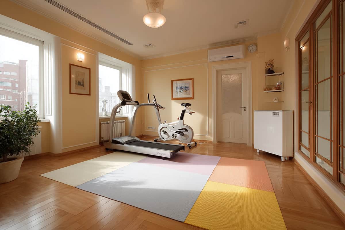
If you’re after something subtle, warm sand is easy to live with. Light beige brings in warmth but doesn’t overpower the space. It’s great for stretching, pilates, or any workout where you don’t want to feel overstimulated.
Wood, rattan, and plants all look right at home here. It’s a solid neutral if you want to use colorful mats or bins, and the whole space stays welcoming—especially if you sometimes use your gym to unwind.
Sunset Coral
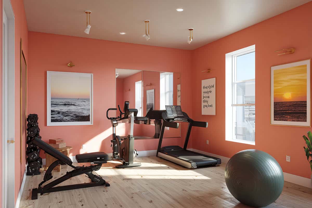
Sunset coral is optimistic and a little playful. This coral-pink shade wakes you up in the morning but won’t overwhelm. It might even nudge you to try a new workout style.
It shines in rooms with good light—natural or artificial. Pair it with cool neutrals or deep navy for a bit of contrast. Little touches, like cushions or towels, can pick up the coral and lift your mood, too.
Teal Blue
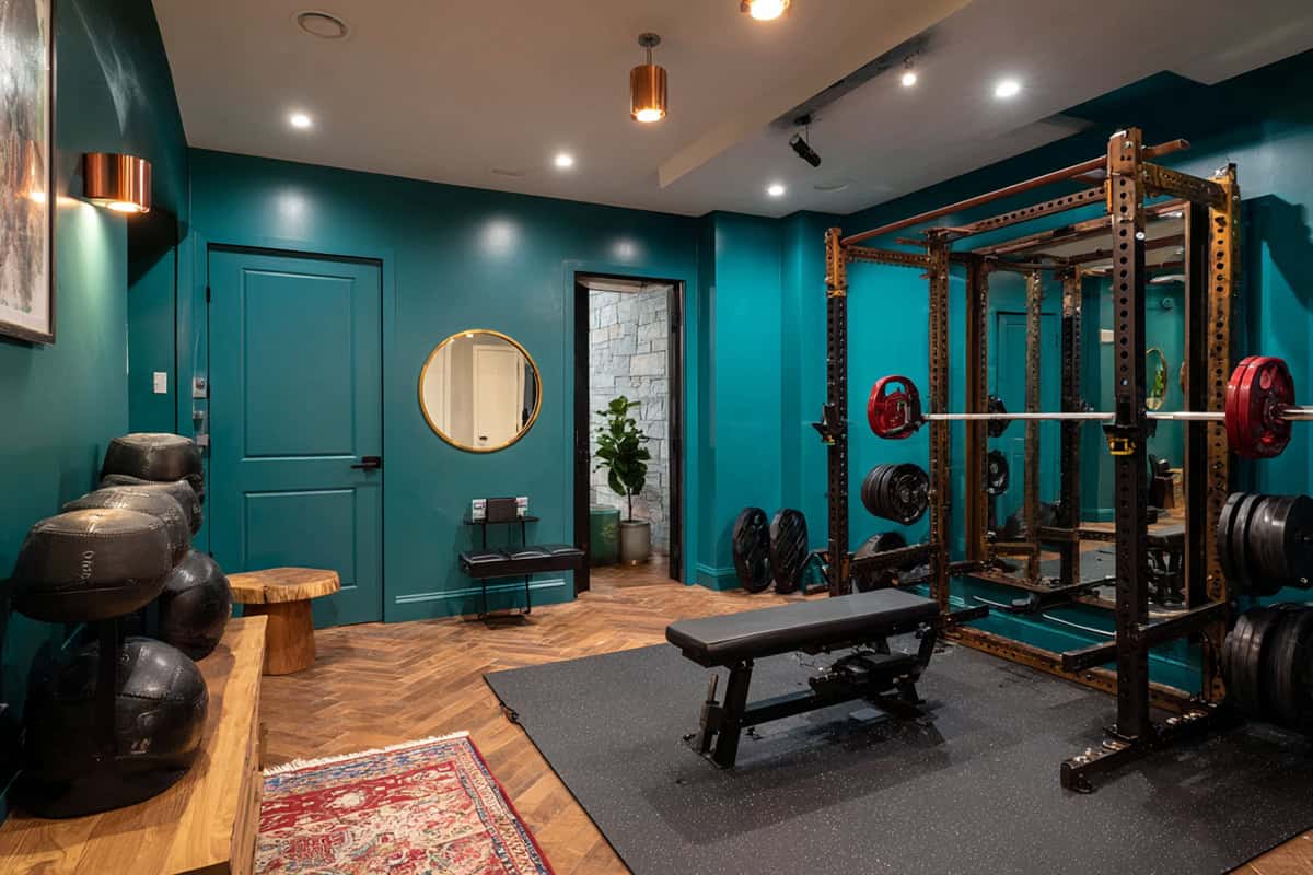
Teal blue walks the line between fresh and calm. It’s a go-to if your gym does double duty—strength, yoga, whatever. Teal keeps things interesting for longer sessions without getting boring.
Both sunlight and regular bulbs show off its undertones. It matches up well with white, black, or metallic gear, and if you want to add plants or wood benches, it all comes together nicely for a space that actually makes you want to work out.
Bright White
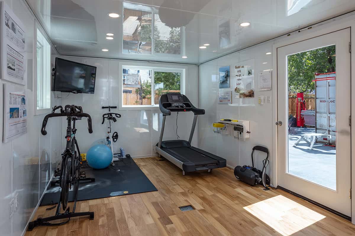
Bright white gives you that sense of clarity and space—honestly, it bounces around every bit of light you’ve got, so even those cramped or windowless gyms don’t feel so boxed in. It’s a color that keeps you on your toes, too; clutter and stray equipment are impossible to ignore when everything pops against the walls.
Of course, you’ll probably find yourself wiping down the walls more than you’d like if you want to keep things looking fresh. Pairing white with colorful mats, towels, or gear can help dodge that sterile, hospital vibe. And hey, it’s basically a blank slate for whatever art or motivational quotes you’re into.
