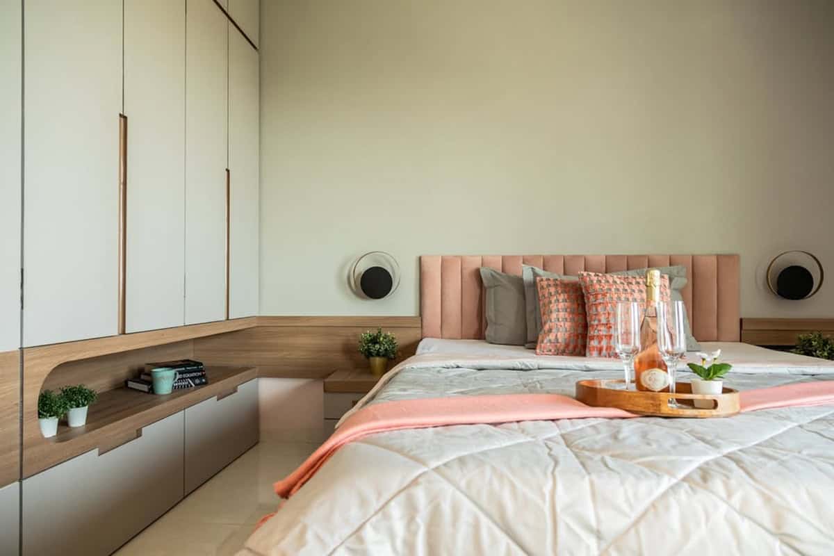
If you’re on the fence regarding what color to paint your bedroom walls, we have good news for you! You don’t have to settle on a single color! Sometimes, the best results come when combining different colors, as you’ll see on this list.
Table of Contents
- Tips on Two-Color Combinations for Bedroom Walls
- 42 Two-Color Combination For Bedroom Walls
- Dark and Bright
- Scalloped Edge
- Single Wall, Different Color
- Built-in Shelf
- Alcove
- Bold Contrast
- Subtlety
- Neutral Transition
- Horizontal Stripes
- Wave Patterns
- Coastal Vibes
- Wall Panels
- Sophistication
- Lazy Summers
- Accent Wall
- Wallpaper
- Wavy Effect
- Carpet on the Walls
- A Dash of Purple
- Zebra Stripes
- Pink and Pinker
- Highlight of the Room
- Warm Terracotta Meets Crisp White
- Sage Green And White For Soft Contrast
- Natural Wood Panels With Clean White Walls
- Blush Pink + Textured Floral Mauve/Taupe Accent
- Mauve Walls With Crisp White Stripes
- Teal-Blue To Pale Ice Blue Gradient
- Grey And Yellow Split Wall Design
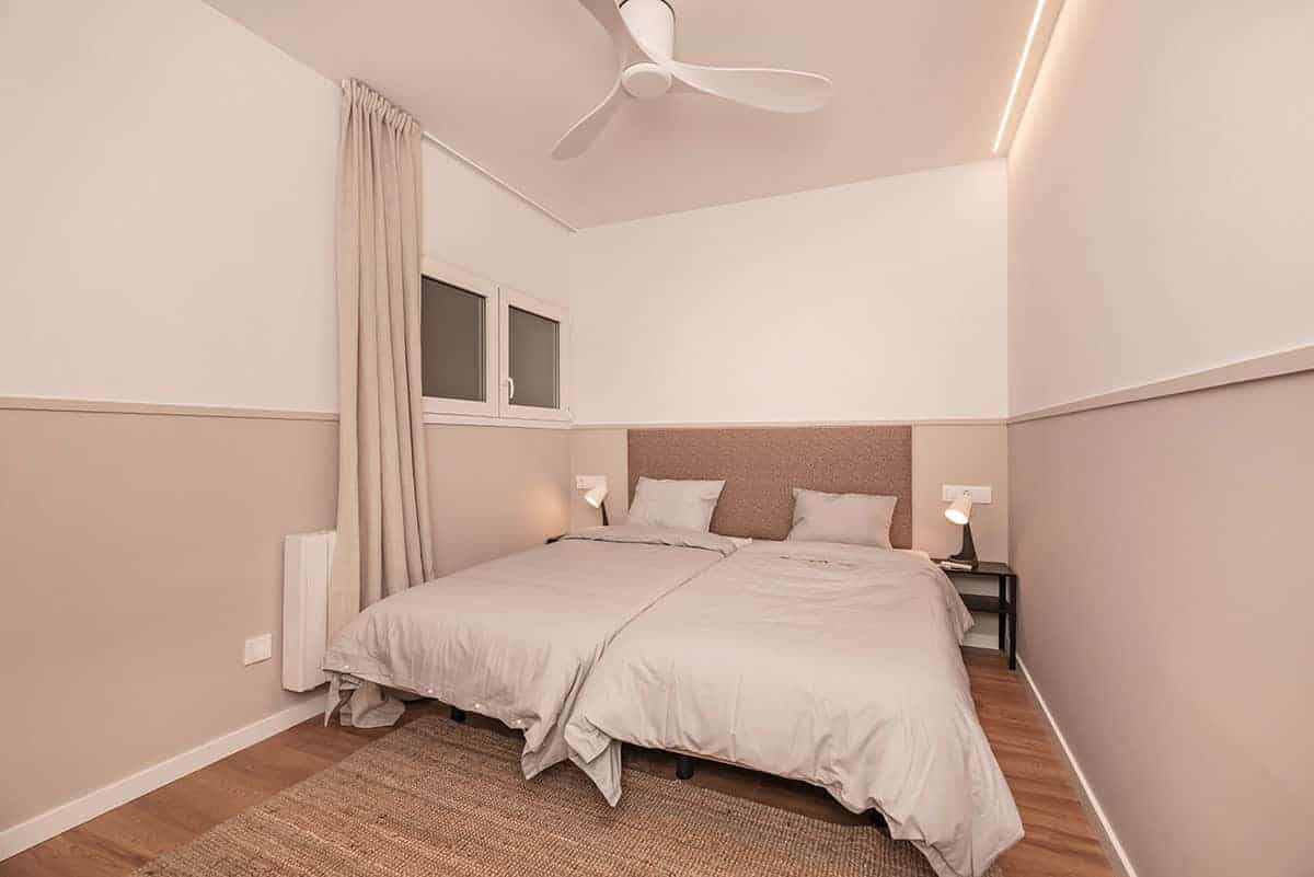
- Warm Beige And Taupe Half-Wall Split
- Cobalt Blue And Soft Tan Two-Tone Walls
- Deep Purple Accent With Warm Beige Walls
- Soften The Mood With White And Lush Green
- Play It Safe With White And Beige
- Lime Green And Yellow To Brighten Up Your Space
- Jewel Tones Of Red And Royal Blue
- Indigo And White For A Boost Of Colo
- Delightful Blue And Harmonious Orange
- Combine Bohemian Chic Red With Light Yellow
- Capture The Charm With Yellow And White
- Calming Green And Daring Pink
- Burnt Orange And White For A Sultry Combination
Tips on Two-Color Combinations for Bedroom Walls
Play with Contrasts: Bold, contrasting color combos capture attention. Try pairing a neutral with a vivid shade to create a stunning visual effect.
Feature Wall Focus: Paint one wall a neutral color and the other a rich, deep hue to establish a focal point. This technique draws the eye toward the feature wall.
Size Perception: Light colors tend to open up a room, making it appear more spacious. Dark shades conjure a snug, intimate vibe.
Half and Half: Two-color wall combos don’t have to be on two separate walls. You can paint the bottom half of the wall with a neutral color and the top half a darker color. Pairing two colors that consist of bold red, for example, with a softer, more delicate shade of cream, will help you achieve a balanced look.
Dynamic Splits: On the flip side, you don’t necessarily have to split the color of your wall in half. An uneven split can add dimension to a small bedroom so it is worth considering. You can, for example, add a small strip of your chosen color (a neutral tone) to the top half of the wall and create the illusion of height while adding a pop of color to the horizontal section of the wall.
Ceiling Accent: If your bedroom has a high ceiling, you can also paint the ceiling in an accent color so as to lessen the illusion of height and balance the eye level.
Complementary Couples: When deciding on two toned-down colors for the bedroom walls, take the safest option by going with white or cream for one wall and an accent color so as not to create competition between the two colors.
Finish Variety: Combining high gloss with matte finishes adds depth and interest.
Creating Focal Points: Select an accent wall color that either complements or contrasts sharply with the main room color.
With the above tips in mind, you’re now ready to make your selection based on our best paint color combination examples for your bedroom walls.
42 Two-Color Combination For Bedroom Walls
Today, we’re going to take a look at 22 two-color combinations for bedroom walls. They range from neutral to risky, but they all look absolutely stunning! See which bedroom wall colors inspire you!
Dark and Bright
Credit to lick
When it comes to combining colors, a classic choice is to go with dark and bright colors. Dark colors, like blue and black, contrast well against brighter tones, such as white and light gray. Here, we see accents of brightness on the darker portion of the wall and vice versa. Experiment with different colors and see which dark-and-bright combos work best!
Scalloped Edge
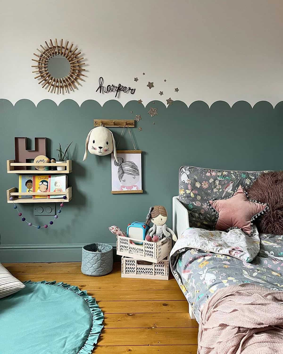
Credit to farrowandball
The previous picture showed how two contrasting colors combine to form a wonderful and sophisticated look. Here, we see a combination of hues that transform the room into a playful wonderland. The scalloped edge where the creamy off-white and muted sage green meet creates a lighthearted atmosphere that any child would love to be a part of. Don’t be afraid to use lesser-common colors!
Single Wall, Different Color
Credit to trendsetter_homes_mo
A combination of colors doesn’t just mean using different colors on a single wall. This homeowner went with a different approach when designing their two-color combo wall. Three-fourths of the bedroom’s walls are covered in a coat of fresh white paint, while the wall behind the bedrest is given a rich chestnut brown. This creates an accent wall, or a wall that has become the focal point of the room due to heavy contrast.
Built-in Shelf
Credit to keadesignlabs
There are plenty of ways to add two or more colors to your bedroom wall. This person took a different route that involves custom-making bedroom furniture with amazing results. As you can see, the closet on the lefthand side is dual-tone, with the upper portion matching the bedroom walls. The middle section is a built-in shelf that spans the width of the closet and extends to the adjacent wall, which also matches the wooden tone.
Alcove
Credit to erin_leigh_paints
You can find all sorts of interesting ways to add color to your bedroom walls. If your bedroom has an alcove, you can paint the space inside it a different color, like in this image. The majority of the bedroom walls are painted a beige color, while the alcove is, as the designer describes it, “Lumiere Roman Clay.” This mix, combined with a few wooden elements, creates a sophisticated look that would be perfect for any master bedroom.
Bold Contrast
Credit to goodhomesmagazine
If you’re more on the daring side, then you should try experimenting with bold color mixes. This person went with a somewhat common mixture of blue and white. But what gives the room such a striking appearance is the type of blue used. It’s a bold shade with a pure-white trim that separates it from the eggshell-white walls. The blue sofa next to the bed may have been the inspiration for choosing this shade of blue.
Subtlety
Credit to dreamspacethedesign
At first glance, the bedroom wall might not look that impressive. Sure, the bedroom is as cute as can be, but what about the walls is two-tone? If you look carefully, you’ll see the bedroom wall is covered in wallpaper that has multi-colored patterns, with white and a slight gray being the dominant colors. These tones complement the overall elegance of the tall mirror, headrest, and wooden closet.
Neutral Transition
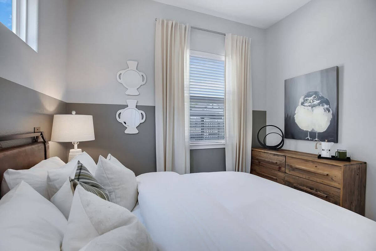
Credit to vluxtrails
When coming up with color combinations, you’ll eventually find a pair that clash heavily or complement each other beautifully. This image belongs to the latter category. The white on top is clearly separate from the gray at the bottom, but they are a neutral combination. Both white and gray pair well with most colors of the rainbow, and together, they make a safe combination. It’s less risky, but at least it’s not a sight for sore eyes.
Horizontal Stripes
Credit to lucyindaloyainteriors
In room design, you can use stripes to play tricks on your eyes. Vertical stripes can trick the mind into believing the ceiling is higher than it really is. On the other hand, horizontal stripes, such as the black-and-white stripes in this image, tend to make us think the room is wider and more spacious. This person cleverly extended the horizontal stripes to only a fraction of the adjacent walls, leaving pure white walls that cover the majority of the bedroom.
Wave Patterns
Credit to palmandprep
The first thing that popped into our minds when first looking at this image is ocean waves. The careful dabbing of various shades of blue paint on the wall make it feel like we’re looking at somewhat rough waters on the horizon. The blue-and-white color scheme can be found in other elements of the room, such as the sofa chairs and carpeting.
Coastal Vibes
Credit to lostandfoundinteriors
While this two-color combination is devoid of wave patterns, the aquamarine color used to cover the bottom portion of these bedroom walls gives us coastal vibes. Judging from the window, this bedroom is probably far from the beach. In fact, it looks like it snowed relatively recently! But you can use your bedroom walls as a canvas to create images or patterns that remind you of warmer climates!
Wall Panels
Credit to https://www.instagram.com/p/DKB2WvPxyWZ/
There are several ways to decorate your bedroom walls. We’ve seen how people have painted their walls in a mix of different colors. And now, we see panels lining the bottom half of these bedroom walls. Panels are great for covering any blemishes in the drywall, but you can also use their colors as a way to beautify the bedroom. There are an infinite number of wall panel styles, so choose what you think works best!
Sophistication
Credit to meredithsinteriors
We see, yet again, another bedroom wall that’s covered in panels. However, these panels are on another level of sophistication and depth! The dark-brown panels clash heavily against the eggshell white walls flanking both sides. Together, the white-and-brown combo stands out against the blue carpeting, creating a look straight out of a five-star hotel. This is a bold color mix, but the results speak for themselves!
Lazy Summers
Credit to boysenpaintphilippines
There are a few words we could use to describe this room, but “lazy summers” seems to suit it best. The light-blue colors, described as “Wonderland” by the original poster, make this room feel like a part of the afternoon summer sky. The farthest wall is coated in a light gray paint, which fits well within its ultra-bright surroundings. While gray is the accent color here, we can’t take our eyes off the blue.
Accent Wall
Credit to cb3painting
Speaking of accents, this bedroom’s accent wall is found deep within the farthest wall of the room. It’s coated in a muted blue hue, while its surroundings are a creamy white. This is almost a perfect replica of the hotel-like bedroom we saw earlier in terms of color scheme, but the colors have shifted position. An accent wall is there to become the focal point, and it’s clear the blueness of the wall is just that.
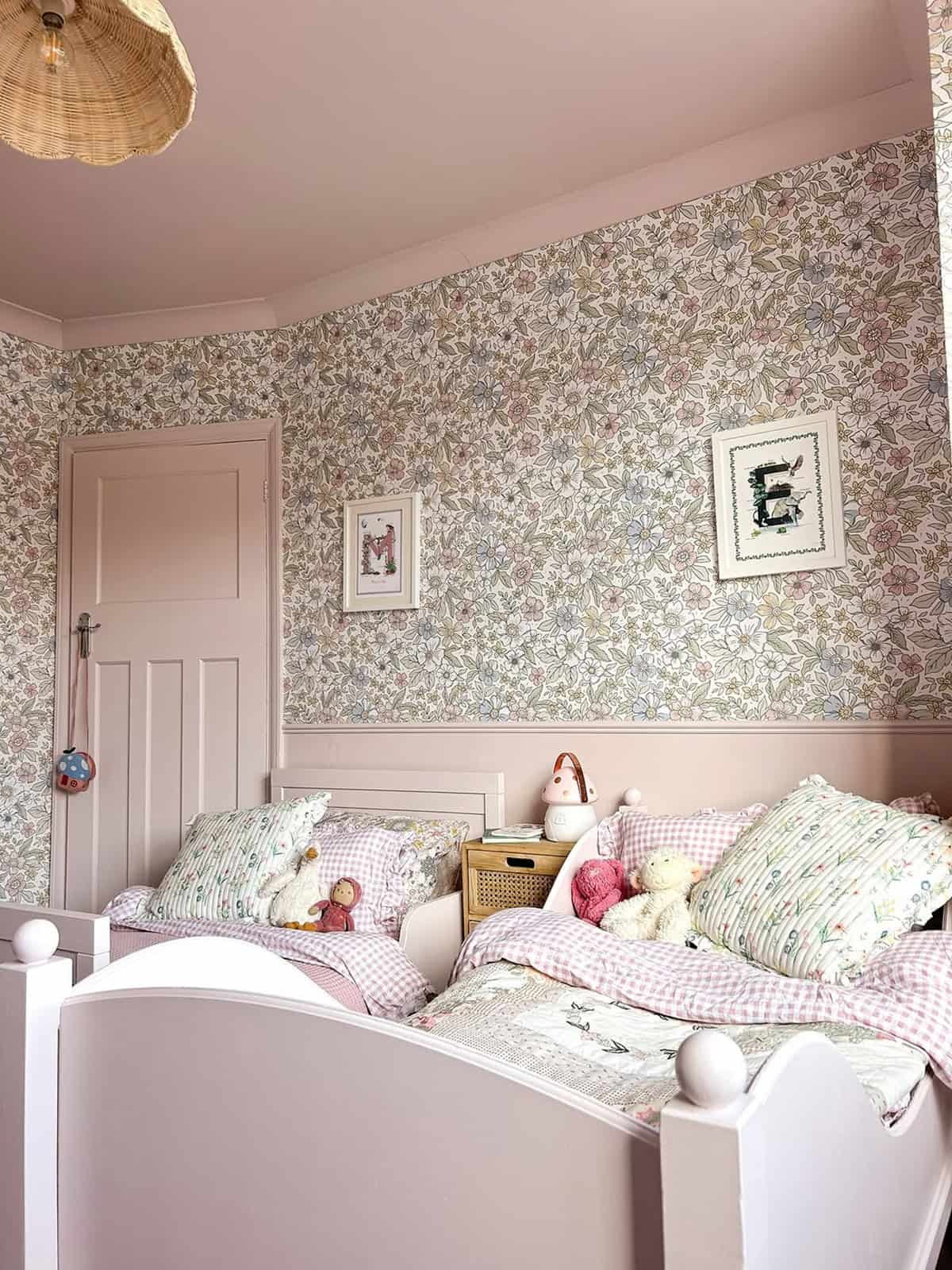
Wallpaper
Credit to houseoflittlewomen
There are several benefits of using wallpaper. First, it’s relatively easy to install. Secondly, it can be used to cover any faults in your drywall. And thirdly, there’s an endless number of colors and patterns to choose from. This person went with intricate floral designs of various colors, while the crown molding, base boards, and door are an identical shade of muted pink. Such a color scheme would be perfect in a bedroom for young girls.
Wavy Effect
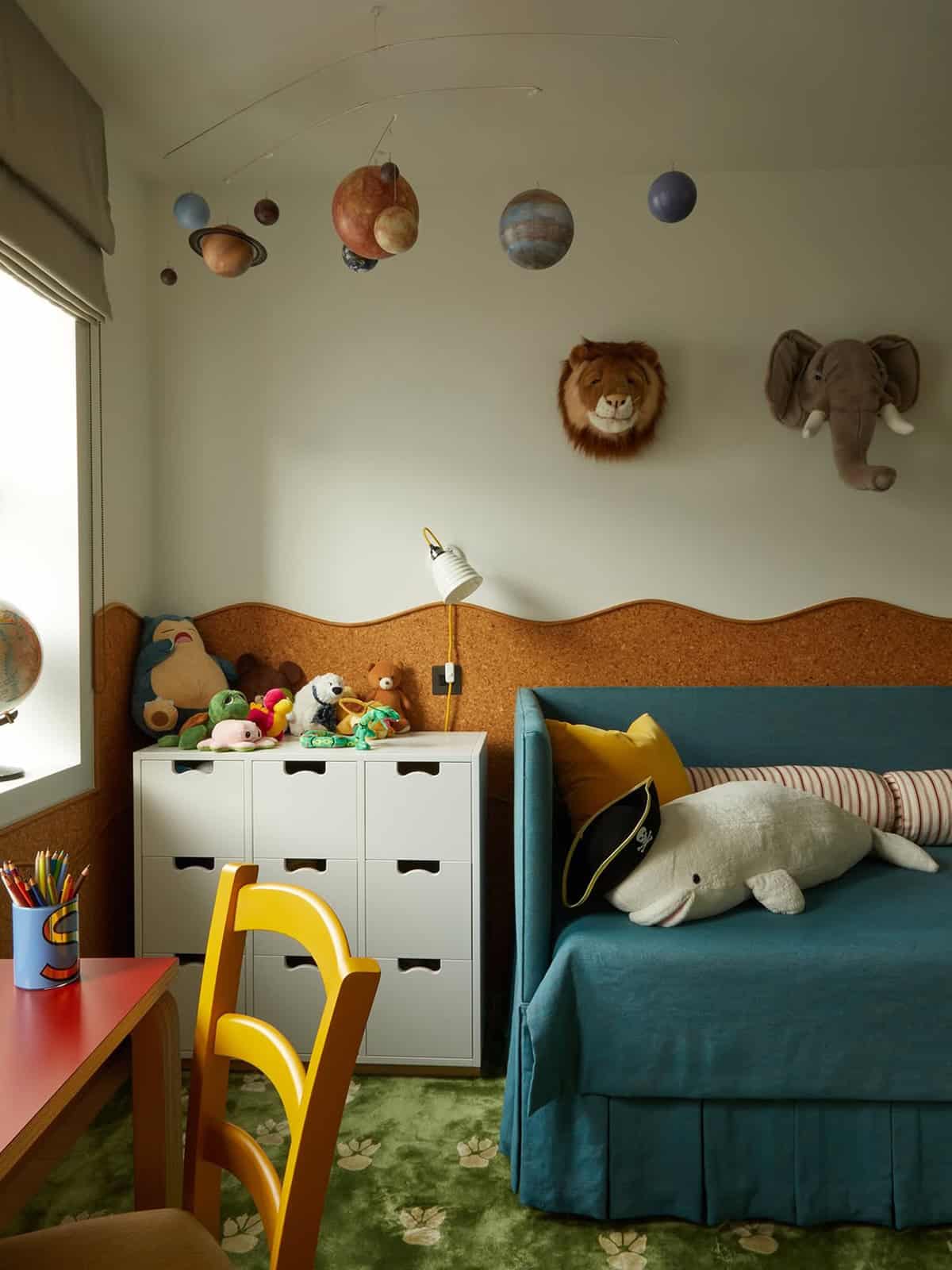
Credit to beataheuman
We’ve seen various effects thus far, from scalloped edges to bold, contrasting lines. This bedroom has a wavy edge where the brown and white meet, but the homeowner designed this bedroom differently. No wall panels, no crisp paint lines—instead, they opted for cork panels with custom-cut edges. The cork is great since it prevents the headrest from slamming into the drywall when their child jumps on the bed.
Carpet on the Walls
Credit to melaniemartininteriors
Here’s an interesting take on two-color combinations. The wall with the window is a simple, clean white. No complaints there since white is the most neutral tone you can go for. But what’s fascinating is the pattern on the accent wall. It looks like thousands of small stones held in place by white mortar. But if you look at the carpeting, you may find similarities between it and the accent wall. Pretty cool, huh?
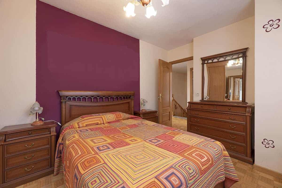
A Dash of Purple
Credit to trishna_design
We said it before, and we’ll say it again. White pairs well with any color of the rainbow, whether it’s the total opposite (black) or anything in between. Here, we see white bedroom walls and panels surrounding a purple accent wall. The layout of this room makes it feel hotel-esque, but the color scheme speaks otherwise. A bold choice to make, but with the right sheets and blankets, purple really is the glue that brings this room together.
Zebra Stripes
Credit to kaarinjoy
Accent walls are there for the designer to add personal flair to a space. It can speak about their passions, their interests, or their desires. It can also be a focal point, which instantly demands attention from anyone who walks in. The white-and-brown zebra stripes on this wall are certainly a fascinating choice. The neutral tones are the perfect foundation for further décor, such as intricate area rugs and potted plants.
Pink and Pinker
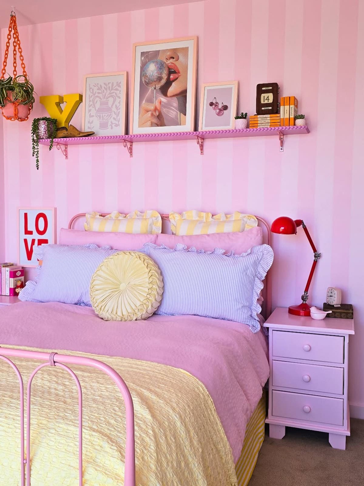
Credit to el_loves_colour
Vertical stripes can have us believing a room is taller than it truly is. But it seems like this homeowner’s aim wasn’t optical illusions but rather to beautify their child’s room as best as possible. From what we can tell, it appears the little girl whose room this belongs to is a fan of pink. So, why not go with several shades of it? The wall is coated in pink and pinker stripes. There’s even a pink floating shelf above the bed!
Highlight of the Room
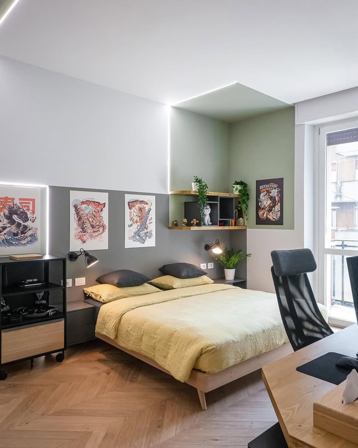
Credit to lialovisolo
Next, we have a bedroom that’s covered in multiple paint colors. The primary colors here are white and gray, which isn’t typically something to get too worked up about.
However, what’s worth noticing is the corner of the room, which is covered in a muted green hue on two walls and the ceiling. This display area is certainly the highlight of the room, and the LED edges make sure everyone knows it!
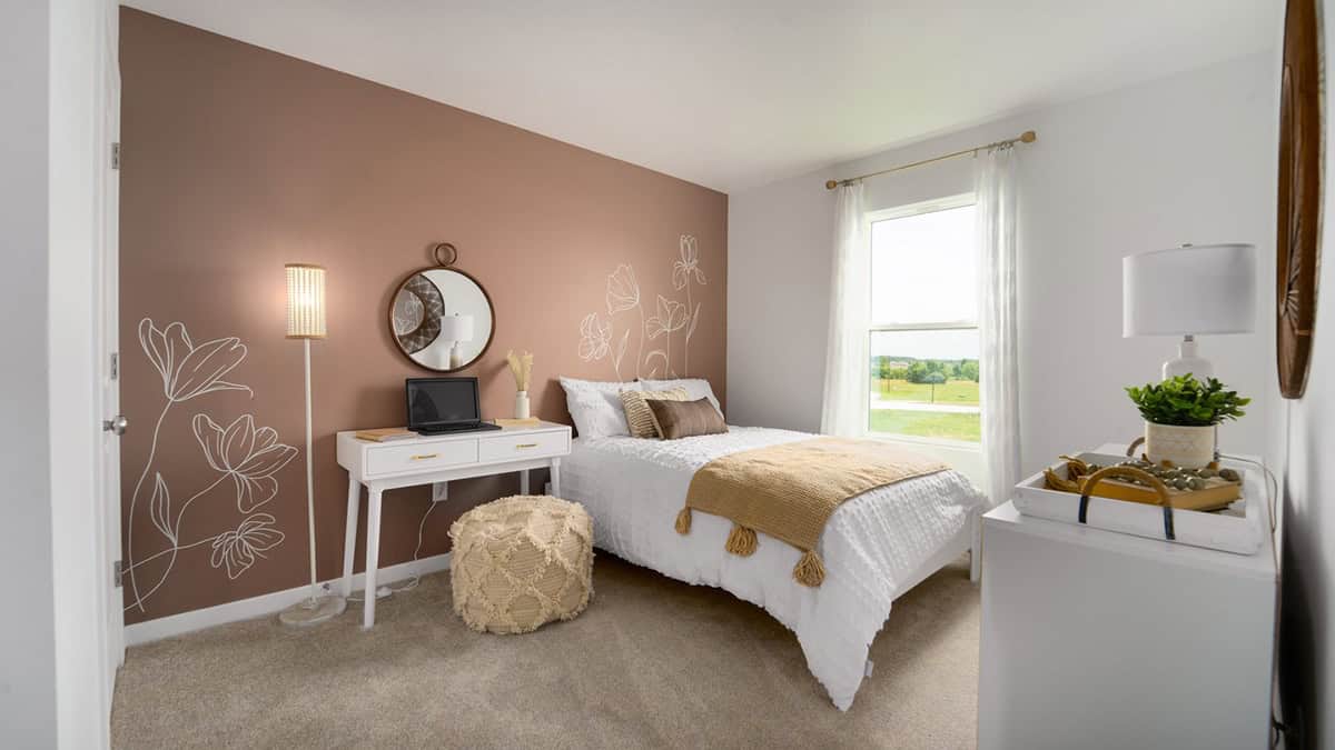
Warm Terracotta Meets Crisp White
A hit of terracotta behind the bed turns up the warmth but avoids that heavy, closed-in feeling. White everywhere else keeps things breathing and fresh.
Go for a sharp, neutral white—skip anything creamy, or you risk muddling the vibe. South- or west-facing rooms catch the best light for terracotta’s earthy glow.
Matte paint does wonders here, cutting glare and letting the clay tone shine. Linen bedding and a touch of black metal help pull the whole look together.
Sage Green And White For Soft Contrast
Sage brings in a gentle, restful energy. It’s light enough for small rooms, especially with crisp white on the trim and ceiling to sharpen things up.
Try sage on most walls, white on one or just the details—keeps the space from going flat. Sage with a hint of grey reads more interesting than the usual green.
Light wood furniture fits right in. Steer clear of icy whites; a warmer white keeps everything harmonious.
Natural Wood Panels With Clean White Walls
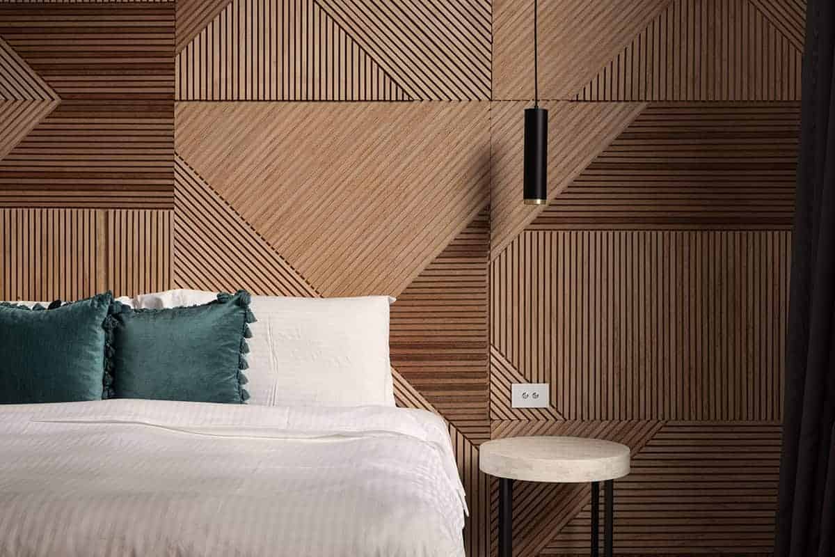
Texture takes center stage with wood slats behind the headboard, stretching the space vertically. The rest in white keeps things airy and uncluttered.
Pick oak, ash, or walnut depending on how much drama you want. Lighter woods open up tight rooms; darker ones add punch in bigger spaces.
Keep trim and ceiling the same white for a clean frame. Simple bedding does the trick—no need to overcomplicate.
Blush Pink + Textured Floral Mauve/Taupe Accent
Blush pink sets a soft, inviting mood across the main walls. A floral mauve or taupe accent, subtle and low-contrast, brings in quiet depth.
The accent wall works best behind the bed—draws the eye, doesn’t overwhelm. Tone down the pattern; you want interest, not chaos.
Stick with neutral floors. Brass or matte black hardware add a little edge. Warm white lights make the pink feel cozy, not candy-like.
Mauve Walls With Crisp White Stripes
Muted mauve lays a sophisticated foundation. Add white stripes—vertical for height, horizontal to widen—depending on what your space needs.
Consistency is key for stripe width. Painter’s tape gets you clean lines, and a bright white keeps the contrast sharp.
Skip glossy paint; it only highlights imperfections. Matte or eggshell is safer.
Teal-Blue To Pale Ice Blue Gradient
Movement comes alive with a wall that fades from deep teal at the base to pale ice blue up top. No harsh dividing lines, just a smooth blend.
Works especially well in modern rooms with high ceilings. The trick is blending—harsh transitions kill the effect.
Go easy on the furniture—light, neutral pieces keep the gradient in focus. Soft lighting helps the colors shift gently.
Grey And Yellow Split Wall Design
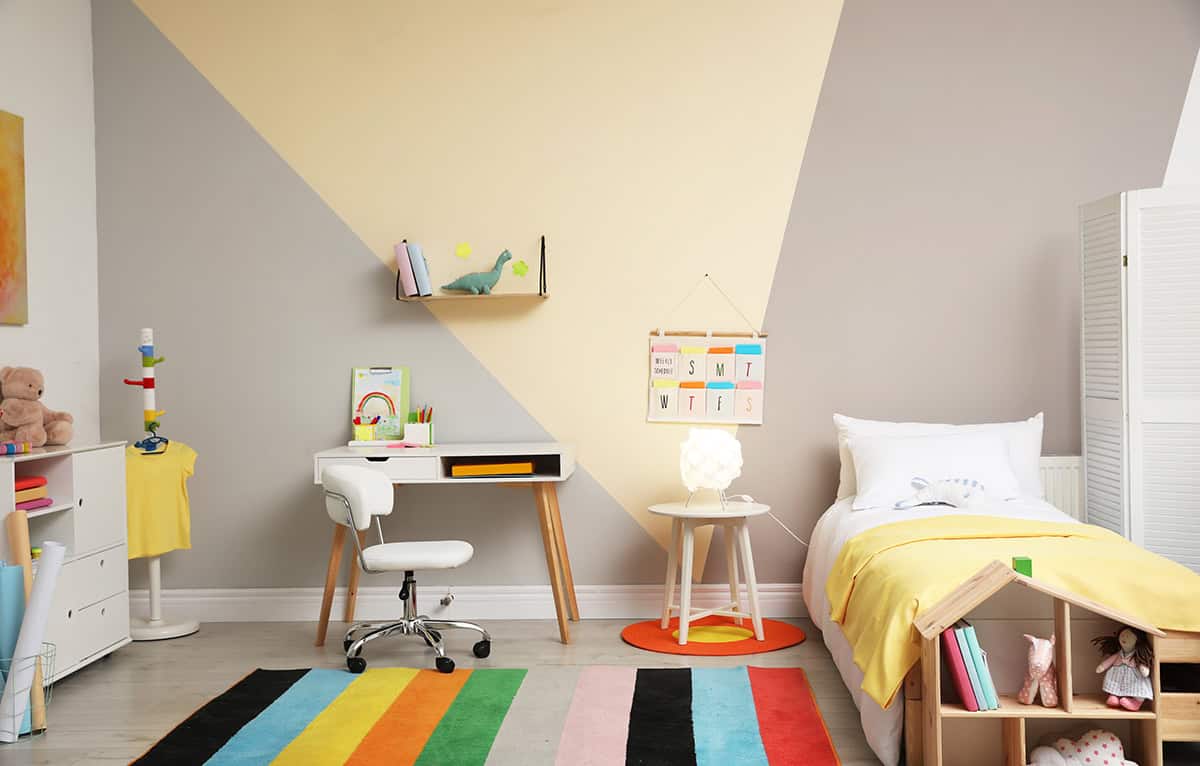
Stability from grey, energy from yellow—split horizontally for balance. In smaller rooms, grey below and yellow above feels grounded but bright.
Keep that dividing line crisp. Muted mustard reads more sophisticated than loud neon. White trim helps everything stand out.
This pairing feels right at home in a contemporary setup.
Warm Beige And Taupe Half-Wall Split
Beige and taupe together offer a soft, subtle contrast—no wild swings in color, just a gentle shift. Minimalist spaces benefit from this approach.
Taupe on the bottom half grounds things; beige up top keeps it light. Make sure the undertones match so it doesn’t clash.
Layer in texture with bedding or rugs, and stick to matte finishes for a polished, understated look.
Cobalt Blue And Soft Tan Two-Tone Walls
Bold cobalt on one main wall instantly grabs attention, while soft tan on the rest dials back the intensity. Natural light helps keep the blue from feeling too heavy.
Tan softens the space and keeps the palette from getting overwhelming. White ceilings keep things bright, and neutral fabrics tie it all together.
Avoid adding more strong colors—let cobalt be the star.
Deep Purple Accent With Warm Beige Walls
Purple packs a punch as a focal point—behind the bed is best. Warm beige elsewhere balances the richness without going cold.
Cool beiges fight with purple, so stick with warm tones. Gold or brass accents, used sparingly, add just enough shine.
Soft lighting deepens the effect. Patterns? Keep them minimal.
Soften The Mood With White And Lush Green
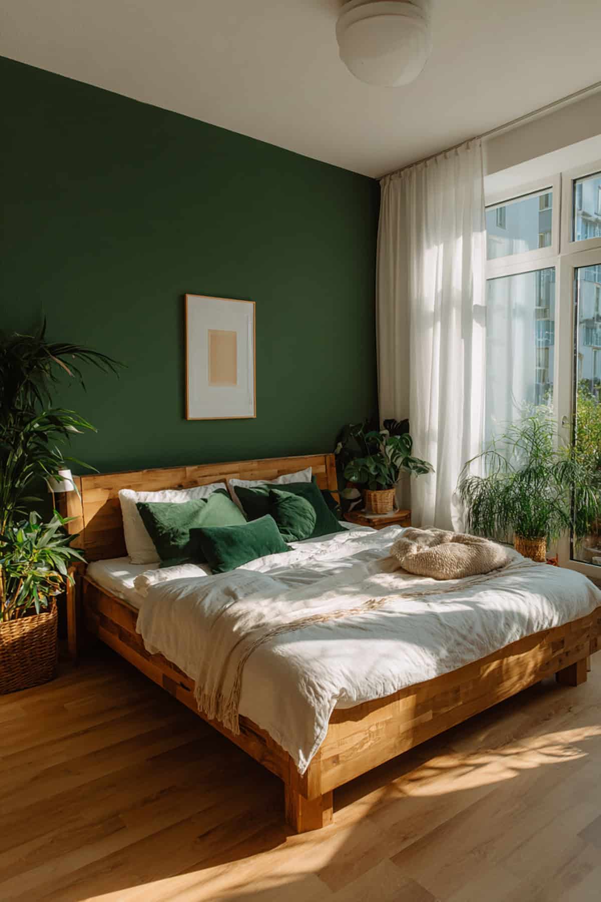
Clean white walls make a solid base, while a deep, botanical green on one wall brings in calm and contrast. The vibe is peaceful, not sterile.
Pick a rich green—nothing too neon or bright. White trim keeps lines sharp and defined. Live plants echo the wall color, and wood furniture rounds out the look. Simplicity rules here.
Play It Safe With White And Beige
Low contrast, high flexibility—white and beige are the go-to for wide appeal and small spaces. Beige on main walls, white for trim and ceiling, and warm undertones prevent it from feeling clinical.
Add life with textured fabrics—linen, wool, woven rugs. Accessories? Less is more.
Lime Green And Yellow To Brighten Up Your Space
Lime green injects energy, yellow bounces the light around. Best in rooms that already get plenty of sun.
Keep lime green to a single wall, use soft yellow nearby, and balance the whole thing with white ceiling and trim.
Stick with neutral furniture and matte paint to keep things from getting too loud. This combo feels young and fresh.
Jewel Tones Of Red And Royal Blue
Strong contrast here—pick one (red or royal blue) to dominate, the other as an accent. Deep red suits bigger rooms; royal blue pairs well with crisp white bedding.
Neutral floors help ground the color. Skip busy patterns and keep lines clean. Lighting is key to avoid a cave-like feel.
Indigo And White For A Boost Of Colo
Indigo brings depth, but without the harshness of black. White trim and ceiling pop against it, keeping the room sharp and defined.
Use indigo sparingly—one or two walls max. Natural light brings out its richness.
Light wood furniture and simple textiles keep things from feeling heavy. Best to avoid more dark colors here.
Delightful Blue And Harmonious Orange
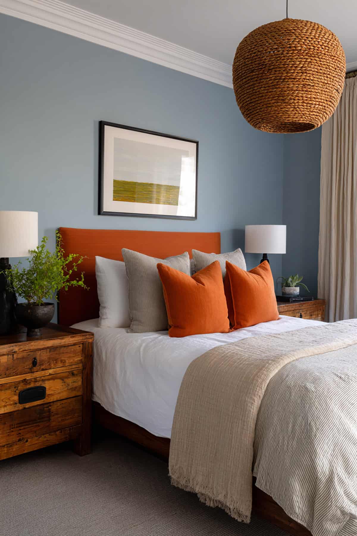
Blue soothes, orange brings a gentle warmth. Stick to muted versions—no bright primaries. Blue works as the main color, orange as a headboard accent.
Moderate saturation is safer. White bedding balances things out, and brass accents add a bit of interest. Clean lines keep it modern.
Combine Bohemian Chic Red With Light Yellow
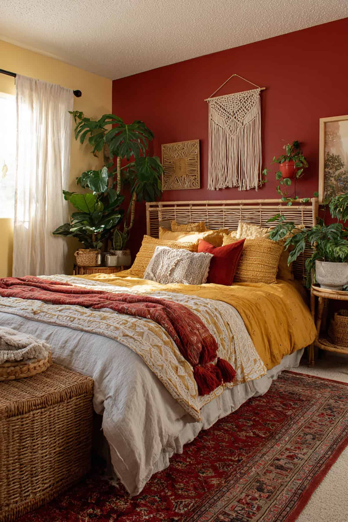
Earthy red grounds the bottom half, while light yellow up top lifts the mood. Feels eclectic, a little boho, without going overboard.
Keep undertones warm for harmony. Woven textiles and wood furniture fit right in. Matte finishes are the way to go—no shine needed.
Capture The Charm With Yellow And White
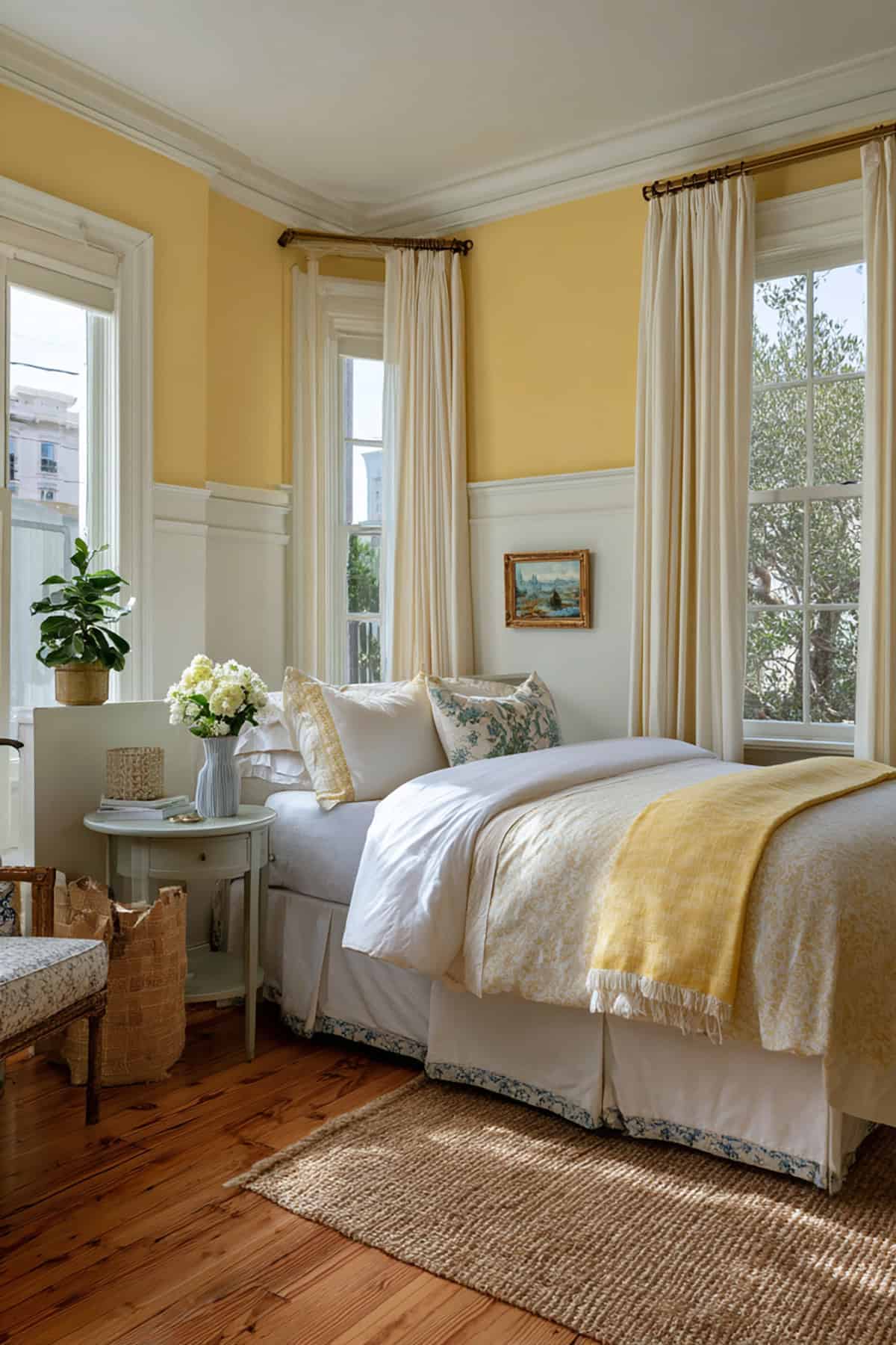
Yellow bounces light around, adding warmth. Soft, buttery shades feel inviting, not brash. Three yellow walls, white trim and ceiling—simple and balanced.
Natural wood furniture and unfussy fabrics fit perfectly. Avoid cold whites for trim; stick with warmer tones.
Calming Green And Daring Pink
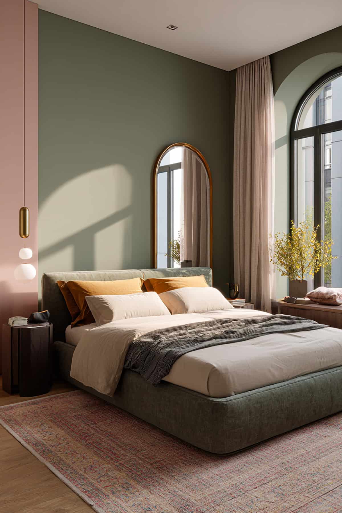
Muted green sets a steady base, while dusty pink brings in contrast without blinding brightness. Both should have similar undertones for unity.
Green on most walls, pink behind the bed for a little drama. Decorative clutter? Not needed. Neutral bedding ties it all together, and matte paint keeps things feeling fresh.
Burnt Orange And White For A Sultry Combination
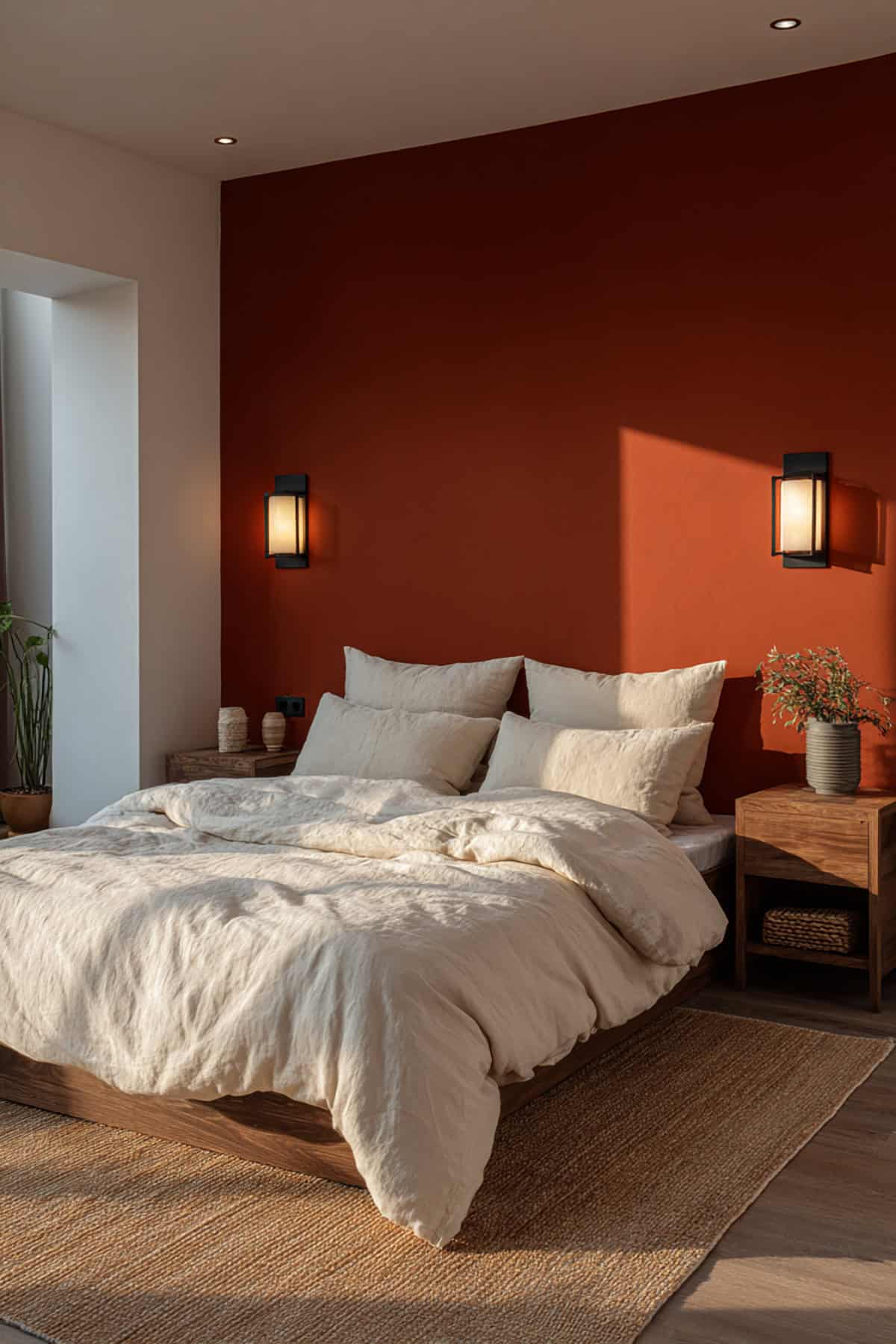
Late afternoon light bouncing off burnt orange can feel almost decadent, especially when crisp white is in the mix to keep things lively instead of stifling. Try orange splashed across a single wall if you’re after a bold move.
Stick with a true, bright white—creamy shades just seem to muddy the vibrancy and, honestly, the whole point gets lost.
Chunky dark wood pieces ground the palette, while a bit of soft, moody lighting dials up the cozy factor. Best not to clutter things up; let the colors do the talking.