If you’re planning to update your basement, start with the walls. Paint is the fastest way to brighten and refresh the space. To help, we’ve gathered 13 of the best basement paint colors that make even the darkest rooms feel inviting.
Table of Contents
Best Paint Colors For a Basement
Picking a paint color down here can totally change how the basement feels and what you want to use it for. The way light works in a basement, plus the paint’s undertones, shifts the whole mood.
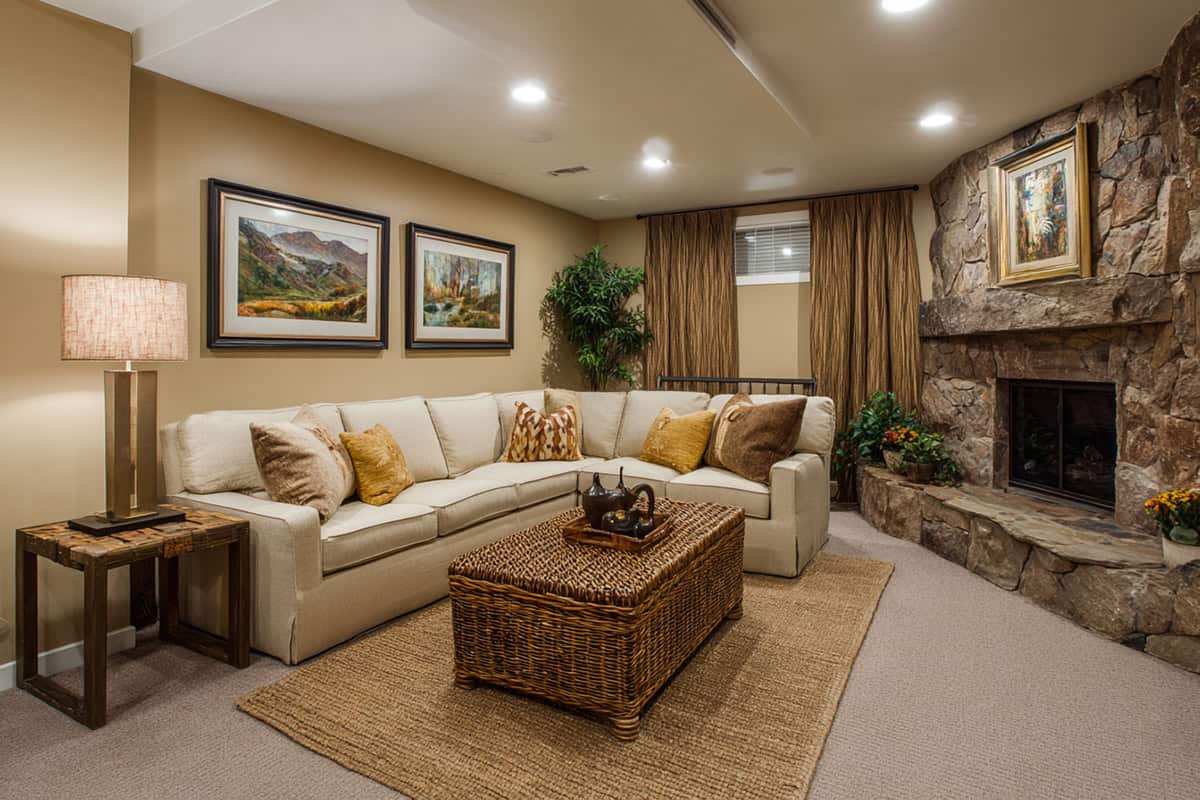
Soft Greige
Soft greige is a go-to if you want warmth without losing brightness. It’s that sweet spot between beige’s coziness and gray’s neutrality. Works with most styles, honestly—from super minimal to more lived-in looks.
Since basements rarely get great natural light, greige reflects what’s there without turning weirdly yellow or blue. It’s less stark than white, so you don’t get that “unfinished basement” vibe.
It’s also practical—greige hides dirt and scuffs, which is a bonus in spaces that get a lot of use.
Warm Taupe
There’s an earthy softness to taupe that feels relaxed without making the basement smaller. It’s at home with leather, natural wood, and muted accessories.
If you’ve got a workspace or a spot for watching movies, taupe cuts down on glare compared to white walls. Still feels inviting, never chilly.
Decor accents really stand out against taupe. The overall effect is calm and grounded—never overwhelming.
Light Sage Green
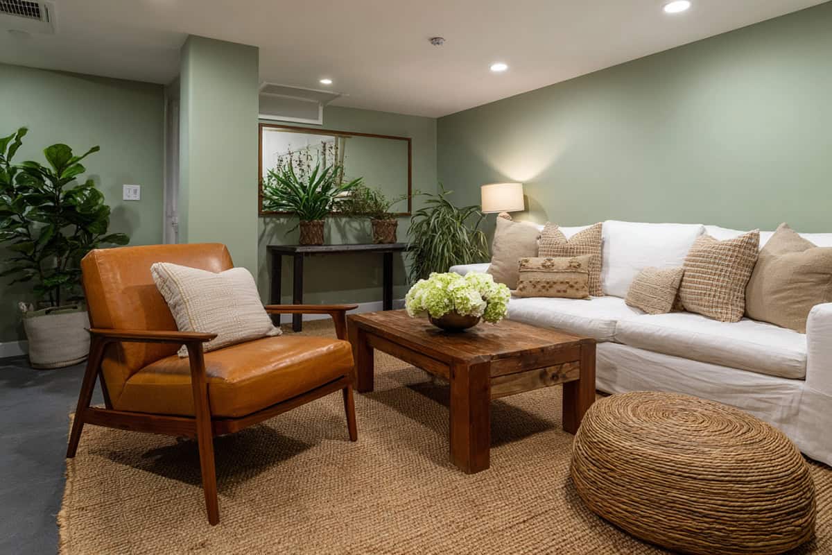
Bringing in a touch of sage instantly connects the basement to the outdoors.
Sage is forgiving on old, uneven walls and pairs nicely with cream or wood trim.
It’s easy on the eyes, especially under basement lighting. This shade just quietly lifts the mood without trying too hard.
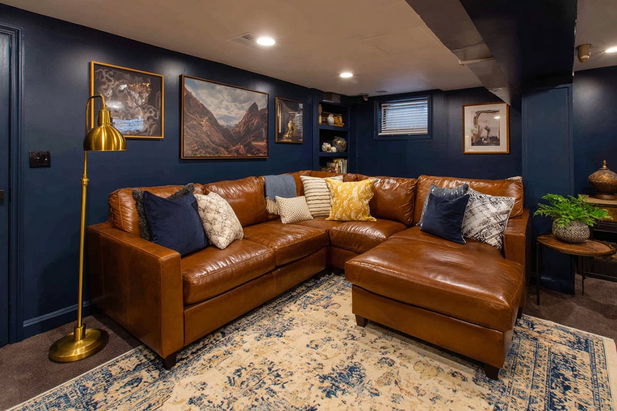
Moody navy is bold but not suffocating—best used for an accent wall or built-ins. It can make a small area feel unexpectedly sophisticated.
Navy looks great with metallics and pops against lighter trim. It’s more polished than gloomy, if you get the balance right.
It gives home theaters or lounges a cozy, immersive feel, and it really helps artwork or decor stand out.
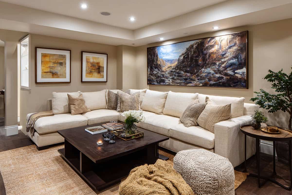
Creamy Off-White
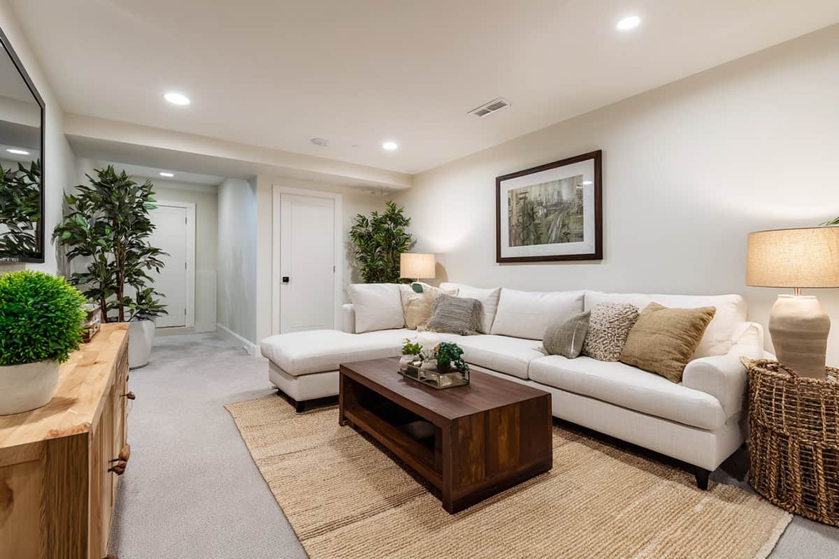
A soft off-white can make dim basements feel bigger and more inviting.
It reflects whatever light you have, making the space seem bigger and closer in mood to your main living areas.
Off-white is endlessly versatile—matches with pretty much any accent color, and never really goes out of style.
Charcoal Gray
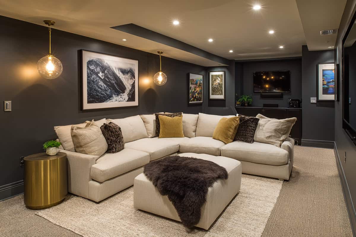
Grounding a large basement is easy with charcoal, a shade that feels bold but controlled. Plus, it’s forgiving if your basement sees a lot of foot traffic.
Pair it with light floors or trim to avoid a cave-like feel. The dark shade brings a sense of intimacy that’s perfect for game nights or movie marathons.
It teams up nicely with metal, glass, or wood, and can even hide awkward ceiling lines or pipes.
Pale Blush
Pale blush brings a gentle warmth—nothing too sugary or loud. It’s great for spaces with little to no natural light, adding a bit of cheer.
Pairs well with light woods, gold, and soft grays. It can turn a basement family room or guest space into a genuinely cozy retreat.
It’s subtle enough for multi-use spaces and won’t overwhelm a smaller room.
Golden Beige
Hints of gold in beige warm up a basement and counteract its naturally cooler feel.
It bounces light around, even in basements with zero windows. Works for both fancy and casual setups.
Earth-toned furniture and art really pop against golden beige, and it fits with both classic and modern decor.
Deep Forest Green
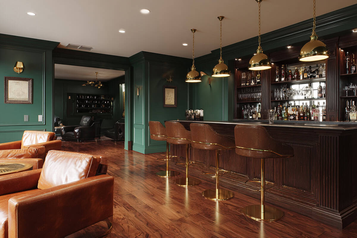
Choosing forest green adds drama and creates a cocooning atmosphere downstairs.
Looks best with brass, tan, and rustic wood. Whether it’s on one wall or cabinetry, it adds drama without draining energy from the space.
The deep color softens harsh lighting and helps create a sense of privacy—sometimes you want that in a basement.
Soft Sky Blue
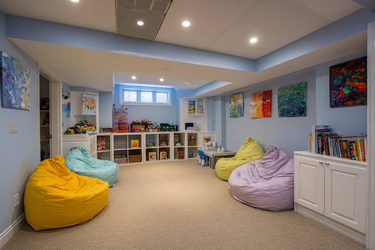
Soft sky blue makes the basement feel open and lighter, almost like it’s getting a bit of daylight after all.
Blue tones are calming, and they mix well with grays, whites, or even some greens and blushes if you’re into a subtle palette.
It’s a solid pick for playrooms, laundry areas, or even an art studio—anything that could use a little extra brightness.
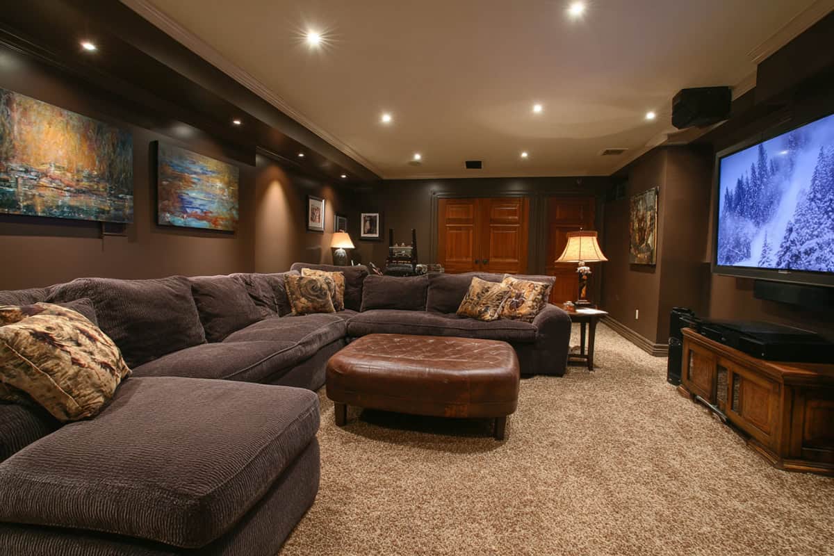
Chocolate Brown
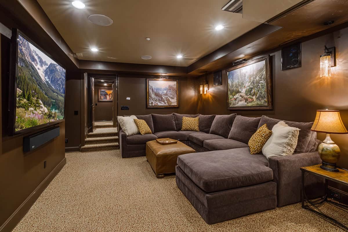
Few colors create a den-like coziness as effectively as chocolate brown.
It hides imperfections and stands up to wear and tear. Looks great with caramel accents and neutral furniture.
With enough lighting, chocolate brown feels secure and grounded. If you’re after a more traditional look, it’s a strong choice.
Warm Terracotta
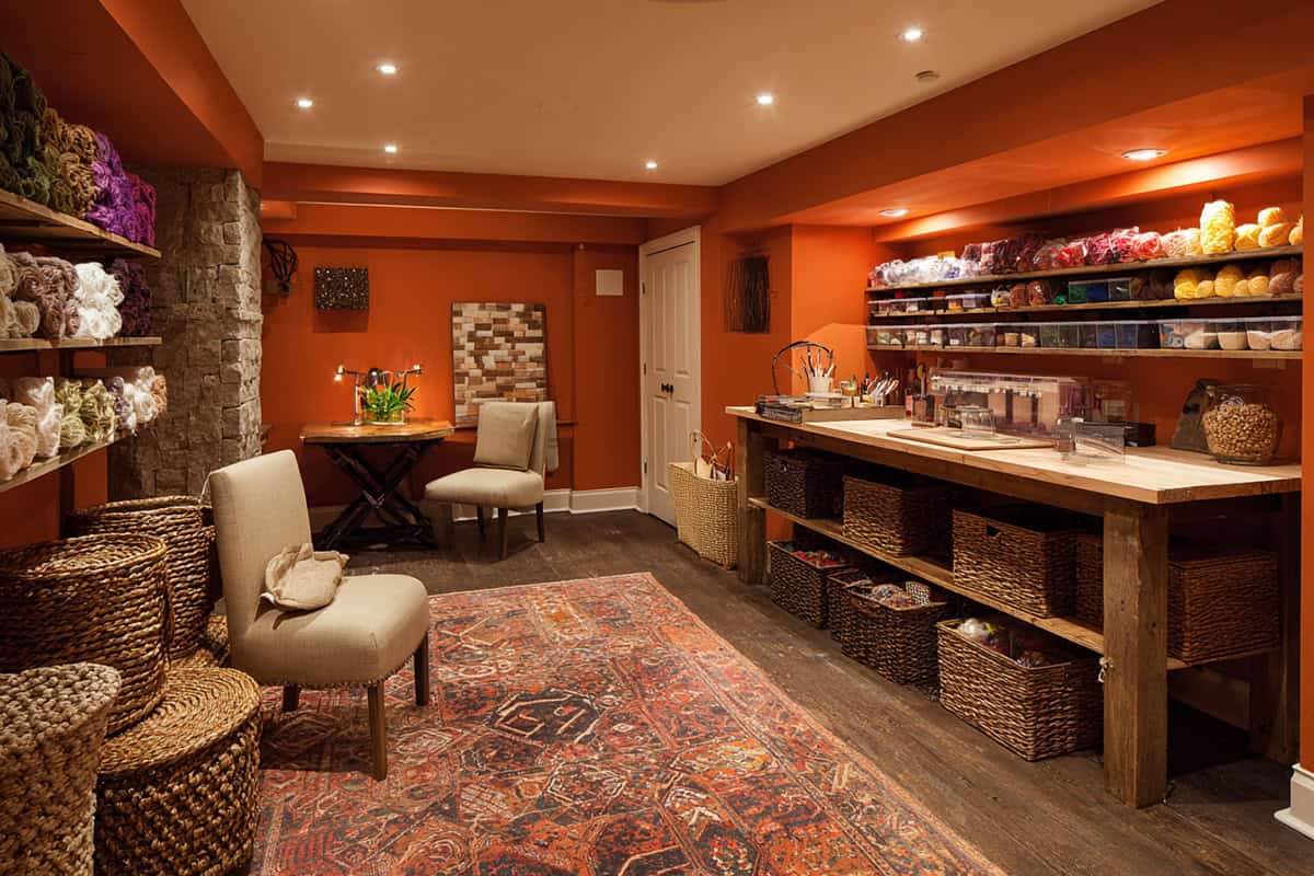
Warm terracotta brings color and earthiness, with just a hint of red and orange for energy—never too flashy.
It plays well with leather, black metal, and both dark and pale woods. Terracotta highlights textures and makes small spaces more interesting.
If your basement is a studio, game room, or creative spot, this shade feels both grounded and lively. It’s got a bit of that Mediterranean or Southwestern flair, if that’s your thing.
Light Silver Gray
A silver-toned gray cleans up the look of a basement while still feeling approachable.
It has a way of opening up small basements, making them feel a little more spacious and modern. Some paints even have a slight metallic undertone, which can bounce light around and perk up a dim room.
This color pairs nicely with bold accents, and it’s easy to match with hardware, fixtures, or even random electronics. Plus, it’s forgiving—scuffs and smudges don’t jump out at you, so it’s actually pretty smart for busy areas.