A fresh coat of paint can change the entire mood of a kitchen faster than almost any other update. Wall color influences how cabinets, countertops, and flooring come together. One shade can make a compact kitchen appear brighter, while another adds depth and contrast.
Browse these kitchen wall color ideas before choosing your next paint color.
Table of Contents
- Kitchen Wall Color Ideas
- Wooden Slat
- Deep Forest Green
- Muted Celery Green
- Terracotta
- Sage Green
- Blue-Gray
- Warm White
- Warm Taupe
- Warm Ivory
- Soft Lavender-Gray
- Soft Greige
- Soft Beige
- Smoky Blue
- Seafoam Green
- Sand-Colored
- Rich Chocolate Brown
- Red Brick
- Pale Gray
- Pale Blue
- Olive Green
- Navy Blue
- Moss Green
- Lime Green
- French Gray
- Eucalyptus Green
- Dusty Teal
- Dusty Green
- Dusty Blue
- Dark Green
- Cream
- Charcoal Gray
- Black
Kitchen Wall Color Ideas
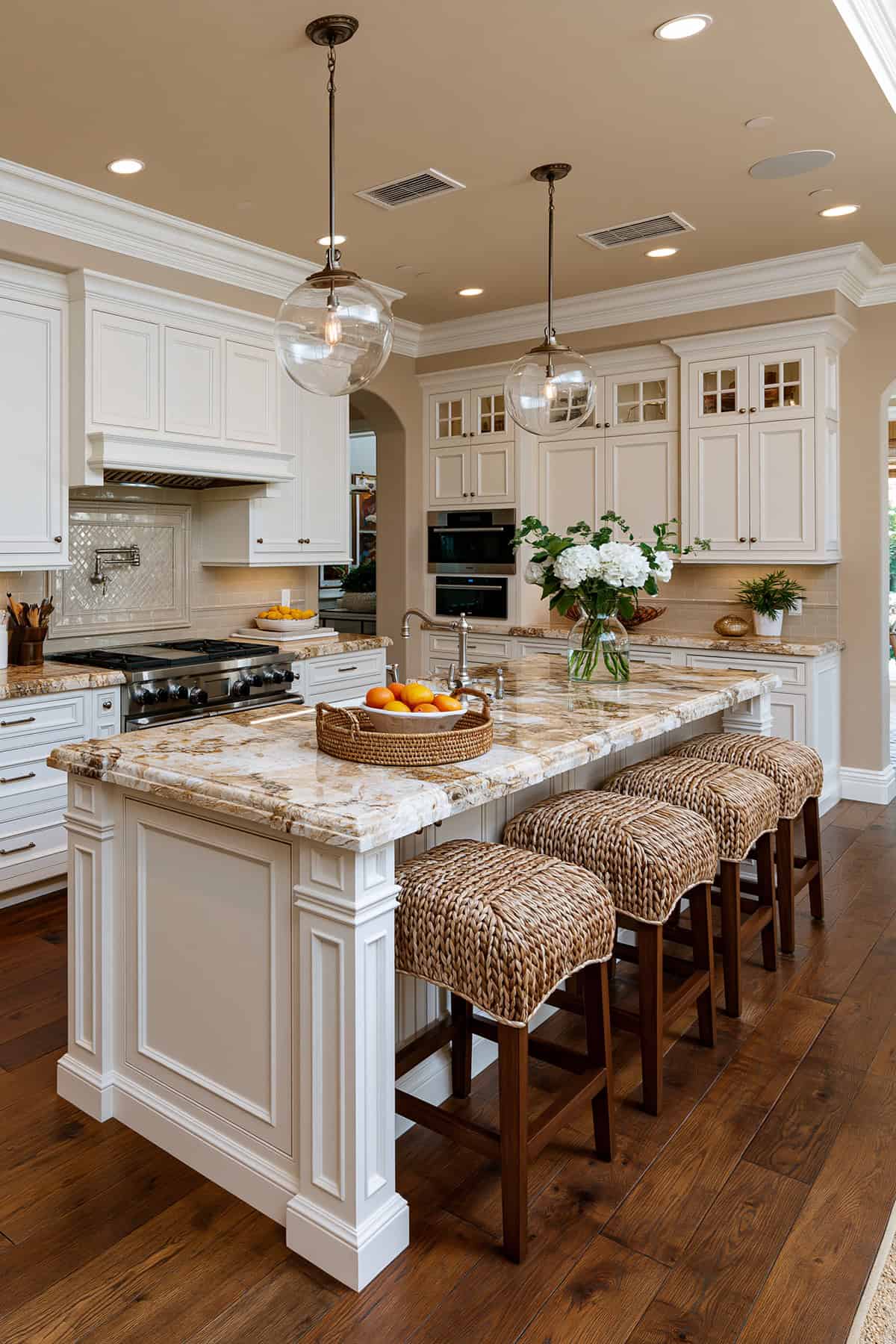
The most successful kitchen paint colors work through contrast and restraint. A warm greige wall can steady bright white cabinets. Meanwhile, a deep charcoal or paint colors such as Hale Navy HC-154 can sharpen a white kitchen with gold hardware, black hardware, or brass fixtures.
If your space has white subway tile, a patterned backsplash, shaker-style cabinets, quartz, or butcher block, your wall color needs to support those materials. Avoid competing with existing finishes. Focus on shades that complement the hardware and appliances.
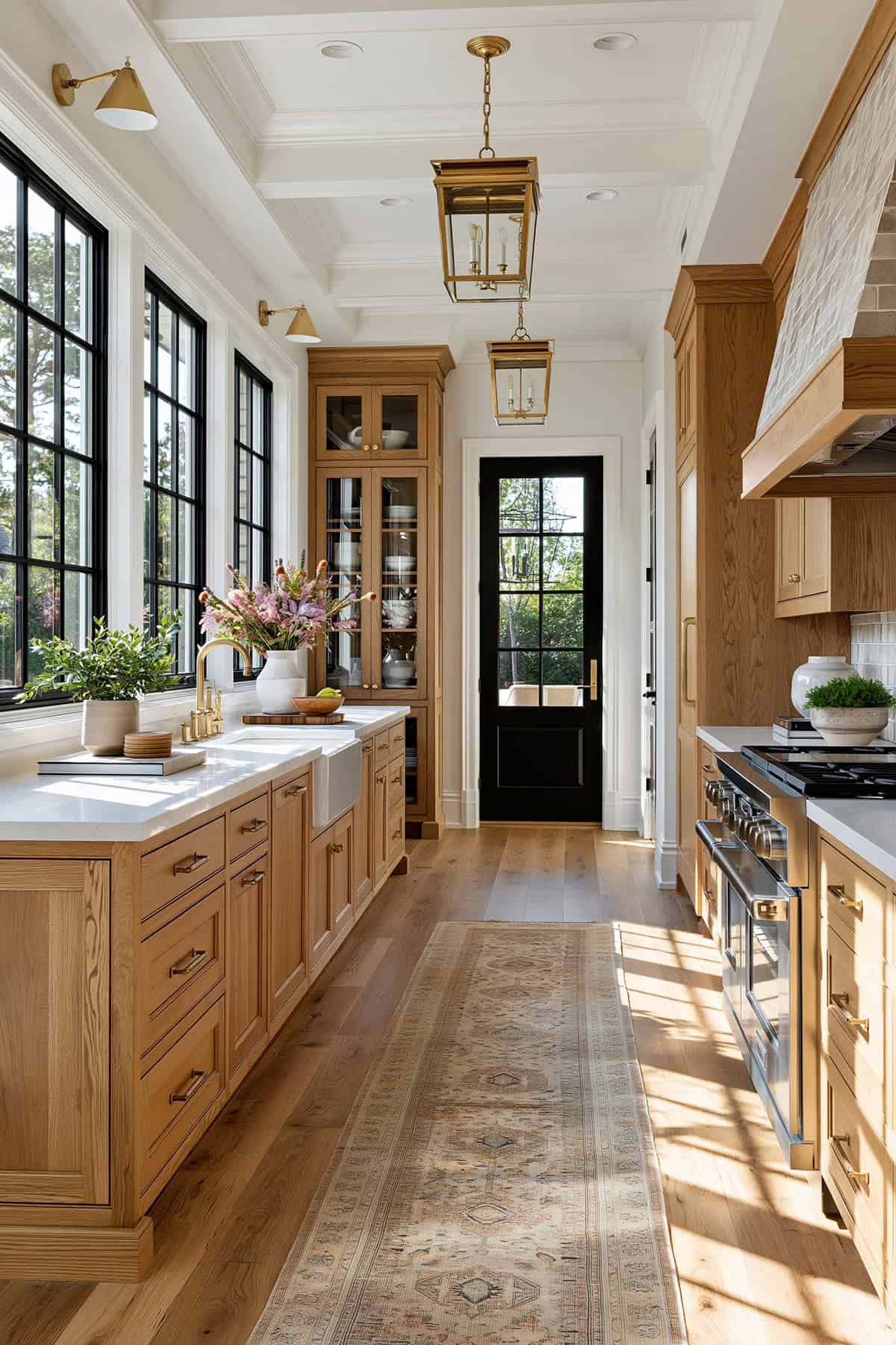
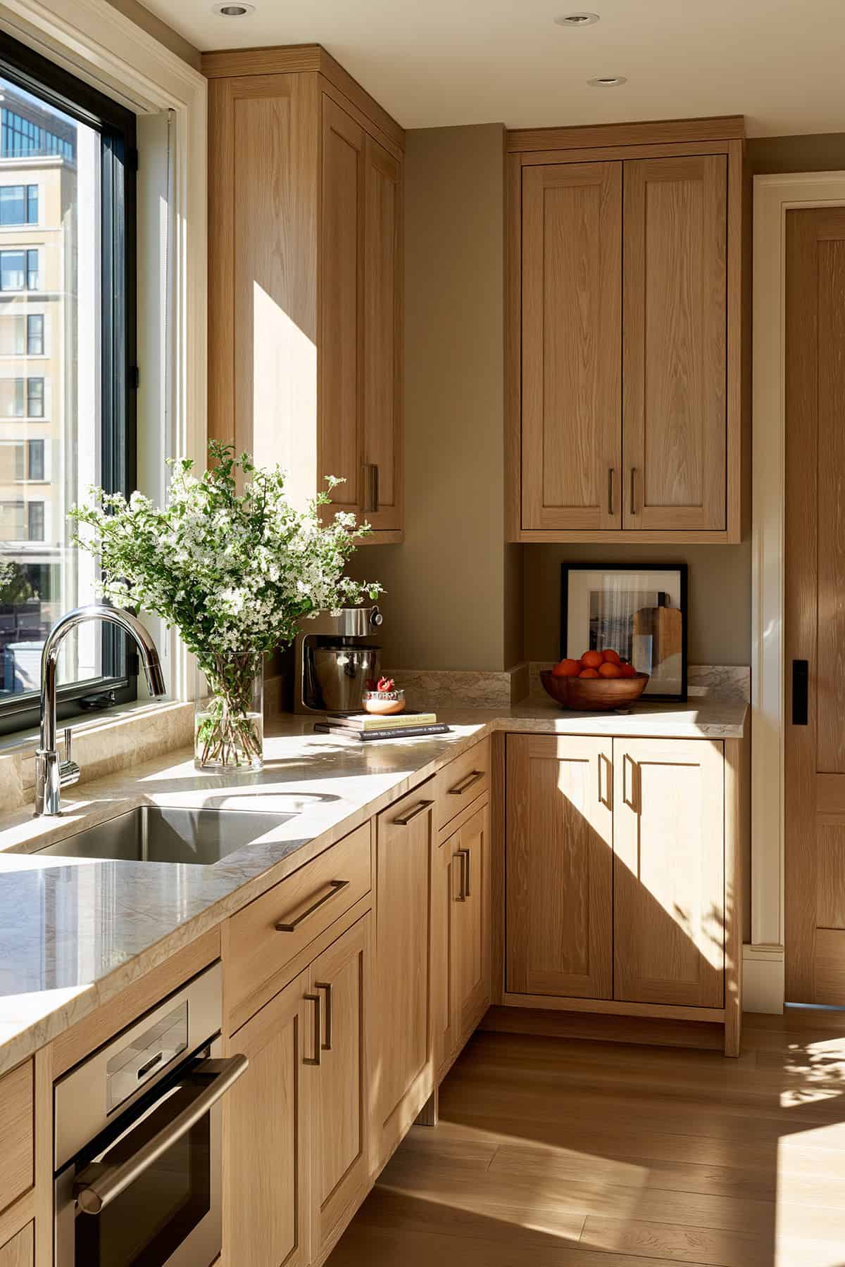
Wooden Slat
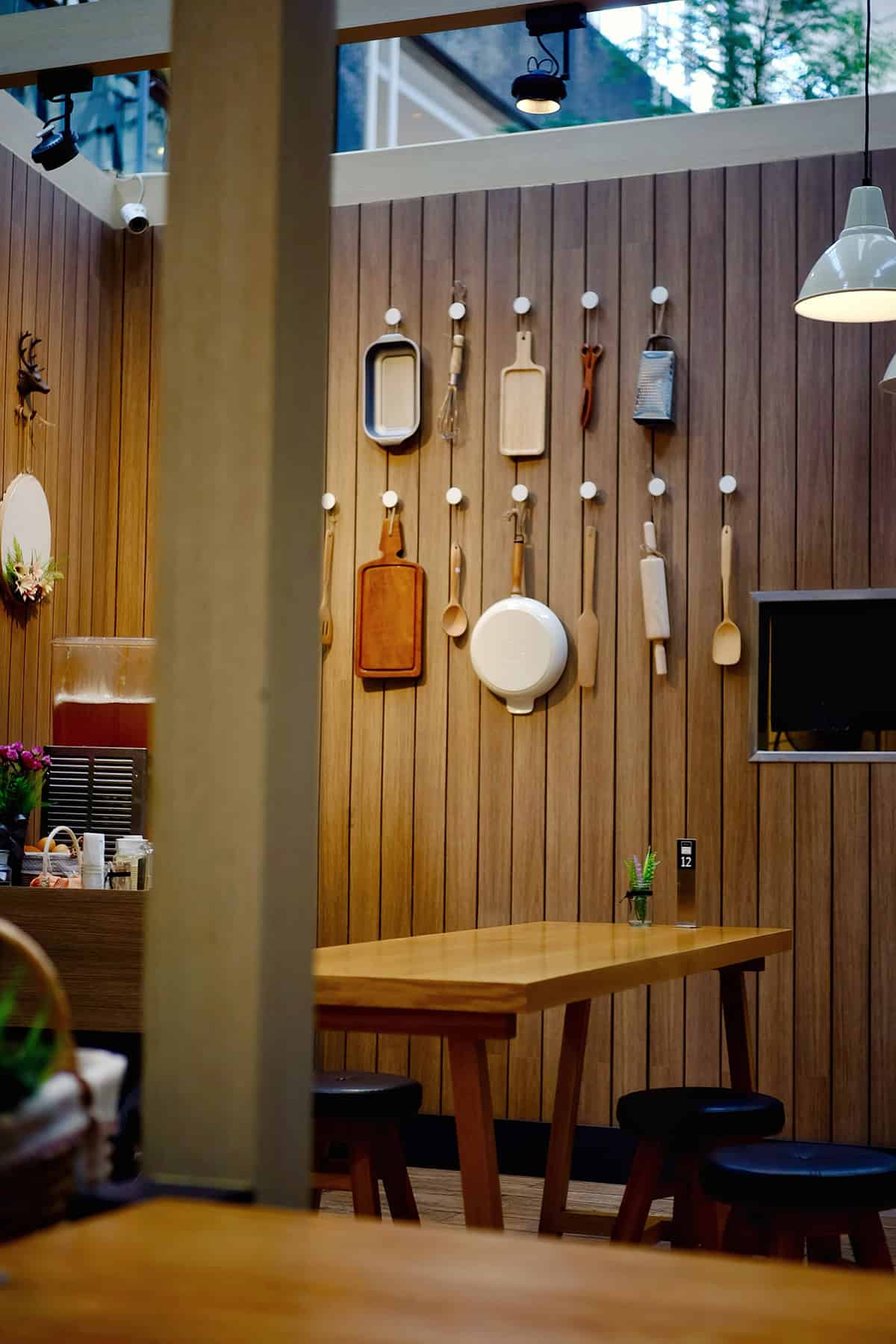
Surface variety changes the whole reading of color, and vertical wood slats prove it fast. If your kitchen leans modern, slatted walls in warm wood tones can stand in for paint. This softens white cabinetry, cool gray counters, and stainless steel appliances.
This direction suits open shelves, a blue island, and classic white finishes especially well. Keep the stain matte and mid-toned so the grain stays visible. If the wood is too dark, the wall starts to look heavy beside marble countertops and white cabinets.
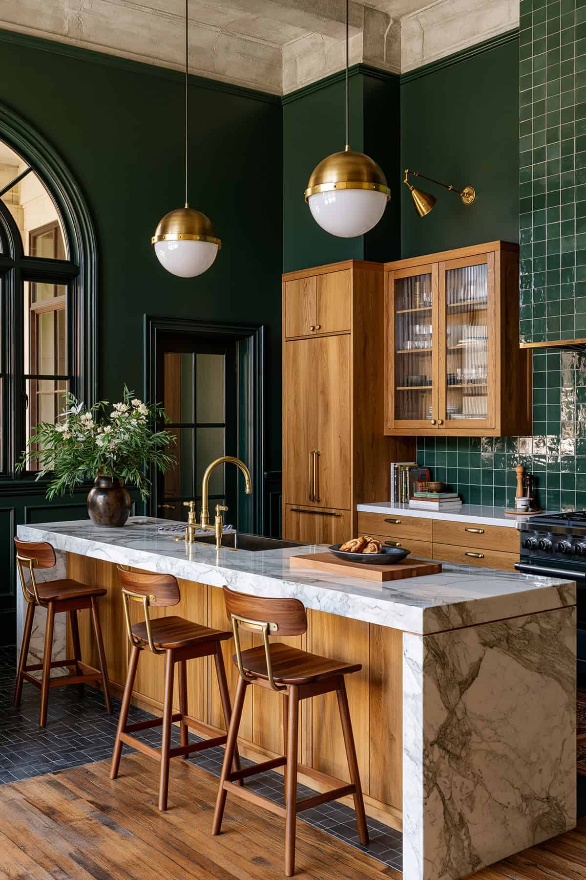
Deep Forest Green
Low light turns deep forest green into a near-neutral, which is why it is so steady in a hardworking kitchen. Against white cabinetry and a white subway tile backsplash, the depth looks crisp rather than moody.
You get the strongest result when the green has an earthy base instead of a sharp jewel undertone. Pair it with brass fixtures, warm wood tones, and dark grout lines for a grounded look. In kitchens with islands, this shade lets a blue or natural oak island stand apart cleanly.
Muted Celery Green
A softer yellow-green shifts the room in a lighter direction without going sugary. Muted celery works best when your cabinets are white dove oc-17, cream, or pale wood, and when the room gets decent daylight.
It has enough color to break from a plain neutral scheme, yet it still looks calm beside subway tile and quartz countertops. If your kitchen includes black hardware, the contrast looks fresh and tailored.
Terracotta
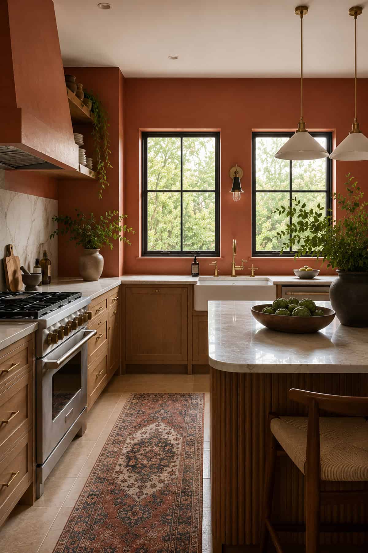
Earth-driven color can be excellent in a kitchen when the saturation stays controlled. Terracotta walls sit beautifully with wood cabinets, butcher block surfaces, and off-white tile because the warmth is material, not decorative.
You need balance here. If your backsplash already has strong clay or red notes, pull the wall color quieter. In a white kitchen, terracotta can give enough weight that gold hardware and marble countertops stop looking too pristine.
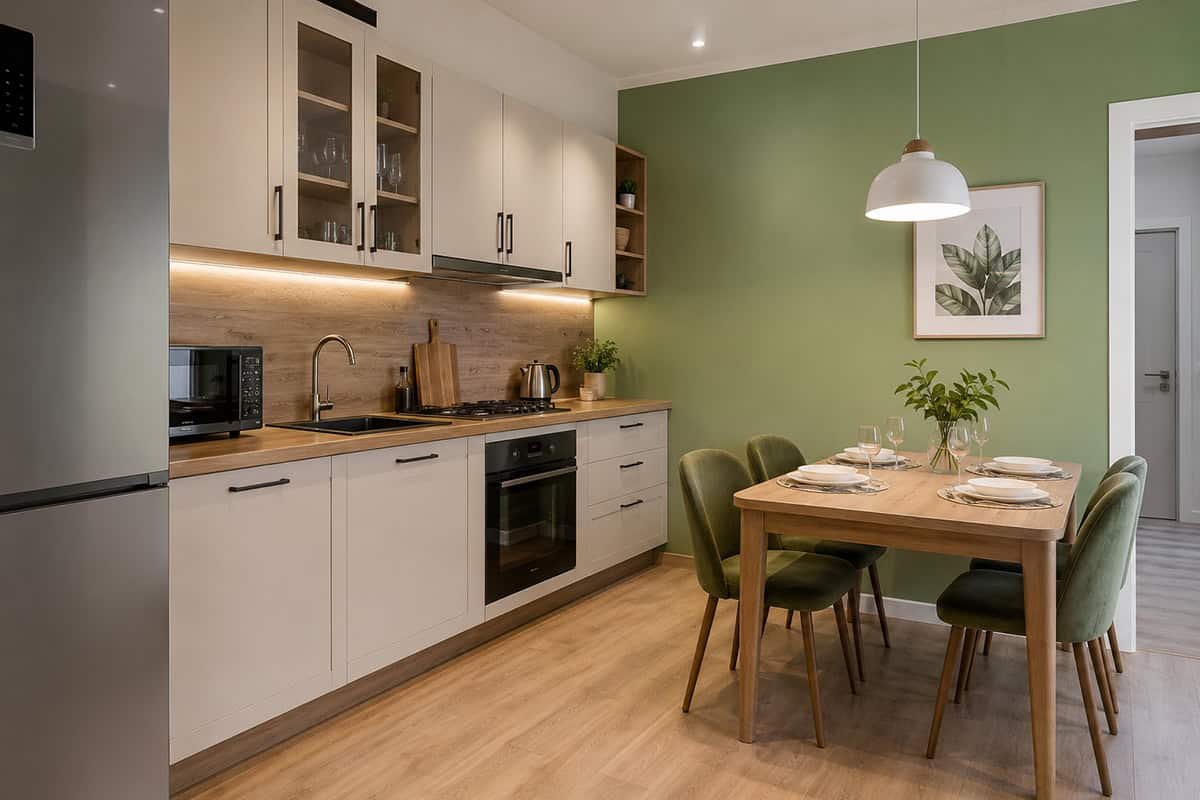
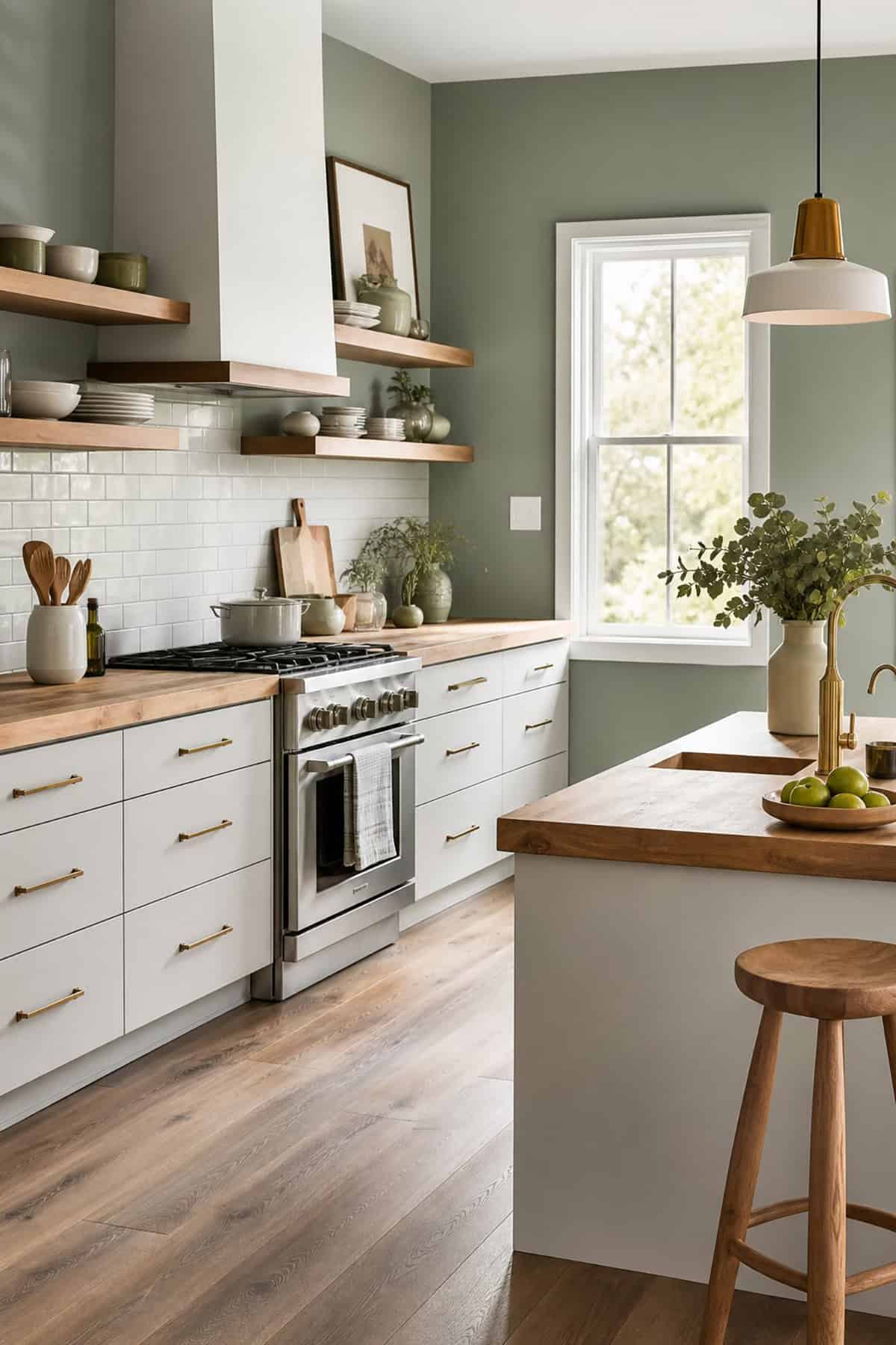
Sage Green
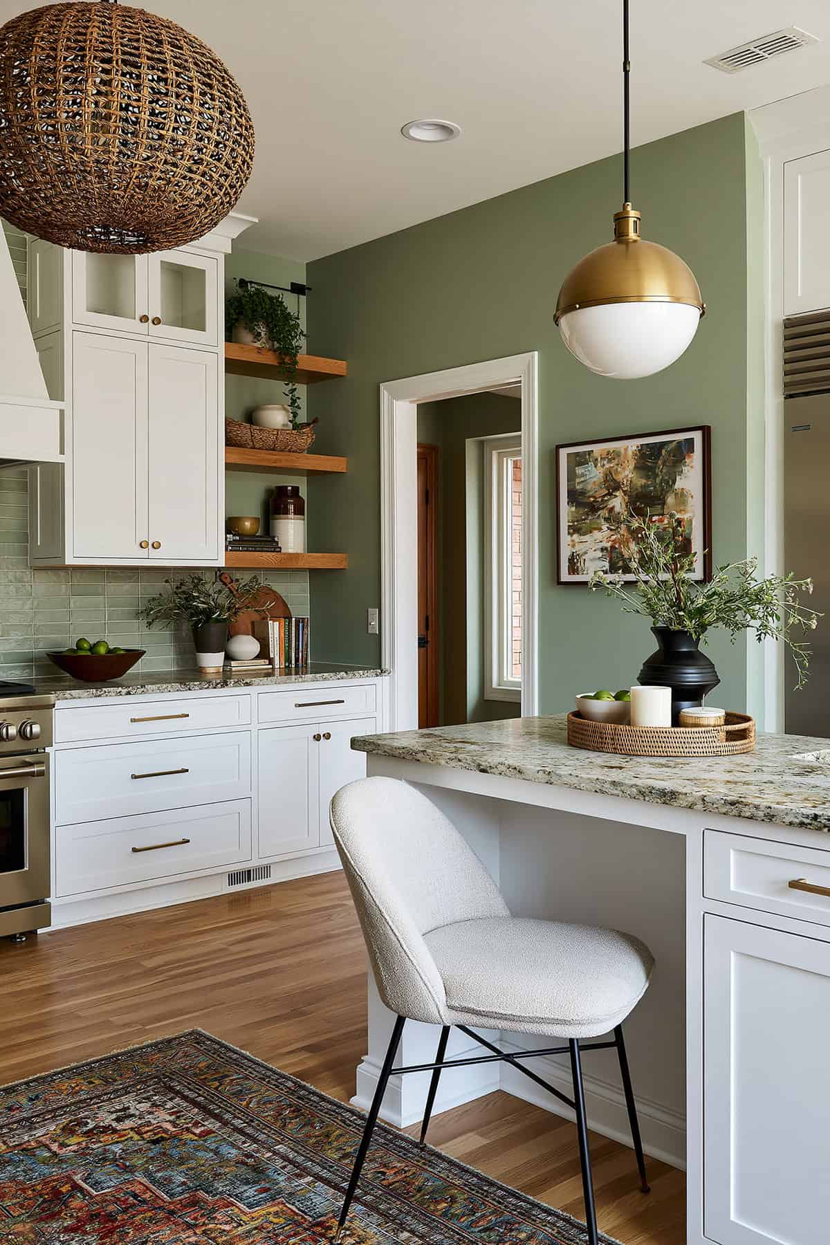
This is one of the safest color moves you can make without defaulting to beige. Soft sage green carries enough gray to stay composed and enough warmth to flatter white cabinets, classic white trim, and natural wood.
It performs well in open-plan kitchens where the wall color needs to relate to nearby living spaces. With shaker-style cabinets, white subway tile, and stainless-steel appliances, sage looks settled and expensive without effort.
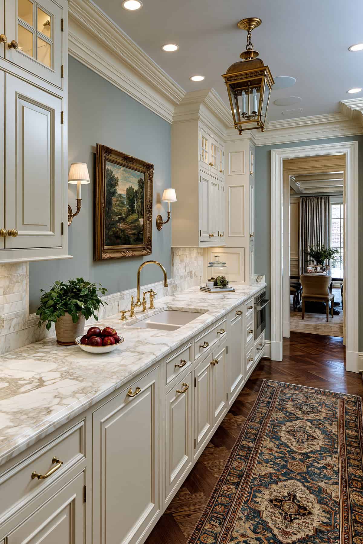
Blue-Gray
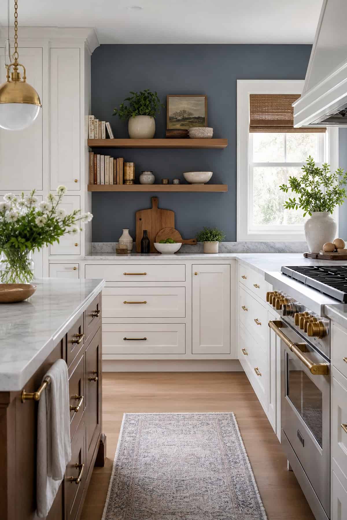
A blue-gray wall works when you want coolness without the flatness of basic gray. The blue note sharpens white cabinetry and marble countertops, while the gray keeps the room from looking nautical.
In kitchens with a blue island, choose a paler wall so the island keeps visual priority. If you lean toward Sherwin-Williams or Benjamin Moore palettes, test these shades in both daylight and under-cabinet lighting. The undertone can swing colder at night.
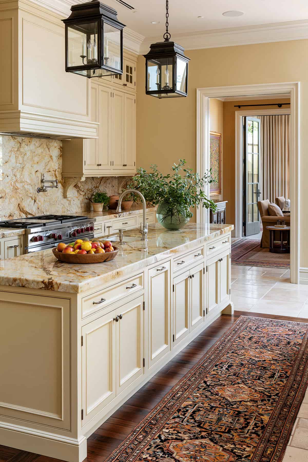
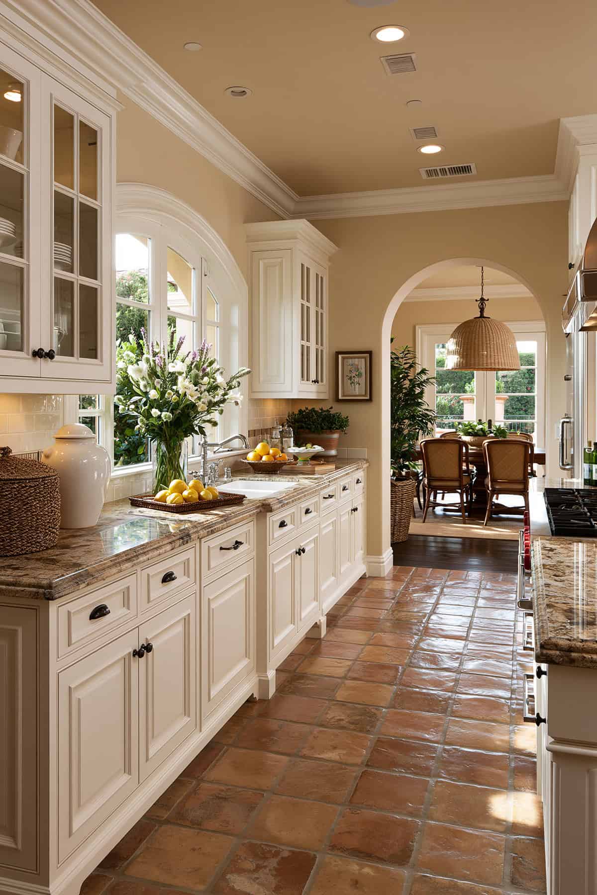
Warm White
White is never just white in a kitchen. Warm white walls keep an all-white kitchen from looking sterile, especially with white cabinets, white subway tile, and stainless-steel appliances.
Look for a shade with a creamy or lightly beige undertone rather than stark brightness. White dove oc-17 remains a reliable reference point. It stays soft near marble countertops, warm wood tones, and brass fixtures.
Warm Taupe
Taupe walls carry more structure than beige and more warmth than gray. That balance is useful when your kitchen color scheme includes white cabinetry, black hardware, and a patterned backsplash that needs a quieter backdrop.
This shade also helps bridge mixed finishes. If your room combines stainless steel appliances, warm oak floors, and a charcoal or blue island, warm taupe keeps those elements from splitting into separate visual zones.
Warm Ivory
Ivory suits kitchens that need softness without losing brightness. It looks especially well near shaker-style cabinets, marble countertops, and gold hardware, where a pure white can look too sharp.
You get a more timeless effect when the undertone leans buttery only slightly. In shadowy corners, warm ivory holds its warmth better than cool gray or stark white.
Soft Lavender-Gray
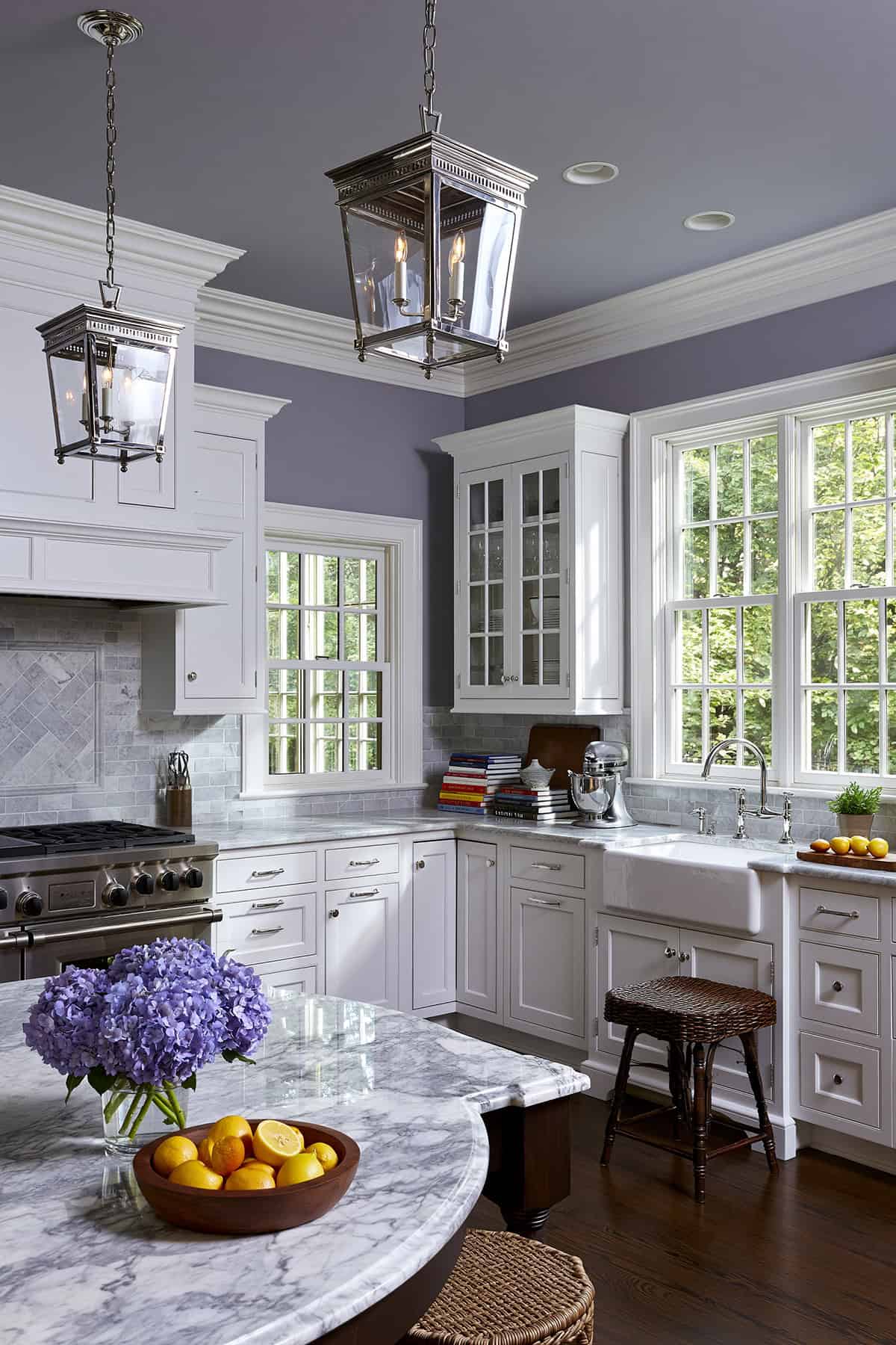
This is a quieter choice than it sounds. Lavender-gray sits in that narrow space where coolness looks elegant, not icy. It can be excellent with white cabinets, silver tones, and subtle veining in stone.
Use restraint with surrounding finishes. A busy backsplash or heavily patterned quartz countertops can muddy the effect. Cleaner lines, classic white tile, and polished nickel let the color look deliberate.
Soft Greige
Greige remains one of the best kitchen paint colors for good reason. The mix of gray and beige steadies both warm and cool materials. This is ideal if your room includes stainless-steel appliances, white cabinetry, and medium-tone wood floors.
A soft greige also gives flexibility with cabinet paint. It works beside hale navy hc-154, deep charcoal, muted green, or classic white kitchen islands without forcing a redesign later.
Soft Beige
The right soft beige can look refined, especially with wood cabinets, butcher block surfaces, and cream tile that need a wall color with warmth and low contrast. This provides a subtle backdrop for kitchen activity.
Keep the undertone clean. Pink-beige can turn muddy near red oak, while yellow-beige can look dated under cool LED bulbs. In person, the best versions look quiet and dry, not peachy.
Smoky Blue
A smoky blue looks mature because the saturation is held back. It sits comfortably with white cabinets, black hardware, and marble countertops, giving you color without the sweetness of a brighter blue kitchen.
In north-facing rooms, test this carefully. Too much gray and the walls can go dull. With warm brass fixtures and wood stools, the shade regains depth and looks deliberate.
Seafoam Green
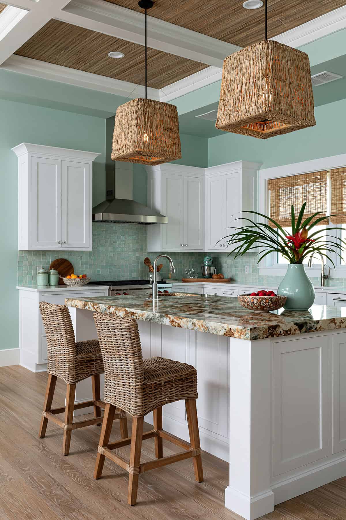
For kitchens that need lift, seafoam can be a smart move if the shade stays muted. It looks airy around white cabinetry and a white subway tile backsplash, especially in smaller rooms that need visual openness.
The key is restraint in the rest of the palette. Clean countertops, pale flooring, and simple hardware keep seafoam from tipping playful. Done right, it is fresh and coastal without a theme.
Sand-Colored
Sand tones sit between beige and taupe, with a drier, more mineral quality. That quality works beautifully with patterned backsplash surfaces, warm wood tones, and handmade tile.
If your kitchen has a lot of hard contrast, black hardware, or a dark island, sand helps soften the room. It gives warmth without the sweetness that can come with creamier neutrals.
Rich Chocolate Brown
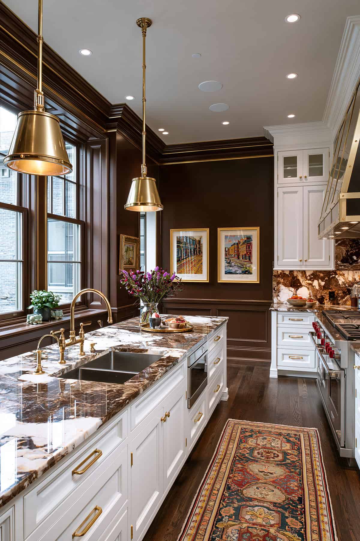
Dark brown needs confidence and enough light around it. In a kitchen with white cabinets, marble countertops, and brass fixtures, rich chocolate is tailored and architectural rather than heavy.
Limit the gloss and keep the trim simple. This shade benefits from contrast, so pair it with classic white millwork, warm wood tones, or a pale stone floor to keep the room from closing in.
Red Brick
Brick-based color has a raw, grounded quality that suits older homes and kitchens with visible character. If your room includes wood cabinets, open shelves, or a butcher block countertop, this hue can be deeply rooted.
The best versions lean earthy, not primary red. A matte finish helps. Next to white cabinetry and subway tile backsplash, red brick looks stronger, so keep surrounding materials quiet.
Pale Gray
When your counters and backsplash are busy, pale gray can restore order. It works especially well with white cabinets, stainless steel appliances, and quartz countertops that have cool veining.
Choose the undertone carefully. A cool gray can sharpen an all-white kitchen, while a warmer gray looks better near wood cabinets and brass fixtures. Flat, chalky grays tend to fall short once food, light, and daily life enter the room.
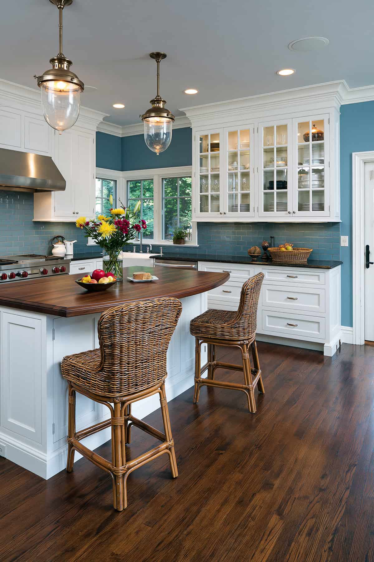
Pale Blue
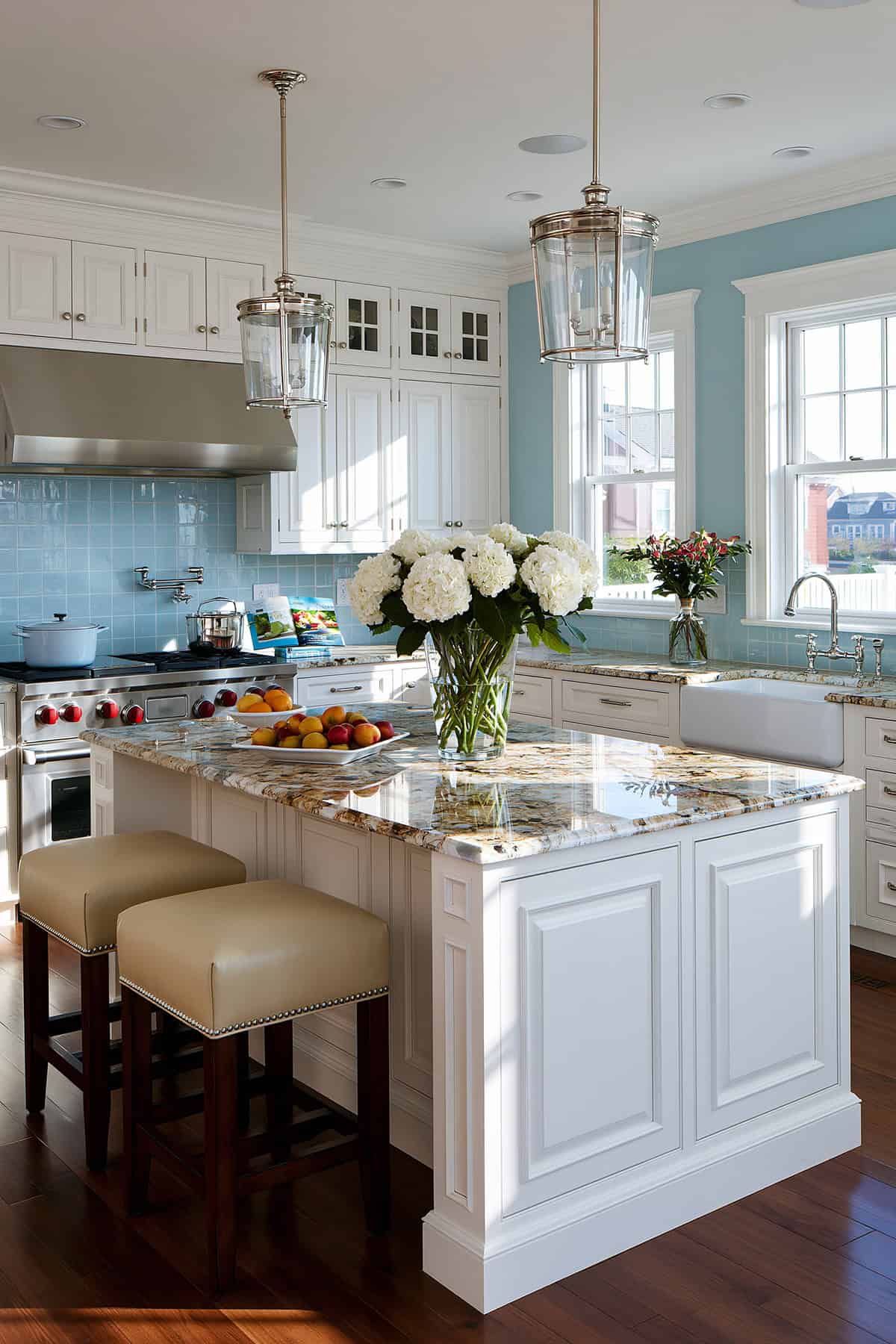
This color can open a kitchen visually, especially if the room lacks direct sun. Pale blue also sits nicely with white cabinetry, silver hardware, and a blue island that is one or two steps deeper.
For a cleaner effect, use simple tile and avoid creamy whites that clash with the coolness. The strongest pairings involve crisp trim, quiet counters, and limited decorative color elsewhere.
Olive Green
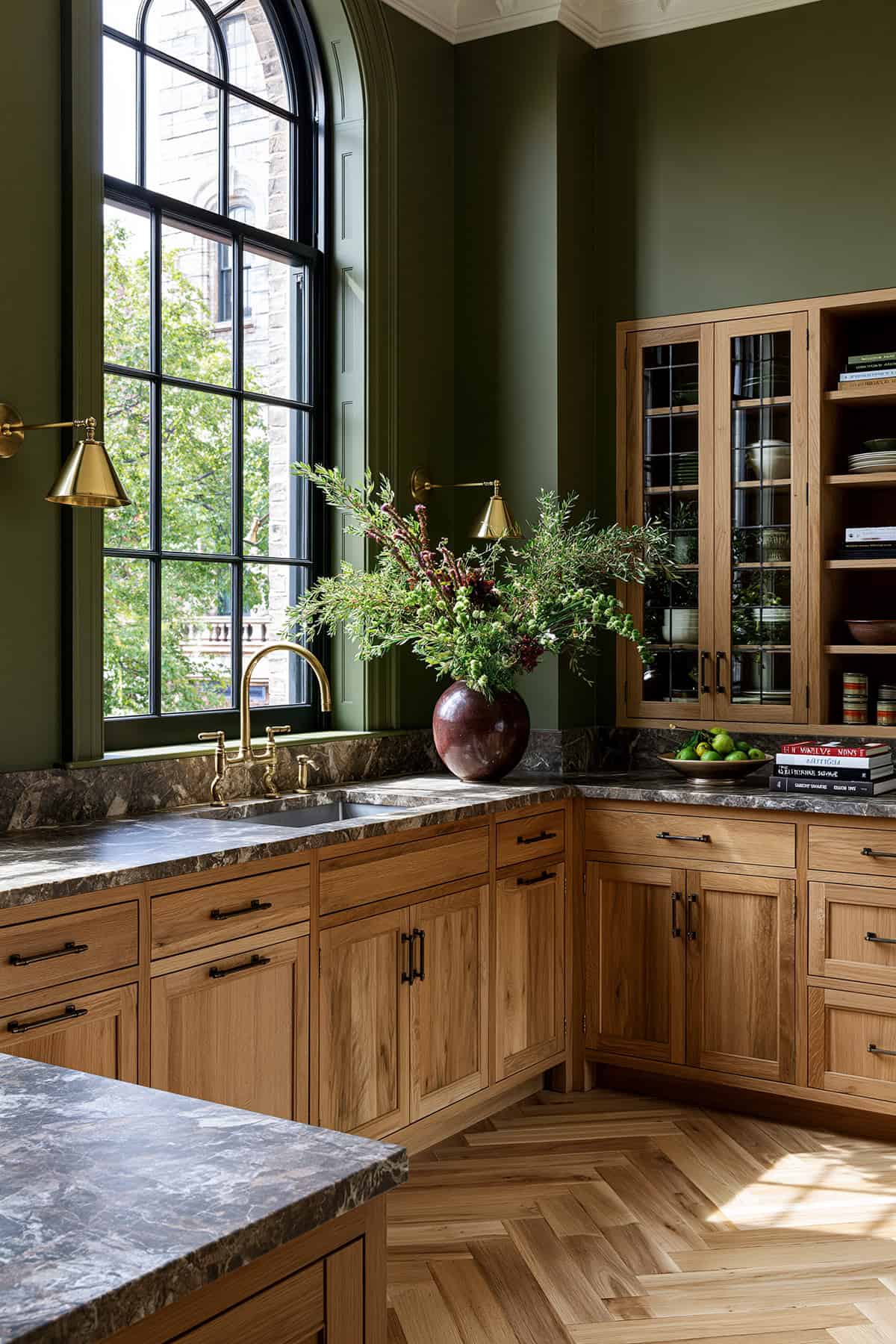
Olive carries a murkier, more complex undertone than sage, which gives it more edge. It looks especially strong with wood cabinets, black hardware, and warm stone surfaces.
This is a useful shade when you want a green kitchen that is grounded rather than light. In rooms with open shelves and aged brass fixtures, olive looks collected and substantial.
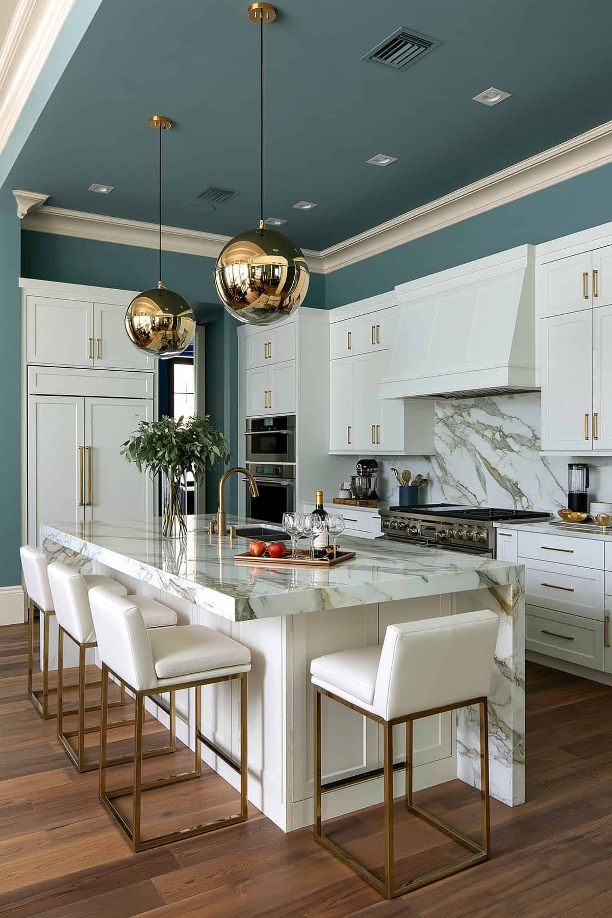
Navy gives you drama with discipline. Used on walls, it suits white cabinets, marble countertops, and gold hardware. It can echo a blue kitchen island without flattening the room into one note.
Hale navy hc-154 is a strong benchmark for a deep blue with staying power. Keep the ceiling lighter and let the backsplash stay simple, especially if you already have dark grout lines or bold veining in the counters.
Moss Green
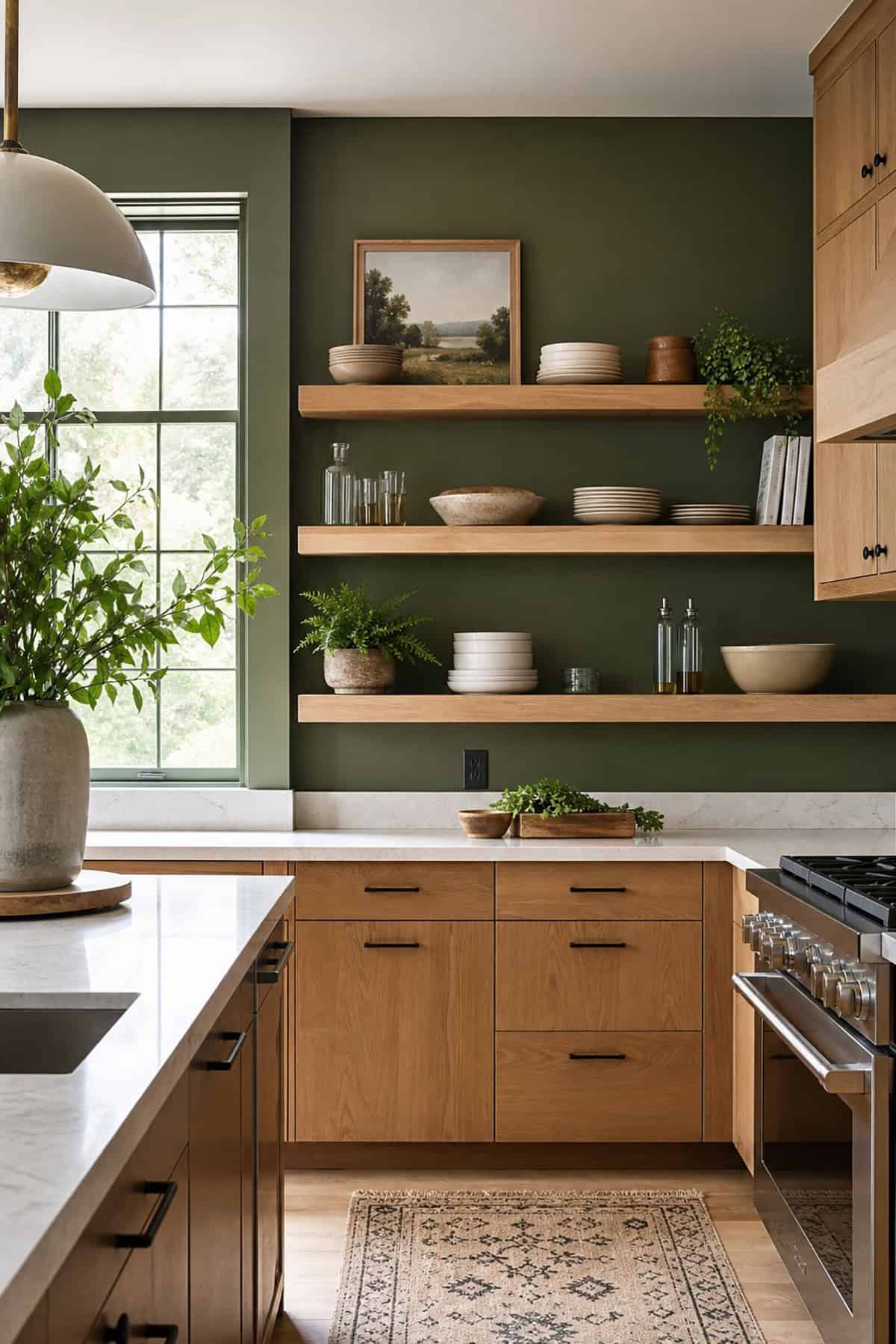
Moss sits deeper and softer than sage, with more brown in the mix. That undertone works well in kitchens with wood cabinets, warm greige flooring, and handmade tile where clean bright greens would look out of place.
Light matters here. In dim rooms, moss can be enveloping in a good way. Pairing it with white cabinetry or classic white trim keeps enough definition around the edges.
Lime Green
This is a bold choice, so proportion matters. A lime-leaning green can energize a breakfast nook wall or a compact cooking zone. A full kitchen in this color takes a very controlled hand.
You need plain cabinetry and strong natural light. White cabinets, stainless steel appliances, and minimal backsplash patterns keep the shade from becoming chaotic. For most kitchens, a muted version will age better.
French Gray
French gray carries a green or taupe cast, which is why it looks softer than standard cool gray. In kitchens with white cabinetry, marble countertops, and brass fixtures, that subtle complexity looks beautiful.
This is a smart color if you want neutrality with depth. It also handles mixed materials well, especially when your kitchen color scheme includes a blue island, warm wood stools, and a patterned backsplash.
Eucalyptus Green
Eucalyptus has a washed, herbal quality that looks airy without going pastel. It pairs naturally with white cabinets, quartz countertops, and light oak accents.
The appeal sits in its restraint. Beside black hardware or stainless-steel appliances, the color stays clean and modern. If your tile has gray undertones, eucalyptus can tie the room together more smoothly than a warmer green.
Dusty Teal
Teal becomes more usable once the brightness drops out. A dusty version can hold its own next to white kitchen elements, dark wood, and brass fixtures without looking tropical.
It is effective when you want color with a bit of tension. Against a white subway tile backsplash and marble countertops, dusty teal looks sharper than sage and less formal than navy.
Dusty Green
A dusted-down green with gray in it tends to flatter nearly every common kitchen finish. White cabinetry, wood cabinets, butcher block surfaces, and stainless steel appliances can all sit comfortably beside it.
This is one of those colors that looks better on larger swatches than tiny chips. On the wall, the softness becomes the point. It calms contrast and keeps a kitchen color scheme from looking too staged.
Dusty Blue
Muted blue can look almost neutral in the right light. That makes it useful if you want a blue kitchen influence without committing to saturated cabinets or a strong island color.
It pairs well with shaker-style cabinets, white subway tile, and black hardware. If your counters run warm, test carefully. The contrast between cool blue and yellow-toned stone can look sharper than expected.
Dark Green
A dark green wall gives instant depth, especially in kitchens with white cabinets and pale counters. It is more organic than black and less expected than navy.
For the cleanest result, keep nearby finishes honest and simple. Warm wood tones, marble countertops, and brass fixtures all hold up well here. Glossy cabinet paint can also sharpen the contrast if the wall finish stays matte.
Cream
Cream works best when you want softness that still looks bright. It flatters wood cabinets, warm tile, and older homes where stark white looks disconnected from the architecture.
The success of cream depends on restraint. Pair it with classic white trim only if the undertones are close, or the wall can look dingy by comparison. With natural linen shades and quiet stone, cream looks settled and timeless.
Charcoal Gray
Charcoal walls suit kitchens with strong light, clean lines, and enough contrast. White cabinets, marble countertops, and stainless steel appliances look crisp against deep charcoal, especially when the paint has a touch of warmth.
Benjamin Moore and Sherwin-Williams both offer useful versions, though the right one depends on your flooring and backsplash. A charcoal with blue in it looks cooler and sleeker. A sootier one lands better beside warm wood tones and brass fixtures.
Black
Black on kitchen walls is all about proportion, finish, and daylight. In a room with white cabinetry, classic white backsplash, gold hardware, and marble countertops, it can look exacting and elegant.
Keep the undertone soft rather than ink-flat. Avoid crowding the wall with too many upper cabinets. Black works best when it frames a composition, such as white cabinets, a blue island, or open shelves.