Home design & decorating tips about architecture, color schemes, paint colors, interior styles, and so on.
Decorating

Living in a small home is nothing to be ashamed of, nor should the limited square footage of your abode mean sacrificing style. Smaller spaces often shine the brightest with the right design choices. Wainscoting can be one of those choices, turning boring walls into textured works of art and craftsmanship.
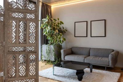
Every home is filled with stories told via the layout and design. Open and spacious or compact and cozy—how we arrange our interiors determines how comfortable the space feels. But if you crave a little more structure in a room without constructing permanent walls, a room divider is a practical and stylish solution. Browse through all 34 room divider ideas and see which one belongs in your home.
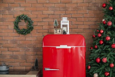
The space above the fridge is always visible, yet rarely planned. It often holds storage bins, boxes, or nothing at all. Using this area for decor helps reduce the visual gap between the fridge and upper cabinets.

Let’s get into some project ideas that aren’t just fun to make but also catch buyers’ attention. Handmade clay goods have a charm that keeps people coming back. Once you start, it’s almost impossible to run out of new things to try.
Crafting for Valentine’s Day can feel extra meaningful when you know someone will gift your work with love. Creating items to give to your loved ones or sell doesn’t mean losing creativity. It means understanding what your partners or shoppers are looking for during this season. This list was designed with both creativity and selling in mind. Head to the article to explore all 47 Valentine crafts you can make and sell.
With spring comes more daylight and a lighter mood around the house. Lanterns just seem to fit—bringing in soft glows and those little pops of seasonal color. Set them up inside or out, and you’ve got an instant nod to renewal. The vibe borrows from spring festivals but also works for regular days at home.
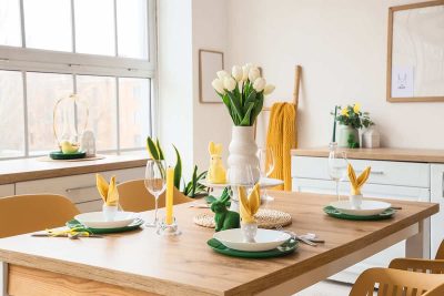
Setting the table in spring feels less like a task and more like a mood. Soft tones, natural materials, and a looser approach make everything feel lighter. Even simple meals feel more enjoyable with a bit of intention. A spring tablescape doesn’t need symmetry or rules. It just needs to feel welcoming. The ideas shared here show how to create that without overthinking it.
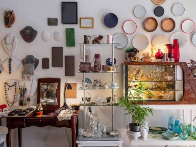
Travel souvenirs tend to pile up faster than we expect. A small bowl here, a postcard there, and suddenly everything feels scattered. Still, each piece holds a memory that deserves a visible place in your home. The trick is showing them off without making your space feel busy or disorganized. This guide walks through smart, stylish ways to make that happen.

Valentine’s Day gift baskets are no longer just candy in cellophane and a last‑minute card. People want gifts that feel thoughtful, styled, and personal without being overdone. The right idea makes a genuinely sweet gift for your wife, your friends, or yourself. Check out the article for 27 Valentine gift basket ideas worth stealing.
Plum often sits in that sweet spot between dramatic and comforting. It pairs beautifully with neutrals, wood tones, and soft metallics. A thoughtful shortlist can prevent costly mistakes. Check out the article to see the 14 best plum paint colors.
A well-chosen violet wall can make a room feel thoughtful and unique. Some shades lean romantic, others modern, and a few feel quietly luxurious. The challenge is knowing which ones look good beyond a tiny paint chip. Seeing curated options saves time and prevents costly mistakes. Check out the article to find the 14 best violet paint colors.
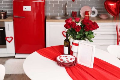
The table is where Valentine’s Day actually happens. That makes layout more important than decoration alone. Plates, glasses, and serving space should come first. Decor should support that structure, not compete with it. This list breaks down table decor ideas that keep things comfortable and romantic. Check out the article for 29 Valentine’s Day table decor ideas.