Some paint colors just work—no matter your home’s style, age, or lighting. If you’re tired of comparing endless swatches, you’ll appreciate these 20 dependable hues that create a smooth, unified look from kitchen to bedroom.
Table of Contents
- Best Paint Colors For The Whole House
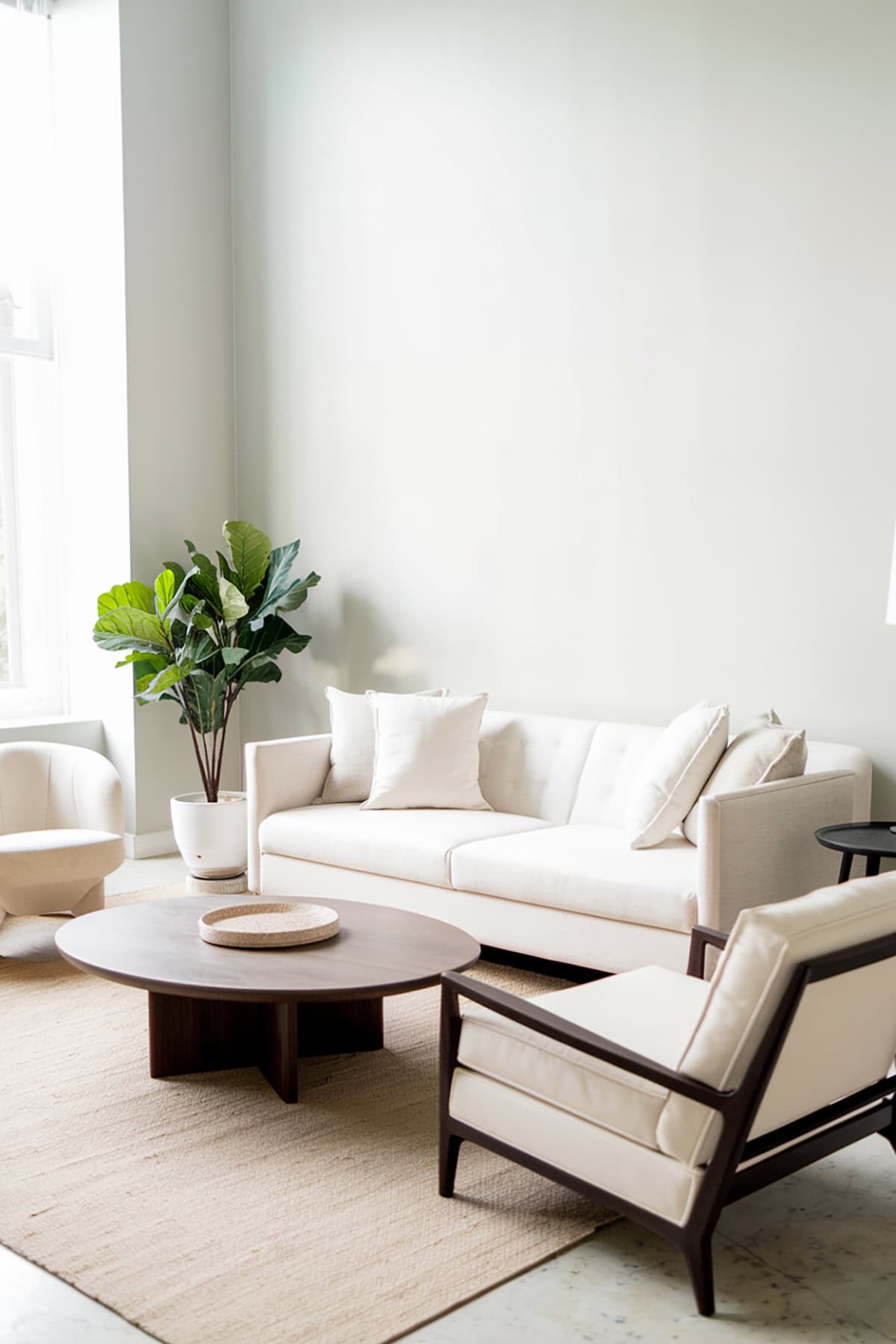
- Benjamin Moore – White Dove (OC-17)
- Sherwin-Williams – Alabaster (SW 7008)
- Benjamin Moore – Simply White (OC-117)
- Sherwin-Williams – Agreeable Gray (SW 7029)
- Benjamin Moore – Revere Pewter (HC-172)
- Sherwin-Williams – Accessible Beige (SW 7036)
- Benjamin Moore – Classic Gray (OC-23)
- Sherwin-Williams – Pure White (SW 7005)
- Benjamin Moore – Edgecomb Gray (HC-173)
- Farrow & Ball – Ammonite (No. 274)
- Benjamin Moore – Gray Owl (OC-52)
- Sherwin-Williams – Mindful Gray (SW 7016)
- Behr – Swiss Coffee (12)
- Benjamin Moore – Pale Oak (OC-20)
- Sherwin-Williams – Sea Salt (SW 6204)
- Benjamin Moore – Chantilly Lace (OC-65)
- Sherwin-Williams – Snowbound (SW 7004)
- Benjamin Moore – Balboa Mist (OC-27)
- Sherwin-Williams – Eider White (SW 7014)
- Benjamin Moore – Coventry Gray (HC-169)
Best Paint Colors For The Whole House
Choosing paint for the whole house means finding shades that play nicely together. These popular picks offer versatility, reflect light well, and have those subtle undertones that make each room feel classic without trying too hard.
Benjamin Moore – White Dove (OC-17)
White Dove is a soft white that never feels harsh. If you want something warm and welcoming, this is a steady go-to. It covers well and looks clean, but not sterile.
It works in natural light, giving walls a gentle richness. You can pair it with almost any trim or accent. That creamy undertone keeps it from feeling chilly, so it fits both modern and traditional spaces.
It’s great on cabinetry or ceilings too, lending a sense of harmony. The versatility is hard to beat, especially in open floor plans where you want everything to flow.
Sherwin-Williams – Alabaster (SW 7008)
Alabaster is a white with just enough softness to avoid feeling cold. It helps your home feel peaceful and inviting, and it’s easy on the eyes in dimmer spots.
The subtle warmth makes rooms look bigger and brighter. It pairs well with warm woods and looks sharp with black or charcoal hardware. Designers often recommend it for its flexibility.
Use it on walls or trim—it transitions from room to room without a fuss. You’ll see it a lot in modern farmhouse or transitional homes.
Benjamin Moore – Simply White (OC-117)
Simply White stands out for its clean vibe and hint of warmth. It’s fresh and modern, not cold or stark. That slight yellow undertone makes it feel lively.
This color works anywhere, from kitchens to living rooms. It matches easily with colorful accents or softer neutrals. It reflects light nicely, so rooms feel open and airy.
It’s also a solid choice for trim. If you use it on both walls and trim, you get a minimalist, cohesive look. The balance here makes it a favorite for consistent color schemes throughout the house.
Sherwin-Williams – Agreeable Gray (SW 7029)
Agreeable Gray is a favorite if you’re after a warm neutral. It’s right between beige and gray, making it fit a bunch of styles. No cool blue or green tones, so spaces feel cozy but not dated.
This shade brings a gentle feel to walls without being heavy. It shifts a bit with the light—sometimes more beige, sometimes more gray. Agreeable Gray is easy to use in living rooms, bedrooms, or even bathrooms.
Pair it with crisp white trim or wood accents. Its popularity comes from being so adaptable, whether your space is big or small.
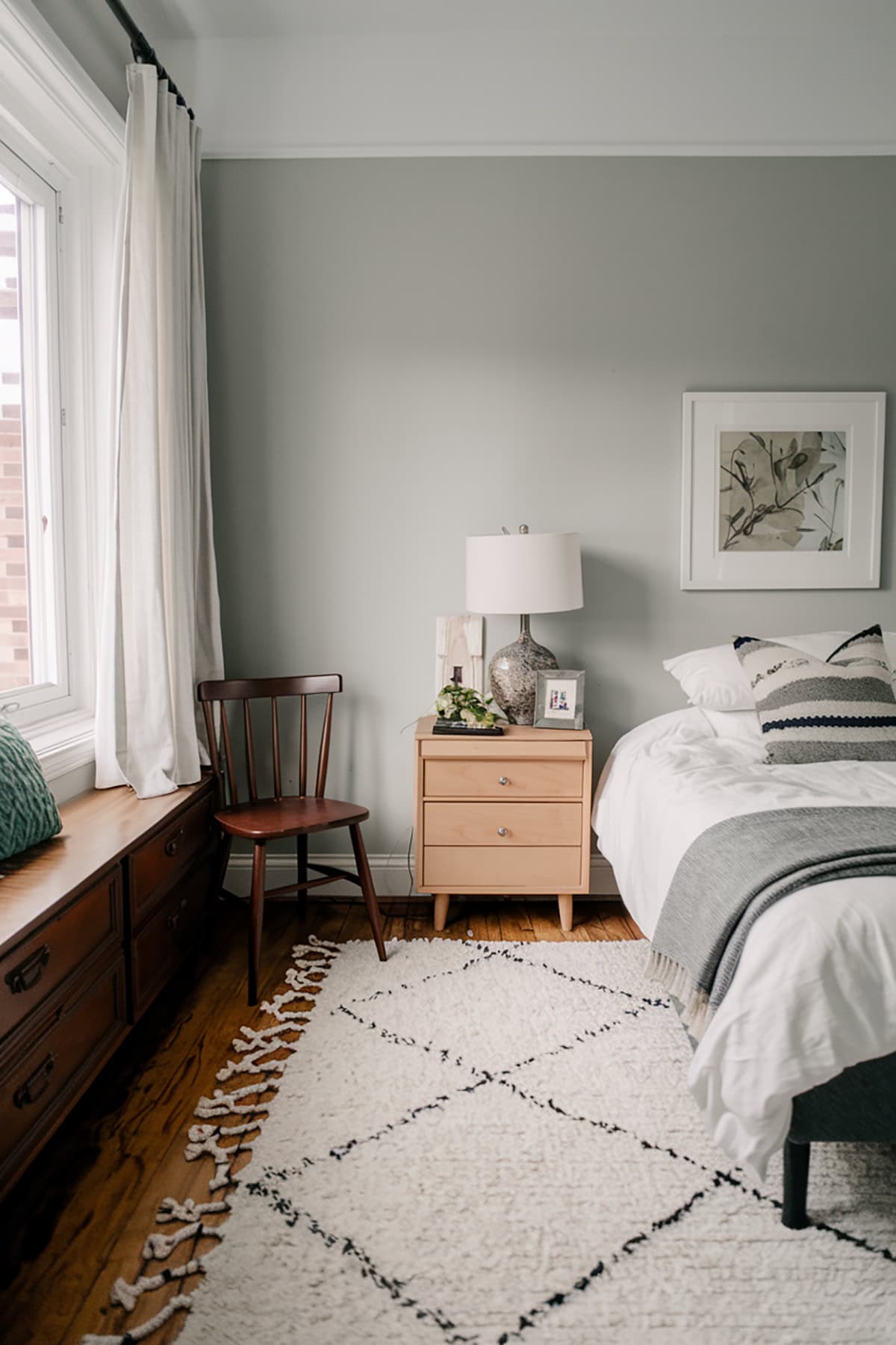
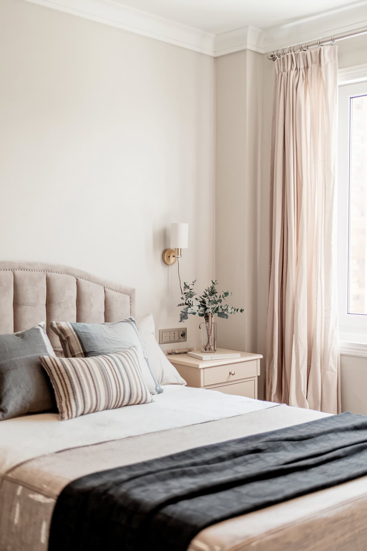
Benjamin Moore – Revere Pewter (HC-172)
Revere Pewter is a classic greige that never feels too cold or too warm. It’s right at home in traditional or transitional interiors. The understated hue goes with a lot of furnishings.
It works in open layouts or rooms that need a unifying touch. There’s enough contrast with white trim, but it won’t overpower or dull a room.
The light-to-medium intensity is forgiving in different lighting. It brings a gentle sophistication to main living spaces, hallways, and even home offices.
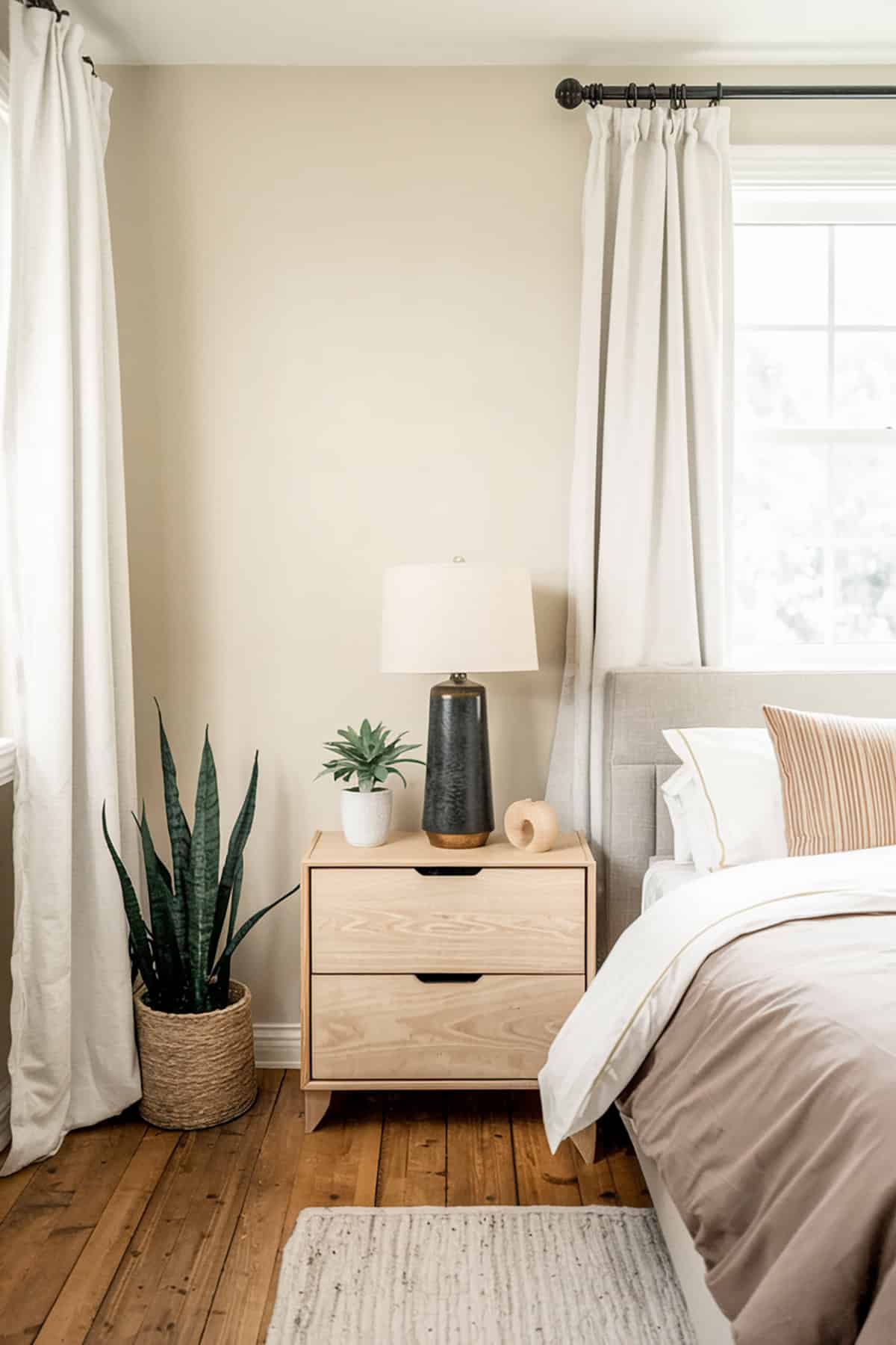
Sherwin-Williams – Accessible Beige (SW 7036)
Accessible Beige is warm and inviting, but not yellowy like some beiges. It feels fresh and works in both north- and south-facing rooms without looking muddy.
Natural light brings out its warmth, while artificial light gives it a soft glow. It pairs well with muted blues, greens, or white trim, and it looks good with most floors.
There’s a touch of gray that keeps it modern. It’s a flexible backdrop for living rooms, entryways, or bedrooms, whether your decor is classic or new.
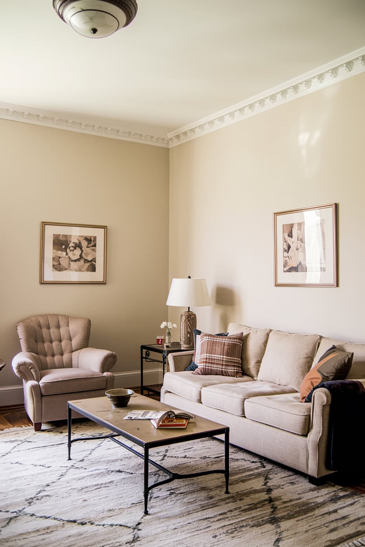
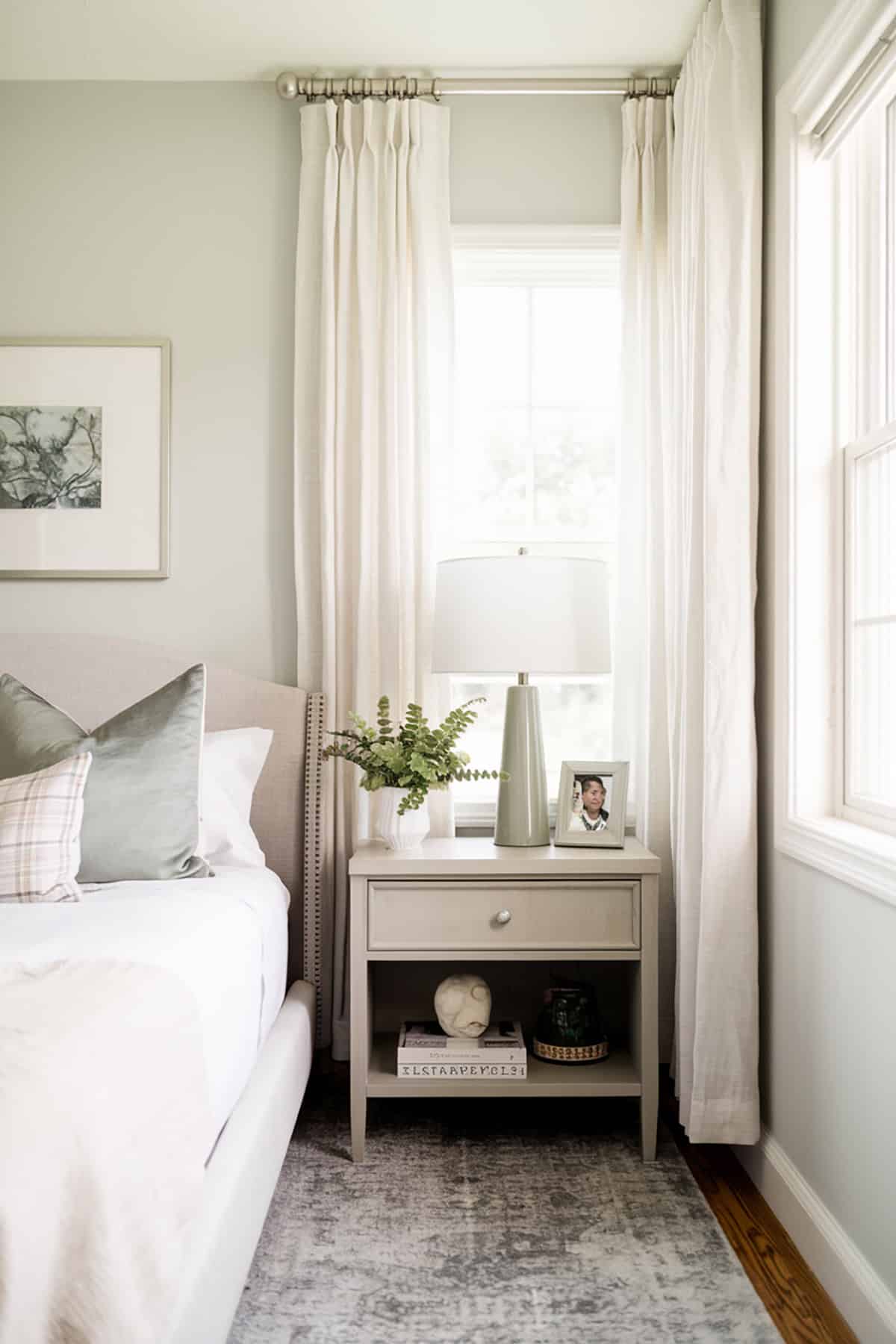
Benjamin Moore – Classic Gray (OC-23)
Classic Gray is a light, misty gray—almost off-white. If you want a subtle color that works with both cool and warm accents, this is it. It never takes over a space or feels bold.
Try it in living rooms, hallways, or spots without much natural light. The result is soft and restful. Even though it’s pale, there’s enough depth to show off trim and doors.
Pair it with creamy whites or accent colors for balance. It’s a go-to for a relaxed, timeless background for art and furniture.
Sherwin-Williams – Pure White (SW 7005)
Pure White is about as close to true white as you can get, but it’s not harsh. There’s a faint warmth that keeps it friendly. If you want crisp but not sterile, this one works.
People use it for both walls and trim. It mixes easily with all sorts of accents and wood finishes. Pure White is a reliable base for both modern and classic styles.
It looks good with dark window frames and brass or black fixtures. The subtle undertone makes it a safe pick for open concept homes where the light keeps changing.
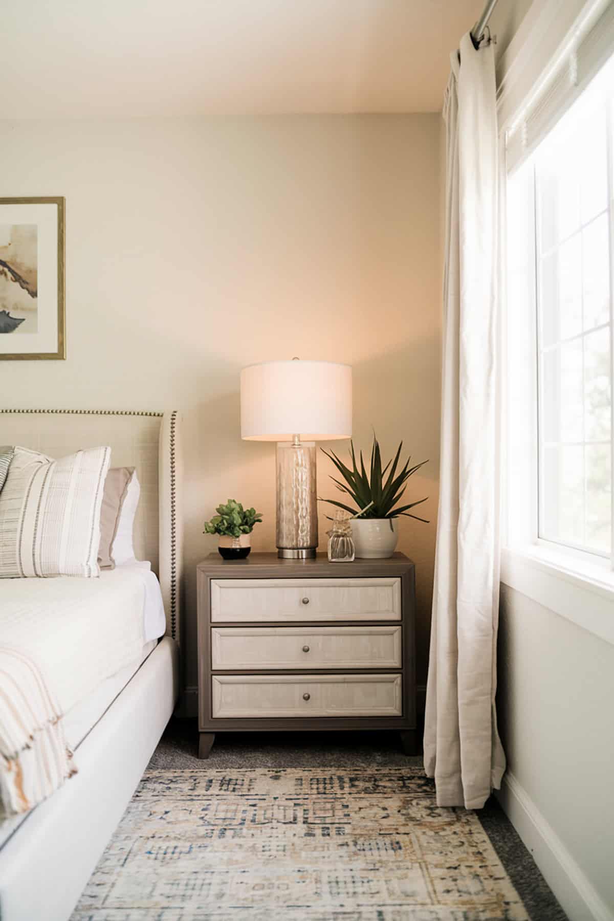
Benjamin Moore – Edgecomb Gray (HC-173)
Edgecomb Gray is a light, earthy gray with warm undertones. It’s popular because it feels natural and sophisticated, never cold or clinical.
It adapts well to different light. The beige comes out in low light, while natural light brings out the gray. Pair it with crisp whites or bolder accents.
The gentle hue works with a wide range of furnishings. It’s easy to use in kitchens, bedrooms, or across an entire floor for a calm, unified vibe.
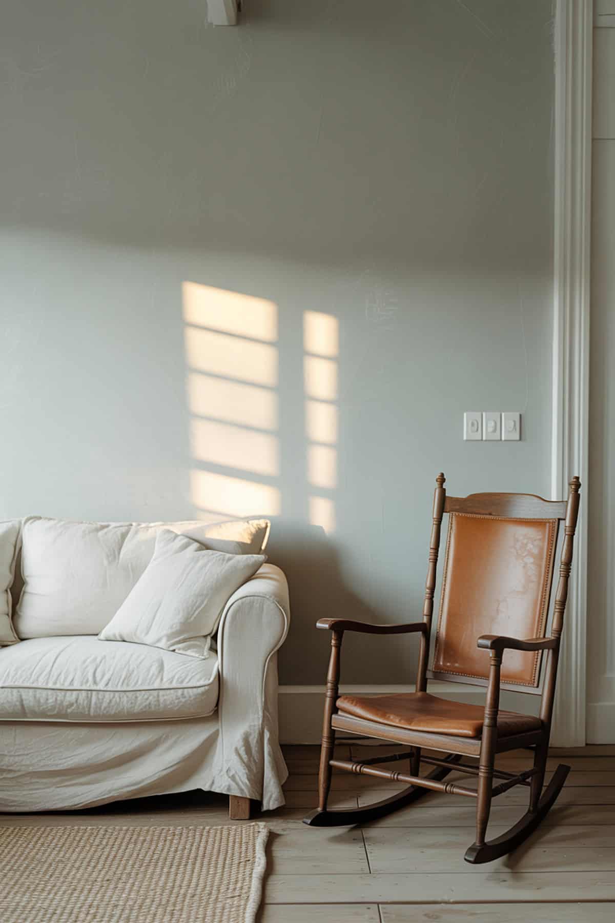
Farrow & Ball – Ammonite (No. 274)
Ammonite from Farrow & Ball is a delicate gray with just a touch of warmth. It’s restful and feels approachable—somewhere between cool and warm, so it’s never stark.
It holds steady in spaces with plenty of natural light and suits contemporary furniture and muted palettes. The subtlety lets your art or textiles pop.
If you want a timeless look, Ammonite keeps things fresh without drawing too much attention to itself. It’s a favorite in whole-house schemes for modern updates.
Benjamin Moore – Gray Owl (OC-52)
Gray Owl is a light gray that balances warm and cool tones. That means it looks good in lots of lighting. It won’t suddenly turn blue or green on you.
If you want something clean and crisp but not cold, Gray Owl is a smart pick. It works in bedrooms, living rooms, and open spaces. With white trim or darker accents, rooms feel calm and organized.
Homeowners like that it updates interiors without feeling trendy. It adapts to different styles and keeps things feeling classic.
Sherwin-Williams – Mindful Gray (SW 7016)
Mindful Gray is a true gray with warm undertones. It gives you color without feeling chilly. The neutral base means it fits with beige or black accents.
In main living areas, Mindful Gray feels clean and inviting. Pair it with white or wood trim to show off its warmth. It’s a mid-tone, so it gives walls more presence than off-whites.
It’s a good pick if you want a bit of color, but nothing too bold. It works well in open-plan homes and handles shifting daylight without fuss.
Behr – Swiss Coffee (12)
Swiss Coffee is a creamy white that’s soft and warm. It makes rooms feel bright and welcoming, without being as stark as some whites. It stays cleaner than classic creams, too.
Use Swiss Coffee throughout your home for a cohesive look. Its gentle undertone goes with woods, metals, and plenty of accent colors. Light bounces off it, so smaller rooms seem bigger.
It’s versatile enough for walls, ceilings, or trim. Handy if you want a calm, consistent palette across different spaces.
Benjamin Moore – Pale Oak (OC-20)
Pale Oak is a pale greige that brings softness to walls. It can look gray or beige depending on the light. The subtle undertones keep it from feeling flat or clinical.
It’s best in open areas or rooms with natural light, delivering a calm vibe. You can coordinate it with warm woods, crisp whites, or stronger colors. The shade stays elegant without taking over.
It works in bedrooms or living spaces, and its gentle tone suits lots of design styles, especially casual or transitional homes.
Sherwin-Williams – Sea Salt (SW 6204)
Sea Salt is a light greenish-gray that shifts with the lighting. You might see more green during the day, and a silvery tone at night. It brings a soothing, coastal feel.
Popular in bathrooms, bedrooms, and living spaces, Sea Salt adds color without being loud. It pairs well with white trim, sandy neutrals, or coastal accents like navy or rattan.
It’s flexible enough for a whole floor plan or just a feature wall. That mutability makes it easy to love.
Benjamin Moore – Chantilly Lace (OC-65)
Chantilly Lace is a true, crisp white. No heavy undertones, so it always looks bright and sharp. If you want trim, walls, or ceilings to feel fresh and modern, this does the trick.
Use it for a gallery-like effect that makes art and furniture stand out. The clarity helps light bounce around the space. It works in both north- and south-facing rooms.
You can mix it with almost any palette, which gives you a lot of flexibility. It’s a top pick for new builds and big renovations.
Sherwin-Williams – Snowbound (SW 7004)
Snowbound is a soft white with a touch of gray. The undertone gives it a neutral, understated finish, so spaces feel calm and clean. It’s a favorite for walls, trim, and ceilings.
It reads a bit warmer than pure whites, especially at night. If you want something that’s white, but not too stark, Snowbound is a good call. It links rooms together with ease.
Pair it with wood, stone, or a range of accent colors. Designers come back to it for its flexibility.
Benjamin Moore – Balboa Mist (OC-27)
Balboa Mist is a light, warm gray with a touch of softness. It adapts to different lighting, sometimes showing hints of taupe or beige. It manages to feel modern, but not cold.
It works in bedrooms, hallways, or living rooms. Balboa Mist gives large spaces a relaxed, gentle feel without washing them out. It matches with light woods and white or off-white trim.
Decor accents like navy, blush, or earthy tones pair nicely with Balboa Mist. It fits right in, whether your style is contemporary or more traditional.
Sherwin-Williams – Eider White (SW 7014)
Eider White is a light, subtle gray with just a hint of warmth. It sits somewhere between white and gray, giving off a soft, clean vibe. You might use it on walls, ceilings, or trim—honestly, it’s pretty versatile.
This color shines in well-lit spaces, though in dimmer spots it can lean more gray. Eider White plays nicely with a bunch of accent colors, so it’s handy if you like switching things up.
It’s especially nice for open layouts or corridors, or really anywhere you want a gentle, unobtrusive background. People seem to appreciate its calming feel and the way it fits in just about anywhere.
Benjamin Moore – Coventry Gray (HC-169)
Coventry Gray stands out as a true gray, just a hint of blue tucked in. It always looks modern and crisp—never veers into beige or muddy territory. It’s a bit deeper than your average light gray, but still manages to work with almost anything.
This color brings a kind of energy and quiet polish to living rooms and bedrooms. It pairs nicely with white trim or even bolder accents if you’re feeling adventurous. There’s something about Coventry Gray that really sharpens up built-ins and architectural details.
It’s at its best when you want some real contrast against light paint or cabinets. Whether you’re in a hundred-year-old house or a brand new build, Coventry Gray just works. That’s the charm of it, honestly.