A house with white exterior walls is one of the easiest to choose a color palette for because white goes with everything. However, this can actually make it one of the most difficult colors to work with because you will be simply spoilt for choice.
If you’re trying to narrow down the best options for exterior accent colors on a white house, check out these attractive examples below for some inspiration.
Choosing an Exterior Color Palette
Settling on an exterior color palette can be challenging and actually quite a responsibility. You want to ensure you don’t upset your neighbors by choosing unpleasant colors, as they will probably have to look at the outside of your house more than you do!
Many people also want to ensure their home blends in with their surroundings to a certain degree, working with the style of the other houses on the street for a consistent feel; however, at the same time, you may also want to make your home stand out or display some of your personality.
It can be a difficult balance to strike between a color palette that isn’t dull but also isn’t too overwhelming. To help you narrow down your potential exterior color palette, first think about these considerations.
Consider the building style
Understanding the style of your building can be really helpful when choosing a color palette because some colors are synonymous with particular styles.
For example, Cape Cod-style homes have a quaint look that is associated with the ocean, so these types of buildings will always look great with a blue-and-white color scheme. For modern, minimalist-style buildings, you could choose more industrial-themed color palettes, such as white and gray, or white and black.
Consider the climate
The local climate might affect the way your color palette looks and the way it ages. If you live in a bright and sunny spot, then most colors will work well because they will appear warm and vibrant.
However, you might want to consider the fact that bright and dark colors will fade more quickly in this environment, so red or dark blue can look washed out quite quickly from UV rays. In a location that is commonly gray and overcast, then warmer colors can help to counteract the dull appearance. In this scenario, avoid colors that will make the home look cold, such as gray and blue.
Consider the neighborhood
The style of your neighborhood could impact the type of color palette that is going to work best for your home. In a community where all of the houses are soft neutral colors, it might be frowned upon by the neighbors if you decide to paint all of your exterior trim in hot pink.
In this instance, you could opt for something unique without appearing defiant; for example, a nice shade of sage green could help separate your home from the rest while maintaining a classy look.
Consider the intended reaction
Colors are able to evoke feelings in people, and every color is linked to different emotions. Think about the way you want to make people feel when they approach your home and then work with these colors. For example, blue is a fresh and clean color, and it is also associated with calm and relaxation, so using this color on the exterior of your property could make people feel soothed and at ease when they approach.
Yellow is a sunny and warm color that is linked to positive energy and creativity, so a bright yellow front door could indicate that a cheerful family lurk within. Wooden tones feel earthy and warm, so opt for these if you want to inspire visitors to feel welcomed.
Popular Color Palettes for White Houses
Brown and White
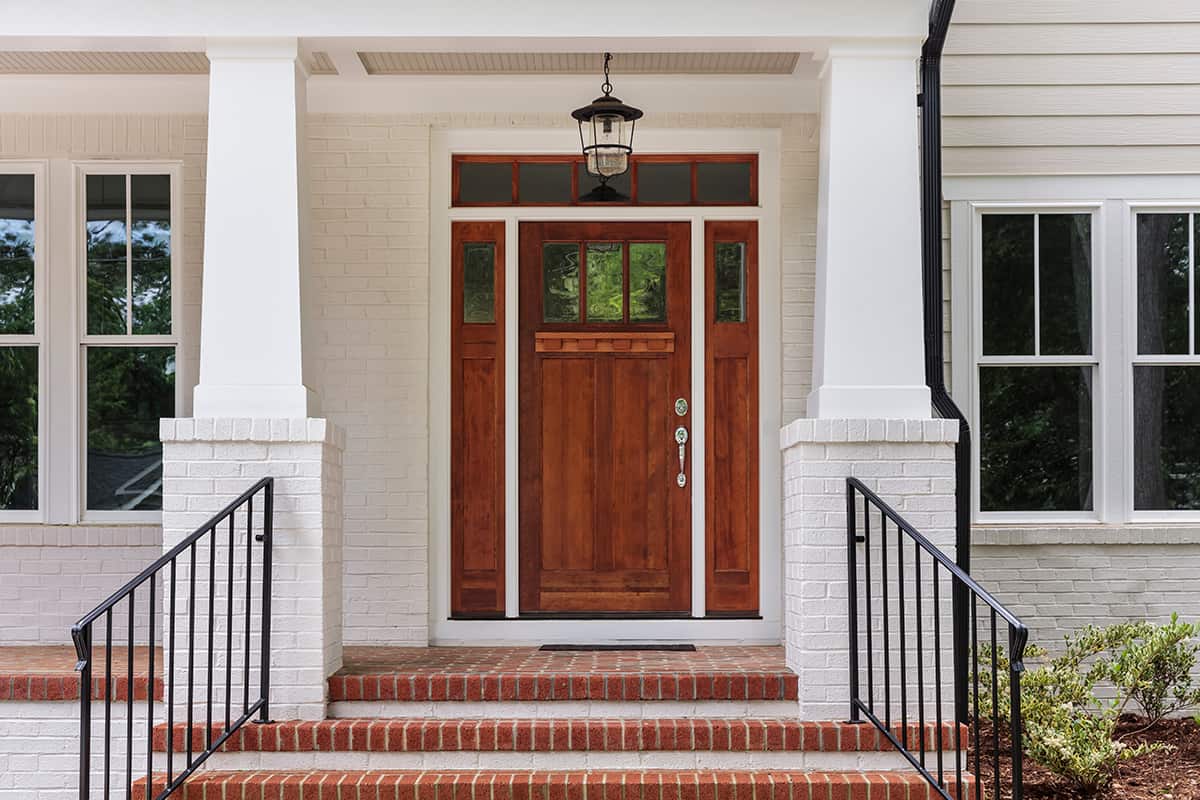
Brown is a neutral color that doesn’t get as much attention as it deserves in home decor. Over recent years the trend has leaned more towards gray and black in interior design, but brown can still be a really great choice as an accent color on a white house.
As a dark and saturated color, brown accents will contrast heavily against white to give that appealing distinction between the two; however, as a warm color, brown won’t read as harsh or intrusive.
Instead, brown comes across as a wholesome and earthy shade, helping to accentuate the clean lines of the white parts of the home. In the property pictured here, a brown door has been matched with brown bricks on the stairs and flooring for a coordinated look.
Red, White, and Black
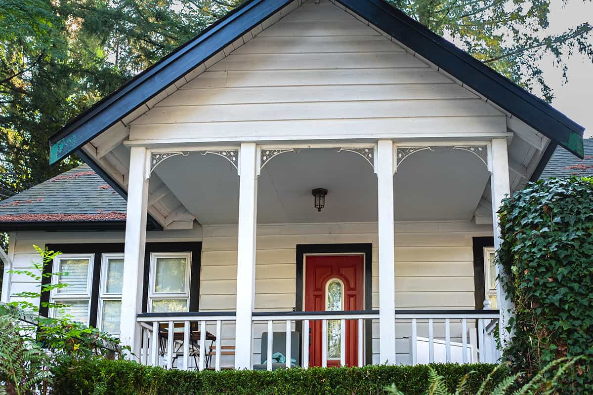
The exterior of this quaint and charming home has been decorated with accents of red and black for a bold, commanding look. The trim around the roof, the windows, and the doors, as well as the handrail around the verandah, are all painted in black.
This creates a sharp contrast next to the white siding, making each feature stand out. Red is a great front door color for a white house, making this the focus of the house, as it is vivid compared to everything else. This color scheme is great for a classic style.
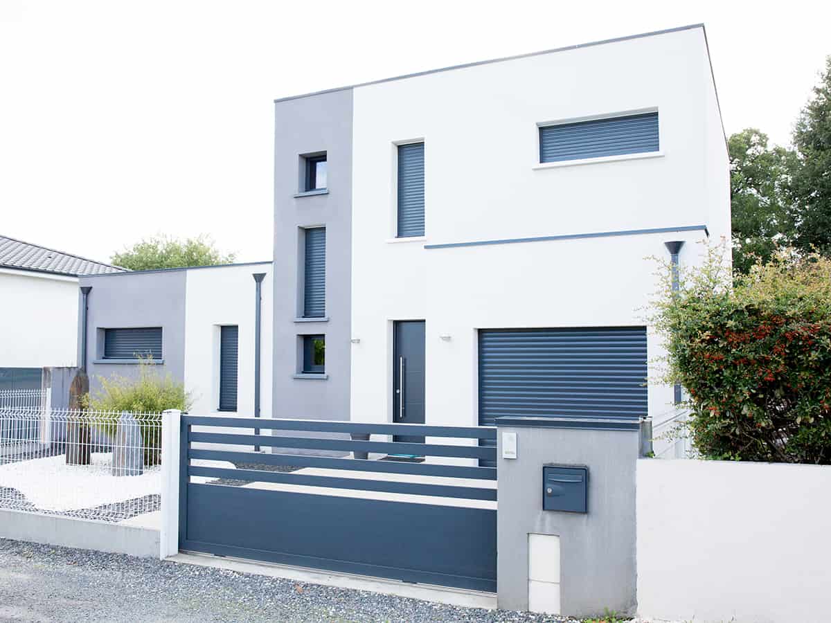
White and Gray
Gray is a very popular color to use as an accent color on white homes because it is neutral yet modern and provides a slight contrast that is easy on the eyes. In the home pictured here, gray bricks have been used on the outer walls of the garage, and these are coordinated with the gray roof tiles and the gray flooring outside the front of the property.
Gray is very versatile, suitable for contemporary homes, classic homes, coastal homes, and historic homes. It is neutral enough to not be offensive, yet it won’t read as bland or boring as an accent color to white.
Yellow and White
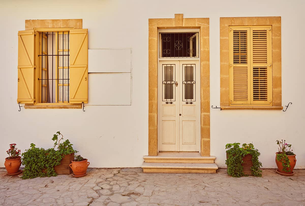
Homes in hot and sunny climates are often painted white because this is a color that reflects the sun and therefore helps to keep the inside of the home cool. On this house in Cyprus, the owner has chosen yellow as the color for the shutters, which makes for a fun and playful style.
The yellow stands out agains the white to ensure the shutters are one of the main features of the property’s exterior, yet it doesn’t make for a bold contrast. This in itself encourages a laidback, casual feel. Yellow is a warming color that reads as inviting and inspiring, ensuring that visitors will fee welcomed and lighthearted when they arrive at this home.
Pink and White
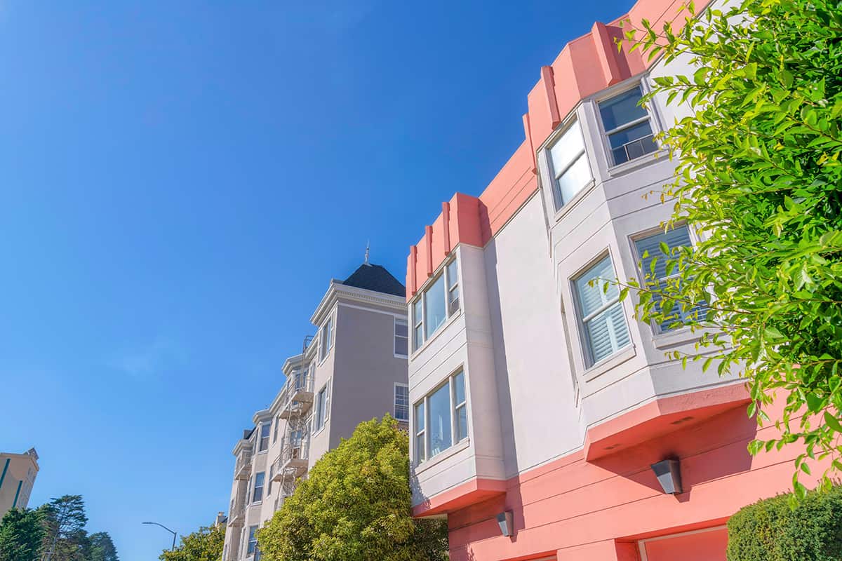
These apartment buildings in San Francisco, California, have been painted in white with pink as the accent color. This shade of salmon pink might not be everyone’s first choice of color on the outside of their home, but there’s no denying it looks simply stunning in this location.
The pink contrasts beautifully against the vivid green leaves on the trees and the clear blue skies, creating a look that feels fresh and energized.
If you want to use pink as an accent color on a white home but are concerned about it being too unique, then start small. Instead of painting all of the trim in pink, add a few pink plant pots to the side of your front door, and paint your house numbers in pink.
Green, White, and Orange
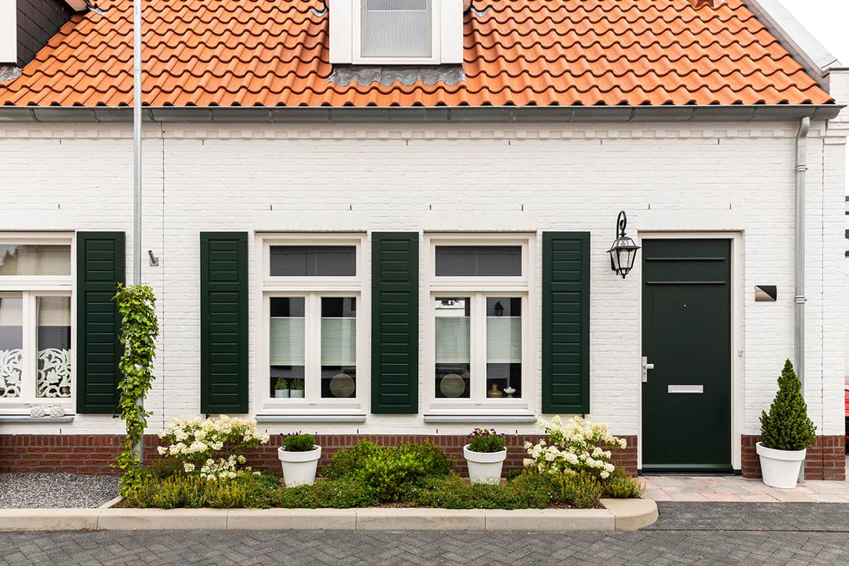
Green and red are directly contrasting colors, but this pairing can read as quite harsh. For a toned-down contrast, use green and orange as accent colors alongside white, as these will still create contrast while having a slightly muted effect.
The walls on this house have been painted white, and the shutters and front door are painted in a dark forest green. The orange tile roof serves to make the green features stand out even more.
Black and White
This farmhouse-style home might look traditional if painted in more muted colors, but instead, it has been updated with the use of black accents.
The pure black window frames coordinated with the black roof tiles and black downpipes give a very distinctive, contemporary look.
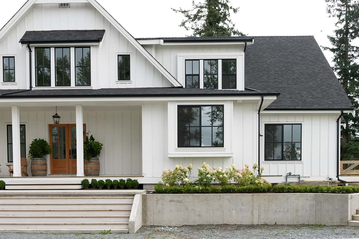
Blue and White
The blue accents on this modern farmhouse give it a unique personality and help the white areas of the home stand out as even more sleek.
It has a traditional, classic feel yet wouldn’t look out of place in a more contemporary neighborhood, as the shade of blue is cooling and leans towards gray. The gray roof and gray brick cladding on the chimney and around the lower parts of the building help to balance out the blue details for a style that is commending without being harsh.