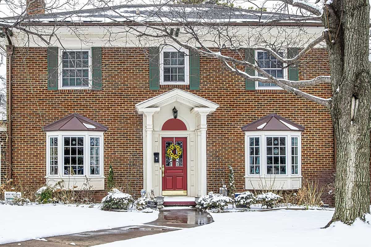
Picking a shutter color sounds simple until you start looking at paint samples. Black, green, blue, gray, and even cream can all work with red brick under the right conditions. The challenge comes down to finding the combination that complements the brick instead of fighting against it. Browse these ideas to see which colors work best.
Table of Contents
Shutter Colors For a Red Brick House
Strong shutter colors for brick house exteriors either sharpen the contrast or calm the warmth. With red brick, the undertone match matters more than the color name, so a warm gray reads very differently from a blue-gray, and black shutters on red brick look cleaner when the trim is crisp and the finish is low-sheen.
Olive Green
Deep olive suits larger brick homes with mature landscaping and darker rooflines. You get a grounded, estate-style look that sits naturally against warm red masonry instead of pulling too cold.
This shade works best when the brick has brown or rust undertones. Pair it with creamy trim rather than bright white, and the facade looks composed instead of sharp-edged.
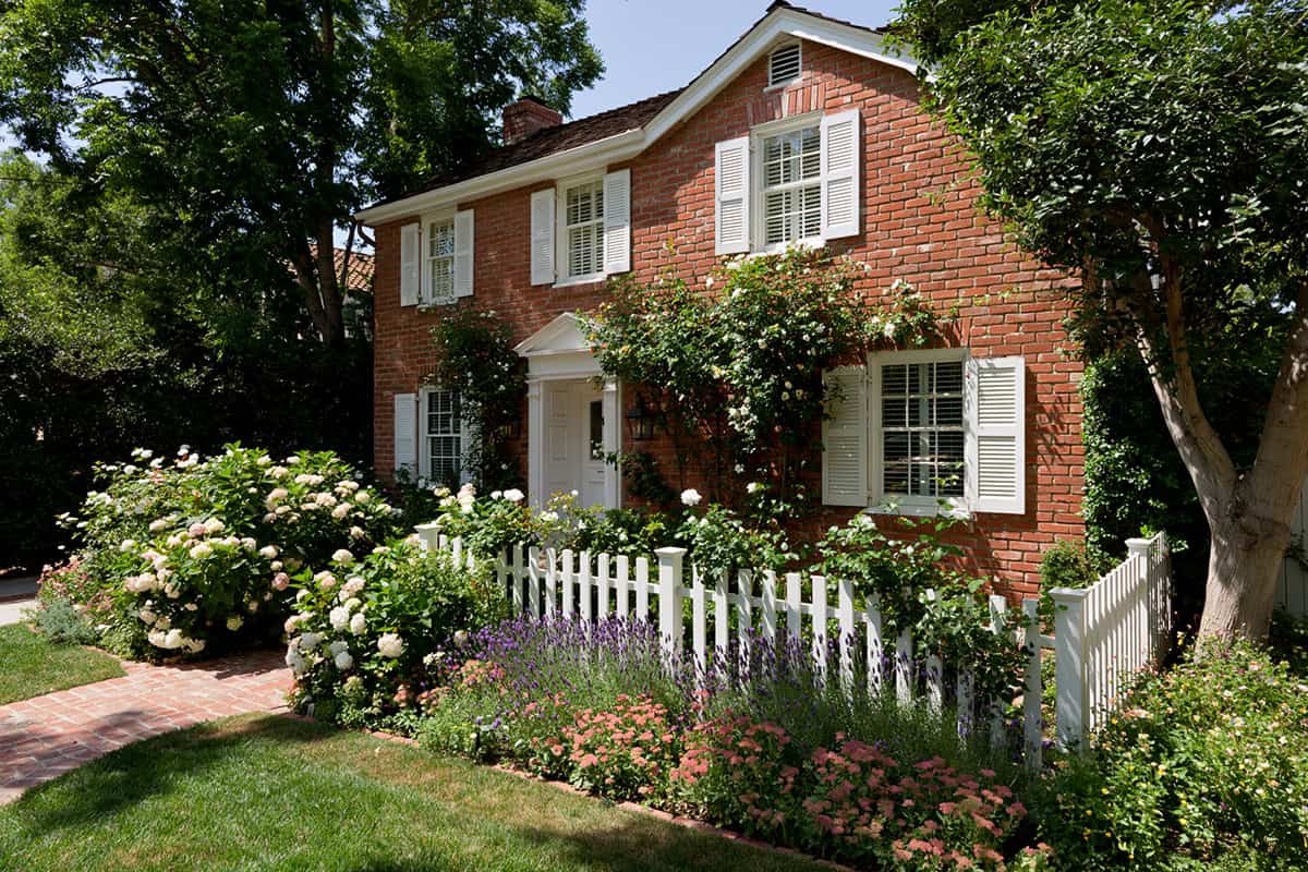
White
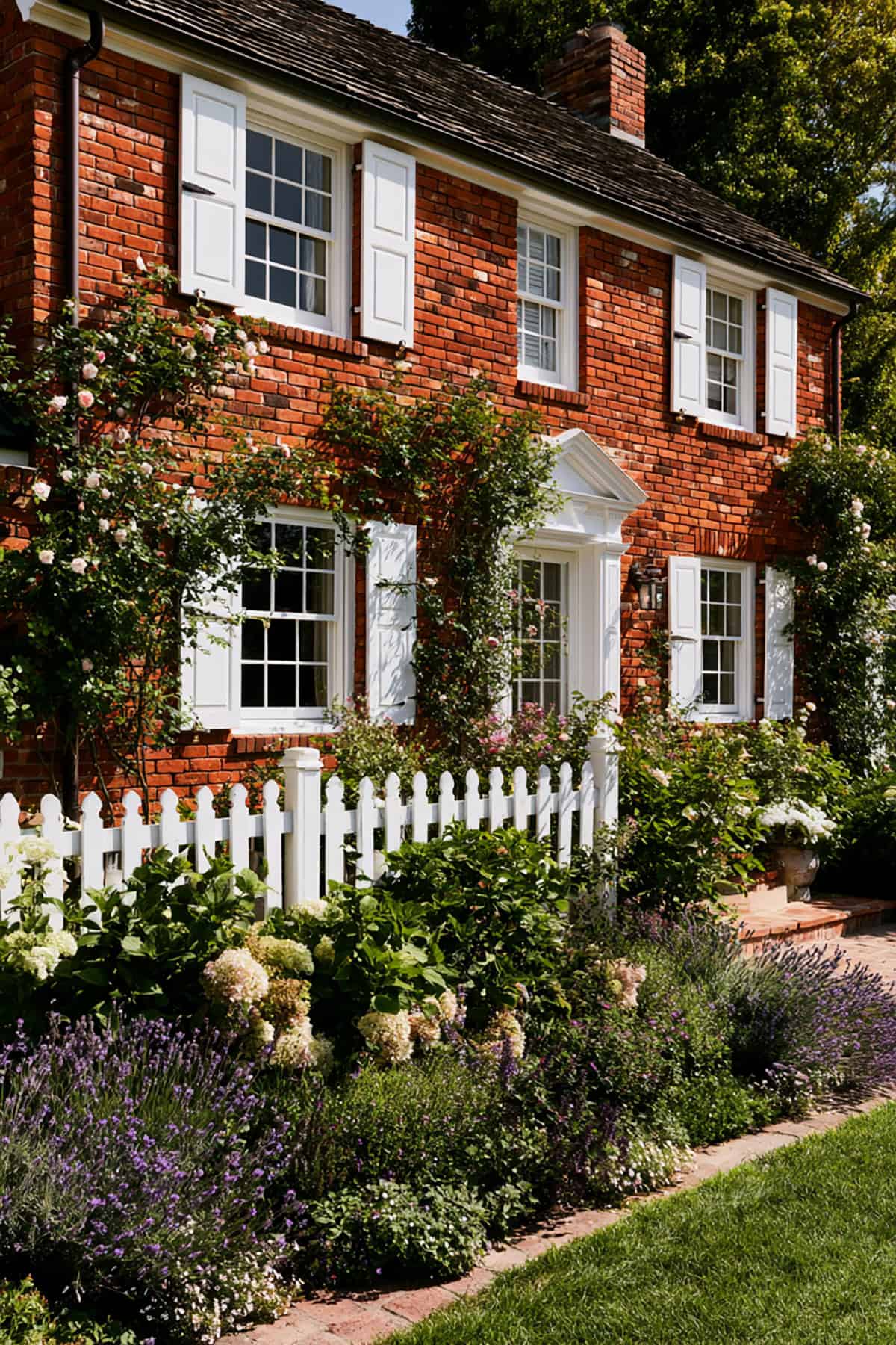
Bright white gives a historic cottage a crisp frame and a cleaner silhouette from the street. It highlights window spacing and masonry detail in a way that darker shutter colors do not.
You need the right white. Harsh blue-white can look sterile against old brick, while a soft white or off-white keeps the contrast fresh without turning glaring at midday.
Warm Gray
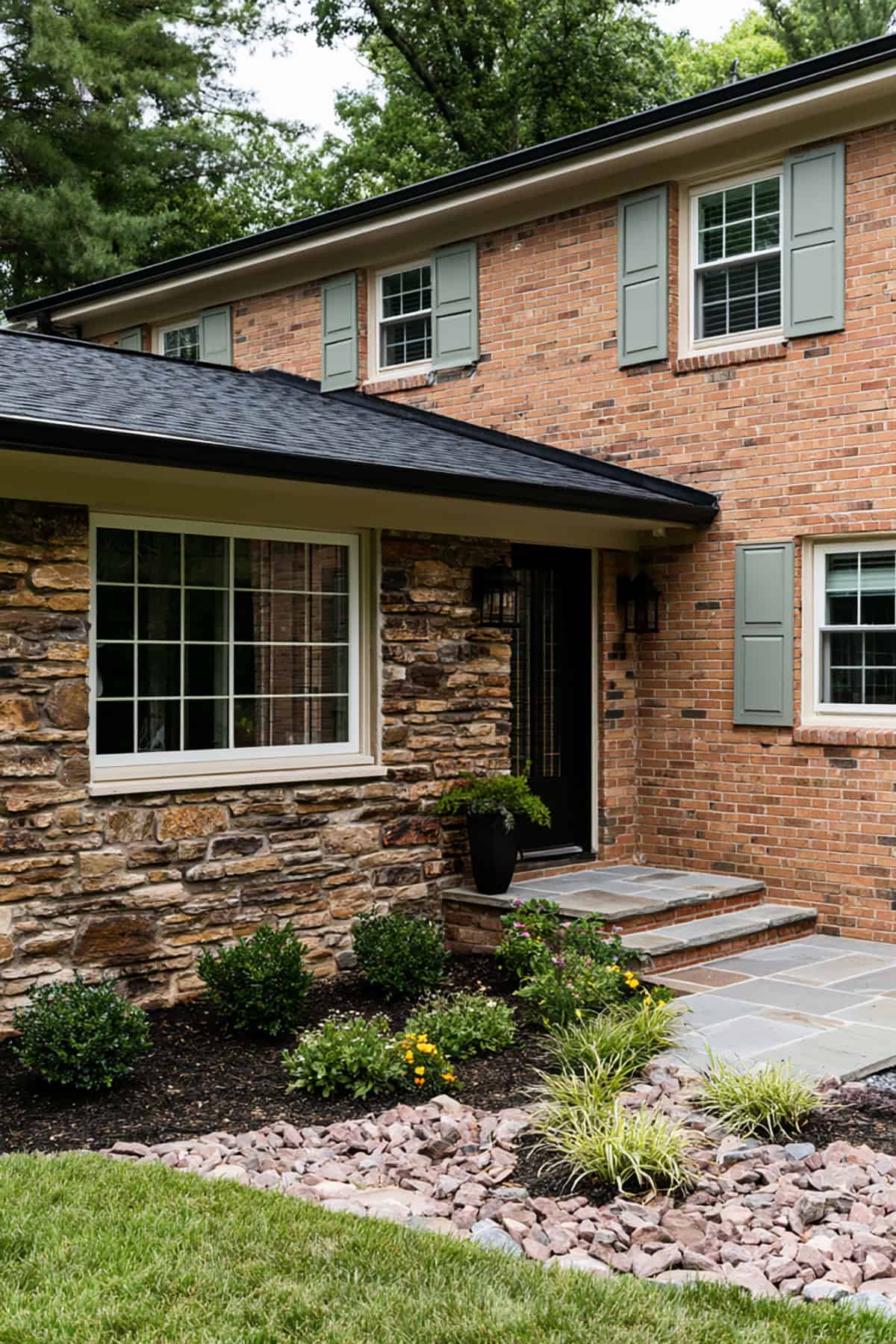
Single-story ranch homes benefit from restraint, and warm gray delivers that. It cuts the red without the severity of black shutters, which helps long facades look broader and calmer.
Watch the undertone closely. If your gray leans icy or blue, the brick may look muddier by comparison. A greige-leaning gray tends to sit better with red brick and beige mortar.
Soft Taupe
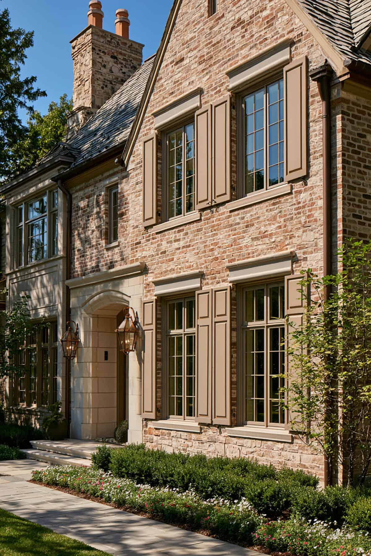
Taupe works when you want low contrast and a quieter exterior finish. It blends with mortar, stone accents, and aged roofing better than stark white or jet black.
This choice fits brick that already has a lot of movement in color. With heavily varied red, brown, and charcoal brick mixes, soft taupe keeps the eye from bouncing all over the facade.
Slate Blue
Colonial architecture handles muted blue particularly well because the lines are formal and symmetrical. Slate blue gives you color without losing discipline.
Keep the saturation down. A dusty, grayed blue respects warm red brick, while a cleaner bright blue starts to clash with the masonry and trim.
Sage Green
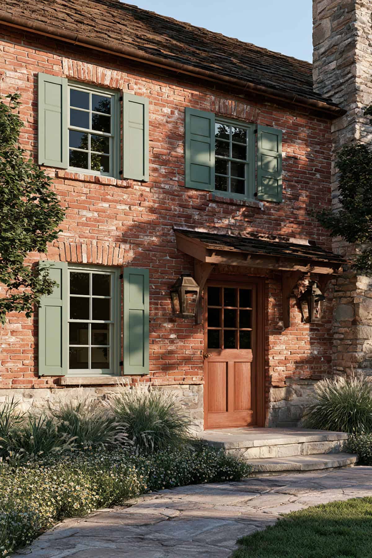
Sage shifts the house toward a softer, lived-in look. Against red brick, it tempers the warmth and reads more relaxed than darker green shutters.
This pairing lands best with cream trim, natural stone walks, and matte finishes. On glossy shutters, sage loses its quiet depth and looks flatter than it should.
Plum
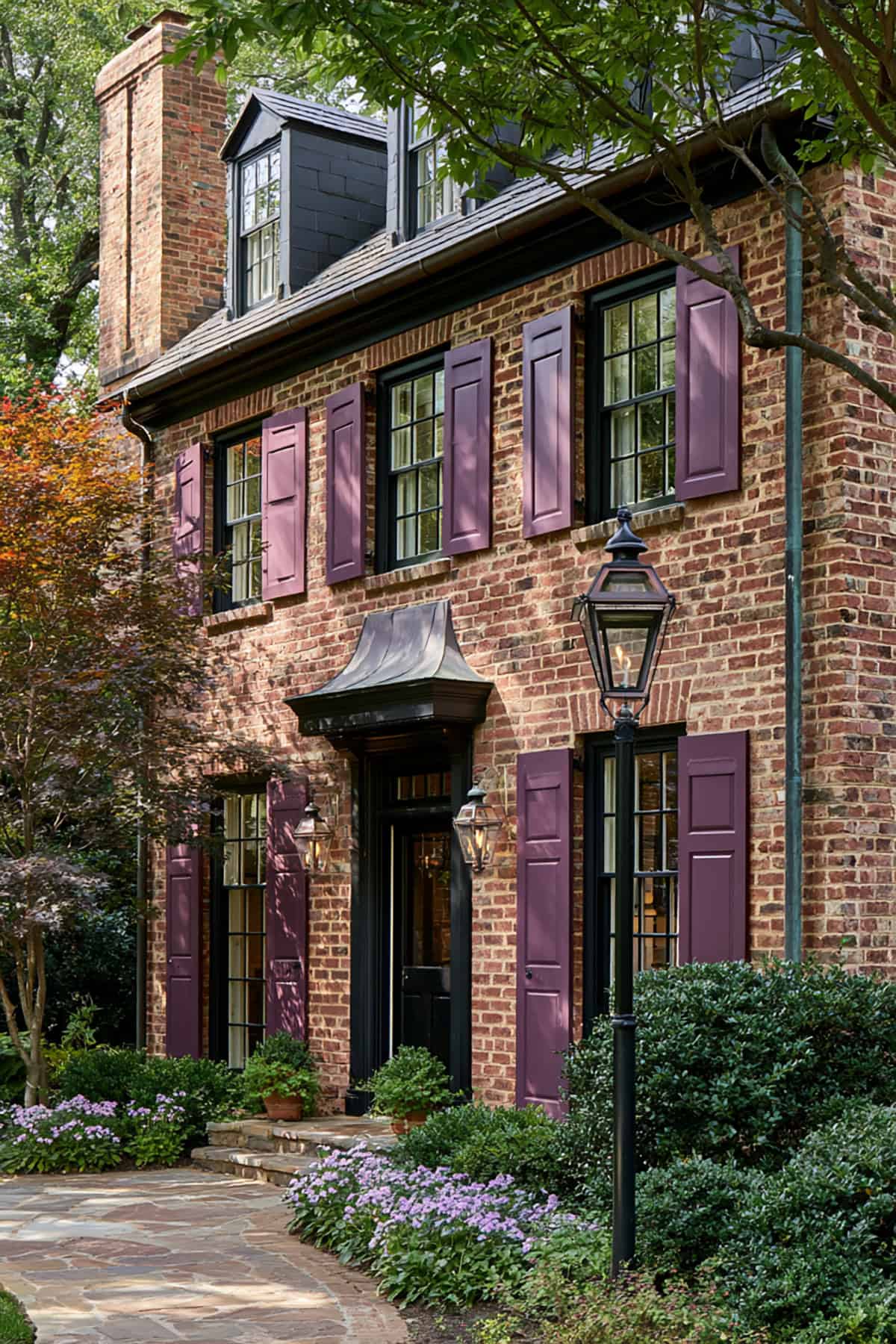
Dark brick with burgundy or brown-red undertones can handle plum better than bright red brick can. The result is moody, refined, and a little unexpected without turning theatrical.
Restraint matters here. Keep the plum muted, closer to aubergine than violet, and let the shutter color carry the accent while the trim stays simple.
Navy blue shutters remain one of the most reliable choices for traditional brick homes. They supply depth and contrast, and they look sharper than many homeowners expect once installed beside warm red masonry.
A true navy outperforms bright coastal blues on brick. If you want a familiar paint reference, shades in the family of deep inky blue work especially well with white trim and black iron hardware.
Natural Cedar
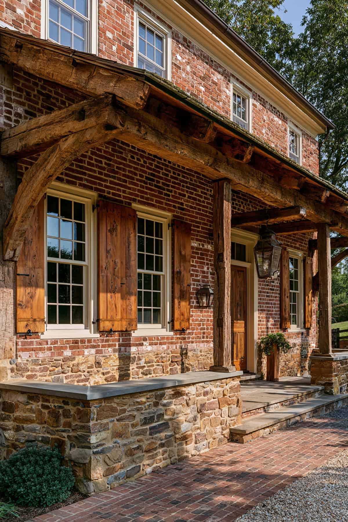
Natural wood shutters shift the house away from painted contrast and toward material contrast. Cedar introduces warmth in a different register, which suits farmhouse exteriors with porches, black lanterns, and simple trim.
The stain matters more than the species. Very orange cedar fights the brick, while weathered or medium-brown wood shutters settle in better and age with more dignity.
Mustard Yellow
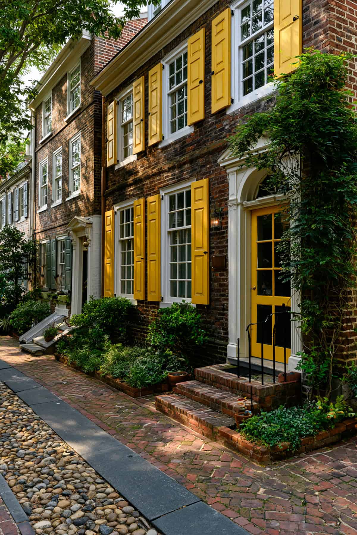
This is a niche move, and it needs the right house. Vintage brick with softened red and brown variation can support mustard in a way newer, brighter brick cannot.
The payoff is charm with edge. Keep the yellow earthy, not sunny, and repeat it lightly through planters, brass lighting, or a stained wood door so it does not look isolated.
Light Gray
If black feels too hard and white feels too stark, light gray splits the difference. It gives your windows definition while keeping the facade open and airy.
This choice performs best on red brick with cooler mortar or pale trim. In strong sun, many light grays wash out, so sample boards matter more here than with darker shutter colors.
Hunter Green Shutters On Brick Estate
Hunter green has the depth to hold its own against substantial brick homes with formal landscaping. The effect is traditional, rich, and steady.
You want enough darkness in the green to read as architectural, not leafy. On facades with cream trim and a dark roof, hunter green settles into the composition with real authority.
Forest Green
Weathered brick has softness built into it, and forest green respects that age better than brighter greens. The darker tone gives old masonry more depth and keeps the exterior from looking washed out.
This pairing improves with natural surroundings. Shade trees, aged copper, and irregular brick variation all make forest green look more convincing and less applied.
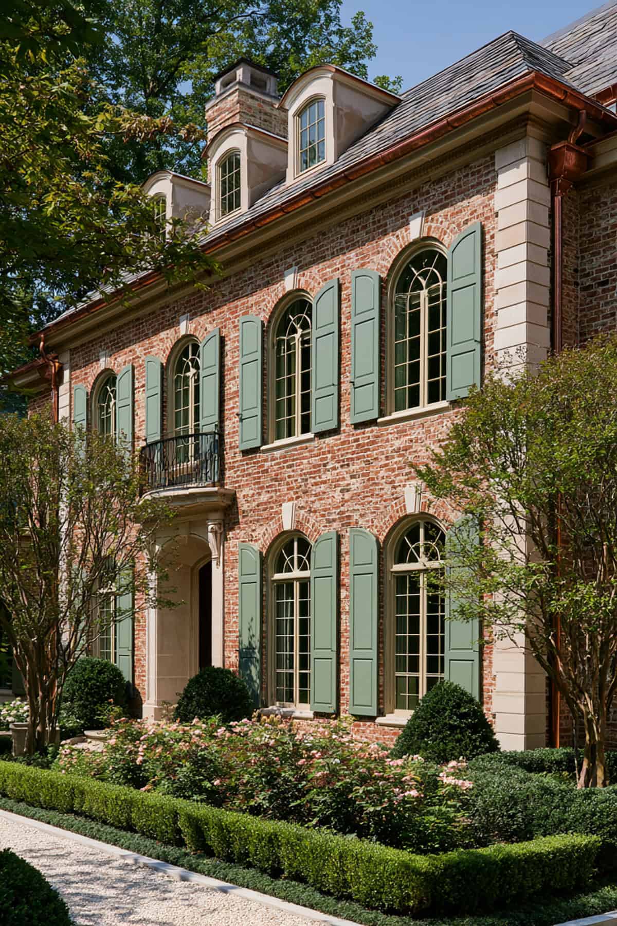
Elegant Blue
Not every blue works, but the right one brings a polished, tailored edge. A restrained elegant blue sits between slate and navy, with enough gray to quiet the contrast.
This route suits homes with balanced proportions and clean trim lines. If your brick leans orange-red, stay away from green-blue shades and steer toward a more neutral blue.
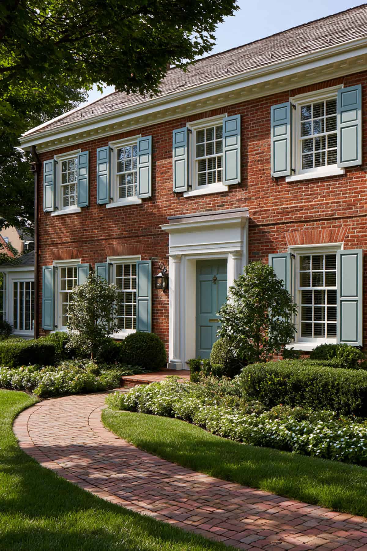
Dusty Blue Shutters On A Brick Cottage
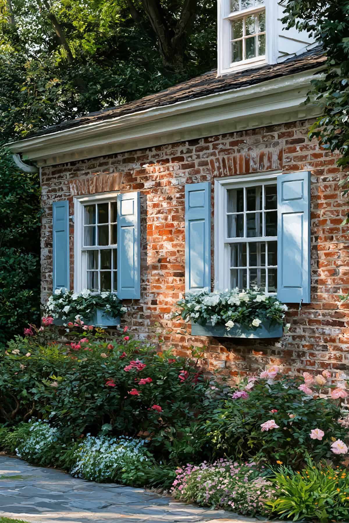
Dusty blue softens a brick cottage without pushing it into pastel territory. The lower saturation keeps the color from competing with the masonry.
You get the best result when the trim is warm white and the landscaping is informal. Cottage facades need ease, and dusty blue supports that better than crisp, high-contrast shutter colors.
Deep Teal
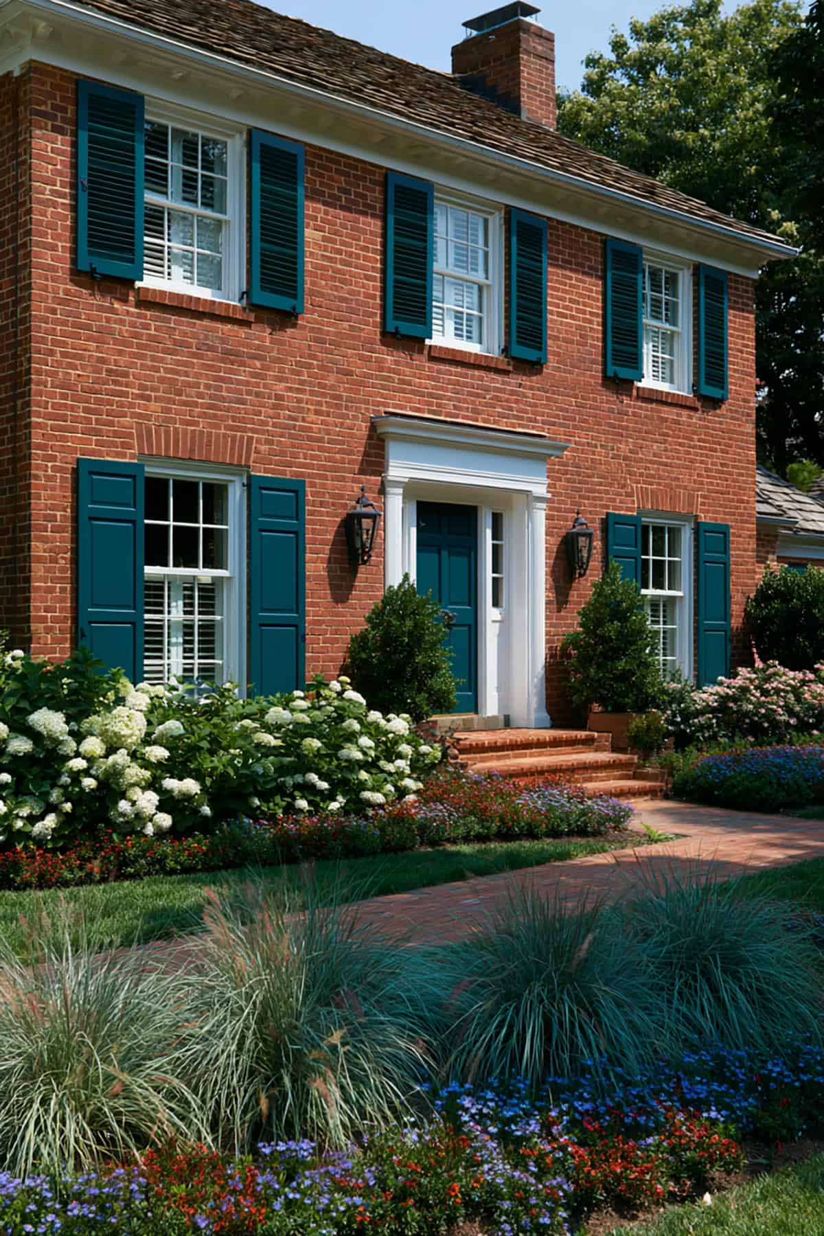
Teal carries more punch than sage or navy, so placement and support matter. On the right brick, especially one with brown-red depth, deep teal looks sophisticated rather than trendy.
Keep it dark and muted. A shade close to Sherwin-Williams Maxi Teal works better than a bright aquatic teal, and it pairs best with simple trim and a quiet front door color.
Dark Brown
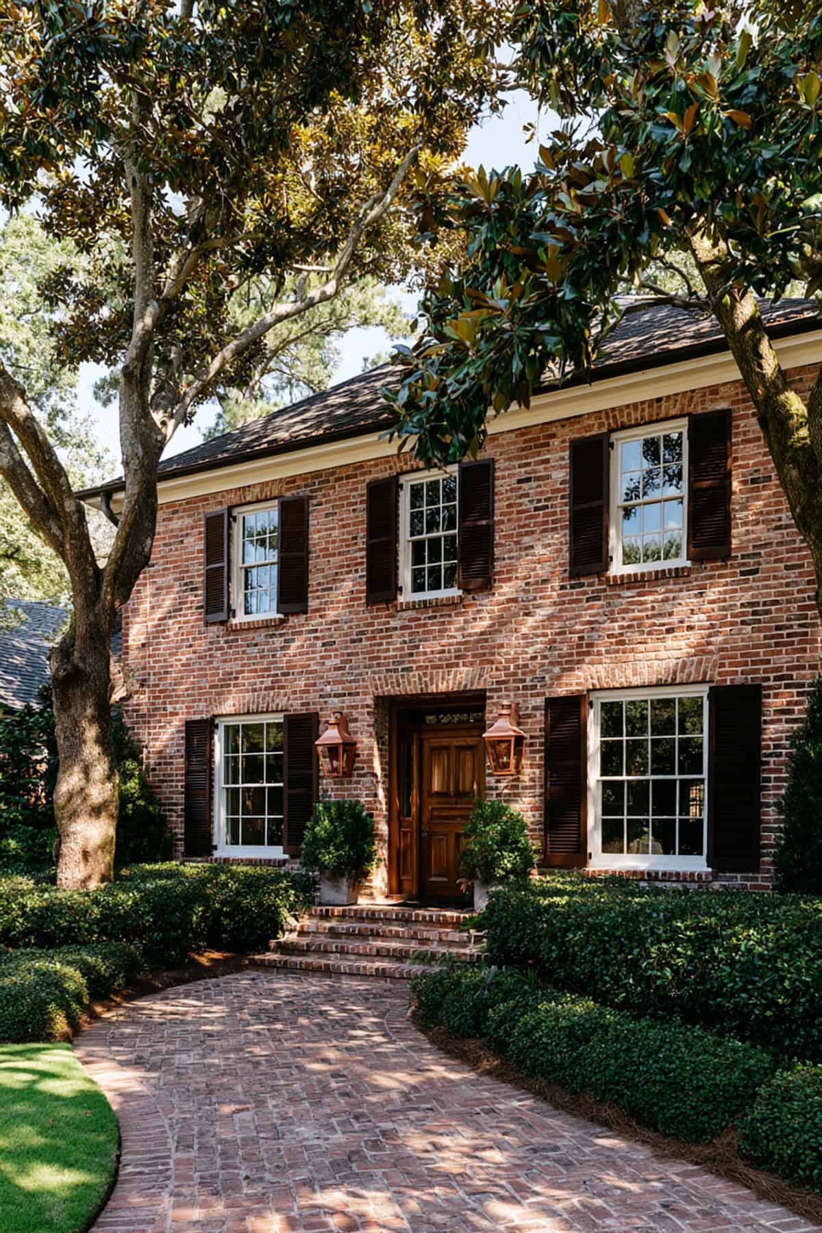
Dark brown is underrated on red brick. Instead of obvious contrast, you get a dense, tonal relationship that suits traditional homes with wood doors, bronze fixtures, and earthy roofing.
This color works through undertone harmony. If the brown carries red or umber notes, it blends with the facade; if it leans too cool or flat, the shutters start to disappear.
Cream
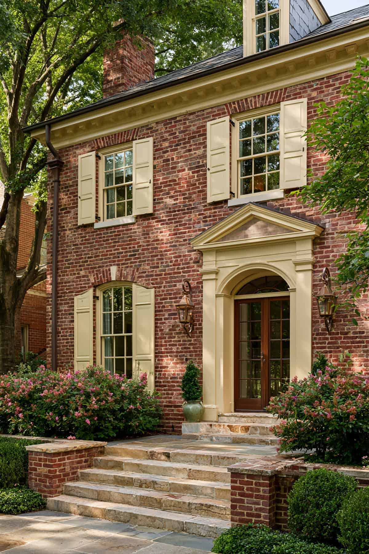
Deep red brick already has enough weight, so cream lifts it without stripping away warmth. The contrast is gentler than white shutters and more forgiving with aging mortar.
Choose a cream with yellow-beige undertones, not pink. On older brick homes, that distinction matters, especially near limestone steps or off-white window trim.
Charcoal Gray
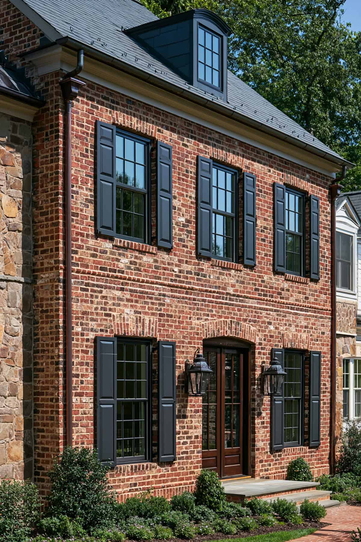
Charcoal lands between black and mid-gray, which gives you strong definition without the stark edge of pure black. It suits homeowners who want a cleaner, updated read from the street.
A charcoal with a faint blue undertone works on cooler red brick, while warmer charcoal looks steadier on clay-red or brown-red facades. Finish also matters, and a flatter sheen looks more architectural.
Burgundy
Burgundy is tonal rather than contrasting, so the success depends on depth. On stately homes with dark brick and formal symmetry, it reads rich and old-world.
Do not match the brick too closely. The shutters need enough distinction to outline the windows, so a wine-dark burgundy works better than a bright red shutter color.
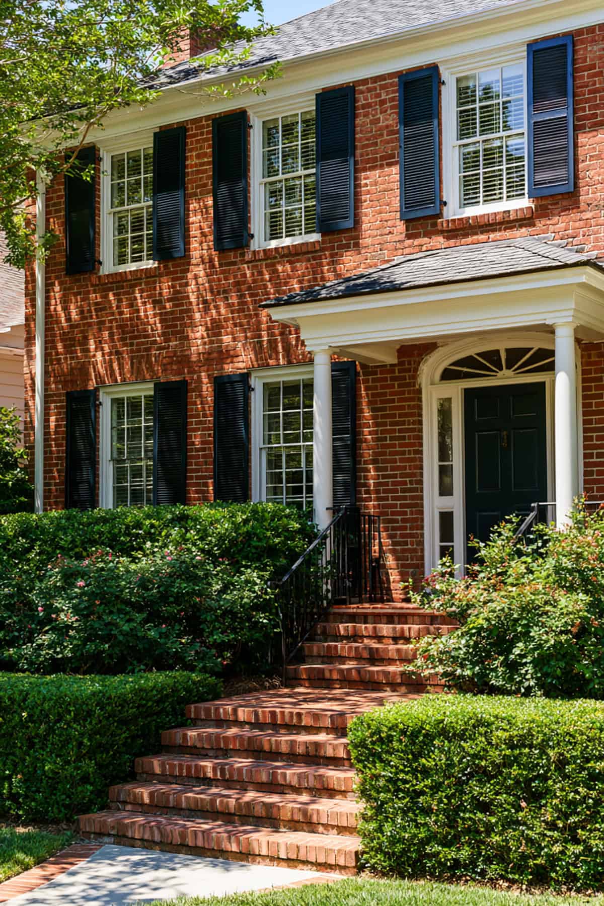
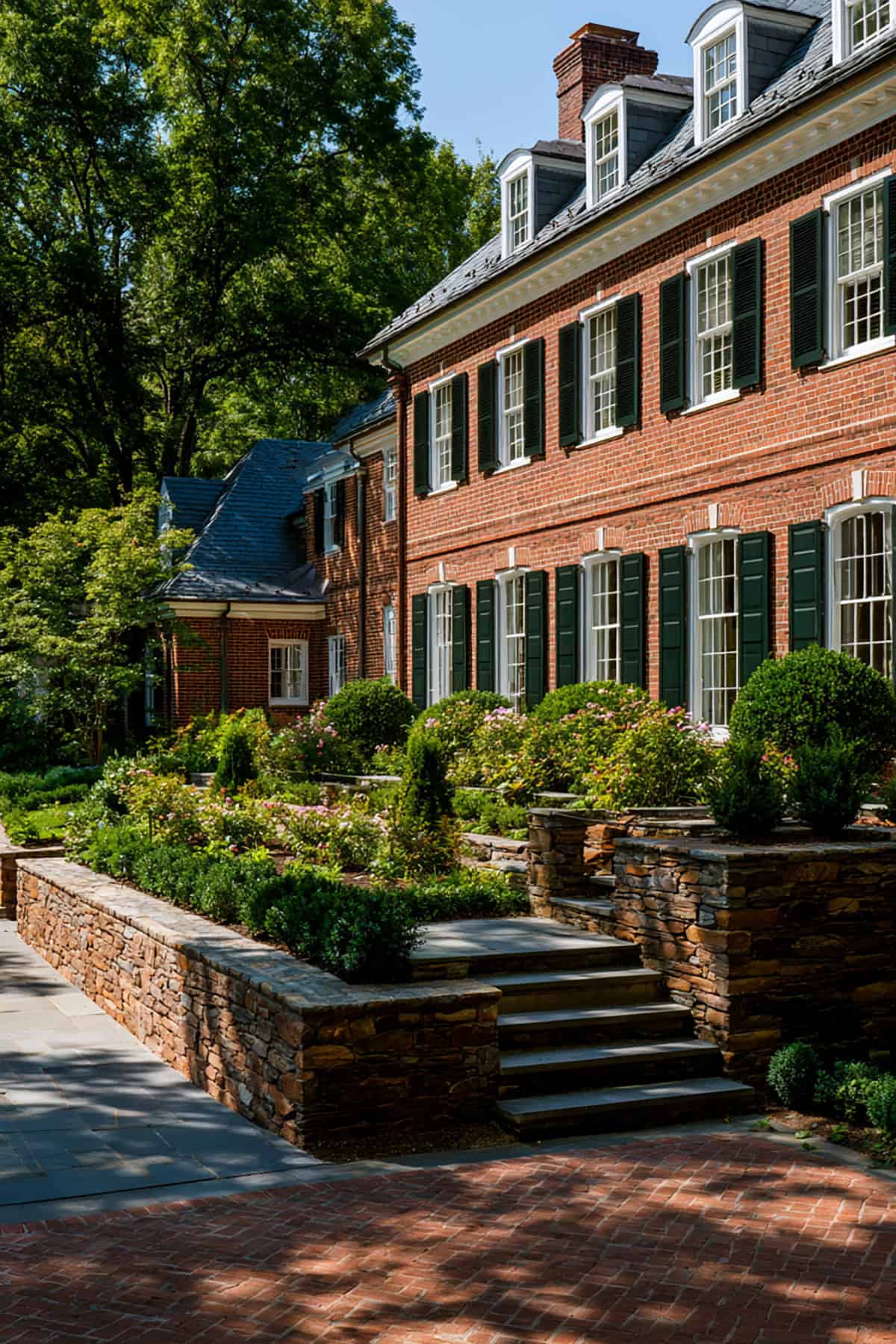
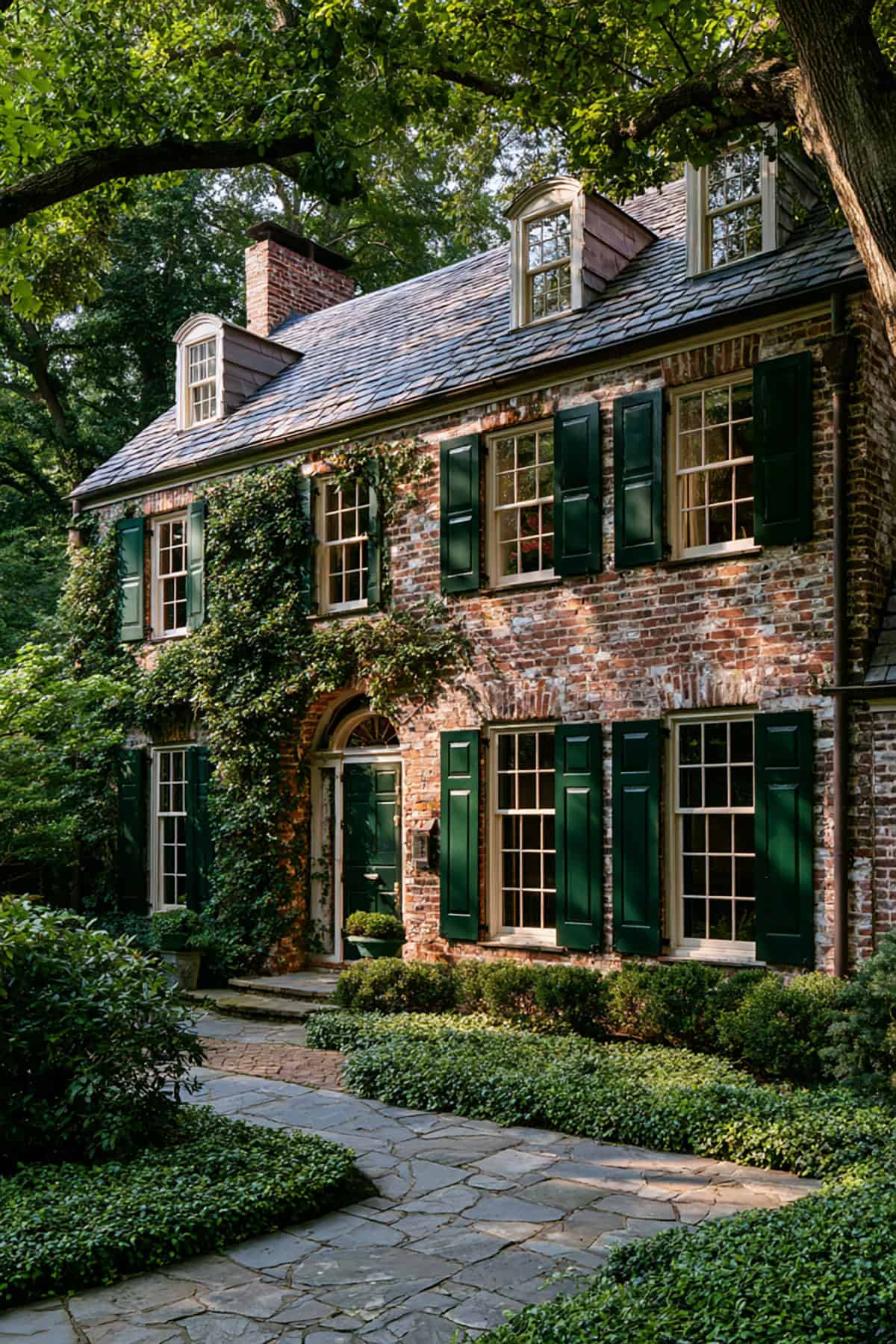
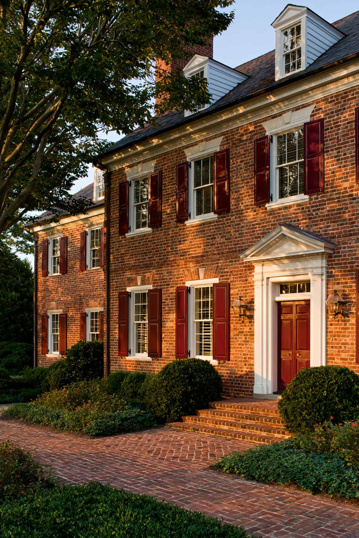
Black
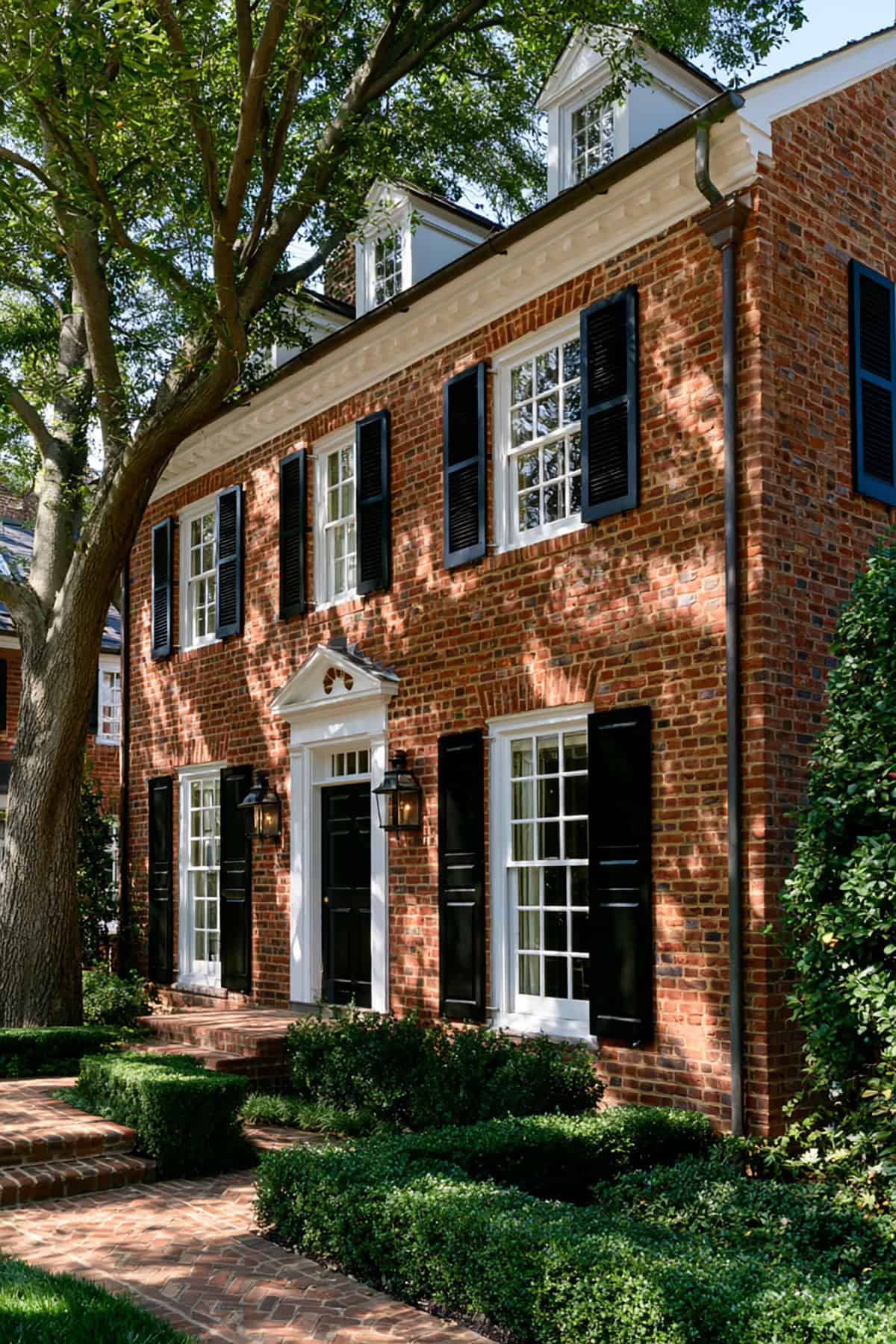
This pairing stays classic for a reason. Black shutters frame windows with clean force, and they sharpen red brick in a way few colors match.
If you want a true black, Sherwin-Williams Tricorn Black remains a strong reference point. It reads dense and clear outdoors, especially with white trim, painted sashes, and a black front door.
Board-And-Batten Black
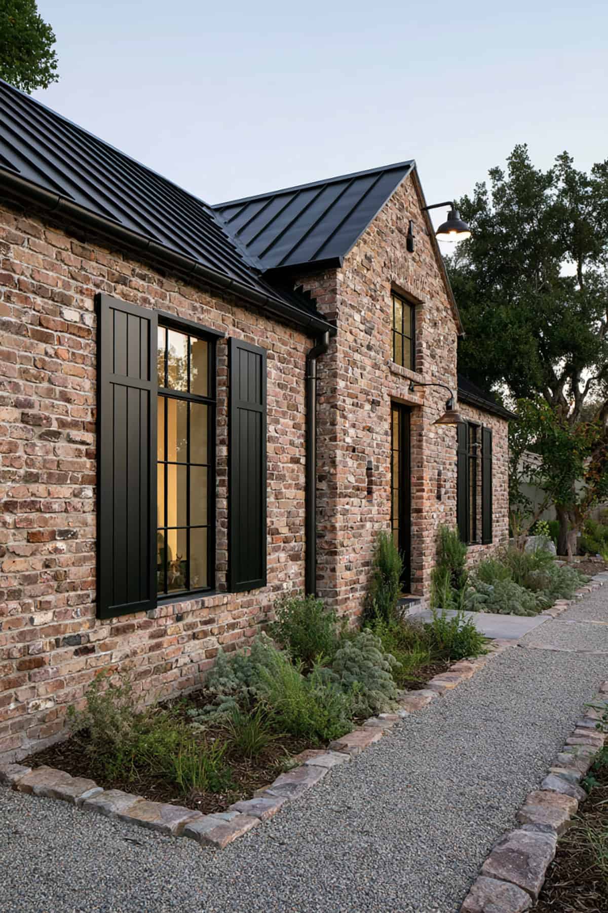
Board-and-batten changes the effect as much as the color does. The style introduces vertical rhythm and a more substantial presence, which suits farmhouse, Federal, and simplified traditional facades.
Because the shutter profile is heavier, black needs enough surrounding balance. White trim, a stained wood door, or muted siding accents keep the house from looking front-heavy while preserving the strength of the black shutters.