Many white houses share the same siding color, yet they can look completely different once the shutters are installed. Dark shades create drama, while lighter tones keep the exterior relaxed and understated. The right choice depends on the character you want your home to have. Check out these 18 shutter colors for inspiration.
Table of Contents
Shutter Colors For a White House
The best shutter colors for a white house range from black shutters and navy shutters to earthy browns, greens, and layered grays. If you want the cleanest contrast, dark blue shutters, navy blue shutters, charcoal, and black stay reliable; if you want a quieter look than white shutters, beige shutters, taupe, greige, pewter, and warm gray keep the exterior softer and more blended.
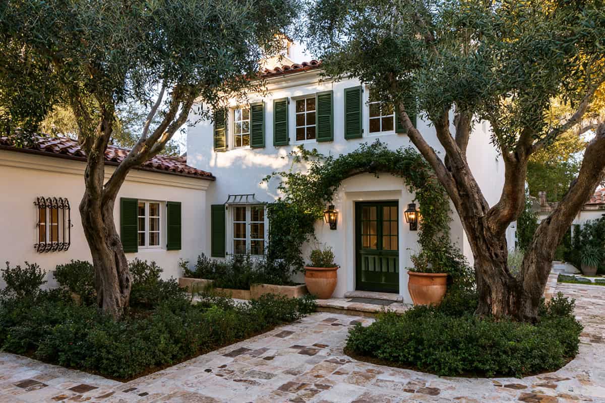
Olive Green
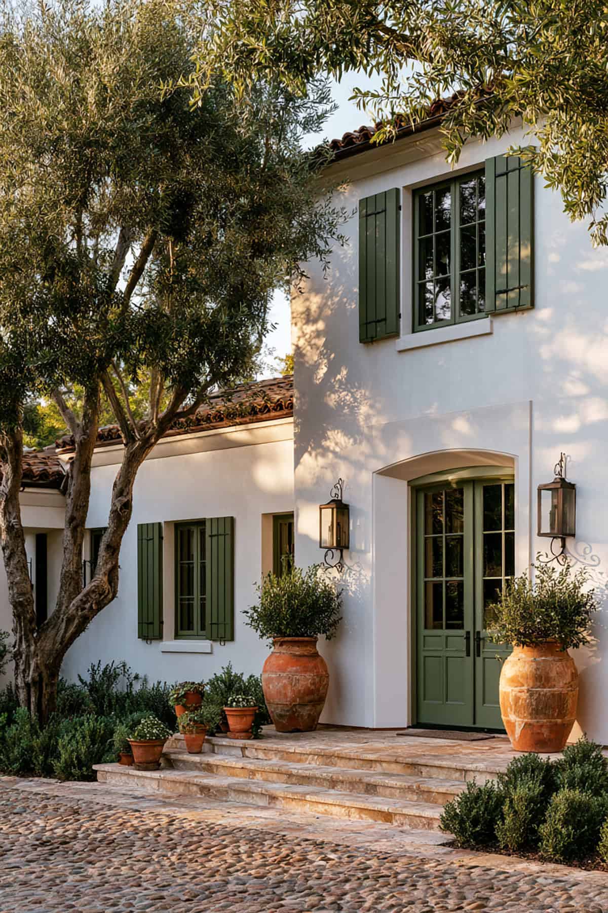
Against crisp white siding, olive reads grounded and mature. You get contrast without the hard edge of black shutters, which matters if your roof is brown, weathered wood, or muted charcoal rather than jet black.
This suits homes on homes with brick foundations, natural stone, or lots of surrounding trees. On a stark cool white, keep the olive slightly grayed down so it does not turn muddy.
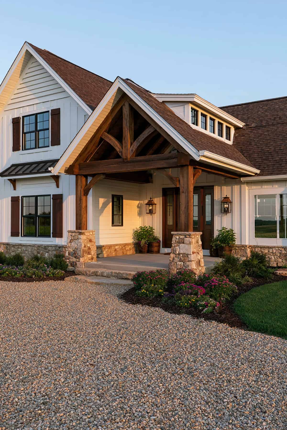
Dark Brown Cedar
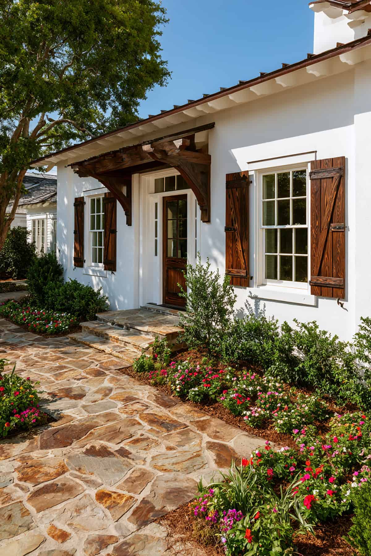
Wood-toned shutters shift a white exterior away from sharp contrast and toward a more natural, established look. Dark brown cedar suits farmhouse, rustic colonial, and cottage exteriors where the trim, porch posts, or garage doors already lean warm.
You need real depth in the stain or paint color. If it lands too orange, the white house starts reading dated fast. Pair it with warm metal fixtures and a medium-brown front door for continuity.
Brick Red
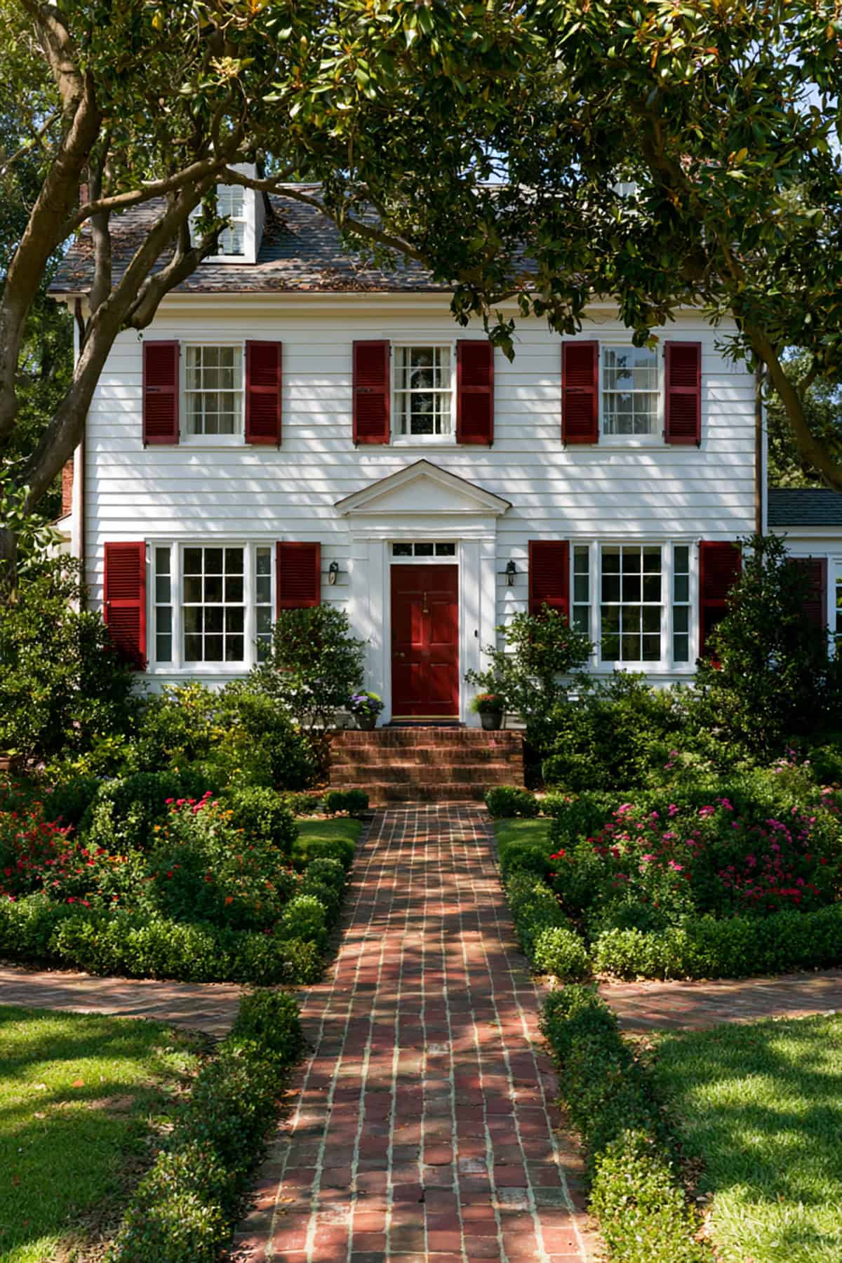
This is a historic move, not a casual one. Brick red suits traditional facades, especially when you have red brick steps, a chimney, or clay-toned roofing already present.
Use a red with brown in it, not a bright primary red. The stronger the white siding, the more disciplined the red needs to be. On a colonial or federal-style home, this choice looks crisp and correct.
Espresso Brown
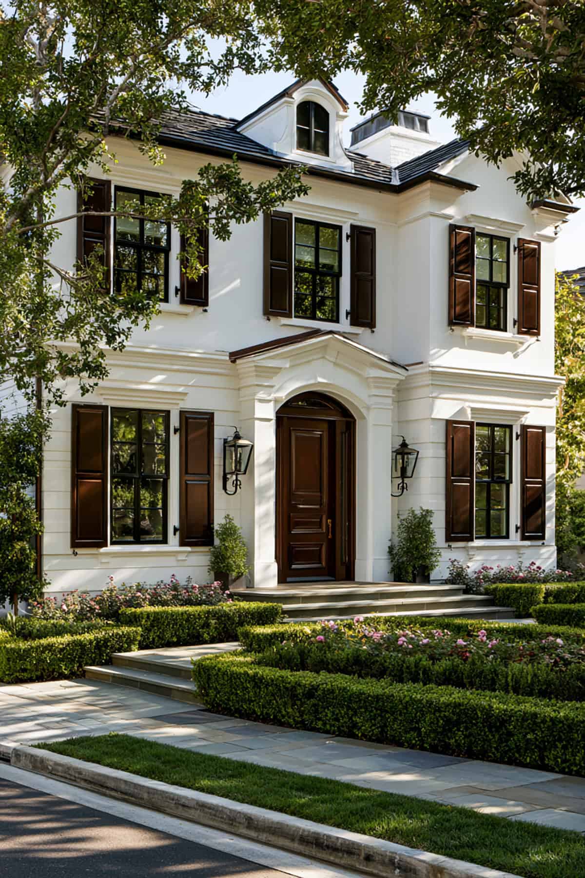
Deep espresso gives you the weight of black with a warmer undertone. That makes it one of the best shutter colors when your white house includes tan stone, bronze windows, or warm beige trim.
Late afternoon sun pulls out its richness, while overcast light keeps it restrained. It reads polished without pushing the house into high-contrast territory.
Chocolate Brown
Chocolate brown has more softness than espresso and more presence than taupe or beige shutters. This is a strong fit if your exterior already carries earthy materials and you want the shutters to support them rather than dominate.
I like it most on off-white or creamy white houses. On a bright blue-white facade, chocolate needs enough depth or it starts looking flat.
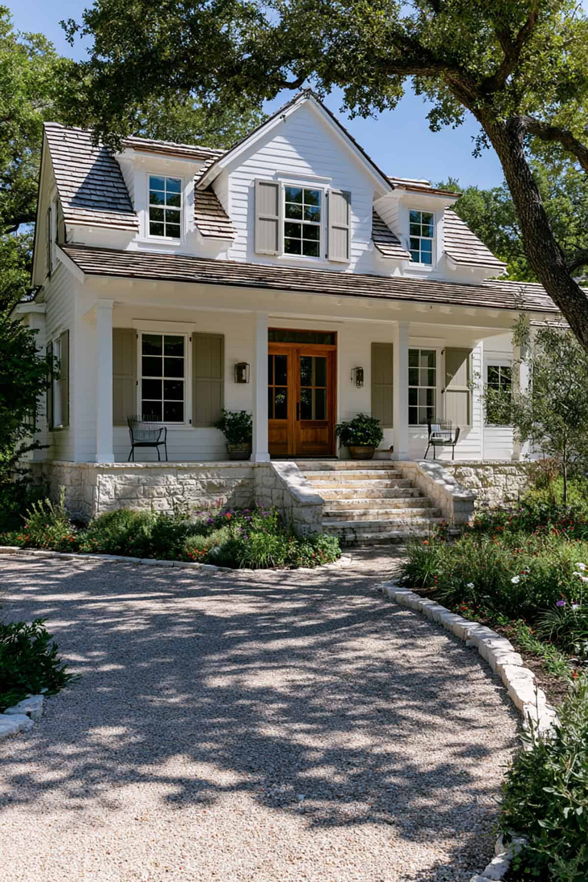
Taupe
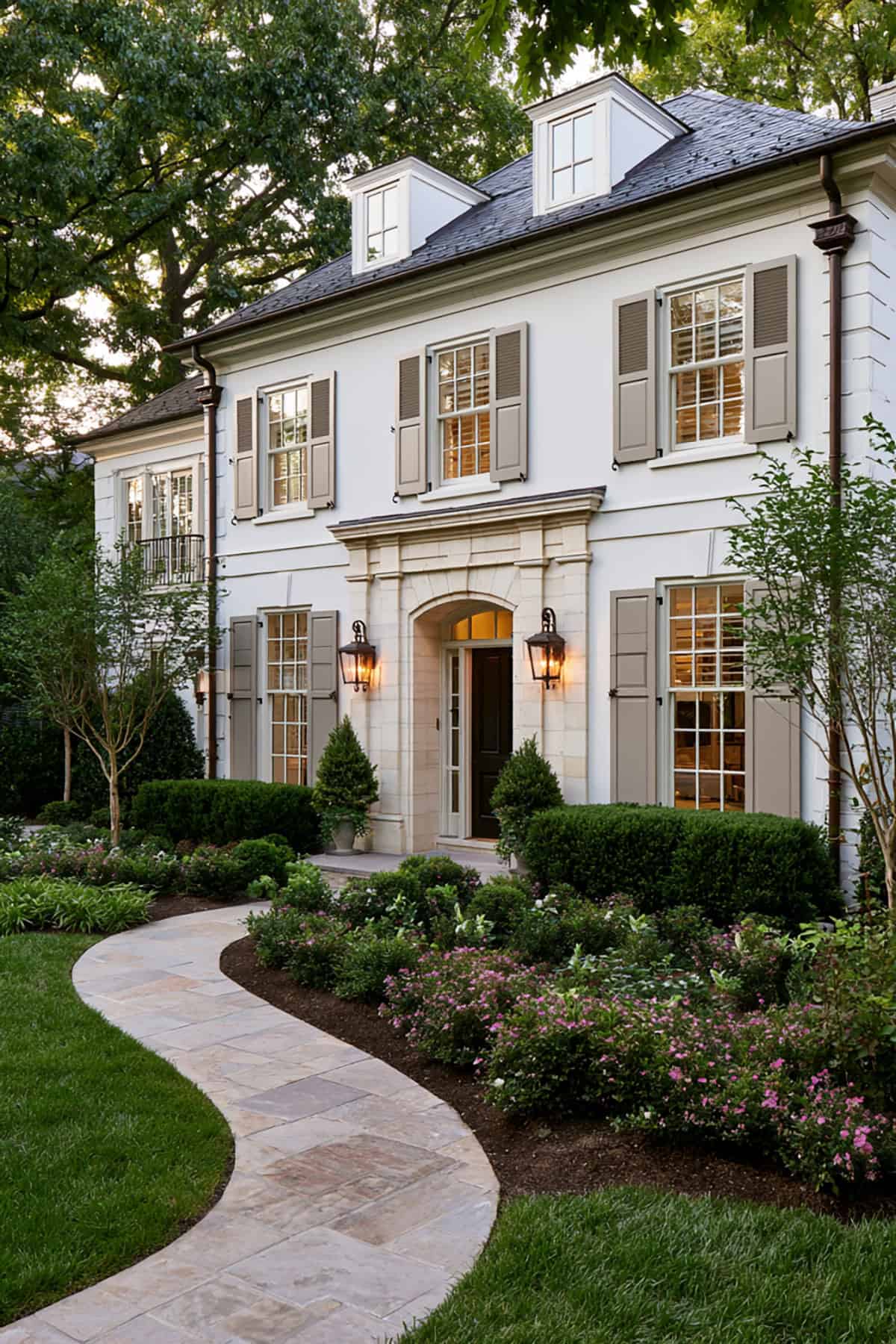
Low-contrast shutter colors for white house exteriors do a different job. Taupe quiets the facade, trims visual noise, and keeps attention on stonework, porches, or landscaping.
Look closely at the white paint first. Warm white pairs well with taupe that leans beige or mushroom. A cool white next to a warm taupe reads disconnected in full sun.
Greige
If beige is too warm and gray is too cold, greige lands in the middle with better control. It suits transitional exteriors, newer builds, and white houses that need subtle definition without stark contrast.
The strength of greige sits in its flexibility. It complements black roofing, medium stone, brushed nickel, and even muted brick. Among shutter colors for white houses, this one is easy to live with.
Pewter Gray
Pewter has more depth than a standard light gray and more refinement than builder-grade silver tones. You get a softened frame around the windows instead of a dramatic outline.
This shade performs best on white houses with cool undertones, slate roofing, or gray stone. If your exterior leans warm, pewter turns slightly steely, so sample it in morning and evening light before you commit.
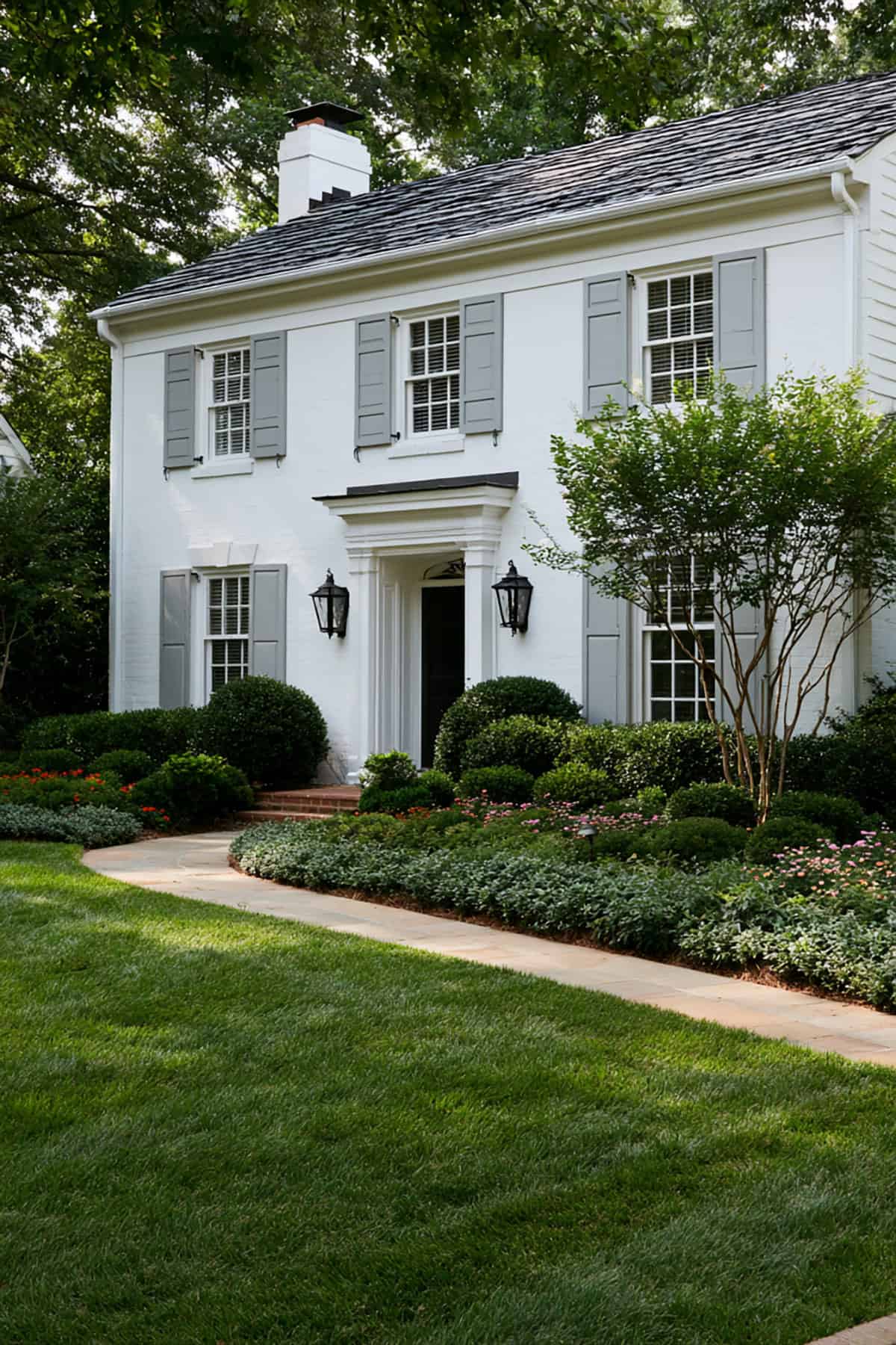
Warm Gray
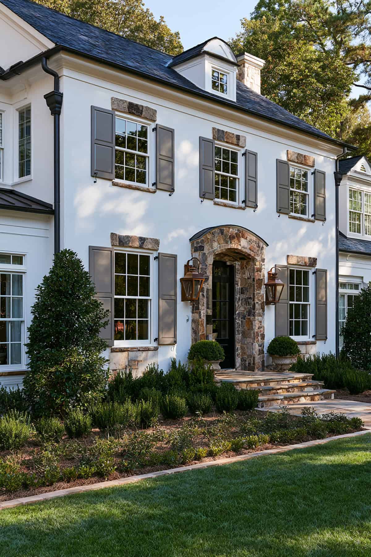
Not every gray belongs on a white house. Warm gray suits the exterior when you want the restraint of gray without the chill that comes from cooler shades.
It pairs especially well with creamier whites, natural wood doors, and beige or taupe masonry. If your house has a welcoming, classic profile and black is too severe, warm gray gives you a cleaner compromise.
Deep Teal
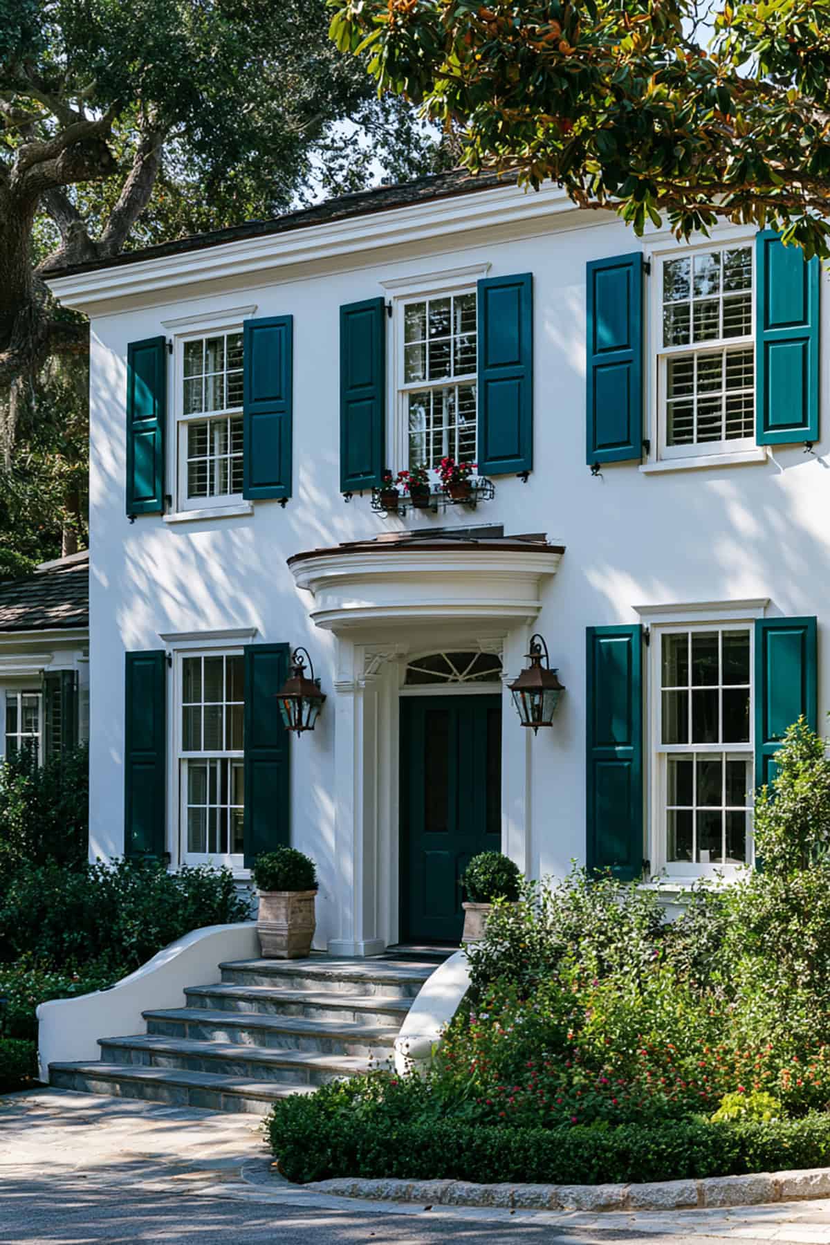
This choice carries more edge than sky blue shutters and more depth than standard coastal blues. Deep teal suits white houses that need color with authority, especially when the front door or porch details already lean bold.
Use it carefully on highly ornate facades. Simpler exteriors handle the saturation better. With brass hardware and clean white trim, the result looks sharp rather than themed.
Forest Green
Dense landscaping changes how shutter colors read, and forest green proves it. Surrounded by mature trees or layered shrubs, this shade ties the house into the site instead of setting it apart from it.
The tone needs richness, not brightness. Paired with white siding, forest green looks traditional and stable, especially on colonials, cottages, and older homes with divided-light windows.
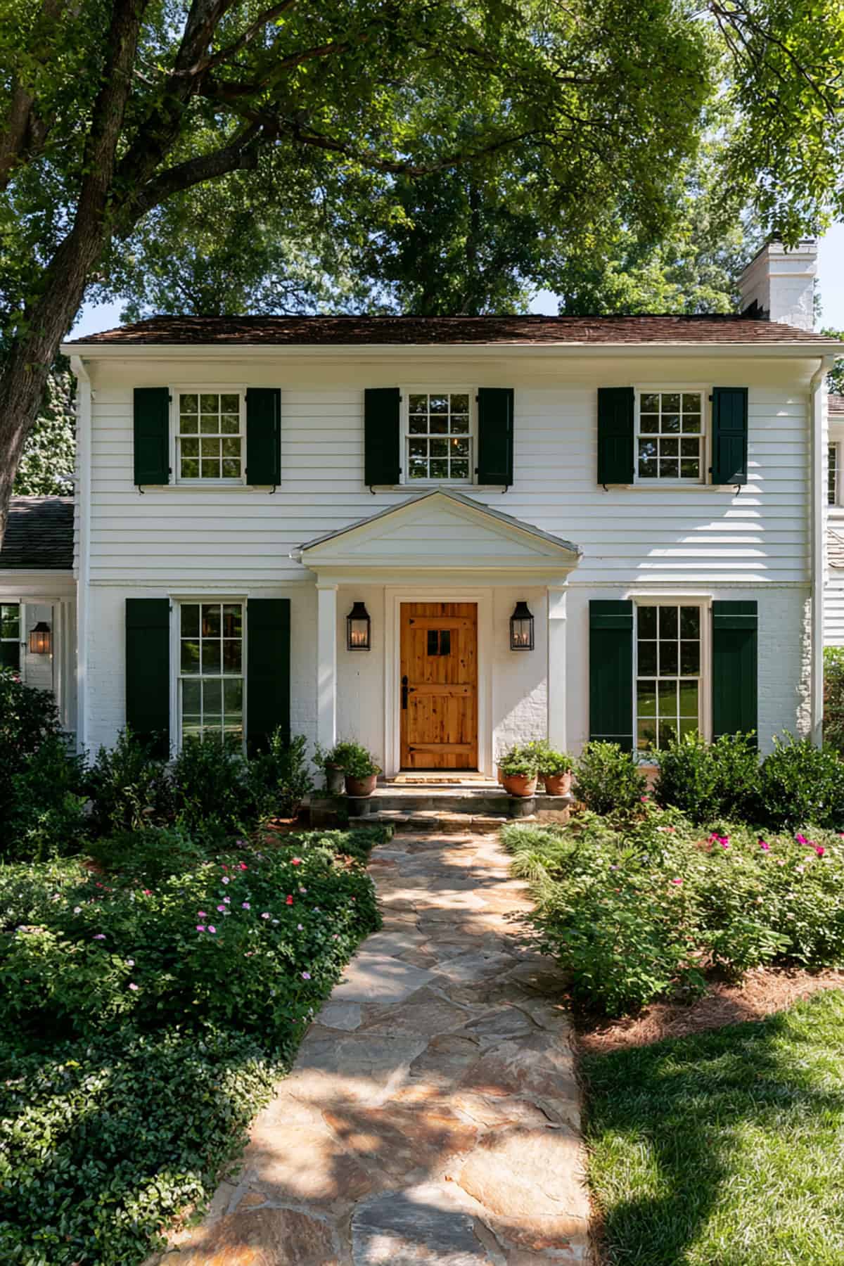
Hunter Green
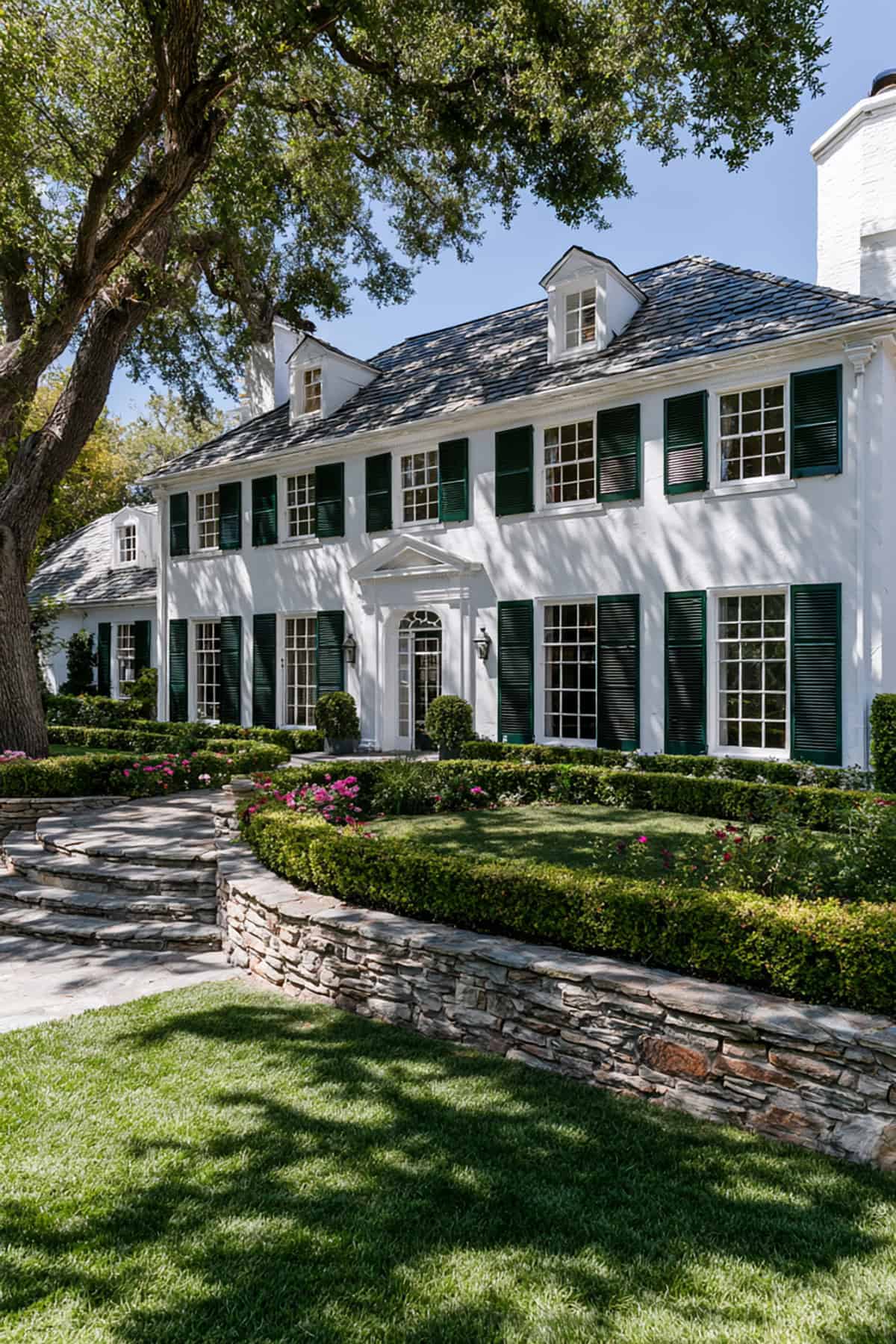
Hunter green carries more formality than forest green. It reads darker, stricter, and closer to the classic East Coast palette that suits brick walks, black iron, and symmetrical facades.
If your home has strong shutters proportionally, wider windows, or a centered entry, this color reinforces those lines well. It is less relaxed than olive and less blended than forest green.
French Blue
French blue shifts a white exterior toward a lighter, more tailored look than navy blue shutters. You still get color contrast, just without the visual weight of dark blue shutters.
This tone performs best when your white paint is clean, not creamy. It also pairs nicely with pale stone, light gray roofing, and traditional trim details where softer blue keeps the facade elegant.
Slate Blue
Muted blue with gray in it solves a common problem. You want blue shutters, just not the brightness of sky blue shutters or the authority of navy shutters.
Slate blue handles changing light well and avoids looking nautical. On white houses with charcoal roofs, gray stone, or cooler trim, it reads composed and current.
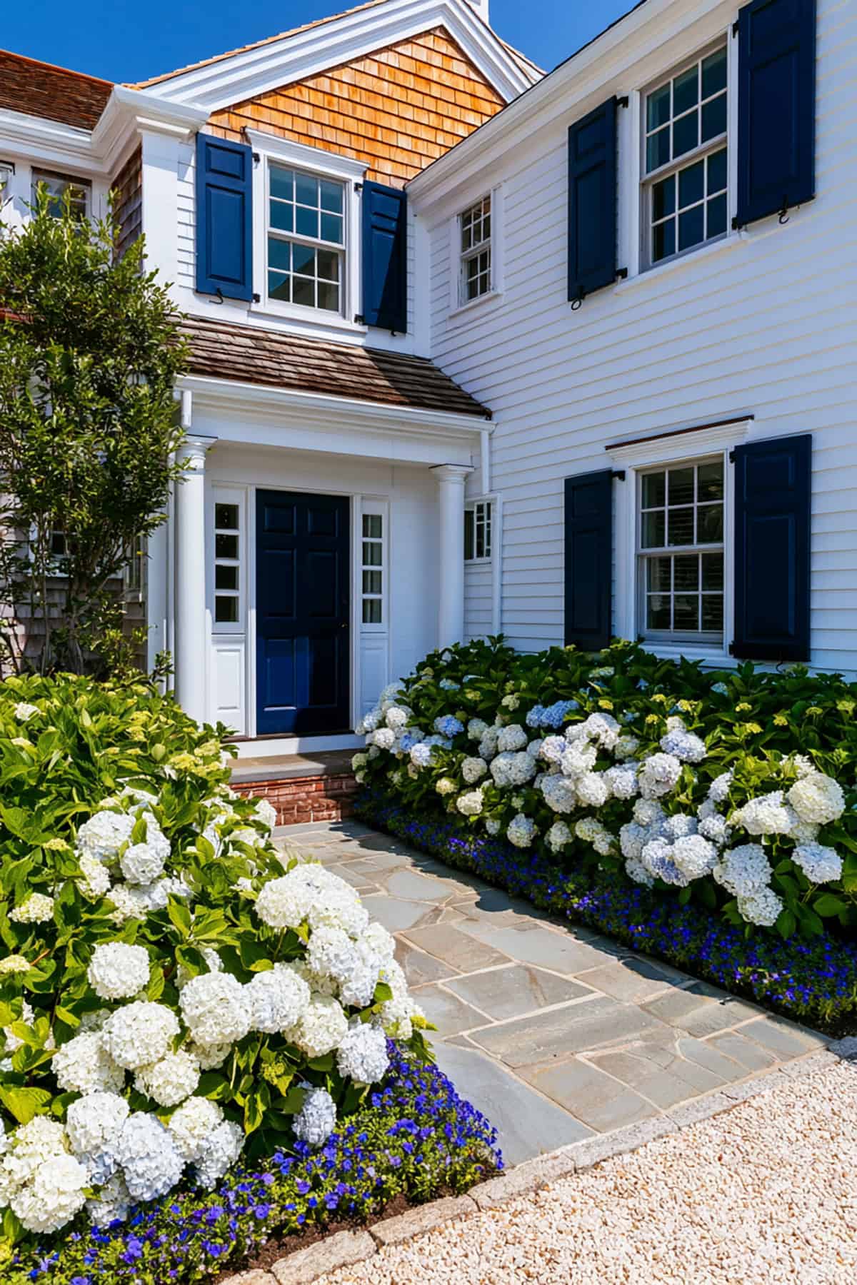
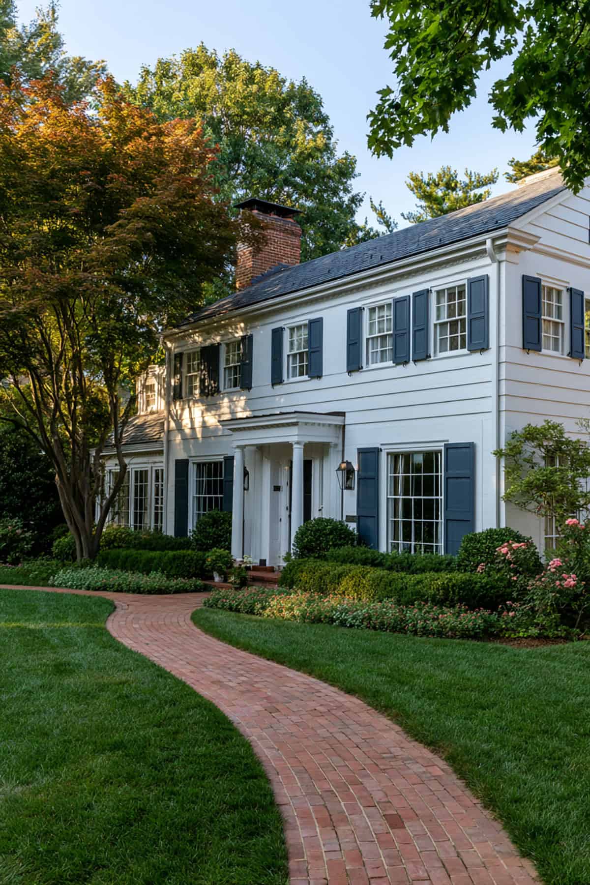
Among the best shutter colors for a white house, navy stays near the top for good reason. It gives you strong contrast, a polished look, and more color than black without sacrificing seriousness.
This is one of the safest choices for colonial, Cape Cod, and coastal homes. A true navy suits both warm and cool whites, though very creamy siding looks better with navy that has a touch of softness rather than an inky base.
Iron Ore
When black is too absolute, Iron Ore steps in with a charcoal-black cast that reads expensive on a white house. It holds depth in bright sunlight better than many true blacks, which flatten out.
This shade suits modern farmhouse, transitional, and updated traditional homes. If your roof is black and your window sash is dark, Iron Ore keeps the palette aligned without the harshest possible contrast.
Charcoal Gray
Charcoal gray gives structure to a white facade and still leaves room for other exterior materials to speak. Stone veneer, brick steps, and stained doors all pair well with it.
You get a cooler, more architectural result than brown shutters and a softer edge than black shutters. For many homeowners choosing shutter colors for white house exteriors, charcoal lands in the sweet spot.
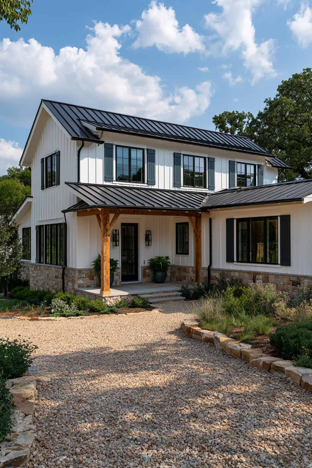
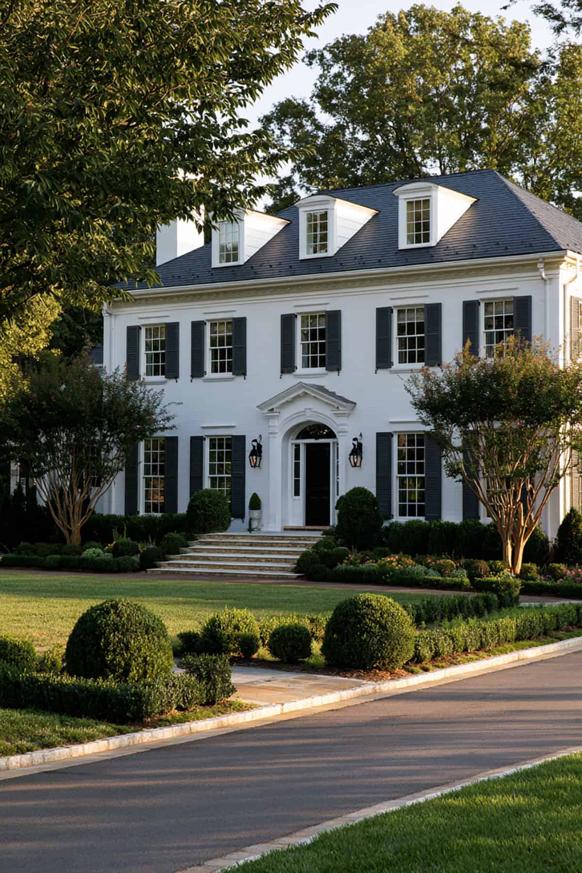
Black
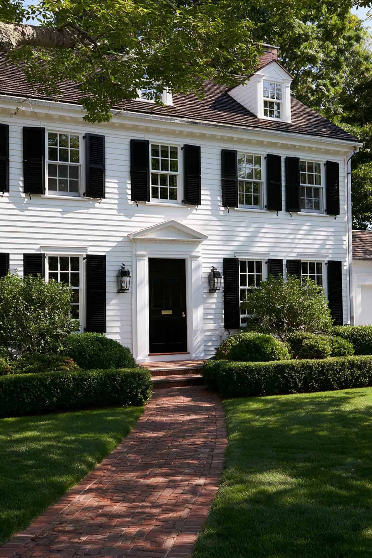
Pure contrast, clean lines, no ambiguity. Black shutters remain the benchmark because they sharpen white siding instantly and suit nearly every traditional form, from colonial to farmhouse.
They also expose every mismatch. If your roof is faded brown, your trim is creamy, or your front door is a competing color, black makes those inconsistencies more obvious. Used on the right house, though, white siding with black shutters still reads crisp, classic, and hard to beat.