The modern farmhouse look has taken over homes everywhere — and for good reason. It’s cozy, timeless, and stylish all at once. If you’re ready to give your walls that perfect farmhouse charm, here are 15 paint colors that nail the look.
Table of Contents
- Modern Farmhouse Paint Colors
- Soft Greige – Agreeable Gray (Sherwin-Williams SW 7029)
- Creamy Off-White – Swiss Coffee (Behr 12)
- Dusty Olive Green – Spanish Olive (Benjamin Moore 1509)
- Slate Blue – Stardew (Sherwin-Williams SW 9138)
- Warm Putty – Revere Pewter (Benjamin Moore HC-172)
- Weathered Gray – Classic French Gray (Sherwin-Williams SW 0077)
- Chalky Sage – Saybrook Sage (Benjamin Moore HC-114)
- Buttermilk Yellow – Friendly Yellow (Sherwin-Williams SW 6680)
- Charcoal Black – Iron Ore (Sherwin-Williams SW 7069)
- Moody Navy – Hale Navy (Benjamin Moore HC-154)
- Blush Beige – Almond Wisp (Behr PPU5-12)
- Muted Terracotta – Canyon Dusk (Behr S210-4)
- Bone White – White Dove (Benjamin Moore OC-17)
- Smoky Taupe – Perfect Greige (Sherwin-Williams SW 6073)
- Antique White – Antique White (Sherwin-Williams SW 6119)
Modern Farmhouse Paint Colors
Getting that cozy farmhouse feel is all about mixing natural warmth and a bit of contrast. Soft neutrals, mellow greens, and those classic blues make for a chill backdrop, while deeper shades bring in some edge and personality.
Soft Greige – Agreeable Gray (Sherwin-Williams SW 7029)
This one’s great when you want a neutral that doesn’t lean too warm or too cool. It’s a blend of beige and gray that changes with the light.
Works for living room or bedroom walls if you’re aiming for calm. Looks sharp with crisp white trim—very farmhouse, but not fussy.
Add some black windows or chunky wood beams for contrast. The space feels grounded, not gloomy.
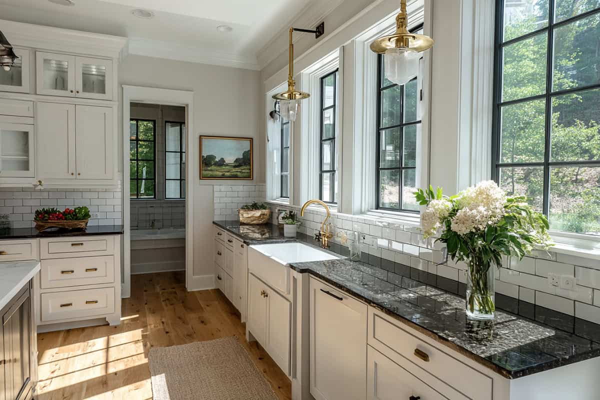
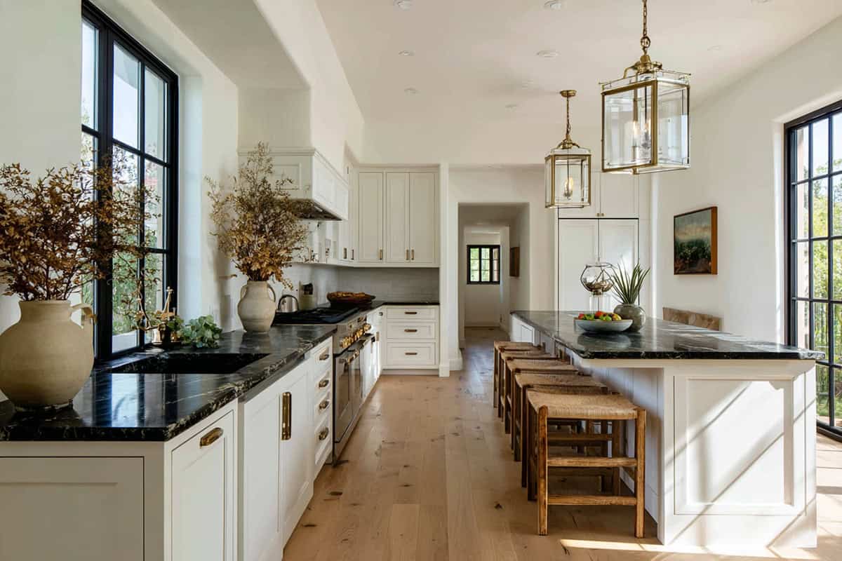
Creamy Off-White – Swiss Coffee (Behr 12)
Swiss Coffee is a soft off-white with a creamy vibe. It dodges that harsh, clinical white but still keeps things bright.
It’s a winner in kitchens, especially next to wood cabinets or open shelves. Lets natural textures really shine.
Try it on ceilings and trim, too—there’s a nice flow if you keep it consistent. Especially lovely if you get good sunlight.
Dusty Olive Green – Spanish Olive (Benjamin Moore 1509)
There’s something grounding about an earthy green that works just as well indoors as it does in nature. Farmhouse interiors love this shade because it brings in that natural touch.
It’s solid for cabinets, a feature wall, or even the entryway. Pairs up easily with beige or cream, so nothing feels out of place.
Add matte black handles or some old wood, and suddenly it’s got that timeless, lived-in vibe. Not too trendy, not too old-school.
Slate Blue – Stardew (Sherwin-Williams SW 9138)
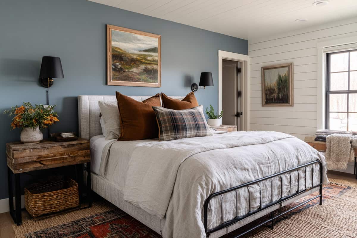
Instead of reaching for pure gray or pastel blue, this choice gives you a muted mix that feels just right. It’s calm and easy on the eyes—never shouts for attention.
Perfect for bedrooms or bathrooms when you want something soothing. White trim or natural wood? Yes, please.
It also plays nicely in living rooms with stone or shiplap. Just enough color to keep things interesting, but still unmistakably farmhouse.
Warm Putty – Revere Pewter (Benjamin Moore HC-172)
Revere Pewter is a greige that leans warm. Super adaptable—it doesn’t freak out in weird lighting.
Great as a whole-house color, especially in open layouts. It gives you a sense of flow but doesn’t disappear into the background.
Pair it with sharp whites, faded blues, or even something dark for a nice balance. It fits in both classic and modern spaces, honestly.
Weathered Gray – Classic French Gray (Sherwin-Williams SW 0077)
A balanced gray like Classic French Gray brings an aged, rustic mood without looking cold or sterile. There’s a warmth to it that keeps things from feeling industrial.
Try it on interior doors, a statement wall, or cabinets. It stands out against lighter colors but doesn’t take over.
With natural wood and soft whites, you get that perfectly weathered look. I especially like it in entryways or mudrooms where you want a little drama.
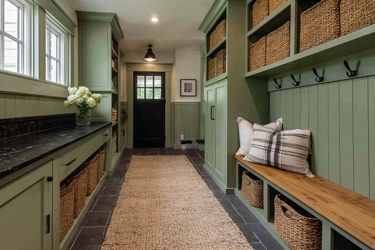
Chalky Sage – Saybrook Sage (Benjamin Moore HC-114)
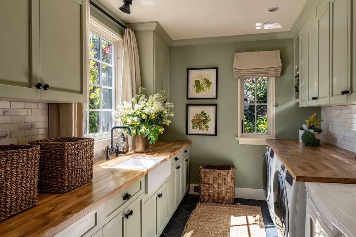
Saybrook Sage is a muted green with a soft, chalky finish. It’s got a gentle, calming feel—very farmhouse but not in-your-face.
Lower kitchen cabinets or an island look great in this shade, especially with butcher block or white tile.
Also feels right at home in bedrooms if you’re after a peaceful retreat. Pair with warm whites for a look that won’t go out of style any time soon.
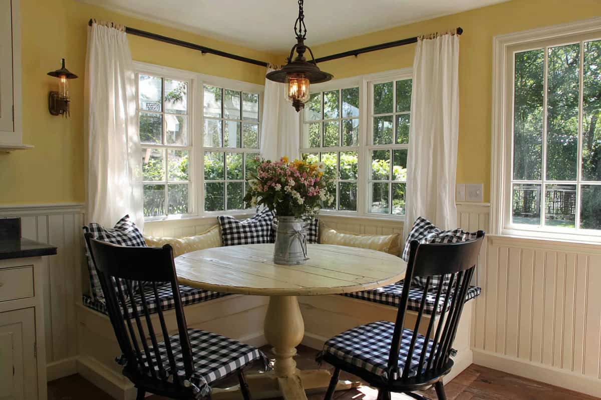
Buttermilk Yellow – Friendly Yellow (Sherwin-Williams SW 6680)
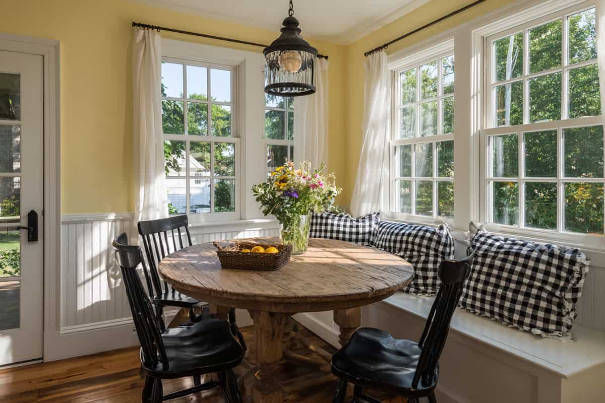
If you want to bring a sunny warmth into the room, this mellow yellow pulls it off without going too bright.
Works well in breakfast nooks or kitchens where sunlight can really show it off. White trim and light woods are a natural match.
If you mix it with soft greens or grays, it keeps things friendly and welcoming—not overwhelming.
Charcoal Black – Iron Ore (Sherwin-Williams SW 7069)
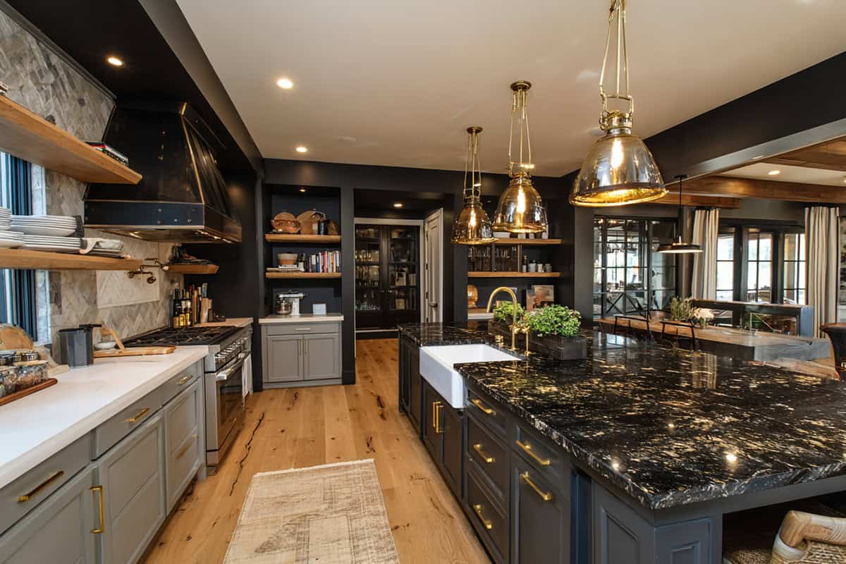
Iron Ore is a deep charcoal that brings strong contrast. Use it when you want to define a space without going full-on black.
It’s sharp on doors, window frames, or as an accent wall. Looks especially good with whites, beiges, or greige shades.
In the kitchen, try it on the island or cabinets for a modern touch that still feels grounded.
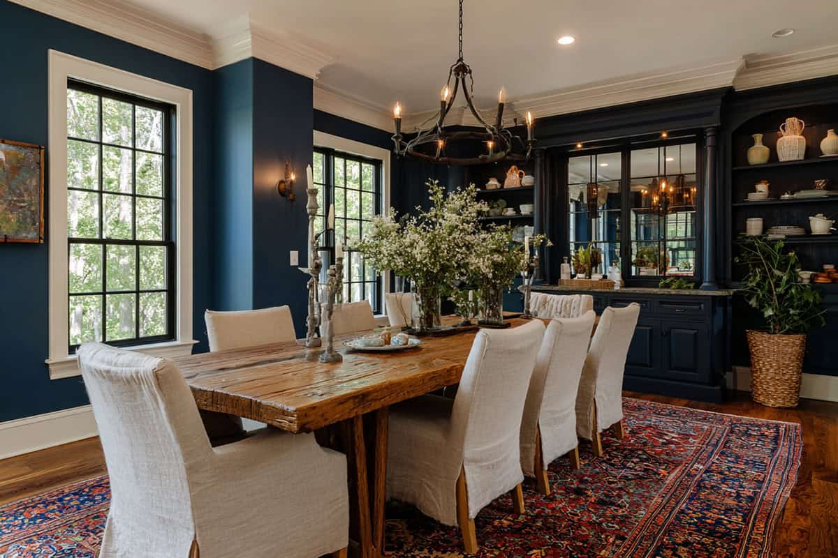
Navy shades can often feel heavy, but Hale Navy adds sophistication with just the right amount of boldness.
It’s a go-to for accent walls, built-ins, or kitchen cabinets. Brass hardware and warm woods really pop against it.
Also works for dining rooms or even an office if you want a space to feel a little cozier. It’s farmhouse, but with a bit of drama.
Blush Beige – Almond Wisp (Behr PPU5-12)
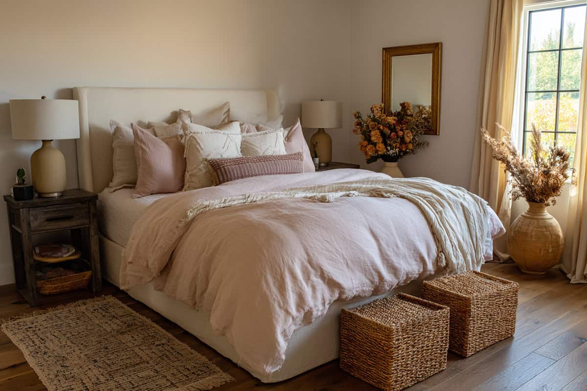
Rather than a flat beige, this subtle blush-infused tone offers warmth and softness that feels especially inviting.
Good pick for bedrooms or living rooms if you want warmth but need to keep things neutral. Pairs up with whites and muted grays without clashing.
Natural fabrics and wood accents help it deliver that gentle farmhouse vibe. Keeps things bright but not sterile.
Muted Terracotta – Canyon Dusk (Behr S210-4)
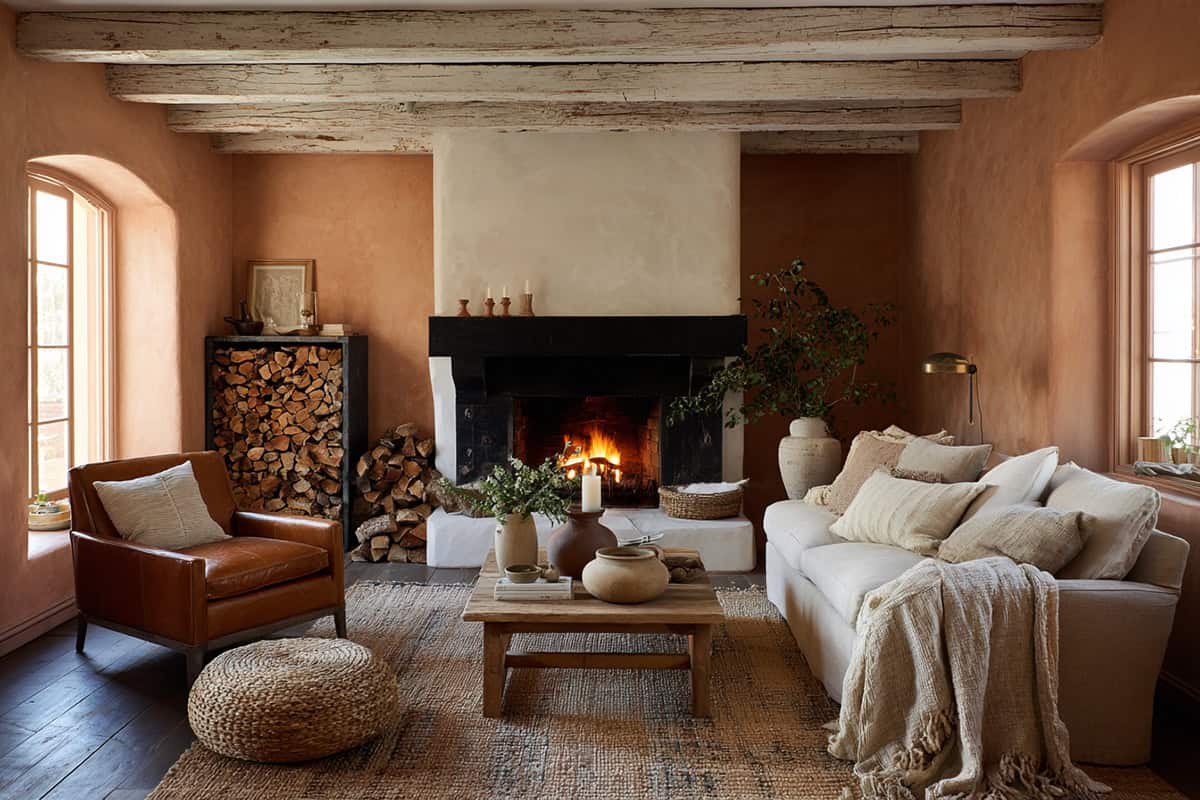
Canyon Dusk is an earthy terracotta with a quiet finish. It brings in warmth but never takes over.
Nice for accent walls, dining rooms, or even the entry. Creams, browns, and muted greens are its best friends.
Throw in rustic wood and some textured fabrics, and you’re well on your way to that cozy farmhouse look. It just feels right in snug spaces.
Bone White – White Dove (Benjamin Moore OC-17)
You’ll get a warm, versatile backdrop here—one that doesn’t feel clinical but still keeps everything bright.
Use it on walls, trim, or cabinets. It’s great in big, open areas where you want everything to feel connected and bright.
It’s especially good at showing off natural textures and cool details when paired with greens, blues, or grays.
Smoky Taupe – Perfect Greige (Sherwin-Williams SW 6073)
Perfect Greige sits comfortably between taupe and gray, with a hint of warmth that works for farmhouse style.
It’s versatile for living rooms, hallways, or bedrooms. White trim and darker accents—black or navy—really make it stand out.
Wood tones play well with it too, so you get a balanced, neutral base that’s not boring. It’s a safe bet if you’re on the fence.
Antique White – Antique White (Sherwin-Williams SW 6119)
For a shade that instantly gives a lived-in, welcoming vibe, this one feels like it’s been part of the home forever.
It’s versatile—you’ll see it on walls, trim, even cabinetry. It tends to look great alongside rustic wood, muted greens, or soft grays.
The shade gives a space that inviting, lived-in feeling without being harsh or glaring. Kitchens, dining rooms, family hangouts—it just sort of works in those spots.