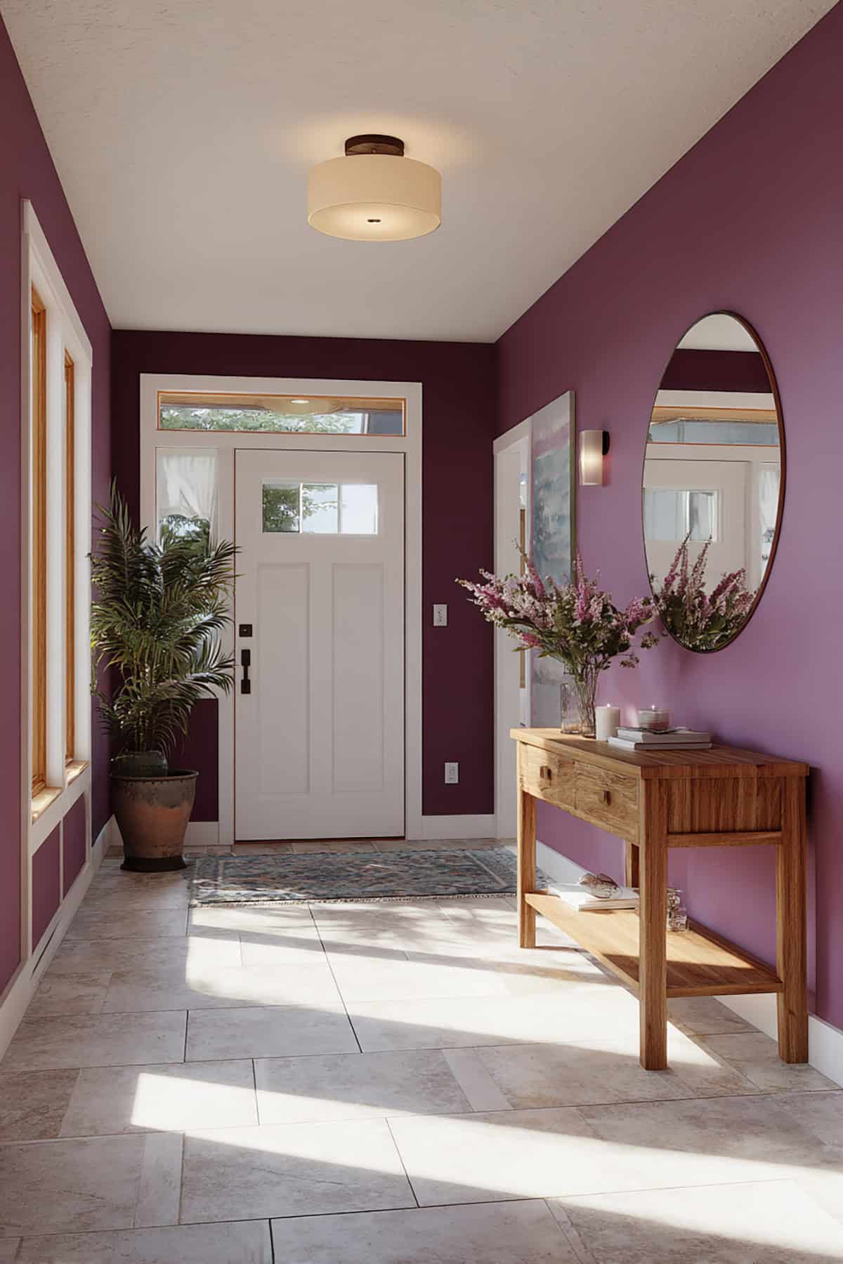
A well-chosen violet wall can make a room feel thoughtful and unique. Some shades lean romantic, others modern, and a few feel quietly luxurious. The challenge is knowing which ones look good beyond a tiny paint chip. Seeing curated options saves time and prevents costly mistakes. Check out the article to find the 14 best violet paint colors.
Table of Contents
Benjamin Moore
Benjamin Moore’s violets range from soft pastels to grounded mid-tones. Each one handles light in its own way and fits different rooms, finishes, and moods.
Spring Lilac (1388)

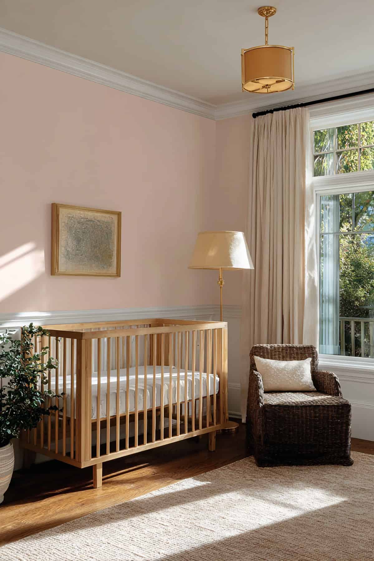
Clean, soft lavender defines Spring Lilac. It stays light without veering pink. The effect is calm—perfect for bedrooms, nurseries, and quiet workspaces.
Daylight keeps it crisp. Warm bulbs nudge in a gentle blush, but it doesn’t go muddy in low light. White trim gives it a nice snap, or try pale wood for a cozier vibe. Matte or eggshell finishes work best if you want less glare. It’s ideal when you want color but not heaviness.
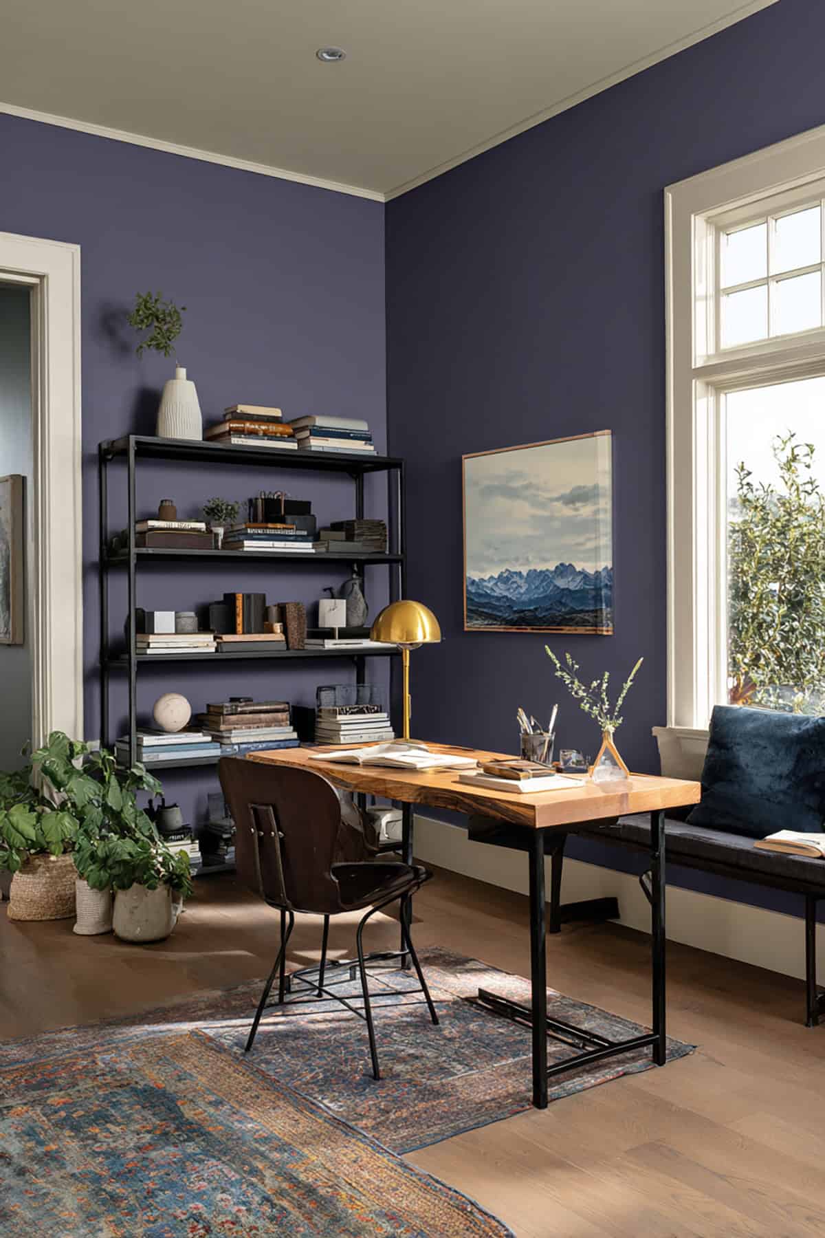
Sanctuary (AF-620)
This one stands out for its grounded, gray-infused depth. It’s mature and subtle rather than flashy.
North-facing rooms benefit from its warmth, sidestepping that flat, chilly feeling some violets can bring. Evening light deepens the color for a richer look.
Works nicely in dining rooms, libraries, or as an accent. Lighter neutrals keep things balanced, and brushed metals add a bit of polish. Satin or pearl finishes fit well—keeps the surface looking refined.
French Lilac (1403)
Balanced and unmistakably violet, French Lilac has a traditional vibe that still feels up-to-date. You get moderate saturation and a true purple character.
Daylight brings out its core, while artificial light softens it. The color remains steady in different exposures.
It’s a solid pick for living rooms or hallways. Warm whites or light gray help keep it under control. Eggshell finish usually does the trick for a subtle, consistent look.
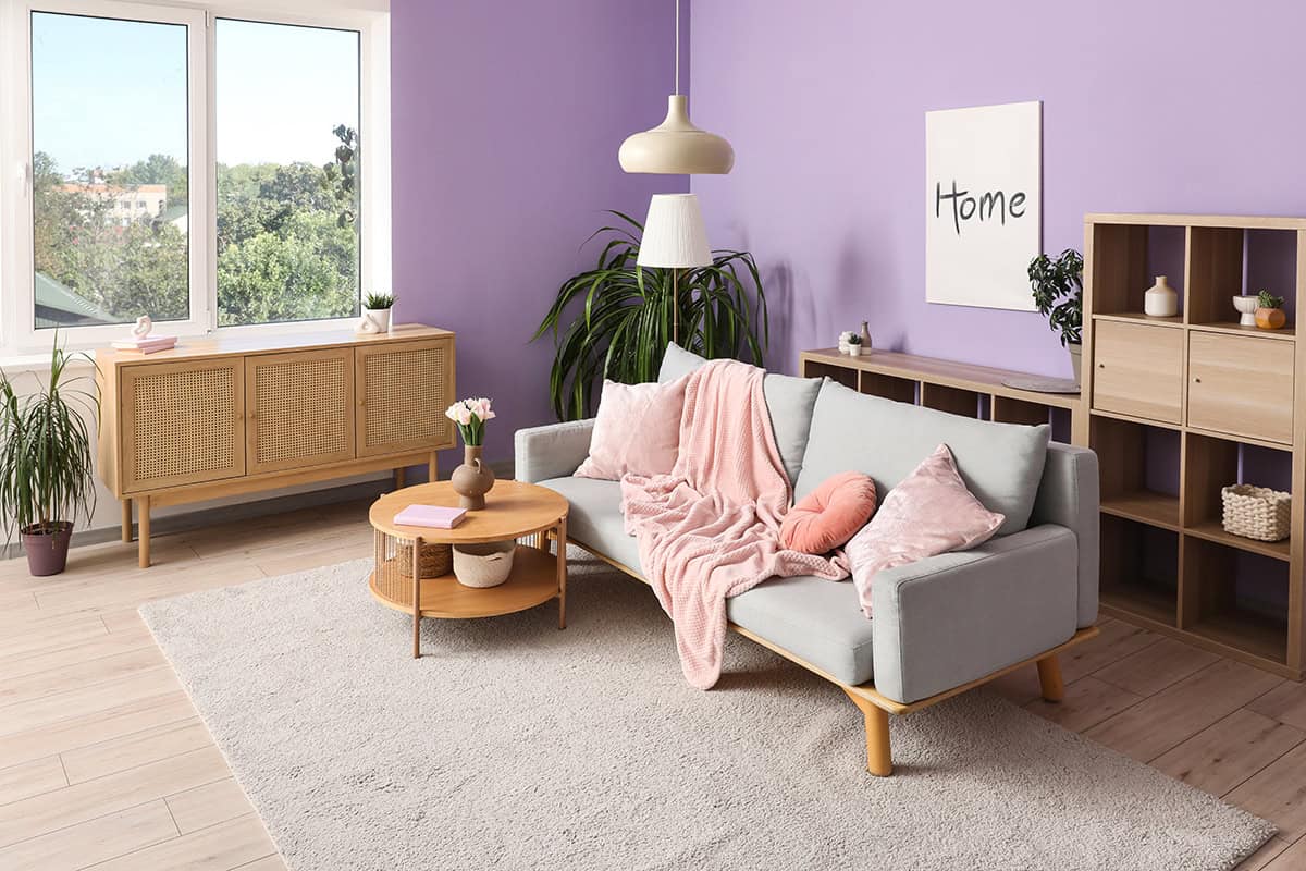
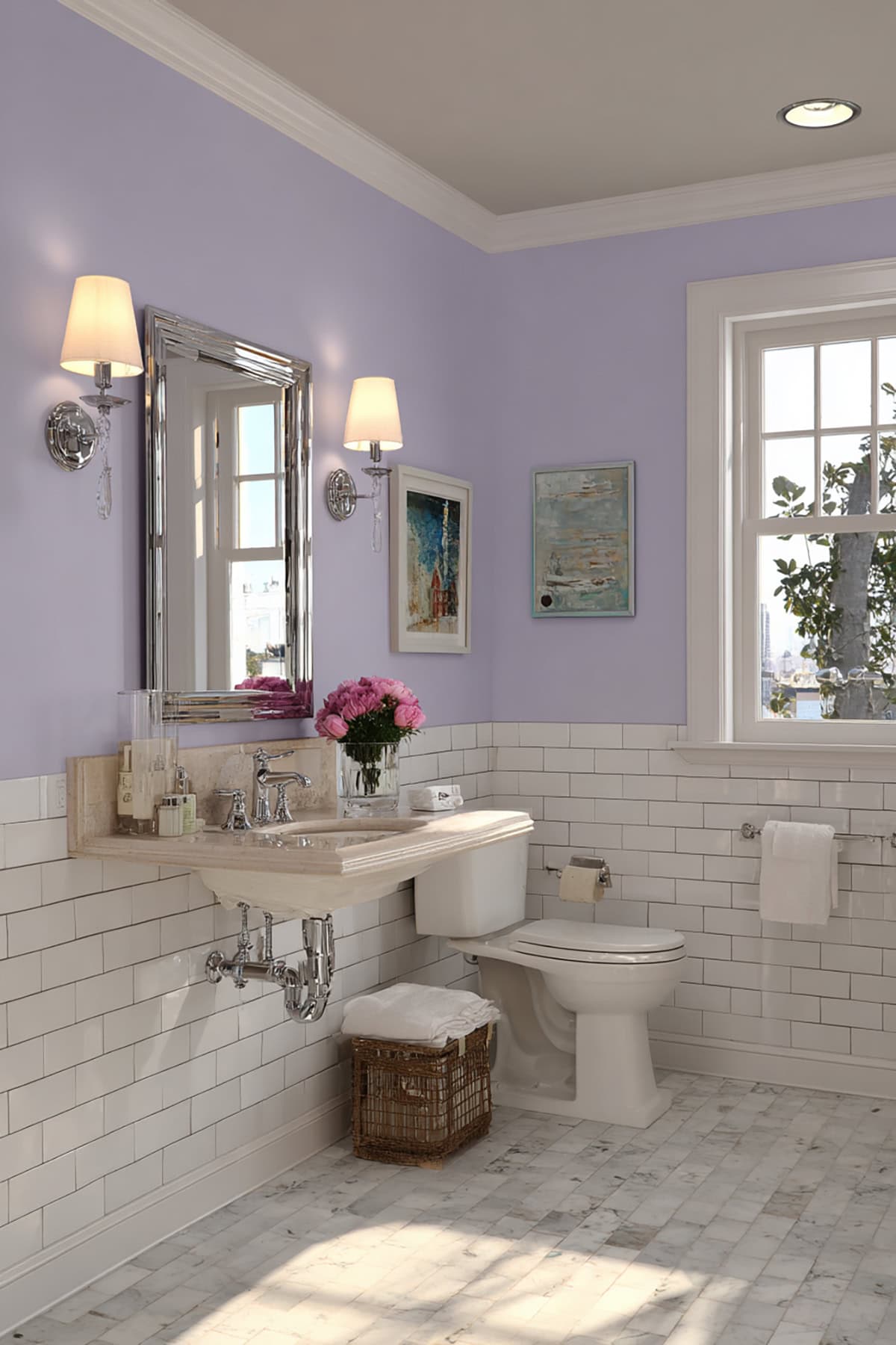
Dreamy Cloud (2117-70)
Pale violet with a cool tilt, Dreamy Cloud is almost off-white from afar but reveals lavender up close. It’s great for making small rooms feel more open thanks to its light reflectance.
Cool lighting keeps it crisp; warm light softens it. Bathrooms and ceilings are good homes for this shade. It pairs easily with marble, chrome, or light tile. Flat or matte finishes keep things delicate and distraction-free.
Sherwin-Williams
Sherwin-Williams offers violets from soft gray-lavender to lighter pastel purples. Plenty of choices for calm bedrooms, airy living spaces, or any area that needs color without heaviness.
Wallflower (SW 6281)
This one’s more gray than purple—a restrained violet with a cool cast. It feels steady, not fussy, and works well in bedrooms, offices, or hallways where you want focus.
North light keeps it sharp, while warm bulbs tease out a bit more lavender. Crisp white trim keeps the color grounded. Light woods, pale stone, and brushed metal all play nicely here.
Coverage is even with proper priming, especially over lighter bases. Satin adds depth, flat keeps it subtle. It’s a supportive color—lets your furniture and art stand out.
Lite Lavender (SW 6554)
This is a true pastel: clear violet, hardly any gray. It feels light and airy, so smaller rooms don’t feel boxed in. Nurseries, guest rooms, and anywhere you want a gentle touch are good fits.
Daylight brings out a clean lavender, not pink. Under warm bulbs, it stays soft and readable. White ceilings and trim keep things fresh.
Expect it to look brighter on walls than on a sample. Usually two coats are enough for even color. If you want visible violet without overwhelming saturation, this is it.
Enchant (SW 6555)
This one’s got more pigment—between pastel and mid-tone. Confident, clear, but not harsh. Accent walls, powder rooms, or creative spaces suit it best.
Natural light brings out a lively core, and there’s not much gray to dull it. In lower light, it deepens but stays legible. Neutral floors and simple décor keep it in check.
Placement matters with Enchant. It’s better in larger rooms than tight spaces. You get an expressive violet that doesn’t tip into melodrama.
Ash Violet (SW 6549)
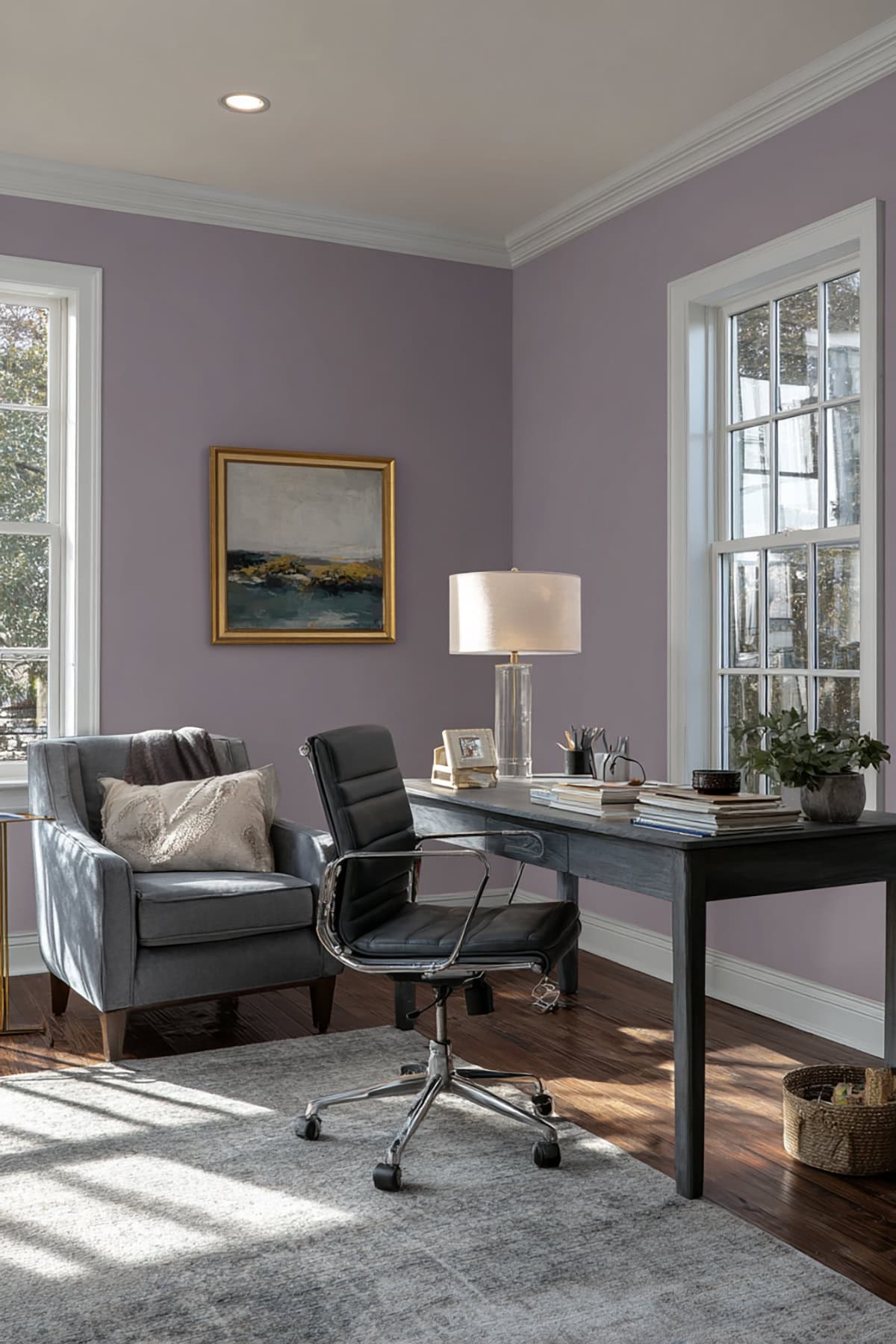
Heavily muted by gray, Ash Violet offers a dusty, sophisticated vibe. It feels grounded, not decorative. Living rooms, dining areas, or transitional spaces are all fair game.
Lighting changes its look more than most purples. Cool daylight nudges it toward gray; warm light brings out the violet. Neutral fabrics and darker woods are good companions.
This shade hides wall flaws better than lighter lavenders. Matte or eggshell finishes enhance its softness. It’s flexible—works in modern or traditional spaces.
Behr
Behr’s violets balance saturation, light control, and versatility. You’ll find options for playful rooms or more formal interiors, with predictable results in typical lighting.
Purple Potion (S100-5)
Bright and youthful, Purple Potion delivers strong color without being jarring. Bedrooms, studios, or creative workspaces benefit from its energy.
Natural light highlights its blue base; warm bulbs soften it. The color holds its own in small rooms since it’s mid-range, not dark.
Pair with soft whites, pale gray, or light maple. White trim sharpens the look and keeps things from getting busy.
It’s a modern, lively violet that doesn’t get out of hand. Flat or eggshell finishes keep it consistent.
Periwinkle Bud (600C-3)

Lighter with a blue influence, Periwinkle Bud creates a calm, airy effect. It’s easygoing and suits shared spaces or hallways.
Daylight brings out its cool side; under warm light, it leans lavender but stays clear. Use it where you want color that doesn’t take over—bathrooms, kitchens, home offices.
White cabinets, brushed nickel, and light stone all work well. The shade is supportive, not overpowering.
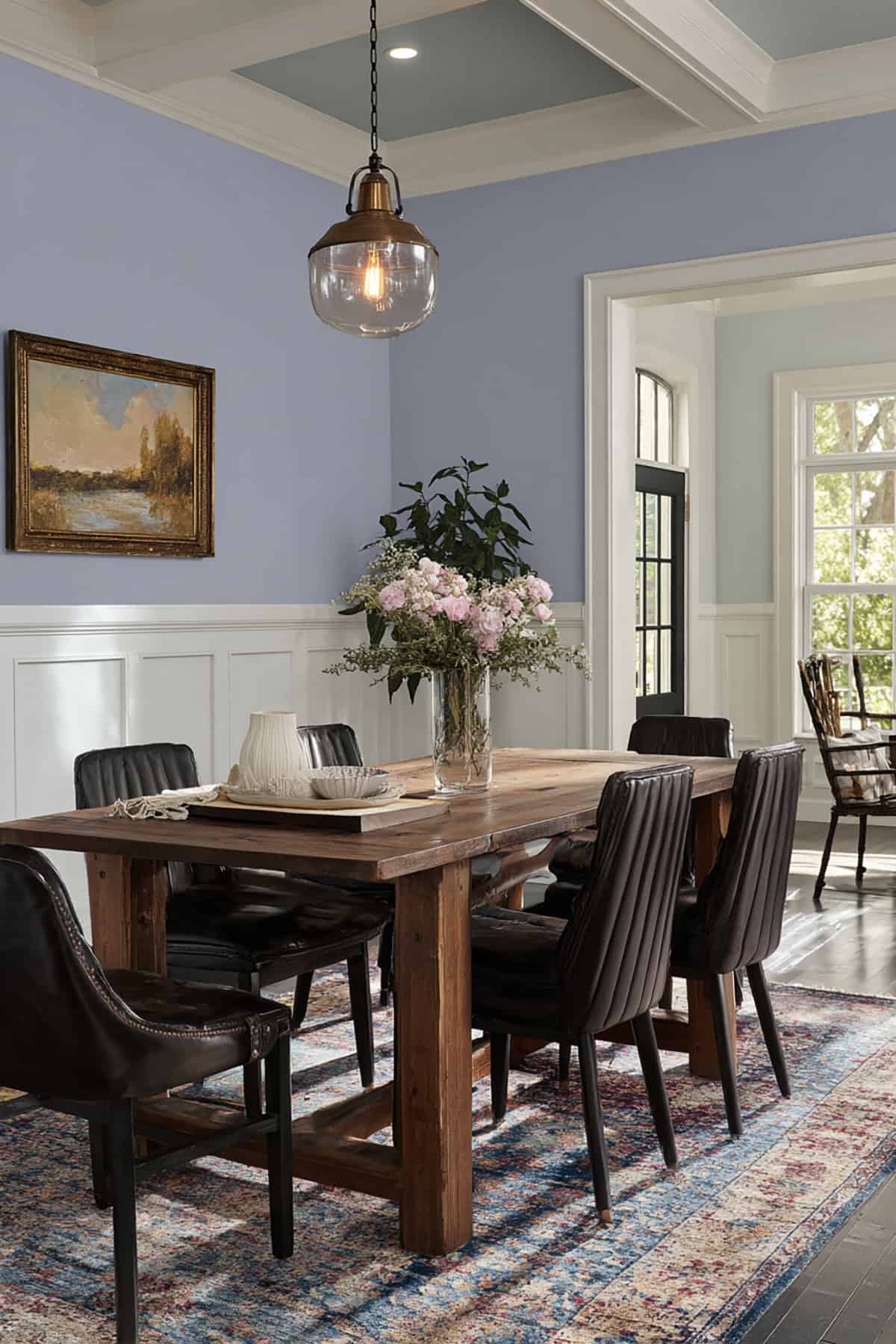
Velvet Evening (540F-7)
Deep violet with gray undertones, Velvet Evening offers structure and depth. Dining rooms, libraries, or accent walls are all good fits.
Low light plays up its richness. In brighter rooms, the gray keeps it grounded and stops it from feeling too theatrical.
It stands out against pale floors or light furniture. Satin finish balances it; flat adds softness. Lighting matters—shadows get more dramatic with this one.
Farrow & Ball
Farrow & Ball’s high pigment and traditional methods produce dense, balanced violets that read clearly in most light and keep their depth on large surfaces.
Calluna (No. 270)
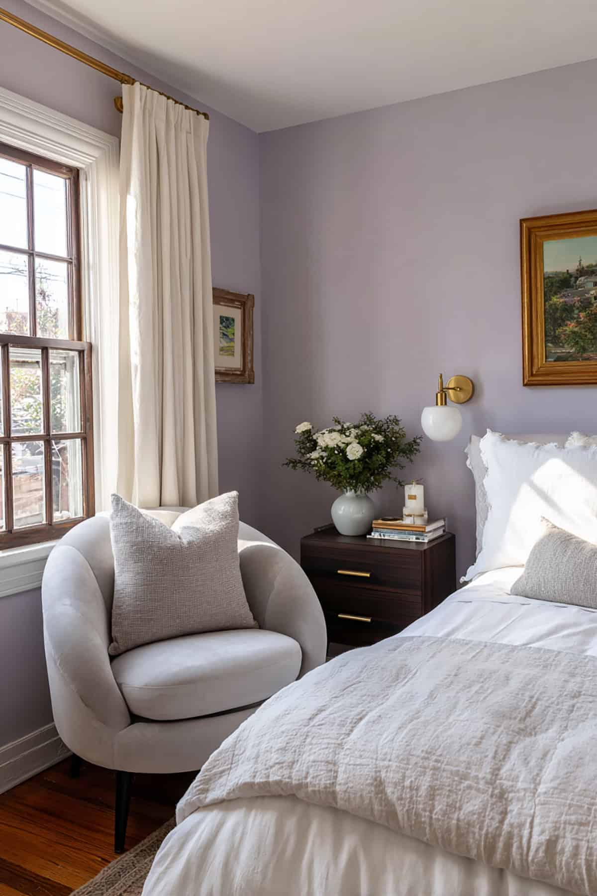
Sitting between lavender and soft grey, Calluna delivers a calm, powdery finish without heaviness. Works nicely in bedrooms, studies, or north-facing rooms. It resists sharp blue shifts at night and stays stable in cool daylight.
It’s at home on full walls or cabinetry. Off-white trim with a warm base helps avoid a flat look. Natural wood and pale stone keep the space feeling grounded.
Brassica (No. 271)
Brassica is darker and richer, with red undertones for warmth. There’s more contrast and drama, especially in rooms with controlled lighting. It reads as true violet, not just purple, even in low light.
Try it in dining rooms, libraries, or as an accent where depth matters. Brass hardware and deep neutral fabrics are great pairings. Balanced lighting keeps the color even across the wall.
Valspar
Valspar’s violets offer balanced saturation and practical performance. These options look clear in most lighting and apply well on both walls and trim.
Rollick (4003-10C)
Rollick lands somewhere between true violet and a soft, almost playful purple—cool undertones, nothing muddy or overly intense. It’s got that crisp vibe, not veering into blue or red territory.
Honestly, it’s at its best in bedrooms or workspaces, maybe as an accent wall if you’re feeling bold. North-facing rooms keep it feeling chill, but toss in some warm bulbs and you get just a hint of extra depth—without the color getting weird.
For trim, neutral white is the move. Keeps the edges looking fresh. If you’ve got pale gray or light wood floors, those will really let Rollick do its thing without making the room feel heavy.
Eggshell or satin finishes are solid picks for keeping the color lively. Matte works too, especially if you want a softer look in a space that doesn’t see a ton of foot traffic.