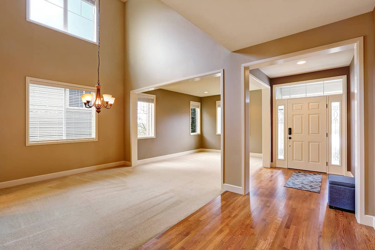
Not all taupe paint colors are created equal. Some feel muddy, others feel calm and refined. I’ve seen how one good taupe can make an entire room look thoughtfully designed. It’s subtle but powerful when you get it right. You just need the right starting point. Head to the article and see which paint color shade fits your space best.
Table of Contents
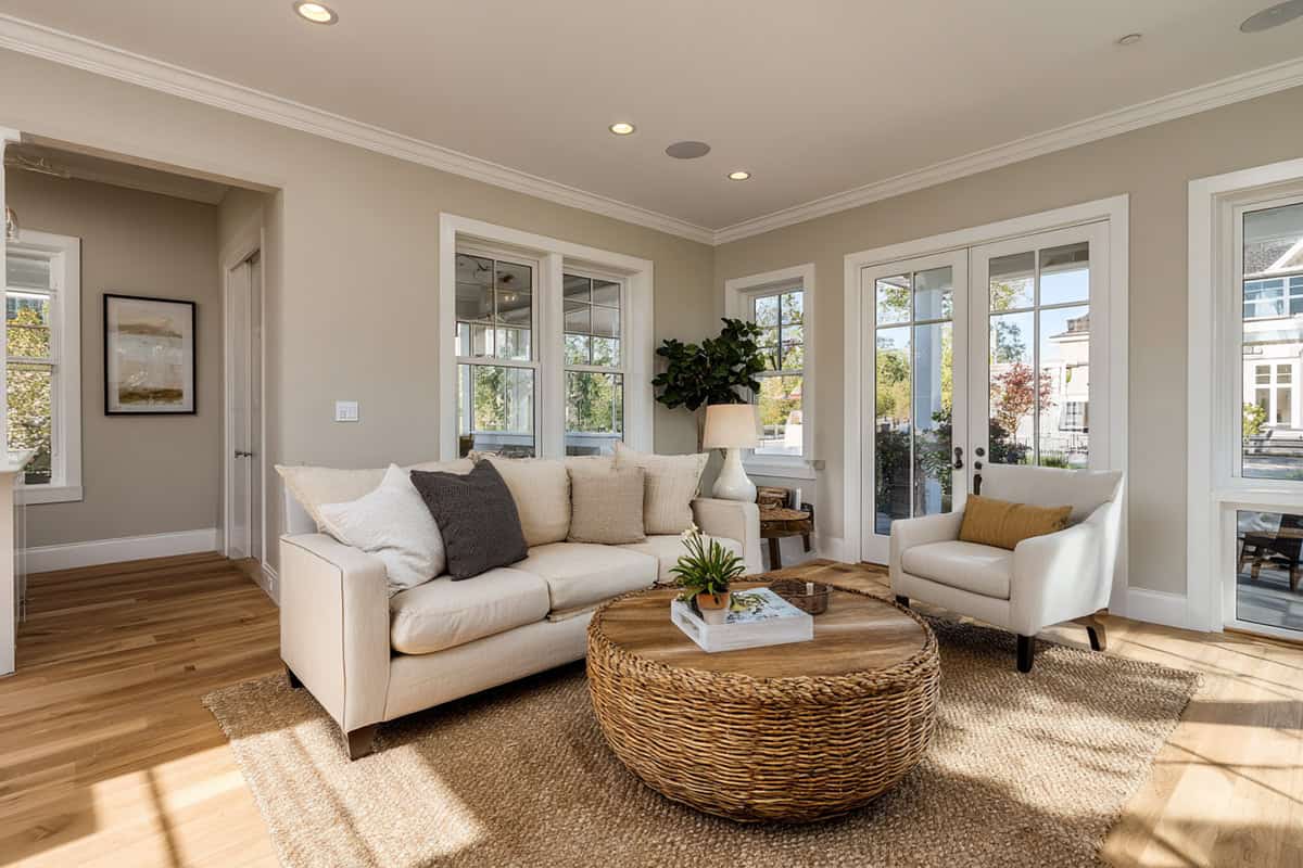
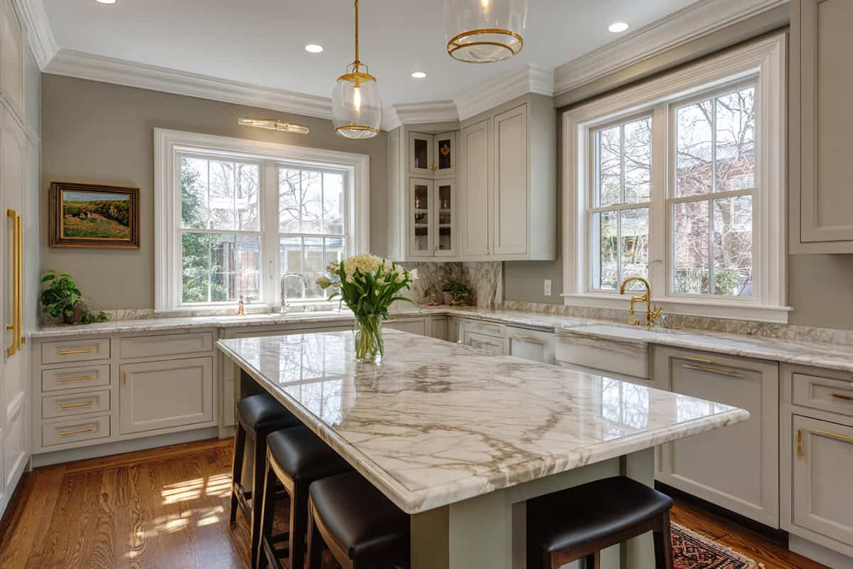
Sherwin-Williams
There’s a grounded, timeless feel to these shades, and they work with pretty much any decor. The way the undertones play with light and materials really affects the mood—sometimes more than you’d think.
Perfect Greige (SW 6073)
This one’s a soft gray-beige blend that just feels calm and cohesive. Perfect Greige doesn’t lean too warm or cool, which makes it work in both traditional and modern setups. It adapts to all sorts of lighting, too—no weird surprises at night.
It’s a great choice if you want a subtle background that still has some character. Goes well with white trim or natural wood. If you like to switch up your decor, you’ll appreciate how flexible it is—stone, leather, dark or light accents, it all works.
Keystone Gray (SW 7504)
This is a mid-tone gray that’s got a taupe edge, so it adds depth but doesn’t get too dark. It’s steady and neutral, not too warm or cool, and gives furniture and art something to play off.
Designers like it for exterior siding or feature walls, but it holds its own indoors too. Clean lines, ivory trim, darker accents—it balances everything without getting bossy. Works in offices, bedrooms, and hallways where you want a consistent, anchored look.
Balanced Beige (SW 7037)
Here’s a warmer, more inviting take that avoids the yellowy look some beiges get. It’s even and natural, so it works in open layouts or rooms with different finishes. Whether you’ve got warm bulbs or cooler daylight, it holds up nicely.
In small rooms, it doesn’t crowd you in. Off-white trim brightens things up, and if you use it on cabinets, it looks refined without being stark. It’s a nice bridge between classic and modern—metal, natural fibers, whatever you’ve got, it fits in.
Virtual Taupe (SW 7039)
This one’s deeper, with a strong brown-gray base. Virtual Taupe has a kind of quiet confidence—great for adding a bit of sophistication without shouting.
It’s ideal for lower cabinets, built-ins, or accent walls, especially if you want to ground a lighter palette. It can handle bolder colors nearby—rust, olive, navy—without clashing. In big, bright rooms, it gives you crisp contrast that doesn’t feel cold.
If you’re after polished but still cozy, this is a solid pick. It’s often used to set off lighter floors or upholstery and keeps things feeling warm, not industrial.
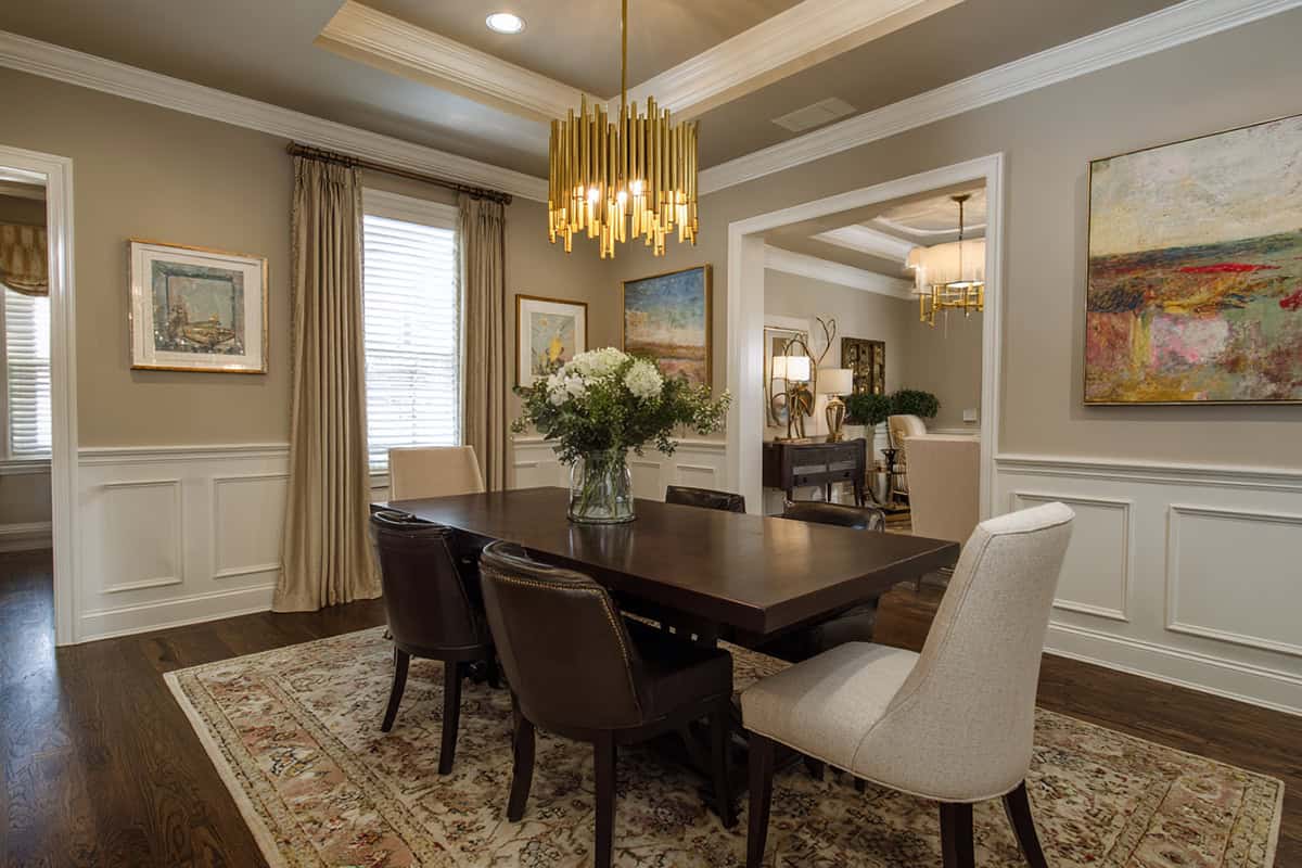
Tony Taupe (SW 7038)
On the wall, Tony Taupe reads as a warm taupe with a noticeable brown base and just enough gray to keep it neutral. It sits deeper than greiges like Edgecomb Gray but doesn’t get heavy or muddy. In a bright room the color shows a calm earthy tone, especially next to wood floors or stone surfaces.
Warm bulbs pull out more of the brown, while daylight keeps the gray side visible. White trim sharpens the edges of the color, and darker furniture tends to stand out clearly against it.
Benjamin Moore
Benjamin Moore’s got a whole spectrum of taupes, and they’re surprisingly versatile. Whether you lean classic or modern, you’ll find something that hits the right note for living rooms, offices, or those in-between spaces.
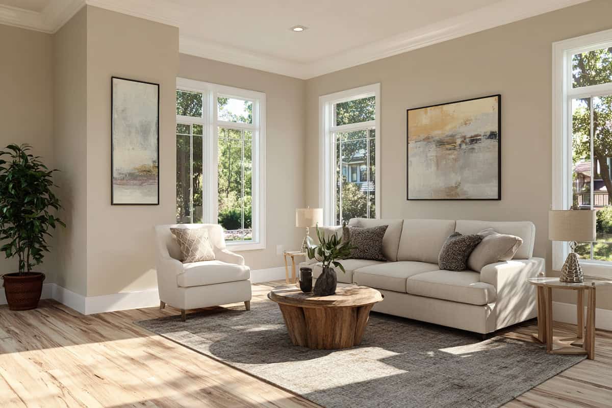
Pale Oak (OC-20)
Pale Oak is a soft greige that shifts with the light—airy in the morning, a bit more taupe under warm bulbs. It’s great for open layouts because it doesn’t boss around your furniture or art.
Pair it with crisp whites like Chantilly Lace or softer White Dove for trim or cabinetry. The result’s subtle but elegant, giving you just enough contrast. If you want warmth without yellow, Pale Oak’s a safe bet. It cooperates with oak, walnut, stone—really, it’s hard to mess up.
Barren Plain (2111-60)
Barren Plain is gray-taupe with a cooler edge, perfect if you want something minimalist but not sterile. It’s soft enough to avoid the chill some grays have, and it stays pretty neutral in all kinds of lighting.
Looks sharp with white trim and matte black hardware. It’s a nice bridge between cool concrete and warmer woods, letting your decor take center stage. Even in bright sunlight, it stays true—no weird blue or green shifts. Good for bedrooms or offices where you want some calm.
Edgecomb Gray (BM HC-173)
Put this on a wall and the first thing you notice is how light it feels. It doesn’t read like a typical taupe at all. Most of the time it looks like a soft gray that picked up a little warmth from the room. Morning light keeps it pale and airy, almost chalky. Later in the day the beige side becomes easier to notice, especially near wood floors or warm fabrics. Next to white trim the color looks clean and relaxed rather than sharp or dramatic.
Grant Beige (HC-83)
This one sits right between beige and light taupe, with sneaky green-gray undertones to keep it from feeling too warm. It’s a go-to for hallways and family rooms—always neutral, never dull.
In bright light, it looks a bit lighter and tan; in shade, it deepens up. It’s dependable, especially if you’ve got warm woods or brass nearby—brings out their best without overpowering. Works solo or as a backdrop for darker accent walls, and it’s low maintenance across different lighting.
Behr
Behr’s taupe paints are honestly reliable—good for adding warmth and contrast without drama. Each shade has its own undertone and depth, so you can really dial in the vibe for your space and lighting.
Toasty Gray (N320-2)
This one’s a mellow blend of gray and brown, creating a calm taupe that’s right at home in any style. It never feels too cool or too beige, just… balanced.
White trim makes it pop, and it’s happy next to black fixtures or wood accents. It doesn’t shift much under different lights, which is a relief. Since it doesn’t lean hard into any undertone, you can pair it with pretty much anything—deep taupe furniture, creamy linens, you name it.
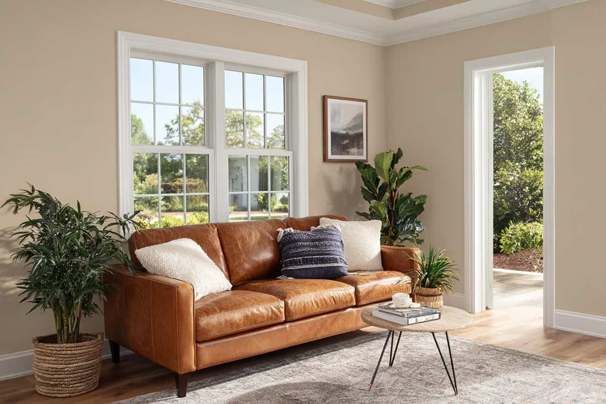
Wheat Bread (720C-3)
Wheat Bread is a medium taupe that leans beige, giving you a relaxed but grounded feel. Not too gray, not too brown—just right for a stable, year-round look.
Pairs up nicely with stone tile, cream upholstery, or dark bronze. Works in living rooms, bedrooms, hallways—anywhere you want a neutral base. Under warm light, a hint of beige comes through, but it never turns yellow. With white trim or black accents, you get just enough contrast for interest.
Farrow & Ball
Farrow & Ball’s neutrals are muted and warm, sitting right between gray and beige. The depth changes with the light, so you get a bit of moodiness that works for both modern and traditional spaces.
Elephant’s Breath (No. 229)
This one’s a mid-gray with a warm taupe twist. Cool light brings out the gray, while sunlight warms it up to a gentle beige-brown. It’s an easy choice for walls if you want a calm background that never feels chilly.
White trim gives it a crisp edge, but it also gets along with charcoal or warm whites. Big or small rooms, it adapts. The effect is understated, not overwhelming—just a nice, balanced finish.
Valspar
Valspar’s taupes are practical, with undertones that feel balanced and easygoing. You’ll find soft neutrals and mid-tones here that work with changing light and a bunch of different design styles. The look shifts depending on what you pair them with—texture, trim, lighting all play a part.
Oatbran (6005-1A)
Oatbran is a gentle beige-gray, perfect if you want a neutral that’s not too cold or too warm. It’s subtle, fitting in with white trim, medium woods, and black hardware.
Natural light brings out its warmth, so it’s nice for living rooms or open spaces. Even under artificial light, it stays muted and lets your art or furniture stand out. It’s a clean backdrop that never tries to steal the show—easy to mix with other neutrals for contrast.
Smoked Oyster (6006-1C)
Smoked Oyster is a deeper taupe, balancing brown and gray. It’s mature and grounded—works especially well in formal rooms or studies. It can tie together both light and dark elements, which isn’t always easy.
With white trim and simple art, it really stands out as a backdrop. In north light, it stays steady; in southern light, it warms up a bit. Keep the decor minimal for a focused look. Semi-gloss or satin finishes show off the subtle shading best.
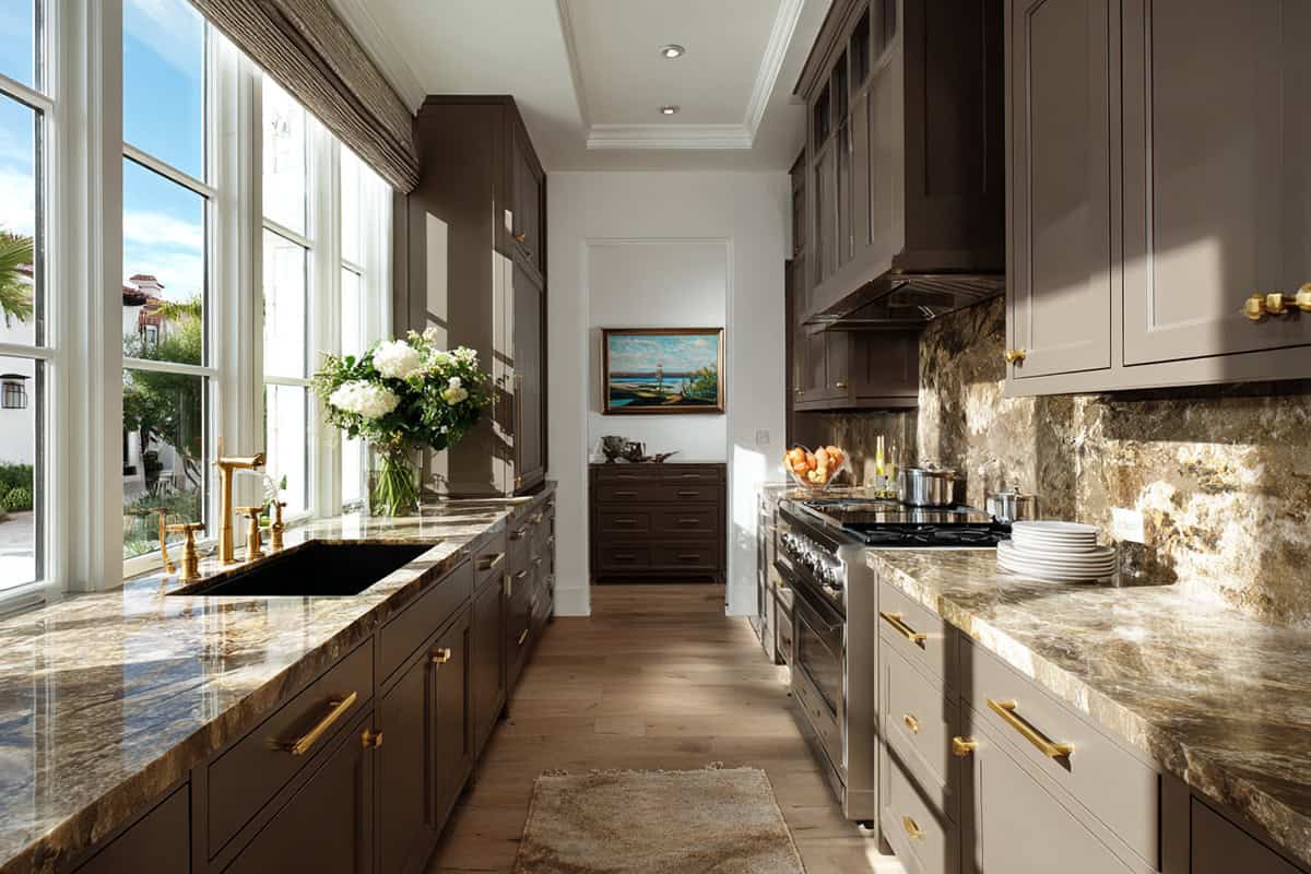
Woodlawn Colonial Gray (6004-1C)
There’s something about this medium taupe—those subtle green-gray undertones really mellow out the way light bounces around the room. Woodlawn Colonial Gray manages to feel both timeless and current, which is honestly pretty rare.
It just works with so many materials, whether you’re dealing with warm woods or the cooler vibe of stone. In kitchens or hallways, it holds its own, rarely shifting weirdly in different lighting. Throw in some off-white trim, and suddenly the architecture pops, but not in an in-your-face way.
Doesn’t seem to matter if your walls are smooth or a bit textured, either—it stays looking sharp, even with the usual chaos of daily life. If you’re after a color that plays nice with a bunch of different styles, this one’s a safe bet.