
Let’s be honest—a romantic bedroom really starts with color. Paint can totally shift the vibe: soft shades calm your senses, deeper ones wrap the room in warmth and intimacy. You get to pick the mood, and the color pretty much does the rest.
If you want to add a little romance to your bedroom or prepare your bedroom this Valentine’s Day, explore this list of paint colors that work beautifully to create a romantic atmosphere
Table of Contents
- Best Romantic Bedroom Paint Colors
- Soft Blush Pink
- Dusty Rose
- Muted Mauve
- Warm Ballet Pink
- Romantic Rosy Beige
- Pale Petal Pink
- Powdery Pastel Pink
- Vintage Rose
- Barely-There Pink
- Warm Blush Neutral
- Creamy Almond Beige
- Soft Champagne
- Warm Sandstone
- Light Café Beige
- Gentle Greige
- Mushroom Taupe
- Warm Putty Gray
- Smoky Lavender
- Muted Lilac
- Soft Plum Mist
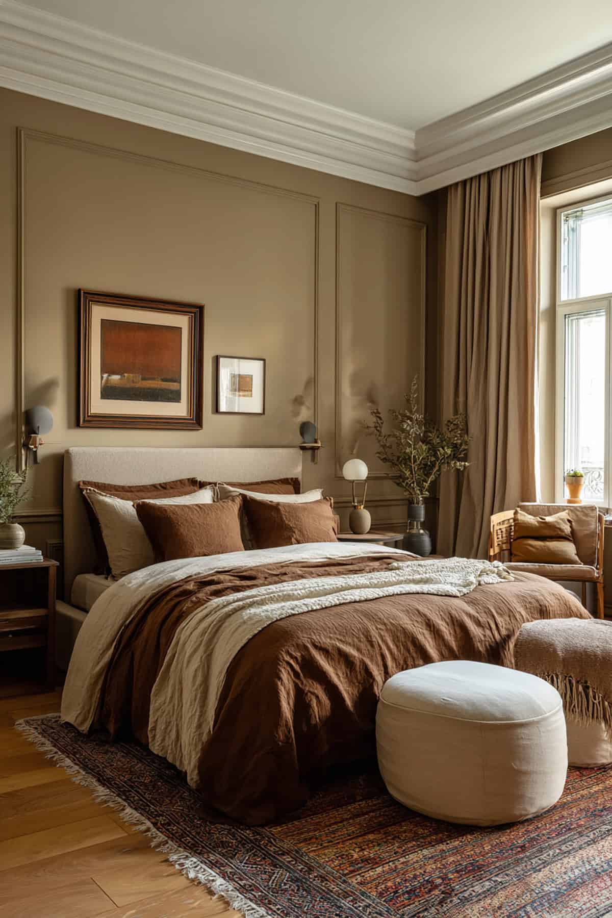
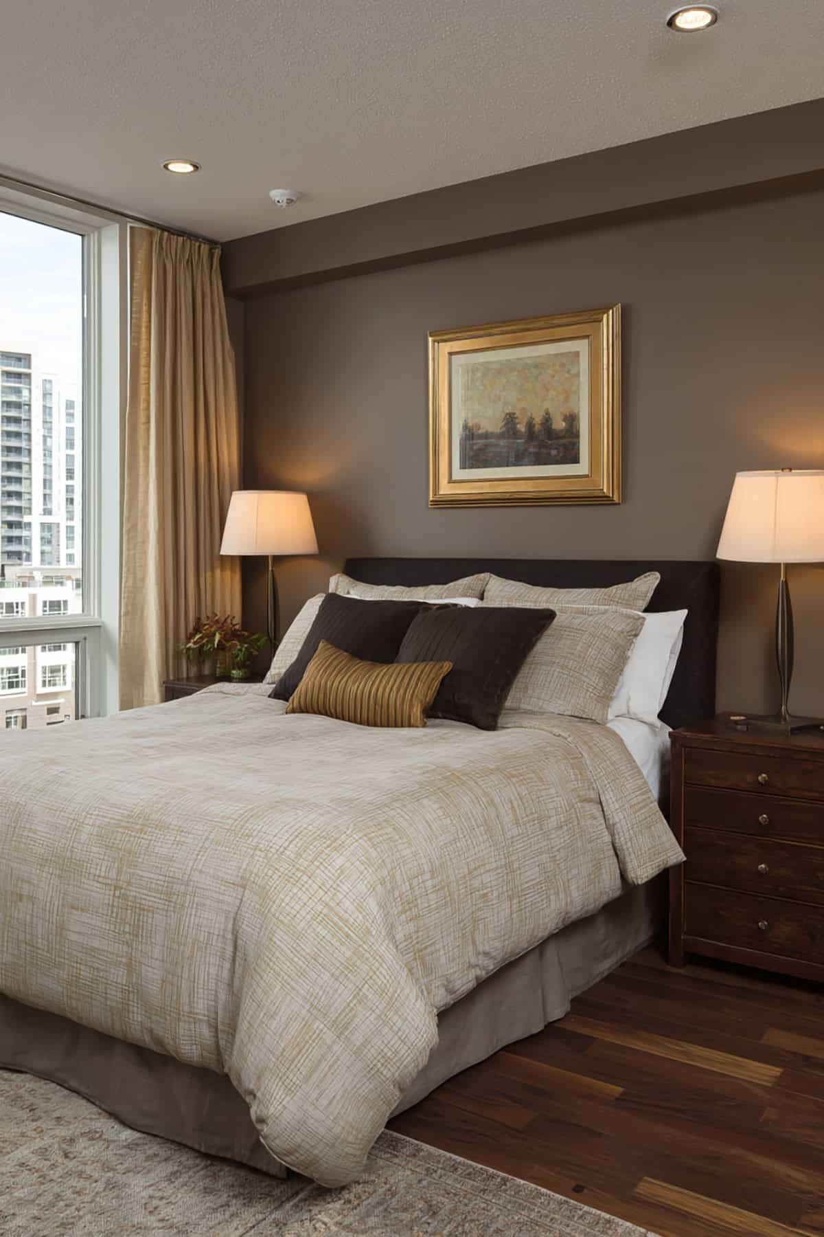
- Warm Cocoa Brown
- Warm Mocha Brown
- Rosy Clay Neutral
- Blushed Taupe
Best Romantic Bedroom Paint Colors
Romantic shades really do soften a bedroom’s edges. Think subtle pinks, beiges, mauves, and those muted neutrals that don’t shout but still make an impact. They’re all about comfort and a little bit of understated glamour.
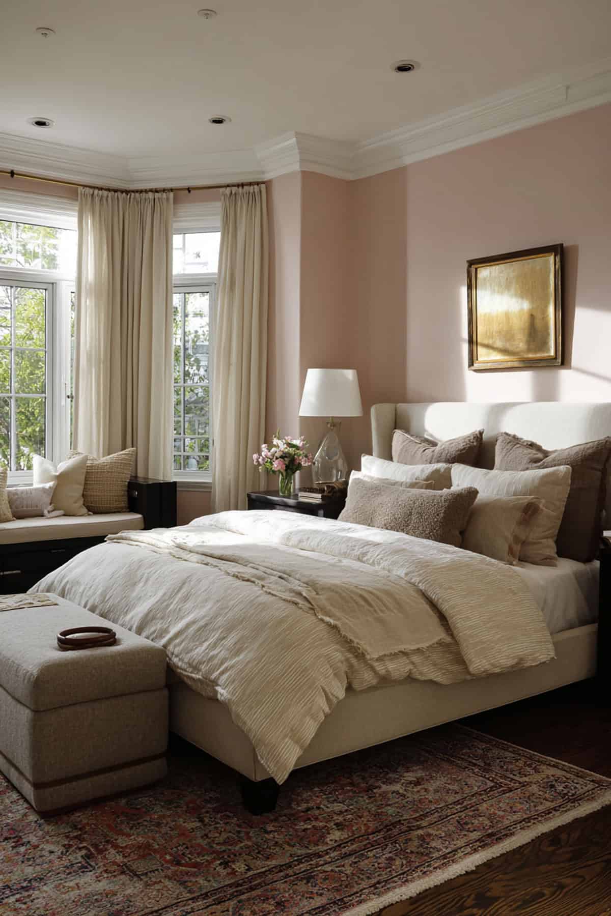
Soft Blush Pink
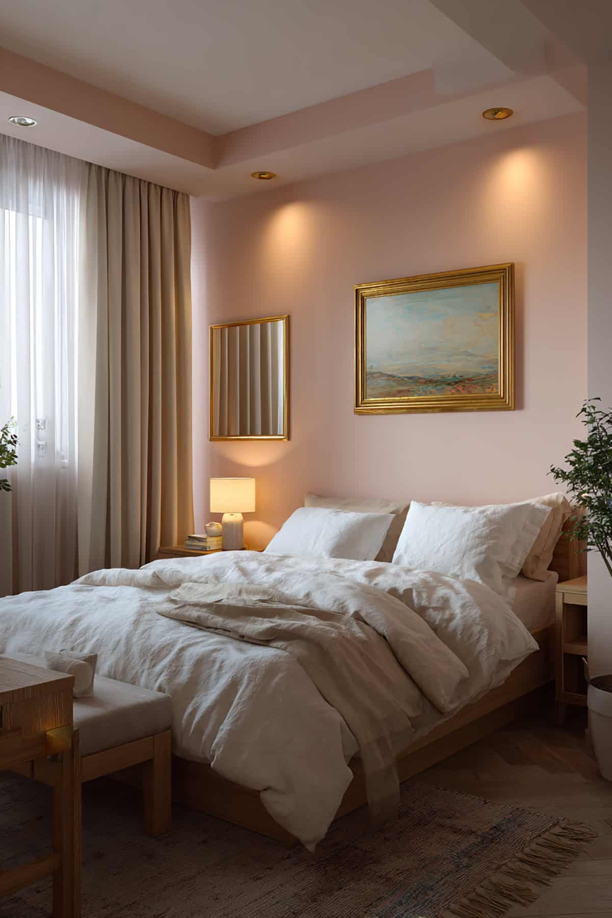
This one’s got a gentle, almost whispery presence—somewhere between pale pink and off-white. Benjamin Moore Pink Damask or Behr Barely Pink are both solid picks. They look great with ivory sheets, gold hardware, or pale wood.
Paint all the walls for a soft glow or use it as your main color with crisp white trim. Warm white bulbs really bring out the pink without making it sugary. It’s friendly with woven textures and matte finishes, too.
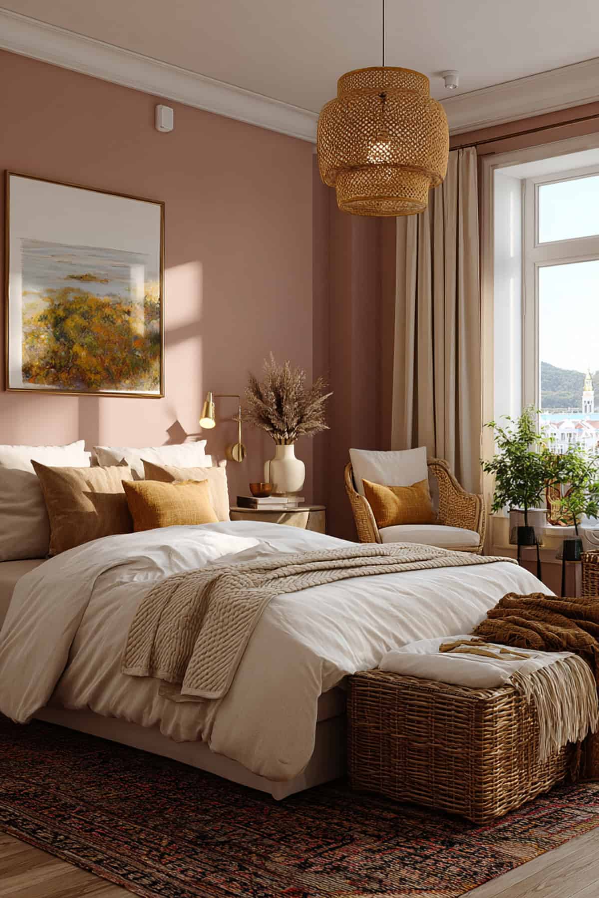
Dusty Rose
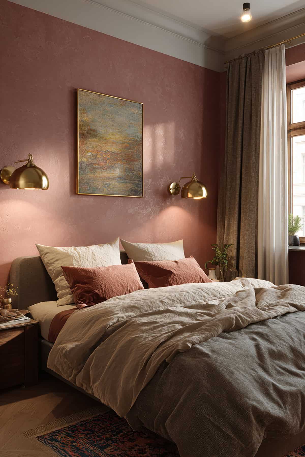
Dusty rose, like Sherwin-Williams Rosy Outlook, brings in warmth without being loud. It’s a bit vintage, not too bright, and feels grown up.
Pair it with off-white trim and brass accents. It’s flattering under low, warm light and adds a hint of depth in smaller rooms. Toss in some linen or velvet for extra coziness.
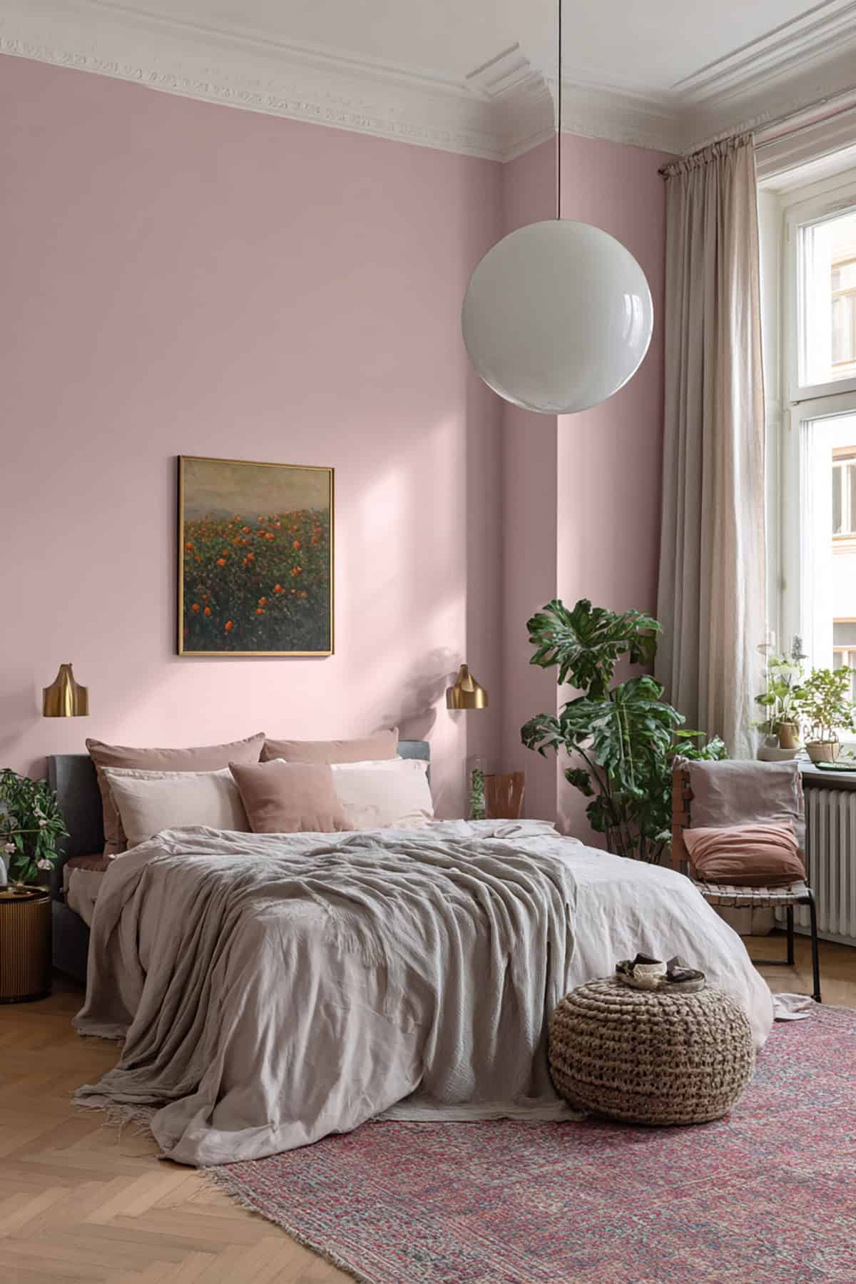
Muted Mauve
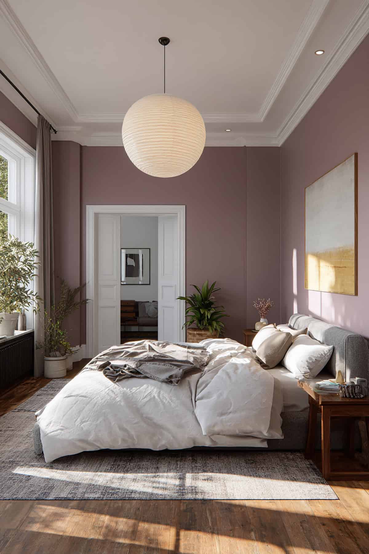
Muted mauve is that sweet spot between lavender and pink, with a hint of gray. Farrow & Ball Peignoir is a good example—elegant but not showy.
Sits well with warm whites or light grays. It doesn’t care if your style leans classic or modern. Use it to blend walls and upholstery for a space that just feels put together.
Warm Ballet Pink
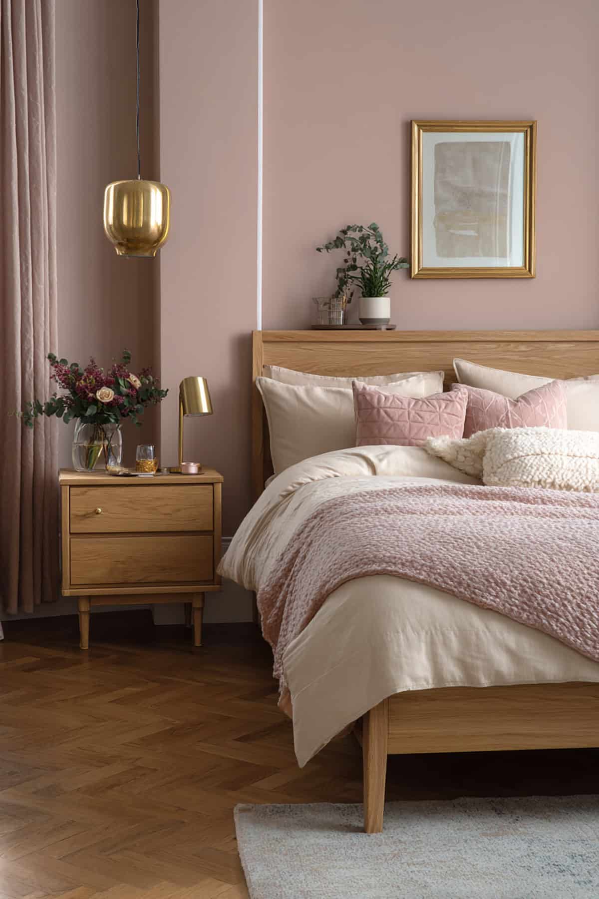
With Behr Ballet Slipper, you get a soft pink that’s warm but not overly rosy. It’s peaceful, feminine, and gives the walls a subtle radiance.
Looks especially nice with light oak or maple. Satin brass lamps or cream bedding complement it well. It’s lively but not so trendy that you’ll regret it later.
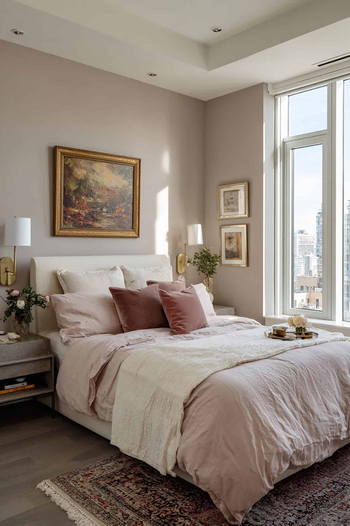
Romantic Rosy Beige
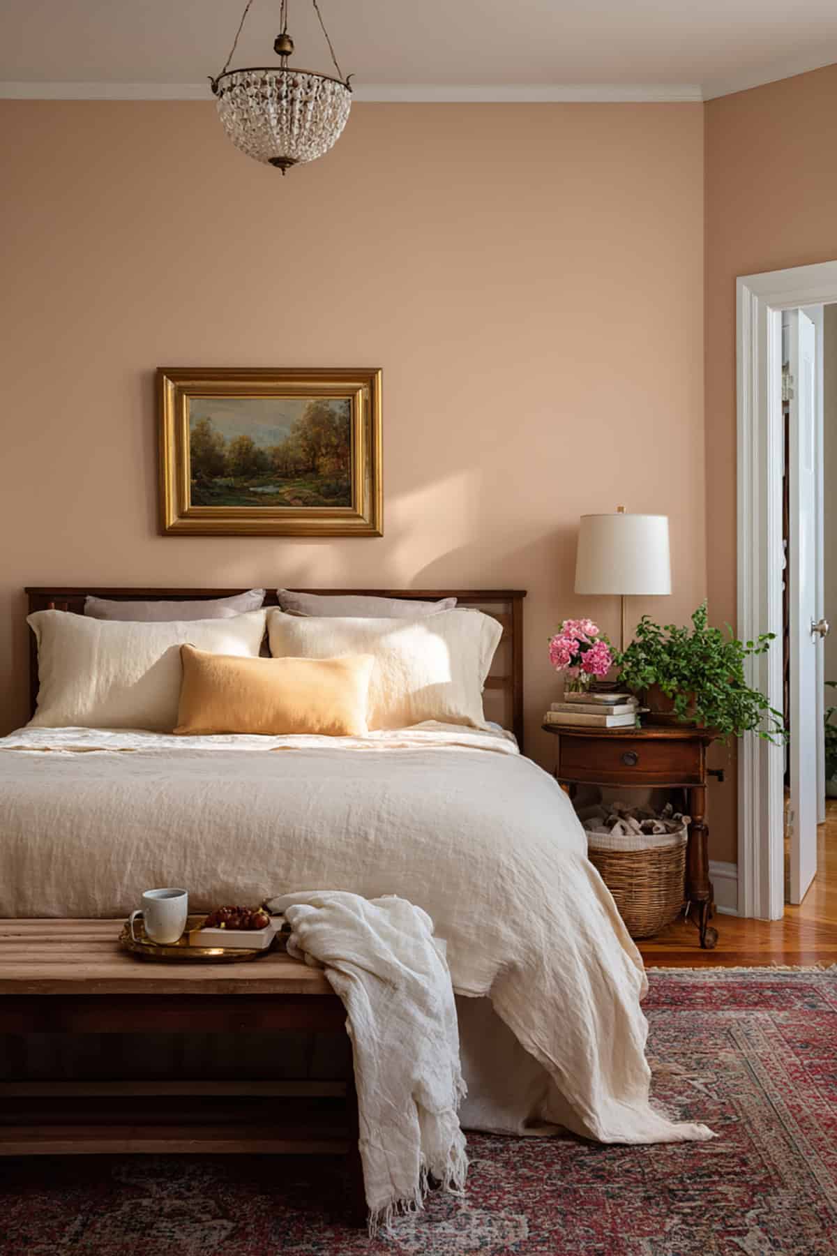
Rosy beige—think Sherwin-Williams Malted Milk—blends pink and taupe for a cozy, adult vibe.
Try it with an off-white ceiling to soften the light. Works for all four walls or just behind the bed. Keeps things understated but not boring, especially if you add linen textures.
Pale Petal Pink
Benjamin Moore Gentle Butterfly is a soft, milky pink that’s almost neutral. It bounces daylight around and keeps the room airy.
Works with pearl gray throws or crisp white bedding. Handles both warm and cool light well. If your room’s small, this color adds just enough depth without crowding things.
Powdery Pastel Pink
For a barely-there touch, Behr Powdered Blush brings a light, cozy feel. It’s subtle and works especially well in bright rooms that just need a hint of warmth.
It smooths out sharp contrasts and keeps things feeling unified. Layer in some textiles or matte metallics for interest. A safe bet for shared or minimalist bedrooms.
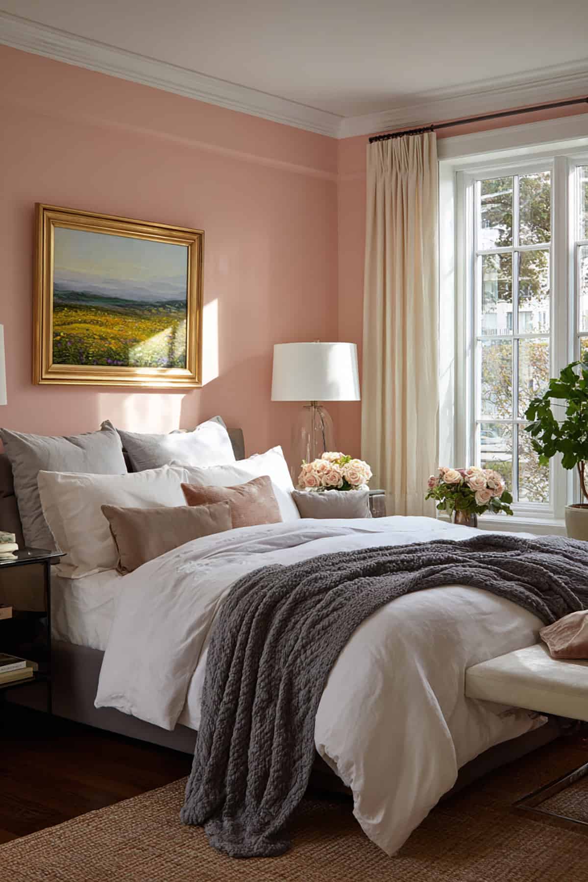
Vintage Rose
Farrow & Ball Setting Plaster is your go-to for vintage rose. It’s got earthy undertones that keep it grounded.
Fits right into traditional decor, but honestly, it looks great with modern furniture too. Linen drapes and russet woods bring out its best side. Adds romance without going overboard.
Barely-There Pink
Benjamin Moore Head Over Heels is so soft it’s almost neutral. More of a glow than a color, really.
Pairs nicely with matte ivory and taupe. It reflects daylight, making the space feel bigger. Good for when you want just a hint of romance, not a full-on pink room.
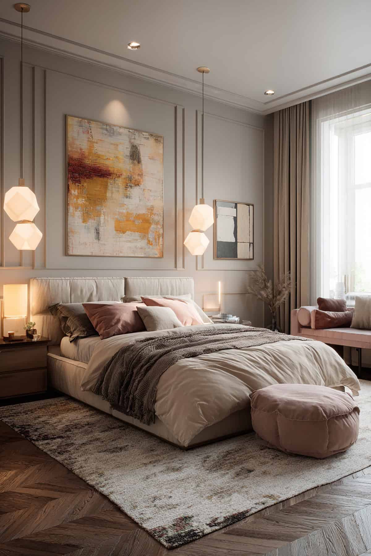
Warm Blush Neutral
Warm Blush Neutral—Sherwin-Williams Intimate White—wraps a gentle pink in a beige base. Modern and easygoing, it’s a subtle nod to romance.
Goes with wicker, cream, and muted gold. At night, lighting brings out the blush. It’s refined, not too girly, and works in both casual and dressed-up bedrooms.
Creamy Almond Beige
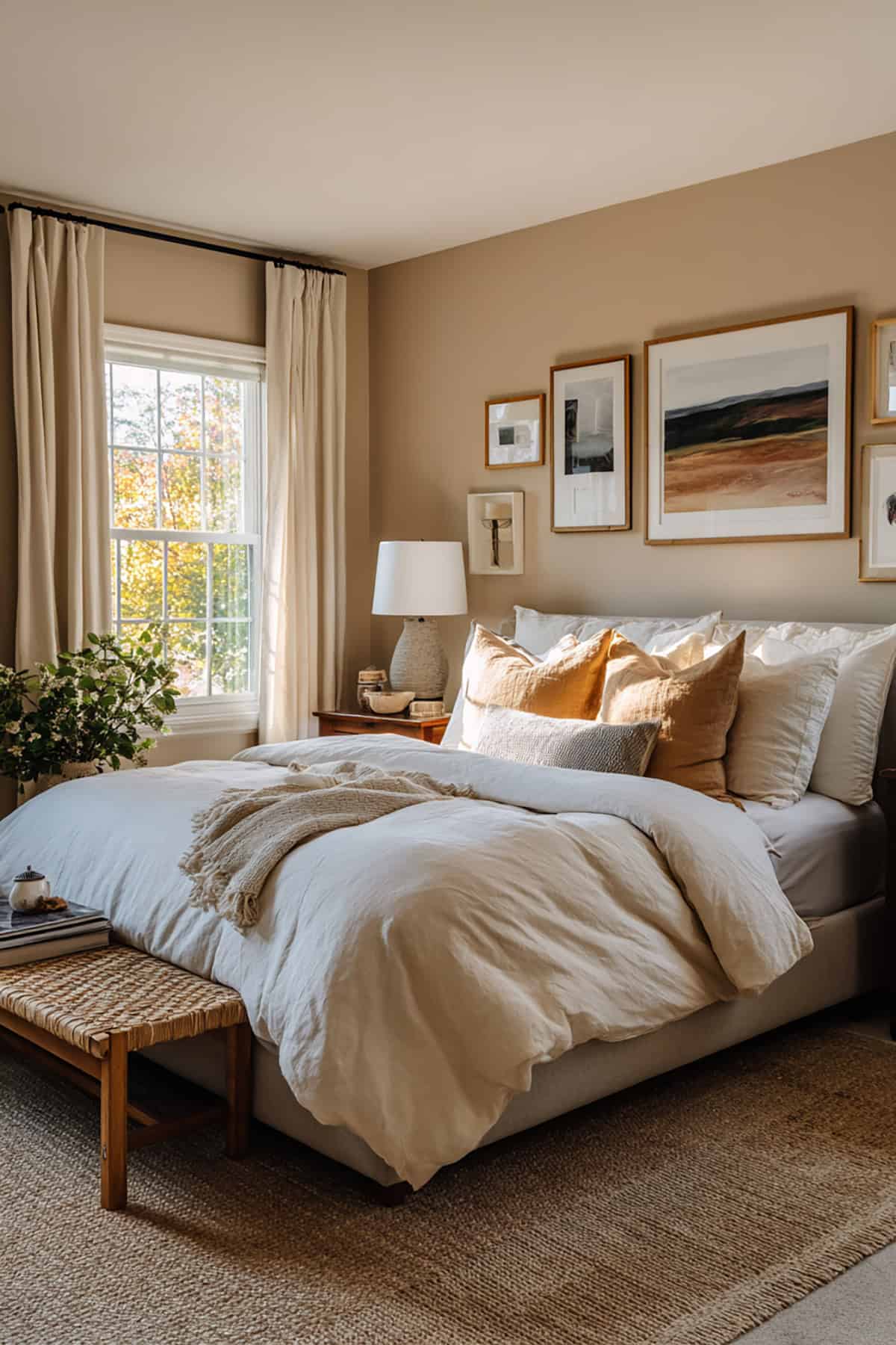
Behr Almond Cream is a soft, fair beige with a peachy undertone. It warms up the room without being obvious about it.
Looks great in natural light and with other neutrals. Mixes well with ivory or tan layers. If you want cozy but not fussy, this is it.
Soft Champagne
Soft champagne, like Benjamin Moore Champagne Ice, has a faint yellow-pink tint. Under soft lighting, it almost shimmers.
Pairs easily with satin metals and muted pinks. It bounces light into corners and keeps things feeling fresh but still romantic. You can mix it with all sorts of furniture styles.
Warm Sandstone
Sherwin-Williams Accessible Beige brings a hint of clay and pink to its neutral base—think subtle luxury.
It gives structure to delicate pieces and plays well with dusty pinks or cocoa textiles. Good as a main color or for tying together a whole palette.
Light Café Beige

Behr Café Latte is a mellow blend of brown and pink undertones. It’s warm but not too much, and pretty approachable.
Layer it with white bedding and natural woods. It connects rosy shades with deeper taupes. Under accent lights, it adds depth without stealing the show.
Gentle Greige
Greige—gray meets beige—like Benjamin Moore Revere Pewter, keeps things balanced and modern.
Pink accents really pop against it, but it doesn’t clash. Works for big or small bedrooms, giving your eyes a place to rest between stronger colors.
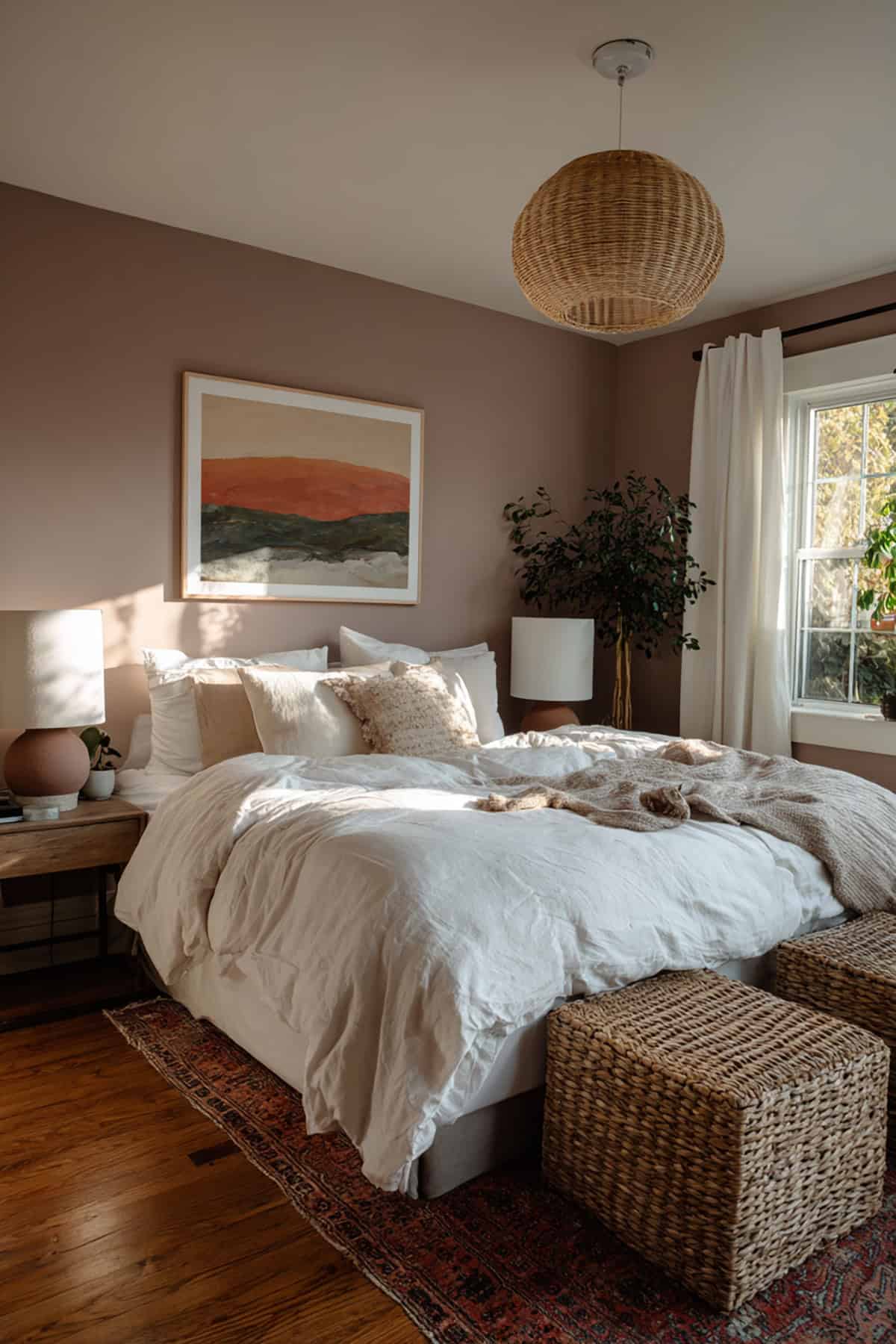
Mushroom Taupe
Farrow & Ball Elephant’s Breath is a mushroom taupe with a bit of purple-gray. It’s earthy and sophisticated, not flat.
Looks good with upholstered headboards, soft brown floors, or mauve bedding. Grounds pastels nearby and keeps the romantic vibe going.
Warm Putty Gray
Warm putty gray, a touch deeper than greige—Sherwin-Williams Useful Gray—adds quiet strength.
It tempers pink or rose accessories without clashing. Try it with brushed nickel or ivory. Keeps things balanced, romantic, and just a bit moody.
Smoky Lavender
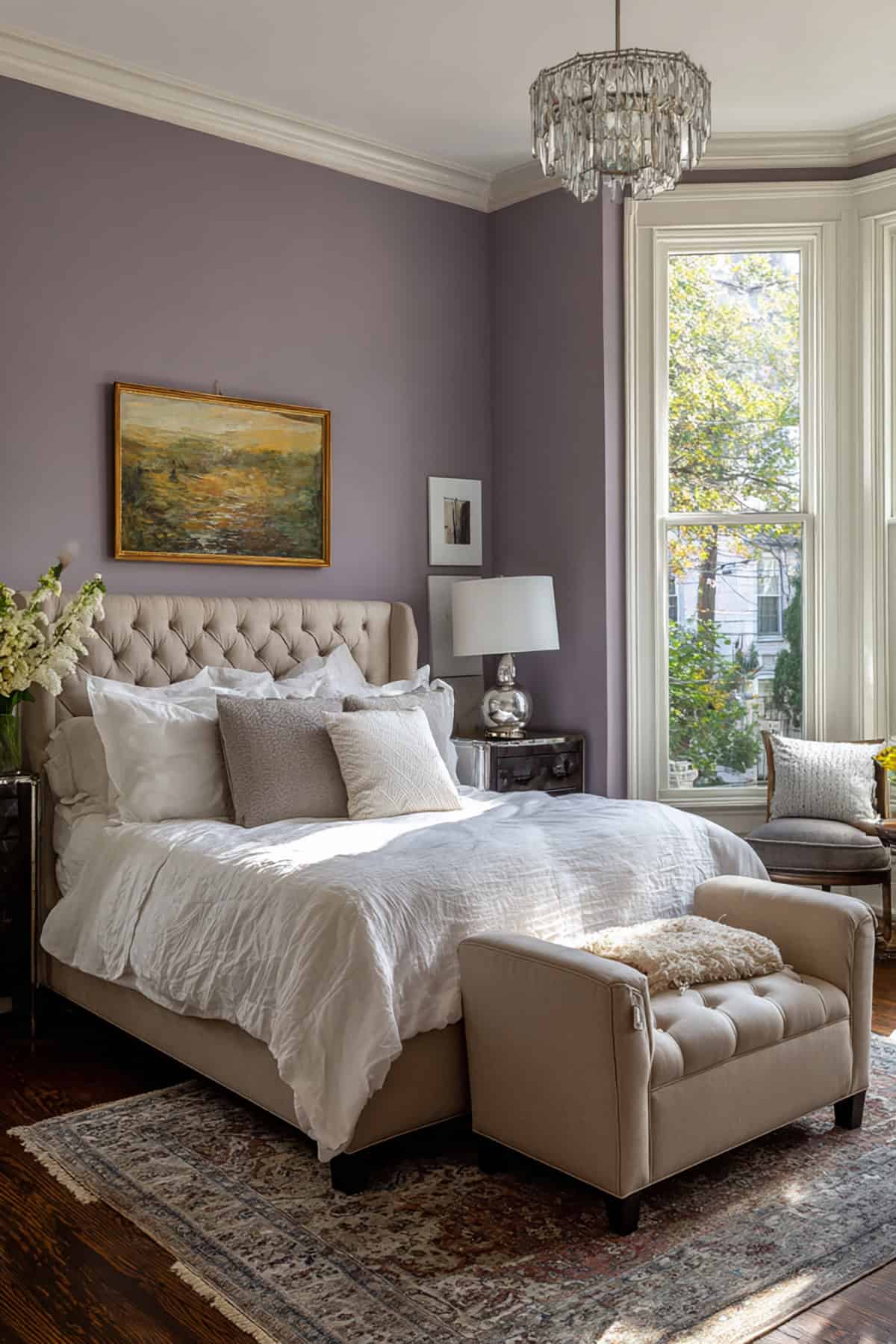
Smoky lavender, like Behr Smoky Lavender, has a grayish tilt that’s calming. Blue and purple mix to keep it subdued.
Works with silver fixtures, deep plum fabrics, and soft whites. The color shifts a bit with the light but always stays soft and misty.
Muted Lilac
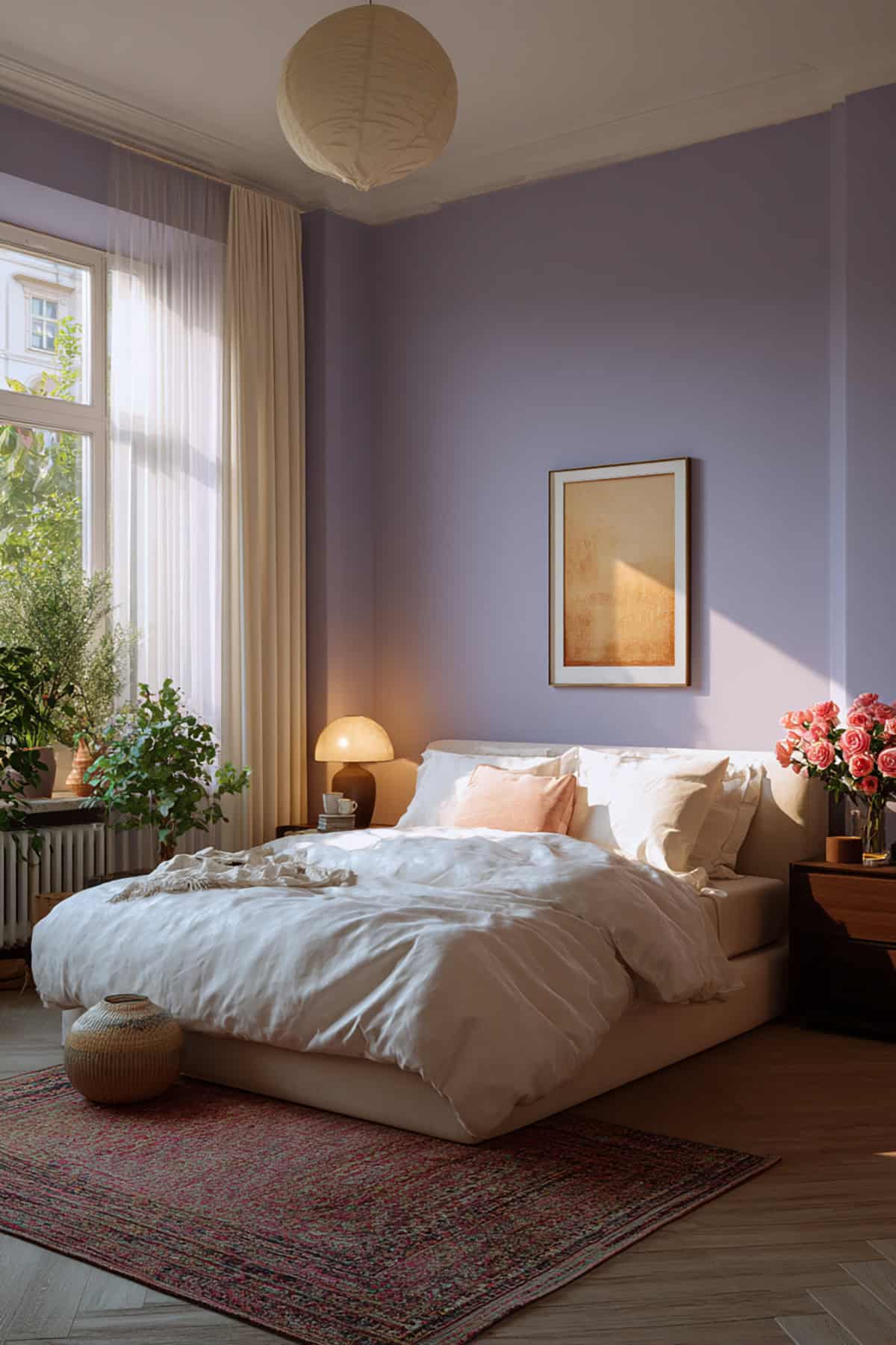
Sherwin-Williams Silver Peony brings in muted lilac, adding a subtle purple warmth. It doesn’t try too hard but still adds a romantic edge.
Pairs well with off-white and rose accessories. Use it for a feature wall or go all in for a cocooning effect.
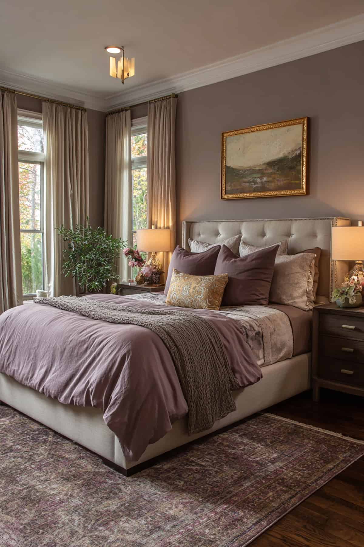
Soft Plum Mist
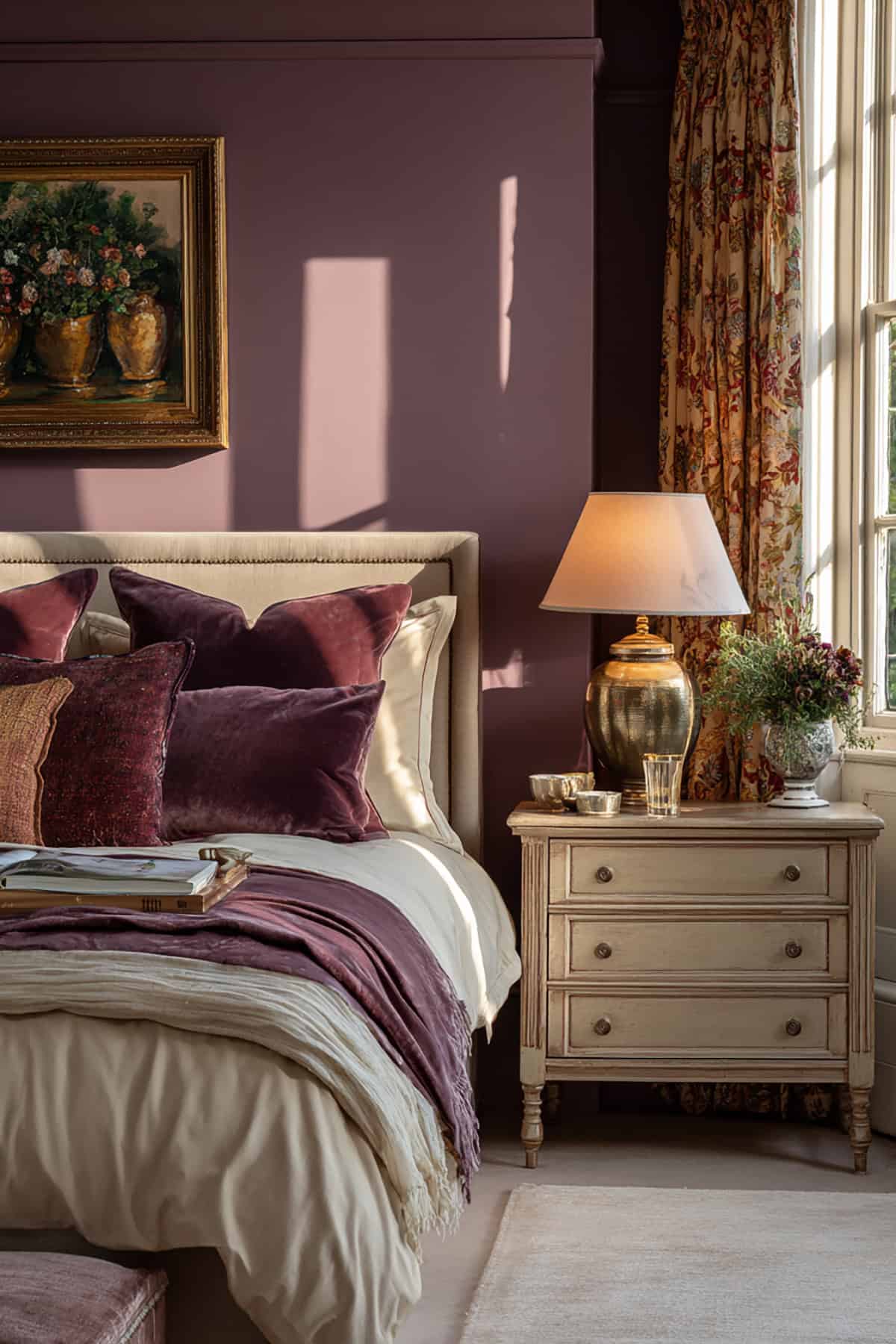
Benjamin Moore Mauve Mist is a dusty, gentle plum. It gives depth without making things dark.
Works best with cream furniture and tactile fabrics like velvet or linen. The color keeps things intimate but defined.
Warm Cocoa Brown
Behr Cappuccino Froth is a soft cocoa with a hint of red. It’s warm and inviting, not heavy.
Pairs well with beige textiles and brushed gold. If you want a romantic look with more contrast and less brightness, this is a good pick.
Warm Mocha Brown
Sherwin-Williams Foothills gives you a grounded mocha shade. It’s got depth but doesn’t weigh down the space.
Great for accent walls or trim, especially with creamy whites, dusky roses, and natural fabrics.
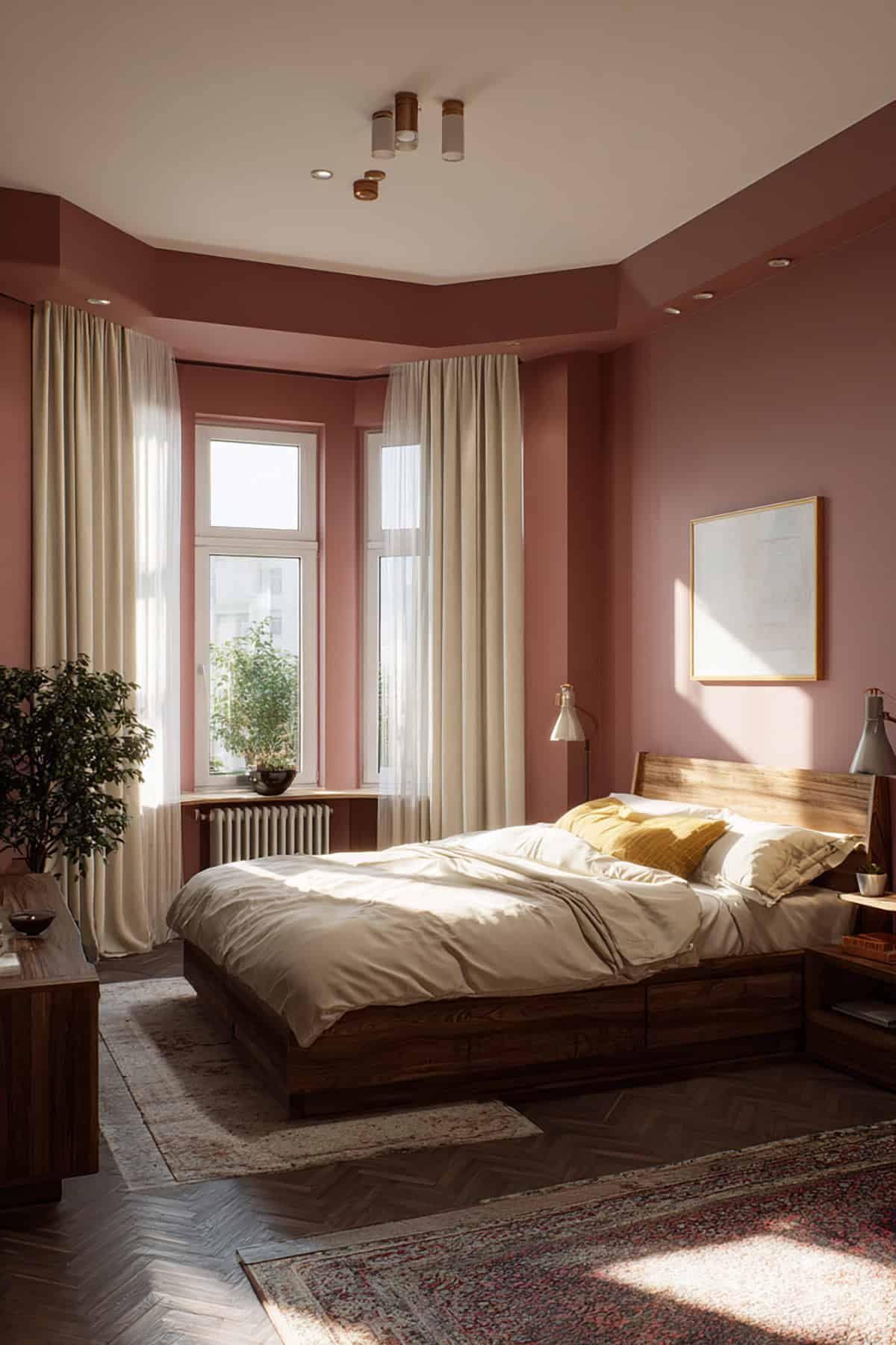
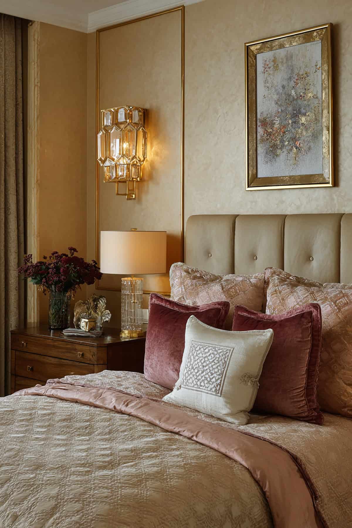
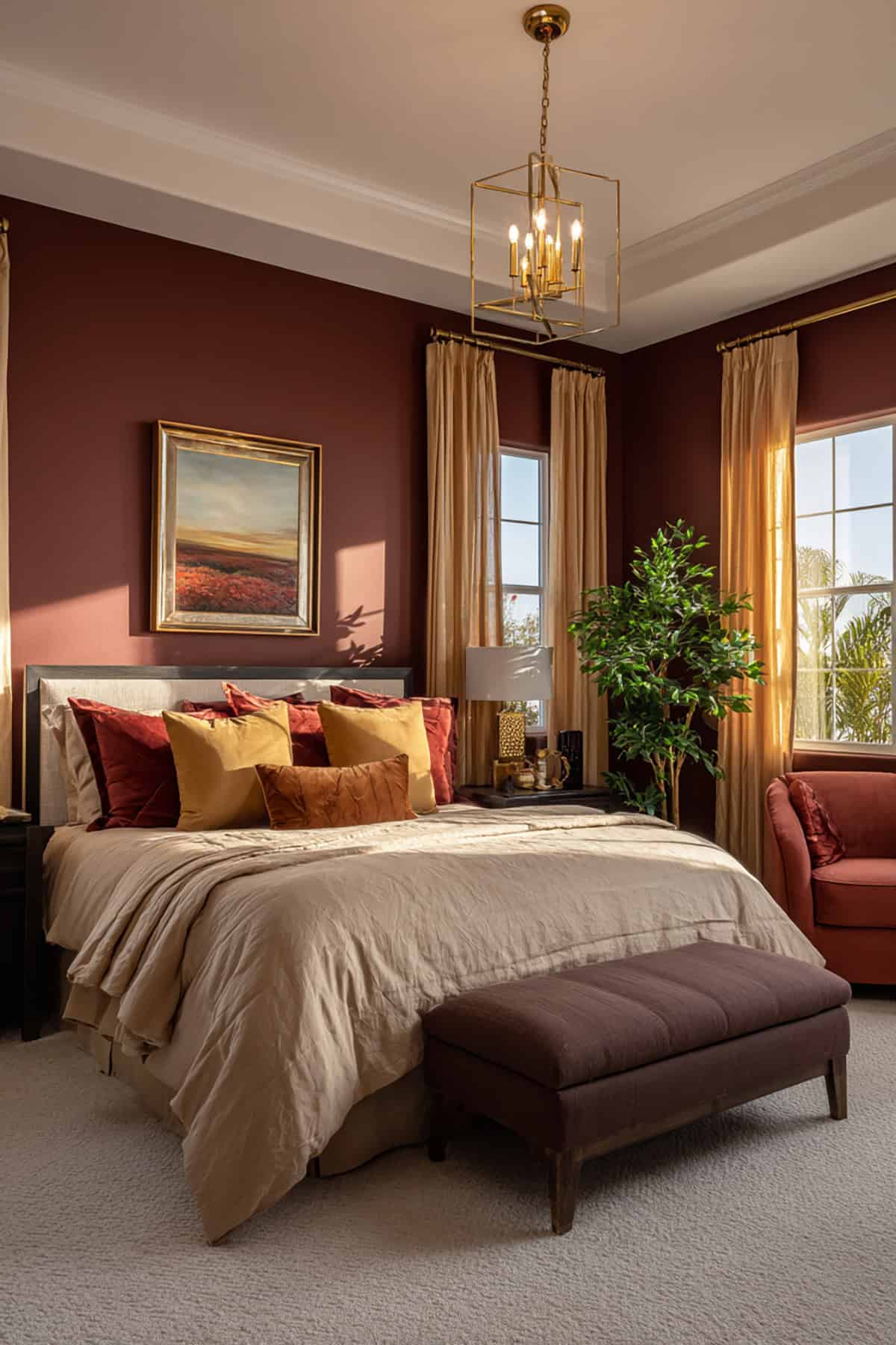
Rosy Clay Neutral
Behr Weathered Terracotta brings together red, beige, and pink in a soft, earthy mix. It’s warm but still feels romantic.
Plays nicely with woven textures and warm light. White or blush fabrics keep it balanced. This one’s all about quiet comfort for everyday unwinding.
Blushed Taupe
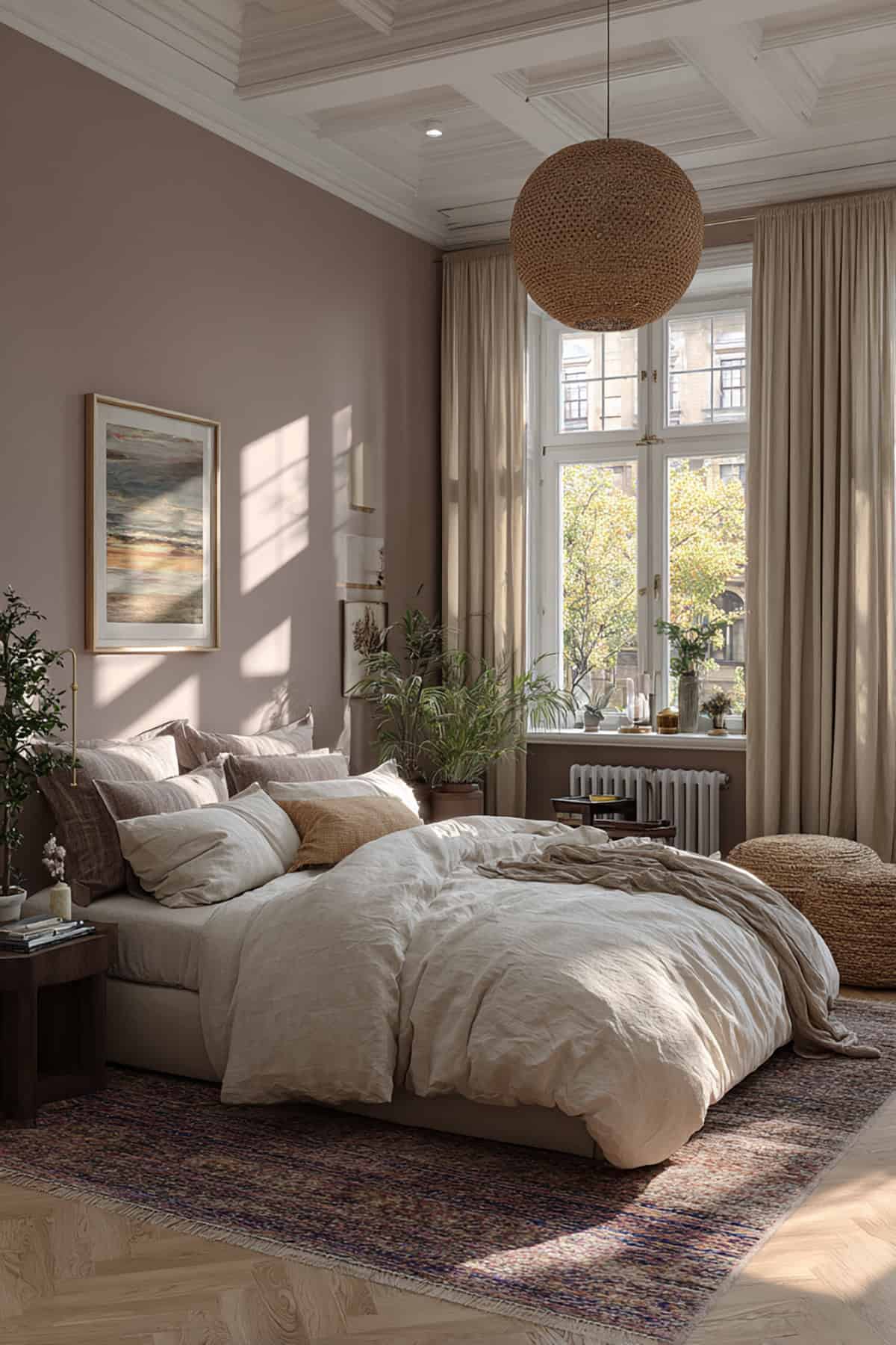
With Farrow & Ball Jitney, you get this blushed taupe that somehow blends gray, beige, and a muted dusty pink. It shifts nicely with the light but never feels out of place.
Pairs well with rougher textures—think linen or jute. The pink undertone doesn’t get overly sweet, which is a relief. Honestly, it’s a flexible, soft shade that fits into so many different spaces without fuss.
Here is a good table that summarizes the paint color tones with our suggested paint color names.
| Color Tone | Paint Color Names |
|---|---|
| Soft Blush Pink | Benjamin Moore Pink Damask · Behr Barely Pink |
| Dusty Rose | Sherwin-Williams Rosy Outlook |
| Muted Mauve | Farrow & Ball Peignoir |
| Warm Ballet Pink | Behr Ballet Slipper |
| Rosy Beige | Sherwin-Williams Malted Milk |
| Pale Petal Pink | Benjamin Moore Gentle Butterfly |
| Powdery Pastel Pink | Behr Powdered Blush |
| Vintage Rose | Farrow & Ball Setting Plaster |
| Barely-There Pink | Benjamin Moore Head Over Heels |
| Warm Blush Neutral | Sherwin-Williams Intimate White |
| Creamy Almond Beige | Behr Almond Cream |
| Soft Champagne | Benjamin Moore Champagne Ice |
| Warm Sandstone Beige | Sherwin-Williams Accessible Beige |
| Light Café Beige | Behr Café Latte |
| Gentle Greige | Benjamin Moore Revere Pewter |
| Mushroom Taupe | Farrow & Ball Elephant’s Breath |
| Warm Putty Gray | Sherwin-Williams Useful Gray |
| Smoky Lavender | Behr Smoky Lavender |
| Muted Lilac | Sherwin-Williams Silver Peony |
| Soft Plum Mist | Benjamin Moore Mauve Mist |
| Warm Cocoa Brown | Behr Cappuccino Froth |
| Warm Mocha Brown | Sherwin-Williams Foothills |
| Rosy Clay Neutral | Behr Weathered Terracotta |
| Blushed Taupe | Farrow & Ball Jitney |