The color you pick for your home office quietly shapes the way you work, even before you log on. It nudges your mood, sets the backdrop for video calls, and either helps you zone in or makes distraction all too easy. Honestly, paint might be one of the most underrated levers for a workspace that actually works.
What’s wild is how much range you’ve got. The best hues run from soft, sunlit whites to deep, dramatic tones that ground the whole room. The trick? Tune your choice to the room you’re actually in: how the light comes in, what you do all day, and what’s already in there. A color that feels sharp and tranquil in a bright studio can go oddly flat in a shadowy corner office.
Below, you’ll find twenty shades, grouped by vibe and function, plus some real-world advice on using color to match your work style and your office’s natural light.
Table of Contents
Home Office Paint Colors
What works in a home office isn’t just about what looks good on a swatch. It’s about how it holds up over a long, sometimes grinding day. Blues and greens tend to help with focus, warm neutrals create a sense of calm, and rich, saturated colors can actually help you block out distractions. The undertones matter—a lot—especially once you factor in screens, lamps, and trim.
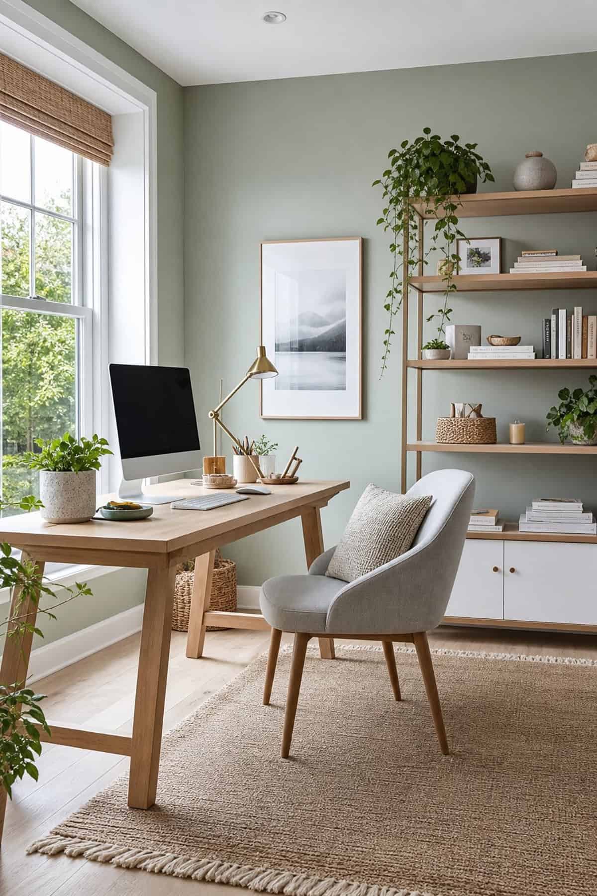
Soft Sage Green
There’s an ease to soft sage that just works for getting things done. Its gray-green base feels calm but never sterile, and it doesn’t go weird under different lights. With warm woods and off-white trim, it looks modern but not cold. In north-facing rooms, it doesn’t turn chilly or washed out, which is rare for greens.
Suggested Paint Colors: Sherwin-Williams Clary Sage (SW 6178), Benjamin Moore Saybrook Sage (HC-114), Behr Sage Green (N400-4)
Dusty Blue
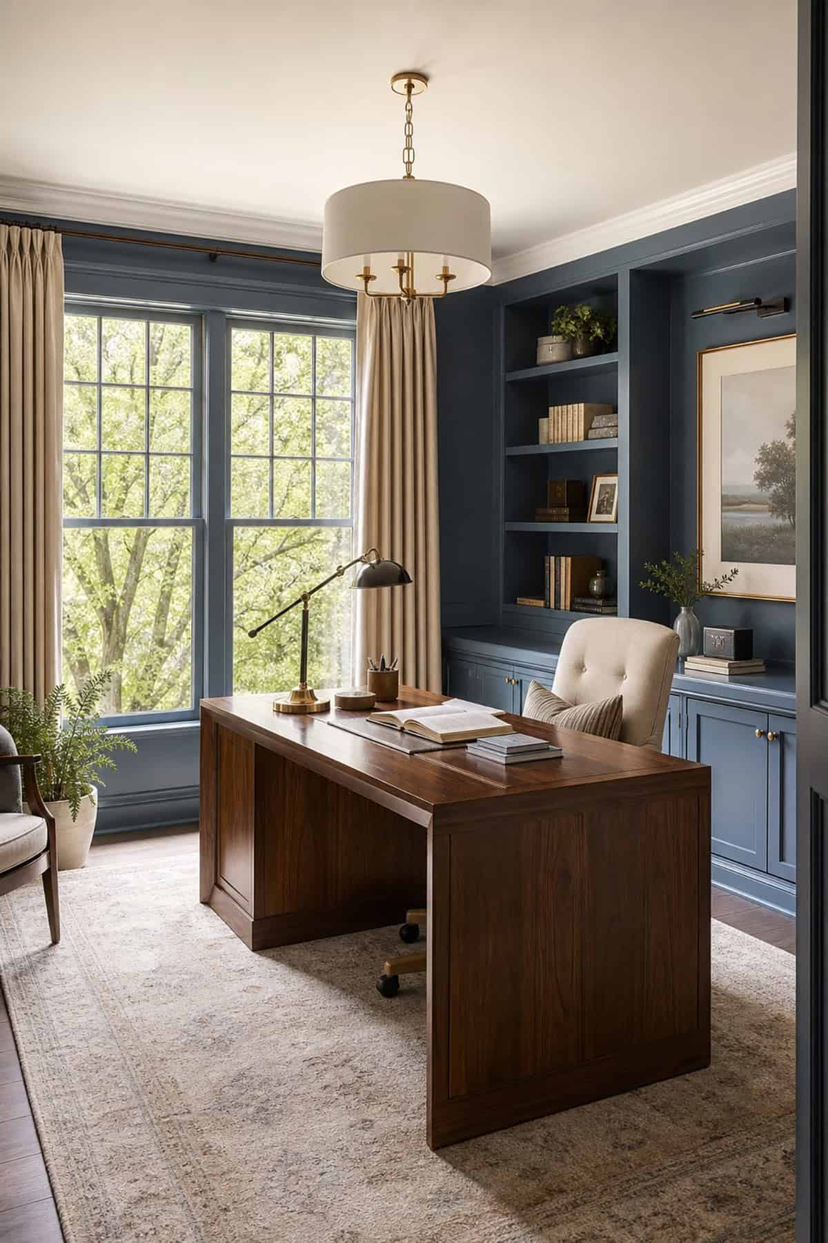
That sweet spot between focus and relaxation? Dusty blue lands right there. It’s got enough gray to avoid feeling juvenile, yet it still feels fresh. On video calls, it comes off as professional but not severe—no need to worry about looking like you’re calling in from a hospital corridor.
Suggested Paint Colors: Sherwin-Williams Smoky Blue (SW 7604), Benjamin Moore Van Courtland Blue (HC-145), Behr Adirondack Blue (N480-5)
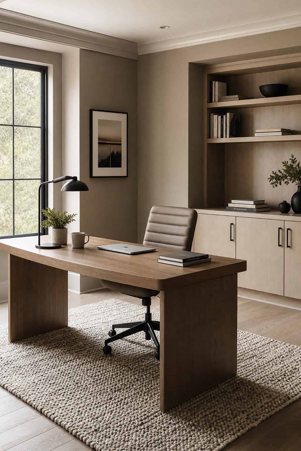
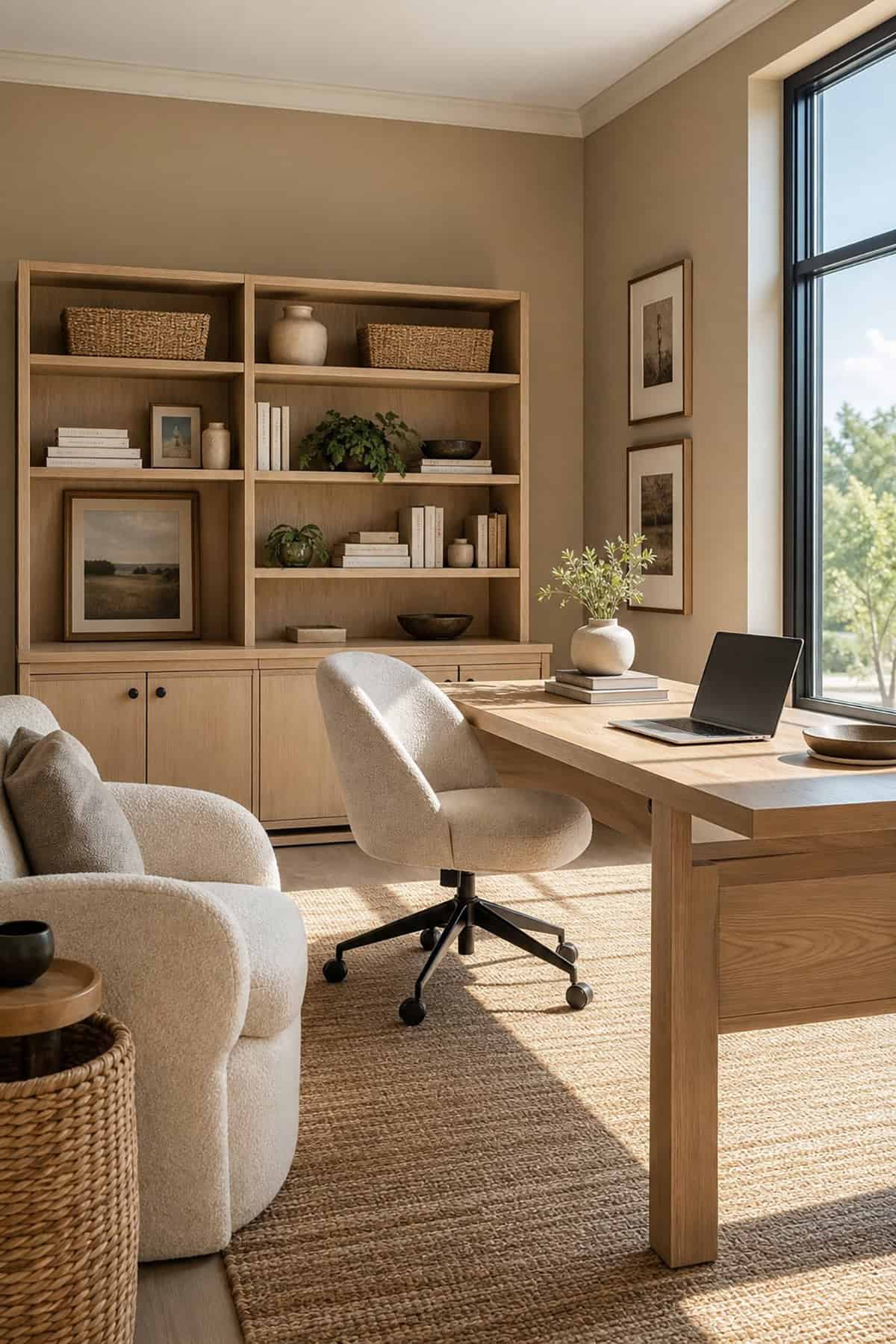
Warm Greige
Warm greige quietly gets the job done. It’s not beige, not gray, and doesn’t age a room. Sherwin-Williams’ Alpaca nails this vibe: subtle, flexible, and easy on the eyes whether you’re working with cool tech gear or old-school wood furniture.
Suggested Paint Colors: Sherwin-Williams Agreeable Gray (SW 7029), Benjamin Moore Edgecomb Gray (HC-173), Behr Wheat Bread (720C-3
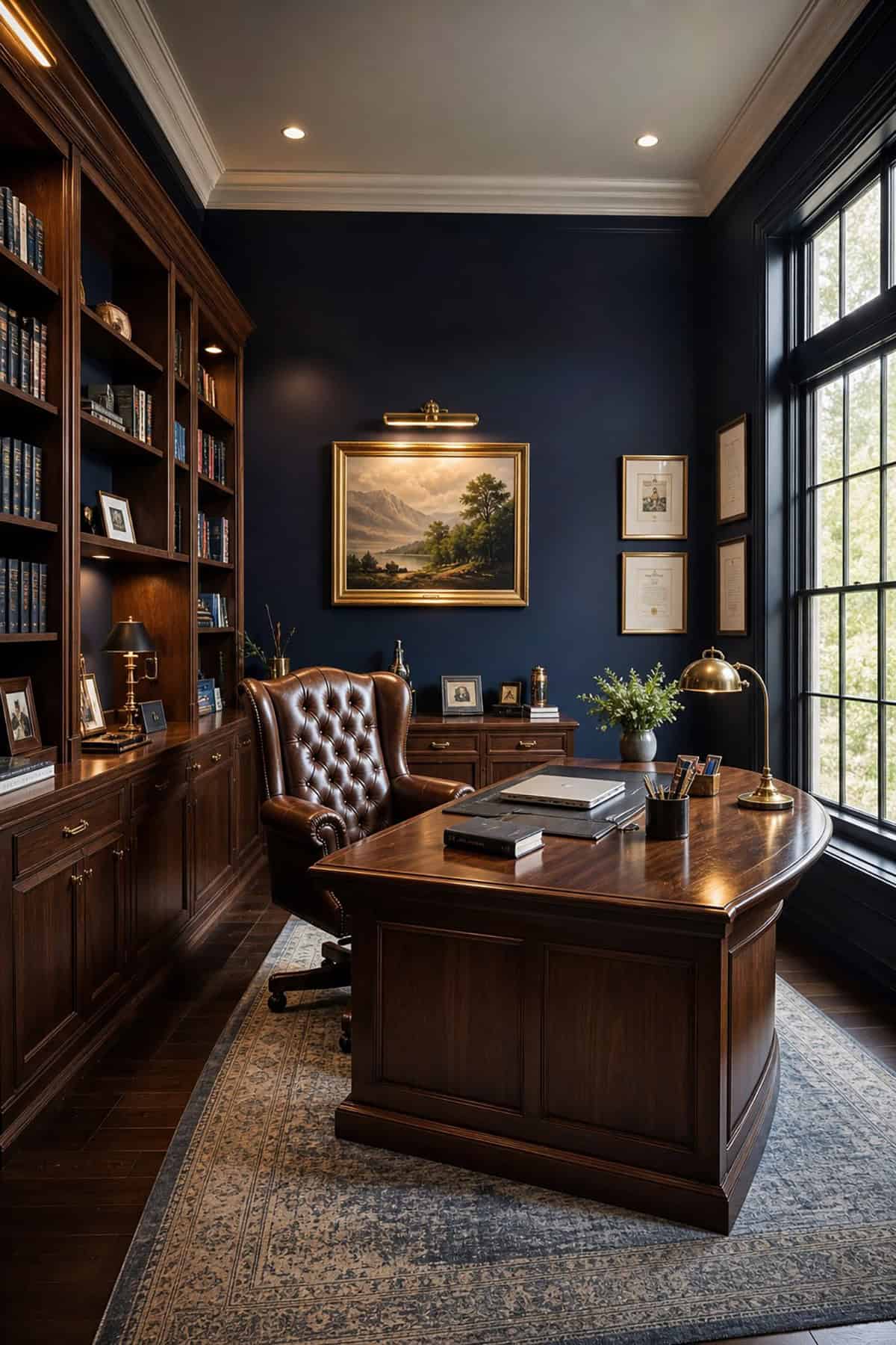
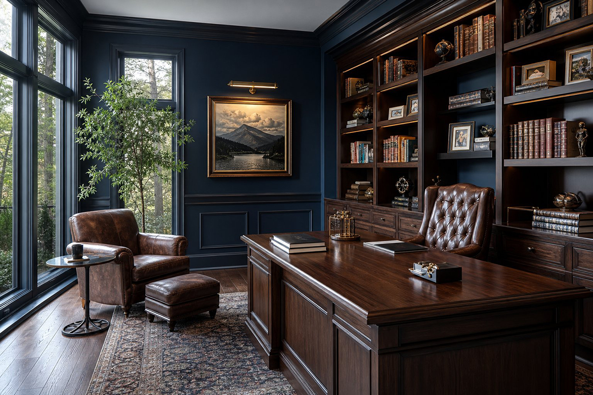
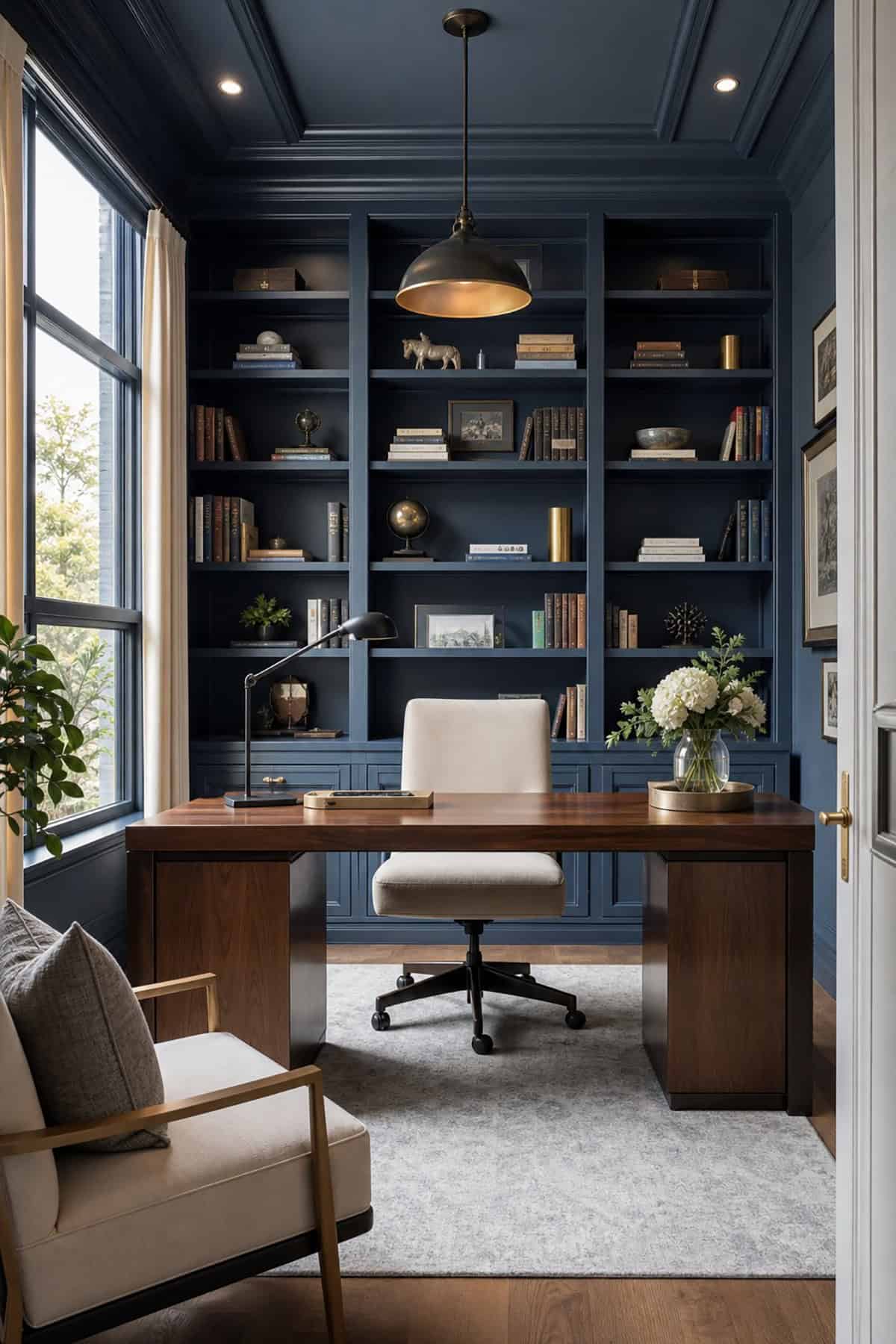
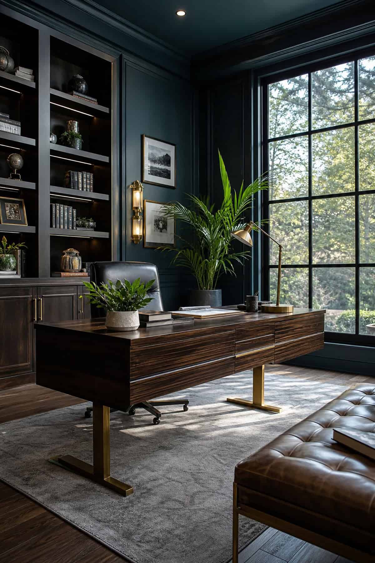
Moody, solid, and somehow both classic and modern, deep navy sets a serious tone. It’s punchy as a backdrop behind a desk, but on every wall, it can get heavy fast—especially if you’re short on daylight. The color cuts visual clutter and looks sharp on camera, which is a bonus if you’re always on calls.
Suggested Paint Colors: Sherwin-Williams Naval (SW 6244), Benjamin Moore Hale Navy (HC-154), Behr Starless Night (S490-7)
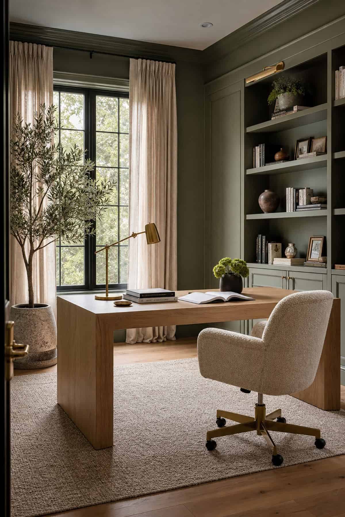
Muted Olive Green
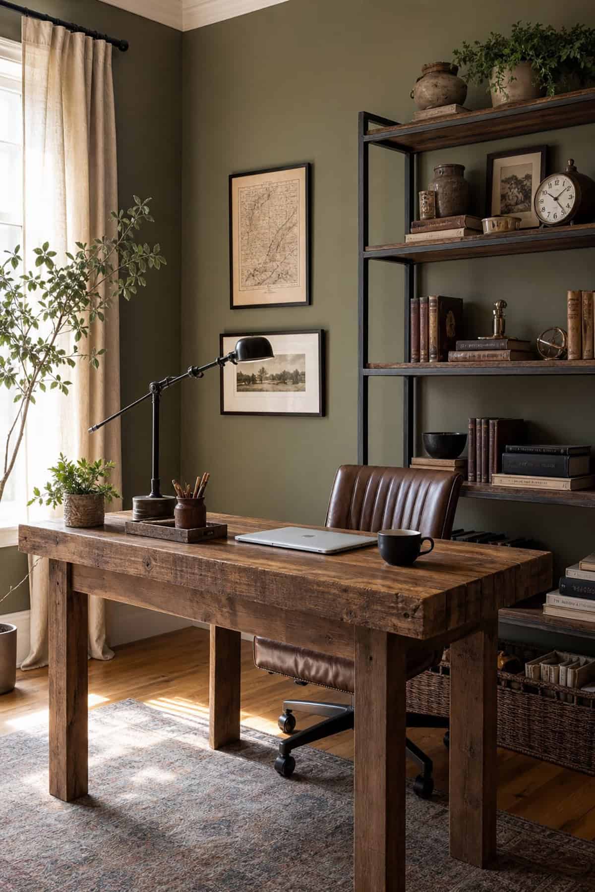
Earthy and a bit unexpected, muted olive brings in warmth without being loud. Those yellow-brown undertones give energy without the glare, which is handy for creative work. It pairs nicely with natural linens, raw woods, and dark hardware—think a little bit vintage, a little bit modern.
Suggested Paint Colors: Benjamin Moore Vintage Vogue (462), Sherwin-Williams Rosemary (SW 6187), Behr Bitter Sage (N390-4)
Charcoal Gray
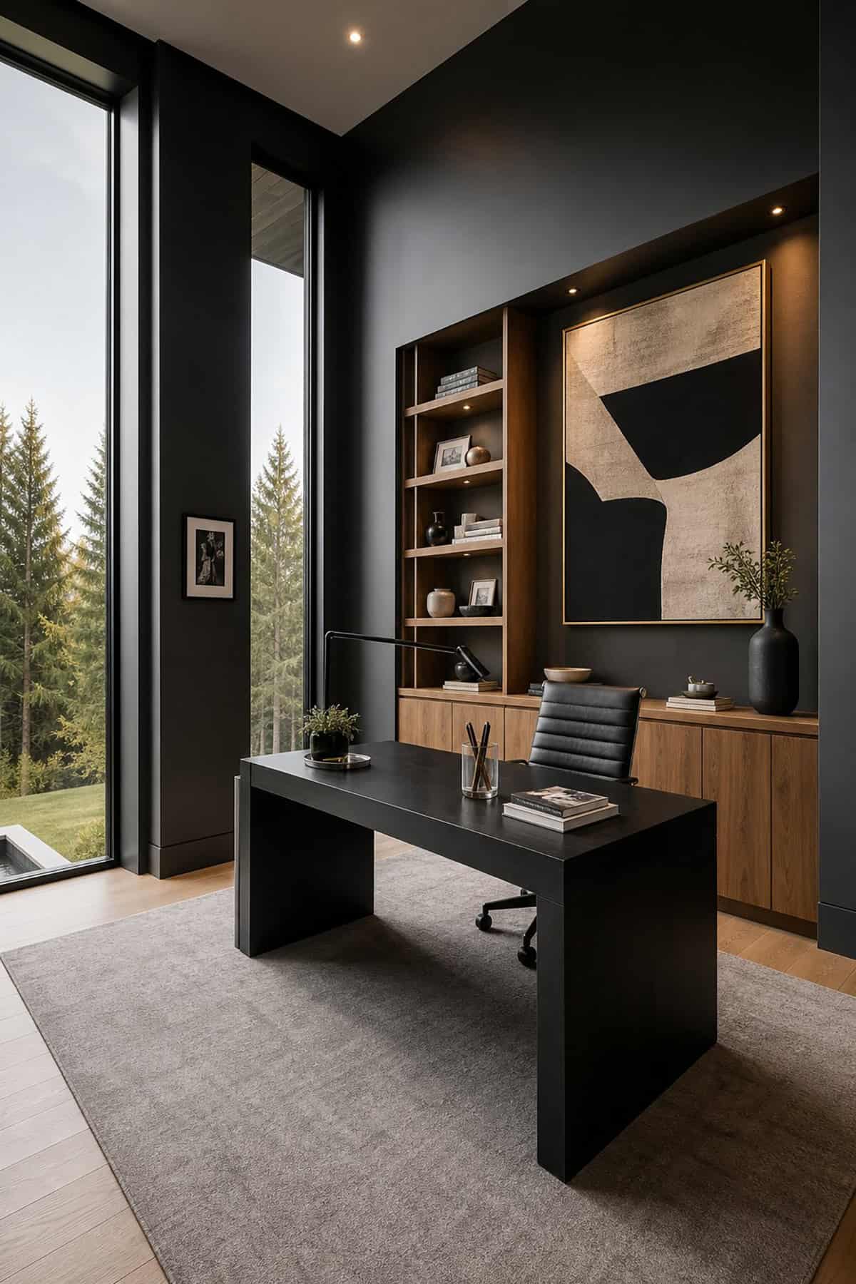
For anyone who likes their workspace to feel like a cocoon, charcoal gray delivers. Sherwin-Williams’ Grizzle Gray is a prime example: deep, saturated, and a little edgy. You’ll need solid lighting to keep it from feeling like a cave, so skip the single overhead bulb and layer your lamps.
Suggested Paint Colors: Sherwin-Williams Peppercorn (SW 7674), Benjamin Moore Kendall Charcoal (HC-166), Behr Cracked Pepper (PPU18-1)
Creamy Off-White
Warm white sidesteps the harshness of pure white, keeping things bright but not blinding. It bounces light around in a soft way, which is easier on your eyes and keeps screen glare in check. Look for versions with a soft yellow cast; anything pink or blue can turn weird under LEDs or at night.
Suggested Paint Colors: Benjamin Moore White Dove (OC-17), Sherwin-Williams Alabaster (SW 7008), Behr Swiss Coffee (12)
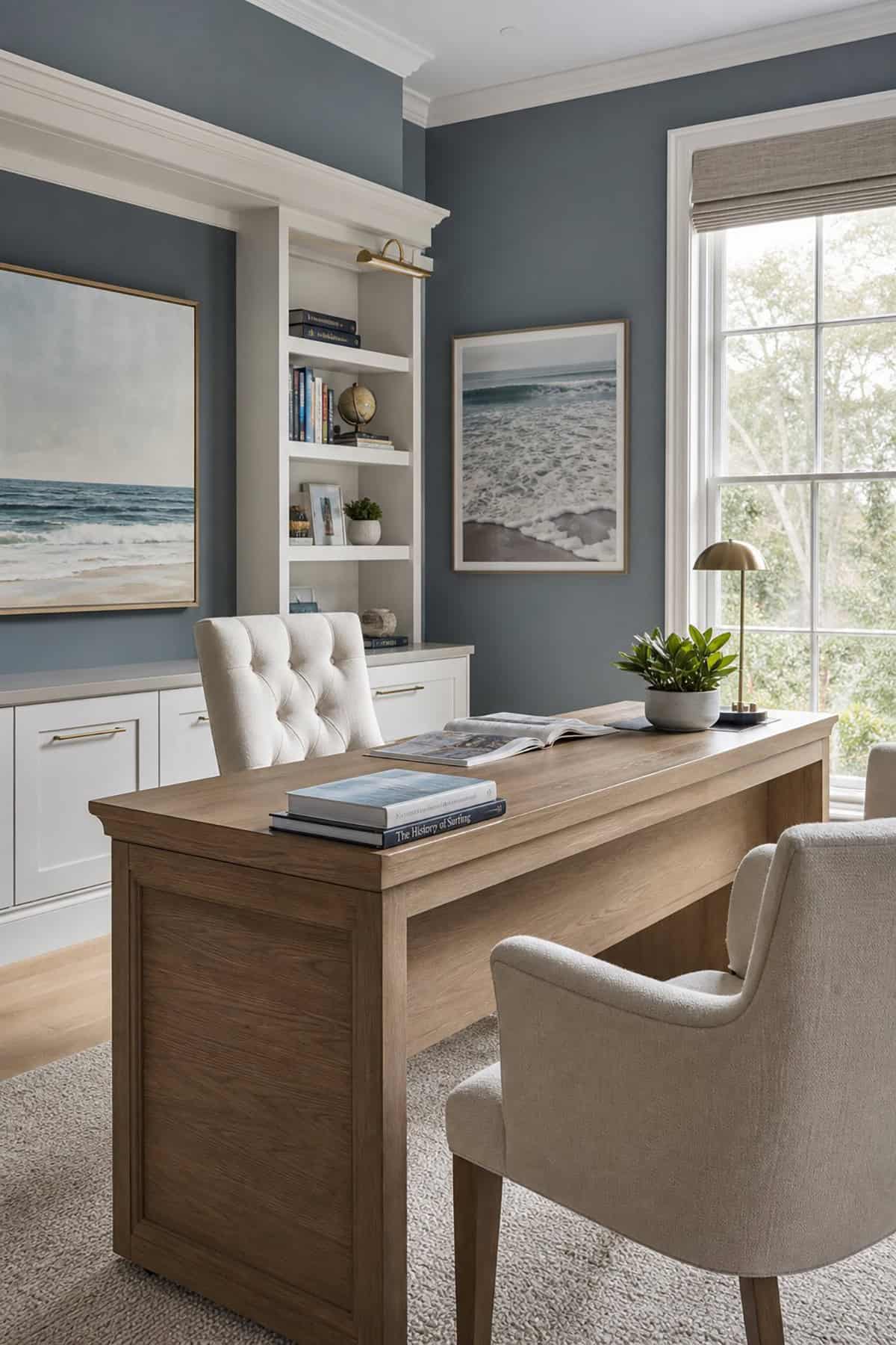
Slate Blue
Cooler and more substantial than dusty blue, slate blue brings a bit of gravitas. Sherwin-Williams’ Rock Candy is a lighter take—airy but not stark. This one needs a fair amount of daylight to keep from feeling too somber, but in the right room, it’s quietly commanding.
Suggested Paint Colors: Sherwin-Williams Slate Tile (SW 7624), Benjamin Moore Normandy (2129-40), Behr Blueprint (S470-5
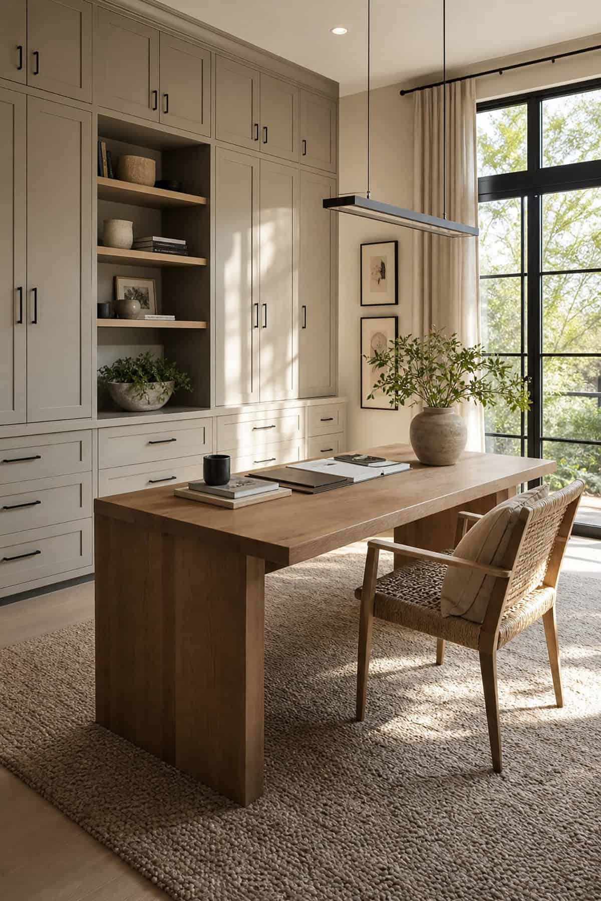
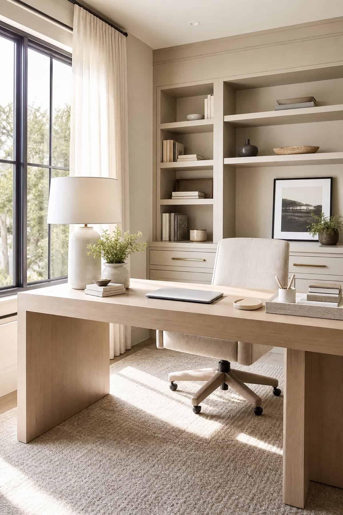
Mushroom Taupe
Soft, warm, and never flat, mushroom taupe avoids the blandness of beige. A touch of cool gray keeps it feeling current, and it layers well with cream and wood. For long-haul desk work, it’s got a gentle, cocooned vibe that feels steady but not sleepy.
Suggested Paint Colors: Benjamin Moore Pashmina (AF-100), Sherwin-Williams Perfect Greige (SW 6073), Behr Almond Wisp (700E-3)
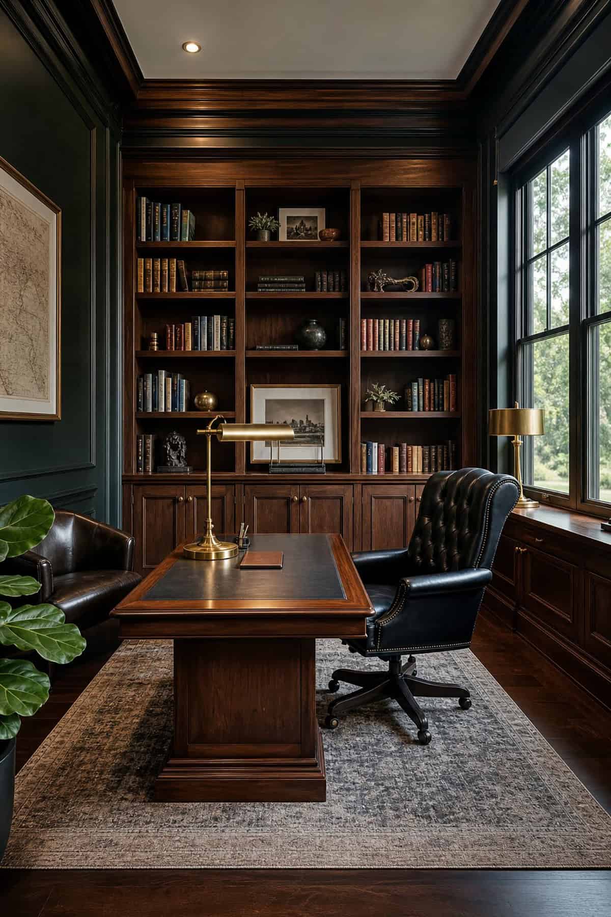
Forest Green
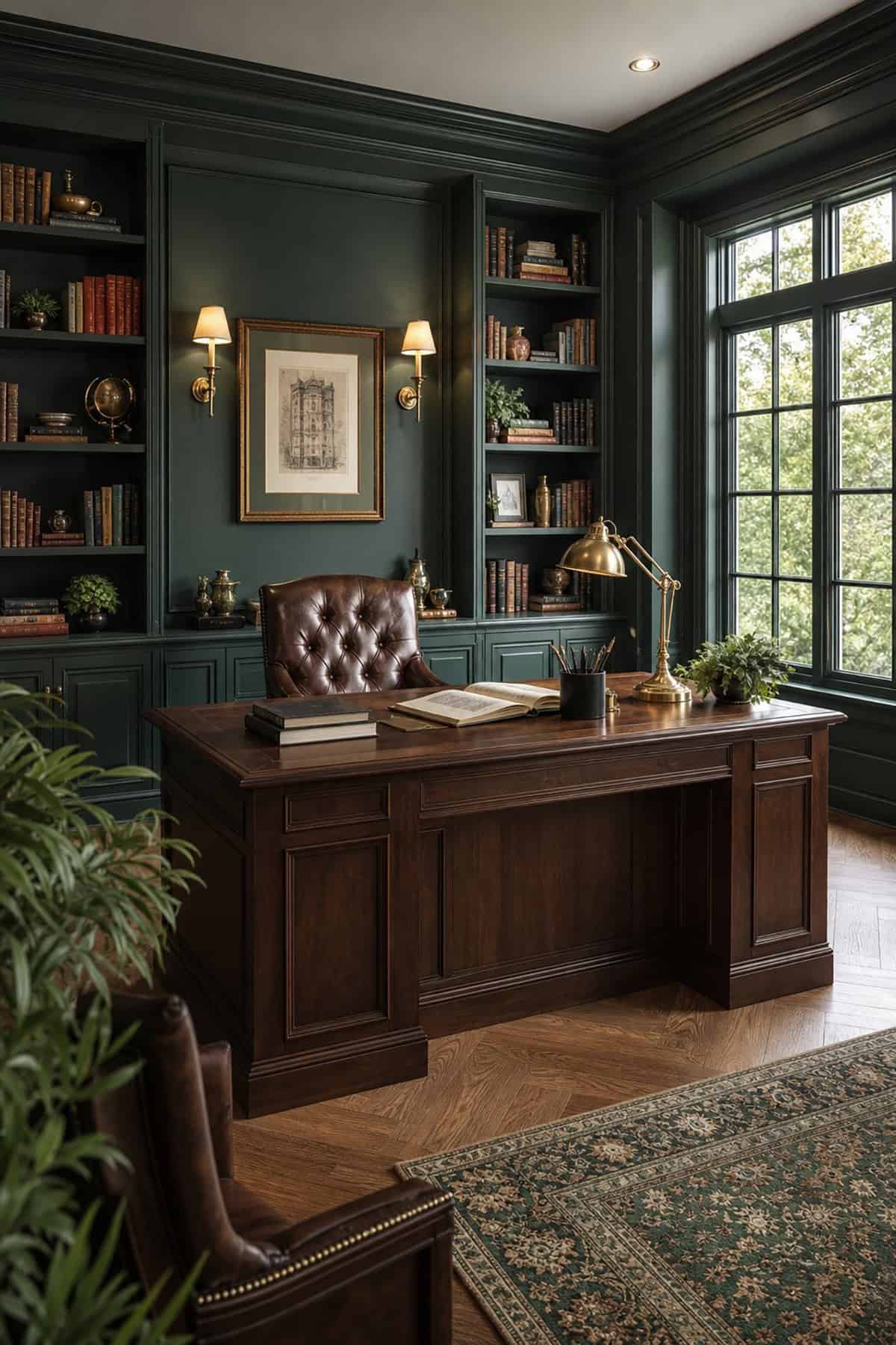
Darker and moodier than sage, forest green brings a sense of depth and seriousness—great for research or writing. Keep ceilings lighter so the whole room doesn’t close in, and stick to matte finishes to avoid weird reflections if you’re using artificial light.
Suggested Paint Colors: Sherwin-Williams Rookwood Sash Green (SW 2810), Benjamin Moore Essex Green (HC-188), Behr North Woods (N410-7)
Smoky Blue Gray
Smoky blue gray is a bit of a chameleon—neutral from a distance, but with blue undertones that show up close. Benjamin Moore’s charcoal blue nails that understated, tailored look. It sits well with white or pale trim, and doesn’t shout for attention.
Suggested Paint Colors: Benjamin Moore Boothbay Gray (HC-165), Sherwin-Williams Stardew (SW 9138), Behr Silver Bullet (N520-2)
Terracotta Beige
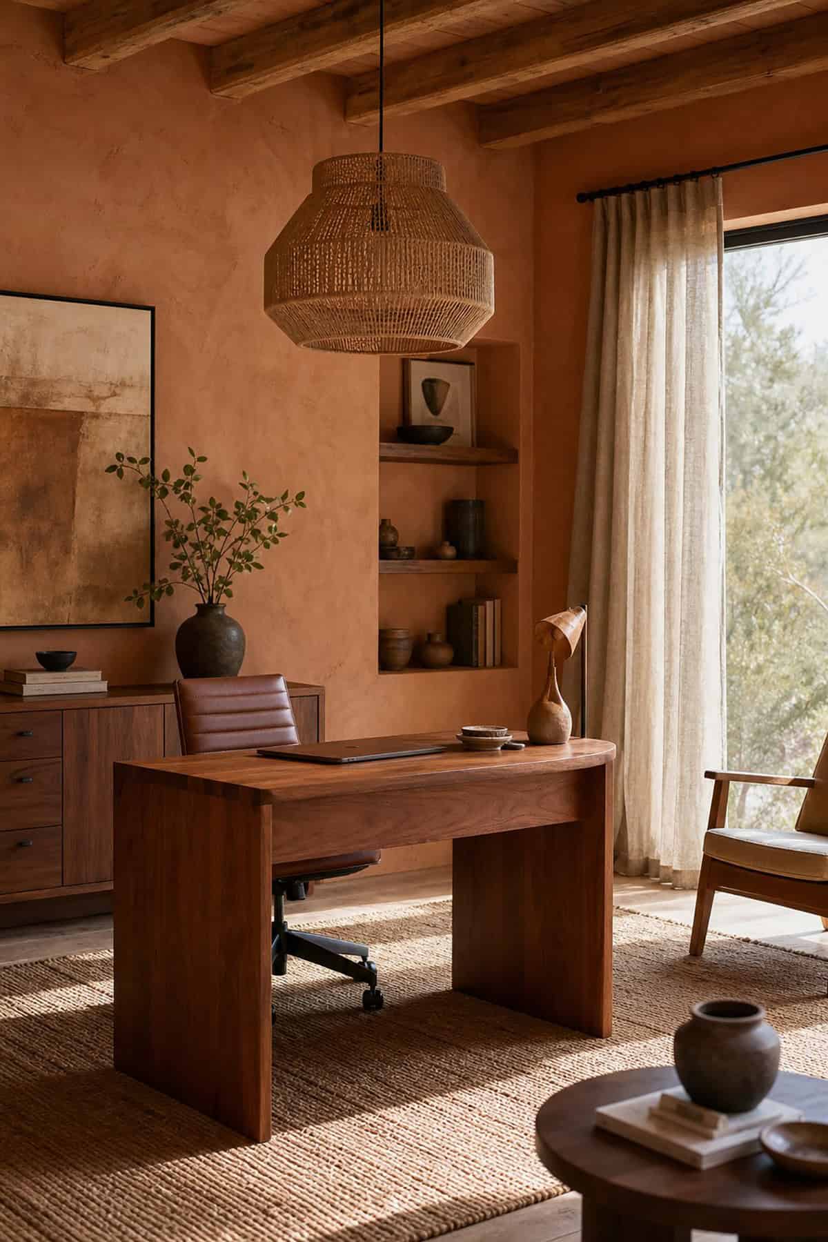
Somewhere between clay and beige, terracotta beige feels warm and welcoming. If you’re on a lot of client calls, it’s a flattering, friendly backdrop. It naturally clicks with warm-toned furniture or brass accents, giving the room a bit of polish without feeling staged.
Suggested Paint Colors: Sherwin-Williams Redend Point (SW 9081), Benjamin Moore Adobe Dust (2175-40), Behr Canyon Dusk (S210-4)
Pale Eucalyptus
Pale eucalyptus leans cooler than sage, with a silvery-green vibe that’s calm but not sleepy. It handles shifting daylight without going dull, and in small offices, it opens things up without making the space feel vacant.
Suggested Paint Colors: Benjamin Moore Healing Aloe (1562), Sherwin-Williams Sea Salt (SW 6204), Behr Breezeway (MQ3-21)
Rich Burgundy
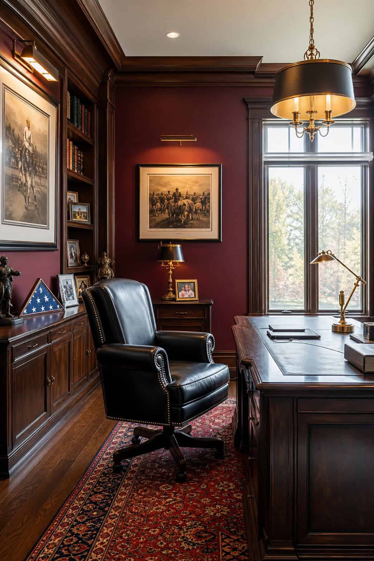
Burgundy isn’t the obvious choice, but when you want focus and a bit of drama, it’s a wild card worth considering. An accent wall behind the desk works best—too much and it can overwhelm. Pair with warm lighting and darker wood for a cozy, grounded feel, and balance it with light neutrals elsewhere.
Suggested Paint Colors: Sherwin-Williams Burgundy (SW 6300), Benjamin Moore New London Burgundy (HC-61), Behr Dark Crimson (PPU1-3)
Soft Clay Beige
Warmer than mushroom, milder than terracotta, soft clay beige is a sweet spot for multi-use spaces. It flatters most skin tones on video calls, works with white trim and natural fabrics, and doesn’t scream “home office” if the room doubles as a guest space.
Suggested Paint Colors: Benjamin Moore Manchester Tan (HC-81), Sherwin-Williams Natural Linen (SW 9109), Behr Sandstone Cove (730C-2)
Moody Teal
Moody teal walks the line between blue and green, so you get focus with a dash of calm. It shifts with the light—cooler in the morning, warmer by lamp light. Definitely test a big swatch before you commit, since it morphs depending on the time of day.
Suggested Paint Colors: Sherwin-Williams Riverway (SW 6222), Benjamin Moore Aegean Teal (2136-40), Behr Ocean Abyss (N480-7)
Light French Gray
Here’s a gray that’s not cold or flat—light French gray has a softness, sometimes even a hint of lavender if the light’s right. It’s neutral, but not boring, and sits well with white furniture or dark wood. LEDs don’t wash it out, so it’s good for tech-heavy setups.
Suggested Paint Colors: Sherwin-Williams Light French Gray (SW 0055), Benjamin Moore Stonington Gray (HC-170), Behr Silver Drop (790C-2)
Dusty Lavender Gray
Dusty lavender gray sneaks in a touch of purple-pink without turning the space into a bedroom. It’s calming and helps dial down tension, which is helpful when work gets intense. Stick with warm whites and natural woods to keep the undertone from feeling too chilly.
Suggested Paint Colors: Benjamin Moore Violet Mist (1437), Sherwin-Williams Sensitive Tint (SW 6267), Behr Ash Violet (PPU17-3)
Blackened Green
Deep, moody, and almost neutral, blackened green has a botanical undertone that keeps it from feeling stark. Works best in bigger offices with good windows, where the color adds presence but doesn’t shrink the space.
Suggested Paint Colors: Sherwin-Williams Greenblack (SW 6994), Benjamin Moore Black Forest Green (HC-187), Behr Dark Everglade (N400-7)
Warm Sand
Softly golden and easy to live with, warm sand feels settled and welcoming, no matter how many hours you’re clocking in. It shifts from cool in the morning to a cozy, honeyed tone by afternoon. It’s a safe bet for anyone who wants a background that’s supportive but not forgettable.
Suggested Paint Colors: Benjamin Moore Muslin (OC-12), Sherwin-Williams Accessible Beige (SW 7036), Behr Sand Fossil (PPU7-8)
How To Match Color To Your Work Style
The way you work matters as much as the size of your room or the desk you’re using. A shade that’s perfect for long, focused analysis might totally kill the spark if you’re trying to brainstorm or design. It pays to think about your actual day-to-day before picking up a paintbrush.
Best Shades For Deep Focus
If you’re in the weeds with writing, coding, or anything detail-heavy, cooler, muted colors help keep distractions at bay. Dusty blue, smoky blue gray, and slate blue all create a steady atmosphere without feeling sterile. Soft sage green and pale eucalyptus do the same, keeping things calm and unfussy.
Skip the super-bright or overly warm paints in these setups—they can hype you up but make it hard to settle in. If you still want warmth, mushroom taupe or warm greige bring it softly, without the energy spike that gets in the way of deep work.
Best Picks For Creative Energy
For creative work, a little warmth or personality in the paint can help spark ideas without becoming a distraction. Muted olive green, terracotta beige, and moody teal add just enough character. Rich burgundy and blackened green are for those who want a more immersive, dramatic vibe while they work.
Warm sand and soft clay beige sit somewhere in the middle, keeping things relaxed and approachable. If your desk is where you sketch or brainstorm, these shades encourage a looser, more open energy than the cool, analytical colors.
Best Backdrops For Video Calls
What’s behind you on camera does more heavy lifting than most people realize. Warm greige, soft clay beige, and terracotta beige all look friendly and flattering on screen. Dusty blue and light French gray read as calm and professional, never cold or institutional.
Very dark colors like deep navy or burgundy can mess with your camera’s exposure and leave your face looking shadowed. Mid-tones with a clean, simple finish keep the focus on you—not just your wall.
What Light Does To Wall Color
Light direction is the sneaky variable that can wreck even the best paint plan. What looks perfect in the store might turn drab or weirdly intense once it’s on your wall. Testing real samples in your actual space, at different times of day, is non-negotiable if you want to avoid surprises.
North-Facing Rooms
Indirect light all day means colors in north-facing rooms tend to go cooler and darker. Warm neutrals like greige, soft clay beige, and warm sand hold up better than icy grays or blues, which can feel a bit bleak. If you’re drawn to green, stick with sage; blue-greens like pale eucalyptus can get muddy in low, indirect light.
Bright South-Facing Spaces
South-facing offices get hammered with sun, so colors look bolder and more saturated. This is where you can pull off deep or cool shades—navy, forest green, and moody teal stay lively without making the space feel like a cave. Warm colors like terracotta beige or sand can get almost too intense at peak daylight, so maybe just stick them on one wall instead of going all-in.
Small Offices And Dark Corners
Late afternoons in a cramped workspace can start to feel oppressive if the walls lean too dark or sterile. Creamy off-white and light French gray bounce daylight around just enough, sidestepping the clinical vibe of stark white. A whisper of pale eucalyptus or a smudge of dusty lavender gray can shift the mood: subtle, but not bland, and the place doesn’t close in on you.
For those tempted by drama, deep tones like blackened green or charcoal gray can work—just tuck them onto a single accent wall or the built-ins, where they deepen the visual field without swallowing the whole room.