The color you put on your deck affects how your entire backyard reads. A warm tone pulls the space in and makes it feel cozy. A cool, light shade opens things up. Get it wrong and even great furniture can’t save it.
The range of deck paint colors available today is genuinely impressive — and the right one can make your outdoor space look like it got a full renovation for the cost of a few cans of paint.
Table of Contents
Deck Paint Colors
The right shade can make your deck feel sleek, sun-drenched, or quietly classic. Below, you’ll find everything from cool grays to toasty browns, each with its own quirks and perks.
Slate Gray
Suggest Paint Colors: Sherwin-Williams Slate Tile SW 7624, Behr Slate Gray, Benjamin Moore Amherst Gray
Cool, modern, and a little urban, slate gray sets a chill vibe. It’s a neutral that doesn’t get lost, especially up against white trim or black railings.
Grime and pollen tend to disappear into this color, and you won’t get the blinding glare that comes with white. On big decks, it keeps things from feeling washed out.
Best if your house has stone or brick, or if you love stainless steel and simple lines. You won’t be scrubbing dust every weekend—it just blends in.
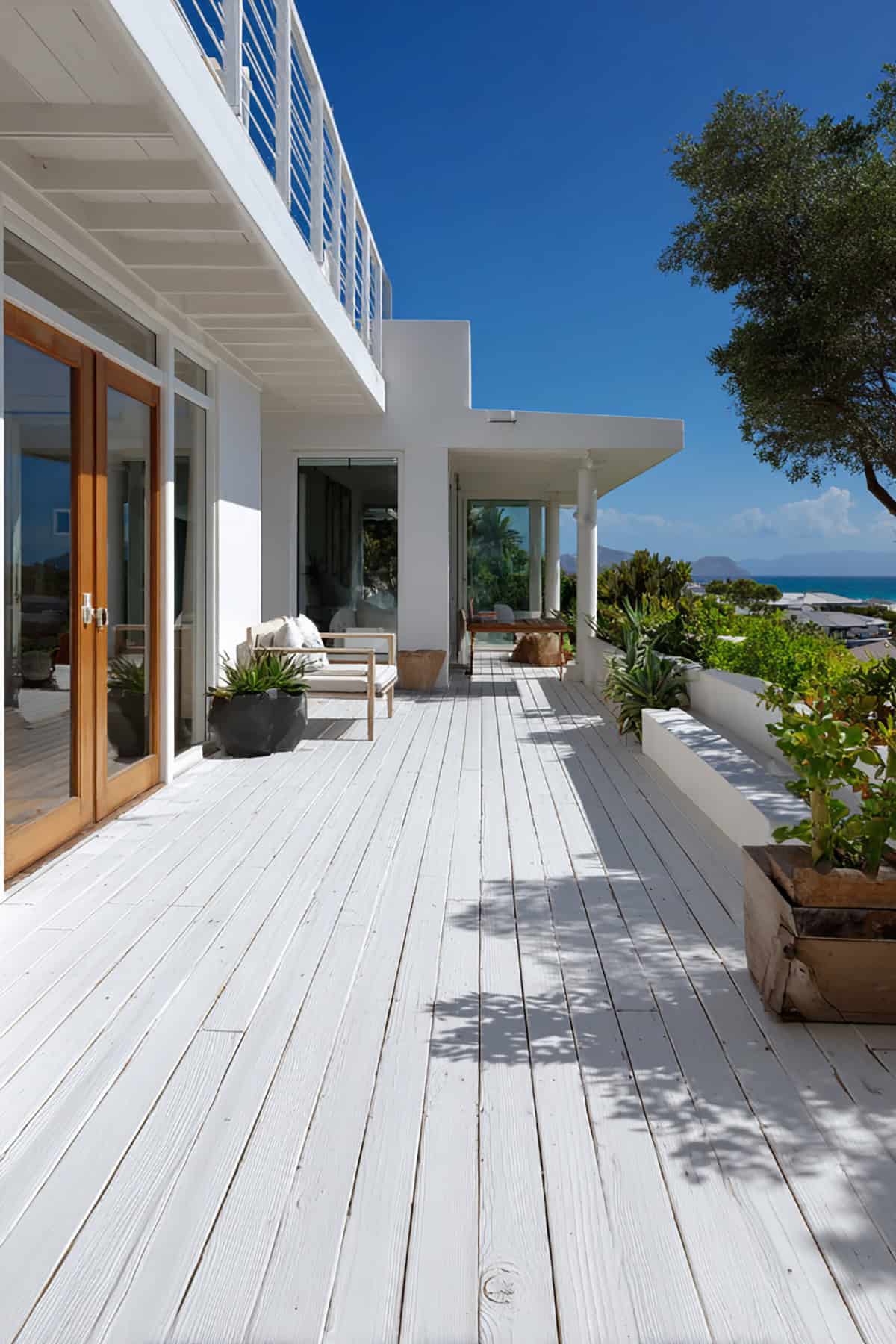
White
Suggest Paint Colors: Sherwin-Williams Pure White SW 7005, Behr Ultra Pure White, Benjamin Moore Chantilly Lace
Few things look as crisp as a white deck. Sunlight bounces right off, so it stays cooler, even in the thick of summer.
The downside? Every muddy paw print and stray leaf pops. You’ll want to hose it off regularly to keep that fresh look.
Perfect for beachy or classic homes, especially with navy or wood accents. Go for a top-tier exterior paint to fight mildew and stains.
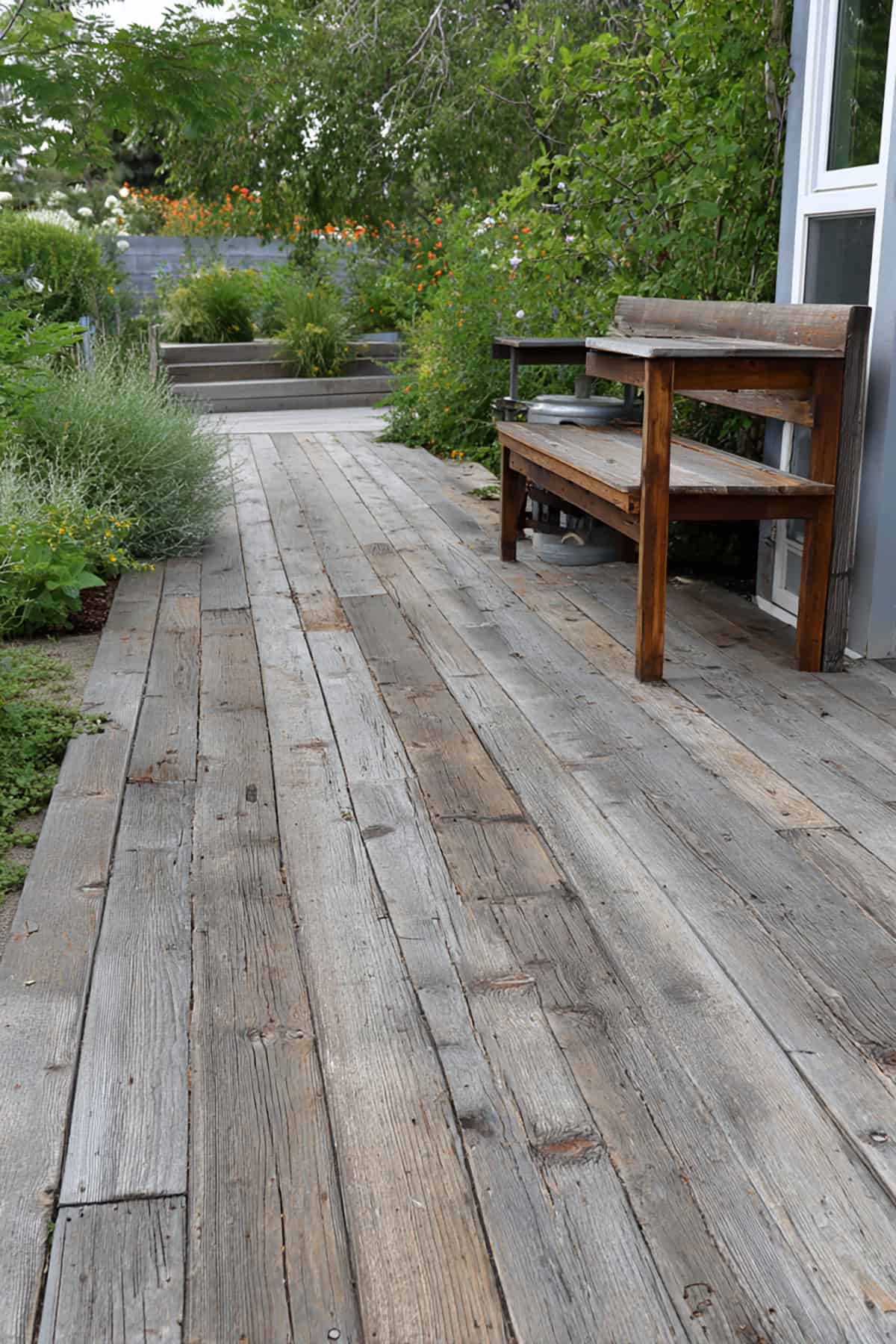
Weathered Gray
Suggest Paint Colors: Cabot Weathered Gray, Behr Weathered Gray, Olympic Weathered Gray
That soft, faded look of weathered gray feels effortless and a bit nostalgic. It’s forgiving—dust and little stains barely register.
Great for blending new boards with old, or if you have pets and kids constantly running around.
It’s a natural fit for farmhouse or cottage styles. Black hardware or white rails add a bit of edge, but it never feels heavy or gloomy.
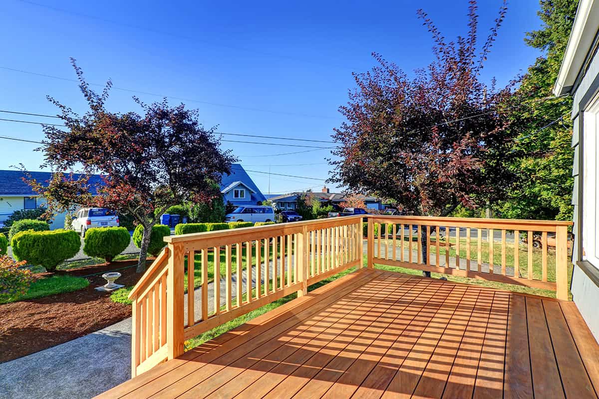
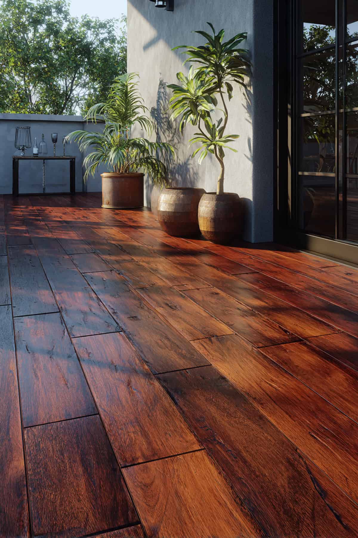
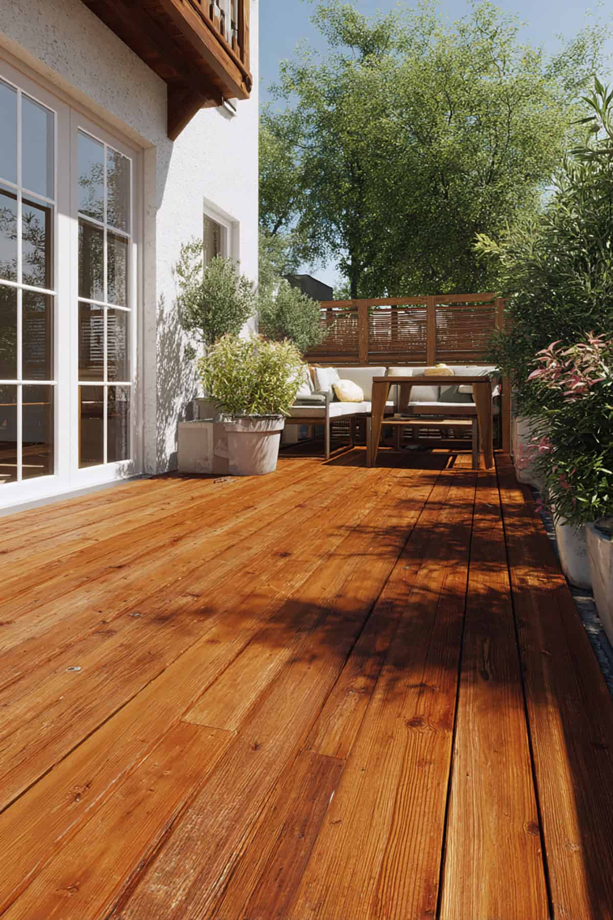
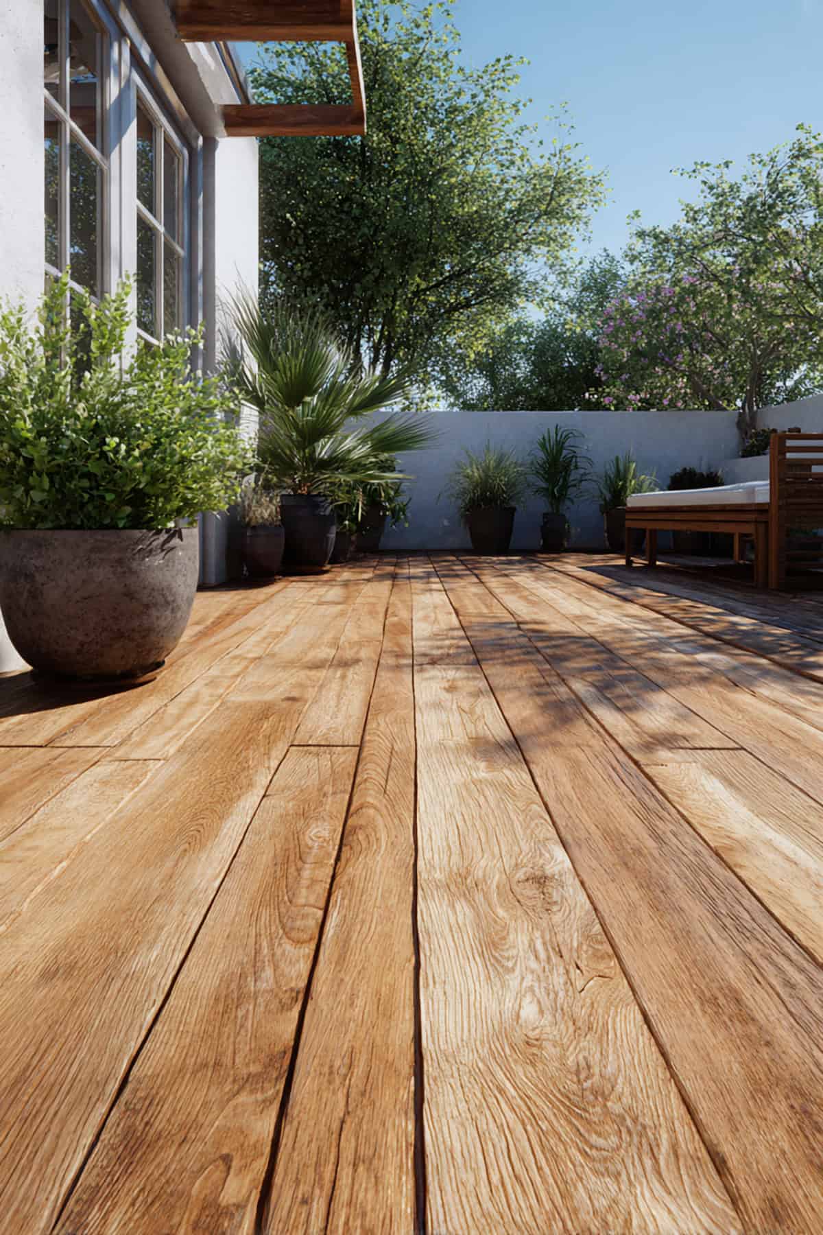
Walnut
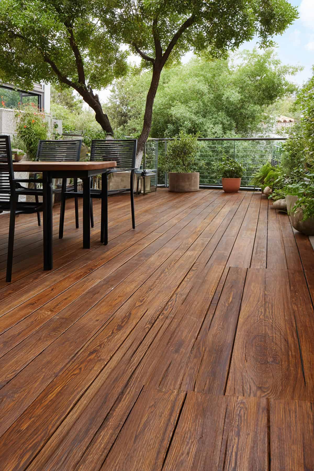
Suggest Paint Colors: Cabot Dark Walnut, Olympic Woodland Oil Walnut, Behr Cordovan Brown
Rich brown with a hint of warmth, walnut creates strong contrast against light siding and feels grounded.
It can get hot in full sun, so if you live somewhere scorching, test a patch first. Darker browns also mean you’ll be touching up more often to keep the color true.
Pairs easily with cream, beige, or stone, and works with classic outdoor furniture. Stick to durable paint to avoid early fading.
Taupe
Suggest Paint Colors: Sherwin-Williams Perfect Greige SW 6073, Behr Mushroom Bisque, Benjamin Moore Stone Hearth
Somewhere between gray and brown, taupe’s a chameleon. It plays nice with almost any trim or siding.
It covers up dirt better than beige but doesn’t get as heavy as deep browns. Suburbs love this one for a reason.
If your house is a mix of brick and vinyl, taupe ties it all together without shouting for attention. Feels calm, never flashy.
Sand
Soft, light, and easy on the eyes, sand tones brighten shady decks without the harshness of white.
They bounce heat, so your feet won’t roast. Especially handy if you’re somewhere sunny.
You’ll spot stains, so cleaning isn’t optional. Dark railings or big planters give nice contrast. Feels right at home with coastal or desert styles.
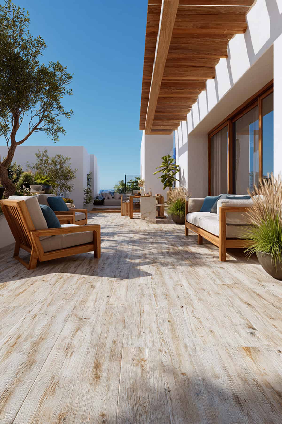
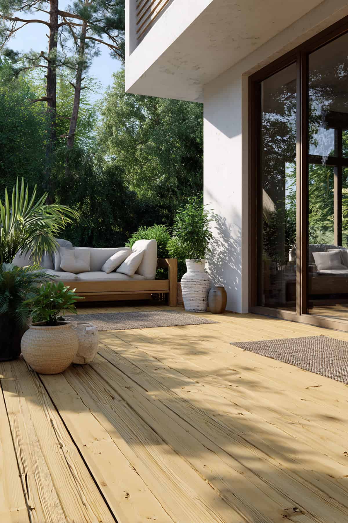
Natural
Suggest Paint Colors: Cabot Natural, Olympic Natural, Behr Transparent Natural
Natural shades keep things close to the look of fresh wood, especially if you use a semi-opaque or stain-style paint.
Timber vibes with extra protection—ideal for cabins or wooded lots.
These tones blend into green yards and stone features, and you won’t see every speck of dirt. Go for UV resistance if your deck bakes in the sun.
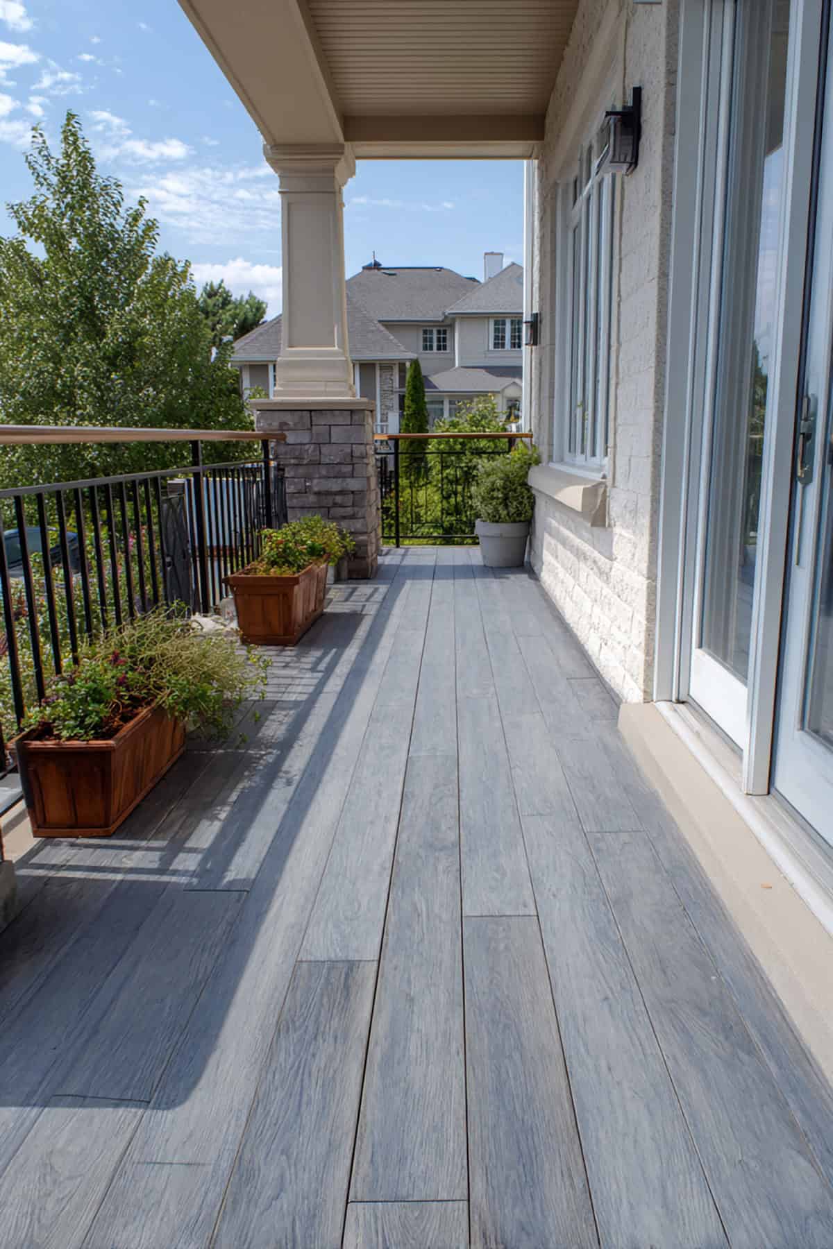
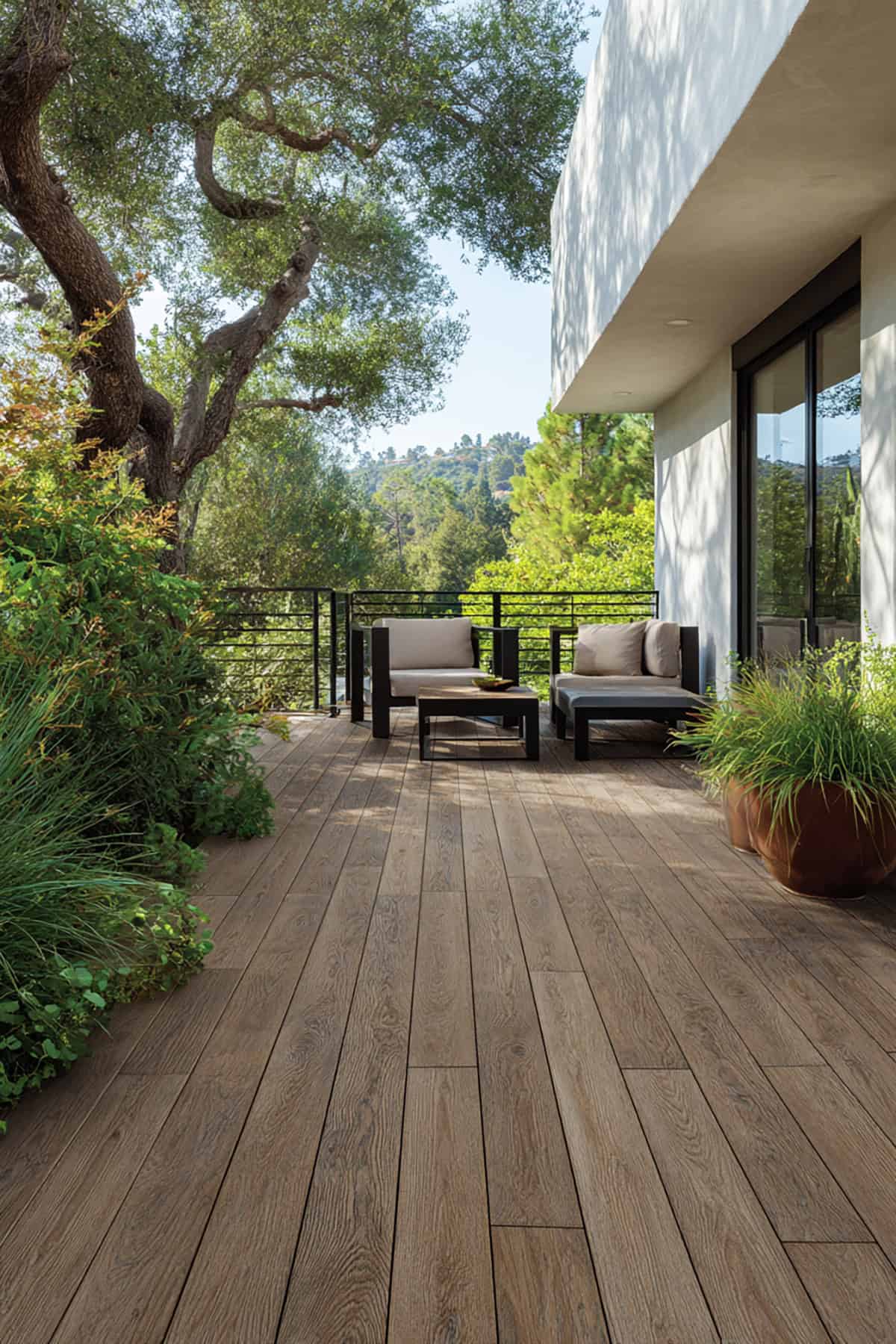
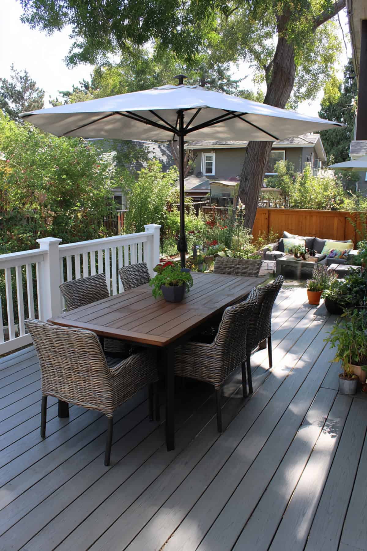
Medium Gray
Suggest Paint Colors: Sherwin-Williams Repose Gray SW 7015, Behr Classic Silver, Benjamin Moore Stonington Gray
Not too light, not too dark—medium gray hits the sweet spot. It doesn’t lean blue or brown, so matching is easy.
White trim or black metal gives it a modern edge, but it’s also a good base for colorful pillows and rugs.
Dust and scuffs fade into the background. Surface stays cooler than deep shades, and the versatility is hard to beat.
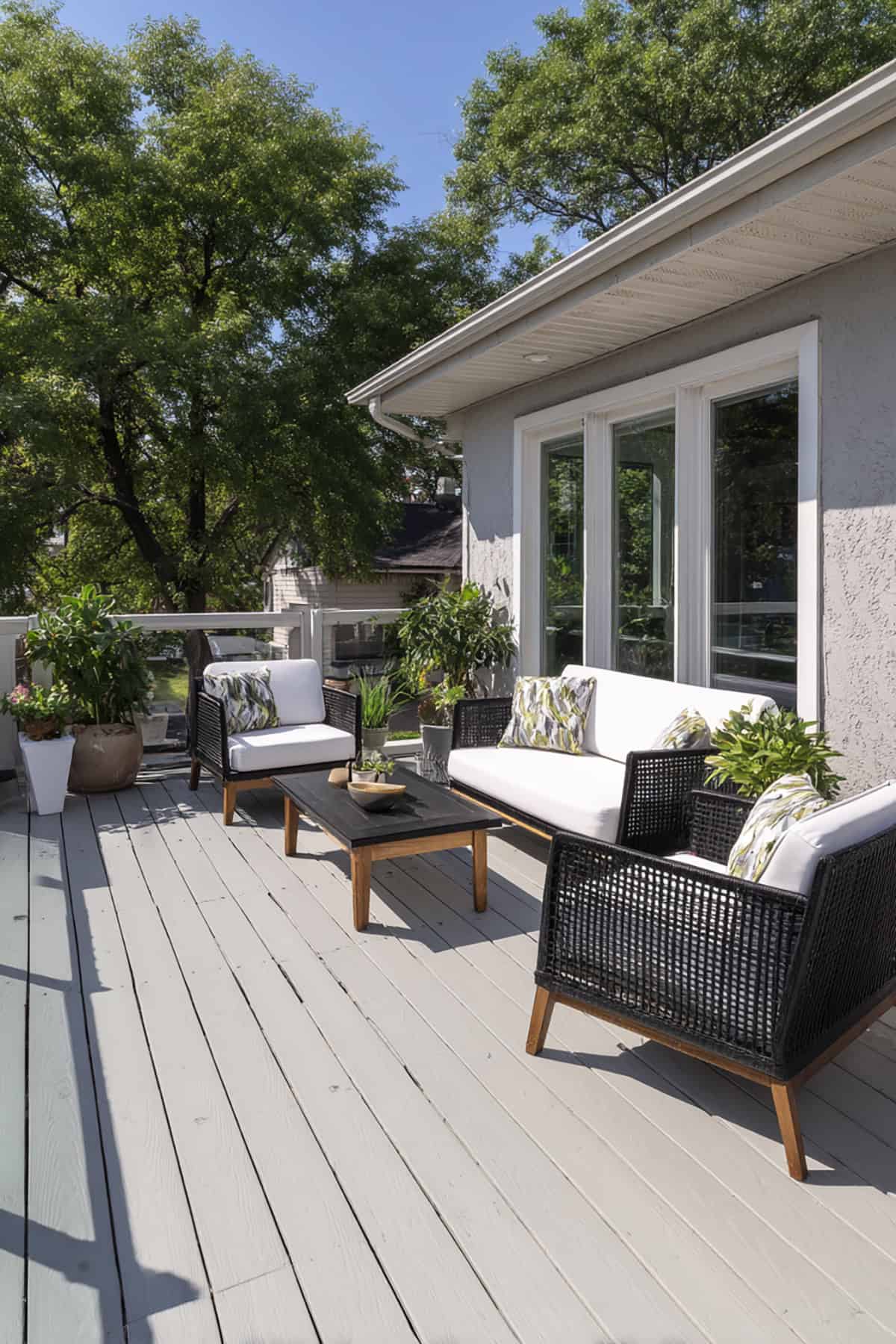
Light Gray
Suggest Paint Colors: Sherwin-Williams Light French Gray SW 0055, Behr Silver Drop, Benjamin Moore Gray Owl
Clean but softer than white, light gray keeps things bright without blinding contrast.
It reflects heat, so it’s pleasant underfoot, and works especially well with blue or gray siding.
Dirt is less visible than on white, but you’ll still notice it more than with darker colors. Makes small decks feel roomier.
Dark Gray
Suggest Paint Colors: Sherwin-Williams Peppercorn SW 7674, Behr Cracked Pepper, Benjamin Moore Chelsea Gray
Moody and bold, dark gray adds instant depth. Furniture and planters really stand out against it.
It can get hot if your deck faces the sun all day, so maybe test a patch first.
Fits modern and minimalist homes, and hides stains better than lighter grays. Especially good for big, open yards.
Dark Brown
Suggest Paint Colors: Cabot Dark Oak, Behr Chocolate Brown, Olympic Espresso
Classic and strong, dark brown gives that woodsy, traditional look. It brings warmth and a little structure to the space.
Surface heat ramps up in summer, so pick a tough exterior paint to keep fading at bay.
Works with brick or tan siding, neutral furniture, and natural fiber decor. It’s grounded and timeless.
Charcoal
Suggest Paint Colors: Behr Charcoal, Sherwin-Williams Iron Ore SW 7069, Benjamin Moore Kendall Charcoal
Charcoal leans bold and dramatic, especially with light siding or white trim. The contrast is eye-catching.
Expect the surface to heat up in direct sun. Rugs or shaded seating help if you’re in a hot area.
It’s fantastic at hiding stains and scuffs. Goes hand-in-hand with modern homes and black metal accents. The vibe is sharp and tidy.
Beige
Suggest Paint Colors: Sherwin-Williams Accessible Beige SW 7036, Behr Swiss Coffee, Benjamin Moore Manchester Tan
Warm without being yellow, beige blends into almost any exterior palette.
You’ll see less dirt than on white, but it still feels bright and open.
Plays nicely with brick, stucco, or stone, and fits both traditional and transitional looks. Keeps things light without stark contrast.
Redwood
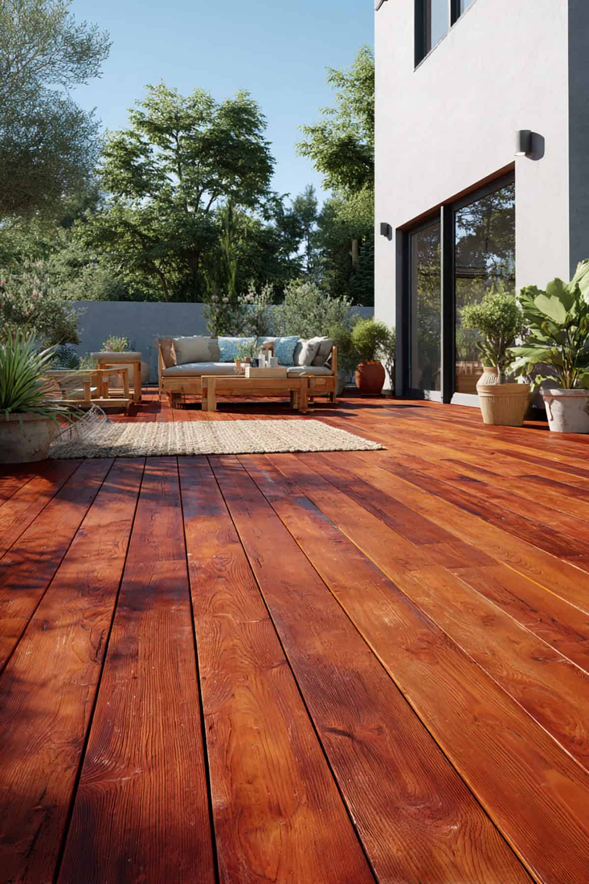
Suggest Paint Colors: Cabot Redwood, Behr Redwood Naturaltone, Olympic Redwood
Redwood brings in that reddish-brown, natural timber tone. It’s warm and adds a little color without going overboard.
Especially nice alongside lush landscaping. The red undertone works with cream or tan siding.
Color can fade with UV, so maintenance matters. Look for products with good color retention.
Mahogany
Suggest Paint Colors: Cabot Mahogany, Behr Mahogany, Olympic Mahogany
Deep red-brown, mahogany creates a polished, almost formal feel. It’s got presence.
This one gets hot in the sun, so it’s best for covered or partially shaded decks.
Pairs with white columns and dark trim, and suits traditional homes. Use a tough paint to keep that rich look.
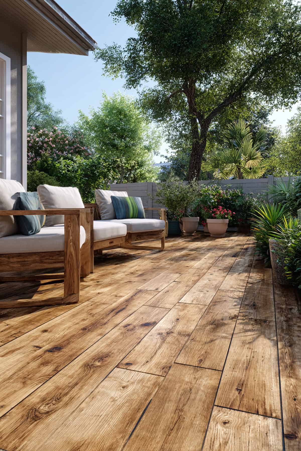
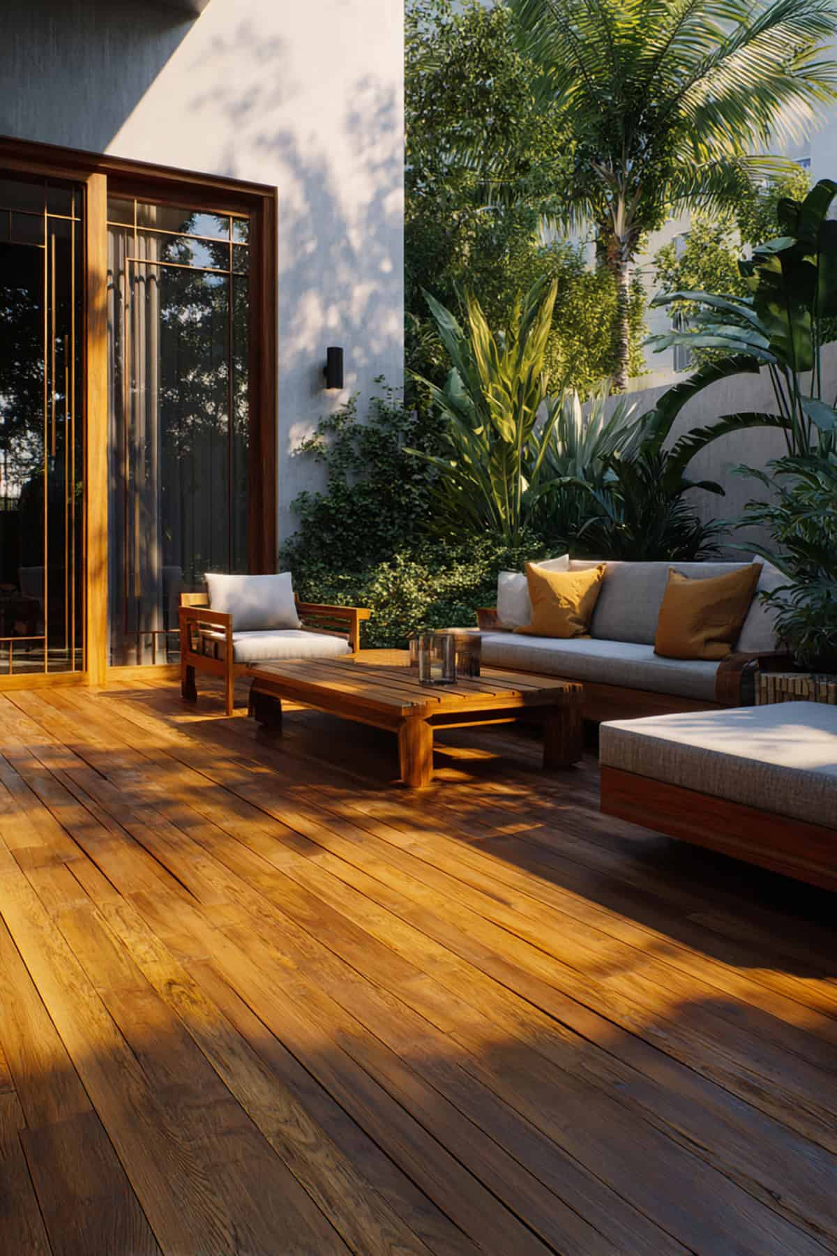
Honey
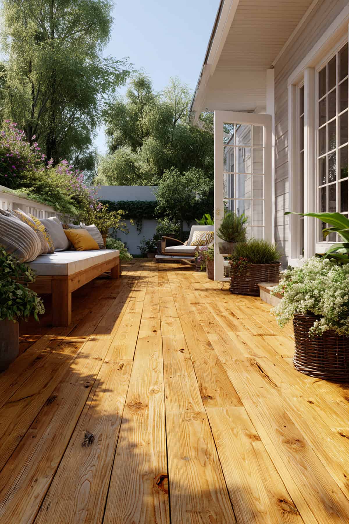
Suggest Paint Colors: Cabot Honey Teak, Behr Honey Brown, Olympic Honey Gold
Golden brown and cheerful, honey brightens wood without making it dark or heavy.
The space feels inviting—great with green lawns and natural stone.
It can show more dirt than deeper browns, so a quick sweep goes a long way. Works for family spaces and laid-back gatherings.
Golden Oak
Suggest Paint Colors: Cabot Golden Oak, Behr Golden Oak, Olympic Golden Oak
Classic and familiar, golden oak echoes the look of interior wood floors. Adds a little warmth and a touch of yellow.
Nice for tying inside and outside together if you’ve got oak indoors.
Pairs with beige or cream siding. Dirt shows a bit but isn’t a big hassle. Fits both rustic and traditional styles.
Espresso
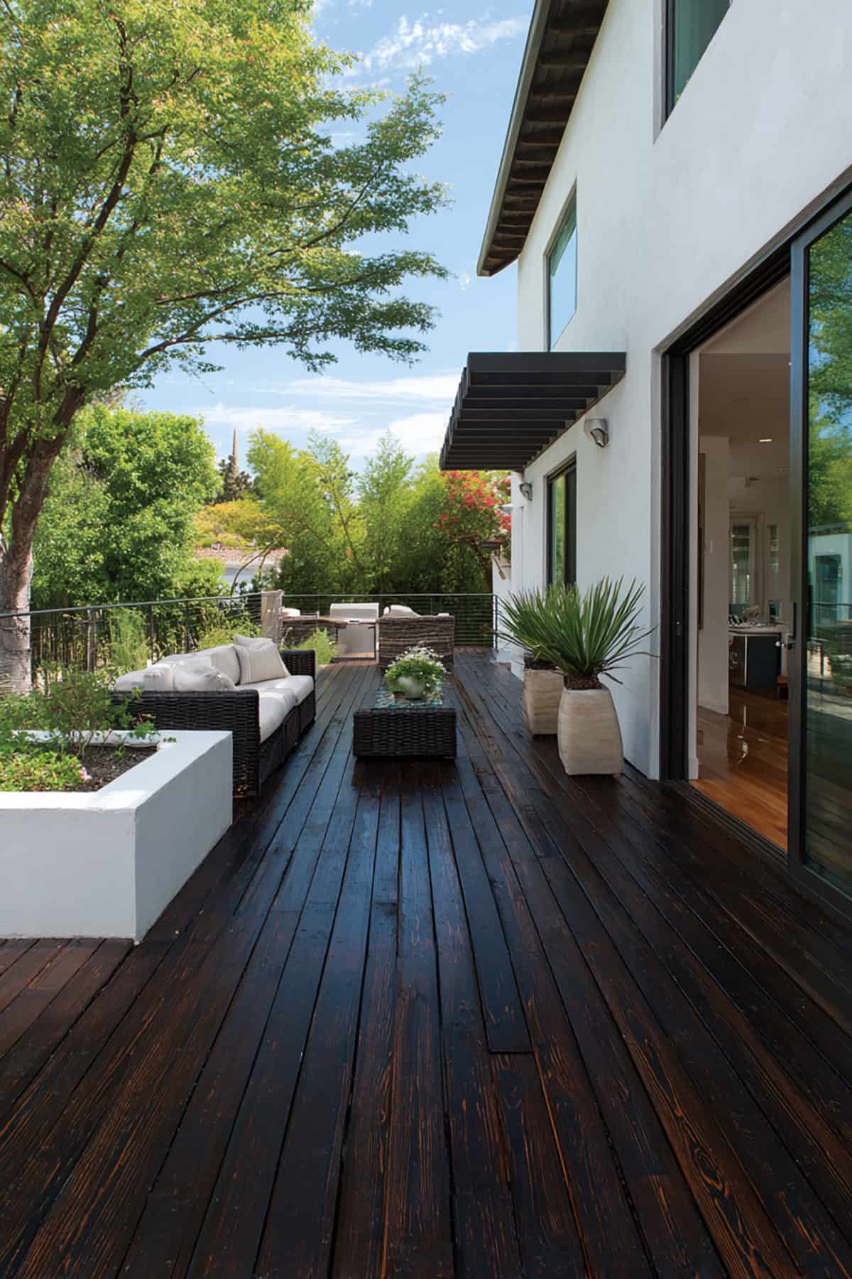
Suggest Paint Colors: Cabot Espresso, Behr Espresso, Olympic Espresso
Almost black, espresso gives serious depth and contrast. It’s a statement, no question.
Surface heat climbs in full sun, so test before you commit.
Ideal for modern or city homes. Stains and scuffs barely show. Light railings pop against it.
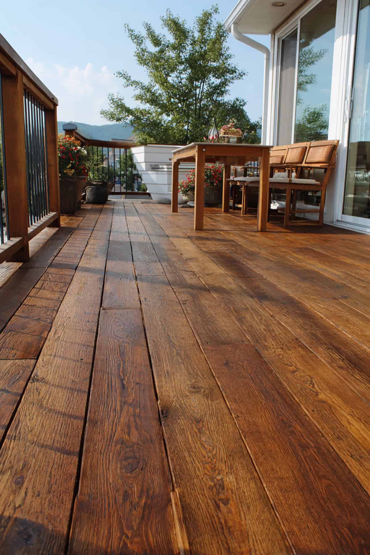
Chestnut
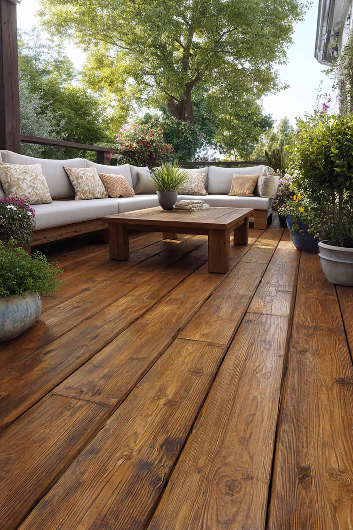
Suggest Paint Colors: Cabot Chestnut Brown, Behr Chestnut, Olympic Chestnut Brown
Chestnut blends red and brown for a richer, warmer take than walnut, but not as intense as mahogany.
You get a natural wood look with a bit of extra color. Works well with earthy exteriors like brick.
High-traffic spots might need the occasional touch-up. Stick with a hardy exterior paint for best results. The overall effect is cozy and solid.
Cedar
Suggest Paint Colors: Cabot Cedar, Behr Cedar Naturaltone, Olympic Cedar
Hints of red and orange give cedar its signature glow, echoing fresh-cut boards.
Perfect if you want to match fences or pergolas, and it slides right into landscaped yards.
Brightens up smaller decks without the harshness of white. Needs UV protection to keep its color from washing out. The atmosphere feels relaxed and welcoming.
Burnt Hickory
Suggest Paint Colors: Cabot Burnt Hickory, Behr Burnt Hickory, Olympic Brownwood
Deep brown with gray undertones, burnt hickory feels sturdy and grounded. It’s a workhorse for busy decks.
Dirt and wear barely register, even in high-traffic areas.
Looks sharp with stone or dark metal. Absorbs heat, so consider your climate. Fits rustic and craftsman homes especially well.
Teak
Suggest Paint Colors: Cabot Teak, Behr Teak, Olympic Teak
Medium golden brown, teak channels a tropical hardwood vibe without going too dark.
Matches teak furniture for a pulled-together look.
Handles sun if you use a good UV-protective finish. White cushions and plenty of plants round out the style. Works for both modern and classic tastes.
Driftwood Gray
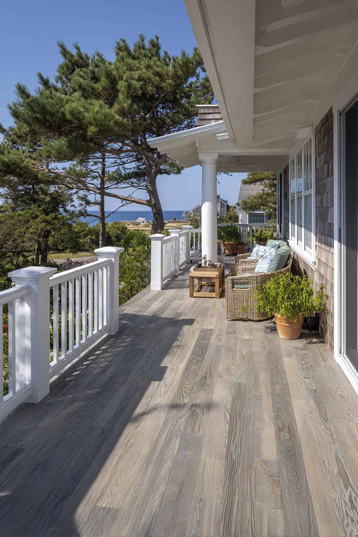
Suggest Paint Colors: Cabot Driftwood Gray, Behr Driftwood Gray, Olympic Driftwood
Soft gray with a hint of beige, driftwood gray has a sun-faded, beachy feel. It’s understated and casual.
Fits right in near water or under bright skies.
Dust and small stains don’t stand out much. White rails and light siding keep the look breezy. A natural for easygoing outdoor spaces.
Clear
Suggest Paint Colors: Cabot Clear, Olympic Clear, Behr Transparent Clear
Clear finishes let the original wood grain take center stage. No color, just protection and texture.
They need more frequent touch-ups than paints—sun can darken or fade wood if you slack off.
Best for premium lumber where you want the wood to show. Only use products rated for outdoor exposure.
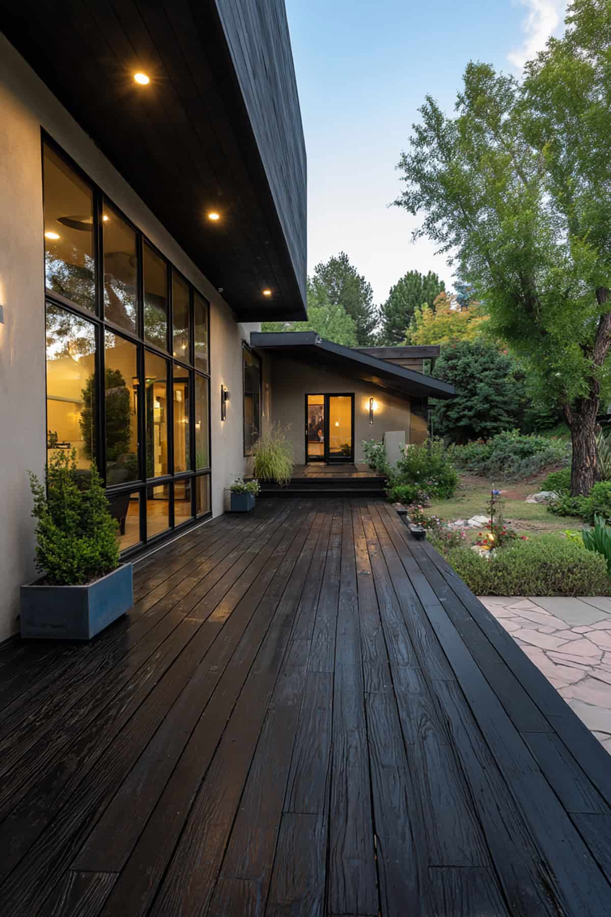
Black
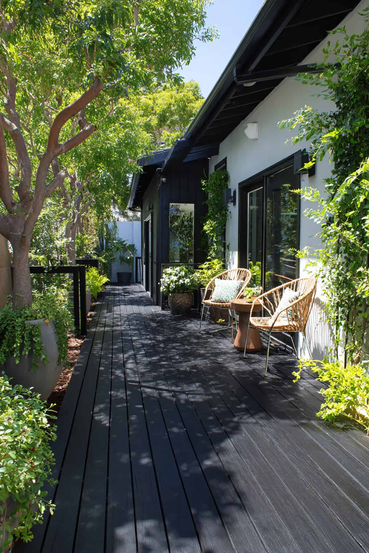
Suggest Paint Colors: Behr Black, Sherwin-Williams Tricorn Black SW 6258, Benjamin Moore Black HC-190
Moody, dramatic, and undeniably bold—black lays down a surface that feels deliberate and intense. Against pale siding or a riot of green, that depth just pops, refusing to blend in.
In full sun, the heat builds fast. You might want to drag over a few shade sails or toss down a rug if you’re barefoot-inclined.
Spills and stains? Not much of a worry here, though dust can be annoyingly obvious. This look vibes with modern architecture and anyone chasing a sharp, confident aesthetic. Stick to premium exterior paint if you care about keeping that color crisp.