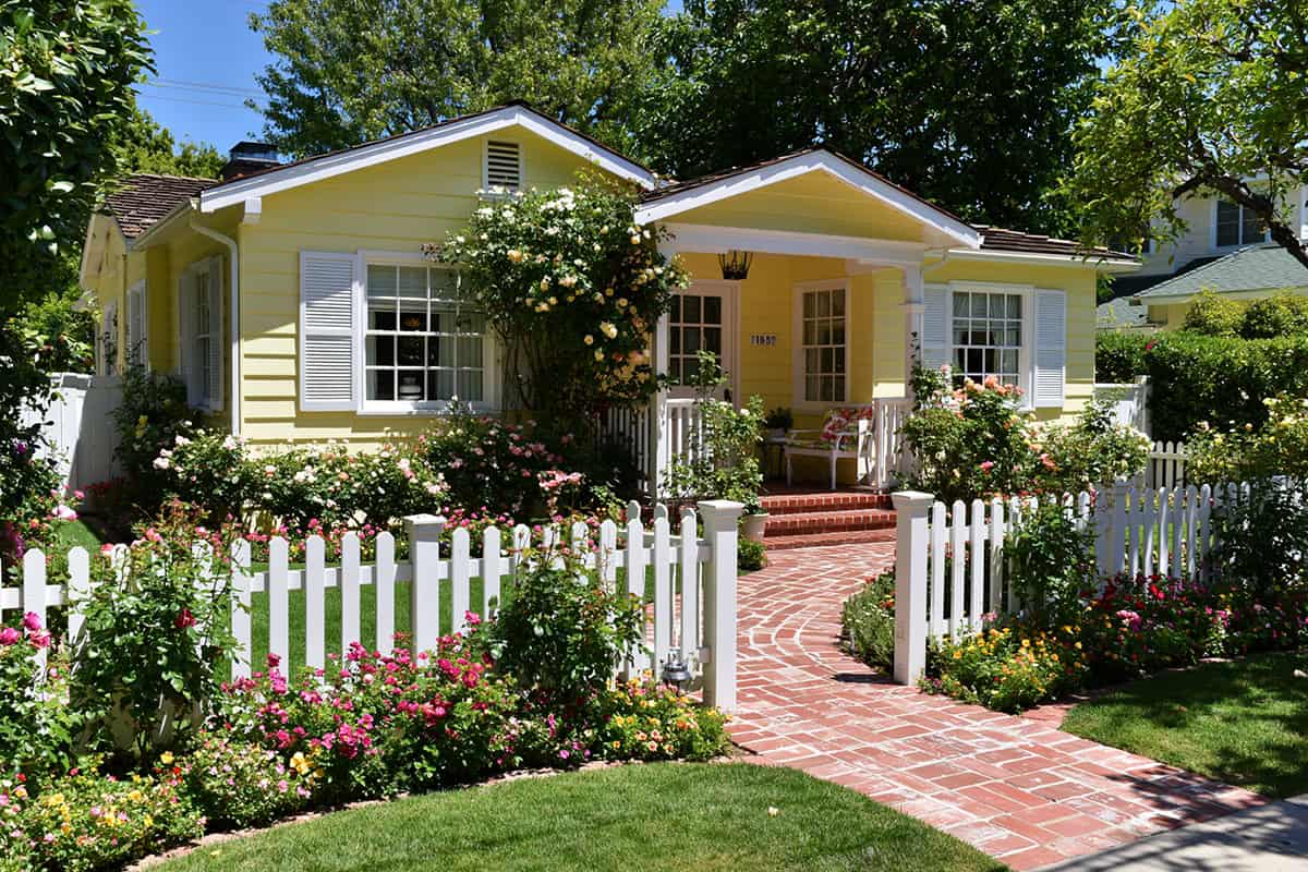
Yellow siding has plenty of charm, yet shutter colors make the final decision much harder than expected. One shade gives the house a crisp, traditional look, while another brings out its warmer side. Tiny paint chips rarely tell the whole story. Browse these 19 ideas before settling on a color.
Table of Contents
Shutter Colors For A Yellow House
The best shutter picks for yellow siding sharpen the look without turning it into a cartoon. Deep green, navy, charcoal, warm grays, even royal blue—they all work, as long as the trim, roof, and front door hold up their end of the palette.
Sage Green
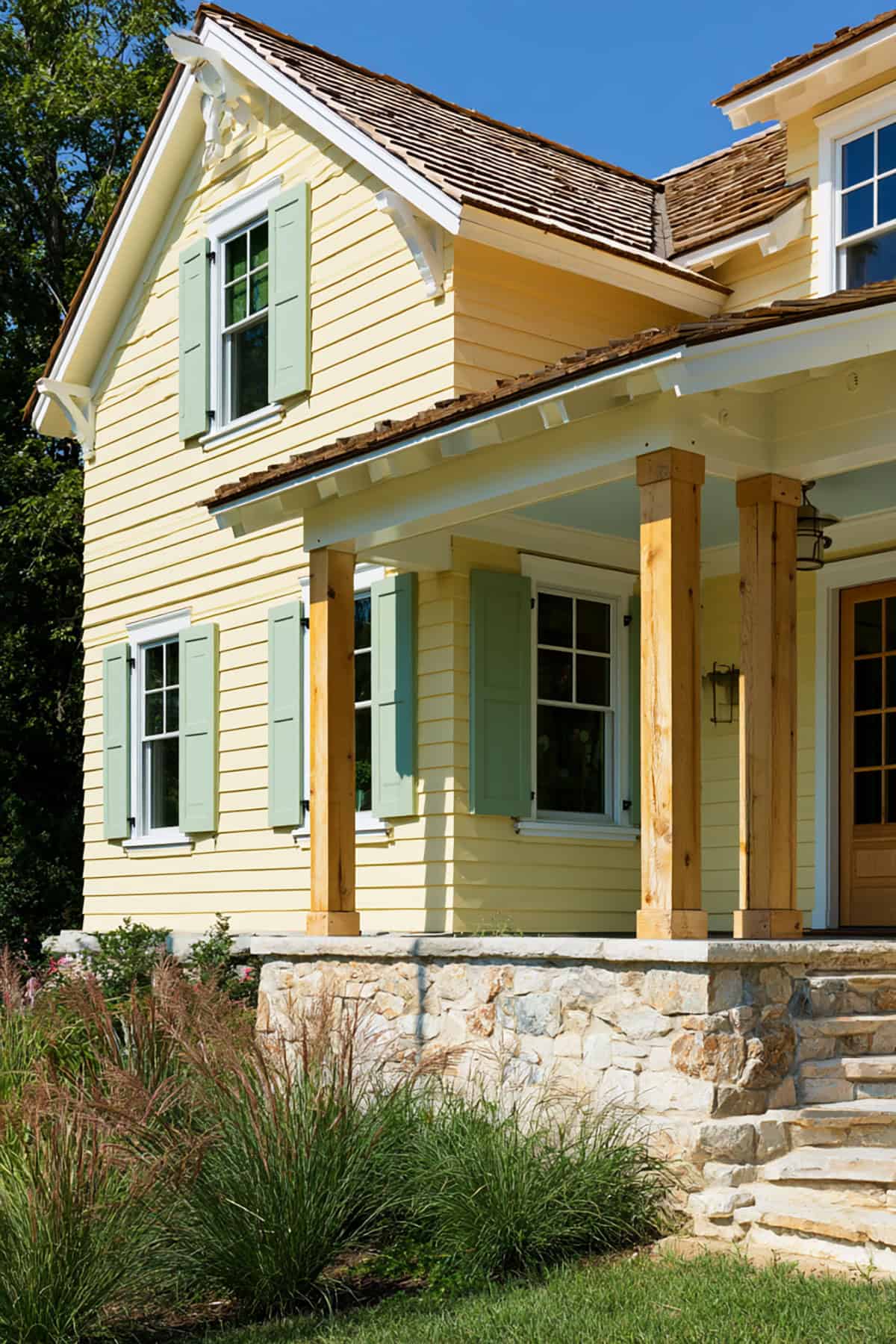
There’s a sun-faded gentleness to a soft yellow farmhouse, and sage steps in quietly. Its gray undertone reins in the sweetness, lending the place some maturity.
White trim, a brown roof, and black hardware round out the look. On board-and-batten or lap siding, sage doesn’t get fussy.
White
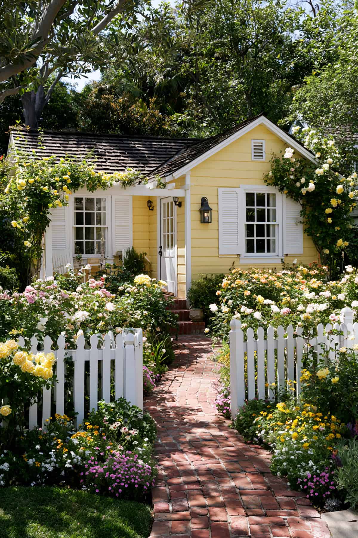
For a cottage, white shutters push the exterior toward a bright, airy look with very little visual weight. That works best when your yellow siding is warm and light, not harsh or saturated.
You need enough contrast elsewhere, usually through a darker roof, painted door, or window sash, so the house does not wash out. On smaller cottages, this combination keeps the scale light and tidy.
Warm Gray
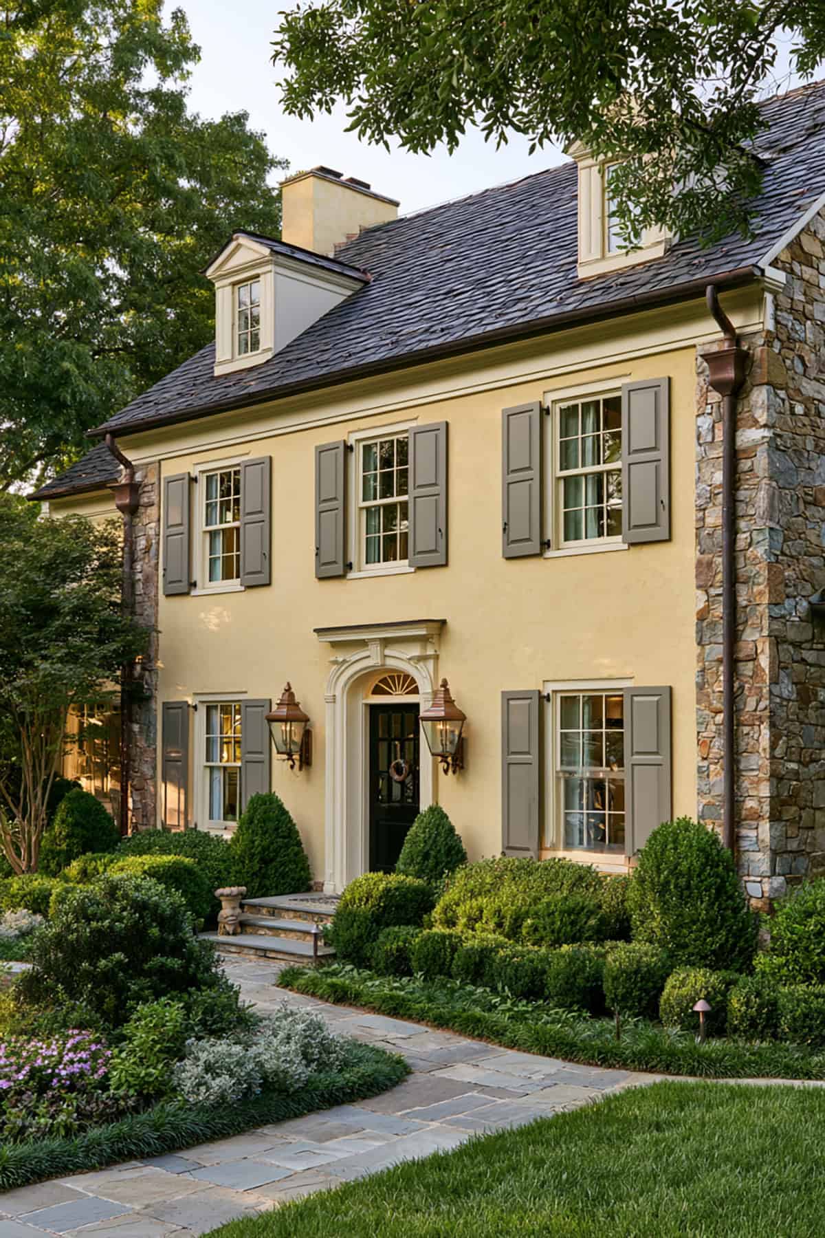
Warm gray pulls yellow siding into a more tailored direction. It trims back the brightness without the severity of black or the cool cast of blue-gray.
I like this choice when the house has stone, beige mortar, or a roof with brown-gray variation.
Taupe
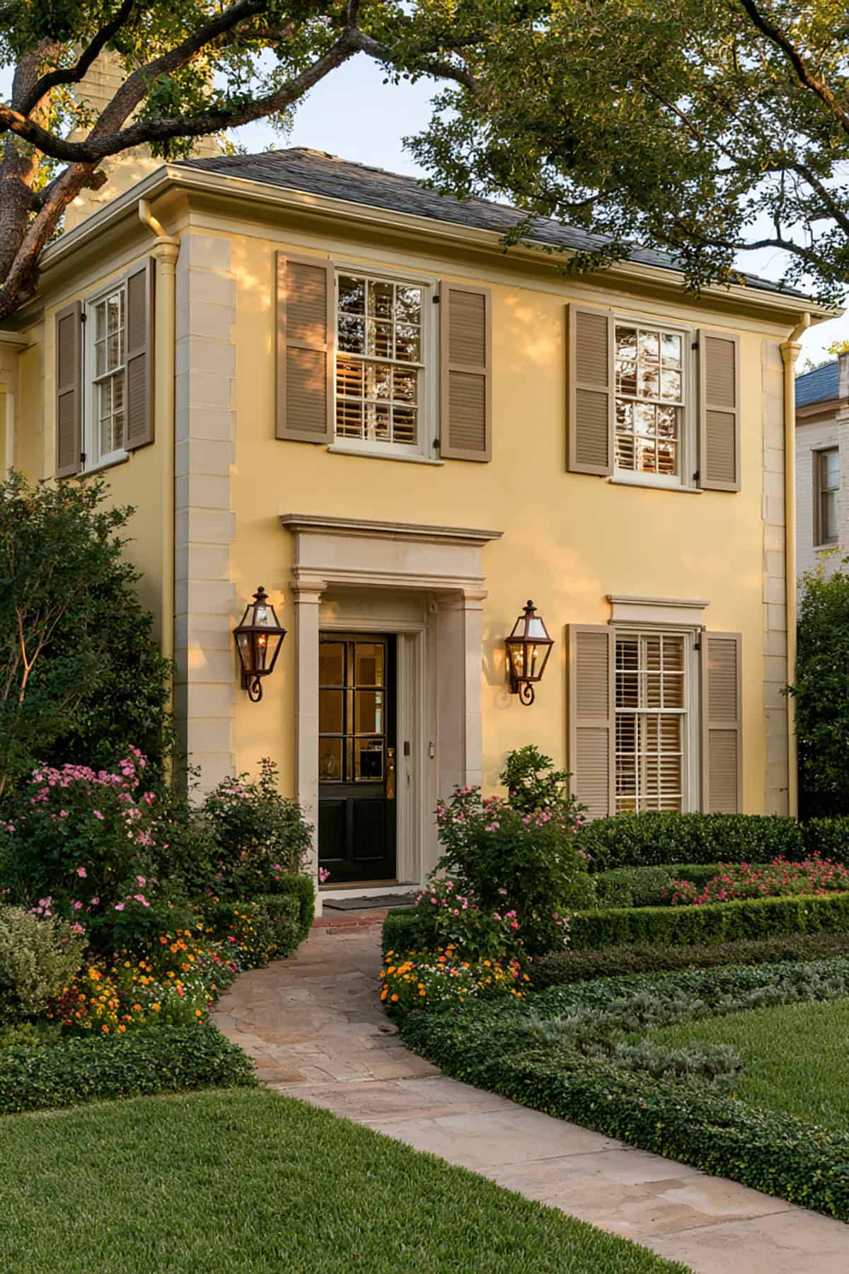
Taupe sits close to yellow in warmth, so the contrast stays understated. That restraint suits traditional homes with symmetrical windows and more formal trim lines.
If your siding leans creamy or antique yellow, taupe shutters keep the facade grounded. This is one of the easier combinations to live with because dirt, pollen, and weathering show less than they do on bright white or deep black.
Slate Blue
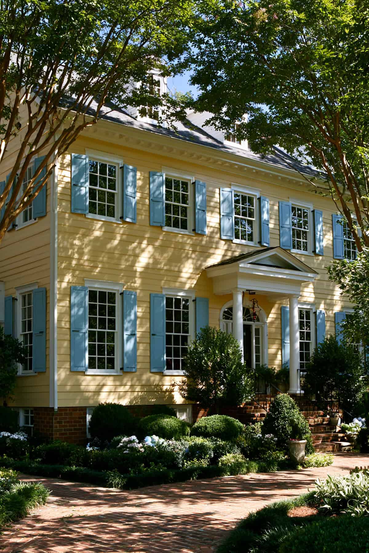
Slate blue shifts a yellow traditional home away from earthiness and toward refinement. The muted blue note cools the siding just enough, especially when your yellow has a golden cast. A brighter blue would read too sharp here, while slate keeps the proportions calm and the elevation balanced.
Pewter Gray
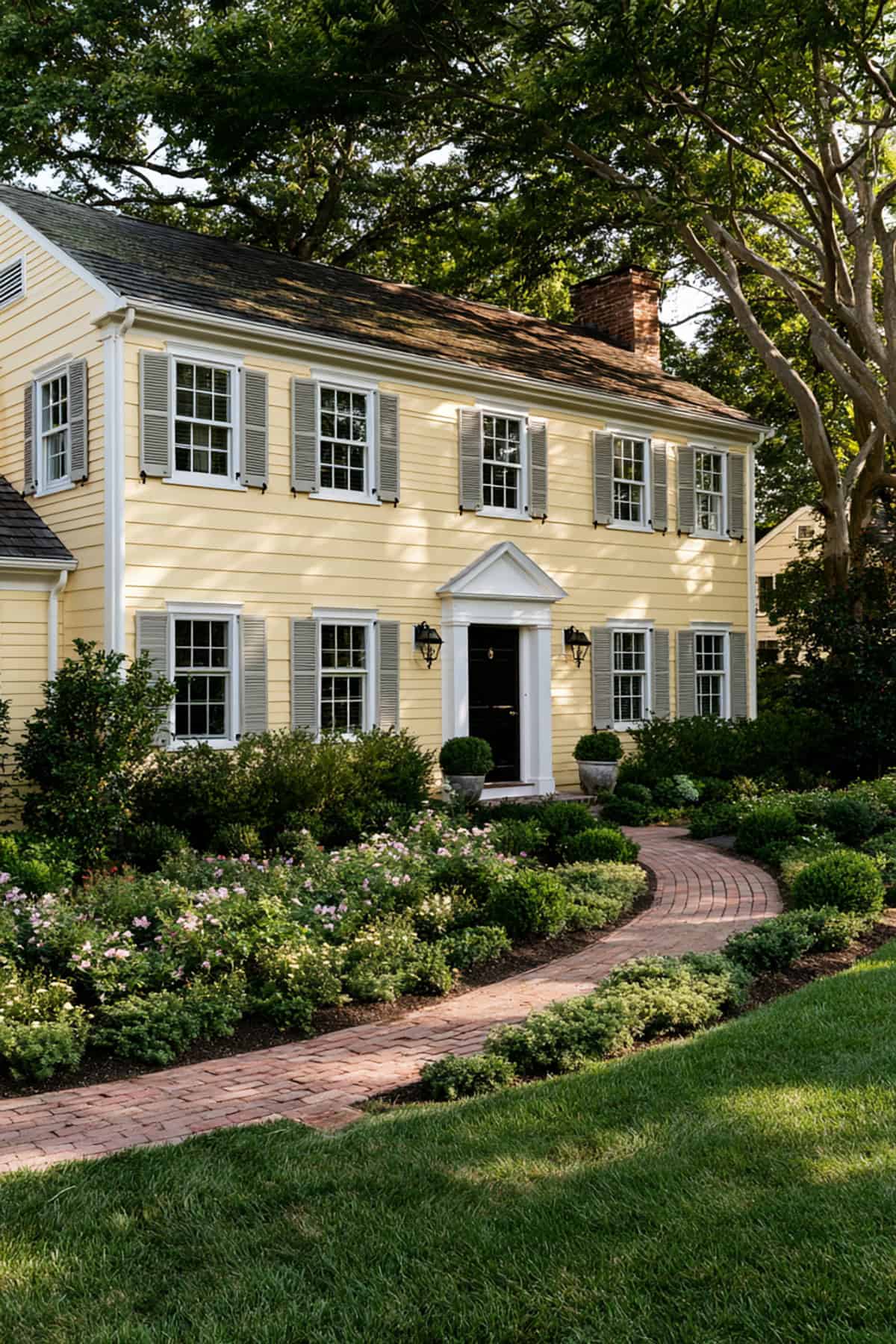
Colonials benefit from disciplined color contrast, and pewter gray respects that structure. It outlines windows clearly without pulling focus from the symmetry.
Against a soft yellow colonial, pewter reads crisp, measured, and slightly historic. I would use it if the roof is slate-toned or the walkway includes bluestone, brick, or aged concrete.
Olive Green
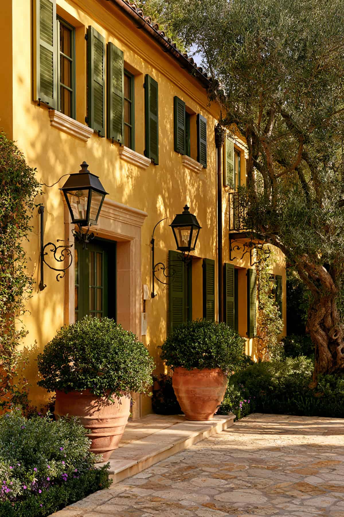
Olive gives yellow siding more depth than sage and more subtlety than hunter green. The effect is grounded, especially when the landscape includes mature shrubs, climbing vines, or heavy tree cover.
This pairing suits houses that need integration with the site rather than sharp contrast. If your yellow is earthy rather than lemony, olive lands in exactly the right register.
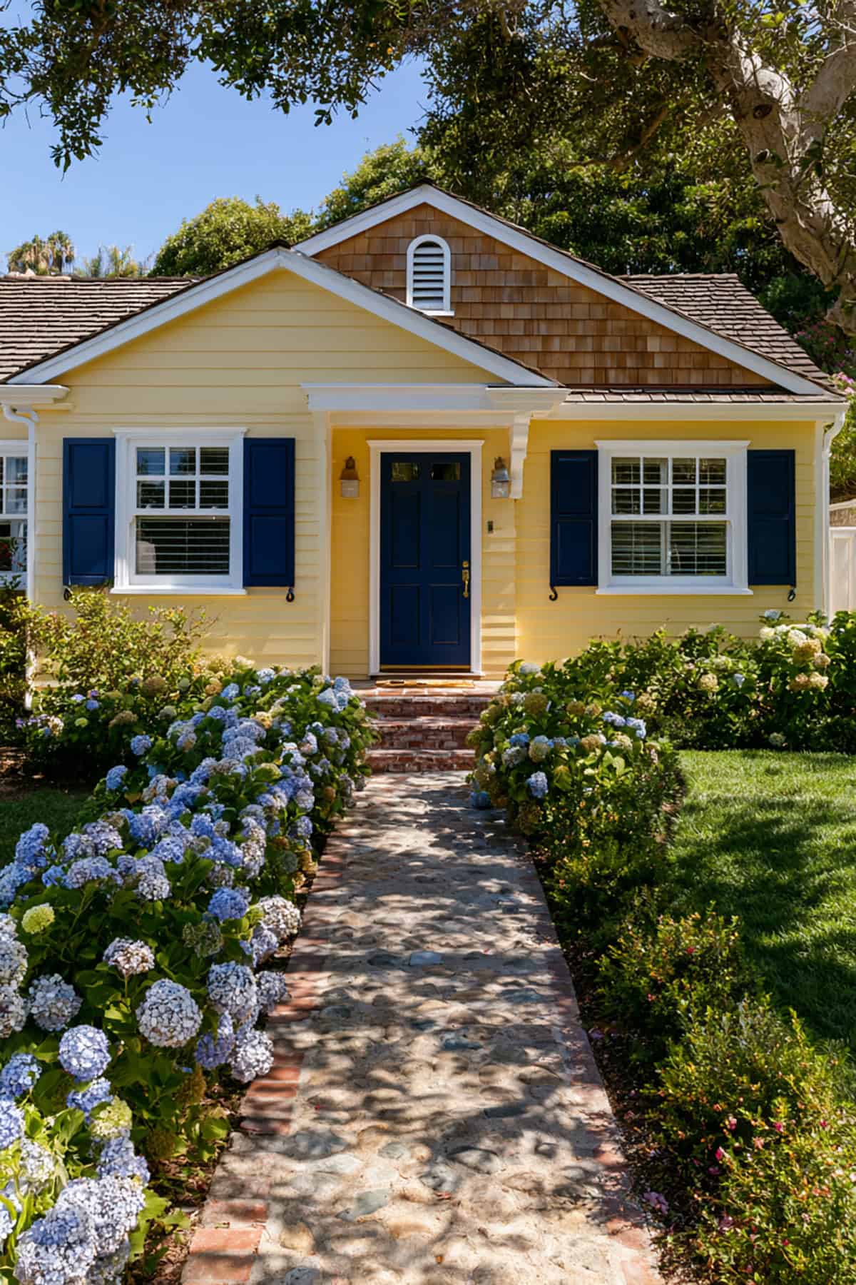
A yellow coastal cottage can tip too playful if the colors are too bright. Navy fixes that by introducing depth and a clean edge around the windows.
White trim matters here. It separates the yellow siding from the navy shutters and keeps the palette crisp instead of heavy. This is one of the strongest choices when your house gets strong sun all day.
Hunter Green
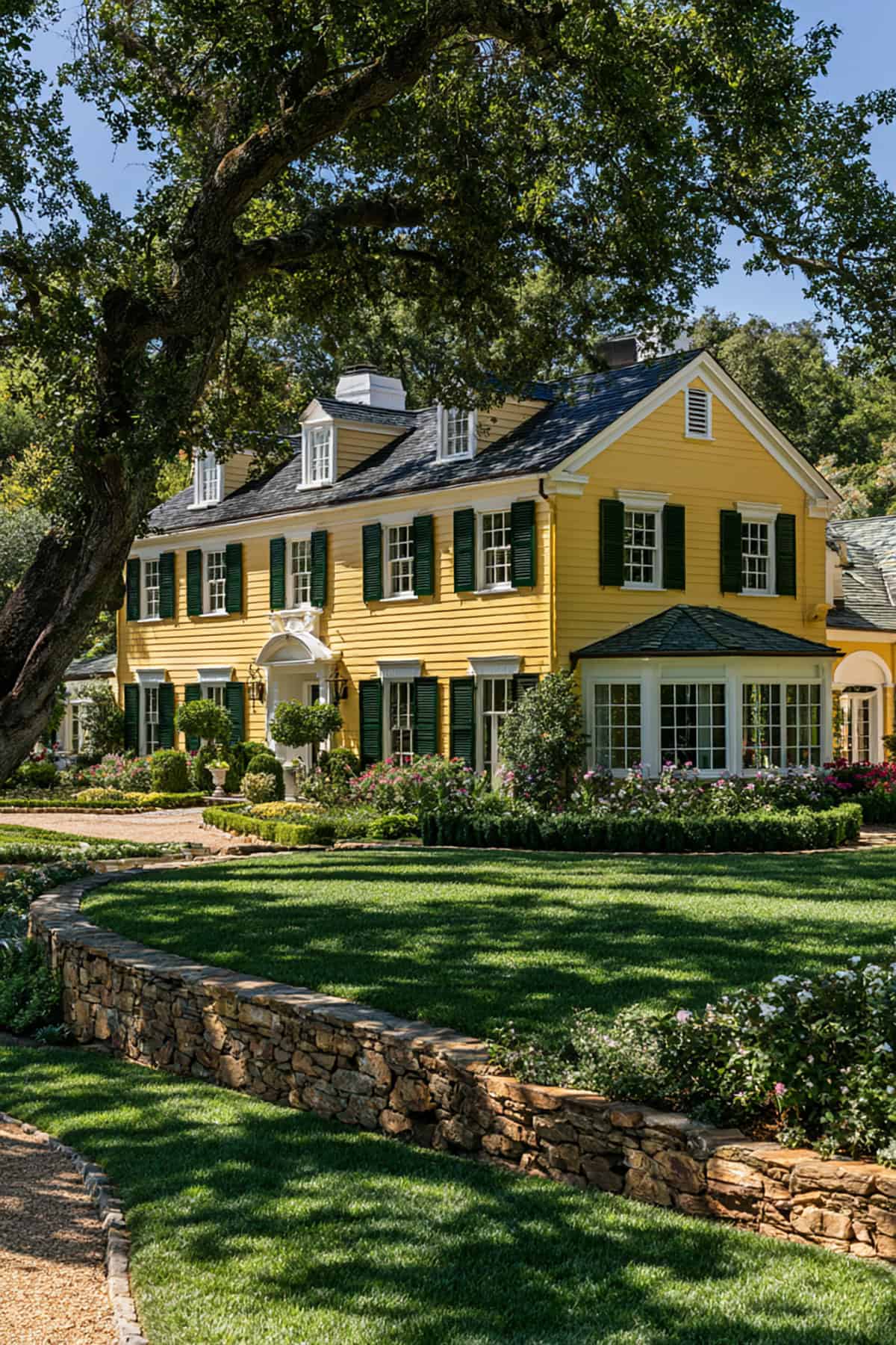
Scale changes the equation. On a larger estate home, hunter green gives enough mass and richness to hold its own against broad walls of yellow siding.
This color belongs with formal landscaping, darker roofing, and substantial trim details.
Greige
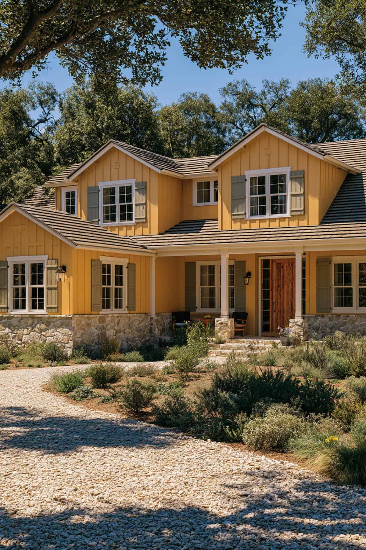
Greige takes farmhouse yellow in a quieter direction than white or black. It sits between warm and cool, which helps when your roof and foundation do not match perfectly.
That flexibility is valuable on remodeled exteriors where siding, stone, and porch columns come from different eras. Greige smooths those transitions and keeps the house from looking pieced together.
French Blue
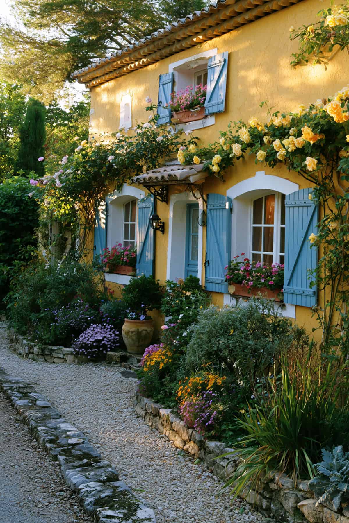
French blue gives a yellow cottage a lighter, more decorative contrast than navy. The effect is brighter and more relaxed, especially with creamy yellow siding and white trim.
You need the right yellow for this. If the siding is too saturated, the pairing gets loud fast. On a buttery cottage with paneled shutters and a painted porch floor, it lands neatly.
Forest Green
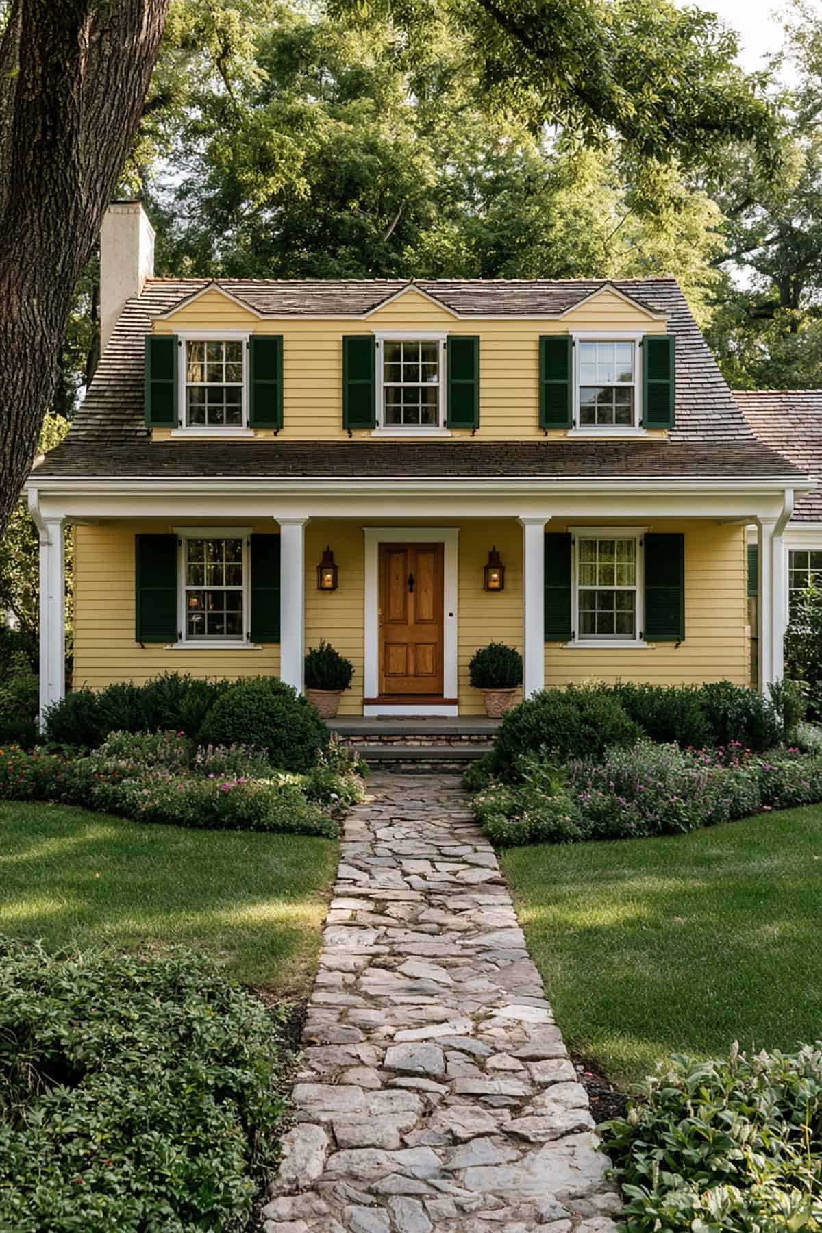
Forest green reads darker and cooler than olive, with more visual authority at the window line. That strength works well on farmhouses with taller elevations, deep porches, or black metal lighting.
Use it when your yellow has enough warmth to offset the green’s depth. On pale cool yellow, forest green looks too stark.
Espresso Brown
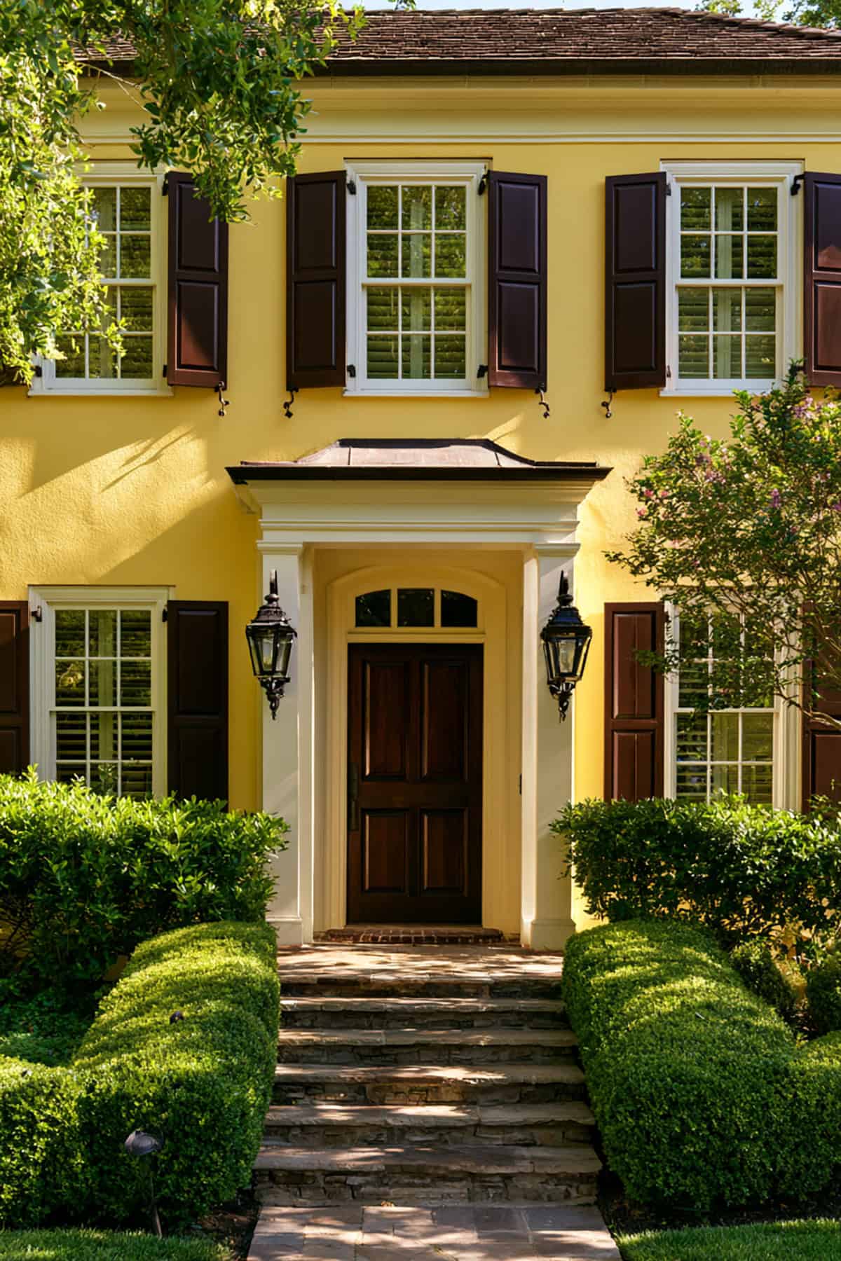
Brown is easy to dismiss until you see it against warm yellow brick or siding with tan trim. Espresso gives the exterior weight and ties neatly to stained doors, wood soffits, and darker roof shingles.
Deep Teal
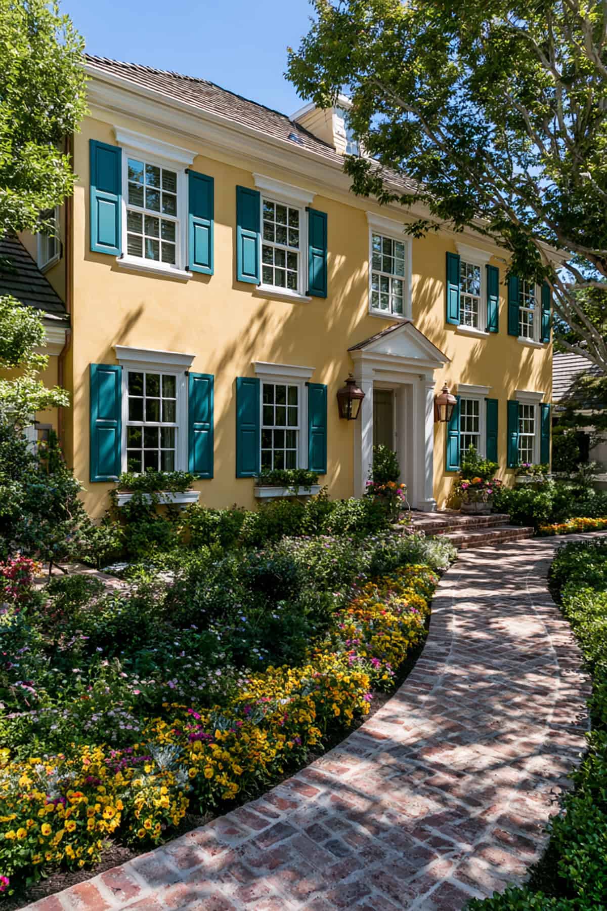
Deep teal introduces more saturation than slate or navy, so the color relationship gets sharper and more distinctive. On the right house, that extra tension looks deliberate and expensive.
Keep the rest of the palette controlled: white trim, dark roof, restrained door color. If too many accent colors are already in play, deep teal starts to compete instead of anchor.
Dark Bronze
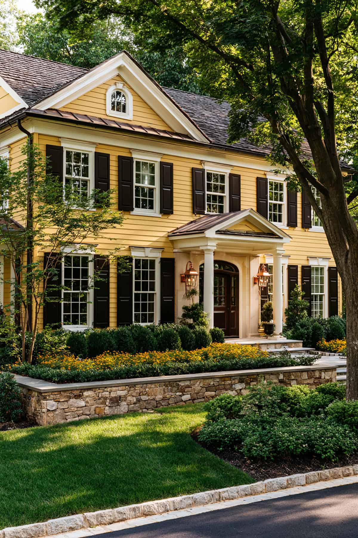
Dark bronze sits in an unusual middle ground between brown, charcoal, and black. That complexity helps when your yellow siding has a muted, historic cast rather than a bright suburban tone.
In late-day light, bronze reads softer than black and richer than flat gray. It pairs especially well with bronze light fixtures, aged brick, and warm off-white trim.
Charcoal Gray
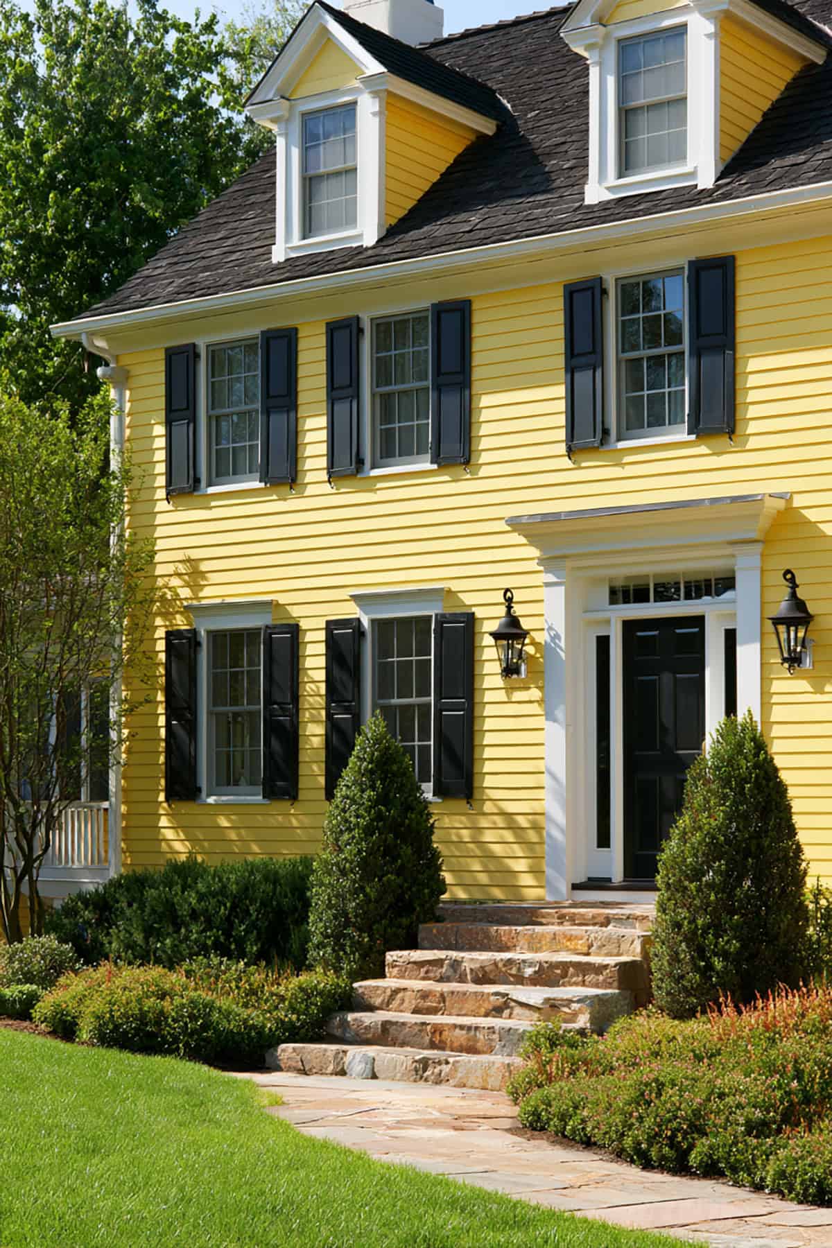
For stronger definition, charcoal is one of the safest and sharpest answers. It outlines windows with real depth and gives bright yellow siding a modern edge.
I reach for charcoal when the house has clean trim lines or a roof with cool gray notes. It also holds up visually through every season, which matters if your landscaping changes the house’s color context across the year.
Burgundy
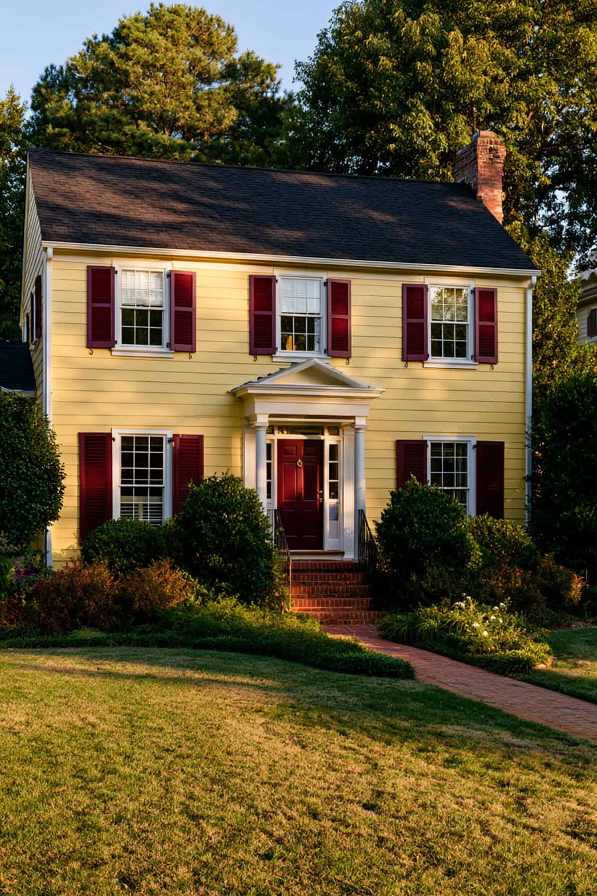
Burgundy brings old-house energy to yellow siding. The red base warms the facade while the depth keeps the color from reading flashy.
This pairing fits well with traditional exteriors with brick walks, dark doors, or older trim profiles. On a plain facade with no supporting materials, burgundy may look disconnected.
Brick Red
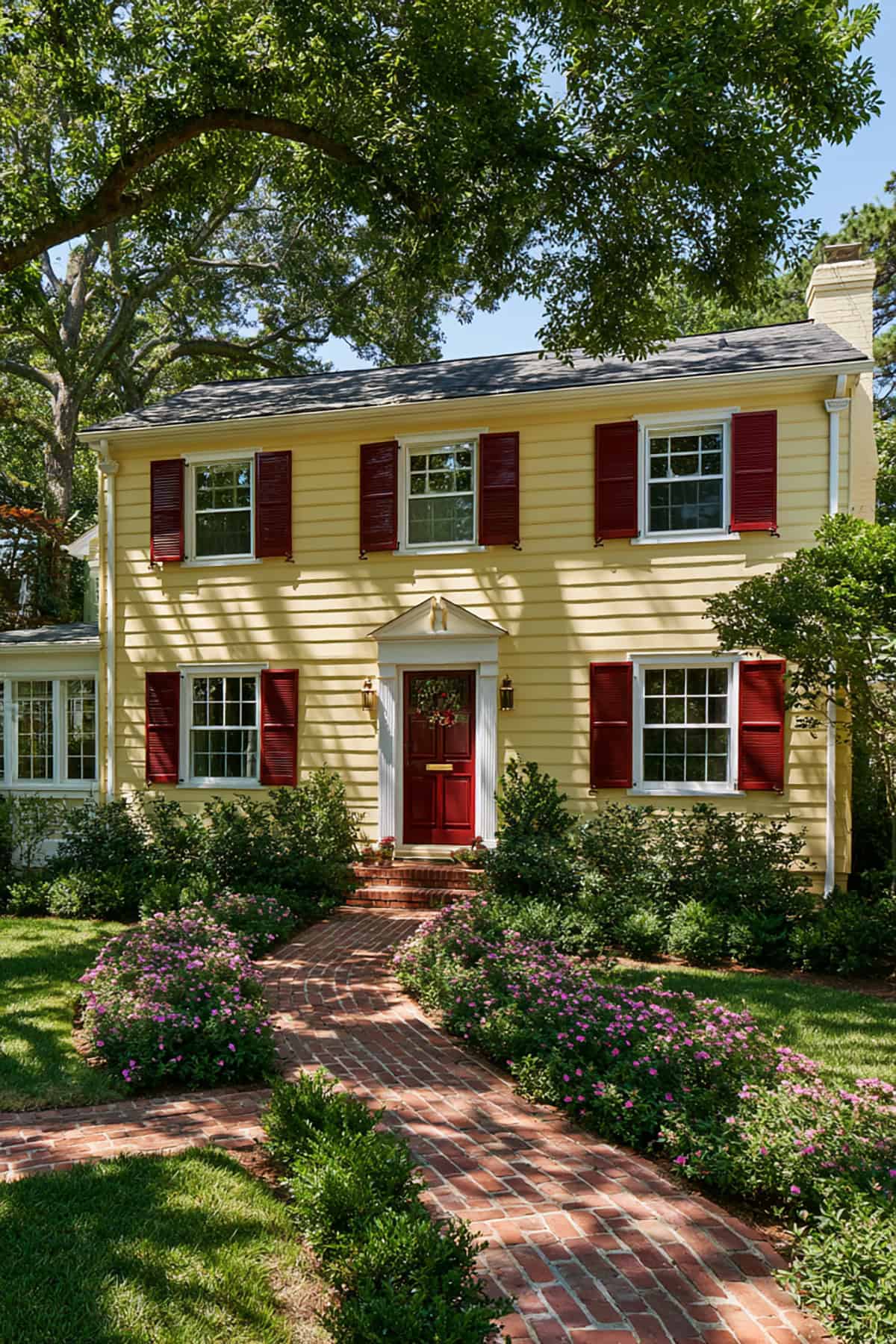
A colonial already has enough formality to support stronger historic color pairings. Brick red works particularly well when the home includes red masonry steps, a chimney, or a brick foundation.
The yellow matters here. Softer ochre or muted cream-yellow sits well with red, while high-chroma lemon yellow looks too sharp.
Black
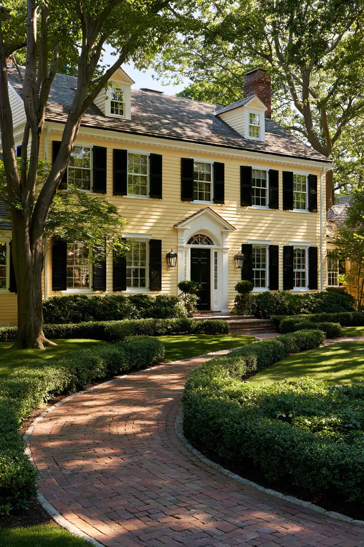
Black remains the clearest high-contrast option for a yellow colonial house. It sharpens symmetry, strengthens window placement, and gives even modest siding a more structured presence.
Black contrasts best if the trim is white or off-white, and the roof carries enough darkness to echo the shutters. If your yellow is pale and classic, black delivers the cleanest, most decisive curb appeal of the group.