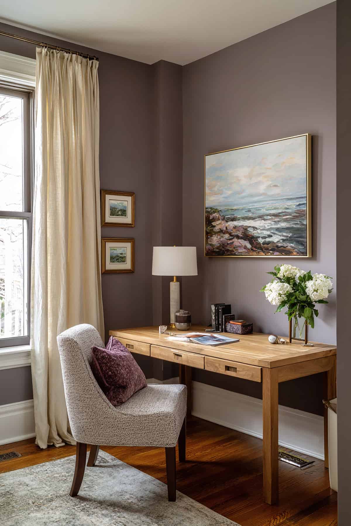
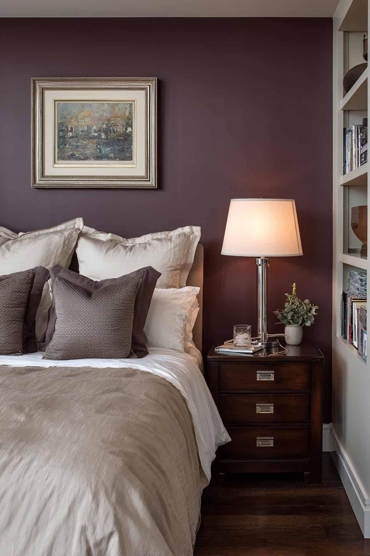
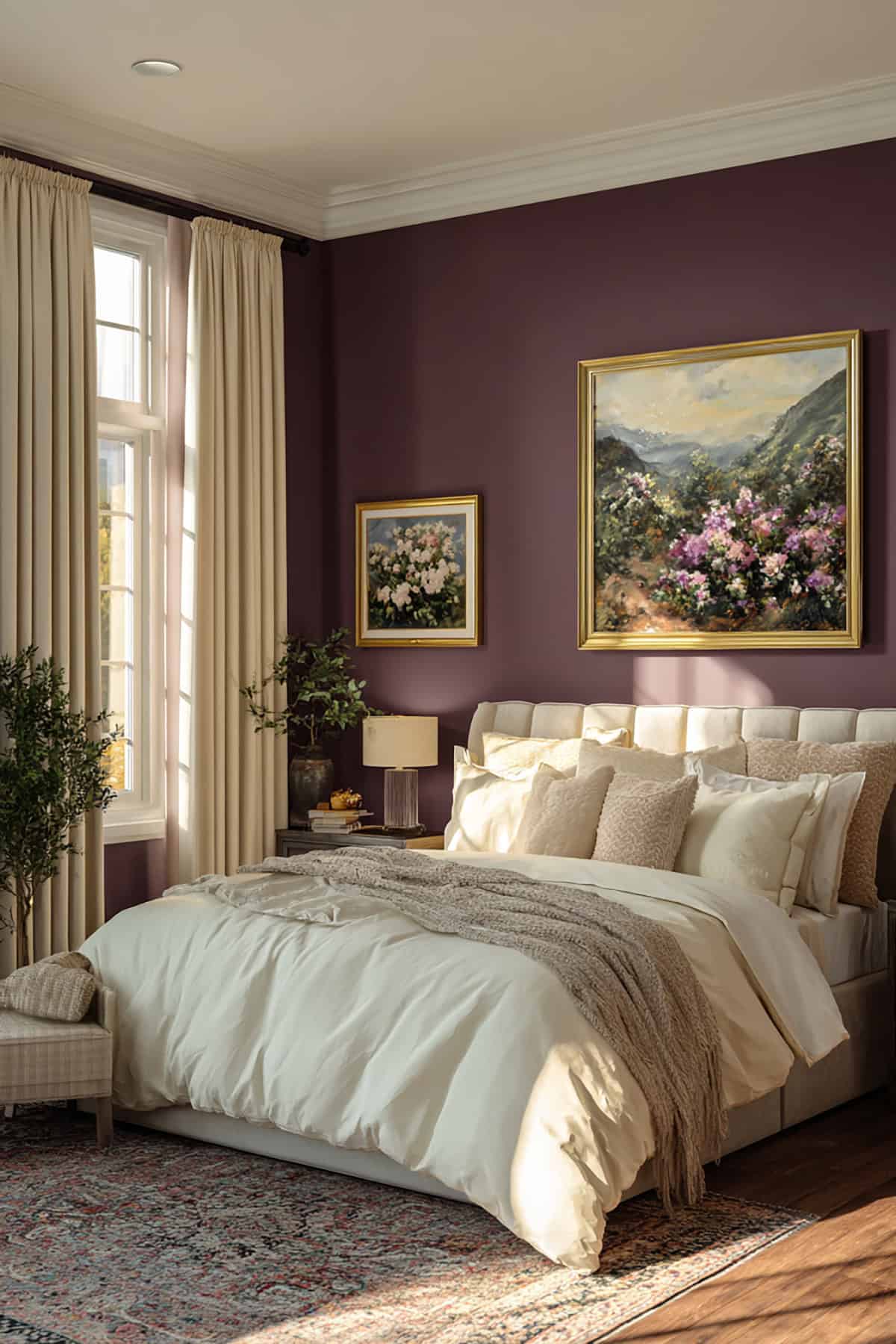
Plum often sits in that sweet spot between dramatic and comforting. It pairs beautifully with neutrals, wood tones, and soft metallics. Still, not every plum shade works the same way in a space. Undertones and lighting play a huge role in the final look. A thoughtful shortlist can prevent costly mistakes. Check out the article to see the 14 best plum paint colors.
Table of Contents
- Plum Paint Colors
- Benjamin Moore Shadow (2117-30)
- Sherwin-Williams Plum Brown (SW 6272)
- Benjamin Moore Kalamata (AF-630)
- Sherwin-Williams Enigma (SW 6018)
- Benjamin Moore Grandfather Clock Brown (2096-70)
- Sherwin-Williams Mature Grape (SW 6286)
- Benjamin Moore Dark Purple (2073-10)
- Sherwin-Williams Wallflower (SW 6281)
- Farrow & Ball Brinjal (No. 222)
- Benjamin Moore Purple Rain (1386)
- Sherwin-Williams Grape Harvest (SW 6285)
- Benjamin Moore French Violet (1427)
- Sherwin-Williams Wisteria (SW 6822)
- Benjamin Moore Caponata (AF-650)
Plum Paint Colors
There’s something about deep plum tones—they bring a sense of calm and a kind of quiet self-assurance. They’re earthy but still sophisticated, and the way they shift under different lights keeps things interesting.
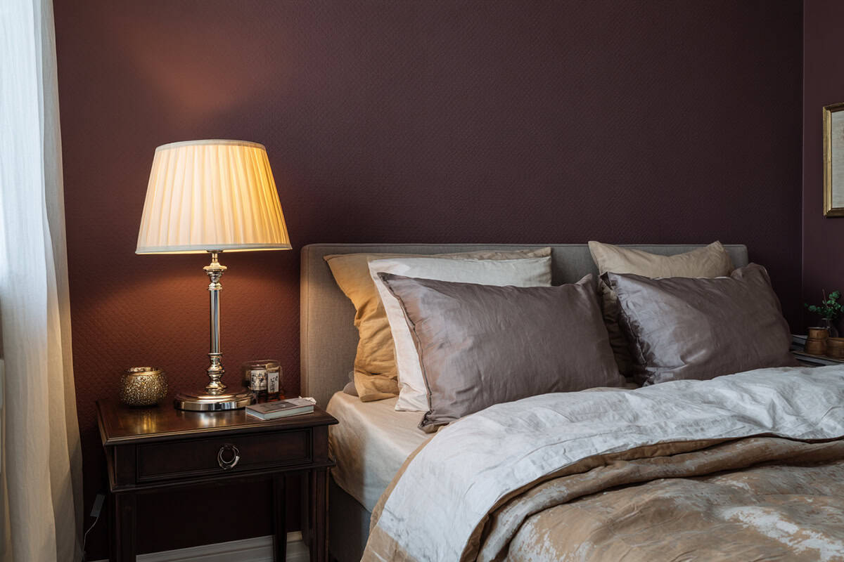
Benjamin Moore Shadow (2117-30)
This one’s got a moody charcoal vibe underneath the plum, so it doesn’t scream “purple.” In low light, you might even mistake it for black.
It’s a go-to for bold walls, especially if your furniture’s on the lighter side. Pairs nicely with soft whites, taupe, and a bit of brushed brass. Small rooms actually feel more inviting, not boxed in, thanks to how it handles light.
Sherwin-Williams Plum Brown (SW 6272)
Plum Brown leans warm, not your usual purple. It’s kind of a dark brown with a berry twist—unexpected, but it works.
Drop it into living rooms for a subtle splash of color. It’s friendly with warm metals and medium woods, but if you throw in gray floors or creamy textiles, you’ll catch a hint of violet peeking through.
Benjamin Moore Kalamata (AF-630)
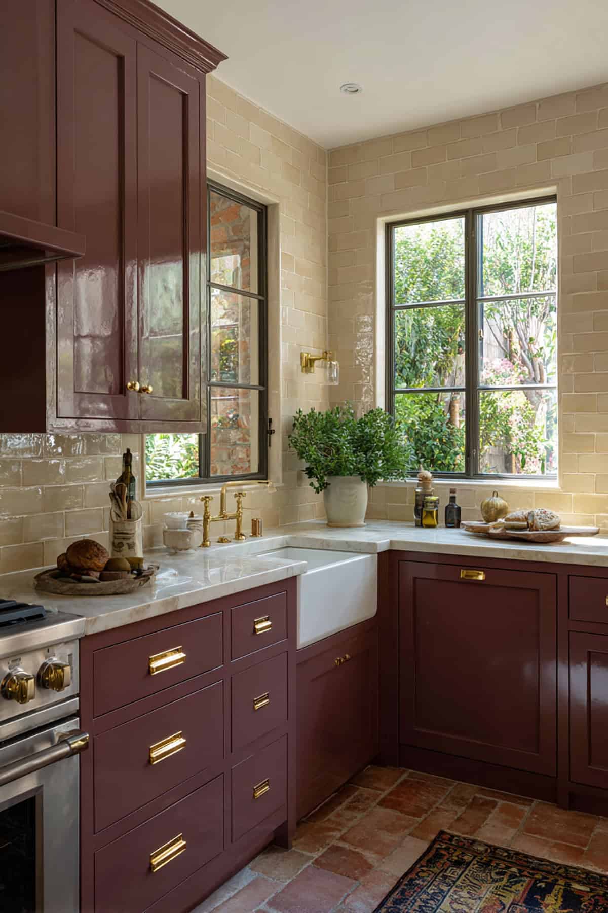
Kalamata’s got that olive-meets-purple thing going on. It feels grounded, not flashy, and it fits right in with both classic and in-between styles.
Try it on cabinets or built-ins if you want contrast against pale walls. It really makes architectural details pop, and it doesn’t look out of place whether the lights are on or it’s daylight. Rich fabrics like wool or velvet get along with it, too.
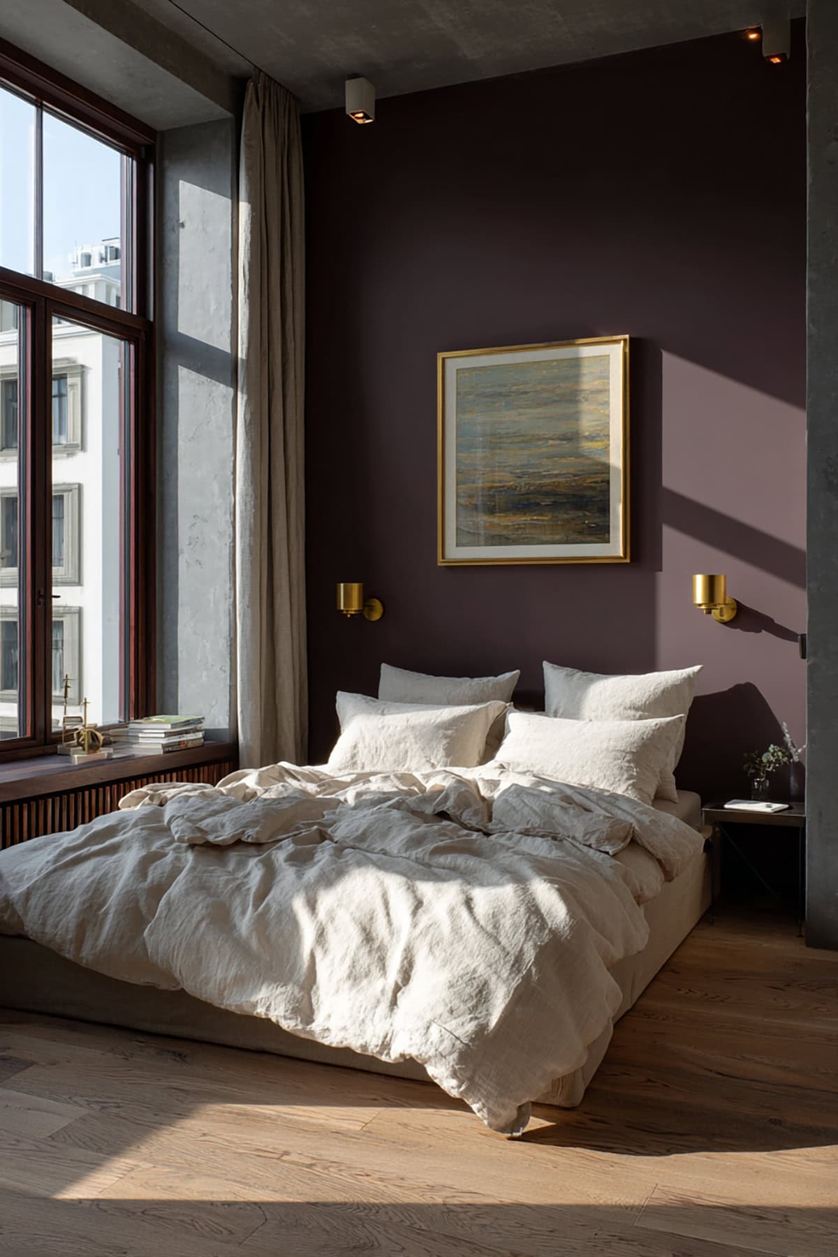
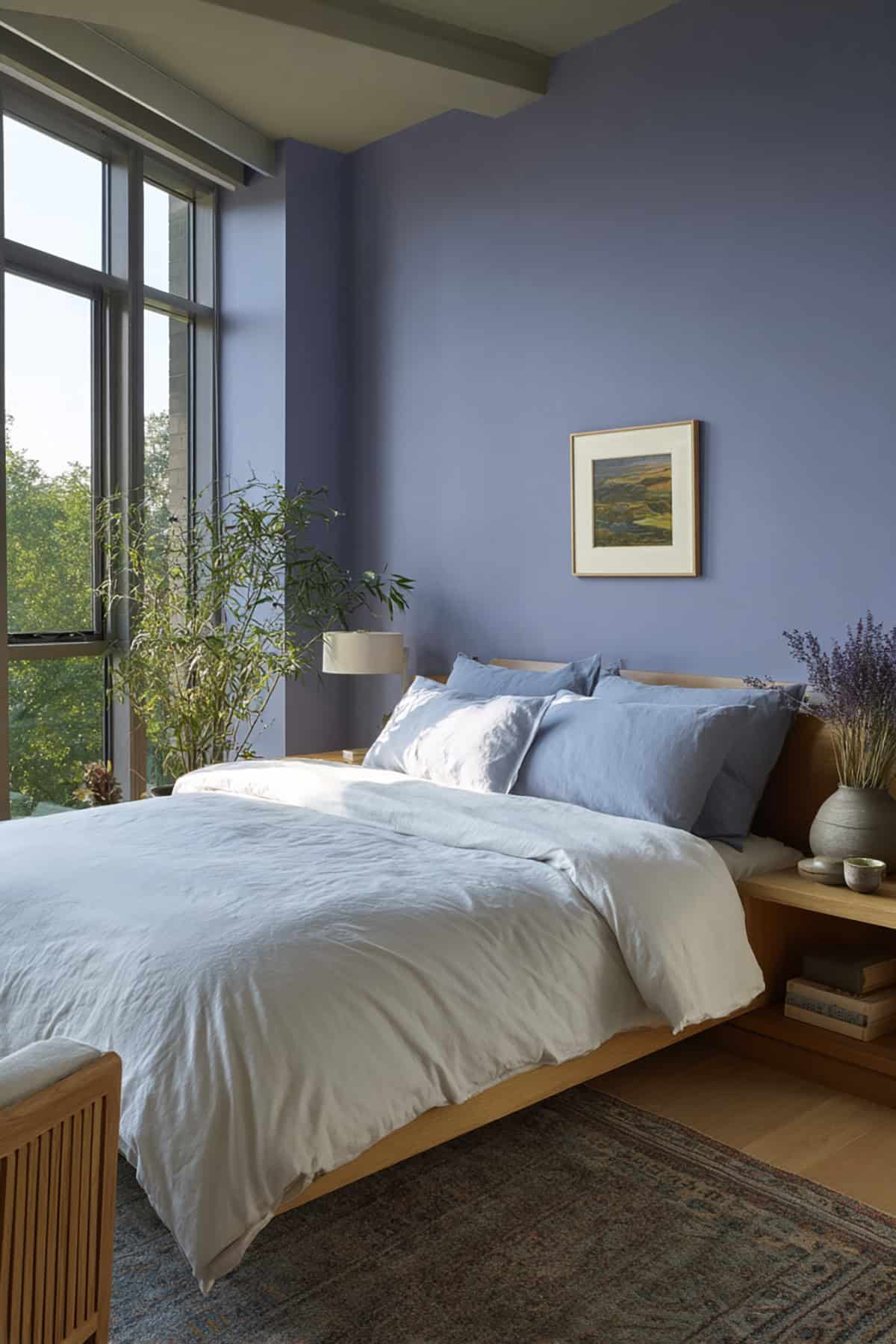
Sherwin-Williams Enigma (SW 6018)
Enigma falls somewhere between plum and aubergine—mature, colorful, but not loud. It’s got depth, but it won’t weigh down a space.
It’s a solid pick for bedrooms or little reading nooks. Matte finishes show off its understated side best, and it works nicely with natural wood or cool neutrals.
Benjamin Moore Grandfather Clock Brown (2096-70)
Despite the name, you’re getting a muted plum-brown with a touch of red underneath. Kind of reminds you of old, beautifully worn wood.
It’s a natural on accent furniture or interior doors. Set against cream or stone-gray, it feels pretty upscale. It’s flexible enough to work with both rustic and modern looks.
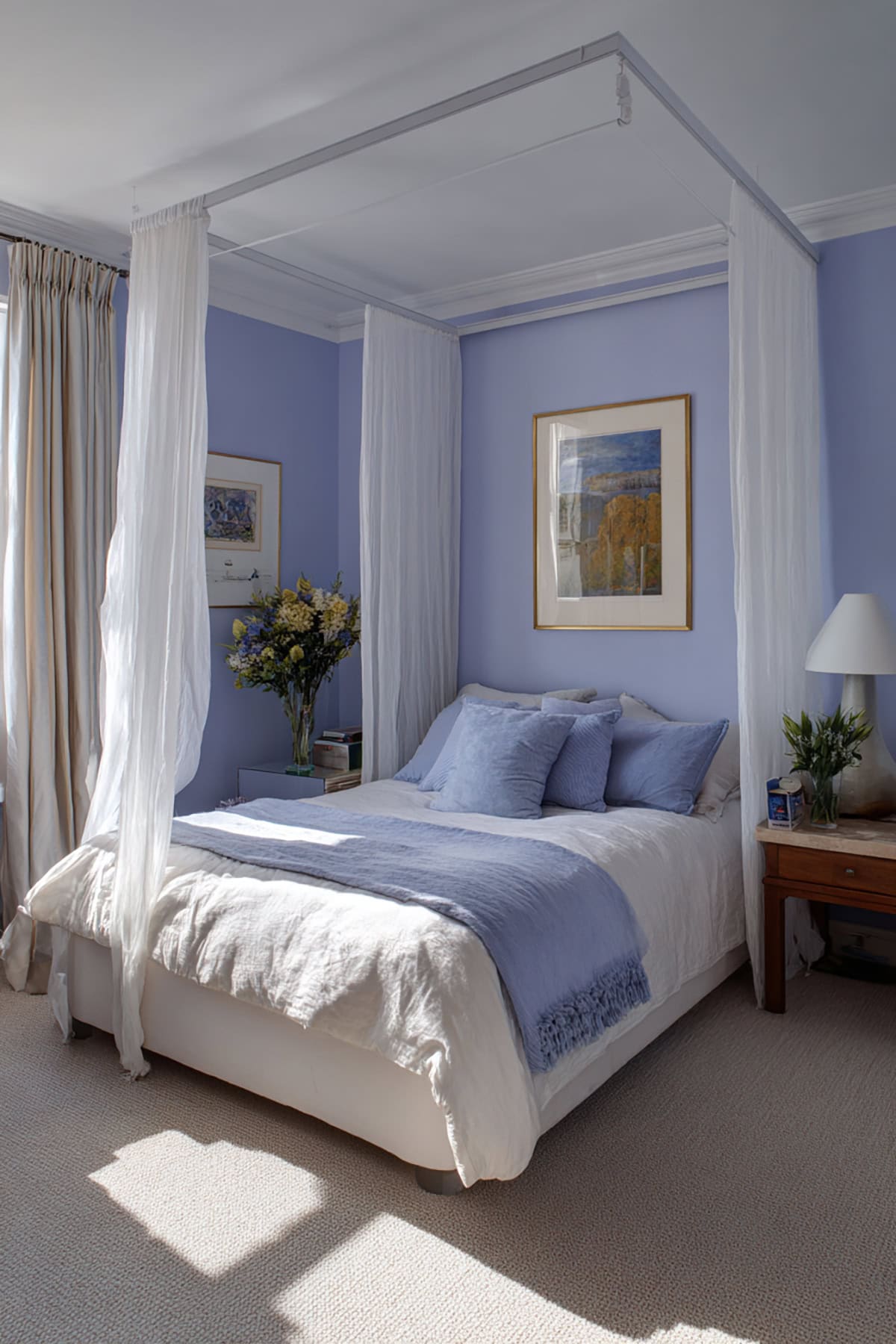
Sherwin-Williams Mature Grape (SW 6286)
Mature Grape sits between soft violet and gray—elegant, and not too showy. Great for bedrooms or offices, especially with brushed nickel or silver hardware.
In daylight, it reads more floral; at night, it deepens into a true plum. Try it with soft whites or pearly accents for a crisp finish. It never gets too heavy-handed.
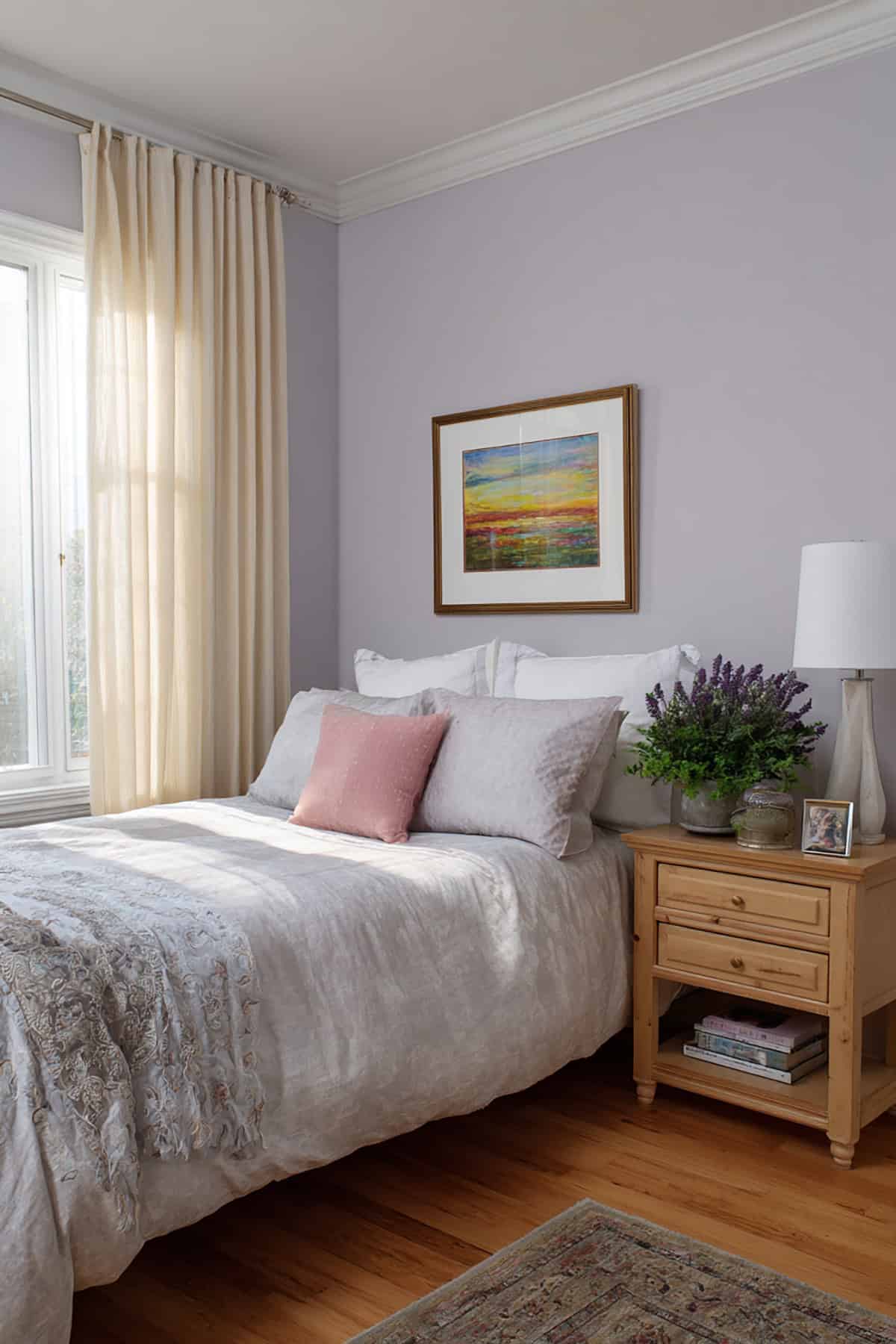
Benjamin Moore Dark Purple (2073-10)
This is about as deep as plum gets—cool violet, bold but not garish. Even a little goes a long way.
It’s perfect if you want to ground a light, airy room. Looks sharp with monochrome palettes, or next to muted lilac or slate. Lighting makes a big difference, so don’t skip the test swatch.
Sherwin-Williams Wallflower (SW 6281)
Wallflower’s a softer, lighter plum with pink and gray in the mix, so it doesn’t feel too intense. Handy for hallways or kitchens that need a gentle pop.
Off-white trim keeps it looking crisp. It’s at home with glass and chrome, and honestly, it doesn’t care if your style leans classic or modern.
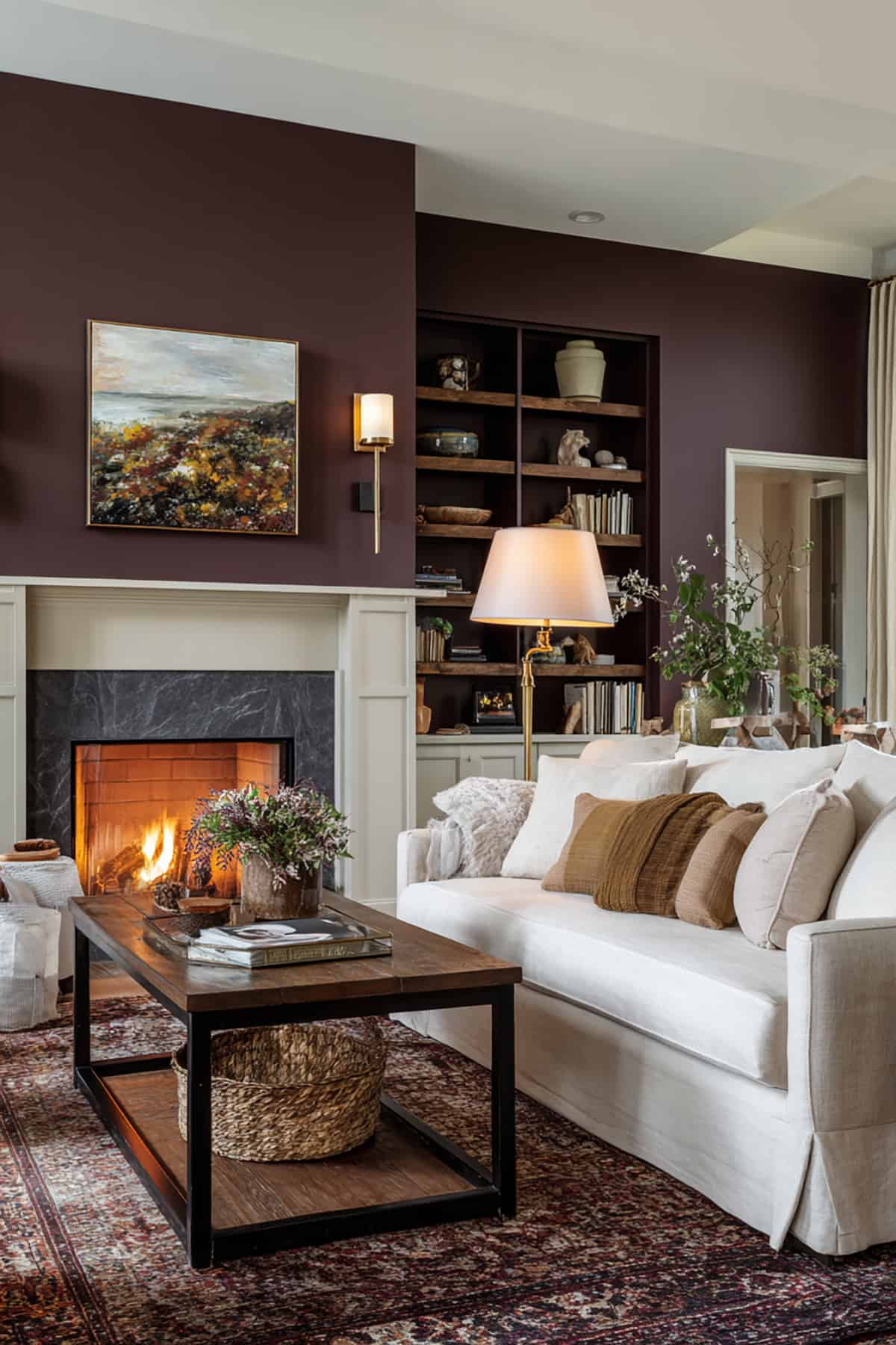
Farrow & Ball Brinjal (No. 222)
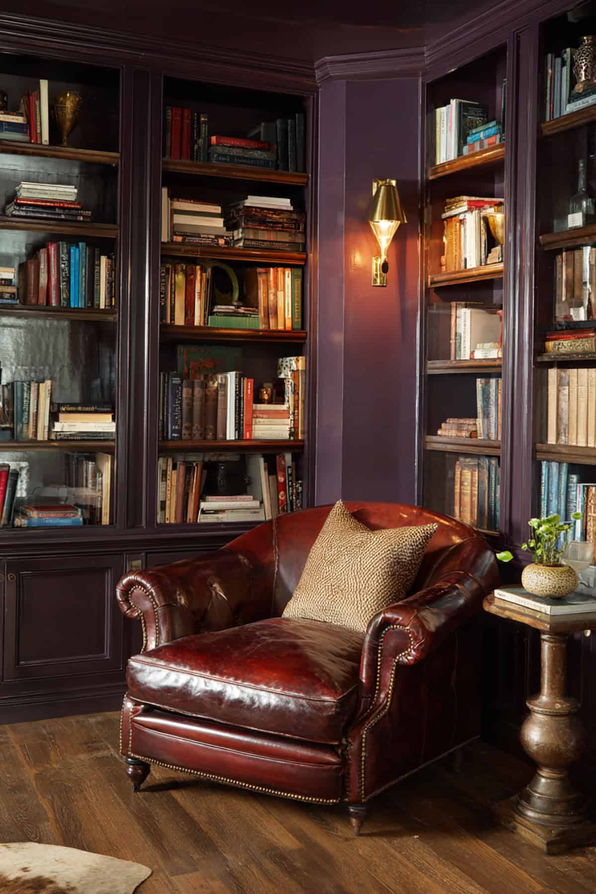
Brinjal’s got that deep aubergine thing, with brown peeking through. It feels rich but doesn’t take over, especially if you use it sparingly. The pigment’s got a natural, almost organic vibe.
Try it on wainscoting or as a backdrop for shelves. Sunlight brings out its earthy side, while lamps show off a softer purple. It’s easy to match with chalky neutrals or bronze details.
Benjamin Moore Purple Rain (1386)
Purple Rain is a mid-tone violet with a hint of blue—lively but not wild. It bridges the gap between modern and classic palettes.
It’s a fun choice for creative corners or quiet reading spots. Soft beige or brushed steel play nicely with it, and in strong daylight, it stays bright without being harsh.
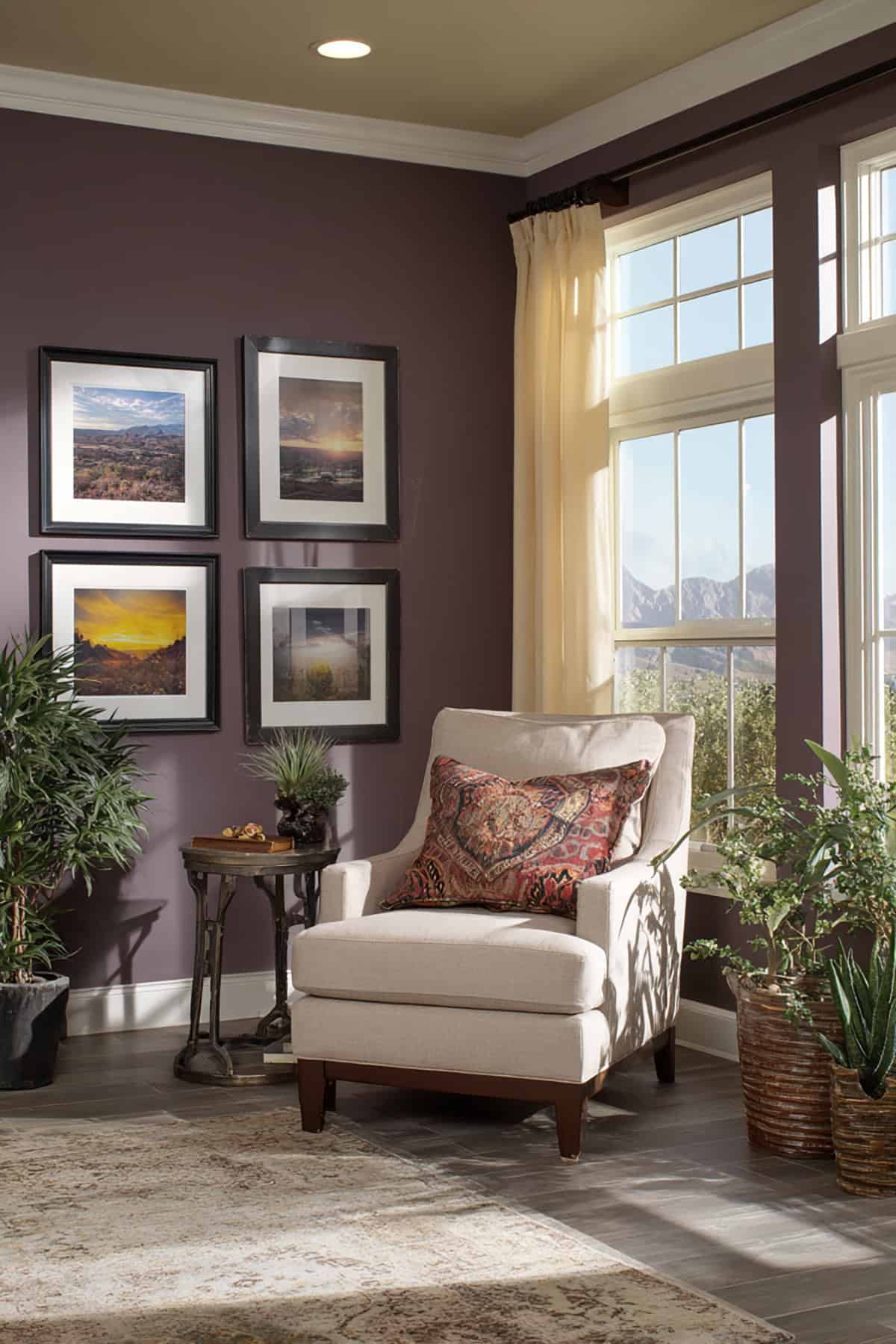
Sherwin-Williams Grape Harvest (SW 6285)
This one’s on the warmer side, like ripe fruit but not too saturated. There’s a nice mix of red-violet and brown grounding it.
Works well in dining rooms or entryways. Off-white trim helps define it, and it looks especially nice with warm lights and natural wood.
Benjamin Moore French Violet (1427)
French Violet manages to be cheerful and restrained at the same time—a floral vibe balanced by a bit of gray.
It’s a good call for offices or art rooms if you want focus without the color shouting at you. Add matte black or dusty beige for contrast. It adapts well whether your windows face north or south.
Sherwin-Williams Wisteria (SW 6822)
Wisteria brings a lighter, bluish plum—a little fresh, a little uplifting, perfect for guest rooms or workspaces. It’s got presence without being in-your-face.
Keep the trim white to make it pop. It softens under warm bulbs and sharpens with cool light, and neutral floors help it shine.
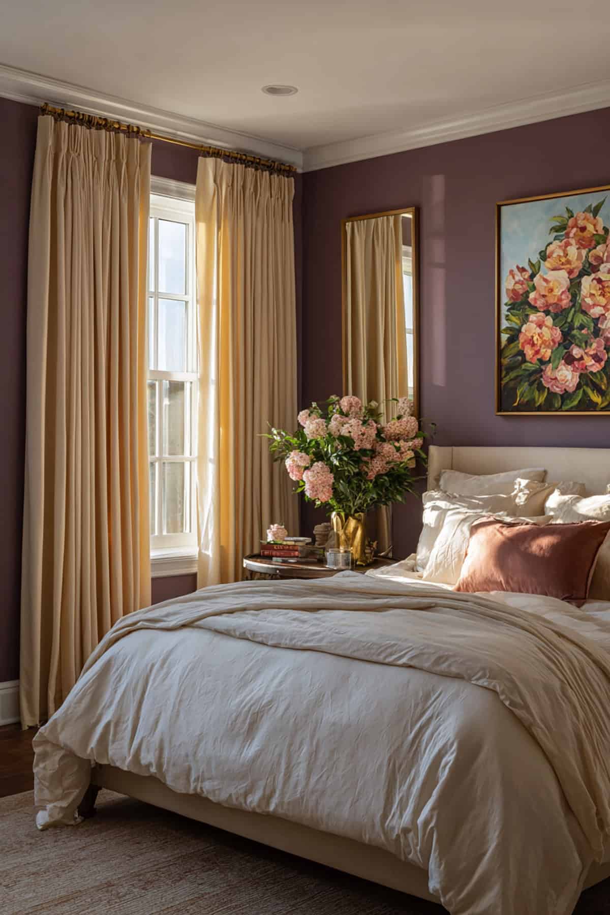
Benjamin Moore Caponata (AF-650)
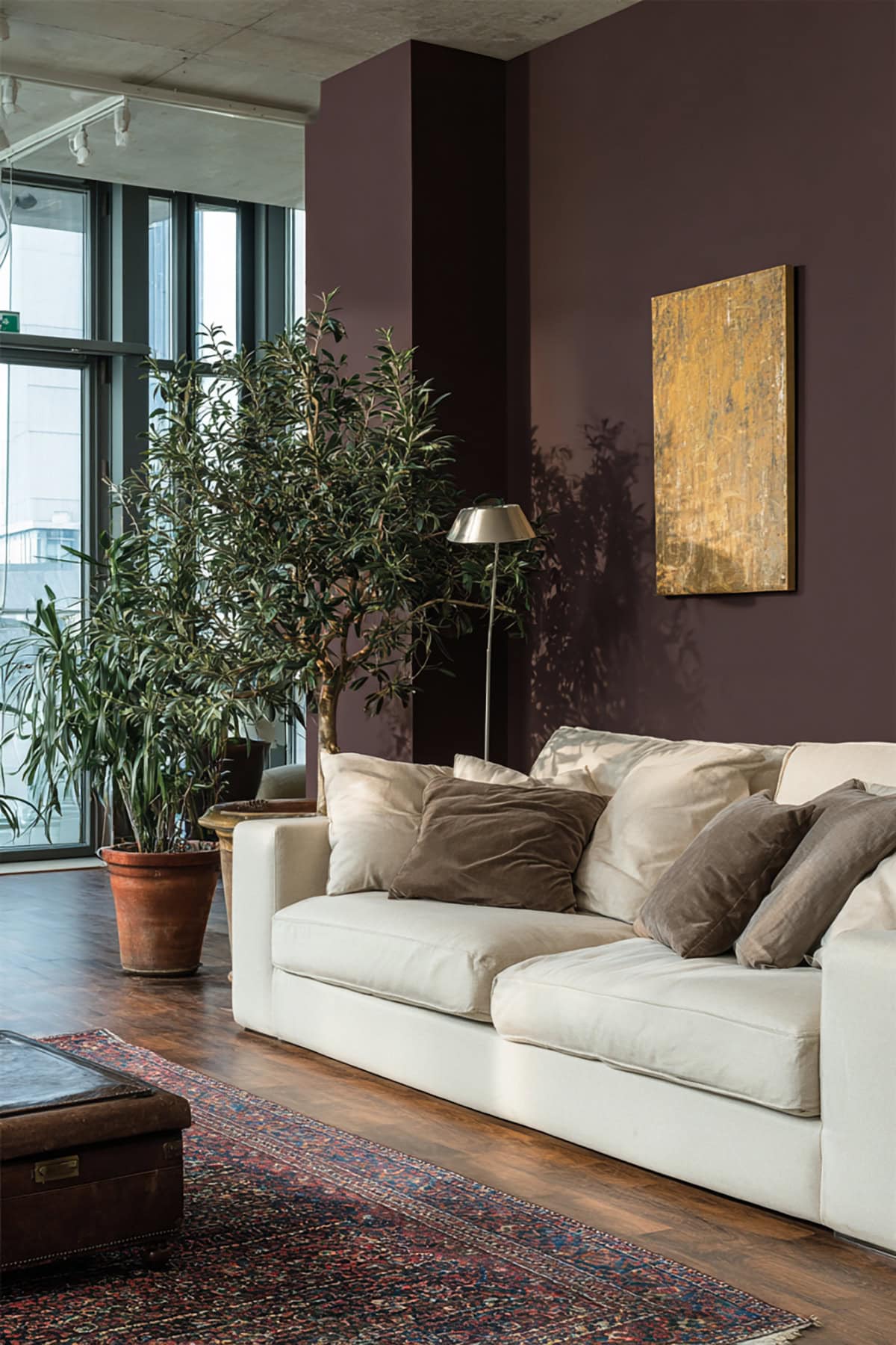
With Caponata, you get a deep, almost espresso shade that quietly hints at violet. It won’t overpower a space, but it’s got just enough personality to stand out, especially next to pale furnishings.
Some folks like it for ceilings or a bold accent wall. It plays well with taupe, olive, or a gentle cream. If the room gets plenty of sunlight, those subtle plum notes show up a bit more, lending a kind of understated elegance.